Interactive infographics explained, with 8 of the best examples on the web

An important skill for anyone working in content — from marketers and designers to journalists and other media professionals — is to make complicated information approachable, understandable, and easily digestible.
By Marissa Sapega
One of the best ways to do this is to create and embed an infographic. Infographics are simple visual distillations of complex information, often using illustrations, short summaries, and data visualisations (such as charts, tables, and maps).
With the rise of web and new digital platforms, this tactic has been taken to a new level with the rise of interactive infographics (otherwise known as animated infographics). Interactive infographics have become an important part of the content marketing strategy of successful marketing teams.

In this article, we’ll cover:
- What is an interactive infographic?
- The rise of visual storytelling on the web
- The benefits of interactive infographics
- What makes the best interactive infographics?
- Impressive interactive infographic examples
- How to create an interactive infographic
- Interactive infographic FAQs
- Free interactive infographic templates: three visual stories to help you get started
Let's dive in below!
In this article, we’ll cover:
- What is an interactive infographic?
- The rise of visual storytelling on the web
- The benefits of interactive infographics
- What makes the best interactive infographics?
- Impressive interactive infographic examples
- How to create an interactive infographic
- Interactive infographic FAQs
Let's dive in below!
Start creating with Shorthand
It's the fastest way to publish beautifully engaging digital stories, infographics, reports, and more.


What is an interactive infographic?


Let’s begin with the definition of an infographic. An infographic (static or interactive) condenses complex data or information into an easy-to-digest visual. The FDA’s food pyramid could be considered a very rudimentary infographic; so could a map of the world with colour-coded countries showing, say, Olympic medals.

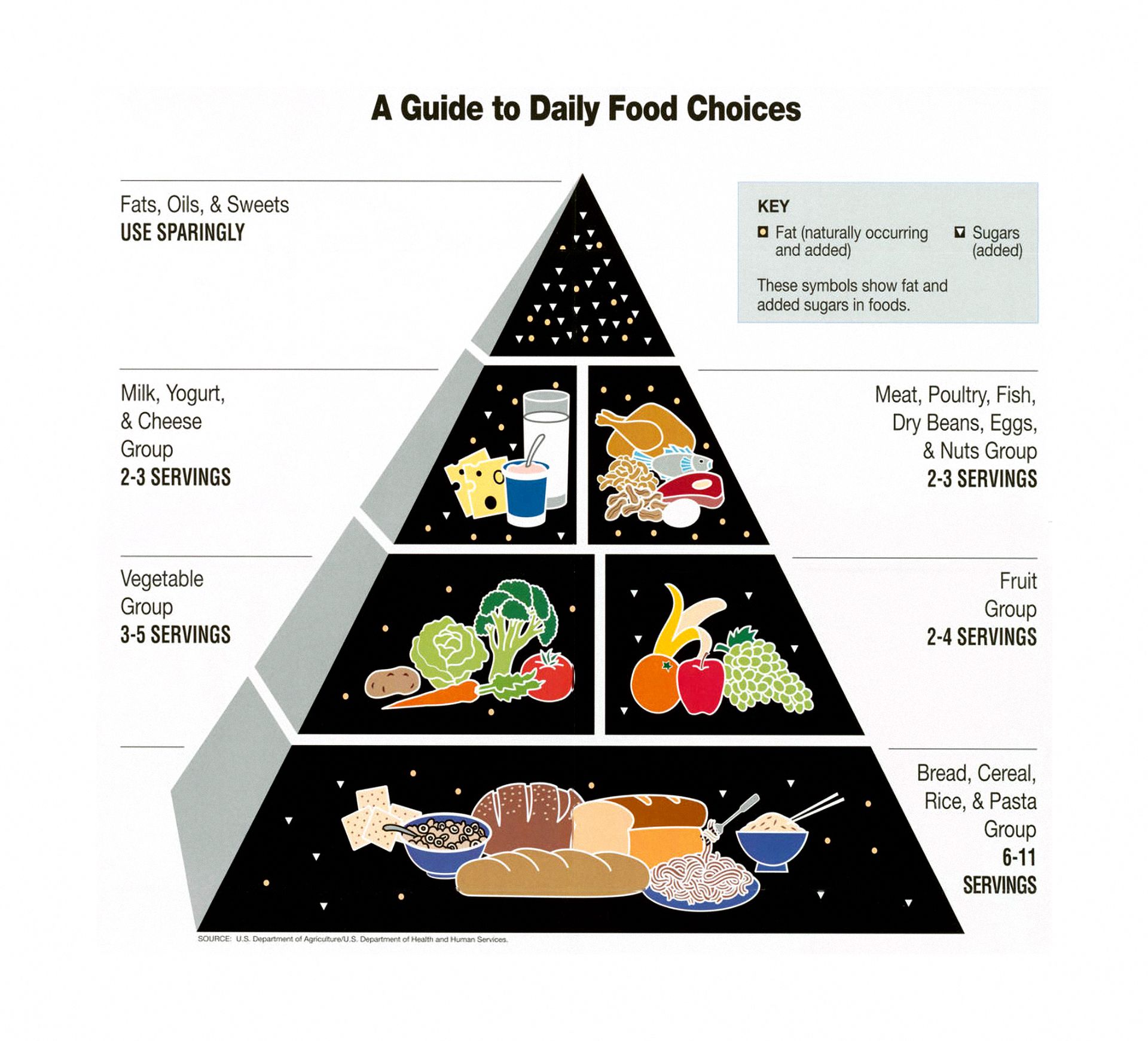
Both examples display significant amounts of information (e.g., types of food, suggested servings per day, and serving size) in a way that makes it immediately understandable.
An interactive infographic is simply an infographic that has some element of interactivity, such as animation effects triggered by the reader clicking and scrolling. These are a form of interactive marketing that requires human engagement to initiate action.
One way to create an interactive infographic is scrollytelling, which relies on the reader scrolling to trigger changes in a piece of content. Scrollytelling can incorporate any combination of graphics, audio, video, and animations to create a thoroughly engaging piece of long-form content.
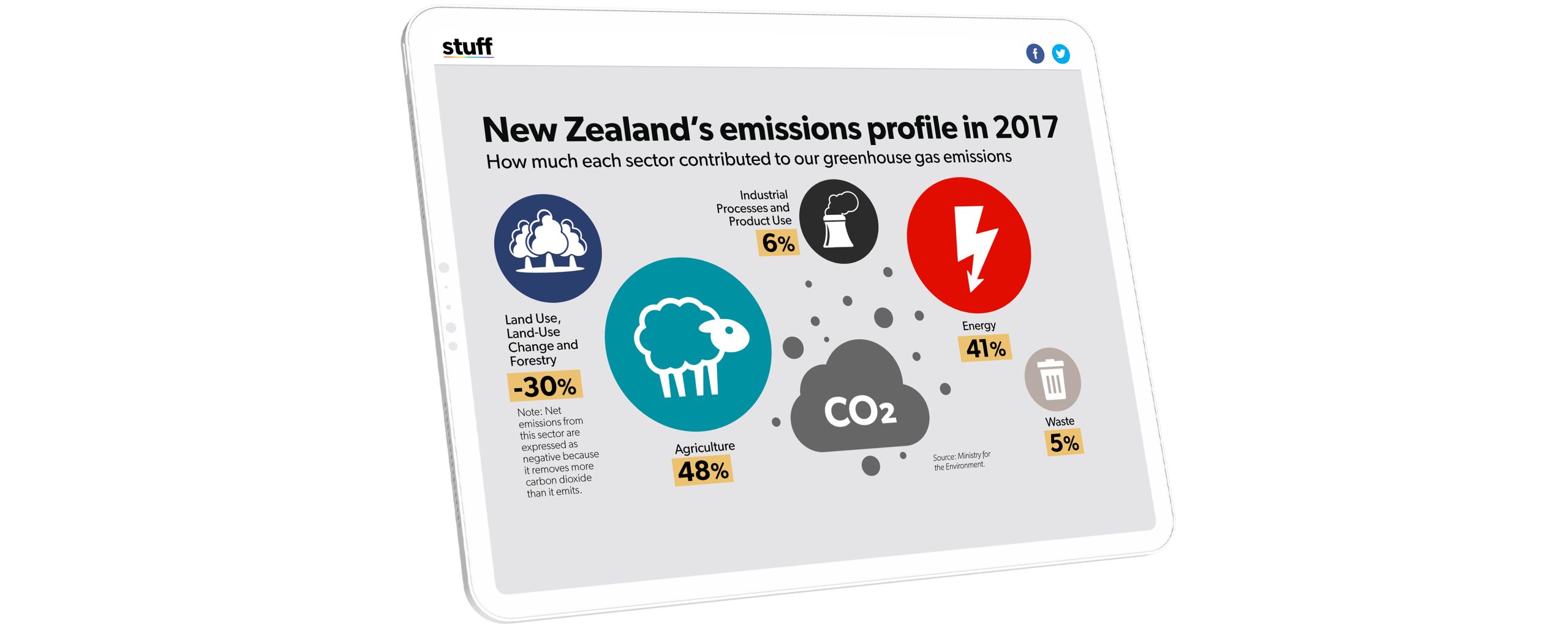
One great example of scrollytelling comes from media company Stuff in their story 407 and rising. This story uses interactive infographics to show the impact of climate change on the planet. You can see other examples in our roundup of the best immersive interactive content.


Now that we know what an interactive infographic is, let's take a quick detour to discuss visual storytelling, which is how the best infographics are used on the web today.
The rise of visual storytelling


Visual storytelling refers to the use of eye-catching visual elements — such as images, video, data visualisations, and motion graphics — to create compelling content. It has been on the rise for several years now across multiple fields, including media and content marketing.
Why has visual storytelling taken off? The main reason is that standards for content on the web are rising, and it's become harder than ever to get readers to pay attention.
As web browsers become more powerful, we're seeing the rise of an arms race for ever more impressive visual content. More and more businesses, publications, and even individuals are leveraging the power of multimedia digital storytelling to share complicated concepts or data.
Many of the best interactive infographic examples on the web today are embedded in immersive visual stories. Before we look at some examples, though, let's run through the benefits of interactive infographics.
Looking for images to use in your visual story or infographic? Check out our roundup of the best free stock photo sites on the web.
The benefits of interactive infographics


Better communication of data and information
Images speak louder than words. Not only do people find it easier to consume information in a visual format, but we also process visuals 60,000 times faster than text, according to t-science. In an age where time is at a premium, effective visual communication with expert infographic design is a huge advantage.
Greater reader engagement
By their very nature, an interactive infographic requires user engagement: you need to scroll, tap, click, or roll over parts to get the full effect. Such interactivity helps attract and maintain the attention of your target audience, so they’re more likely to devote time consuming the information. This, in turn, helps support the next benefit: search engine optimisation (SEO).
Improved SEO
Search engine algorithms utilise many different criteria to determine page rank for queries, including high-quality backlinks from credible entities. If you publish an interactive infographic on your site, chances are it’ll generate more buzz and backlinks than a plain text article or static infographic.
Additionally, experts hypothesise that time spent on a page is an SEO factor as well. Search engines often penalise sites with low dwell times (when people exit within a few seconds), as it signifies that the page did not answer the user’s query.
Better distribution
It’s hard to declare content a success if the only people who read it are your co-workers and your mother. (Well, depending on how highly you value your mother’s opinion, that is.) Generally speaking, people create content so others will consume it; it’s not meant to exist in a vacuum. Interactive infographics are more appealing and stickier. As a result, people are more likely to share them with others.
The potential for sharing is especially critical for social media promotion. As more people click, comment, and share your posts, algorithms pick up on these actions and will expose your content to a broader audience, leading to a virtuous cycle that feeds on itself.
Higher perception of quality
There’s nothing inherently untrustworthy about a static infographic or a traditional blog post. That said, an interactive infographic delivers an immediate impression of authority. It’s the same reason why high-end make-up brands use glass bottles and beautiful packaging: appearances positively influence people’s perception of the product’s value.
Why should a perception of quality matter? For one thing, higher prices are directly related to perceived value (hello, luxury watches!). Everything on your website (including interactive infographics) will be subject to user assessment. Why not go the extra mile if it reflects well on your brand and allows you to charge what you believe your product is worth?
More interesting
Why do people prefer to watch videos instead of reading? Why does sound enhance visuals? Any time you layer in an additional sensory experience, it stimulates our brain more, which is inherently rewarding. However, keep in mind that there is such a thing as gratuitous stimulation (like having so many videos or animations that they fragment your attention), which can result in unnecessary cognitive overload.
What makes the best interactive infographics?

The best interactive infographics are simple, responsive, feature true interactivity, and fit the narrative of the story:
They’re simple
Infographics that take difficult or high-volume data and communicate it clearly and simply to their audience are among the most powerful data storytelling tools.
They’re interactive
If they encourage clicking, scrolling, hovering, or sharing, they increase engagement with your story and help prevent readers from getting bored or clicking away.
They’re responsive
The infographic should work well on mobile screens as well as desktop — no pinching and zooming required.
They fit the narrative
Your interactive infographic should clearly fit your story and be explored within the text in a way that makes sense — not just added as a bolt-on graphic.
Now that you understand what makes the best interactive infographics, let’s look at some real-life examples.
Best interactive infographic examples
Any information can be transformed into an interactive infographic. Here are some of the best interactive infographics examples from media organisations and nonprofits around the world.
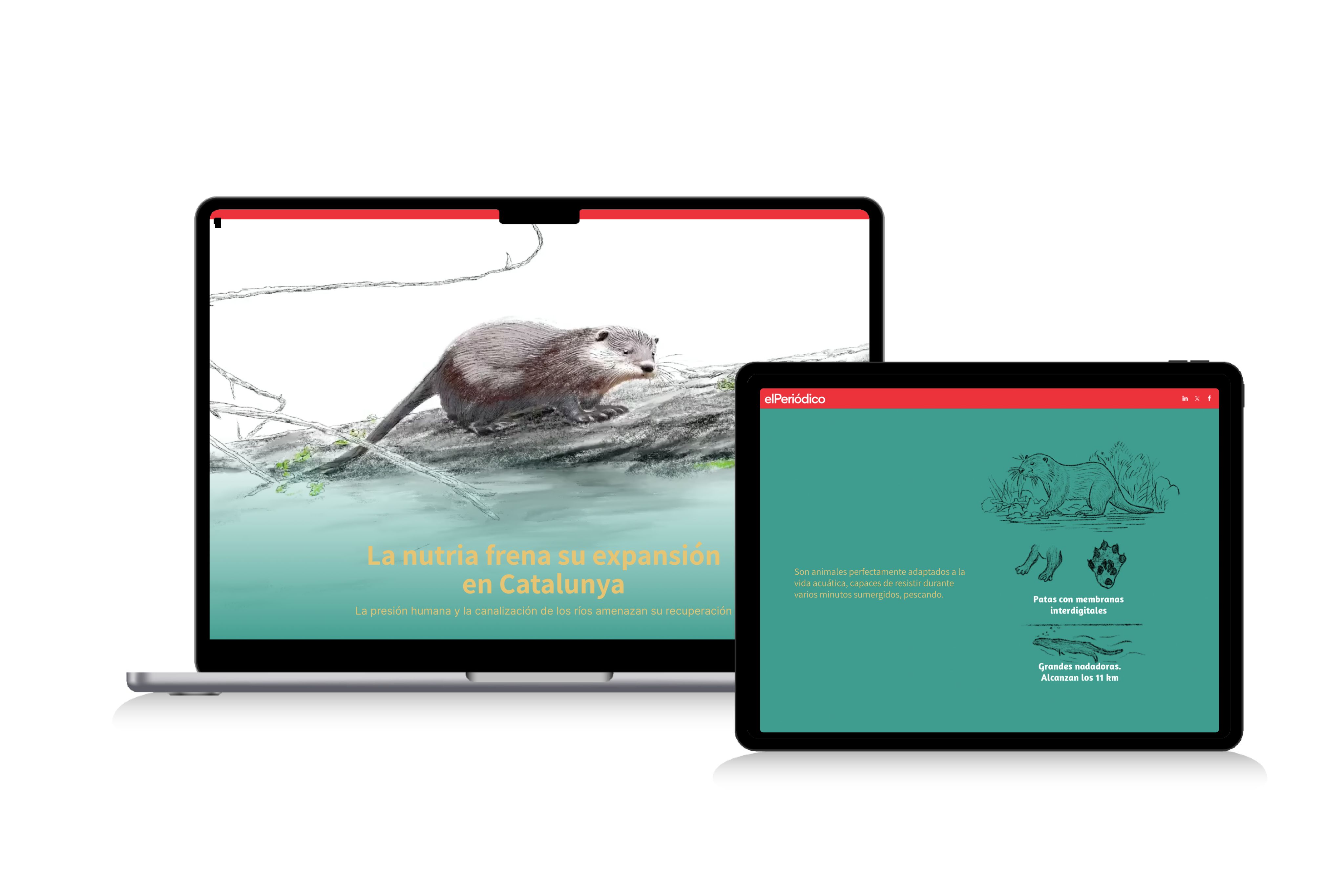
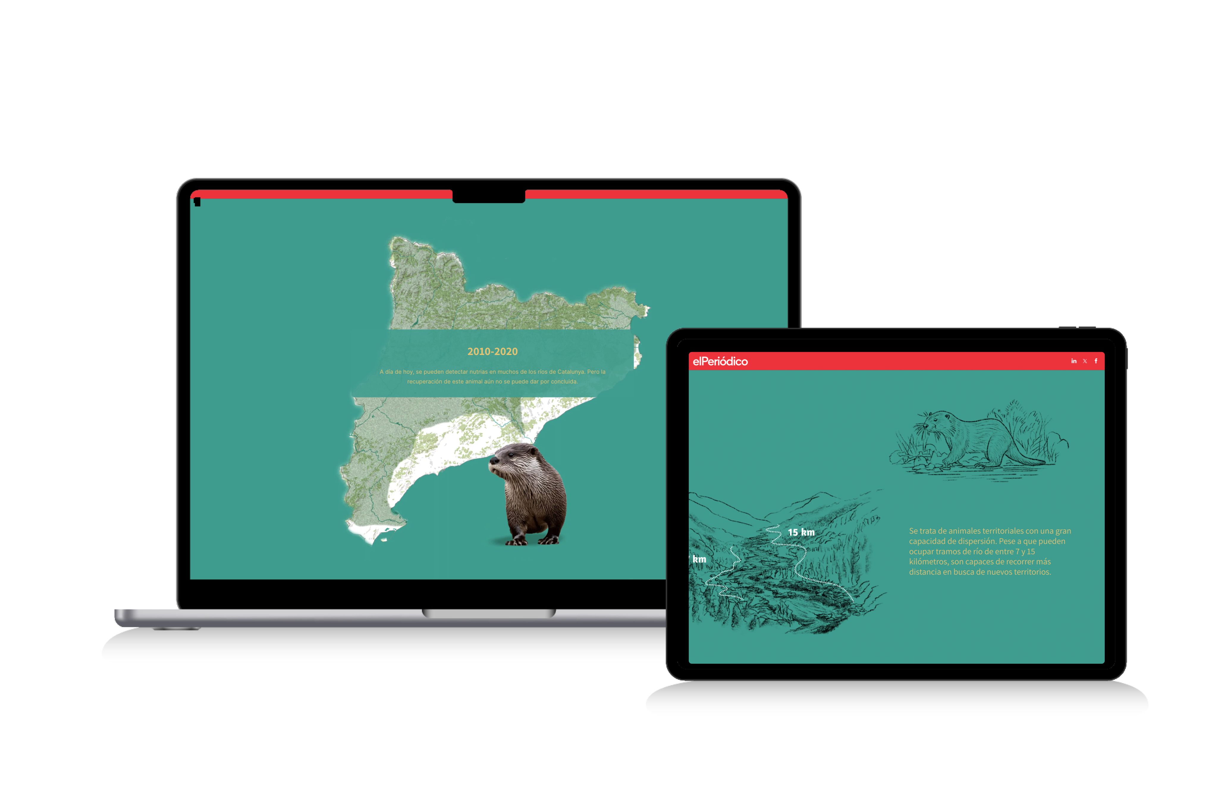
La nutria frena su expansión en Catalunya
There are a number of different infographics in El Periódico's story about otter populations in Catalonia, including scrolling maps, and anatomy and habitat diagrams. But perhaps the best one is the river visualisation that reveals, as the reader scrolls, how seemingly innocuous changes to the landscape — dog walkers, creek-side paths, tree branch removal — have consequences for the local wild otter population.


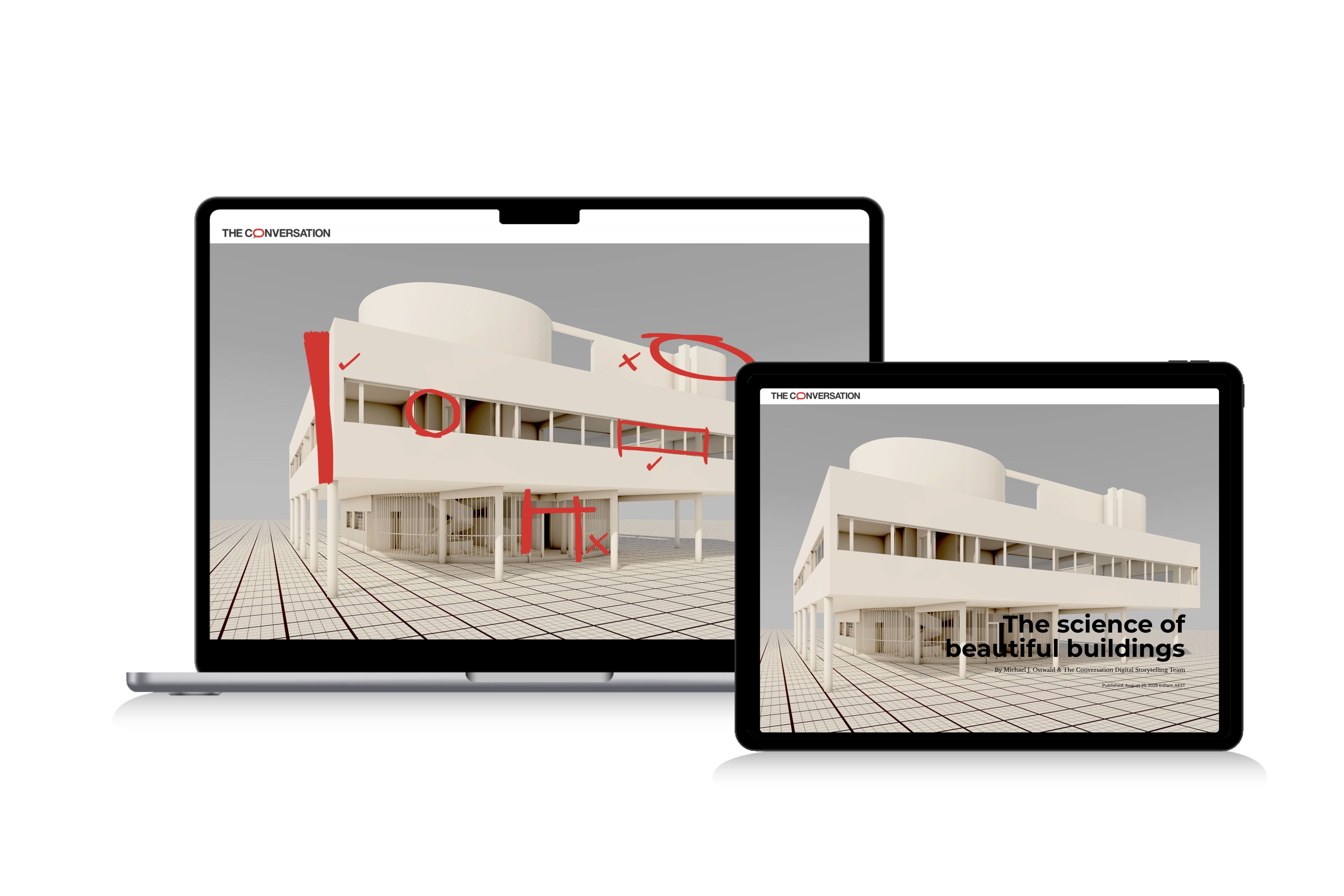
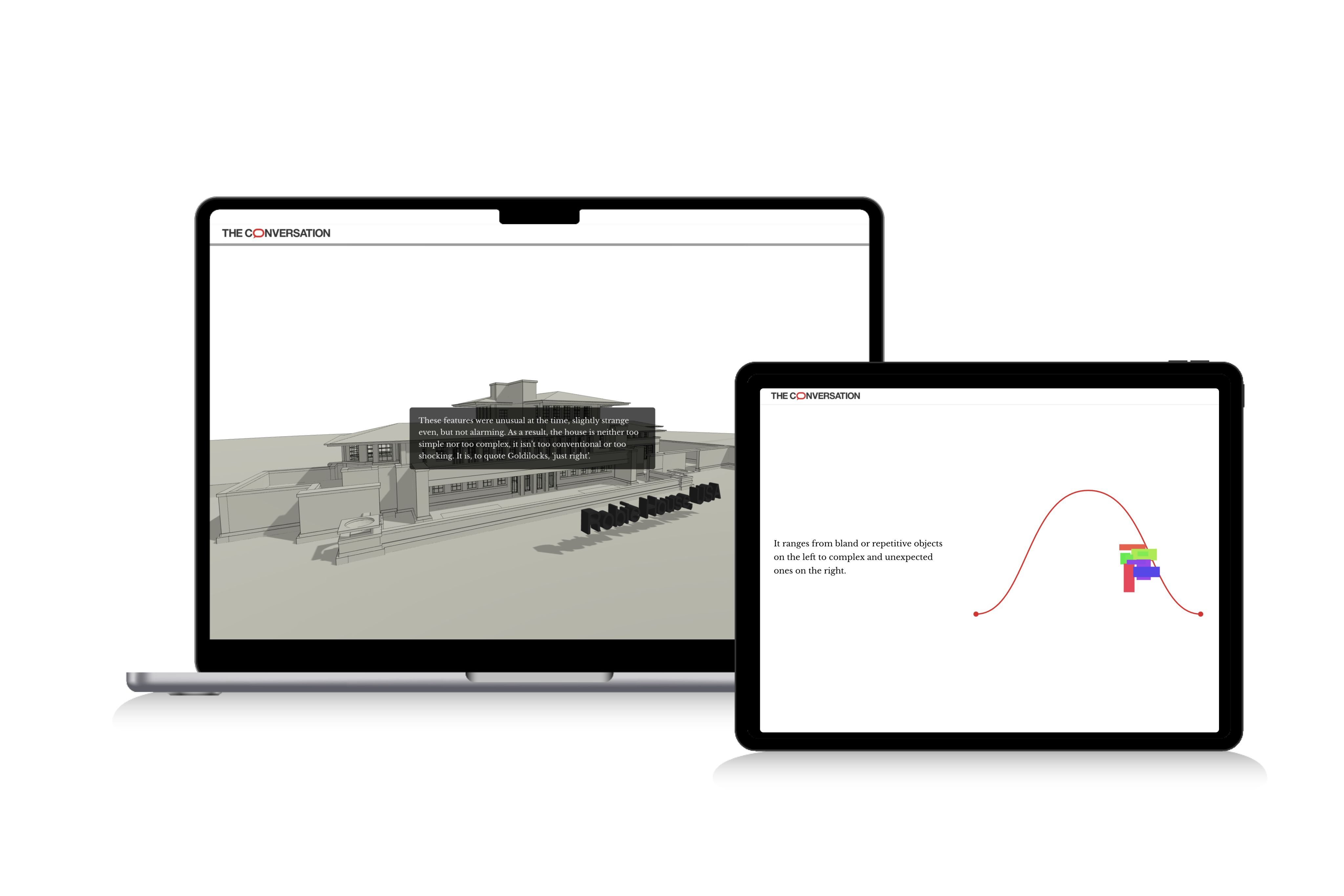
The science of beautiful buildings
A number of infographic and immersive elements make up The Conversation's fantastic exploration of architecture and taste. Famous works of architecture are measured on a bell curve comparing the ‘pleasure’ and ‘stimulation’ of the beholder, and a more simple interactive infographic featured, though, is eye tracking analysis of people looking at a standard home is shown with heat mapping over a simple graphic.


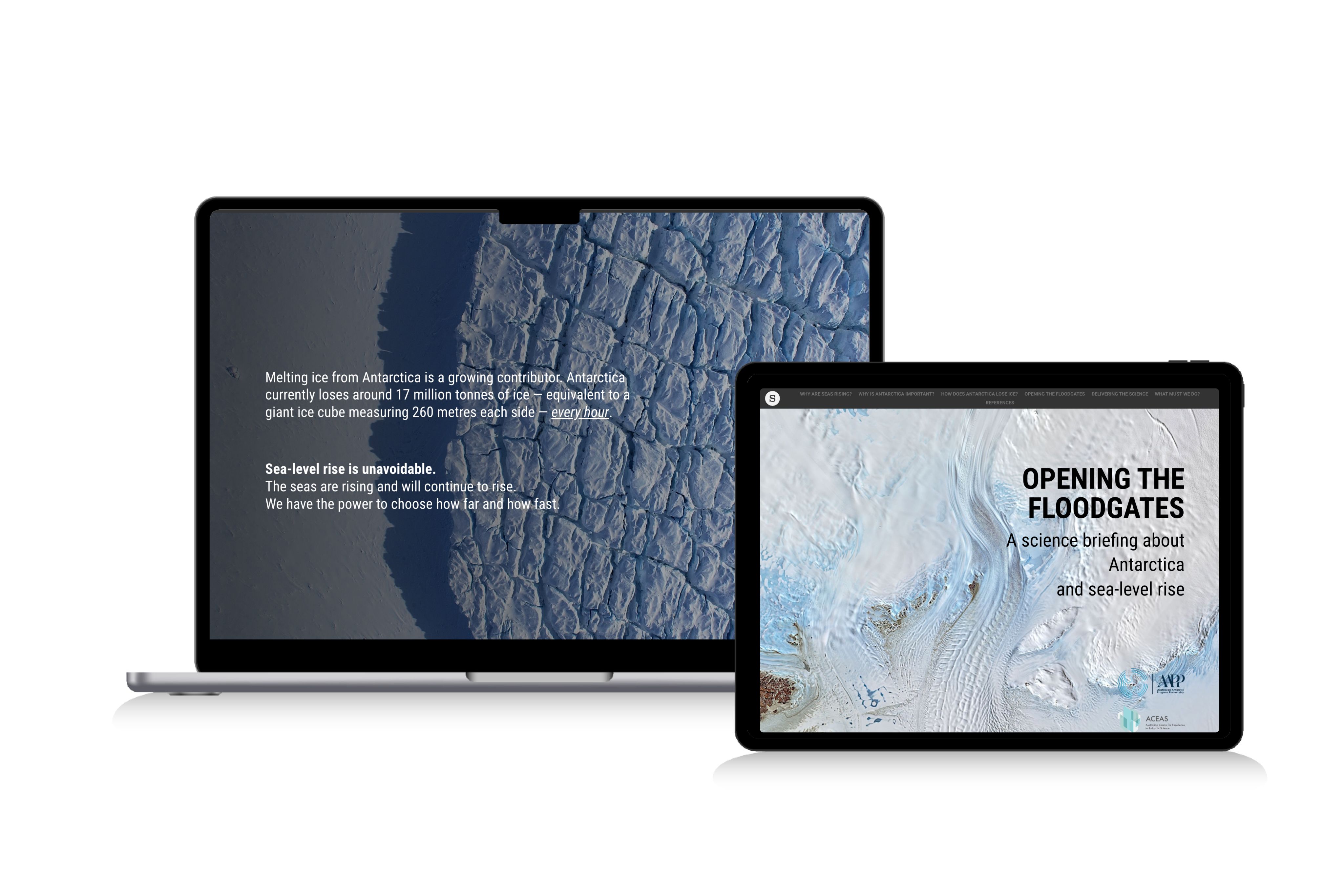
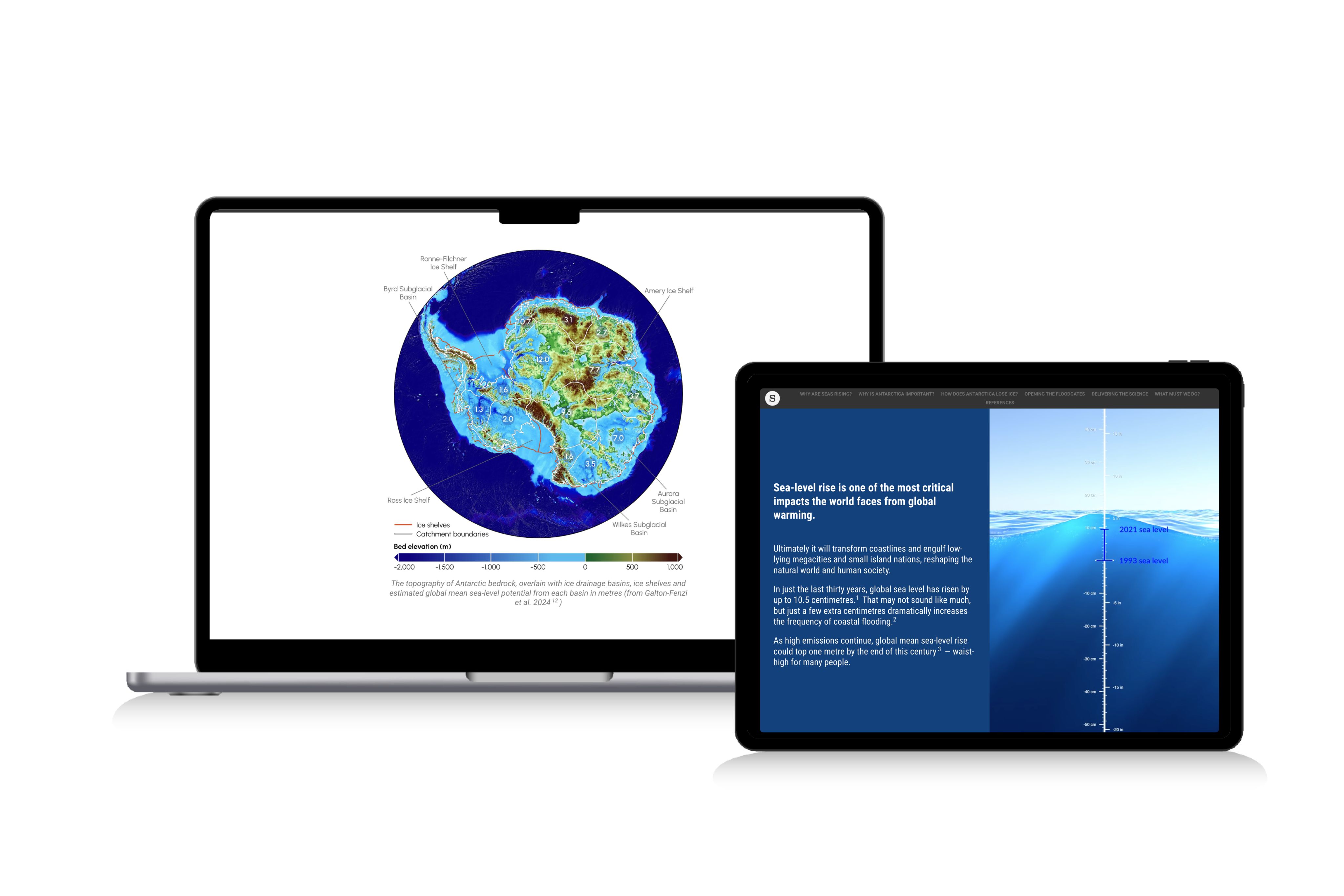
Opening the floodgates
Sometimes it can be hard to tell a story with data, to help your reader understand the numbers at your disposal. The Australian Antarctic Program Partnership kept it simple. To clearly communicate its research on sea level rising it used… a sea level rising.
It doesn’t get much clearer than that. The sea level creeping higher and higher does a fantastic job of communicating the problem at hand; it’s a fine example of how the best data storytelling breaks down the difficult data into something readers can visualise.


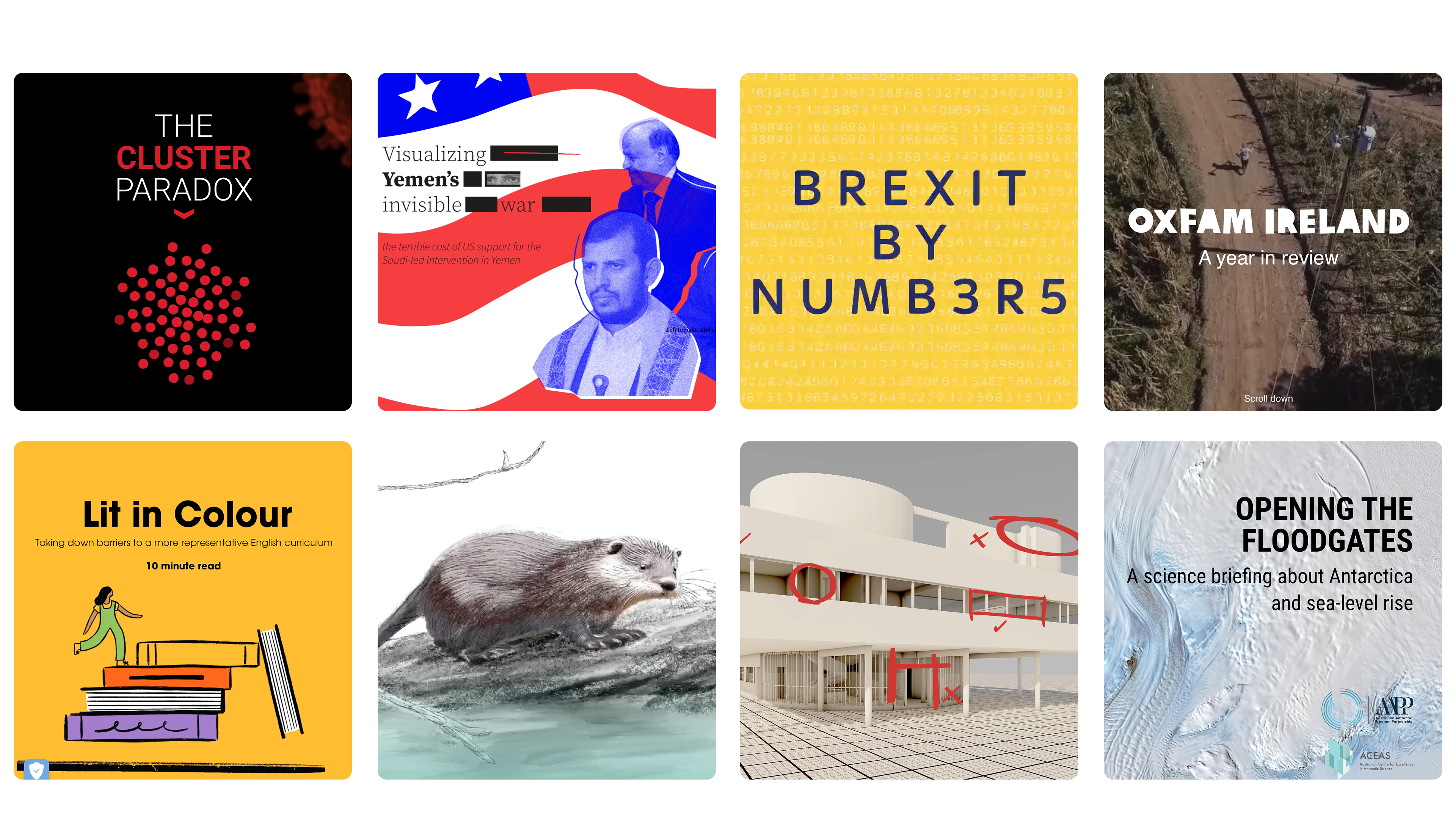
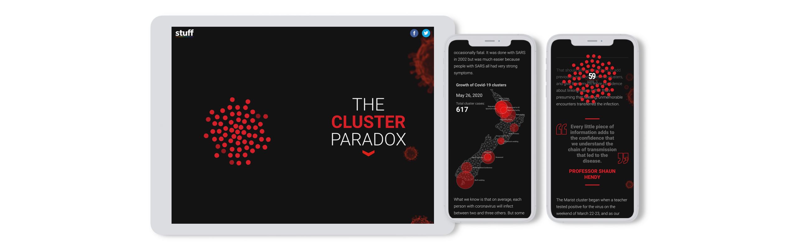
The Cluster Paradox
The COVID-19 pandemic has been a terrifying experience for individuals worldwide. Even so, thanks to an onslaught of news stories and horrifying statistics since March of 2020, people have been somewhat desensitized to new information. New Zealand media company Stuff decided to break through the clutter by creating an interactive scrollytelling story on COVID-19 clusters.
Stuff begins by setting the stage for the piece, describing why documenting clusters in New Zealand is not the terrifying act it may seem to be at first glance. Scroll down further and the reader encounters illustrations of the island highlighting where clusters broke out.
As the reader continues to scroll, they learn more details about each cluster (how it started and grew), accompanied by animated dots representing the increase in cases as time went on.


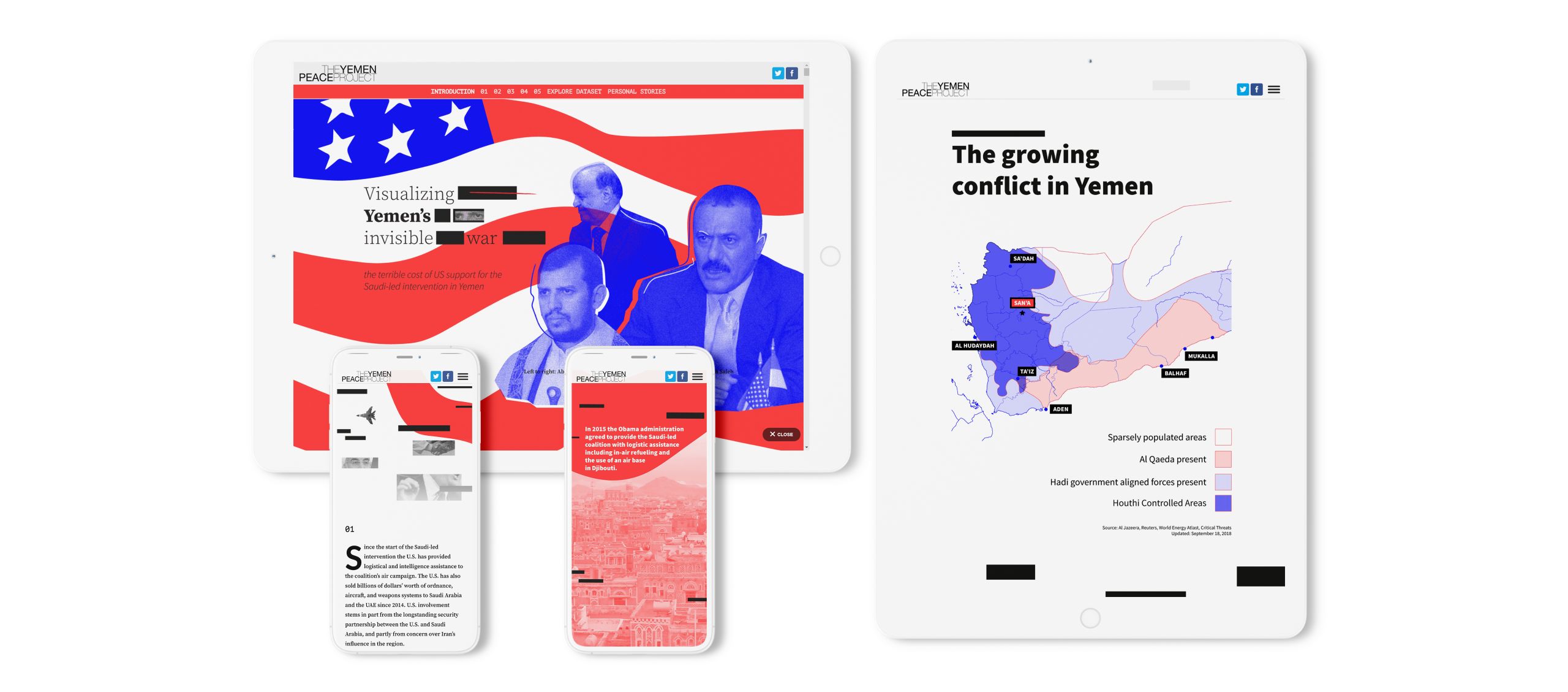
The Yemen Peace Project
Yemen has been wracked by war, corruption, and instability for decades. The Yemen Peace Project lays bare its disturbing history with a scrollytelling story dotted with charts, black and white photographs, and full-screen images that convey the destruction better than words ever could.
It also features an engaging interactive map of the country demonstrating the relentless spread of Al Qaeda and Hadi government forces as you scroll.


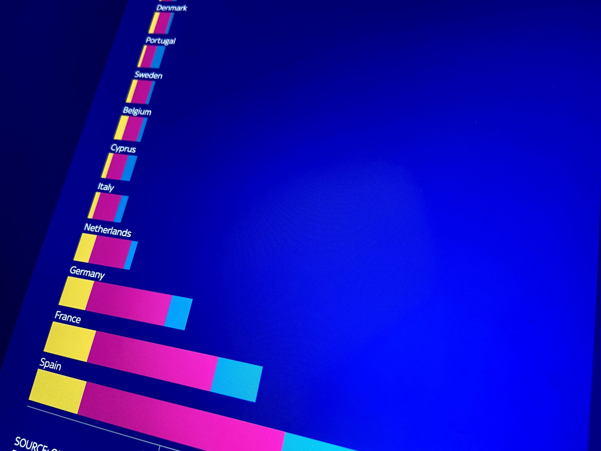
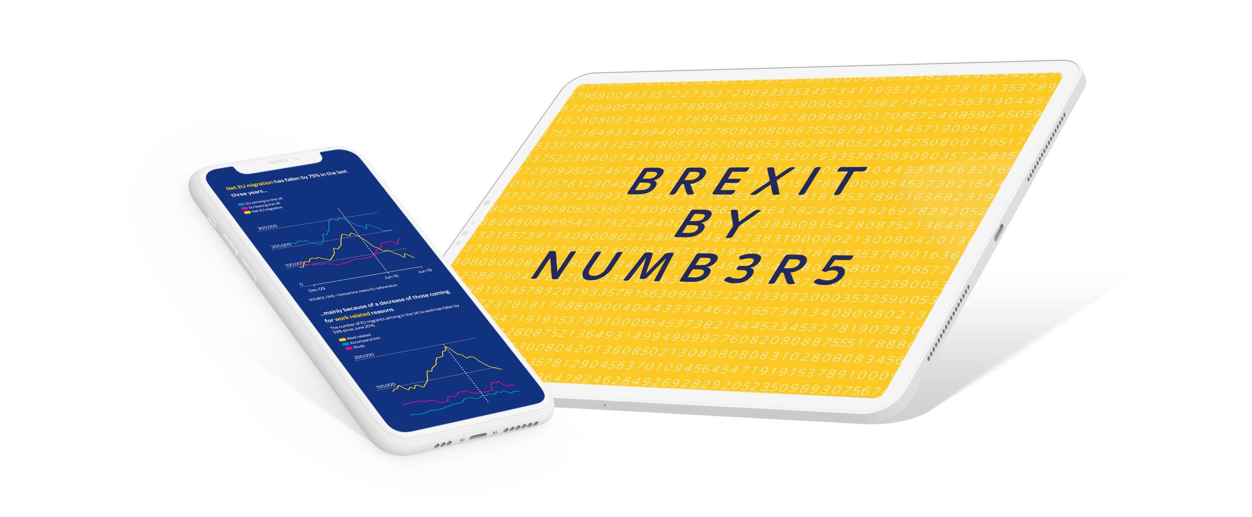
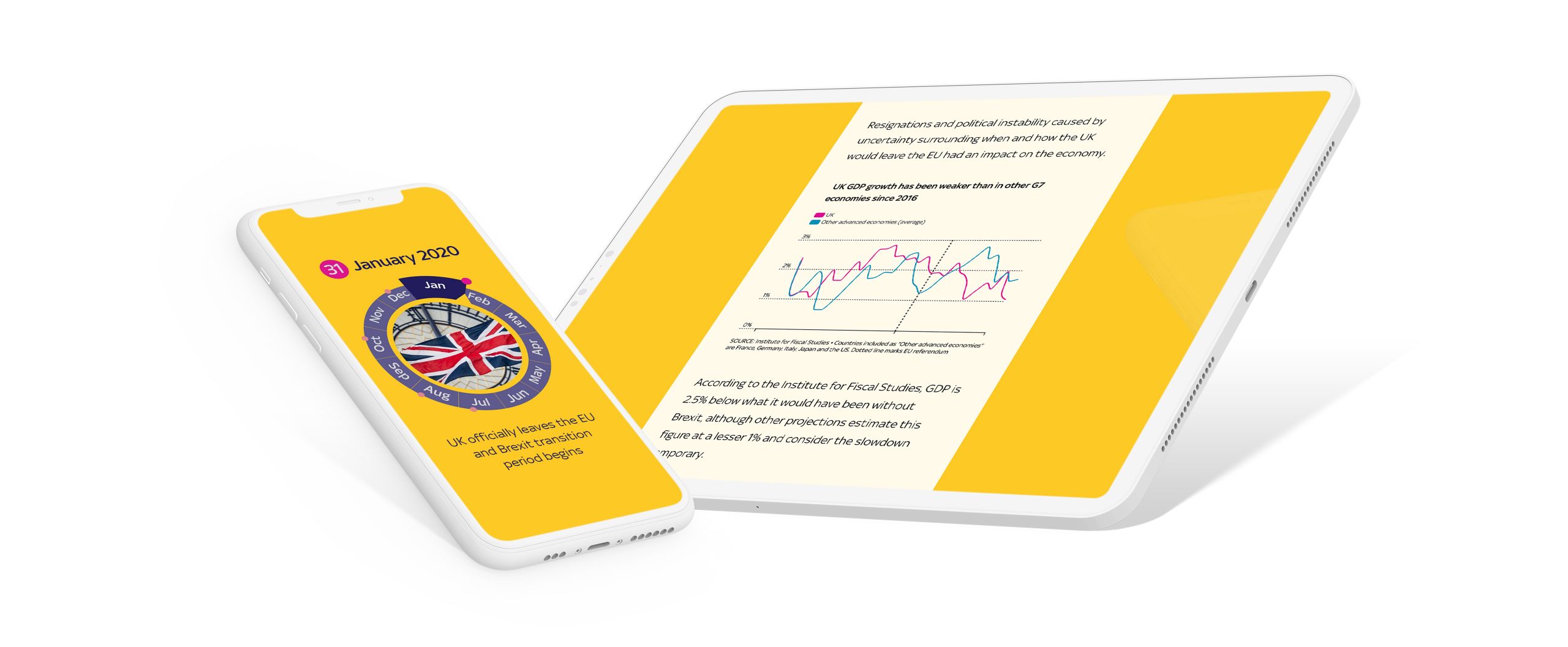
Brexit by numbers
Sky News’ award-winning 'Brexit by numbers' describes the history and aftermath of the UK’s break from the European Union. As the reader scrolls, a timeline beginning in June 2016 unfolds, with the story highlighting critical events and statistics, such as net migration and Britons living abroad. All told, this engaging piece manages to distill a massive amount of information into a piece of content that is easy to consume.


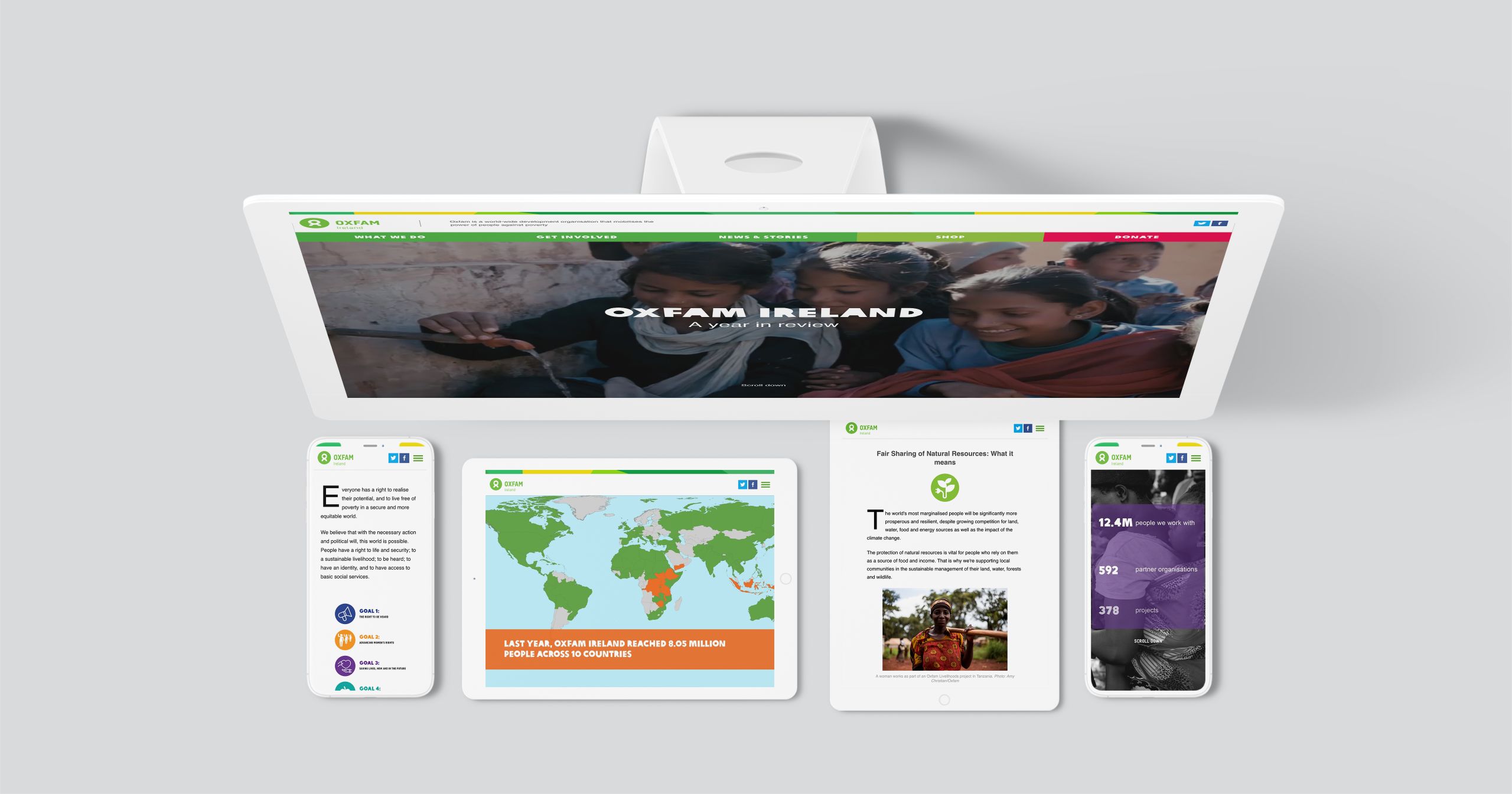
Oxfam Ireland
Oxfam is a non-profit that aims to eliminate poverty worldwide. Its engaging story showcases the work of the Ireland branch by laying statistics over a world map, which change as the reader scrolls. Using this format helps users stay engaged as they consume quick hits of information.
The second part of the story delves into Oxfam’s goals, which it conveys using a combination of illustrations, full-screen photographs, and minimal text. The result is a dynamic experience that delivers substantial information in a way that does not overwhelm the reader.

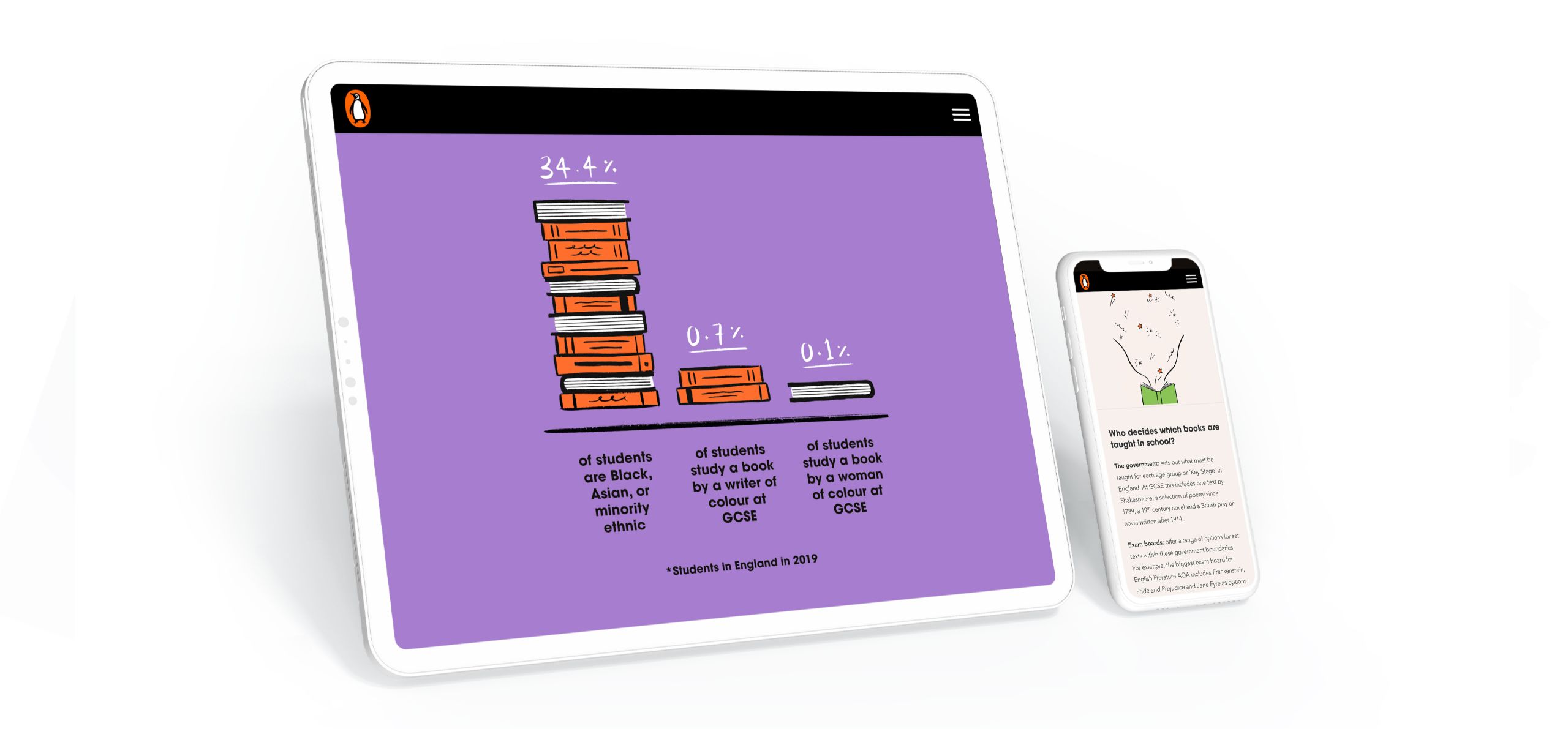
Lit in colour
In 2020, Penguin Books UK partnered with the race equality think tank The Runnymede Trust, with the goal of making English literature more inclusive. Lit in colour condenses its report into a breezy, easy-to-understand digital story, highlighting key points for readers. It intersperses charming images with quotes from students, stats from research in the report, and explanatory text.
While the animation and illustrations are simple, 'Lit in colour' still manages to sustain a user’s attention through to the end, thanks to its punchy colours and dynamic content.


How to create an interactive infographic

There are a few ways to build an interactive infographic, each with its own pros and cons. Take a look at the approaches below to determine which one is right for your organisation:
Hire a developer
Pros: A competent developer can build a beautiful, bespoke interactive infographic for you. It will be unique and crafted precisely to your specifications. (It can also be embedded into Shorthand!)
Cons: As with many things in life, talent comes at a premium. If you want a truly stunning, one-of-kind piece that no one could replicate (without significant effort), you’ll need a budget, particularly if you're looking to create interactive content at scale.
Use a design platform
Pros: Design platforms can be used to create impressive interactive content. If you have access to design resource and can swing a subscription to an online design platform, then this is a good option.
Cons: Designers often use technologies that are not accessible to non-designers, so if you don’t have consistent access to a professional (or know how to use the technology yourself) it’s not an ideal option. Also, while it will almost certainly cost you less working with a developer, it can still be pricey.
Use a digital storytelling platform
Pros: With so many options available to create static infographics, an easy way to make them interactive is by leveraging Shorthand’s scrollytelling features. With this approach, you can create exceptional interactive content at scale without a design background, and you can easily update your infographic if you need to. Some platforms will also offer templates for you to use.
Cons: If you want to create content that is truly unique, it's still a good idea to contract a graphic designer. But with a digital storytelling platform like Shorthand, you'll be able to avoid additional web design and development costs, meaning your design resources will be more effectively allocated.
Interactive infographic FAQs
What makes a great infographic?
The best interactive infographic examples combine strong visual design with meaningful interaction. They are simple, responsive, and support the narrative of the story they appear in.
Where can I find inspiration for interactive infographics?
Start with the examples on this page, then explore Shorthand’s gallery of great data storytelling examples.
How can I create an interactive infographic like these examples?
You can hire a developer, use a design platform, or build your own story using a digital storytelling platform. The best interactive infographics are usually created in tools like Shorthand, which support scrollytelling, multimedia, and responsive design.
Ready to create your interactive infographic? Try our free templates
These free templates feature animated charts, illustrated grids, scrolling diagrams, and more — everything you need to tell your visual story.