
How to make
an infographic


Let's start with the obvious: Storytelling is getting more visual. From social media to news publications, content creators are increasingly using high quality images, charts, infographics, animations, and other data visualizations to make their stories more engaging.


by Kimberlee Meier
by Kimberlee Meier
In the past, visual storytelling was technically difficult — i.e. expensive — for most teams, and was usually reserved for 'special', one-off pieces. But with the rise of easy-to-use, no-code tools, it's become possible for anyone to create their own infographics and other impressive visual content.
In this guide, we're going to cover:
- What is an effective infographic?
- Why create an infographic?
- 4 ways to create infographics
- Examples of brands that use infographics to bring their stories to life
Let’s get started.
Start creating with Shorthand
It's the fastest way to publish beautifully engaging digital magazines, reports, internal comms, and more.


What is an
infographic?

An infographic is a type of visual content that provides information or data in way that is eye-catching and easy to understand.
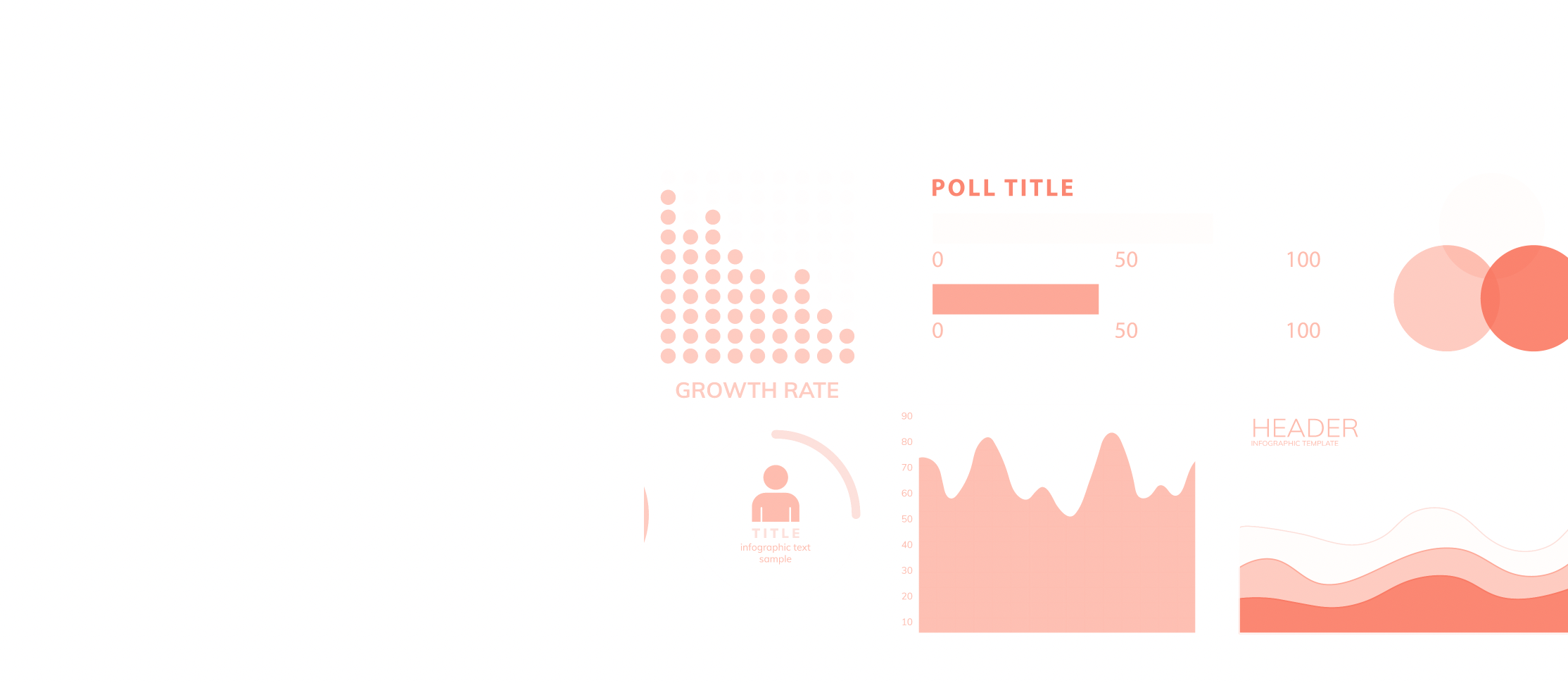
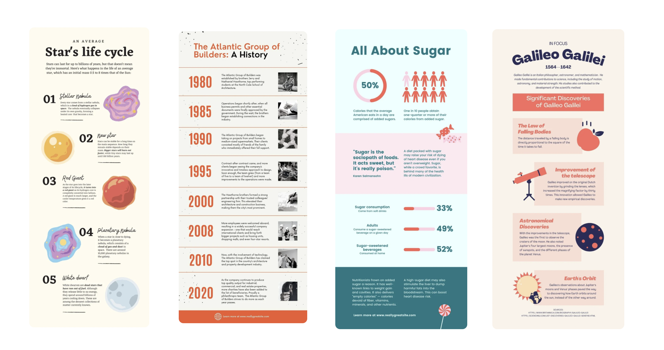
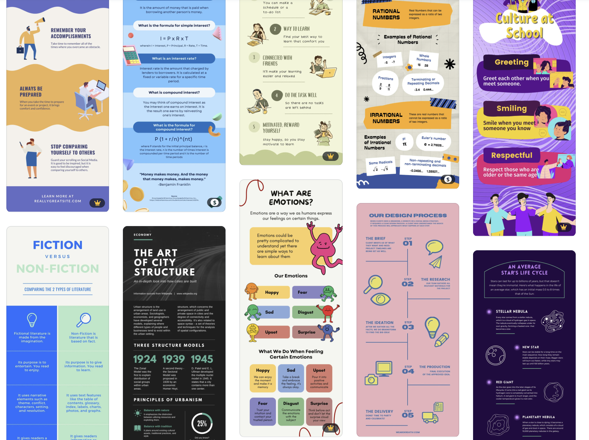
There are many different types of infographics. Some infographics use typography alone, while others use data visualisations, including pie charts, graphs, and maps. There are timeline infographics, comparison infographics, process infographics — and many more.
The best infographics use a mix of succinct copywriting and excellent graphic design, with generous use of white space.
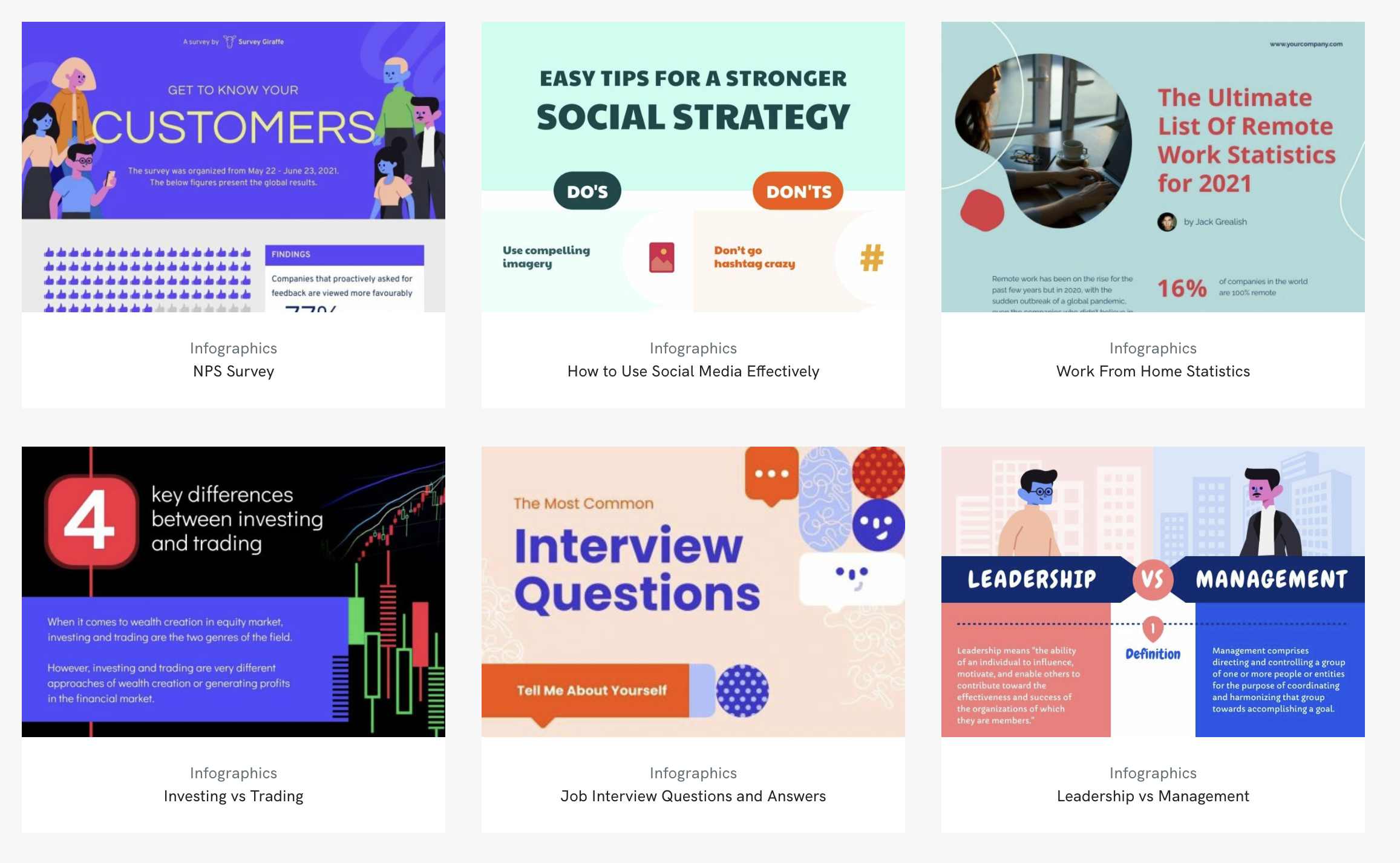
Infographics are a flexible content format. Some custom infographics push the boundaries of visual design, while others — indeed, most — use templates from online software platforms (we've listed five of the most popular below).
Infographics can be distributed in a range of image file formats, with the most common being JPEG, PNG, and PDF.
It goes without saying, but good infographic design is critical. While a professional graphic designer will always get better results — often using professional design tools like Photoshop or Illustrator — the infographic tools listed below will enable beginners and the rest of us without advanced design skills to create professional-looking content.

Why create an infographic?
1. To communicate information
The first reason to create an infographic is also the most obvious: infographics are simply a great way to communicate complex information. For this reason, they're commonly used in media publications, such as data visualisation for science communication.
2. To build backlinks for search engine optimisation (SEO)
Among professionals in content marketing and SEO, infographics are known as excellent backlink bait. Because they often contain interesting data, writers like to embed them — and link to them — in their third-party content. These links are an extremely important signal to Google that your content is valuable. With enough backlinks, you'll have a much easier time ranking on the first page for your content.
3. To improve your visual story
With the rise of visual, multimedia storytelling on the web, it's become much more common to break up long chunks of text with images, including infographics. An infographic with good design can be uploaded as an image, or embedded from a third-party infographic tool, such as those listed below. If you're using an immersive content platform like Shorthand, then you can also consider creating a no-code interactive infographic.
4. To share on social media
As we all know, it's tough to get attention on social media platforms like LinkedIn. A great infographic can help you compete for likes, clicks, and shares.
So, infographics are clearly a great addition to any piece of content. But what tools can you make them yourself? We’re glad you asked!
4 ways to create infographics


1. Canva
Canva is a powerful online design tool (and infographic maker) that allows you to create great looking content — even if you do not have any design knowledge.
Thanks to the huge range of infographic templates available, Canva is our top pick for creating quick, visually stunning infographics for your stories. Once you’ve chosen an infographic template, you can then use the drag and drop editor to customise everything from color scheme to data points and typography.

Canva’s charts and graphs make it easy to customise with your own data points.
You can even integrate data and information from Google Sheets to populate more complex and detailed pieces.

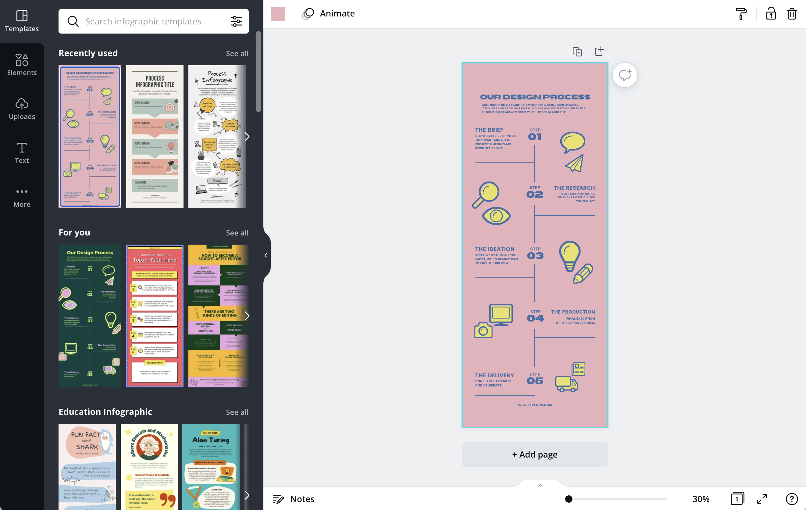
Changing the infographic to match the other elements of your story is easy, too. Just pick the colour swatches and typography that match your brand. As is common with other tools, Canva allows you to export your final infographic as a PNG, JPG, or GIF.
In their own words
"Canva’s infographic maker includes hundreds of free design elements, allowing you to experiment with data visualisation like a pro."
Time it takes to make an infographic
Under 30 minutes.
Pricing
Freemium plans give you access to infographic templates as well as fonts, icons, and images .
2. Venngage
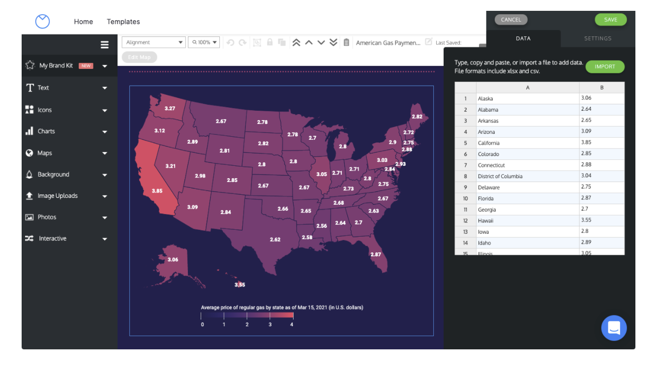
If you are looking for a way to create more data-heavy infographics—try Venngage. The tool allows you to insert “widgets” into infographics that will pull data from various sources, like charts or maps, and use them to create striking images.
Here’s an example of a detailed map infographic that’s been created using Venngage:


Inside Venngage's infographic editor, you can change each state's statistics individually or bulk edit them by importing a .csv or .xlsx file with data that you've already prepared. The editor also allows you to change the infographics fonts, colours, and border widths. When you’re happy with the design, you can then download it as an image or embed it into your story.

In their own words
"Venngage is the easiest way to create beautiful infographics online. Choose from hundreds of templates, charts, and more!"
Time it takes to make an infographic
30 minutes to 1 hour.
Pricing
You can play around for free, but if you want to export infographics, you’ll have to upgrade your plan (premium tiers start at $19/month).
3. Piktochart
The third tool on our list to help create infographics is Piktochart. This is a good choice if you want your infographics to be heavily skewed towards images and graphics.
If you get lost when first using the tool, Piktochart has a tutorial to guide you. Start by picking an infographic template from Piktochart's library (or starting a design from scratch) and then customising it with your own shapes, images, and icons.
The editor also allows you to embed different elements into your infographics, like charts, maps, tables, and even videos.

In their own words
"Here at Piktochart, we want to create an easy app for you to tell stories, whether it's in the format of a presentation, report, banner or infographic. Join over 7,500,000 users in telling better stories."
Time it takes to make an infographic
About 1 hour.
Pricing
Piktochart has a freemium version with limited functions. If you want to export infographics or access templates, you’ll need to upgrade to the Lite plan, starting at $14/month.
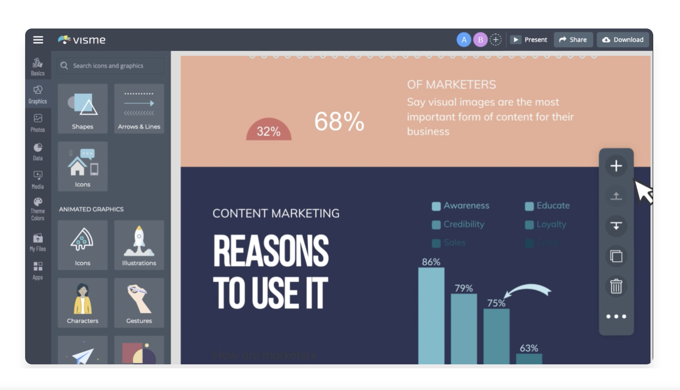
4. Visme
The last tool on our list to build detailed infographics is Visme.
Visme is the perfect way to break down complex data sets and use them to create infographics, timelines, charts, and statistics.
While this tool does take a little more time to learn how to use compared to the others on our list, it is a better tool to use if you are creating infographics with lots of data points or you're trying to explain complicated statistics.

In their own words
"Tell better stories and translate boring data into beautiful visual content right in your browser. Share or download using our all in one easy-to-use editor."
Time it takes to make an infographic
Roughly 1 hour.
Pricing
Visme offers a freemium version with limited access to templates. If you want more options, premium plans start at US$12.25/month.
3 examples of
great infographics


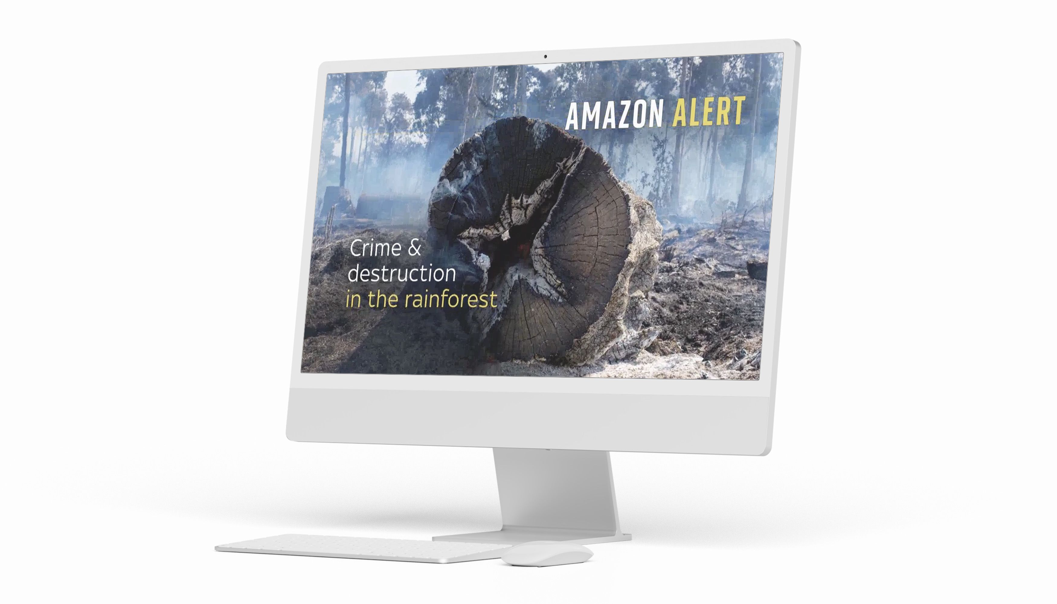
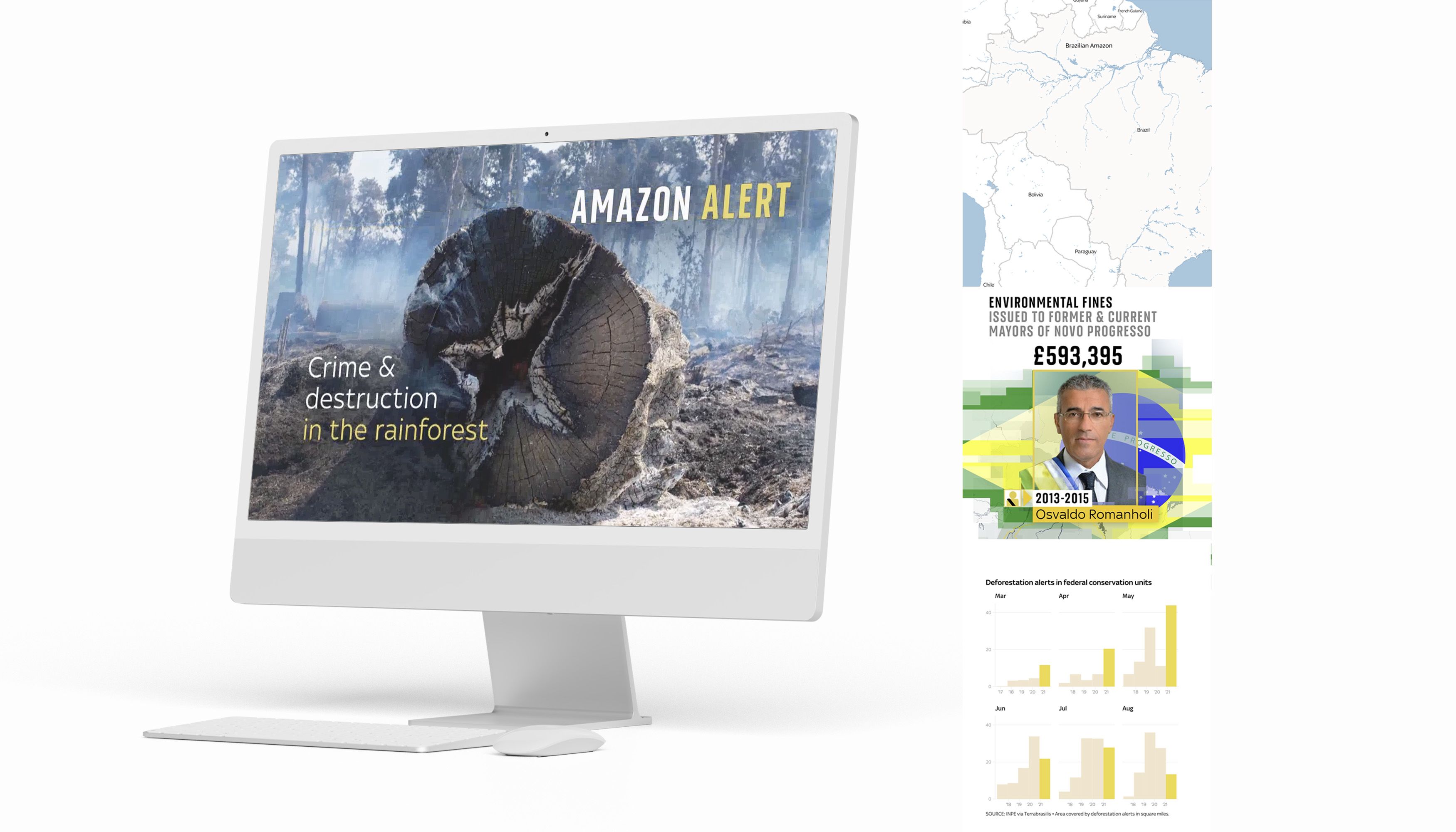
Sky News warns about deforestation impacts in Brazil
In 2019, Sky News examined accusations that Brazil's president Jair Bolsonaro was the cause of a new spate of deforestation in the country.
To help readers visualise the changes in the country's protected rainforests since Bolsonaro was elected, Sky News used interactive infographics powered by Shorthand. Each time the reader scrolled down the page, the graphic highlighted the increasing levels of deforestation.


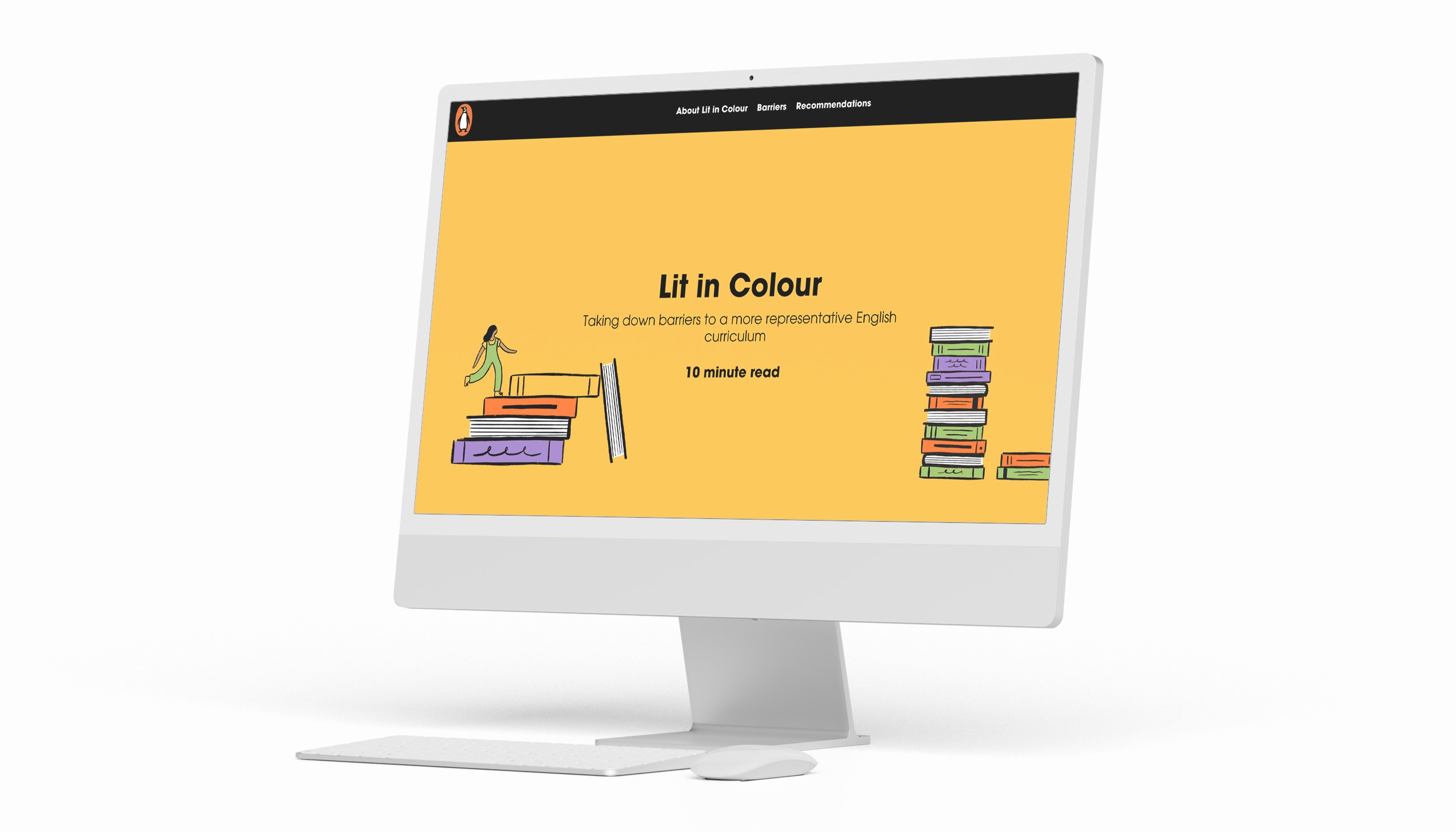
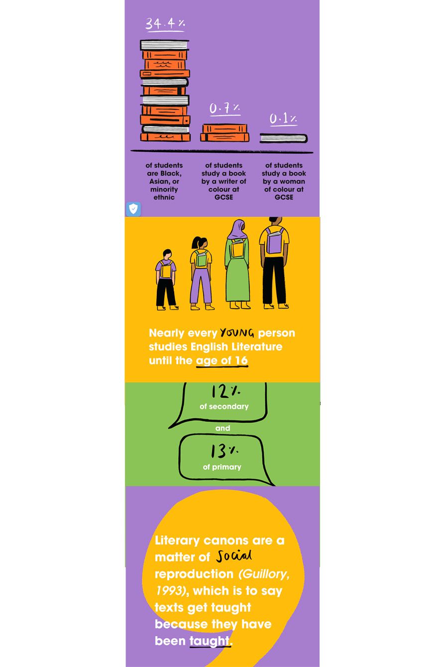
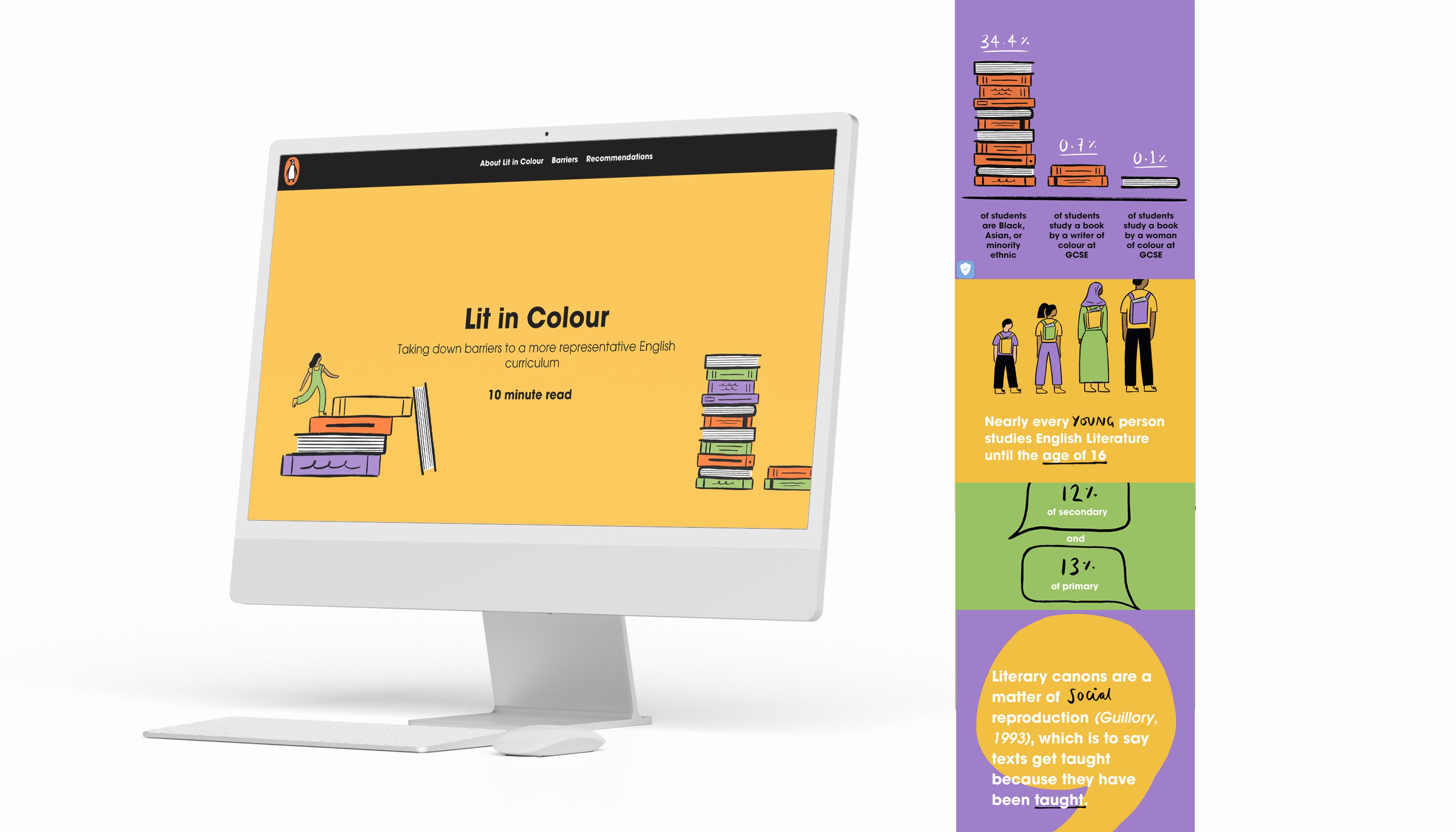
Penguin campaigns for a more representative English curriculum
When Penguin decided to campaign for a more inclusive, representative, racially equal English curriculum in the UK, it launched Lit in Colour.
The programme aims to transform the English curriculum to be more inclusive, so young people can read and study books by Black, Asian, and minority ethnic writers.
When the campaign launched, Penguin used infographics to talk about complex racial disparities within the UK schooling system. The interactive infographic also break down the organisation's goals based on student feedback, surveys, and statistics around specific texts young people selected in their GCSE and A-Level exams.


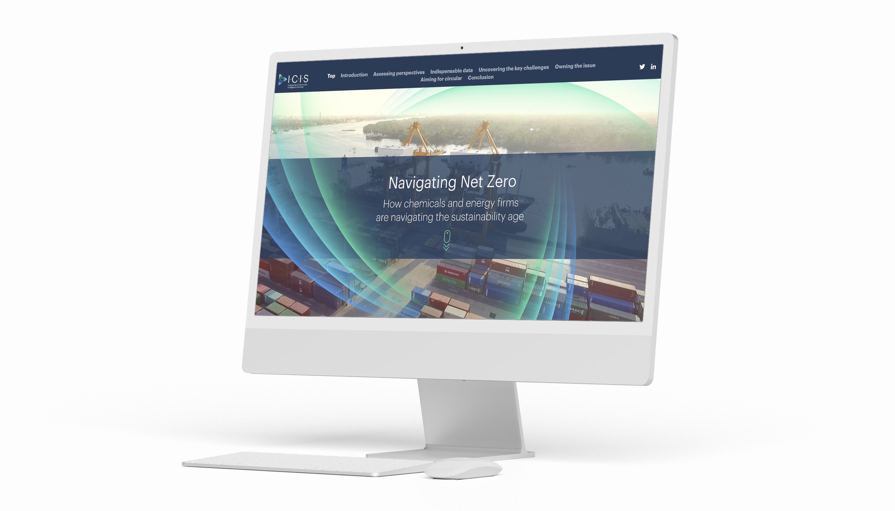
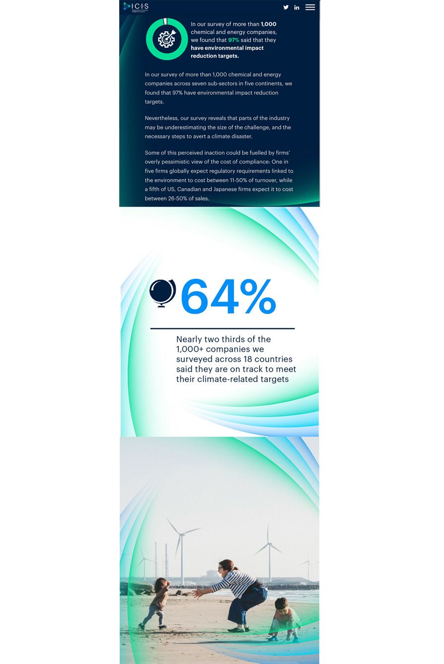
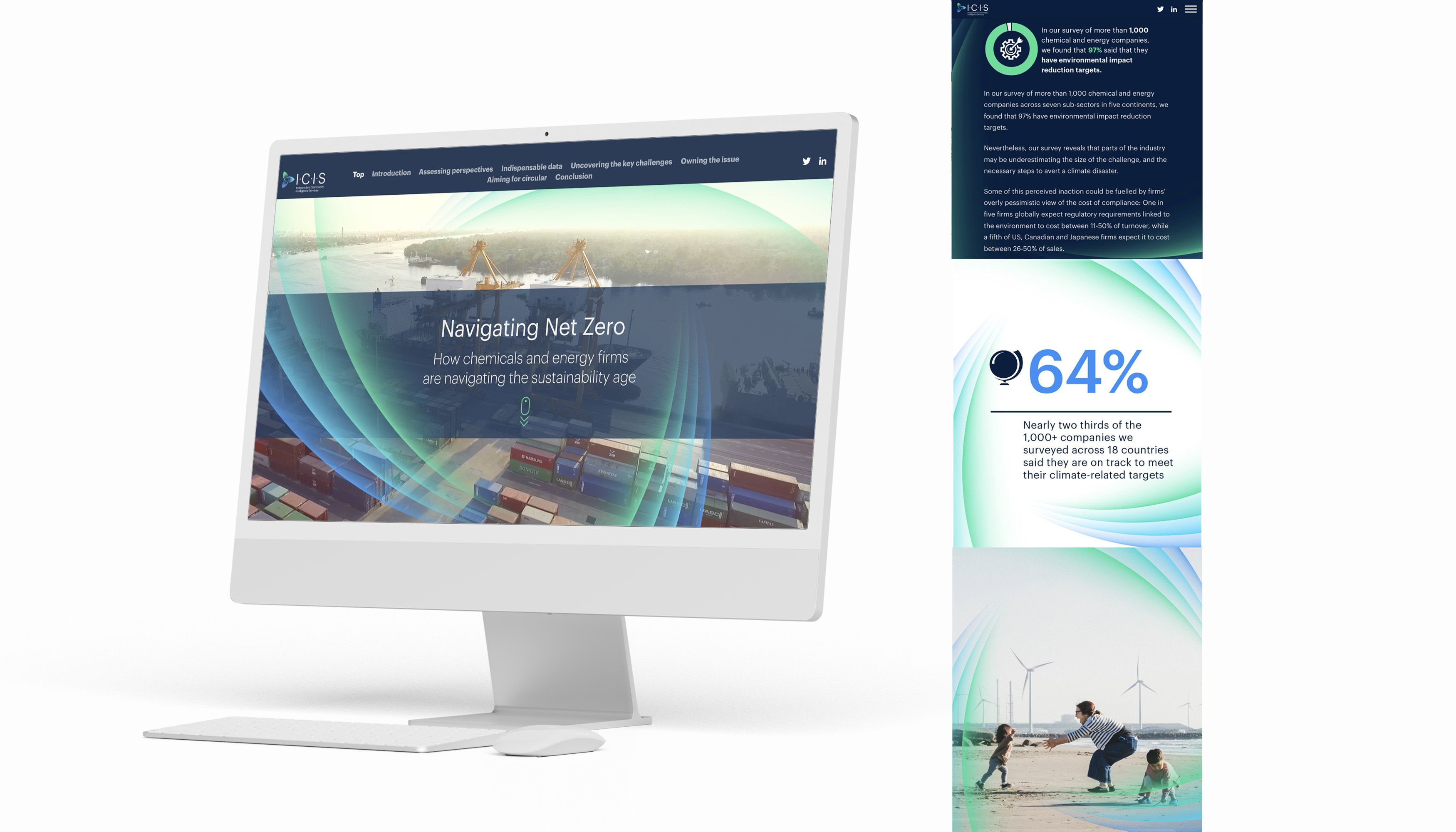
ICIS campaigns for a more sustainable planet
Navigating Net Zero is a detailed breakdown of how chemical and energy firms are shifting their industries to meet net-zero targets.
It's a difficult subject to explain to a reader, especially when trying to help them visualise how carbon emissions or different emerging markets are impacting climate change efforts. So, the article uses detailed graphs and maps to show the reader how each industry or country is tackling the issue.
The article also uses infographics to break down otherwise mundane issues inside the debate about reaching net-zero, like how companies set emissions targets, who is in charge of making the final decisions, and how long sustainable infrastructure usually takes a business to implement.
Suddenly, a topic that seems very complex is easier to understand—all thanks to infographics.

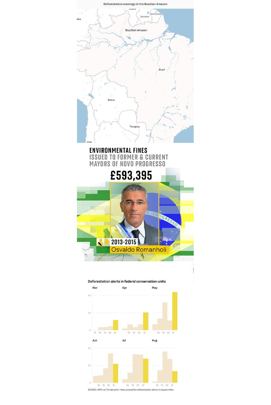
Sky News warns about deforestation impacts in Brazil
In 2019, Sky News examined accusations that Brazil's president Jair Bolsonaro was the cause of a new spate of deforestation in the country.
To help readers visualise the changes in the country's protected rainforests since Bolsonaro was elected, Sky News used interactive infographics powered by Shorthand. Each time the reader scrolled down the page, the graphic highlighted the increasing levels of deforestation.
Penguin campaigns for a more representative English curriculum
When Penguin decided to campaign for a more inclusive, representative, racially equal English curriculum in the UK, it launched Lit in Colour.
The program aims to make books for everyone and transform the English curriculum to be more inclusive so young people can read and study books by Black, Asian, and minority ethnic writers.
When the campaign launched, Penguin used infographics to talk about complex racial disparities within the UK schooling system.
The interactive infographics also break down the organisation's goals based on student feedback, surveys, and statistics around specific texts young people selected in their GCSE and A-Level exams.
ICIS campaigns for a more sustainable planet
Navigating Net Zero is a detailed breakdown of how chemical and energy firms are shifting their industries to meet net-zero targets.
It's a difficult subject to explain to a reader, especially when trying to help them visualise how carbon emissions or different emerging markets are impacting climate change efforts. So, the article uses detailed graphs and maps to show the reader how each industry or country is tackling the issue.
The article also uses infographics to break down otherwise mundane issues inside the debate about reaching net-zero, like how companies set emissions targets, who is in charge of making the final decisions, and how long sustainable infrastructure usually takes a business to implement.
Suddenly, a topic that seems very complex is easier to understand—all thanks to infographics.
Want to find out how you can add infographics and interactive scrollytelling to your next story?