8 examples of powerful data storytelling

Over the last five years, we’ve seen an explosion in excellent data storytelling. Data visualisation has emerged as a powerful tool for transforming complex data into actionable insights.
A big part of this story has been the rise of data journalism. However, data storytelling has also found its way into content teams across various sectors, including brands, NGOs, universities, and more
Renowned data visualisation and data science teams, such as those at the New York Times and Five Thirty Eight, have produced some of the most highly praised data stories. These interactive narratives showcase the capabilities of modern web browsers, making them stunning examples of data storytelling.
Today, businesses, non-profits, universities, and other institutions are leveraging data visualization tools to create impressive visualizations that drive their message home.
In this guide, we'll cover:
Want to learn how to tell better stories with data? Read Tim King's Death to boring data: how to turn stats into stories people want to read.
Start creating with Shorthand
It's the fastest way to publish beautifully engaging data features, reports, internal comms, and more.


What is data storytelling?
Data storytelling involves using data to craft a compelling narrative, often employing mediums like infographics, data visualisations, interactive maps, and feature articles. It is an incredibly powerful tool for conveying complex information in a way that is easily digestible.
A good data story hinges on the ability to create an engaging and informative narrative. This requires selecting the right data points, drawing correlations, and weaving them into a coherent and captivating story.
Data storytelling can greatly benefit businesses in their marketing campaigns, as it helps target audiences grasp the information being presented. Furthermore, it aids decision-makers in understanding raw data and making informed choices.
Beginners to data storytelling can start by exploring simple visualisation techniques, such as pie charts, before delving into more advanced methods. With platforms like Spotify leveraging data storytelling to engage their target audience, it is evident that data visualisation is a crucial element in today's communication landscape.
The democratisation of data storytelling
Here’s the problem, though: few (if any) content teams have the development resources of the Times. If all effective data storytelling relied on a team of data scientists and web developers, then we wouldn’t see very many data-driven stories.
Happily, this isn’t the case. Nearly every media company in the world is publishing data stories, with data journalism and data storytelling skills becoming increasingly sought-after.
"Democratisation" might sound a little lofty, but it’s true: the barriers for telling stories with data have radically decreased over the last five years. Why? Because of four related trends.
- More data. 'Big data' has become a cliché, but it’s also undeniable: we are producing and storing more data than ever, across every field imaginable, including the environment, property, finance, transport, entertainment, law and order, sport, epidemiology, data analytics… you name it.
- Better access to good data. This isn’t true across the board, but data is generally becoming more accessible. Government agencies in particular are (slowly, slowly) becoming more adept at proactively releasing datasets for reuse. Agencies are motivated to help the private sector make business decisions, but this data is available for everyone to use and derive key insights from.
- Better human-friendly data tools. It wasn’t too long ago that data analysis and use required access to enterprise-grade (read: incredibly expensive) or free-but-complex tools. While those tools still exist — and are great for specialists — we’ve seen a range of entry-level tools developed that are aimed at ordinary humans, who are building their data literacy to make great use of them in their work.
- No-code digital storytelling. It’s one thing to develop great data visualisations. It’s another thing to put them to effective use in a story. This is where digital storytelling platforms like Shorthand come in. With Shorthand, you can create interactive data visualisations using static images. This means you can produce excellent data stories without writing a line of code.
The business of data storytelling
But this doesn’t tell the full story. Even with lower barriers to entry, data storytelling still needs to make business sense for your organisation. Your content team should only invest in data storytelling if it helps your organisation — whether it's a media company, brand, government agency, university, or NGO — achieve its strategic objectives.
Here are four reasons organisations should invest in data storytelling:
- Data storytelling is good for branding. Increasingly, content teams are realising the brand benefits of publishing high-quality content, including longer content that makes use of attention-grabbing visual assets such as data visualisations. Data storytelling will help you build a reputation for expertise, which will cement the value of your brand.
- Data storytelling performs well. Data stories tend to perform well on the metrics content marketing teams care about, including time-on-page, bounce rates, click-through-rates, and conversions. They are also more likely to receive backlinks from other websites — critical for the performance of your content in search engine rankings.
- Data storytelling can scale. We’ve mentioned this above, but the rise of no-code platforms means that you can create amazing-looking data stories without investing in developers. The pricing structure of platforms like Shorthand means you can publish unlimited stories on your subscription — allowing you to scale your digital storytelling without blowing your budget.
- Data storytelling can help you know — and grow — your business. We’ve also seen the rise of amazing data storytelling within organisations, using dashboards and other business intelligence and business analytics tools that data analysts use to generate data insights for their business.
8 stunning data storytelling examples
1. Murky waters


The Centre for Strategic and International Studies’ (CSIS) observation of China’s shipbuilding industry provides a number of different styles and examples of great data visualisation.
To begin with, it has three animated bar and line charts that show the scale of China’s ship manufacturing compared with the US. These charts are good. But what’s great, is a little further down the article.
Analysis of 4500 records breaks down the ‘risk’ of ships from different shipyards into four different colour levels, and the volume is represented in different sized dots. As the reader scrolls, the coloured dots move into a range of formulations and chart styles, helping to provide an idea of context and scale. It exemplifies one of proper data storytelling’s most important factors: it does not overload with numbers, instead using size and colour to deliver the message.


Start creating your own data story with Shorthand
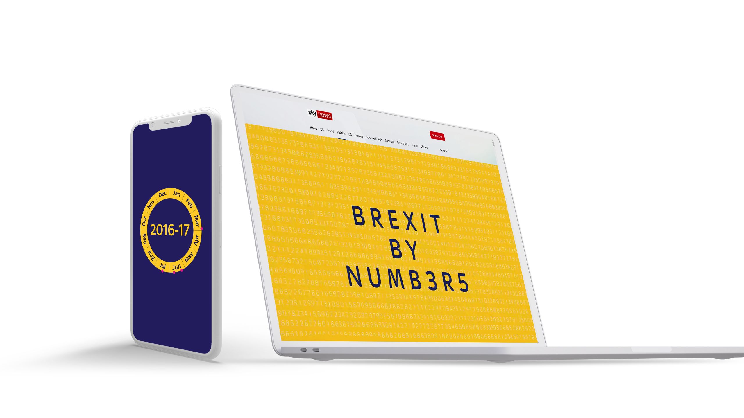
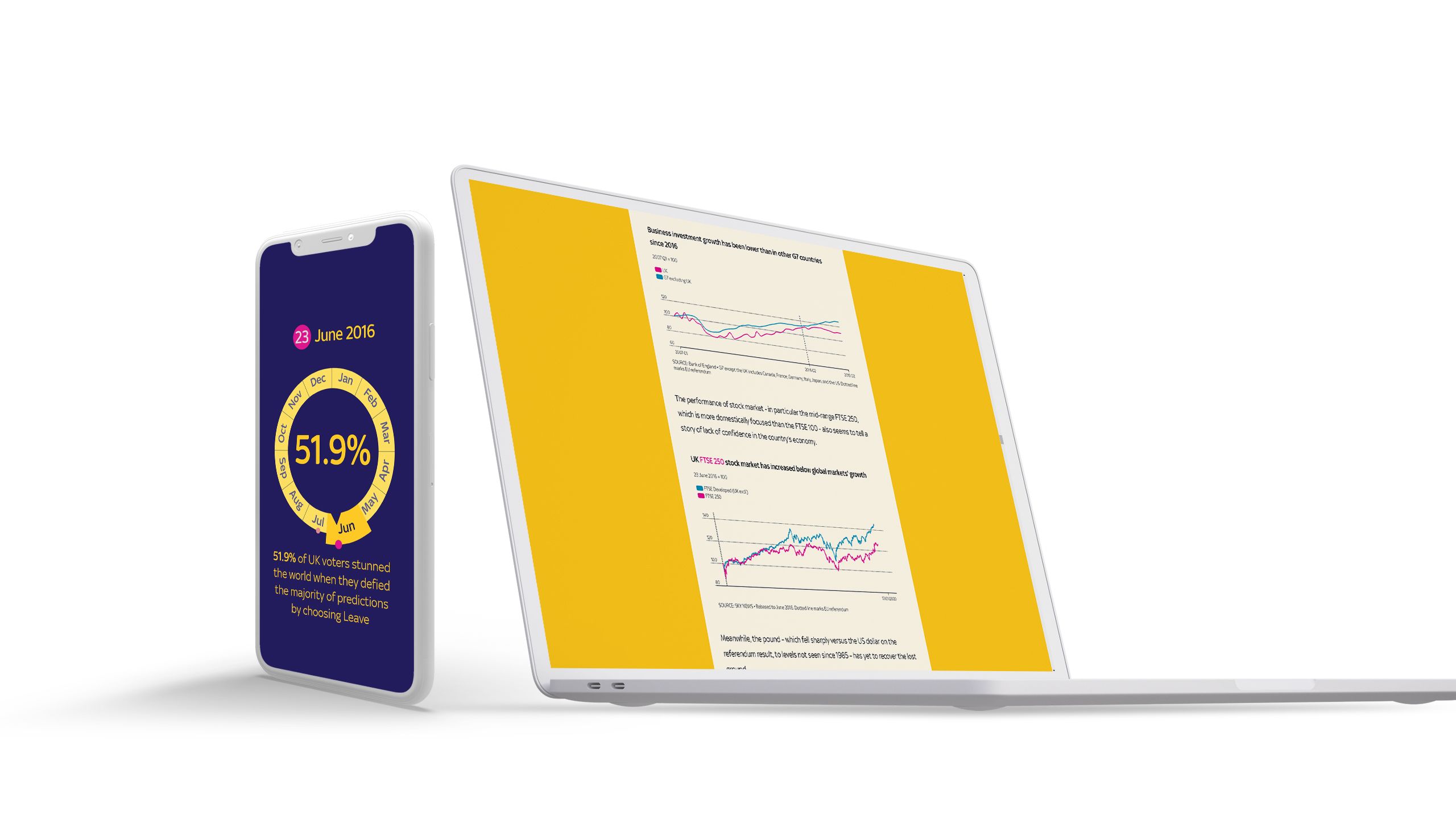
2. Brexit by numbers
During the Brexit debate, all sides made very specific and confident claims about the impact of the United Kingdom leaving the European Union. For those looking on, this led to a great deal of confusion about what the impact of Brexit would actually be. It has also made decision-making within the UK very difficult.
To help, Sky News produced this incredibly informative story with actual data points on the immediate impact of Brexit on the UK. Their assets worked beautifully in the story, and would also have been a great draw on social media.


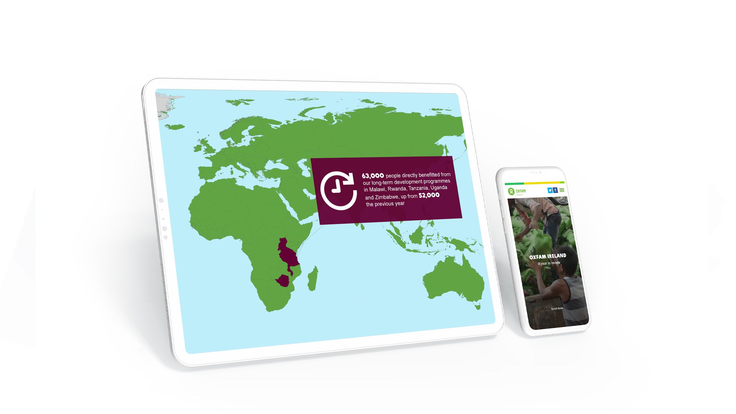
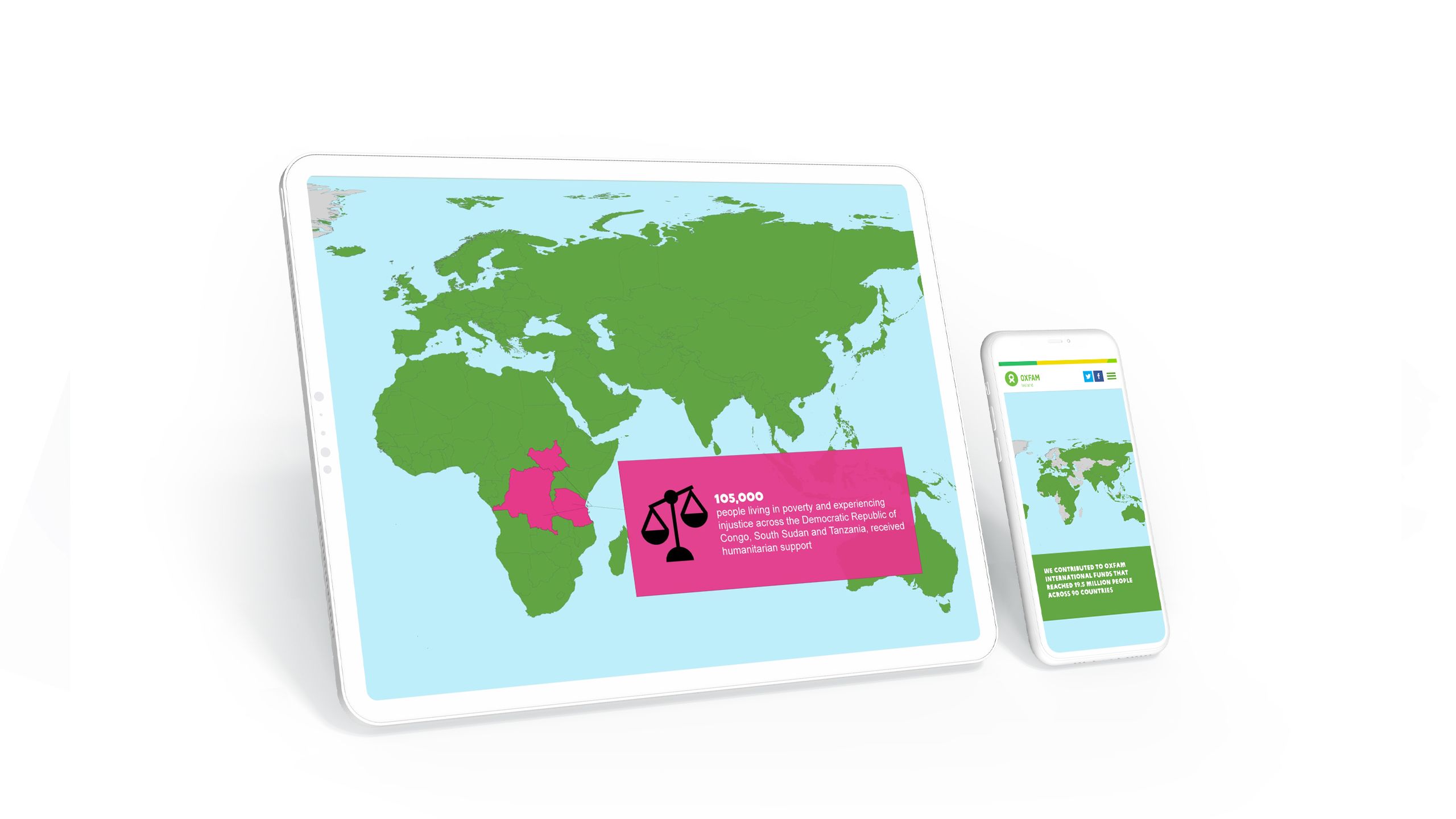
3. Oxfam Ireland
It’s common for NGOs to have ambitious goals — but it’s less common for them to track and report on these goals using data. The best NGOs, like Oxfam Ireland, not only collect this data, but use it to tell a story of both urgent need and impressive impact.
In their annual impact report for stakeholders and the public, the team at Oxfam showcase how they drive change using data-driven maps, dashboards, and infographics, presented in an elegant and digestible way.


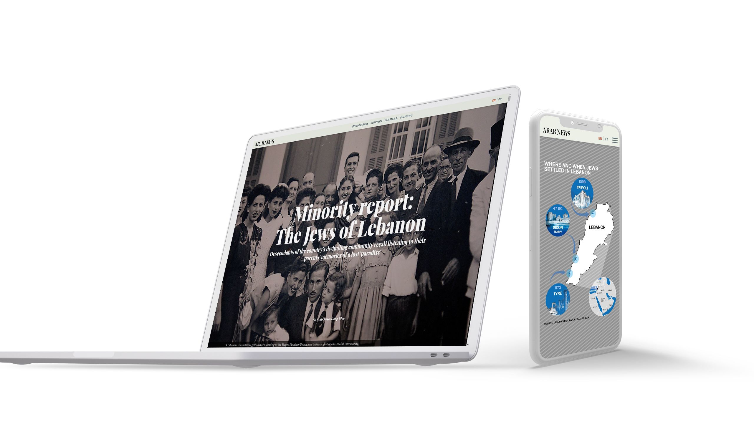
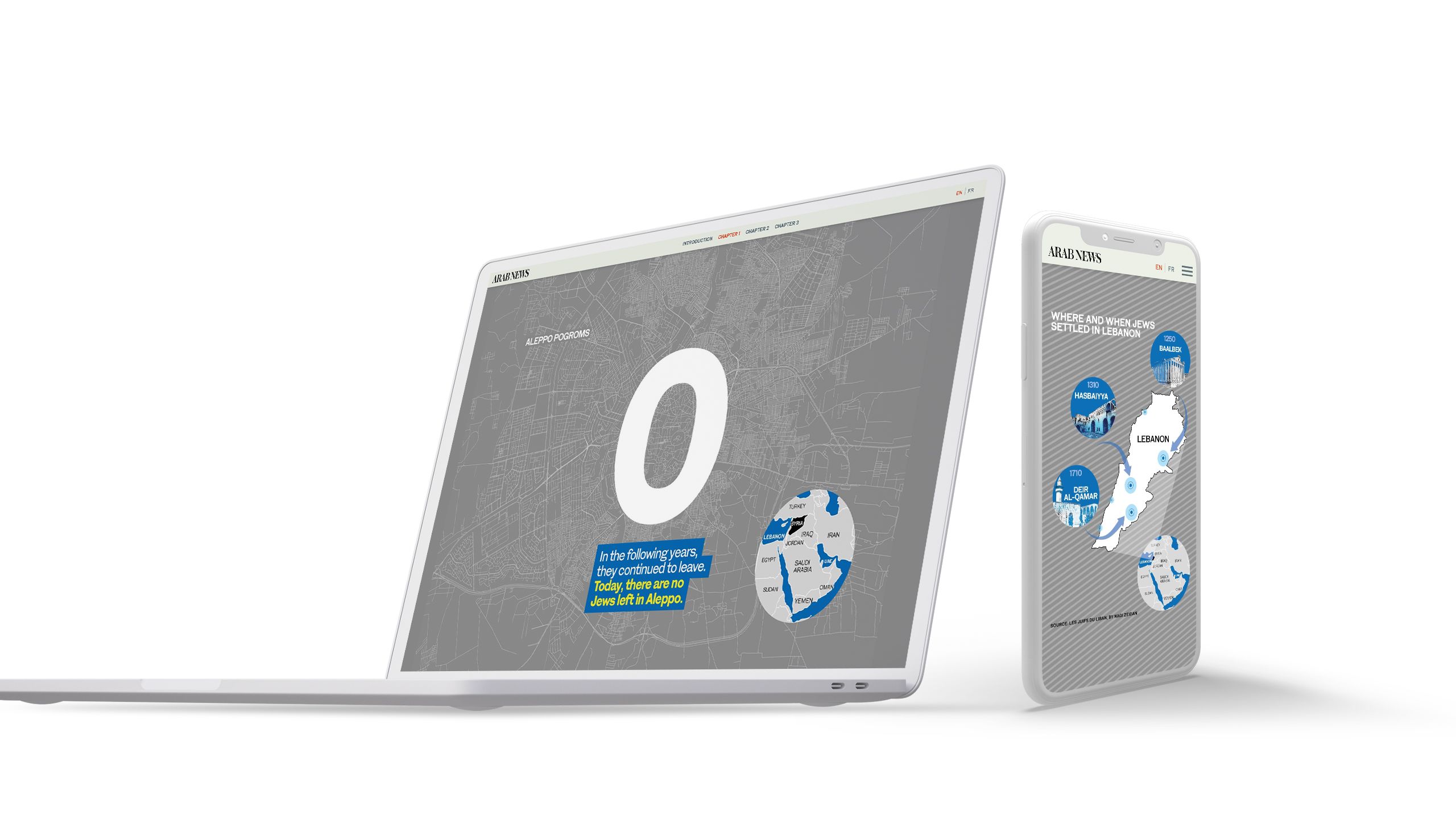
4. The Jews of Lebanon
Often with data storytelling, less is more. While data experts might want to include dozens of charts, the best content teams know how to use data visualisation in the service of a compelling story.
This is the case with The Jews of Lebanon from Arab News, which tells the rich, often tragic story of a minority community in Lebanon. While the team no doubt had access to a range of demographic data, they used the simplest — the size of the Jewish community in raw numbers — to punctuate their story.


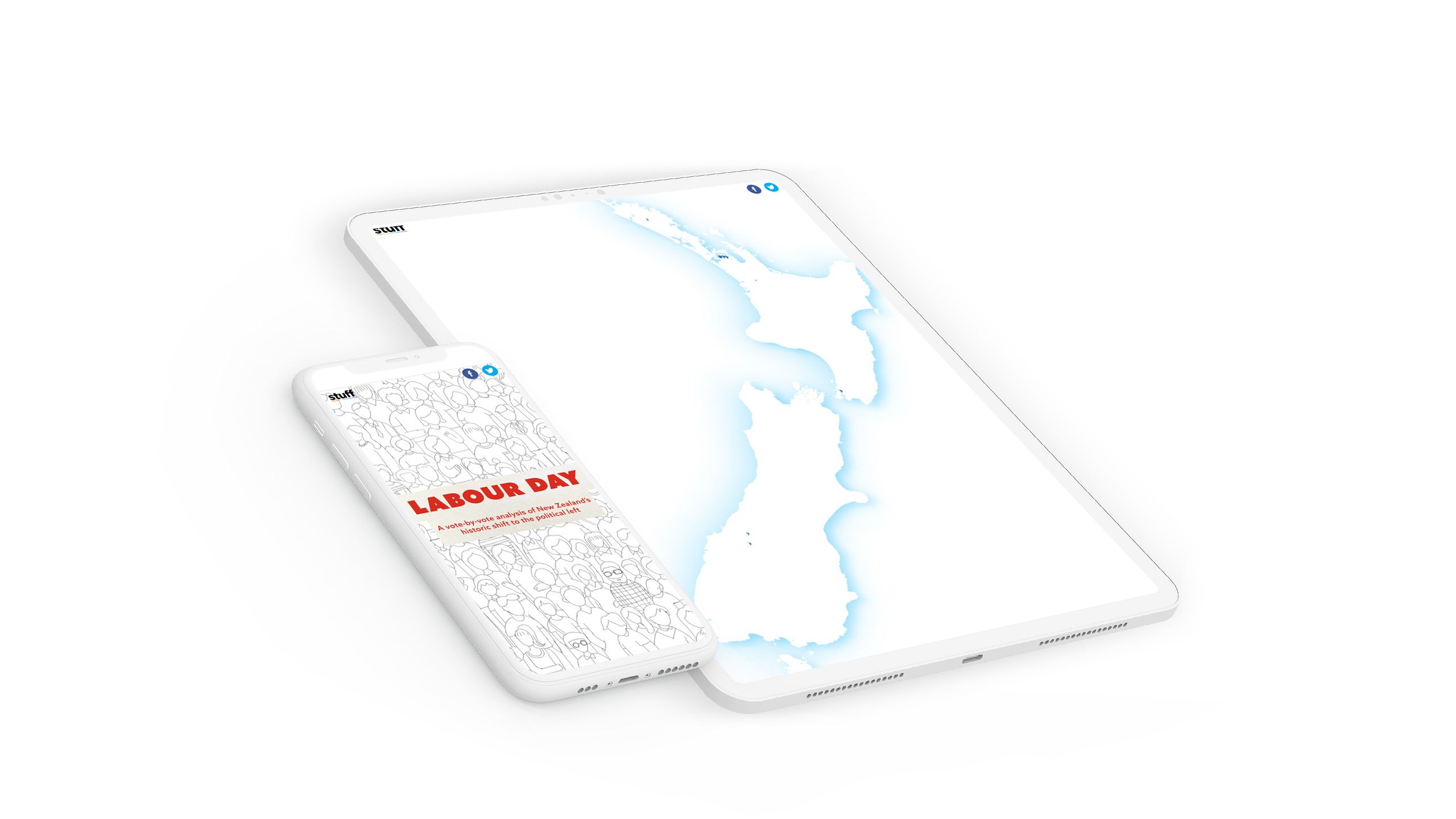
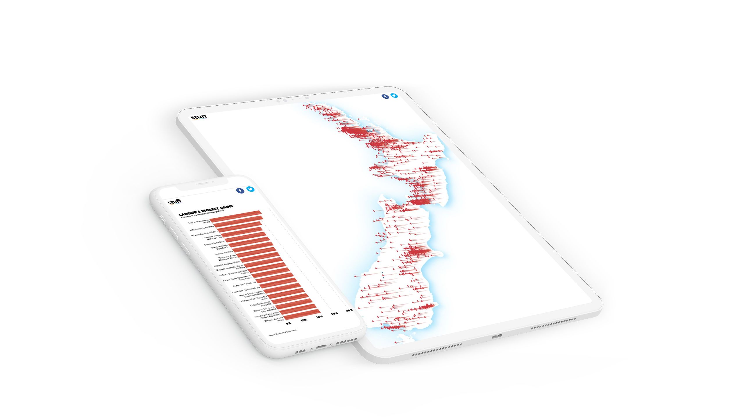
5. Labour day
In November 2020, the New Zealand Labour Party — led by Jacinda Ardern — won a historic and sweeping election victory. To showcase the scale of the victory, New Zealand media company Stuff produced a series of beautifully designed interactive bar charts, line charts, and maps.
While the story did use some CSS and HTML, the charts themselves were simply static illustrations, with the interactivity triggered as the reader scrolled. It's a great example of the power of data to show the breadth and scale of an event.


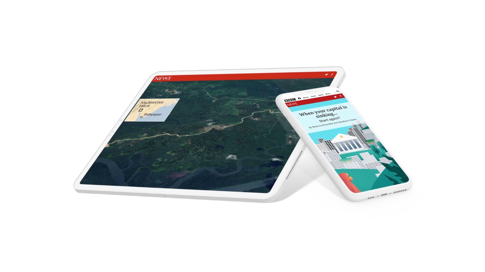
6. The Sinking Capital
When most people think of data storytelling, they imagine charts and graphs. But some of the most exciting data storytelling uses geospatial data — including raster data, such as satellite imagery and aerial photography — to create interactive maps.
A powerful example of this comes from BBC News. In this piece of investigative journalism, they use a range of data sources to show the scale and impact of plans to move Indonesia’s capital away from Jakarta.

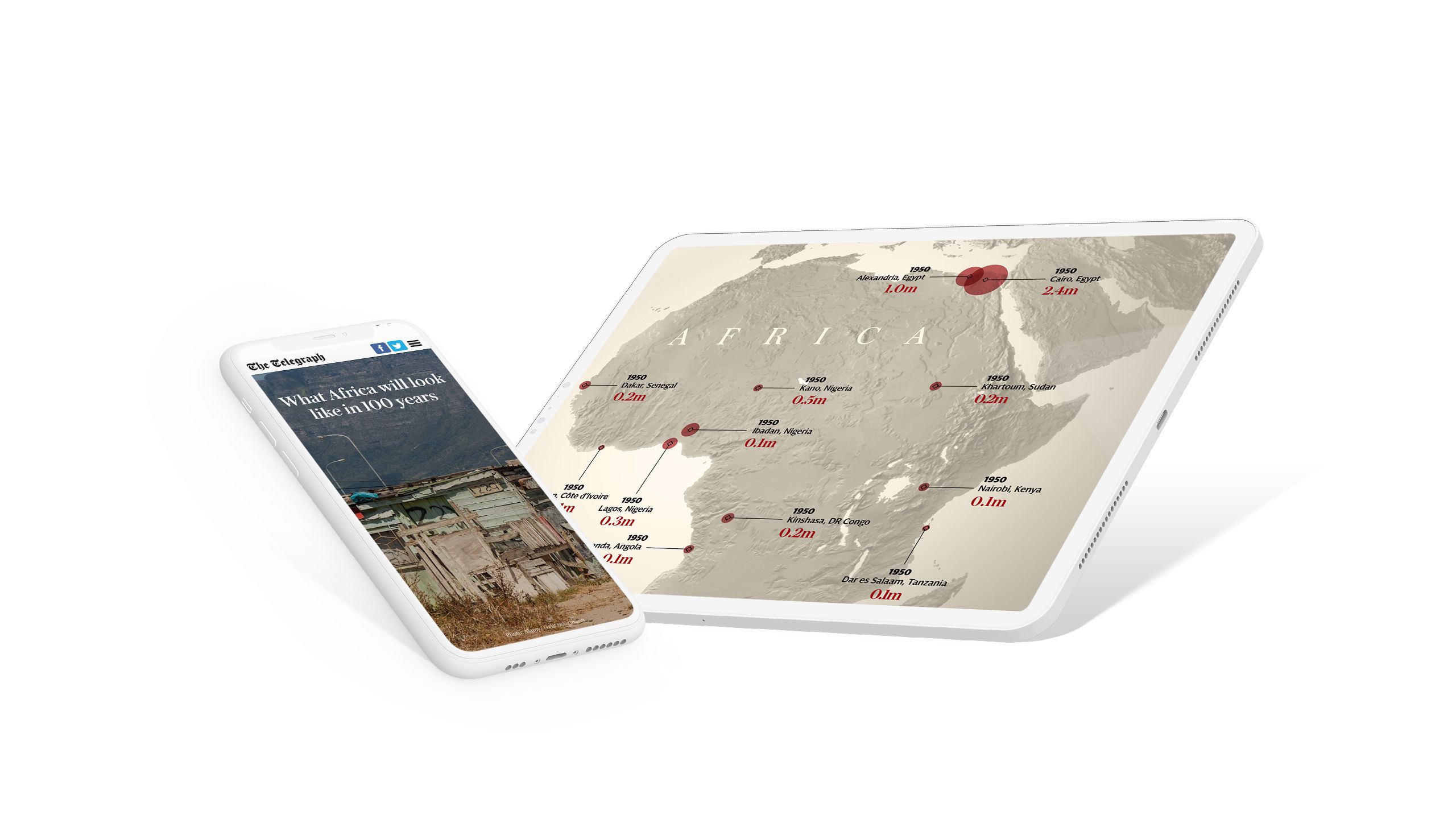
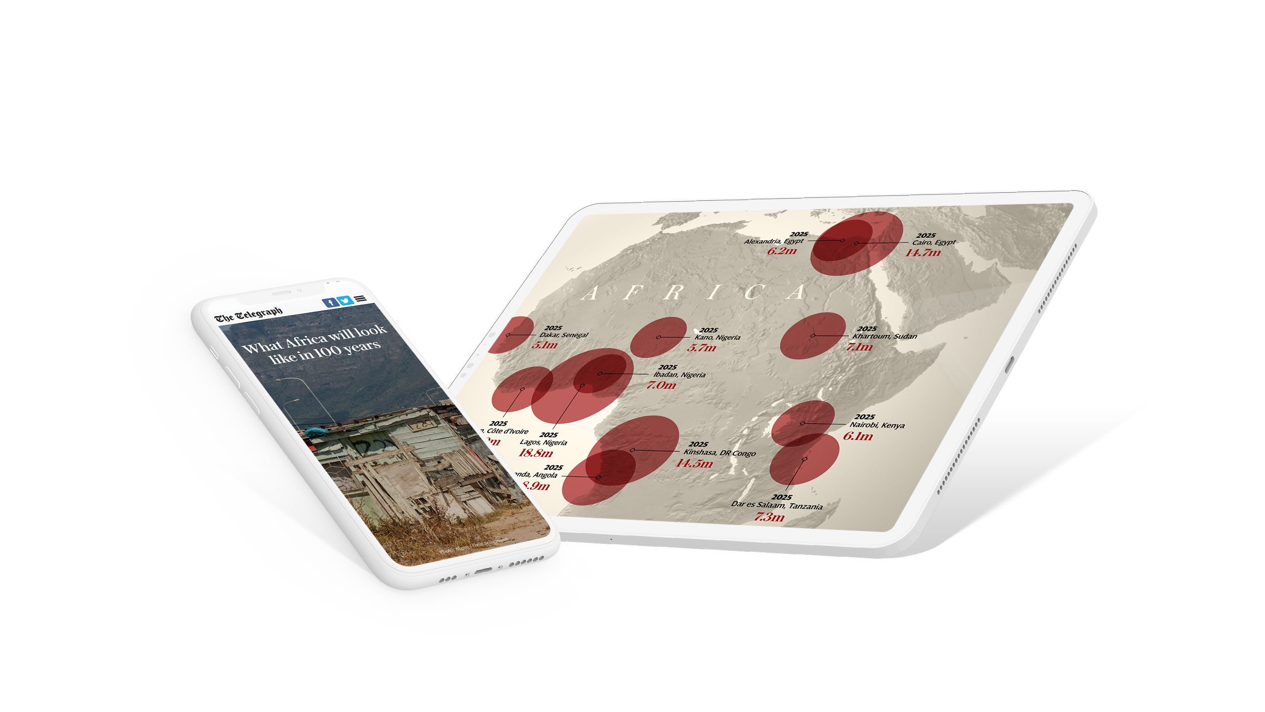
7. What Africa will look like in 100 years
In some stories, the numbers are so stark that they need to be given centre stage. This is especially true in this classic data story from The Telegraph.
With well-executed, scroll-based animation of static images, the team show the implications of rapid population growth across the continent of Africa over the next century.


8. Coronavirus timeline
With the outbreak of the COVID-19 pandemic, content teams from organisations around the world — including media companies, NGOs, universities, and other businesses — published a slew of excellent data visualisations. One story came from Radio NZ who published — and continued to update — a timeline on the impact of COVID-19 in Aotearoa New Zealand.
Rather than use scroll-based animation, the team at Radio NZ decided to embed rich visualisations from data visualisation platform Tableau. The resulting story offers the best of both worlds: a stunning, well-told story, punctuated with impressive interactive charts and maps.