How data journalists create beautiful feature stories

New data journalism tools make it easier than ever to integrate data visualisations, including charts, graphs, infographics, and maps.
For over a decade now, media commentators have been celebrating the rise of data journalism — it isn’t hard to see why.
Publications across the world are investing in data journalists. Readers have come to expect high-quality data interactives and infographics from news organiations ranging from the Guardian’s datablog and the Washington Post to Propublica and Argentina’s La Nación. We’ve even seen the rise of specialist data journalism and data visualization publications, such as 'The Upshot' from the New York Times and Nate Silver’s FiveThirtyEight.
It’s hard to argue with the results. In recent years, the most urgent and compelling stories on the planet have been data-driven journalism and investigative reporting. In 2016, for example, financial data scraped from the Panama Papers drove a swathe of investigative stories into global capital flows and tax avoidance. In 2019, satellite data exposed the all-too-human causes of the devastating fires in the Amazon rainforest.
Clearly, we have an urgent need for data journalists to create beautiful feature stories about our world.
But, there’s a problem.
Data journalists are under pressure


For those working on the ground in newsrooms around the world, predictions of a data-driven future — where, as some argue, the ‘data’ in data journalism might become redundant — can be hard to swallow.
The fact is, when you move beyond the most well-funded newsrooms in the world (of which there are only a handful), data journalists are usually working on their own, under enormous pressure, with limited support and resources. Regular journalists who want to create in-depth, data-driven news stories, but who lack the support of in-house developers, face even greater challenges.
So, where does that leave us? What if you don’t have the budget of the New York Times? Or the developer chops to create (and maintain) bespoke data visualisation web apps?
Start creating with Shorthand
It's the fastest way to publish beautifully engaging data stories, reports, digital magazines, and more.
Data journalism tools are driving a new era in data-driven stories


Here's the good news: the era of ‘computer-assisted reporting’ is over. The tools journalists have available to them today are far more accessible and powerful than ever before.
Here’s the better news: there are plenty of examples of data journalists creating beautiful feature stories — and not all of them have a background in data science, or a fully-resourced data team of data scientists.
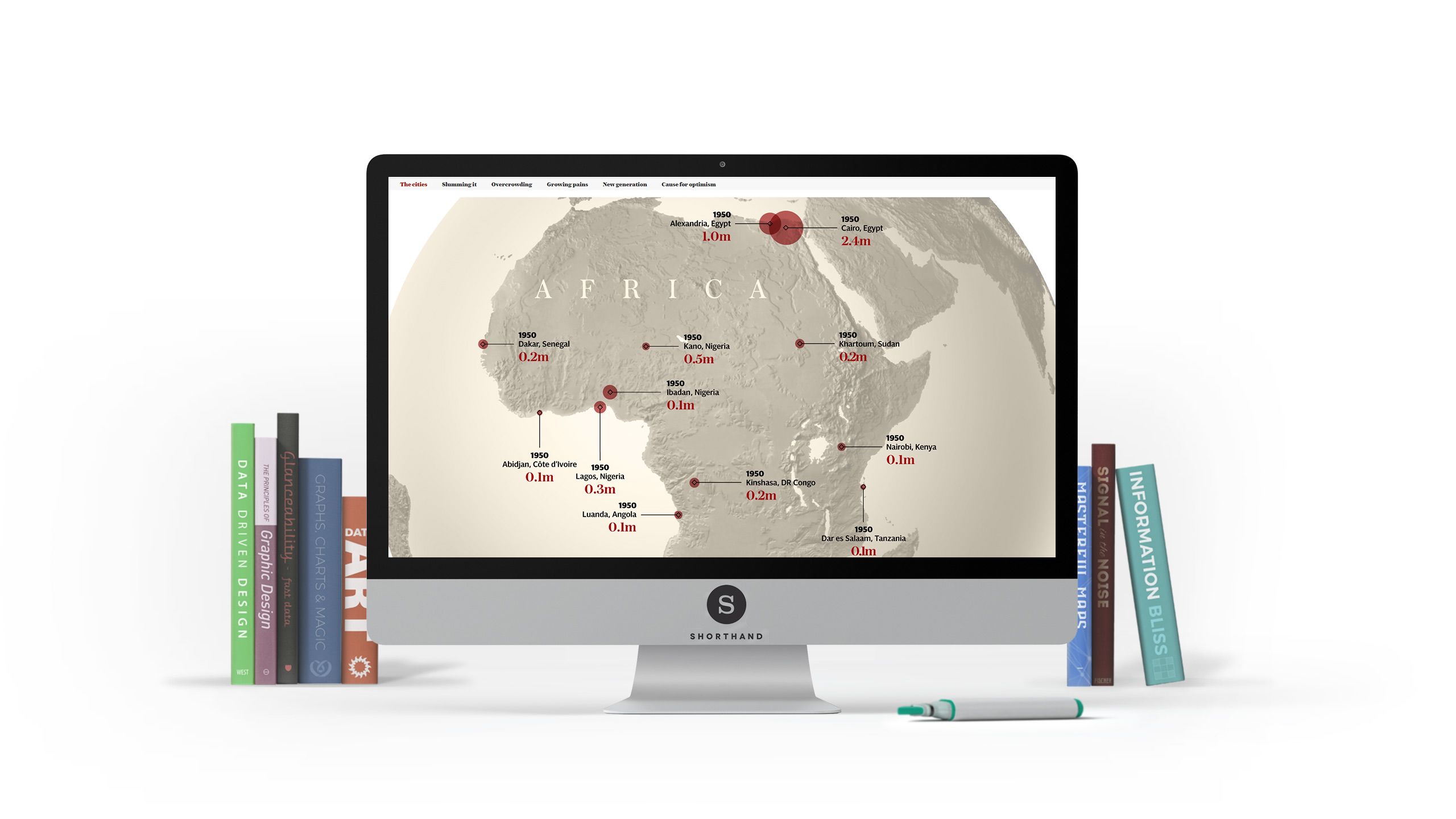
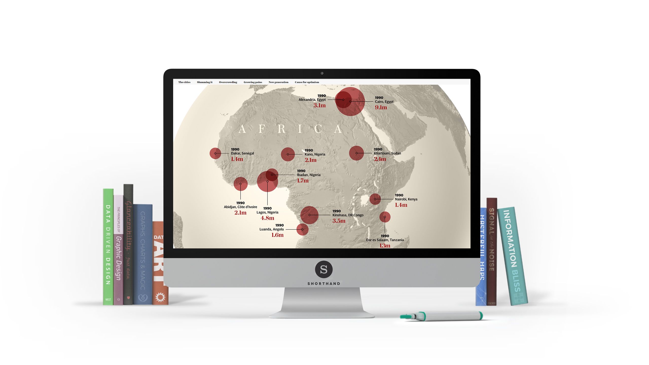
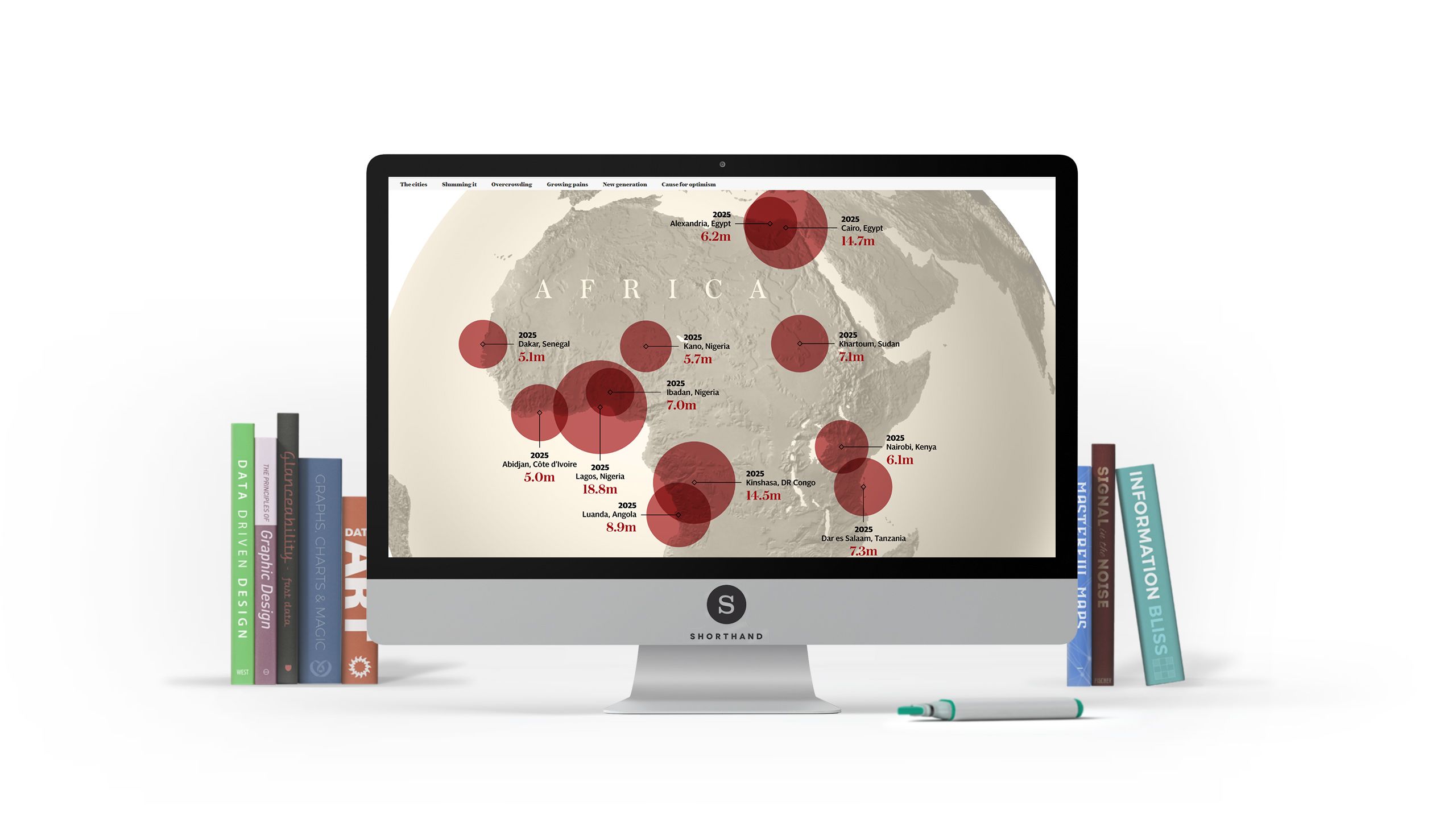
The Telegraph, for example, used Shorthand to create a powerful feature story, 'What Africa Will Look Like in 100 Years.' Drawing on data from the UN, the World Health Organisation, and a range of NGOs, data journalist Ashley Kirk wrote a visually compelling story about the challenges and opportunities the continent faces in the century ahead.
Another example comes from Sky News, which has used Shorthand to give real-time updates about the outbreak of COVID-19. Drawing on data from Johns Hopkins University and the WHO, the story presents data about the outbreak in simple-but-powerful interactive maps, tables, and charts.


These stories are far from dry. They show excellence in the fundamentals of journalism — including telling stories that engage readers — using the data they have available to them.
So, if you’re a data journalist looking to build beautiful feature stories like these, where do you start?
1. Get the data you need

At the heart of every data-driven feature story is (surprise, surprise) the data. Depending on your story, you might be sourcing data from government agencies, NGOs, academic researchers, or even private companies.
This data will be at the root of any visualisation you publish — whether it’s a static chart or map, or something more interactive — so it’s important to dedicate some time to sourcing exactly what you need.
While an increasing amount of data is a Google search away, it’s likely most of the data you need will take a bit more sleuthing. At best, you might need to send a few emails and make a few phone calls. At worst, you may need to make some formal requests under your FOIA — or equivalent — legislation. If this is the case, you may need to be patient!
Even data that you do find online may not be available in the format you need. Prepare yourself for the dreaded PDF!
Which brings us to the next step.
2. Clean your data

In an ideal world, data would land on your desktop in a machine-readable CSV, with standard, human-readable schemas. Too often, though, data is made available in closed formats like PDFs, with schemas that are either impenetrable or inconsistent. Unfortunately, any issues in your source data will feed into your data visualisation, so it’s important to manage these issues as you go.
For more complex stories, this step may (frustratingly) be the most time consuming part of your workflow. At the end of the process, consider giving feedback to your data source, especially if it’s a government agency. Feedback from data journalists can sometimes (accent on the sometimes) catalyse better data release practices in the future.
3. Decide what to include (and what not to include)

Once you’ve drafted your feature story, you’re going to need to decide what data to visualise in your final piece — and also what data to leave out.
Sometimes, data journalists want to include every dataset they have to support their story. Data journalists, though — like all journalists — need to 'kill their darlings' and only include data that is critical to the feature story being told.
It may help at this point to import your draft story into your publishing platform, such as Shorthand, and begin to think about how your data visualisations will work on the screen.
This is also a good time to check out your chosen platform’s features. Shorthand supports a range of features, such as scrollytelling (a tool to animate sequences of still images), and you may want to prepare your visualisations to make the most of them.
4. Visualise your data

How you visualise your data will depend on your skills, software, and budget. Some data journalists are experts in R and Python; others will have access to BI tools like Tableau or open source mapping tools like Quantum GIS.
There are a plethora of data visualisation tools out there, including many for non-technical journalists. If you’re new to data journalism, don’t be intimidated. Start small — and don’t be afraid to make mistakes.
5. Go static — or interactive

A key decision to make during the data visualisation process is to decide whether to make static assets — that is, image files of charts and maps, for example — or whether to create something more interactive and dynamic.
If you’re using Shorthand, the good news is that tools like Scrollmation can be used to make static images appear dynamic and interactive. If you lack developer resource (or even if you don’t!), this is a great way to go.
With Shorthand’s Developer Tools, you can also embed custom CSS, Javascript, and HTML into your feature story. Depending on your expertise, you may consider incorporating rich interactive maps using tools like Mapbox, Leaflet, or OpenLayers. You can also incorporate interactive charts from your other data visualisation tools.
6. Lay out your story with your data visualisations

Now it’s time to start laying out your story. Using Shorthand, you can avoid bespoke web development and easily create a fully responsive, premium feature story by dragging and dropping a range of elements.
Features you can use with Shorthand include:
- Title sections, with your title and subtitle laid out over or alongside a feature image
- Scrollmation sections, where images or data visualisations transform as a reader scrolls through the text
- Scrollmation backgrounds, where the background image changes as the reader scrolls
- Reveal images, where readers scroll through a series of background images
- Media, including embedded video and GIFs
- Fully responsive images, including automated text-over-image formatting
If you are using these features, remember to mix up your media and don’t overuse one visualisation feature (like Scrollmation) above others, as your reader is likely to notice. And make sure you think about the image file formats you are using.
And remember, above all else: story is everything. A tool like Shorthand can be used to build a beautiful feature story with compelling data visualisations — but, ultimately, it’s the story that matters.
7. Rinse and repeat

Finally, you want to make it as easy as possible for you and your team to create and publish your next story. Sustainable data journalism requires journalists to find efficiencies wherever they can. And there’s no point starting from scratch with each story.
Once you’ve got a feature story under your belt, it’s worth thinking about building out custom templates. These will make it easier (and cheaper) for you and your colleagues to publish beautiful feature stories as you go, over the long term.
Before you choose a feature storytelling platform or data visualisation tool, it’s worth trying it out first. With Shorthand, it’s free to create an account and start building — upgrade to a subscription only when you’re ready to publish.


