How to create great data journalism


Suddenly, data journalism and data storytelling are everywhere. From the New York Times and FiveThirtyEight to Sky News, ProPublica, and The Guardian, we're seeing news organisations produce an increasing number of beautiful, informative, and compelling feature stories grounded in data analysis and visualisation.
by Kiera Abbamonte
Businesses and non-profits are also integrating data into their marketing and communications efforts.
This hasn't always been the case. In the past, data journalism required expensive and complicated enterprise tools, which limited its reach. But in the last few years, it's become much easier to produce multimedia data stories at scale, thanks to better browsers and bandwidth, new software and no-code platforms, and the increasing accessibility of authoritative, high-quality data.
In this guide, we explain how and why newsrooms are creating stunning data stories, based on an in-depth webinar with the Sky News team and their award-winning piece of data journalism, Brexit by Numbers.
In the guide below, we cover:
Start creating with Shorthand
It's the fastest way to publish beautifully engaging data journalism, reports, internal comms, and more.


What is data journalism?


Data journalism is journalism grounded in the analysis, explanation, and visualisation of data.
Great data journalism helps readers to understand and draw conclusions about their world. Data journalism has made its way into every part of the newsroom, from sports, culture, and property to politics, economics, and environmental journalism.
Typically, data journalism is recognisable by its use of intuitive, digestible data visualizations, including charts, graphs, maps, infographics, and other interactive visual elements.
Data journalism isn't new — indeed, journalists and content teams have always used data and statistics to beef up their feature stories. Prior to the current wave of data journalism, there was the 'computer-assisted reporting' trend of the 1990s, which relied on computational analysis to make sense of complex datasets for the purposes of reporting.
Data journalism and data storytelling also aren't restricted to newsrooms. Outside of journalism, there's a range of publishers — from datablogs and academics to nonprofits and businesses — producing empirical, data-driven stories.
Why data journalism is so popular


So, what’s new or different about data journalism today? There’s no denying the rise of data journalism in recent years — but why is it happening now?
Historically, data journalism has been out of reach for all but the most well-funded or technical teams, mostly due to the cost of enterprise tools, hardware, data scientists, and developers, as well as a lack of options for presenting data on the web.
But that’s changing due to a confluence of factors.
1. We have more data
Thanks to activists in the open data movement, we have much better access to high-quality public data, especially from government agencies. This still isn't perfect, though, with many agencies dumping large datasets online without context, publishing datasets that aren't coherent with other, similar data, or releasing data as a dreaded, mostly-useless PDF.
While investigative reporters and watchdog journalists will still rightly grumble about freedom of information requests, there's no doubt that proactive release of data from authoritative data sources has been a boon for data-driven journalism.
2. Better data literacy in newsrooms
Newsrooms are typically filled with humanities graduates who last picked up a statistics textbook in their mid-teens. They are not typically filled with experts in data science. This explains why, historically, there has been so much mis-use and misunderstanding of data in news publications.
To a degree, this is changing. The rise of data journalism as a speciality area in journalism has led to an increasing number of newsrooms hiring a data journalist (or two) to produce stories and provide support. Some have even created entire data teams and have a specialist data editor, though this is relatively rare. This, in turn, has led to better and more informed use of data.
3. New media business models
As print declines and digital advertising plateaus, most media companies are looking to get payments directly from readers. While there are many different models — as we explain in our guide to paywalls — this is often in the form of paywall subscriptions and membership fees.
A fundamental part of this business model is building a reputation for trustworthy, high-quality content. And this is precisely what great data journalism is.
4. Data stories perform well
A related point is that data stories routinely score high marks on a range of the metrics that matter for content teams and publications—from on-page metrics like bounce rates, social media shares, CTR, and conversions to backlinks.
As we explain in our guide to longform journalism, this is also true of other high-quality immersive content.
5. More powerful tools
In decades past, there were technical barriers to handling what has become known as 'big data.' Even the most well-resourced newsroom struggled to handle and process — let alone access — datasets that would be considered trivially small by today's standards.
With the rise of faster computers, better internet, and more powerful and accessible software, it's become much easier to clean, process, and analyse data, including 'big data' that would have proven unwieldy in the past.
With the rise of programming languages like Python and R, data journalists can produce exceptional and complex work, all from their local machine.
6. Cheaper, more accessible tools
Increasingly, data journalism isn't just for data specialists. As software becomes more powerful, a range of cheaper and more accessible options — including no-code and low-code platforms for visualising and publishing data — have entered the market. These tools allow anyone to create great-looking data visualisations, without needing a computer science PhD to use them or generous funding to afford the enterprise software price-tag.
This includes visual storytelling platforms like Shorthand, which allow anyone to produce interactive data visualisations using nothing more than static images.
7. The audience demands it
With the rise of misinformation, there’s been a groundswell for greater transparency from a range of authoritative sources, including brands, journalists, and governments. As a result, more of these sources — including journalists — are publishing data to show how they arrived at their conclusions.
What makes a good data story?
Let’s turn now to what a good data-driven news story looks like (for the record, you can find plenty of examples in our gallery of featured data stories).
Consider this your checklist as you build out your own data journalism efforts.
Note: We discussed this topic in a past webinar with Sky News on the production of their Brexit by the Numbers data story. You can watch a recording of the webinar here, and we’ll be including some of the insights their team shared throughout the rest of this guide.


1. Good data
Finding and analyzing data is often the first step in your data journalism workflow. It can also be the most resource-intensive step, but it’s worth doing right, because high-quality data is at the heart of data journalism.
As we've already mentioned, some data will be publicly available. Other data will require investigative reporting to access.
Once you've obtained the data, you'll need to do your own due diligence to ensure that the collection methods, research subjects, and any analysis are sound and free from bias. Also, raw data isn't always ready to use, so it's also likely you'll need to dedicate time to cleaning data to make it fit for purpose.
2. Finding the story from the data
To build a great data story, you have to let the data speak for itself. It’s easy to dive into the research phase looking for data that conforms to a story that’s already formed in your mind. Too often, this is how data is used in stories that aren’t data-led. This problem, known as confirmation bias, leads to flimsy, poor quality stories.
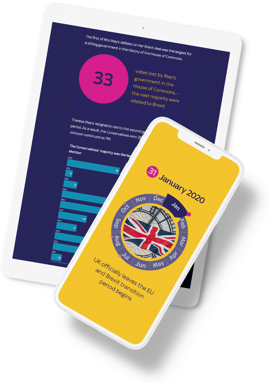
As Sky News Output Editor Ronan Hughes put it when talking about their award-winning story, Brexit by Numbers:
“We knew that numbers were an integral part of the story, that there were a lot of conflicting views about which side you're on—but you can't really dispute facts,” Ronan said. “So we wanted to produce something which was visually engaging and fact-based, which took stock of where we were at with that story at that time.”


The first step in producing this kind of story is to take stock of the data and find the story from there.
“There's a lot of research before you actually start to produce the story,” Carmen Ilab, Data Journalist for Sky, adds. “Which data is available? Which areas do we want to cover? It's a very big story, so it could be anything between politics, immigration, economy, everything.”
Identify that central narrative through-line that will carry readers through the resulting piece by looking within the data for:
- connections between data points,
- trends and patterns,
- outliers,
- counterintuitive numbers.
3. Storyboard and structure
Carmen notes the importance of mapping out the structure of your story.
“Once you have all that information, we sat down together again, and we tried to organize all the content and which bits we are leaving out, and which bits we are including in the story, what is more important. […] It was a conversation about how we can display this information and how we can make this story engaging."
The next step combines the first two and turns them into an outline—a map of your data story’s structure, plus the data, visualizations, and written content you’ll use to build it out.
This is when you’ll start to think about which specific data points to include, the best ways to represent or visualize each, and how they’ll all tie together. It’s also when you identify areas of the story that may need more help from the written side of things to help readers make sense of the data.
“It was about trying to give the piece structure, so that it wasn't just a piece which was a load of charts,” Ronan adds. “It was a piece which brought the data through in different ways—because data is more than just charts and numbers.”

4. Establish a clear narrative through-line
One of the easiest mistakes to make with data journalism is to overlook the importance of narrative. When you’re staring at a mountain of data, it can be difficult to see through the numbers to the heart of what they’re really telling you. It’s also hard to decide which data points to exclude because they don’t follow this central narrative.
Without a clear narrative through-line, you’re just repackaging a bunch of numbers—not contextualising or helping your audience make sense of them.
As Carmen Ilab, Data Journalist for Sky, puts it:
"We wanted to have a common thread running through the whole piece, not just four separate sections. We wanted to have something to unify the whole story, as well. It was very important not to have a patchy narrative — one chart here and another chart there — because then it becomes messy."

5. Make it interactive
Some forms of great data journalism are interactive, allowing the reader to effectively 'choose their own adventure.'
As Sky News Output Editor Ronan Hughes puts it:
"Any sense of animation you can bring into a piece really helps—you can feel like you're interacting with the content.
“We're all used to picking up a phone and tapping away and interacting with content. I think this allowed us to get that sense for a user that they were really working their own way through the story, as opposed to just working in a linear fashion.”
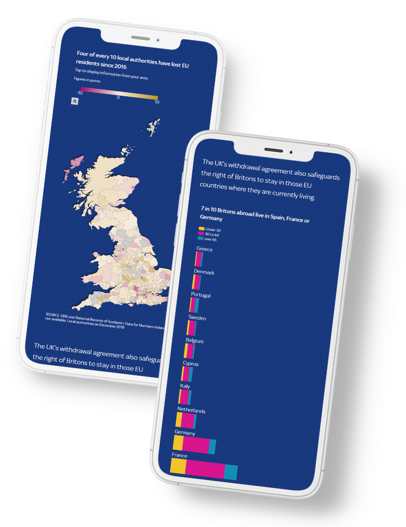
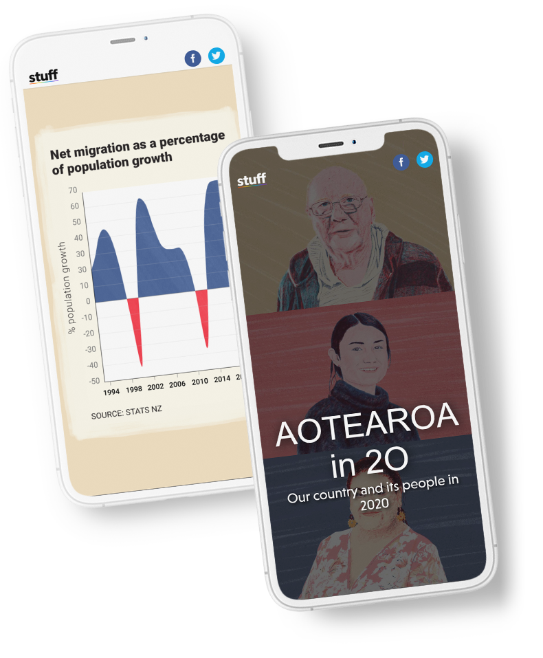
One simple way to build interactivity into your data stories is by allowing the reader to trigger new data layers as they scroll. A great example of this technique comes from Stuff, with their story on Aotearoa in 20.

If you use Shorthand to build your data stories, our scrollytelling features can help you make images feel dynamic and interactive, without needing help from developers. And if you do have developers on hand, our Developer Tools enable you to add custom CSS, Javascript, and HTML into your stories.
More to explore:
Looking to build your own data story?
Get started with Shorthand today.