
10 inspiring examples of interactive maps


Ever been fascinated by a novel featuring a custom map of its fictional world? Or perhaps you've used Google Maps to virtually explore New York or a place you've never visited?


If you've experienced this, then you understand the power of data visualisation through maps. It can help immerse an audience in the physical setting of a narrative or visualise a data story in a clear, engaging manner.
Over the last decade, interactive maps have gained popularity in website design, coinciding with the increased accessibility and ease of use of mapping technology. Creating these maps might not be a walk in the park — after all, it takes time and expertise to craft excellent interactive maps — but numerous tools, providers, and tutorials exist to help streamline both the technical and design aspects of the process, assisting you in building your map.
That's great news since using maps for digital storytelling offers immense potential. You can animate maps with images, embed rich data, enable scroll-triggered functionality, or showcase macro and micro views of an issue or location.
In a previous post, we've discussed the best tools for crafting interactive maps. Now, let's focus on inspiration. We'll share some of our favourite bright and beautiful ideas for your next piece of digital storytelling with maps.
Image: Юрий Парменов/Adobe Stock

Start creating with Shorthand
It's the fastest way to publish beautifully engaging digital stories — with interactive maps, timelines, and more.


What is an interactive map?
Before diving into examples, let's clarify what we mean by 'interactive map'. Broadly speaking, an interactive map is any visual representation of a physical location that adapts as a reader interacts with it.
It's a wide-ranging definition, and rightly so—there are numerous ways to approach interactive mapping, depending on the information you wish to convey and the tools at your disposal.
An interactive map can be as simple as a series of static map images combined and activated via scrollytelling. More complex creations, like Google Maps-style maps or Google Street View, allow readers to drag, zoom, view points of interest at street level, or overlay data points, statistics, and other information. Mapbox is another popular choice for creating custom maps using APIs and JavaScript.
Regardless of the type of map, the essential feature of an interactive map is that it changes as the audience scrolls, clicks, or otherwise engages with it. Real-time updates, heatmaps, and popups are just a few examples of how interactivity can be incorporated into map view.
By adding interactivity, you can emphasise key points on the map, guide readers through the information they need, and boost audience engagement through interactive marketing. This approach can also be applied to social media campaigns or integrated into a WordPress site, making it a versatile tool for various digital storytelling formats.
Image: rikirennes/Adobe Stock
10 inspiring examples of interactive maps
In the following roundup, we'll explore different interactive map templates and base maps, along with case studies illustrating how full-screen maps enhance the user experience. So, let's dive in and explore the world of interactive mapping!

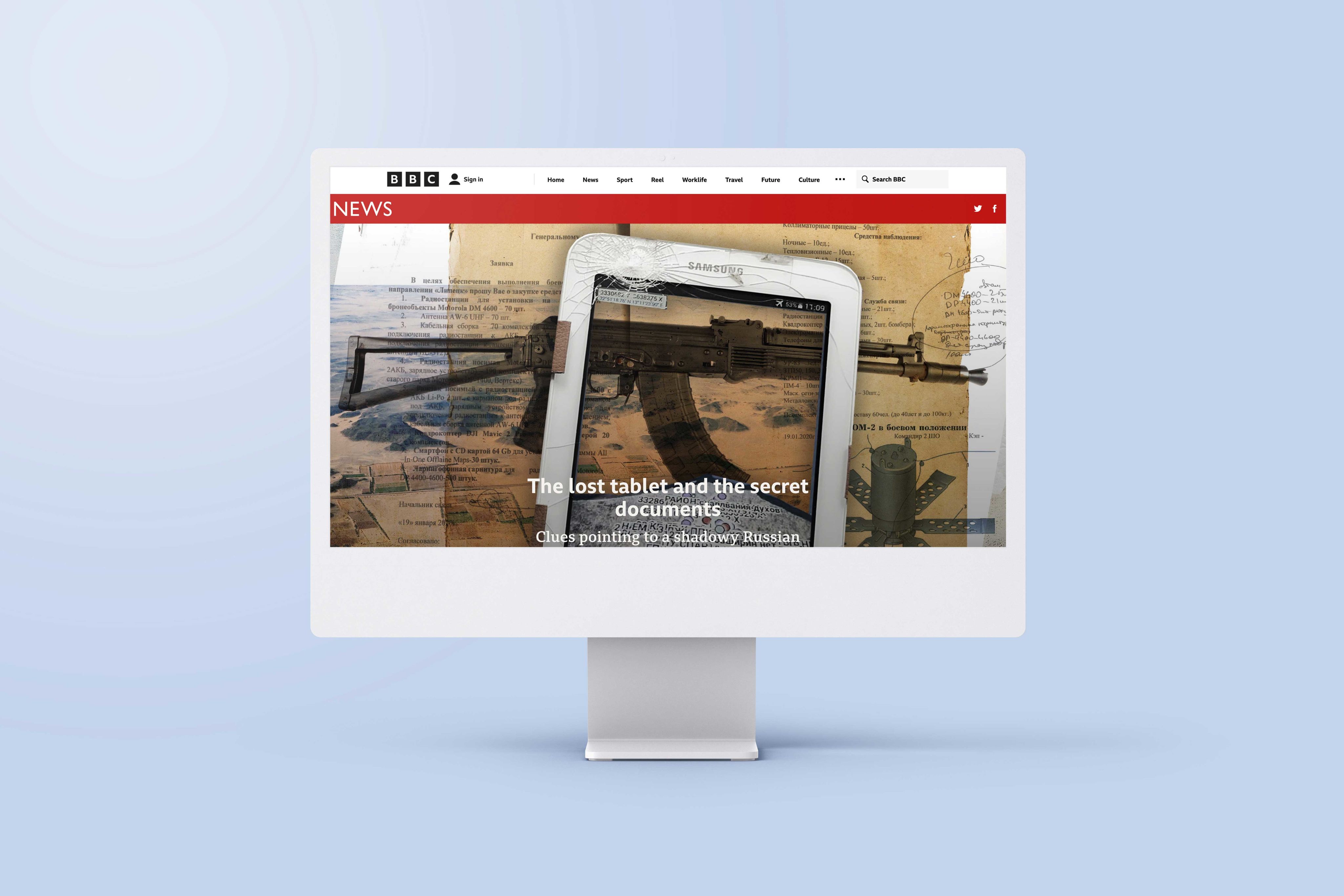

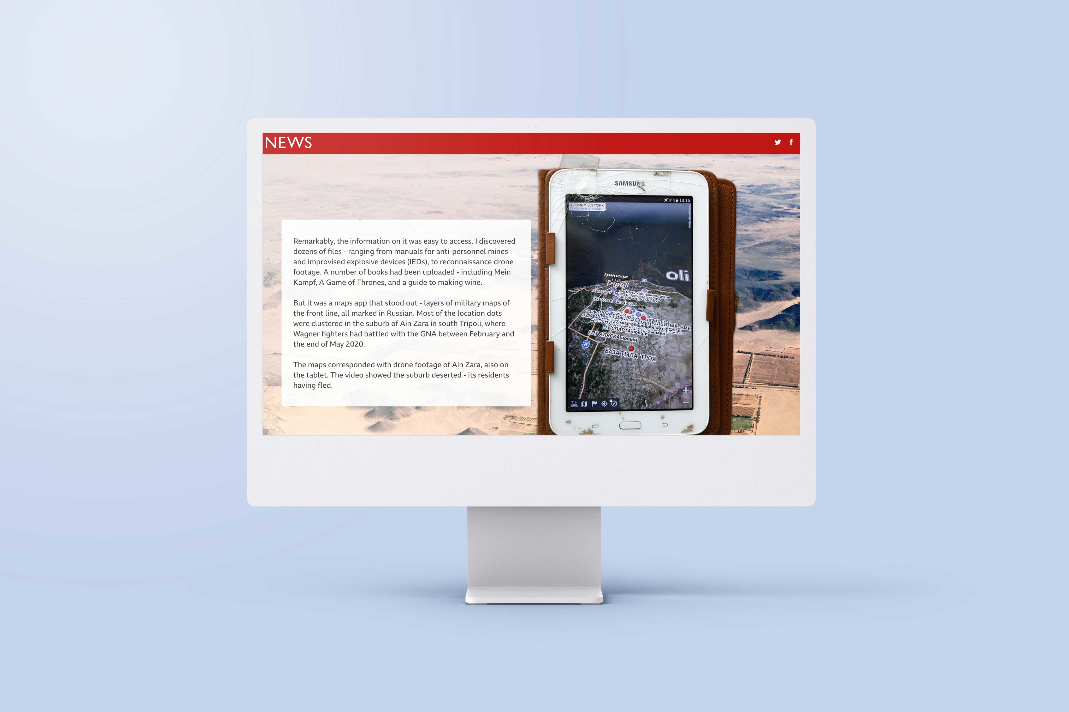


1. The lost tablet and the secret documents
- What it is: a report on a secretive Russian mercenary group.
- Who created it: BBC
- What the map shows: military maps with the locations of assets, mines, and more.
Why we picked this example
When a lost tablet was found chock full of information on a shadowy Russian mercenary group, the BBC published a report on their analysis of the details it contained. Some of the most compelling findings came from the tablets Maps app. The report includes both static images from the app, along with simple overlays to help add context for readers. It’s a great example of using an interactive map simply.

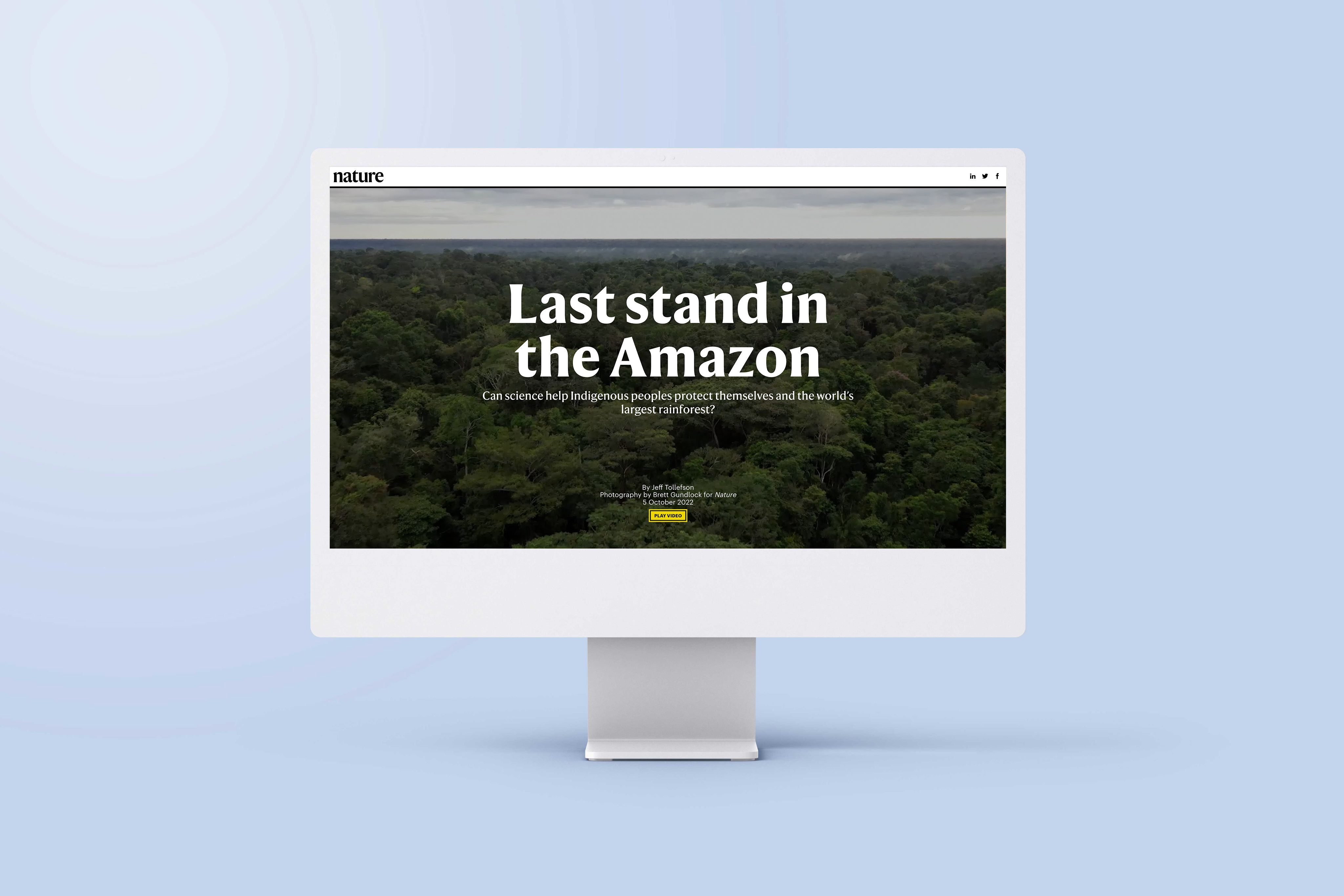

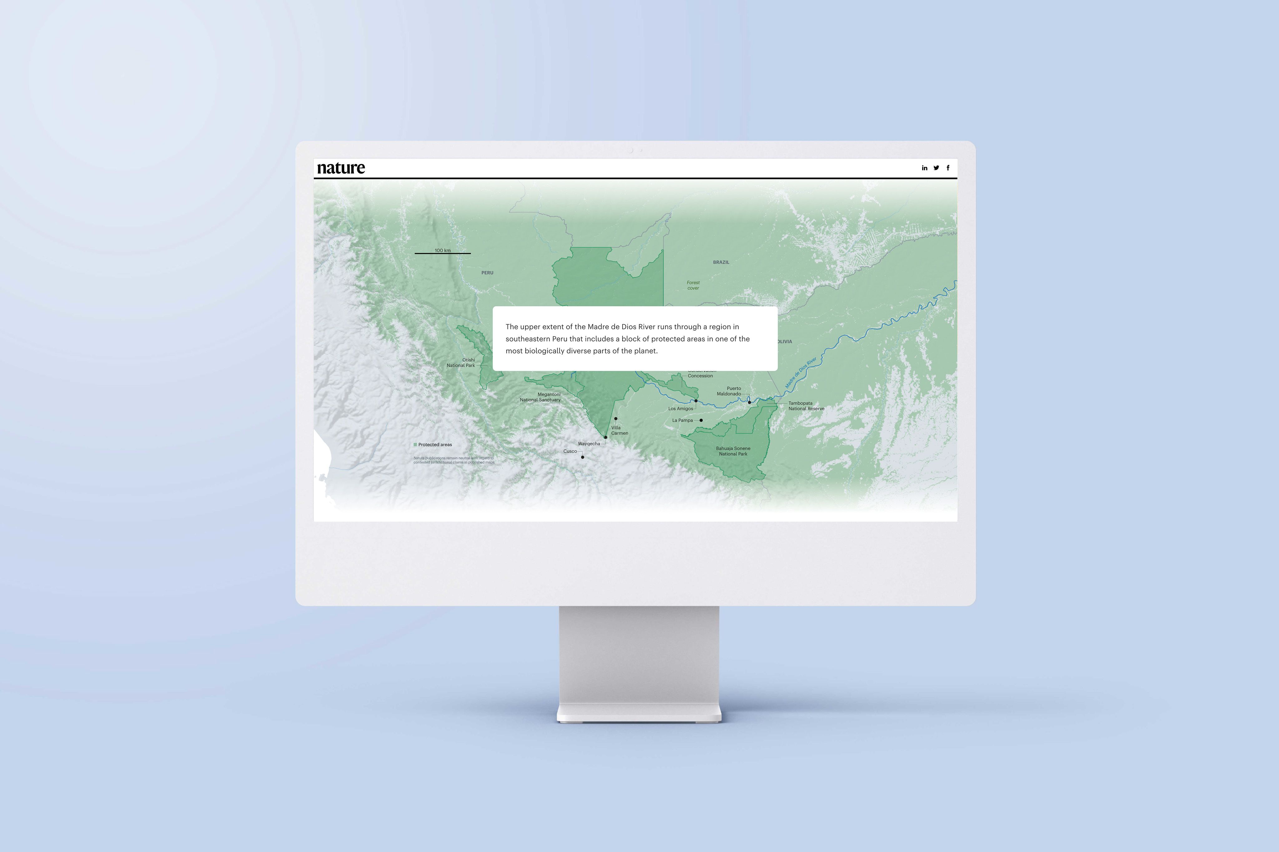

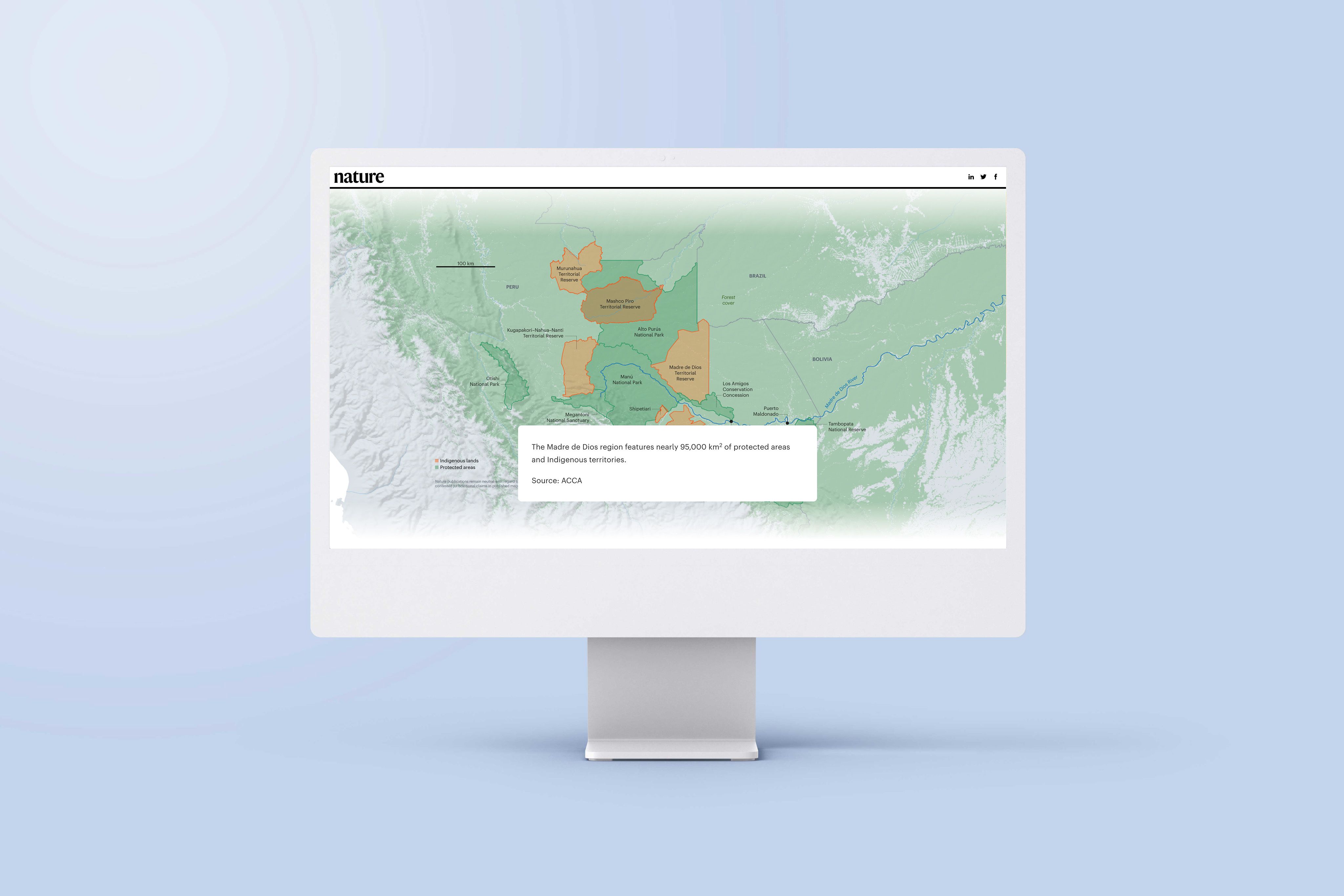
2. Last stand in the Amazon
- What it is: an investigative feature exploring the pressures reshaping the Amazon rainforest.
- Who created it: Nature
- What the map shows: a series of interactive maps focused on the Amazon, showing how deforestation, infrastructure, mining, and land use intersect across the region.
Why we picked this example
This immersive story from Nature uses multiple map visualisations to support a complex environmental narrative. As readers scroll, the maps update to highlight different forces at work — from roads and development projects to protected areas and deforestation hotspots.
The maps work as analytical layers, helping readers understand how overlapping pressures are reshaping the Amazon. This article is a strong example of how interactive maps can guide readers through a detailed investigation without overwhelming them.


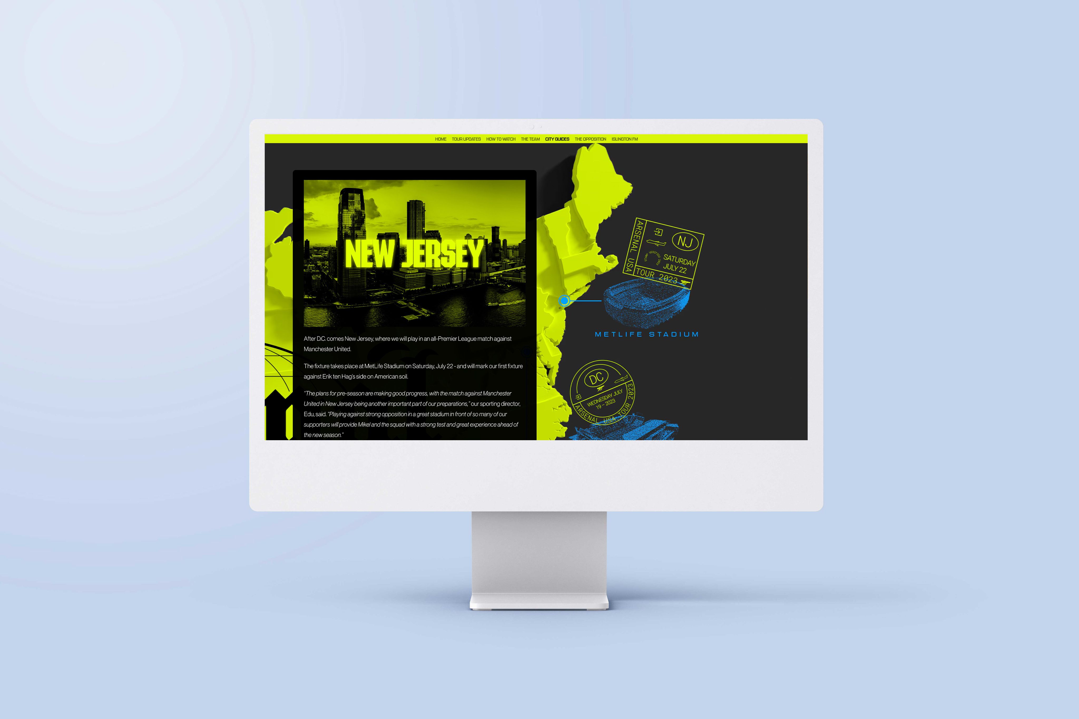

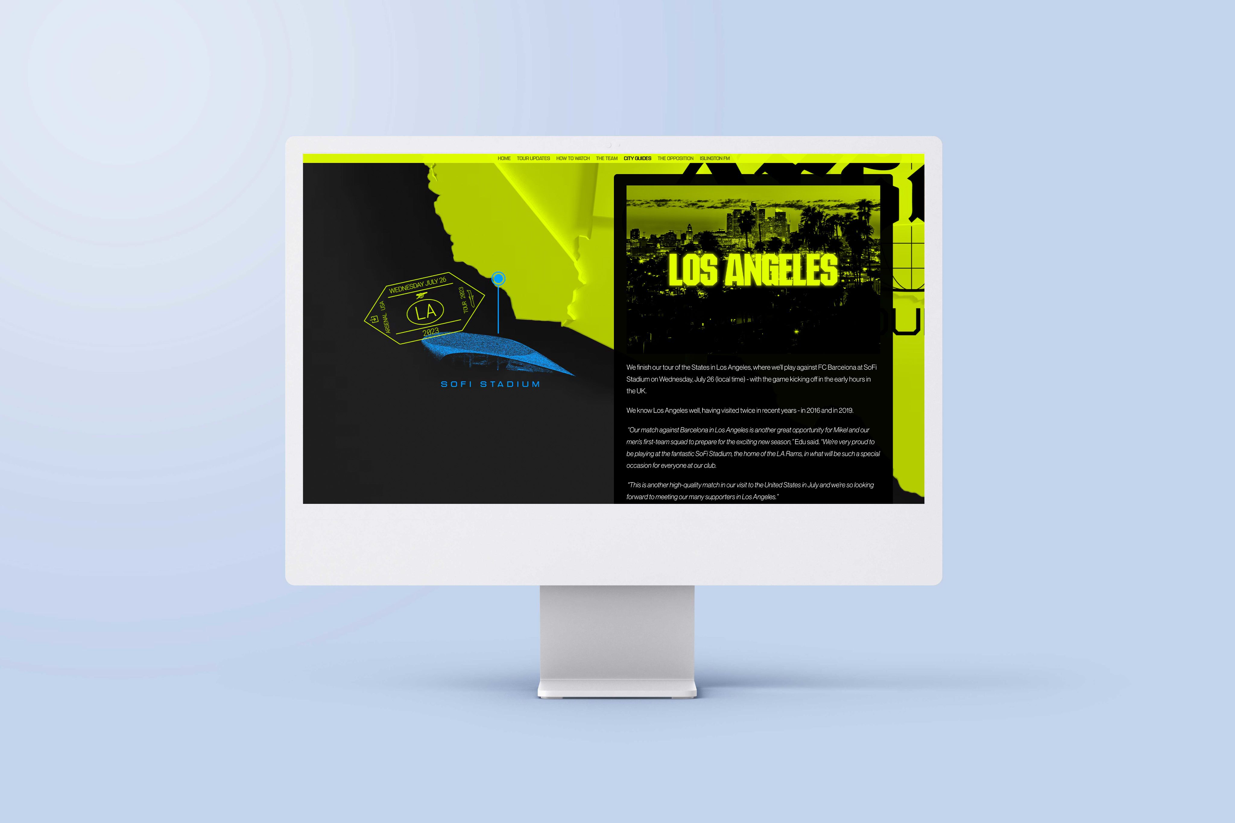
3. USA tour 2023
- What it is: a brand story announcing Arsenal Football Club’s 2023 US tour.
- Who created it: Arsenal F.C.
- What the map shows: a bright, animated journey through Arsenal’s USA tour itinerary.
Why we picked this example
Arsenal’s US tour announcement uses a simple, colourful animated map to help fans quickly get their bearings. Readers can follow the journey as it unfolds from city to city, getting a clear sense of the scale and timing of the tour.
The animation does just enough to keep things lively, turning a straightforward schedule into something engaging and shareable. It’s a good reminder that interactive maps don’t have to be complex to be effective, especially in brand storytelling.


4. A detailed look inside the Austrian Parliament (Ein detaillierter Blick in das österreichische Parlament)
- What it is: a richly illustrated digital dossier offering an interactive look inside Austria’s Parliament.
- Who created it: Kleine Zeitung
- What the map shows: the illustrated “Infografik”, created with Shorthand’s Reveal section, presents a 3D overview of the renovated Parliament building, with labelled hotspots that explain key spaces and features.
Why we picked this example
The animated infographics and maps make the institutional architecture and political history tangible. Rather than simply describing seating arrangements or renovation dates, this immersive story lets readers see how the historic building has been transformed.
The interactive elements — including layered illustrations and an animated timeline — help readers visualise concepts that are difficult to grasp through text alone.

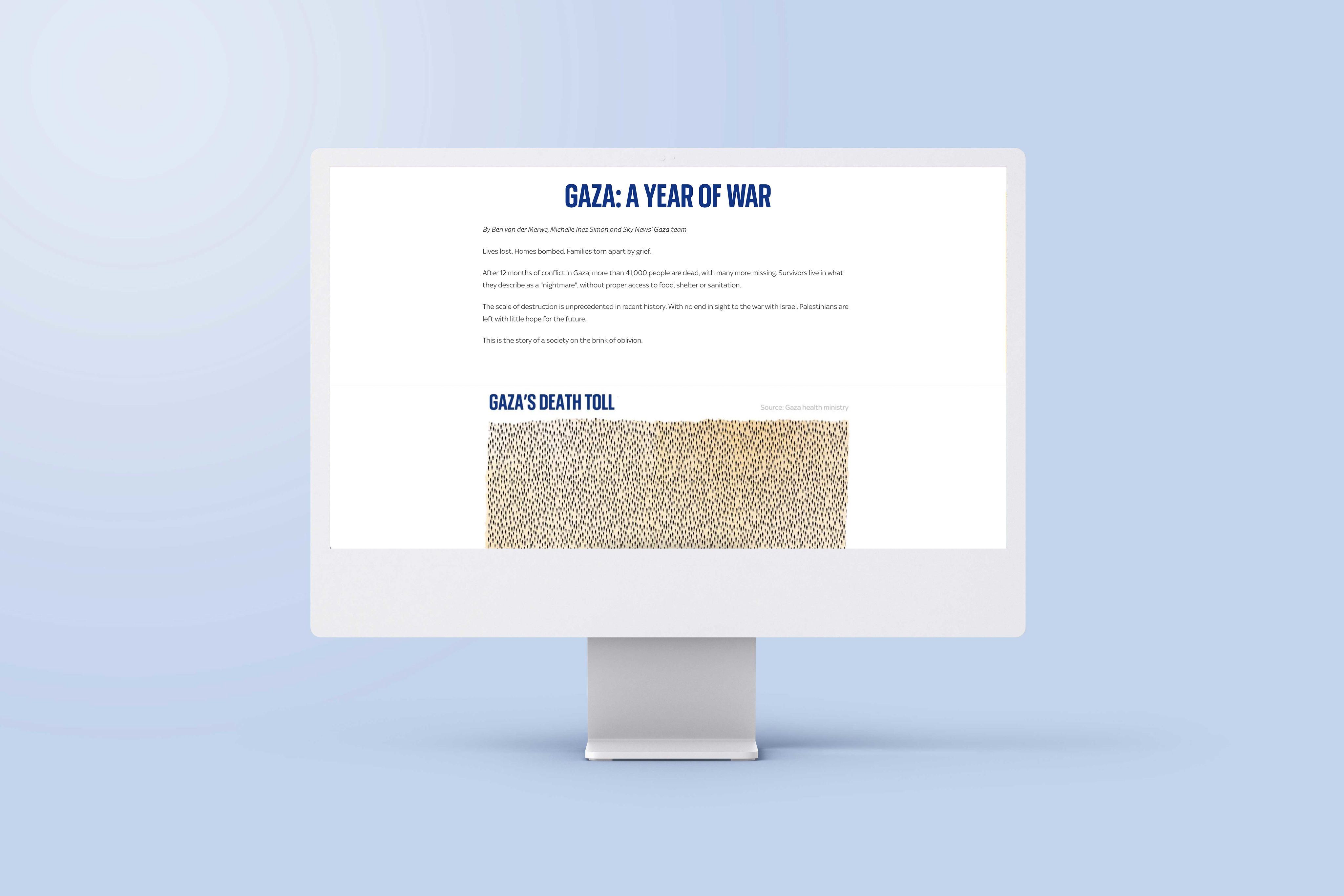

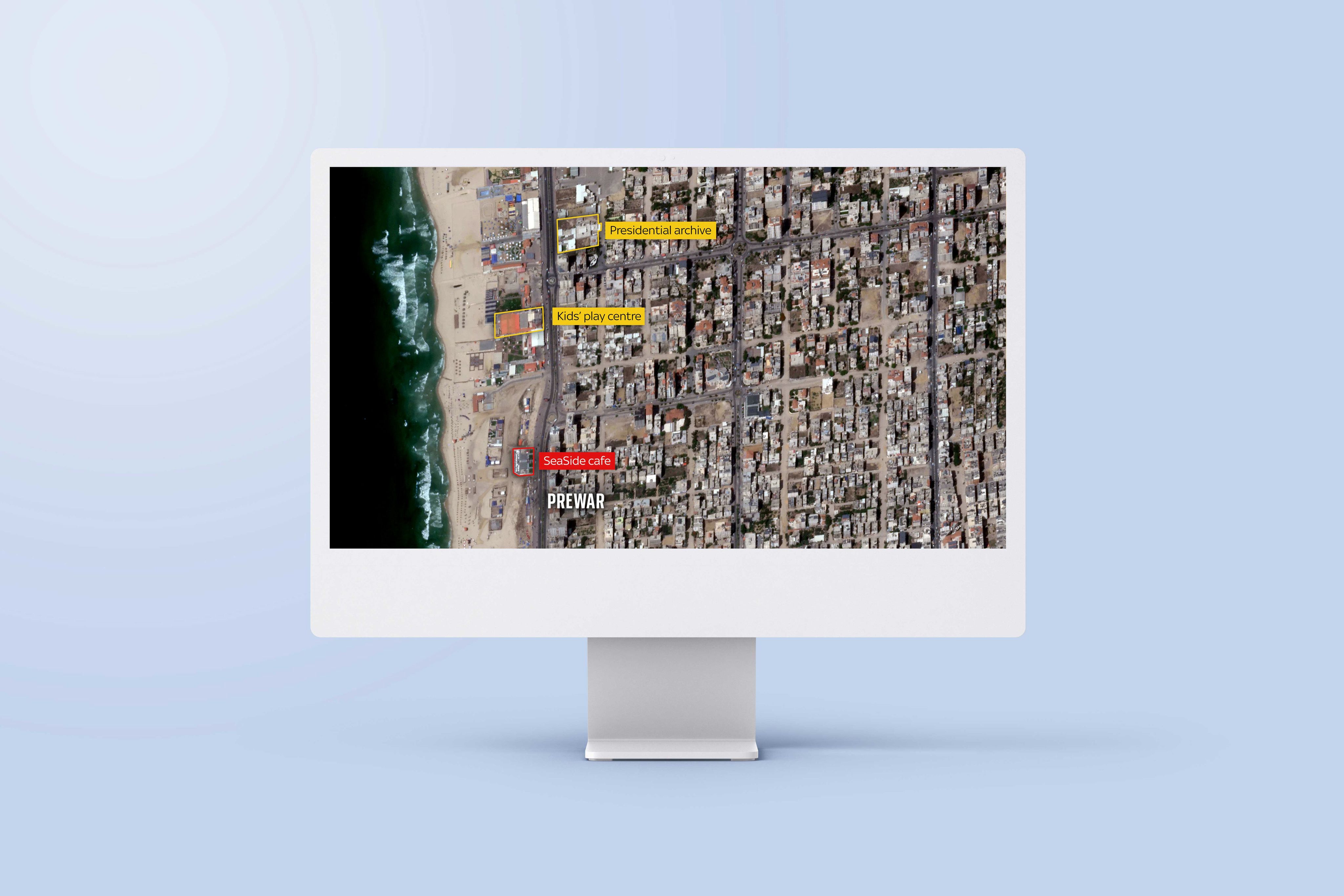

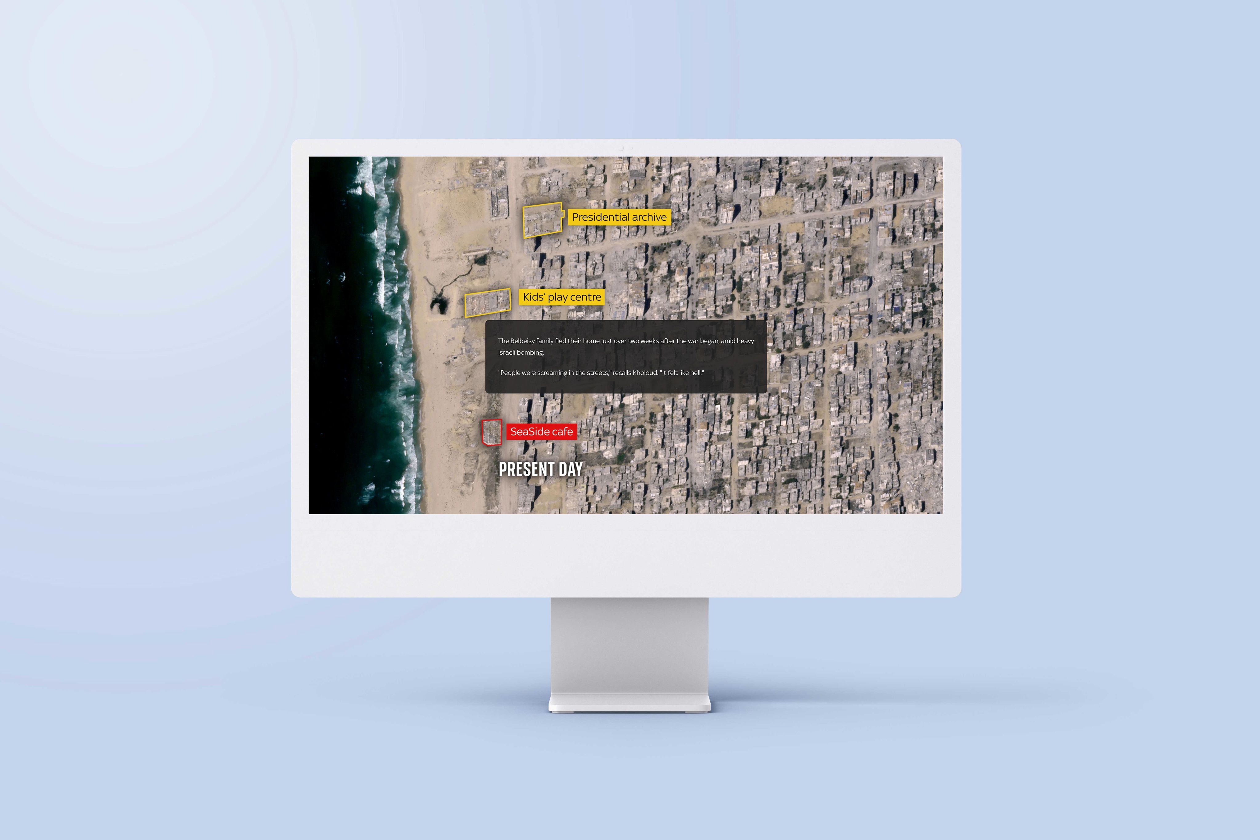
5. Gaza: A year of war
- What it is: a multimedia news investigation into how more than a year of conflict has transformed Gaza’s landscape and society.
- Who created it: Sky News
- What the maps show: where buildings have been damaged or destroyed across Gaza, with coloured overlays indicating the extent of devastation based on UN and satellite imagery analysis.
Why we picked this example
This Sky News feature uses before-and-after imagery, showcased in Shorthand’s Reveal section, to make the scale of destruction in Gaza visually real. As readers scroll, satellite images and animated overlays show how once-vibrant neighbourhoods have been reduced to wastelands.
Rather than asking readers to parse numbers in text alone, the maps anchor the story — showing not just where destruction has occurred, but how it has unfolded over time. The result is a more urgent, tangible narrative, and a strong example of how interactive maps can deepen understanding of ongoing conflicts.

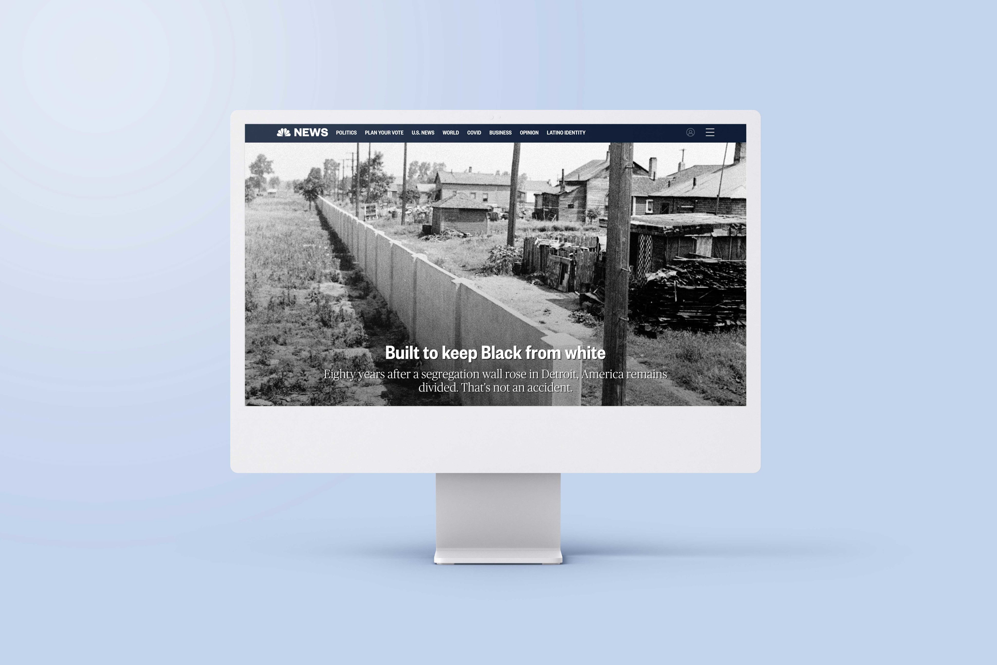

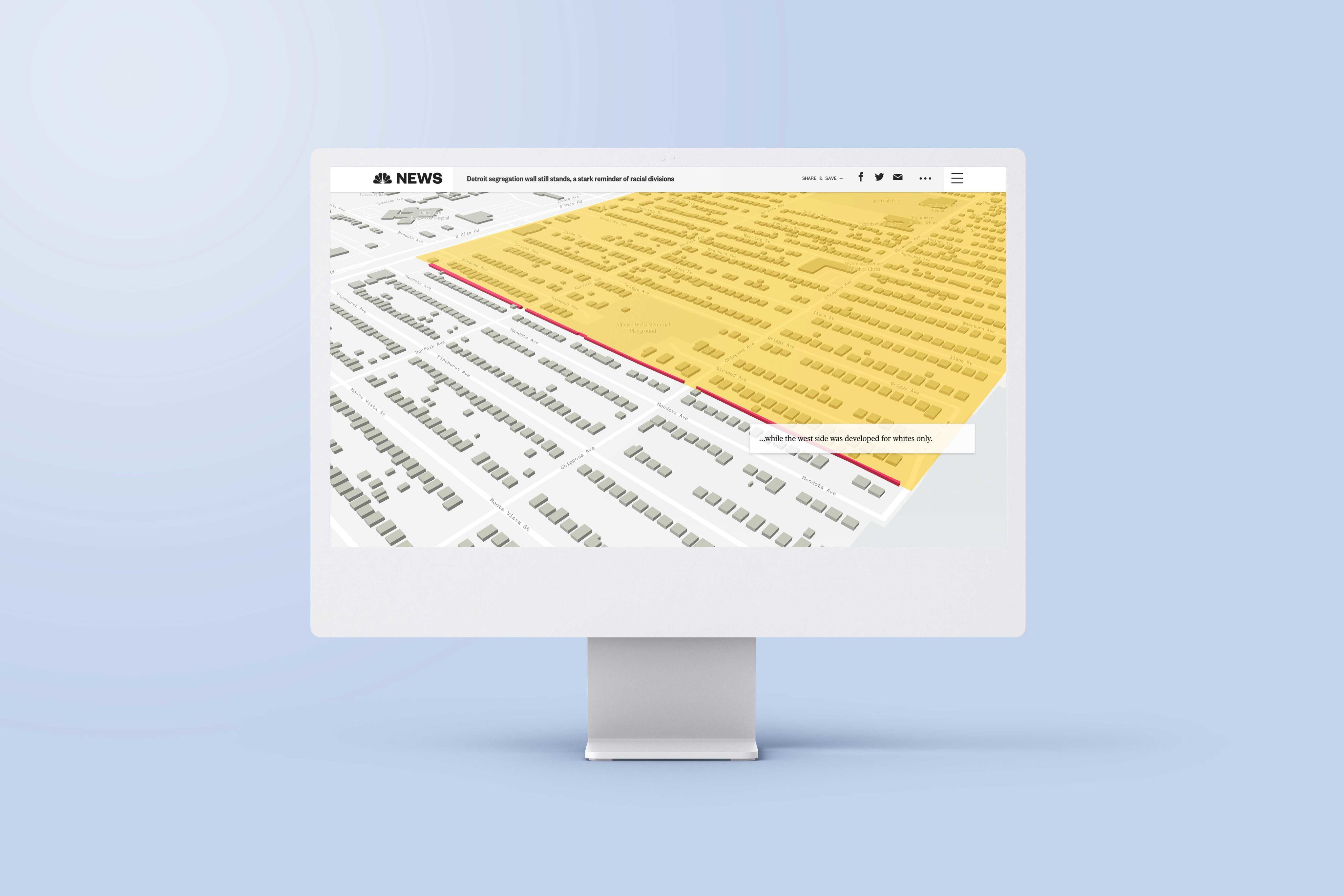

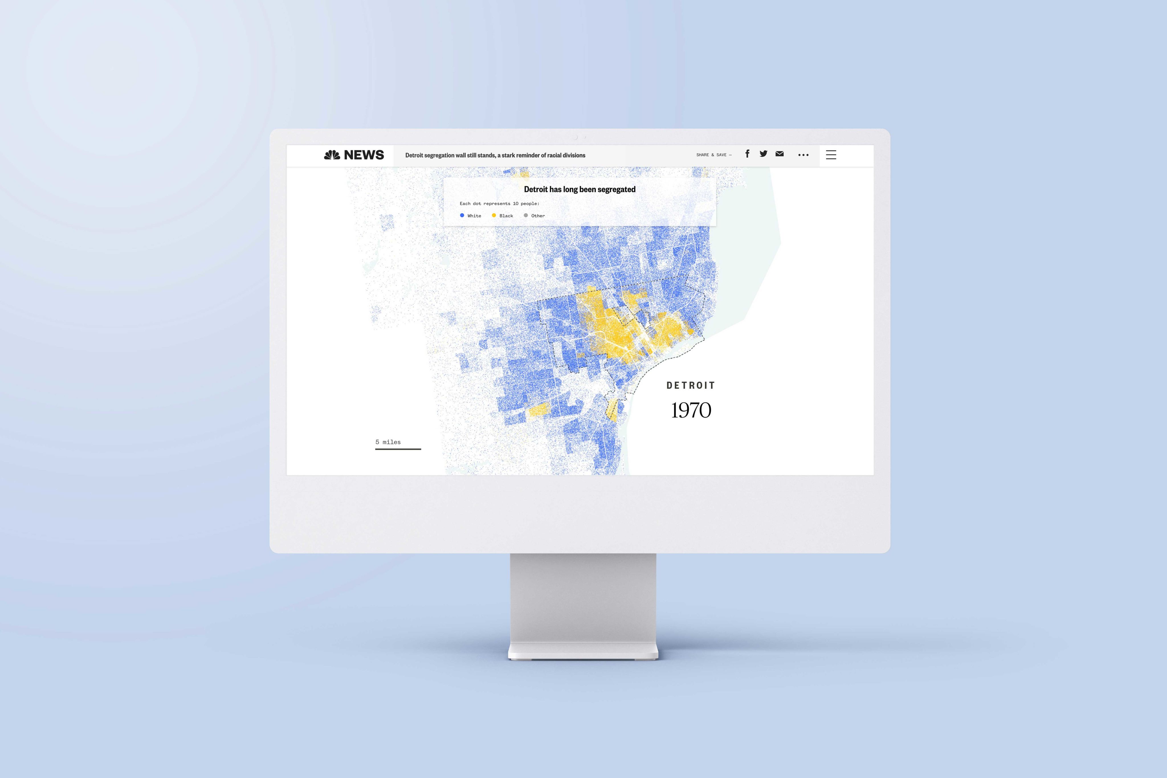
6. Built to keep Black from white
- What it is: an editorial on the history of segregation in America and its legacy today.
- Who created it: NBC News
- What the map shows: the historical and continued legacy of racial segregation in Detroit.
Why we picked this example
This editorial from NBC News (which won a Webby Award for Best Individual Editorial Feature) uses several interactive maps to show the reality and the legacy of racial segregation in Detroit. Each map serves to showcase the geography of Detroit and its suburbs, along with the segregational lines drawn historically.
Perhaps the most powerful map is the last one. It shows the clear racial divides across Detroit and how they remain largely unchanged from 1930 to 2019, then it illustrates in no uncertain terms the real financial impact of that segregation on home values in each neighbourhood.

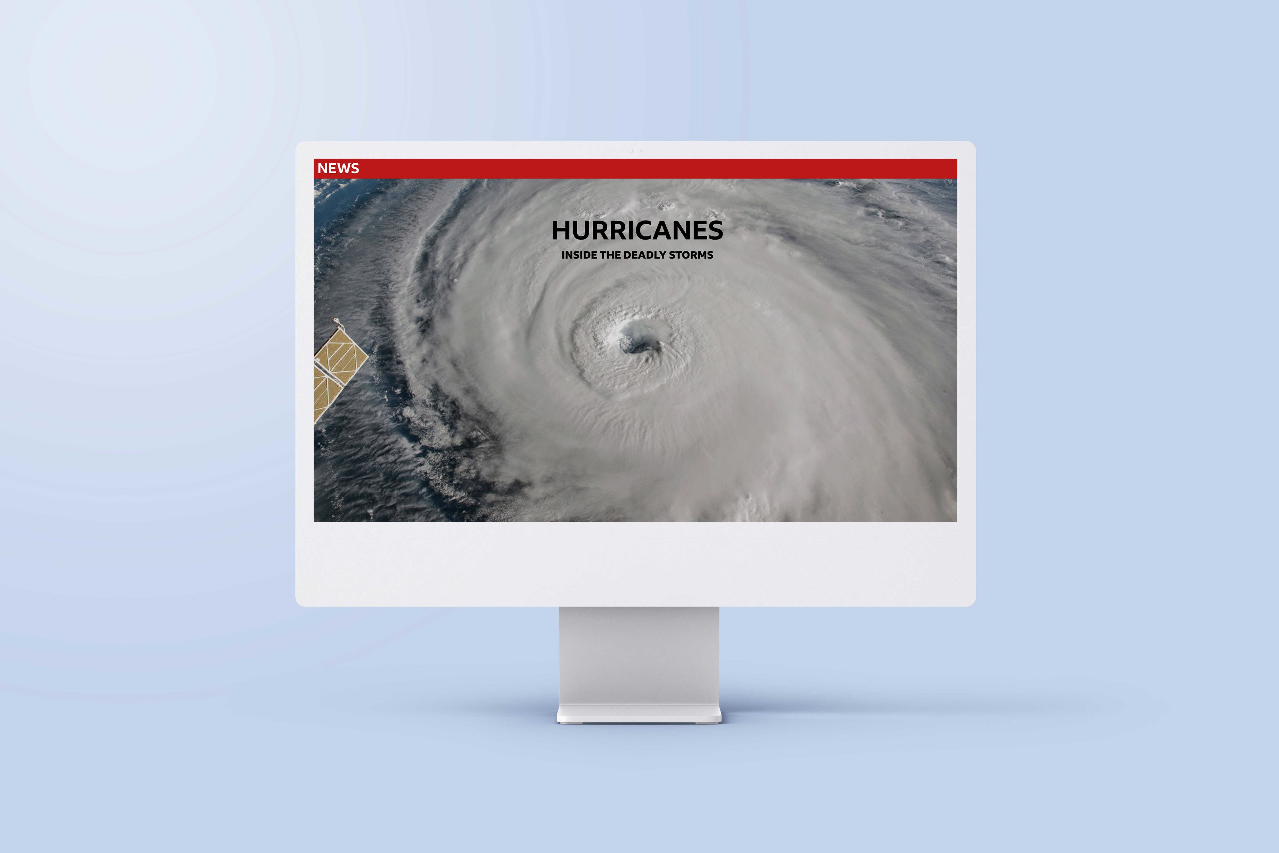

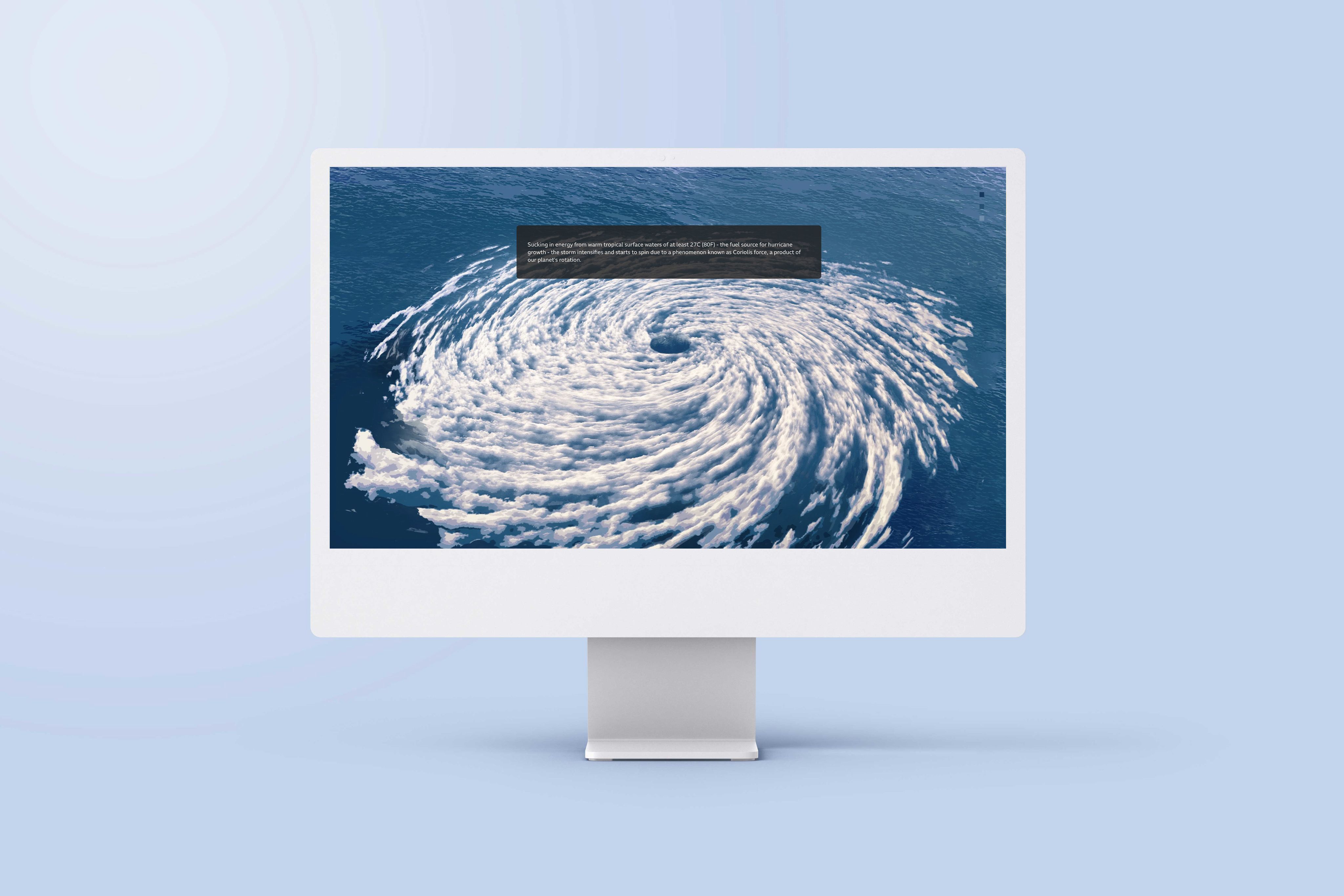

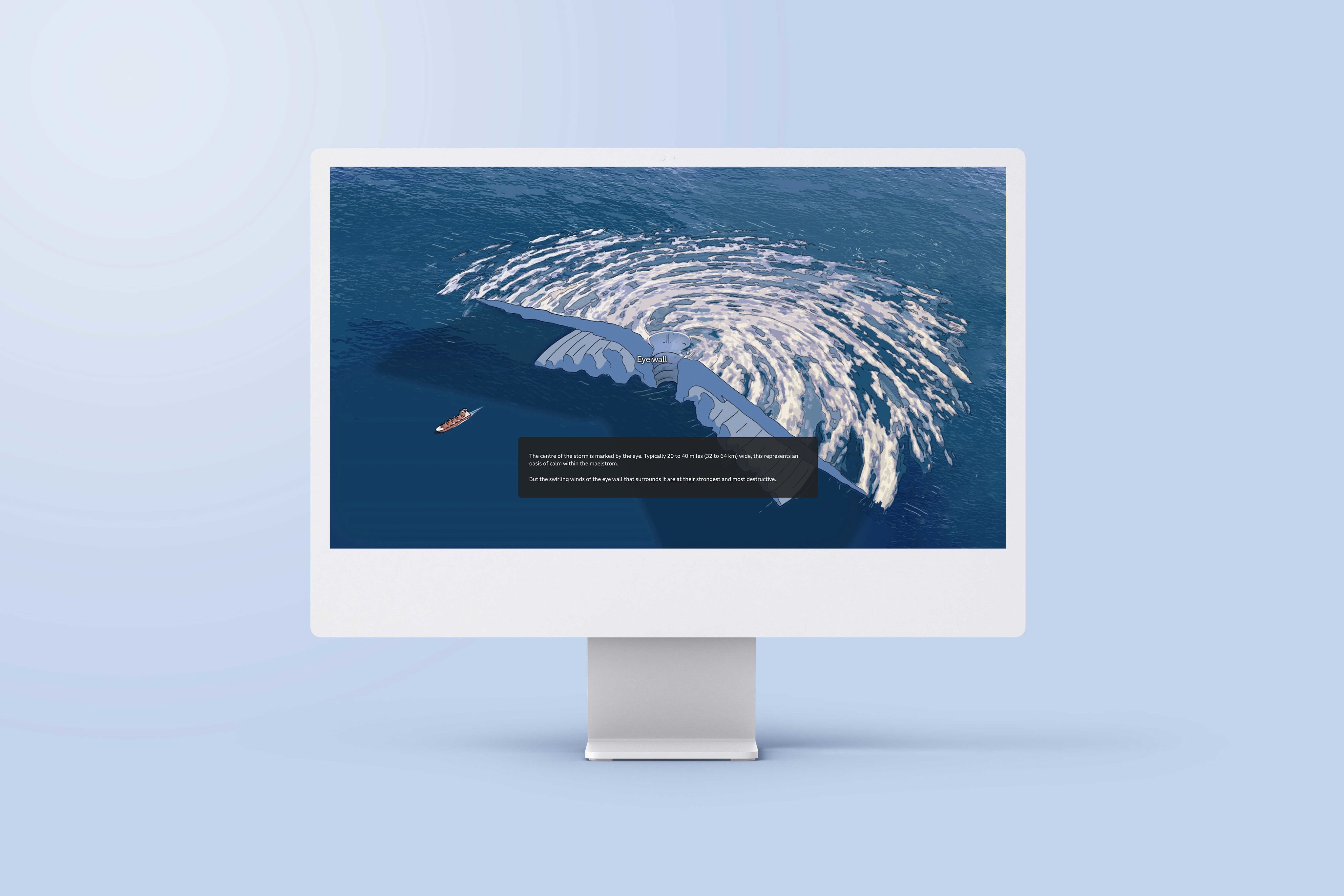
7. Hurricanes: Inside the deadly storms
- What it is: an immersive news feature that takes readers inside the science and impact of hurricanes.
- Who created it: BBC News
- What the map shows: this multimedia story leans on a rich combination of interactive maps, satellite imagery, and illustrated animations to explain how hurricanes form, strengthen, and move.
Why we picked this example
A combination of interactive maps and animated graphics helps break down a complex natural phenomenon. Instead of relying on text alone, the visuals show how warm ocean waters, Earth’s rotation, and storm structure come together to create powerful hurricanes. As readers progress through the story, the graphics trace a hurricane’s lifecycle from formation over tropical waters through intensification and eventual landfall, turning invisible forces like wind patterns into something tangible.

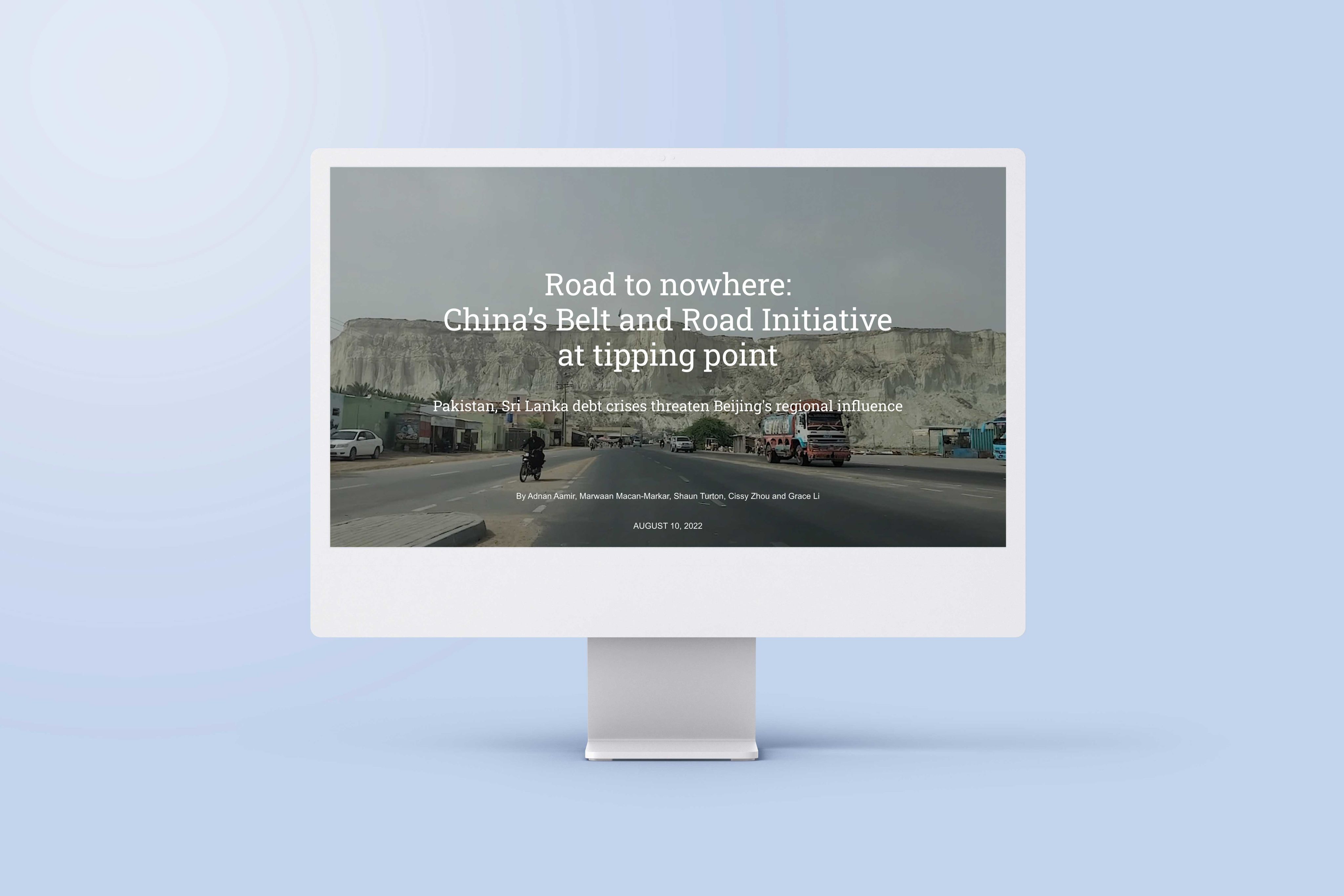

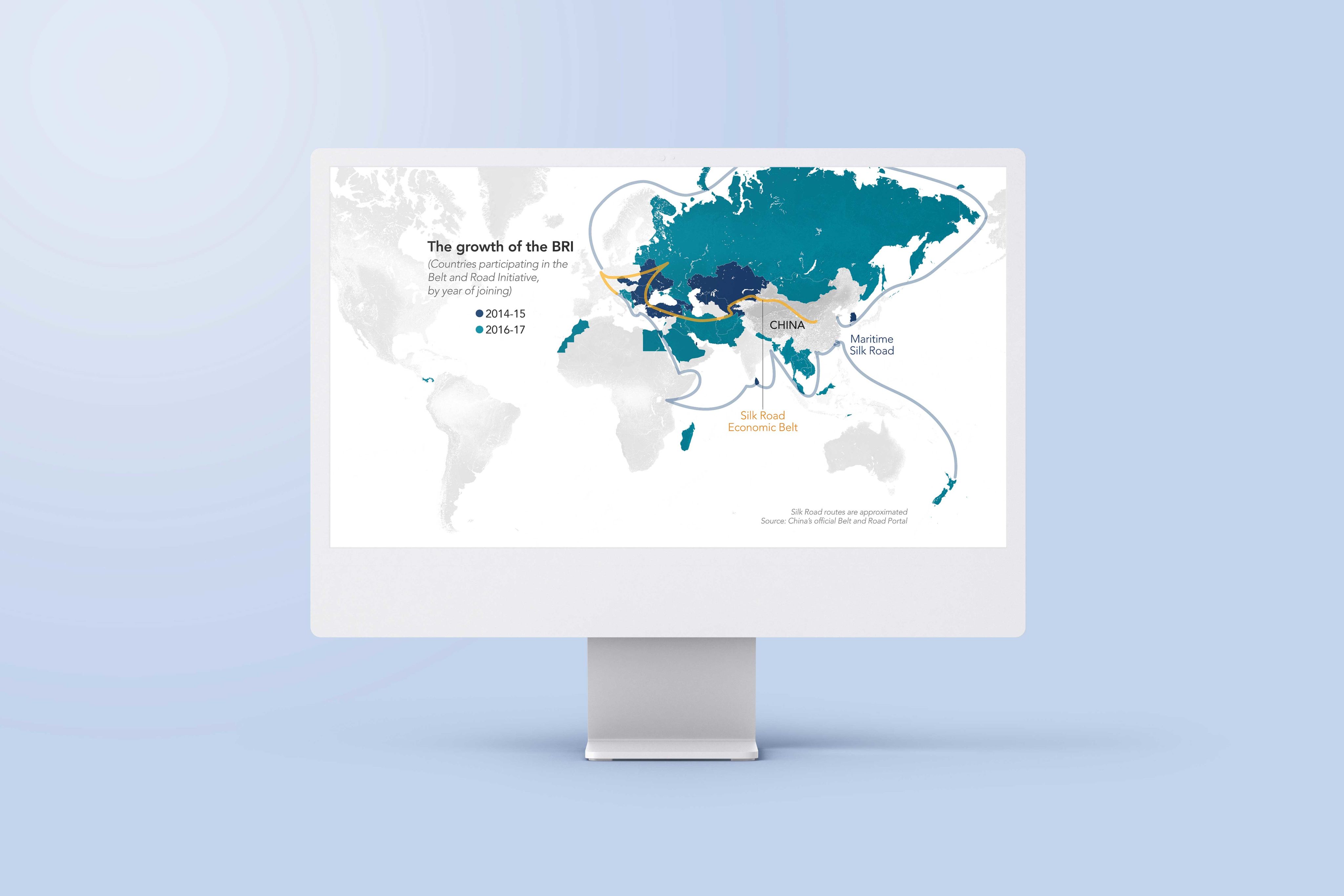

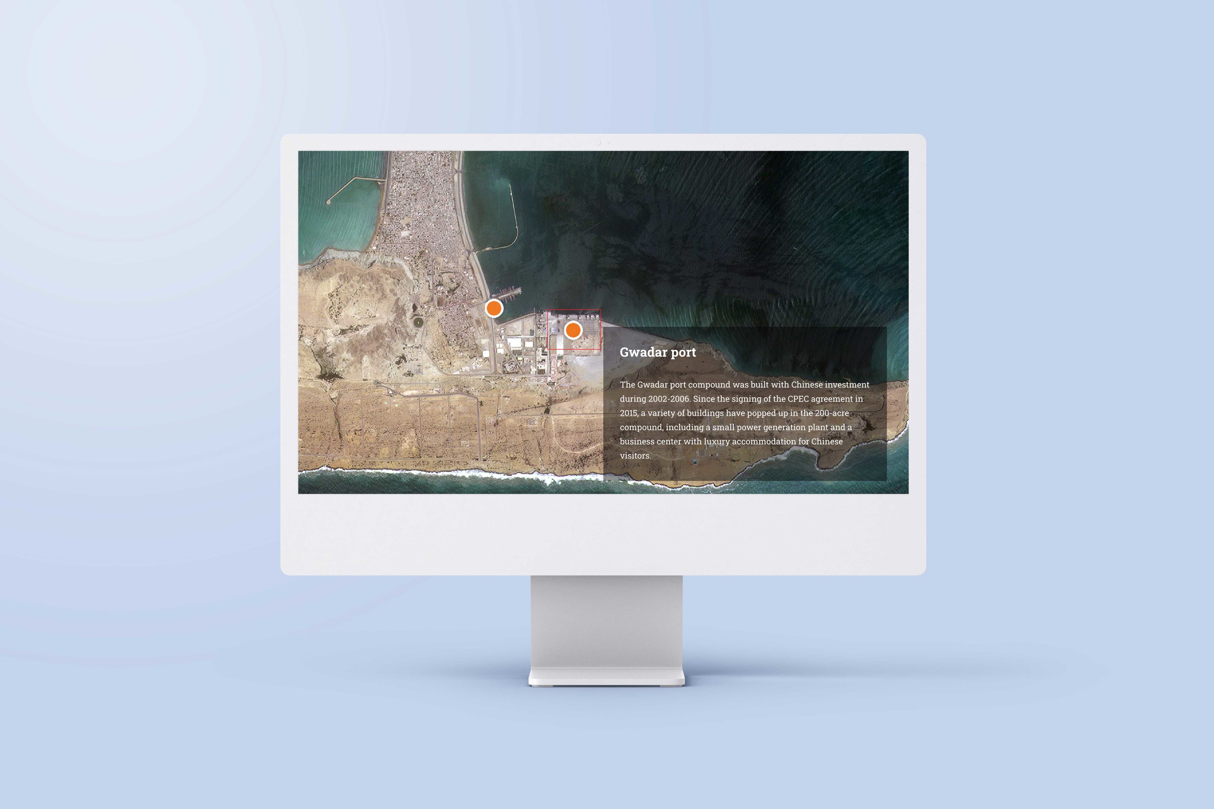
8. Road to nowhere: China’s Belt and Road Initiative at tipping point
- What it is: an article on China’s Belt and Road Initiative (BRI).
- Who created it: Nikkei
- What the map shows: the global spread and ambitions of the BRI.
Why we picked this example
This article from Nikkei uses a simple but powerful map to show the development, scale, and ambition of the Chinese Belt and Road Initiative (BRI). Using Scrollmation, the map highlights countries participating in the BRI as the years progress from 2014 to 2022.
Early in the story, the map helps to hammer home the global ambition of the policy, before diving into its failures and stagnation.

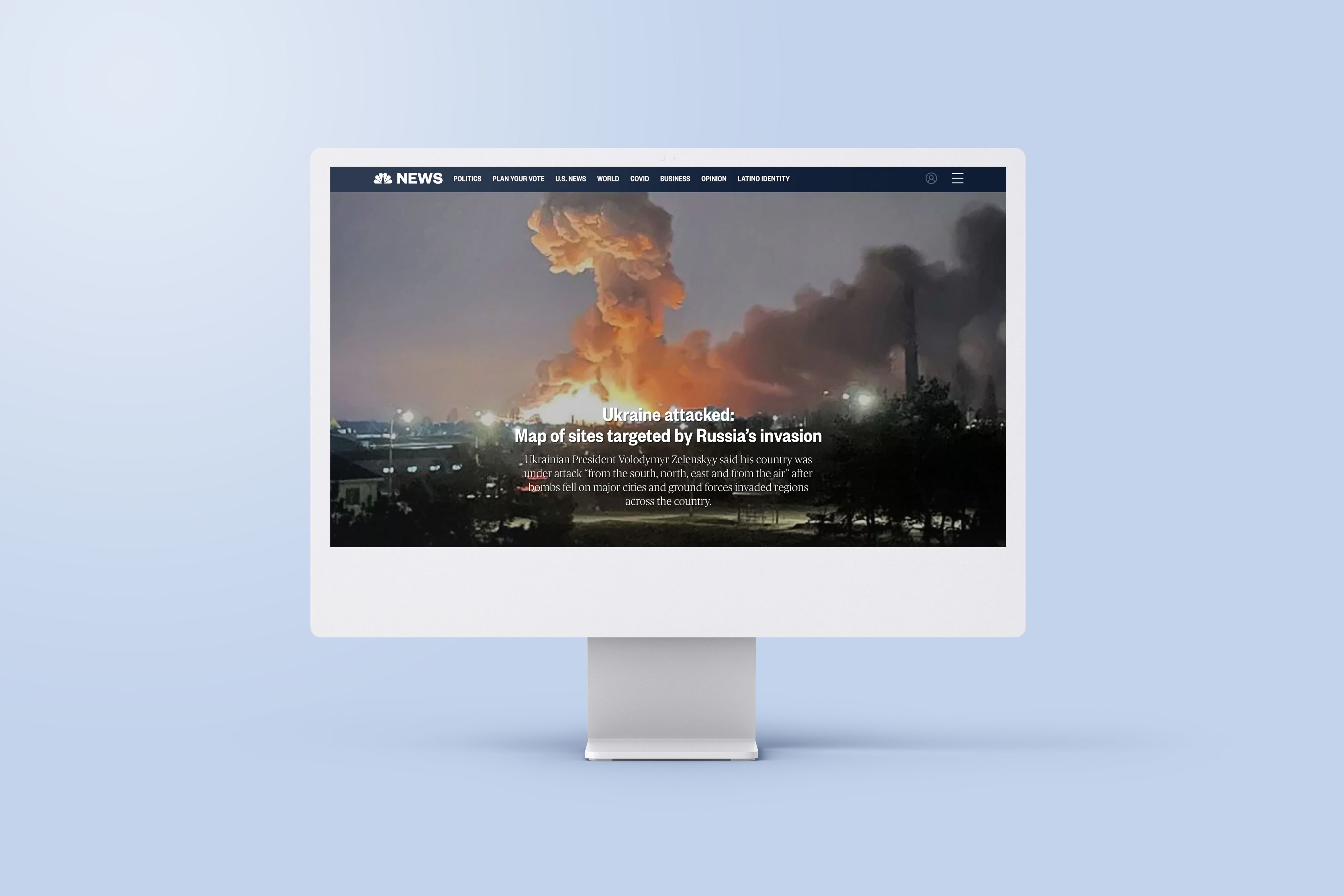

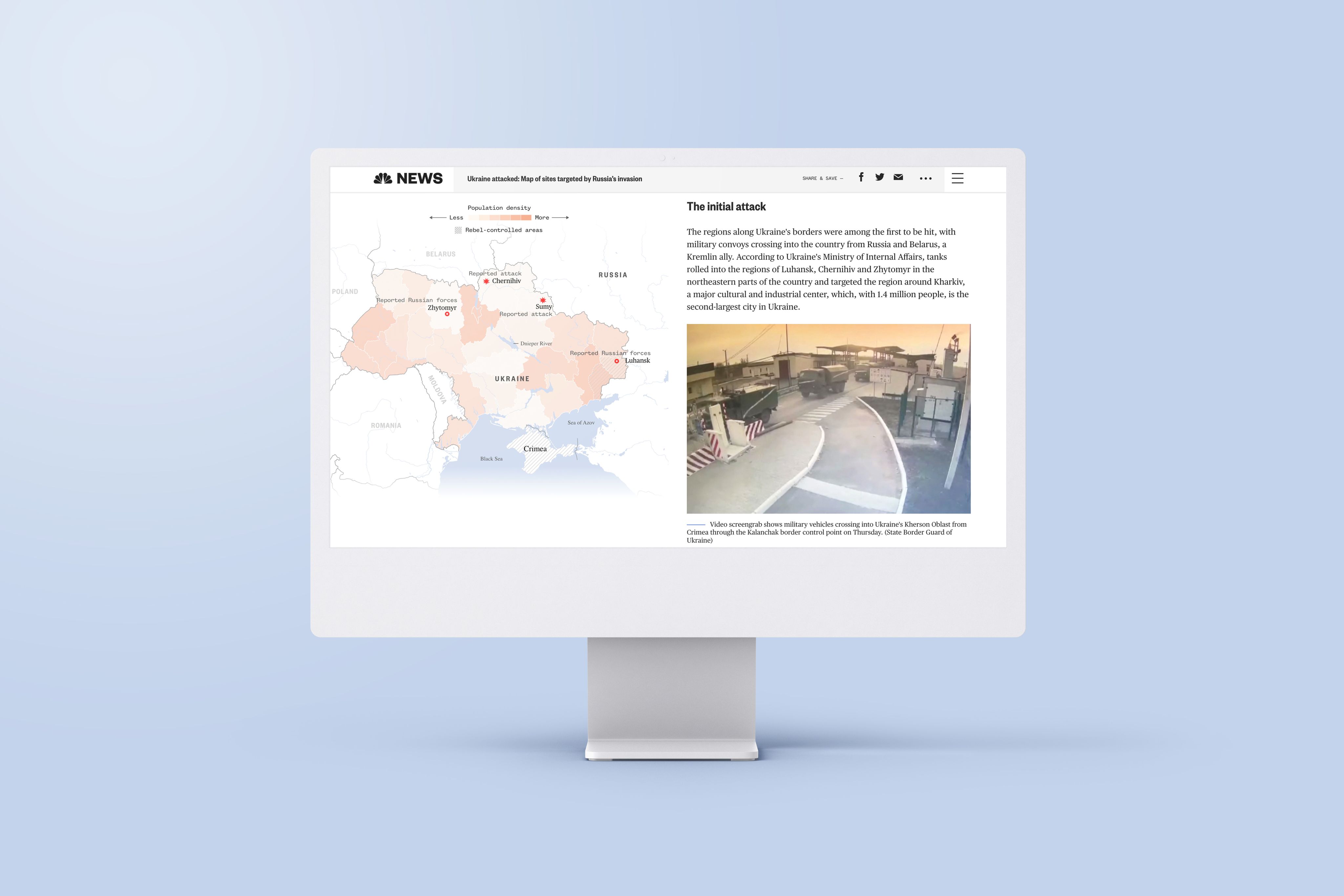

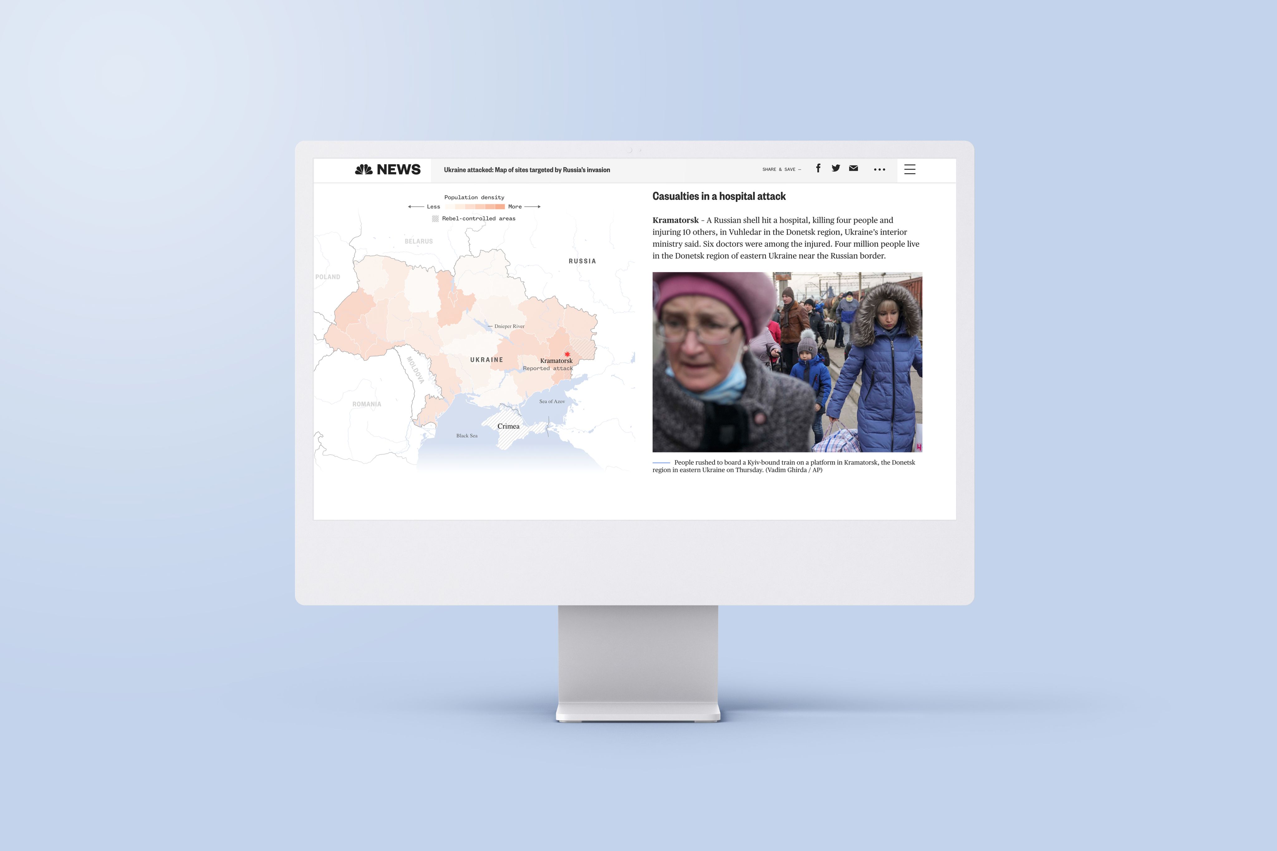
9. Ukraine attacked: Map of sites targeted by Russia’s invasion
- What it is: a news report detailing Russian attacks on Ukraine.
- Who created it: NBC News
- What the map shows: the location of attacks.
Why we picked this example
This interactive map from NBC News does two things incredibly well. For one, it shows readers — many of whom have likely never been to Ukraine — where Russian attacks have taken place. At the same time, it helps the audience contextualise the timeline of the war.
The map doesn’t move; it’s always visible along the left-hand side. But it changes as you scroll, highlighting the location of individual attacks and reports of Russian forces in tandem with the timeline of the written article.

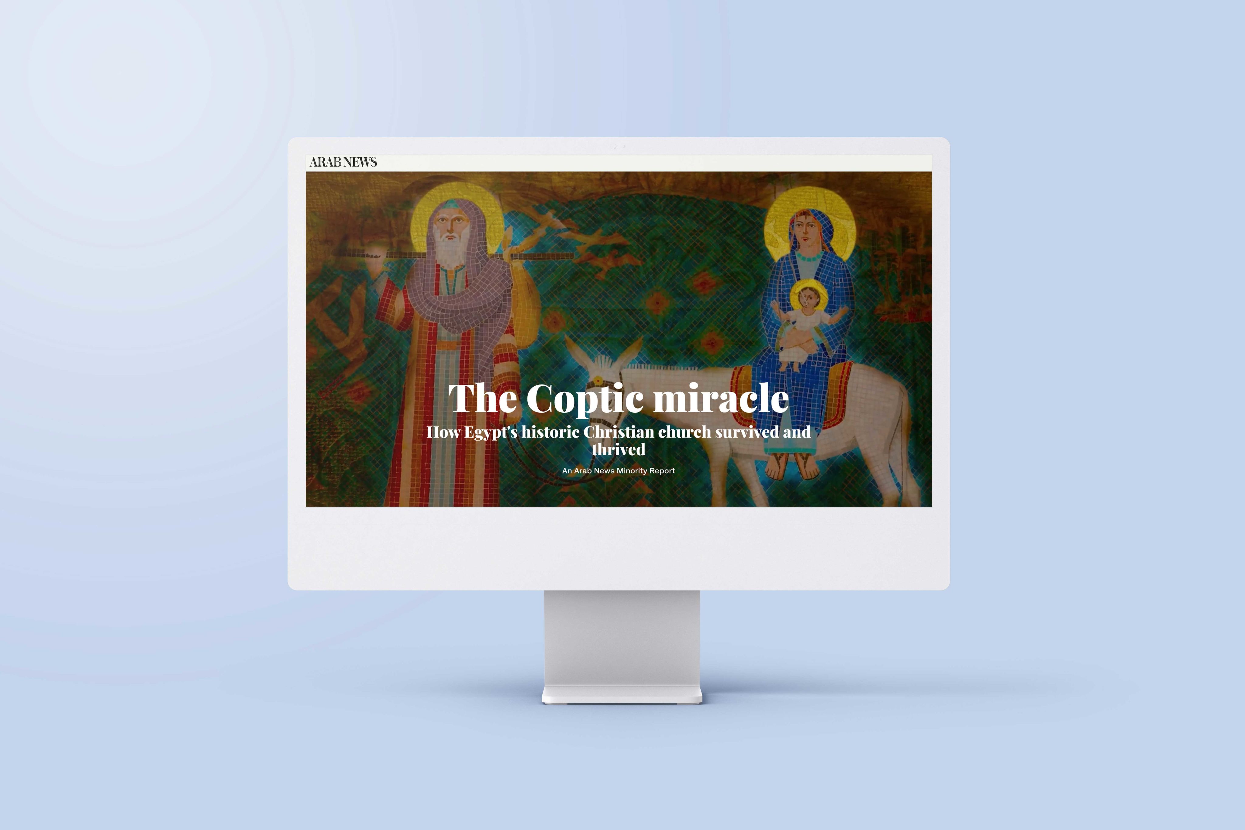

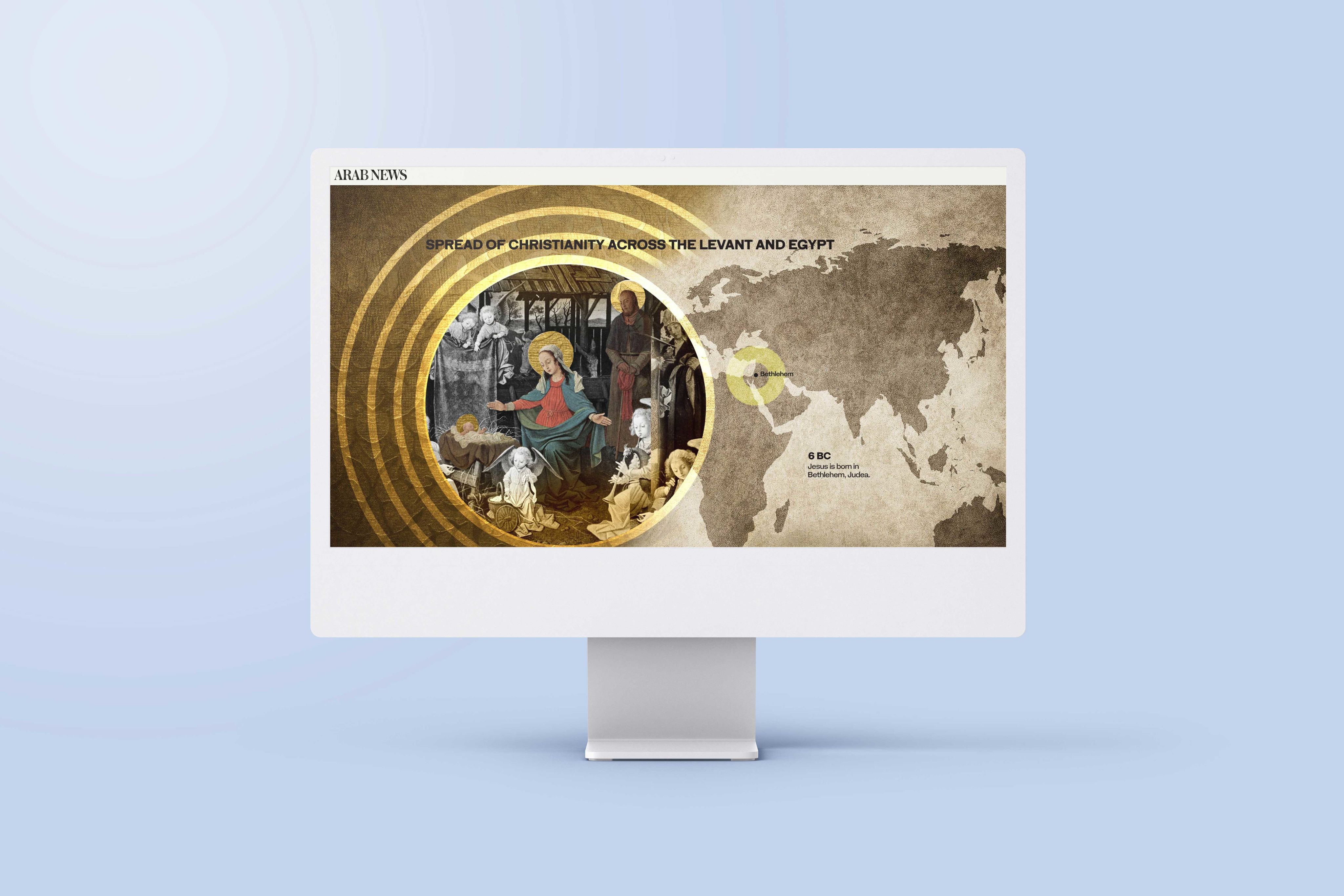

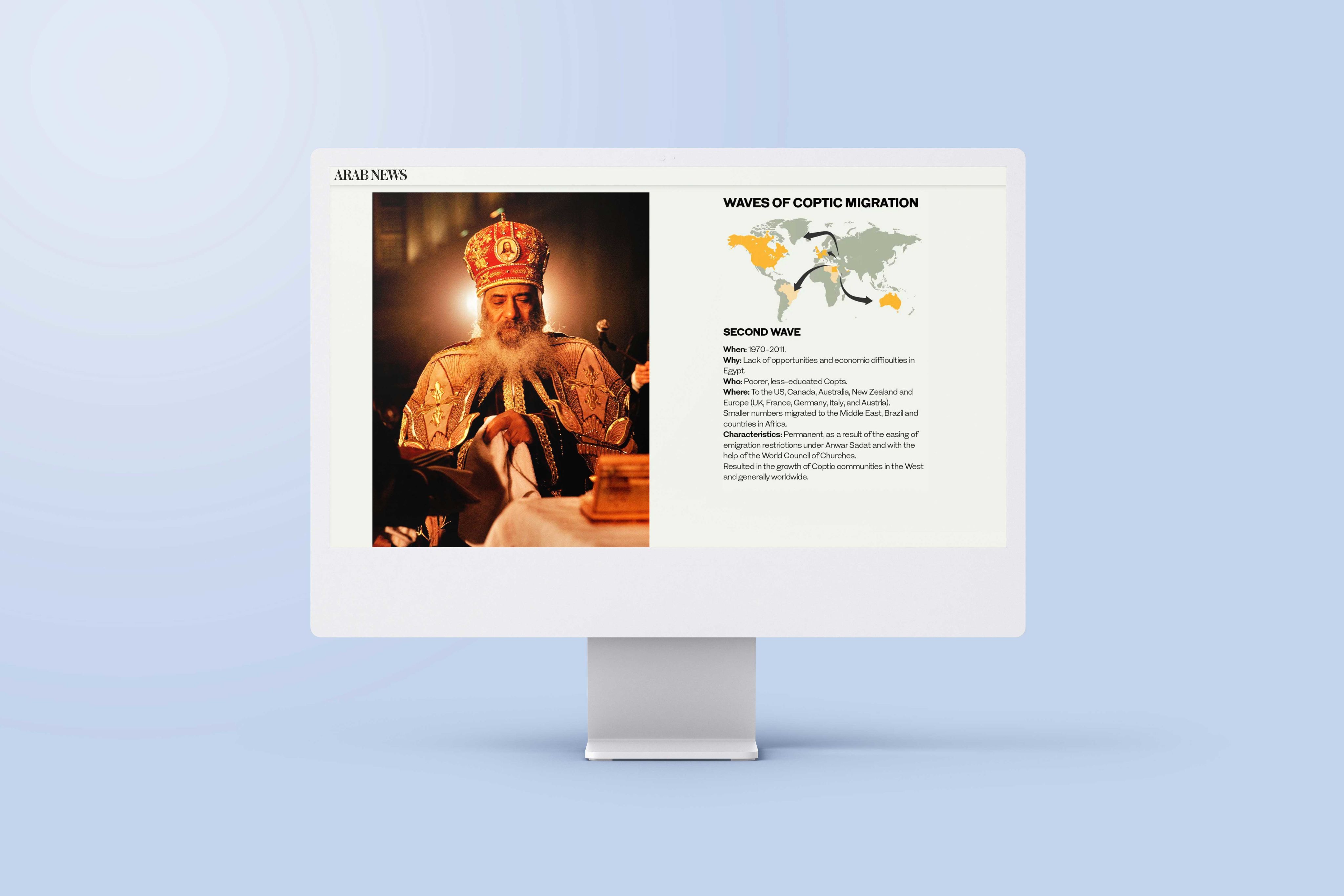
10. The Coptic miracle: How Egypt's historic Christian church survived and thrived
- What it is: a history of the development of Coptic Christianity.
- Who created it: Arab News
- What the map shows: the three waves of migration of Coptic Christianity around the world.
Why we picked this example
This story from Arab News uses interactive maps in a few ways. The first map is an example of stunning visual and web design and helps showcase how Christianity originally came to Egypt and the surrounding region. The highlighted areas show this spread and include years to help readers understand the timeline.
The second world map, later in the story, visualises the diaspora of Coptic Christianity beyond Egypt as a result of persecution. As you scroll, it clearly shows the route of each of the three waves of migration across the globe.

Wrapping up
As the examples above illustrate, there’s a huge variety of ways to use and approach interactive maps. The investigative news articles, in particular, make it clear how powerful interactive maps can be for digital storytelling — there’s so much potential for map-based storytelling on the web.
With digital technologies and tools making this kind of interactivity accessible to a growing number of people, there are exciting horizons ahead for every sector, from journalism and tourism, to education, nonprofit, and beyond.
Start creating with Shorthand
It's the fastest way to publish beautifully engaging digital stories — with interactive maps, timelines, and more.