5 excellent examples of longform content

One of the myths of modern marketing is that attention spans are getting shorter, and it follows that the only way to cut through the noise is by going viral with a TikTok dance.
by Claire Deane
The good news is that this isn't true. As Brendon Hufford puts it, people don't have short attention spans, they have short consideration spans. And these days, they have a lot to consider.
Great longform content still has the capacity to capture and keep the attention of a busy audience. But if we look at what's working in longform content, we see there's a catch: it has to be great.
And the definition of what counts as 'great' content on the web is changing. Audiences now expect longform pieces to combine immersive visual content like multimedia and interactive elements, with excellent writing and UX design.
What does this look like? Read on to find out:
How to create a great piece of longform content
We’ve analysed some of the best pieces we’ve seen at Shorthand, and some of the common criteria are:
- Provide real value and interest to readers: Dig into an important issue, help to solve a particular problem, provide actionable advice, or give space for a long in-depth interview.
- Don't go overboard: While there’s plenty of metrics on the optimal length for longform content (Hubspot cites between 1500 and 2330 words, while Wordstream believes a seven-minute read time is the sweet spot for content length), the best pieces dive deep into a topic, without adding fluff.
- Design beautifully: And use imagery and video to keep readers engaged.
- Use multimedia content: Like data, maps, video, and images to help readers get an even deeper understanding of the topic.
- Write for humans: Don't write for the algorithm (but longform content is great for the algorithm too).
5 examples of great longform content
(and why they work)
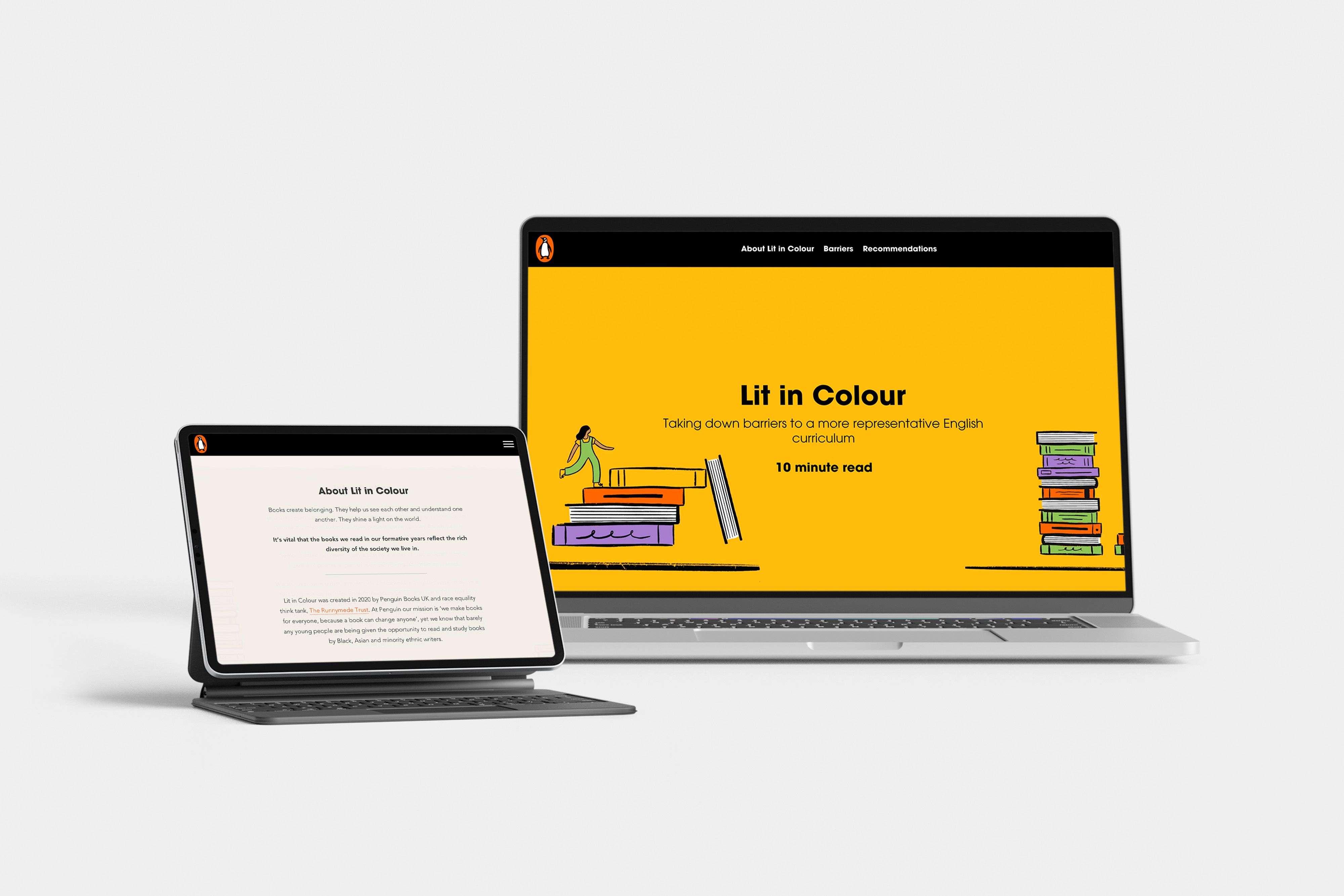
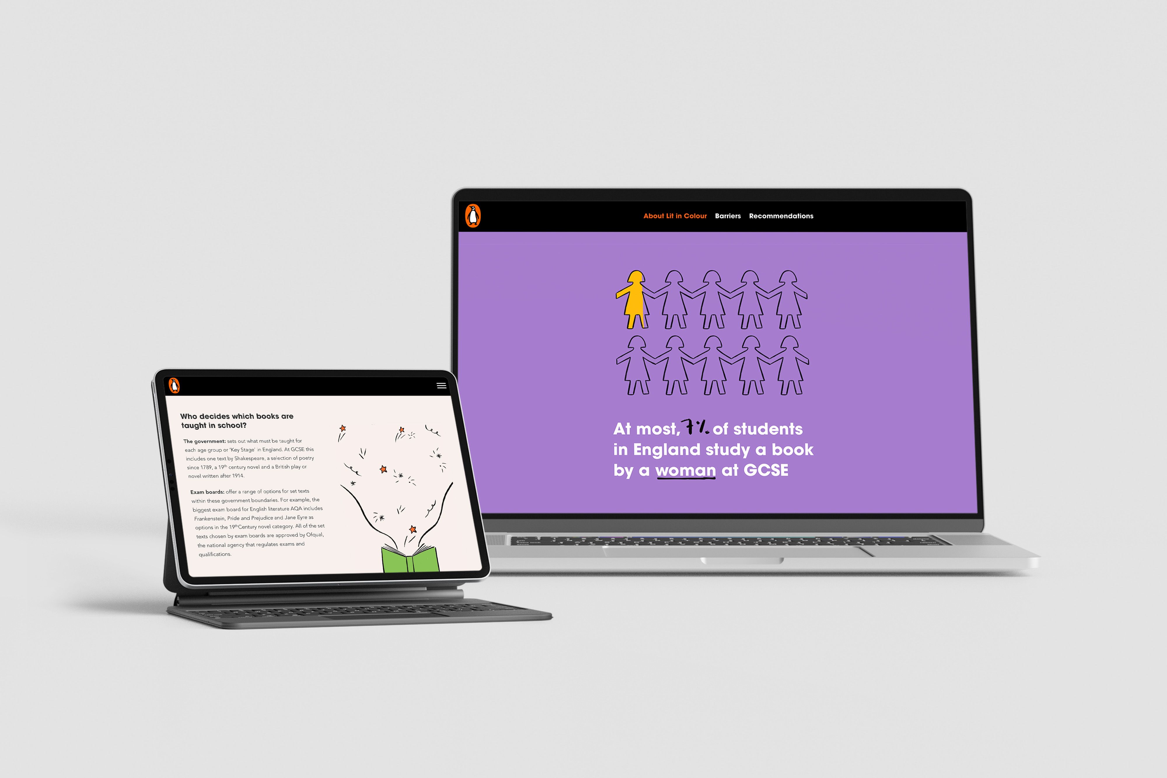
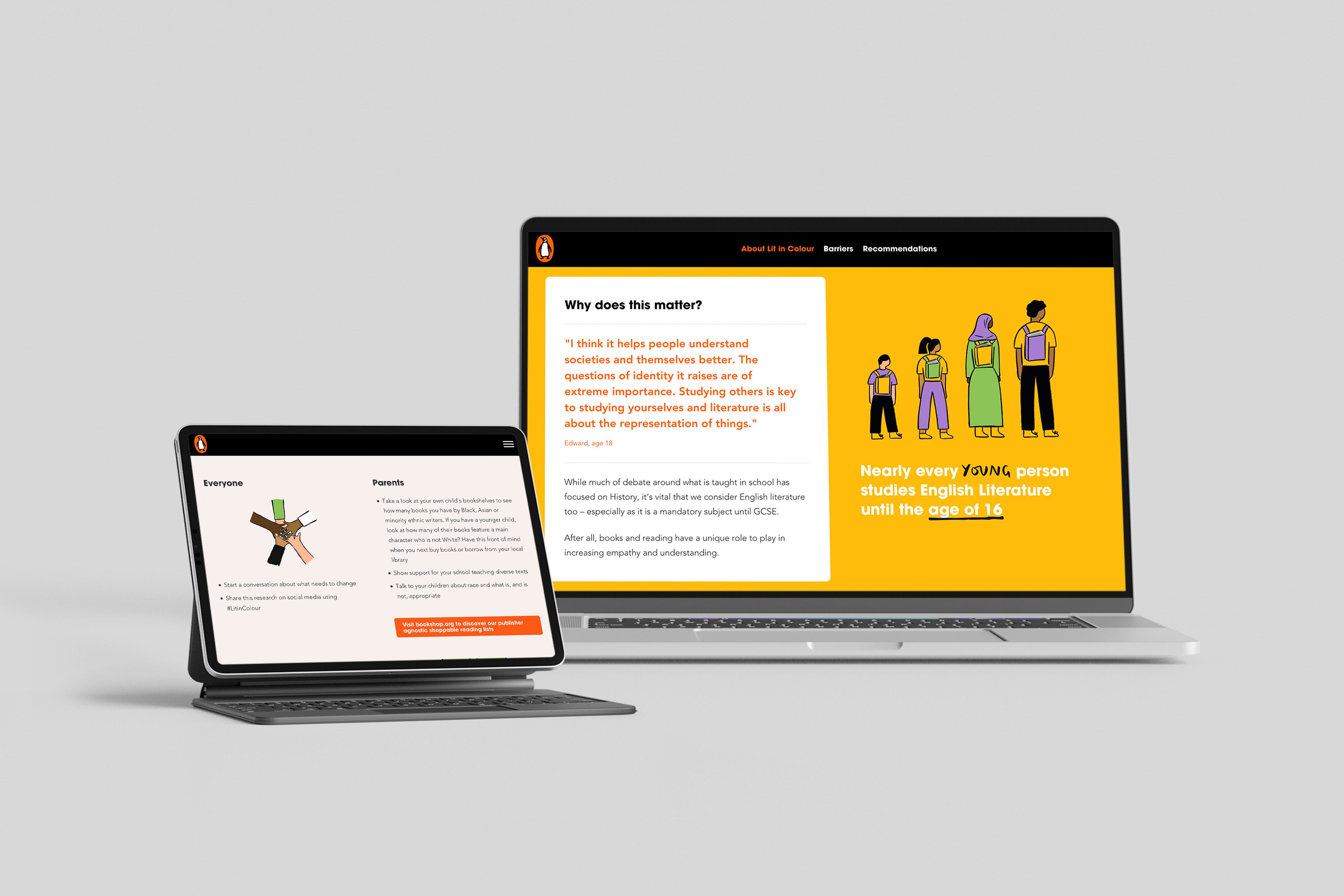
Penguin Books UK’s Lit in Colour program, along with race equality think tank, The Runnymede Trust, produced a report outlining how schools in the UK could make the teaching and learning of English literature more inclusive. While the report could have existed as a (rarely read) PDF, Penguin Books UK created a piece of visual longform content designed to make the findings and recommendations accessible.
Why it works
- Start with user experience in mind. In this case it’s the '10 minute' indicated read time that appears at the top of the page. Data shows that engagement rates on longform articles increase by up to 40% after reading times are added.
- Make long feel short. This piece of longform content is just that — long! However, the content is broken up with visually interesting elements, including strong quotes from other sources and subheadings. Not only do these help break up and categorise the content, and improve readability, the use of quotes is an engaging way to prove their point by adding an impartial, outside voice.
- Say it with imagery. Infographics are a great way of making data easier to consume, particularly in longform content. Infographics have been shown to “help establish expertise, can improve visibility in multimedia search, attract high-quality links, and attract new leads,” according to Search Engine Journal. Using them also makes it far easier for readers to stay engaged with your content, helping them digest key facts and figures at a glance. Learn more about using data and infographics to tell a compelling story.
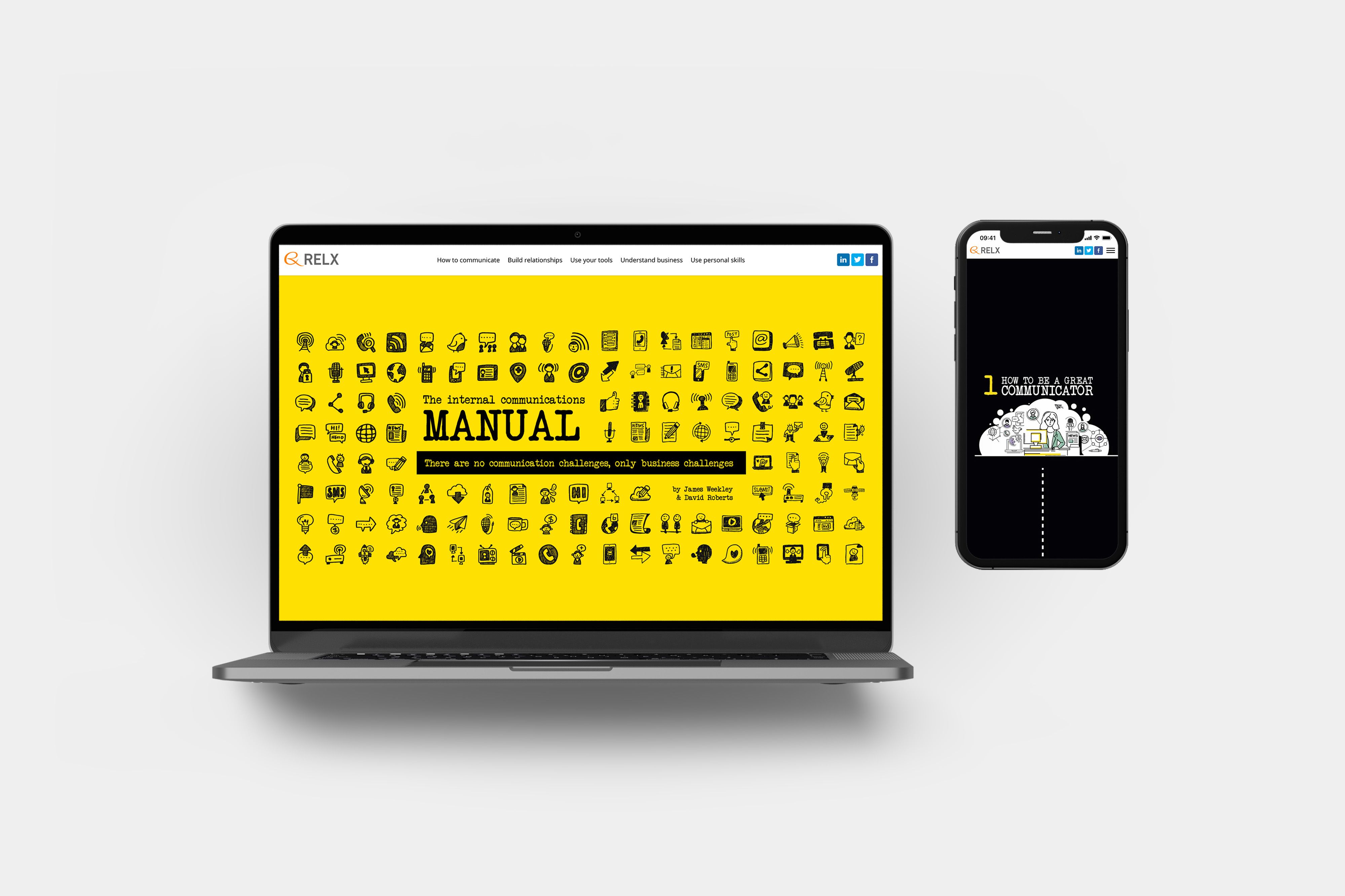
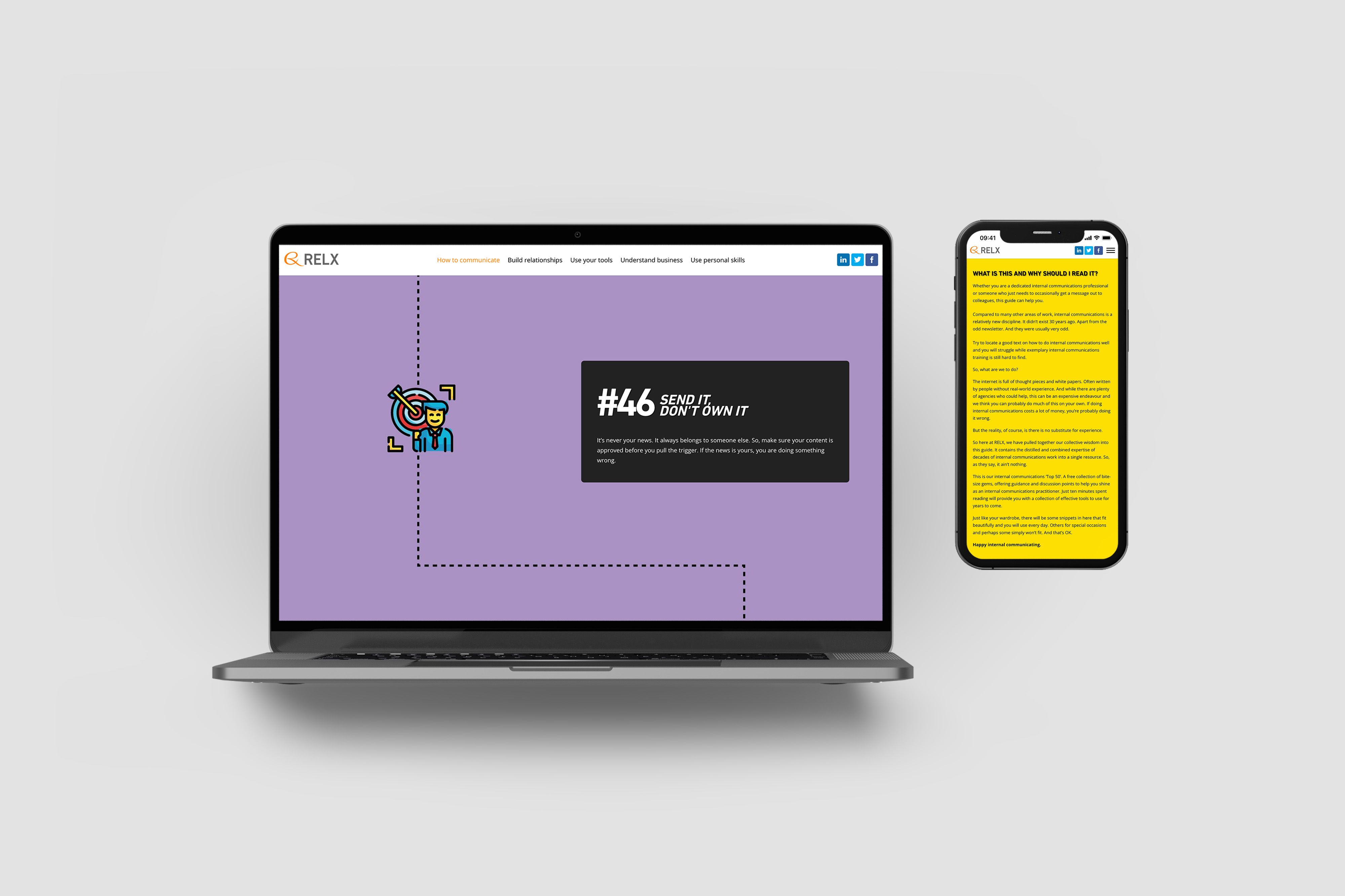
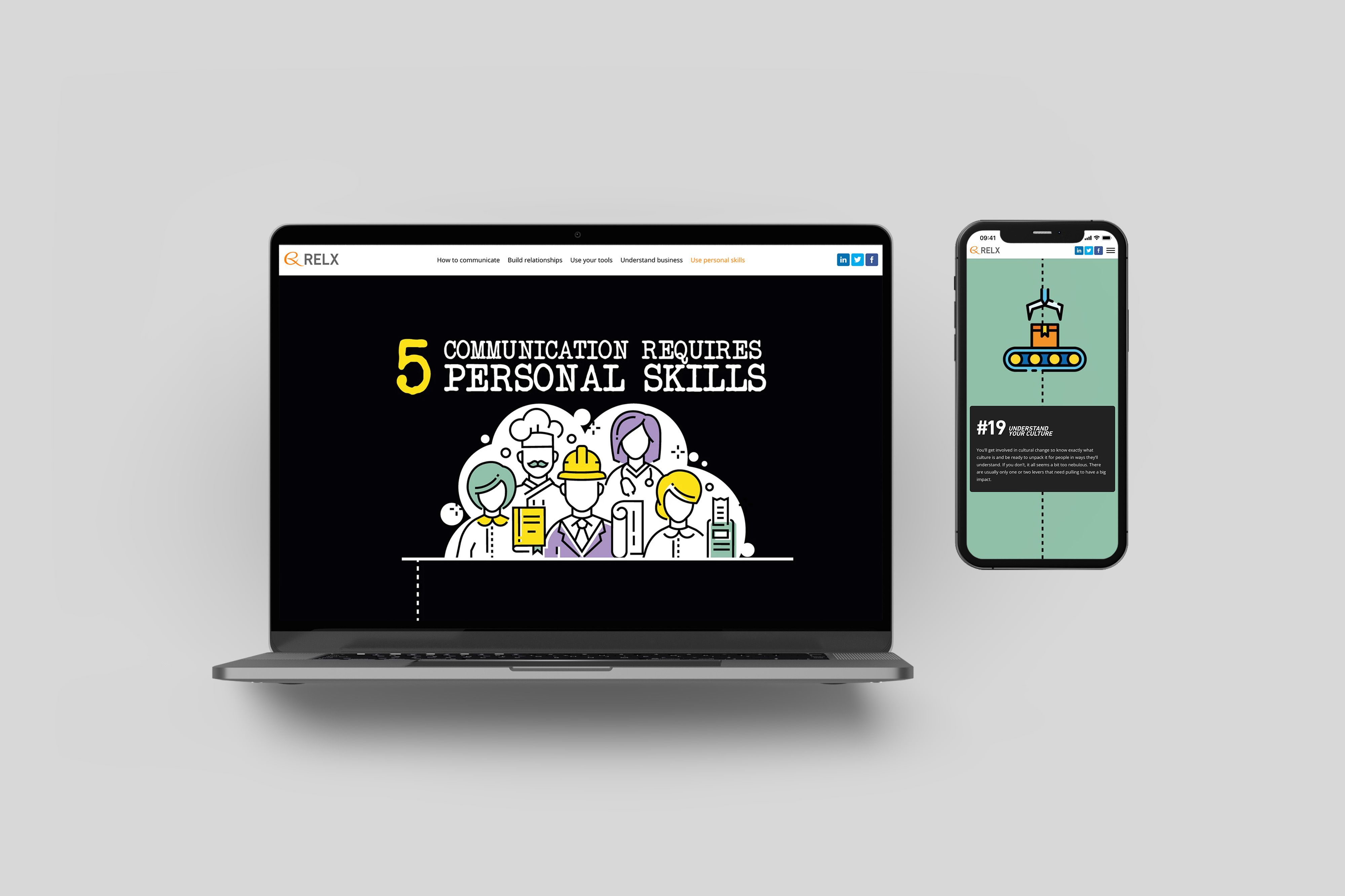
RELX wanted to share its collective years of internal communications wisdom while also creating a top-of-funnel resource that would demonstrate its knowledge to prospective clients. The Internal Communications Manual is a beautiful piece of content for internal comms practitioners that also serves to demonstrate RELX's quirky tone of voice.
Why it works
- Google (sometimes) loves a long list. RELX’s choice to compile a listicle of 50 top tips for internal communicators is strategic. The number feels meaty, but the short, snappy blurbs also make it digestible.
- Make readers feel at home. This piece of longform content is reminiscent of a microsite. It features a clear navigation across the top of the screen to help users jump to the sections that are important to them. This structure is familiar to readers, and also helps keep them engaged by giving them a sense of control over how they read.
- Map the reader’s journey. The graphic elements of the piece take readers on a journey. The imagery acts like a map that encourages readers to follow a path through the content, leading them to the next important tip. The writers have cleverly chosen to start their tips from #50, encouraging readers to work their way towards the #1 spot.
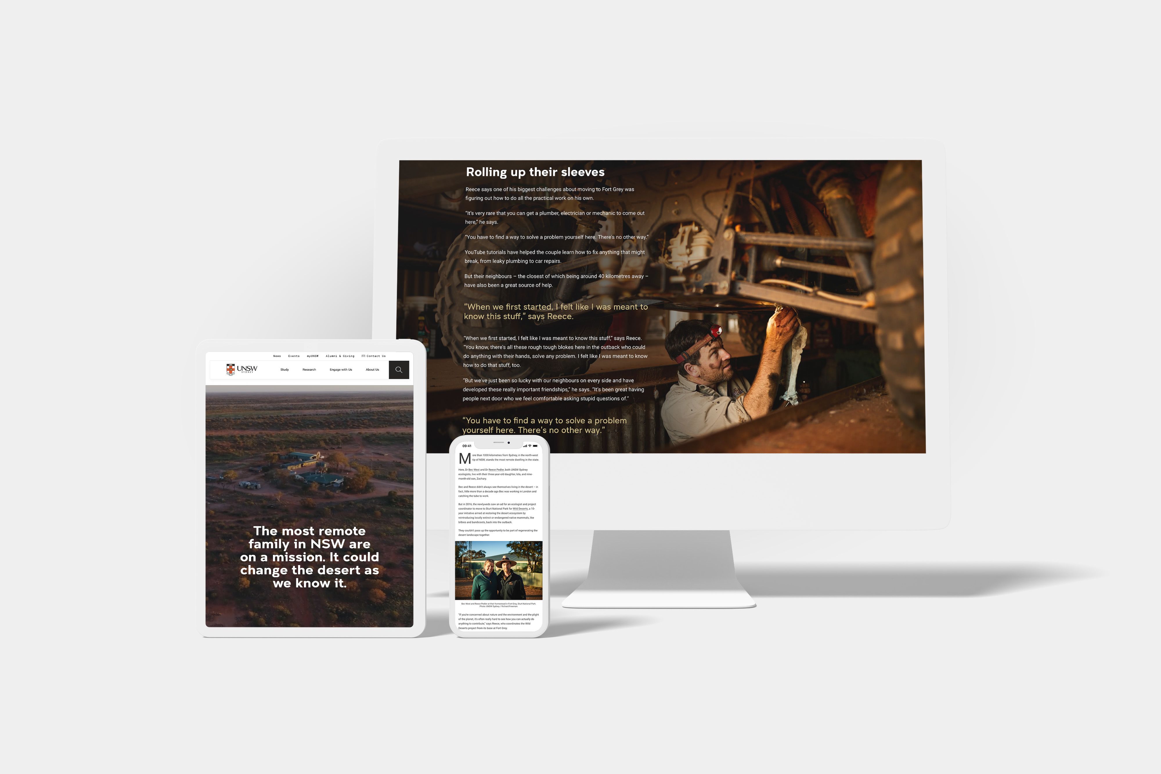
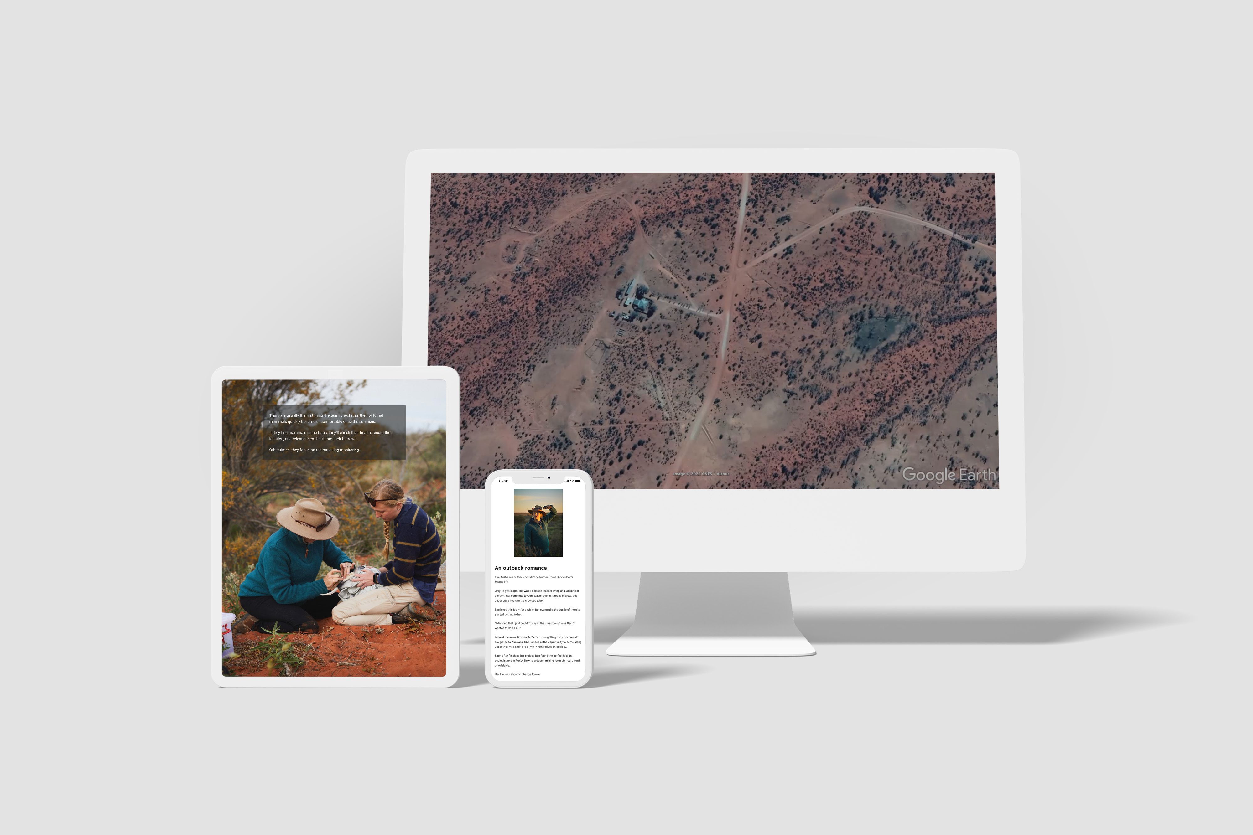
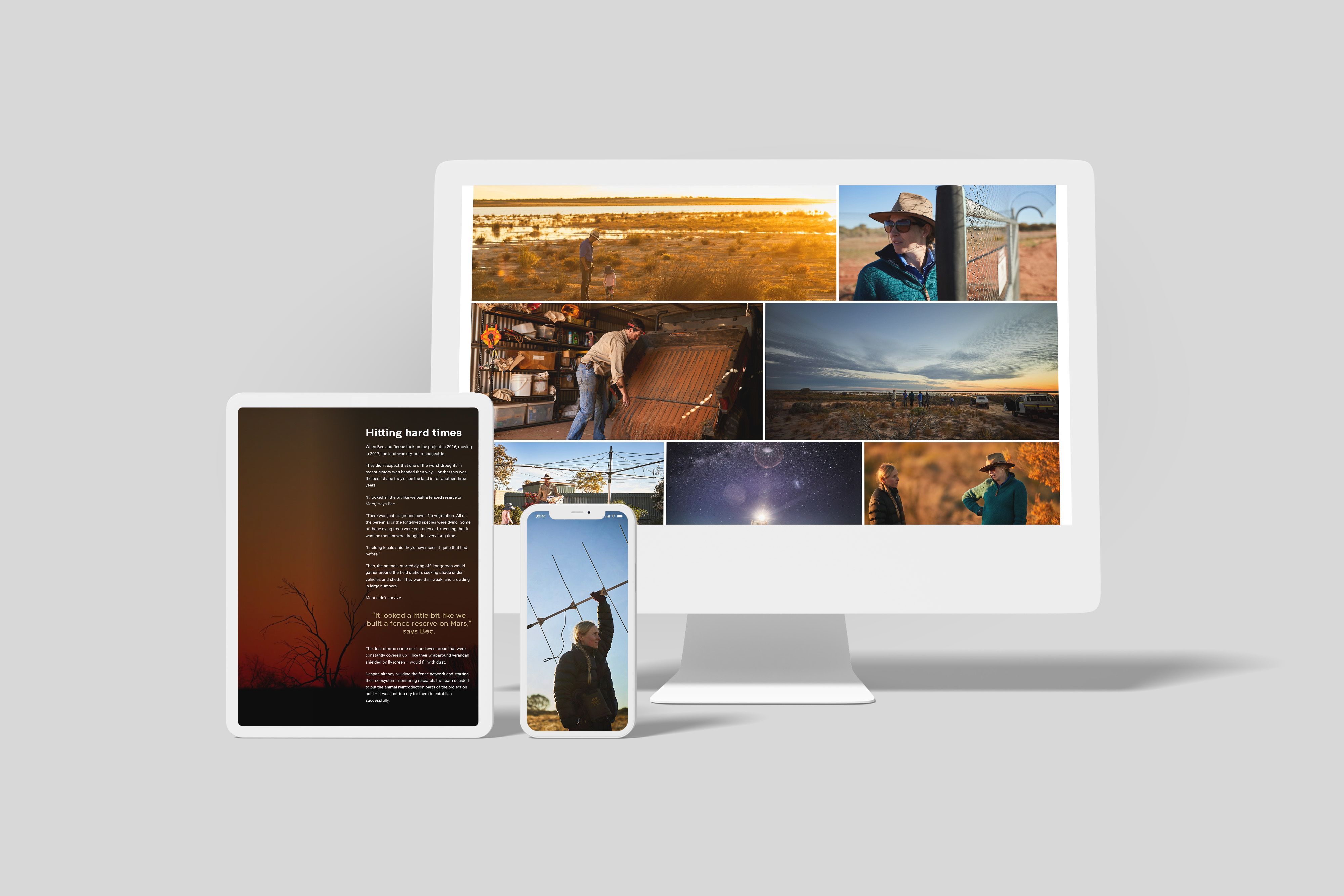
A research project about restoring the desert ecosystem in the outback of Sturt National Park could be a pretty dry subject. UNSW has humanised the story by focussing on the family behind the study, while integrating imagery and video to help readers understand the scale of the project and the landscape it’s being delivered in.
Why it works
- Leverage the world’s second largest search engine. YouTube videos embedded within the piece provide more context for the story, but also allow the authors to leverage YouTube as a search engine in its own right. The larger piece is made up of assets that can be distributed across multiple social channels, increasing the potential distribution and search engine ranking.
- Keep readers on your site for as long as possible. This piece features multiple links to other research and articles from the UNSW website. This keeps people on the website, encouraging them to read more about the work being done by the organisation.
- Make images work harder. Captions are used to describe the images, making them more meaningful than a visual element on their own. This approach is important for SEO, as well as making the content more accessible.
Looking for more great feature story examples? Check out our article, 7 examples of engaging feature stories.
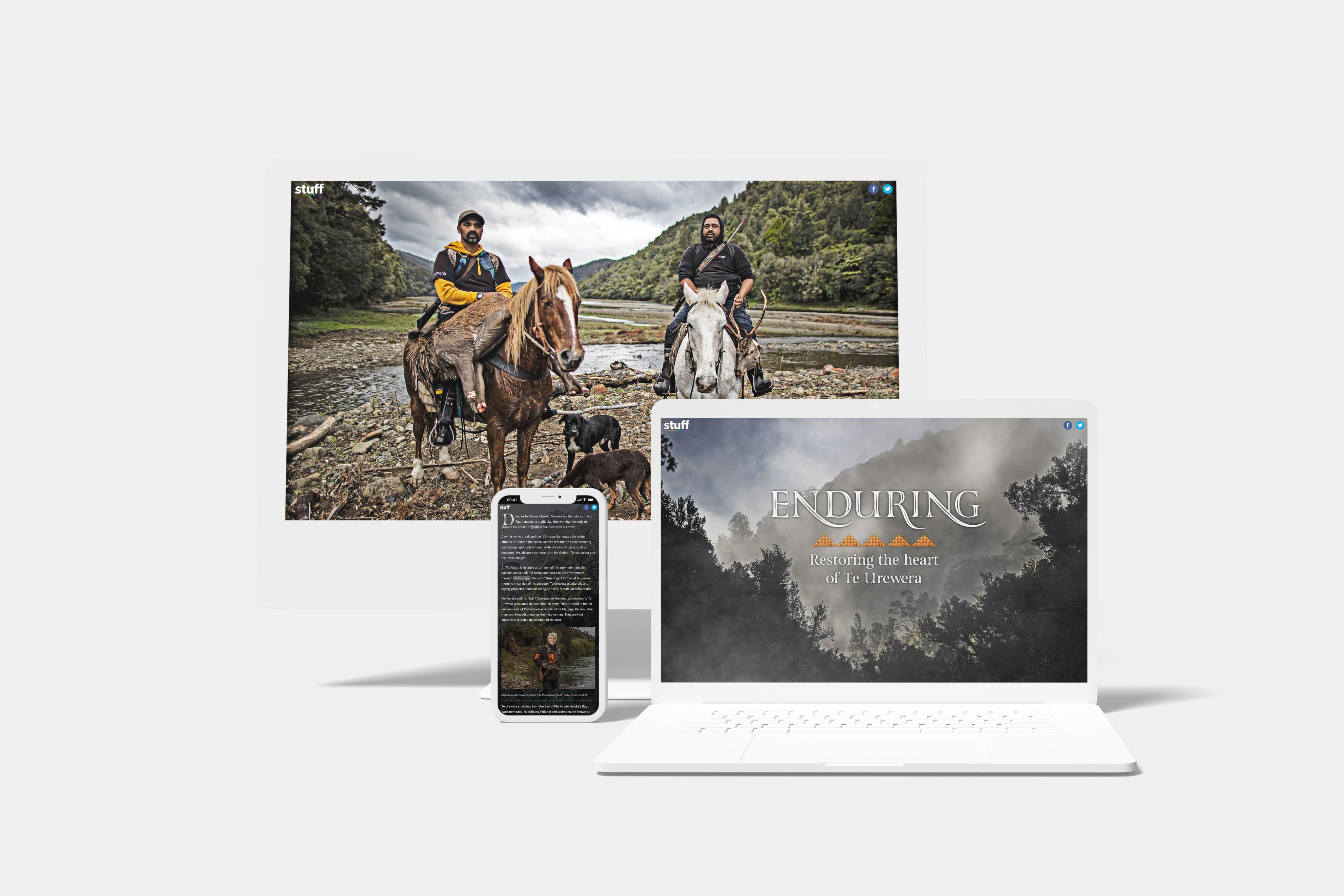
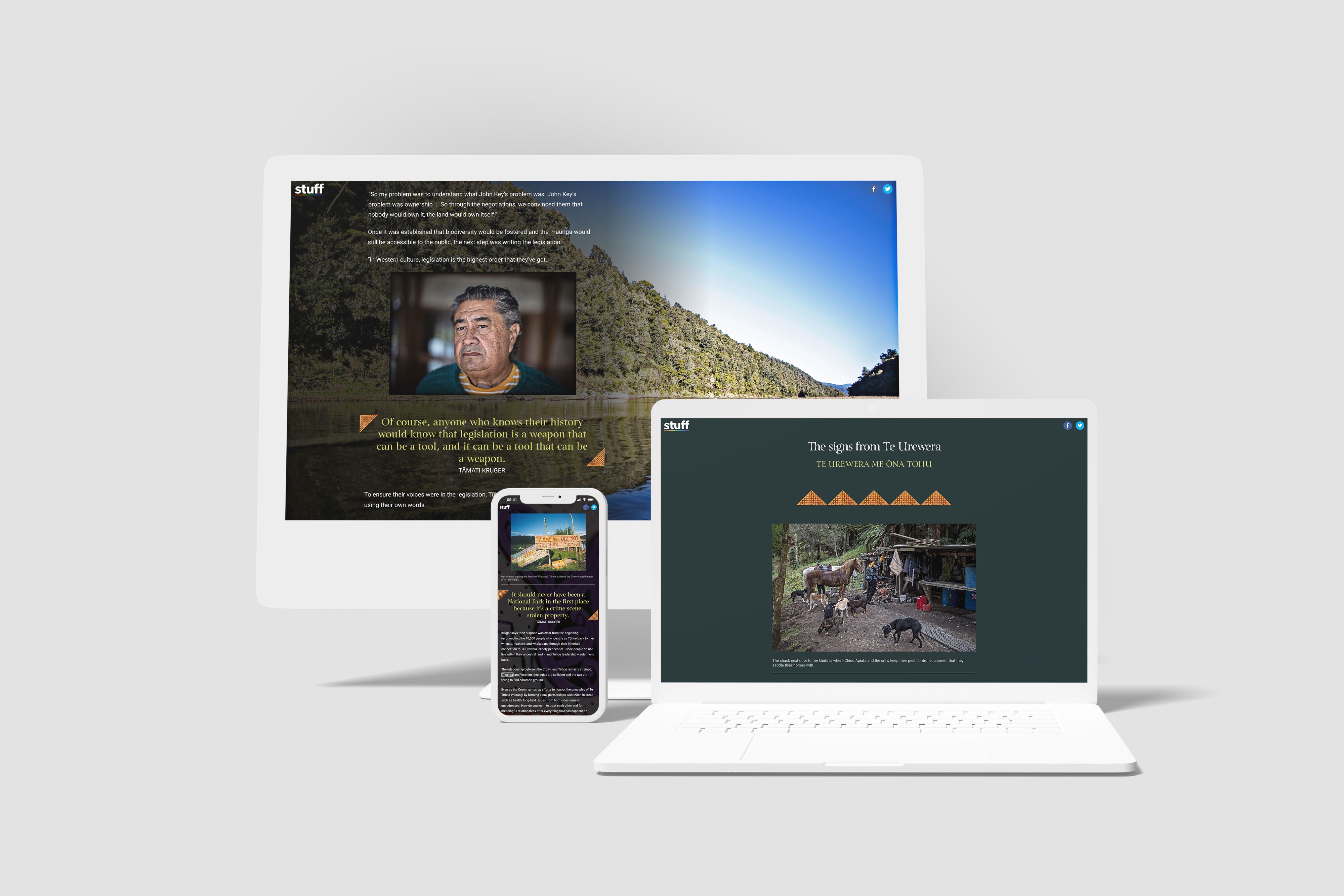
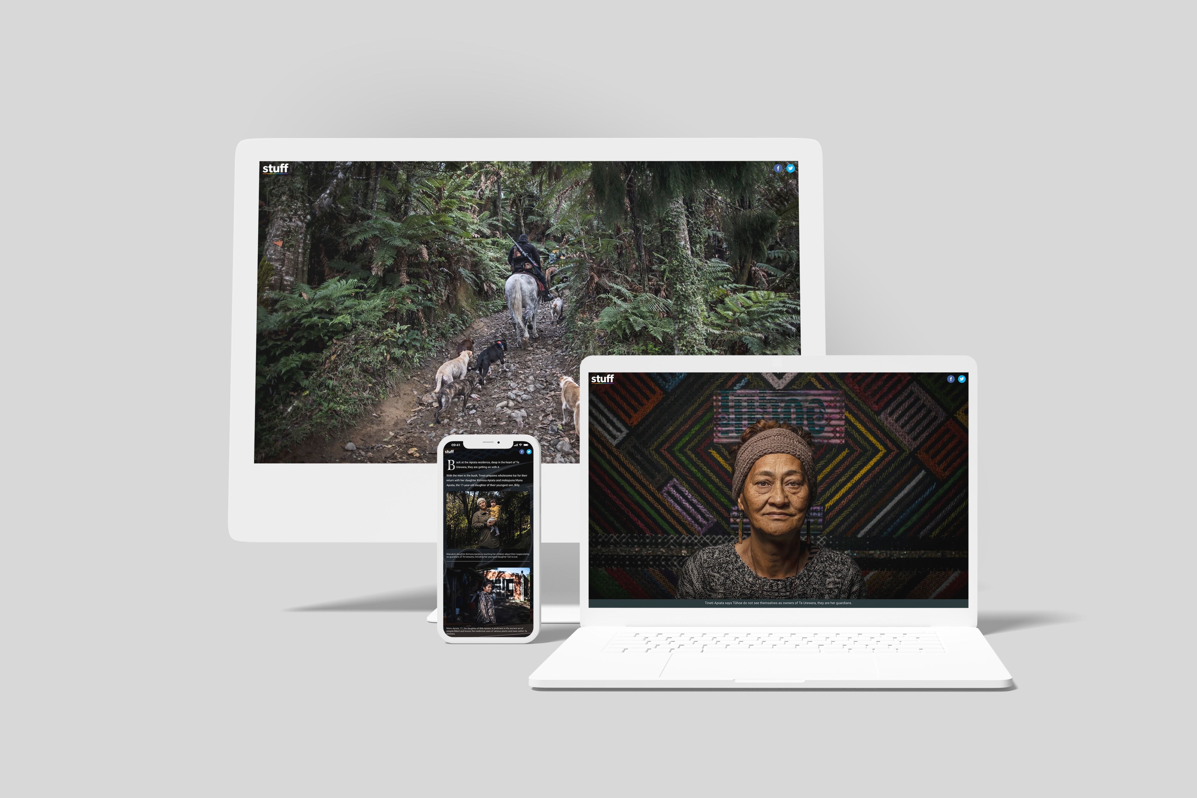
Stuff NZ’s feature editorial on the people of Te Urewera in New Zealand couldn’t have been told with just words on a page. Imagery, video, sound, and interactive elements make this story immersive and are critical to evoking an emotional connection with the reader.
Why this piece of longform content is so successful
- Consumer’s choice: listen, read or watch. Adding the option for users to listen to the story as a podcast lets readers consume the content in a way that suits them.
- Educate, but do it subtly. Interactive elements are used throughout the piece to keep readers engaged while maintaining the integrity of the story in the way it was told to the authors. This piece features in-article translations, allowing the authors to educate readers in a way that maintains the flow of the reading experience.
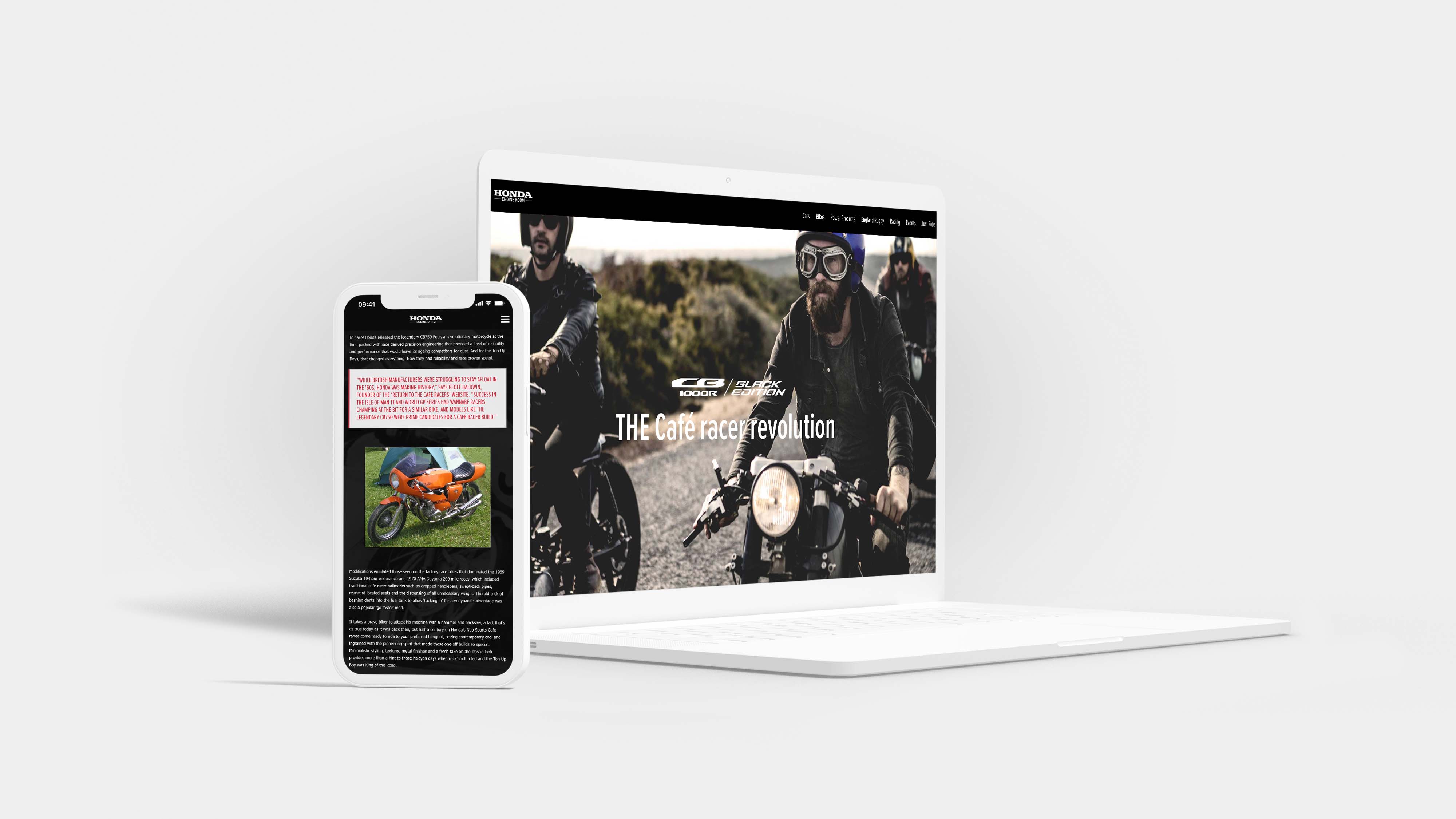
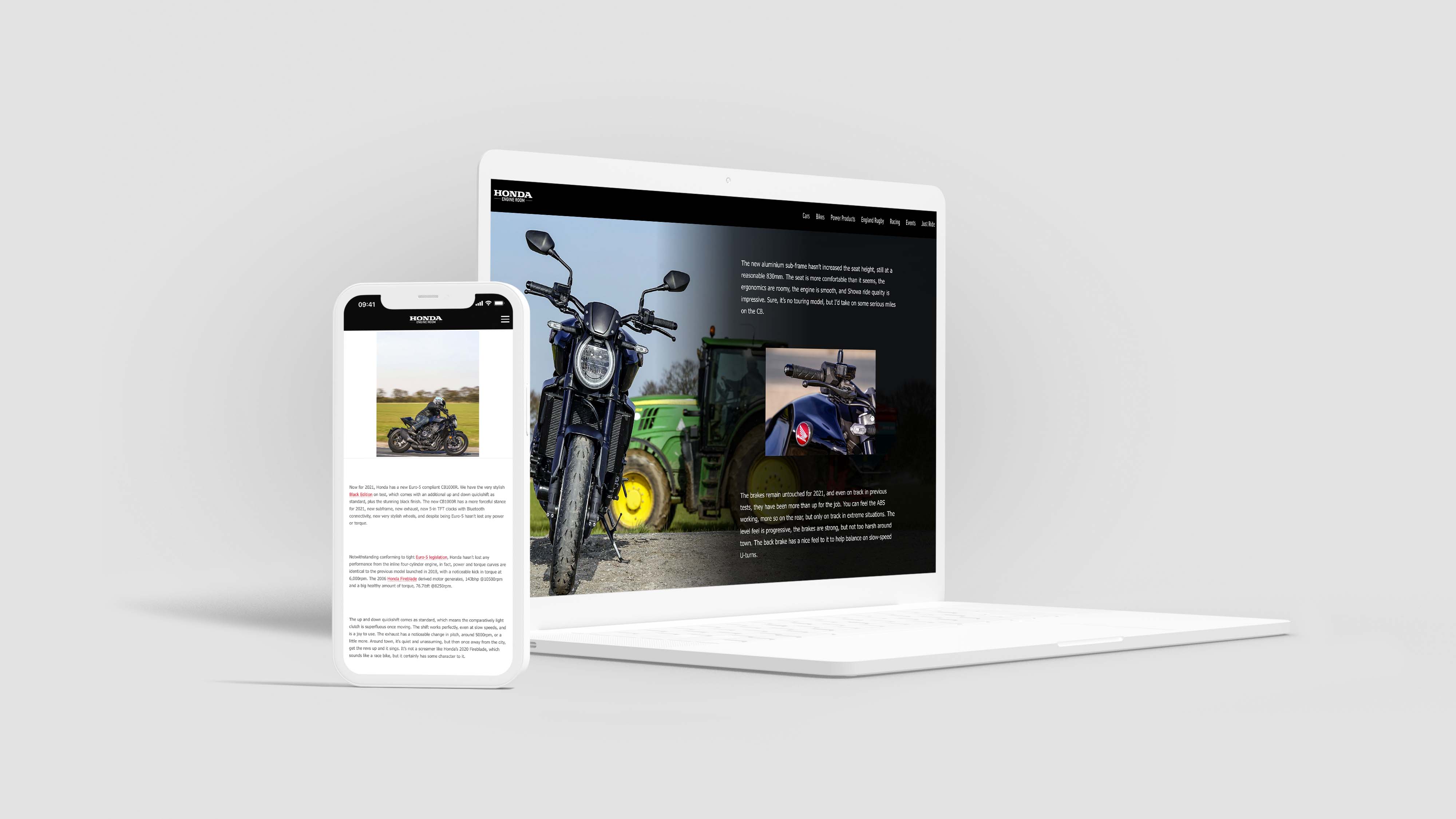
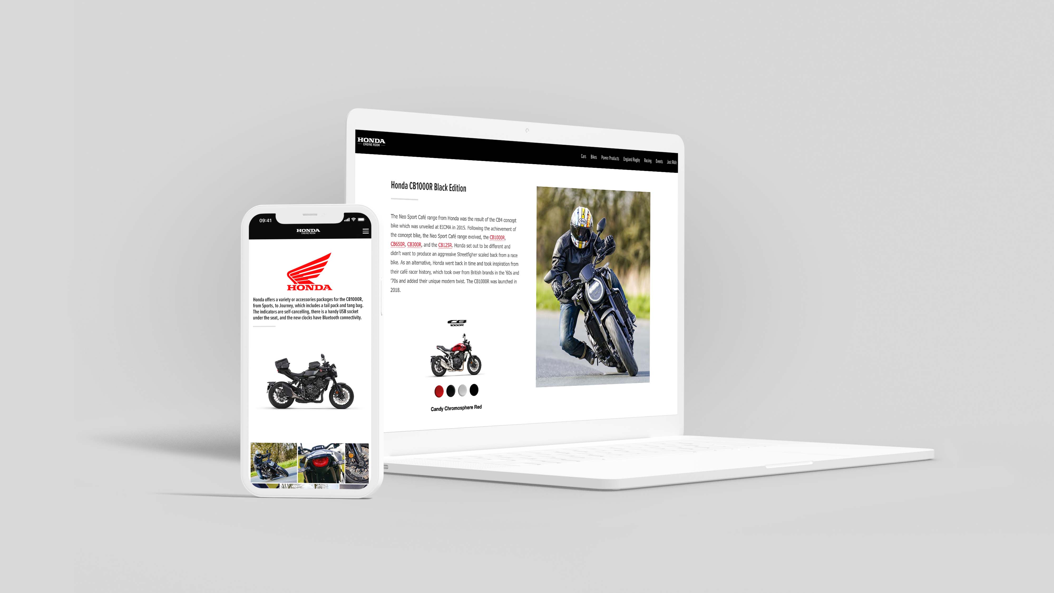
Honda has recognised the opportunity for longform content creation to work as a promotional piece that feels like a magazine excerpt.
Why this piece of longform content is so successful
- Combine commerce and content. This longform content piece recognises the audience: Honda superfans and influencers who are likely to go deep on the history of the motorbike. This piece allows Honda to tell a story about the product, integrating customer experience, imagery, history, and more. The display ads that feature throughout the page feel like a part of the editorial without being jarring.
- Showcase subject matter experts. More than just a typical product page, this piece highlights the author as a subject matter expert by demonstrating his experience and expertise. Readers feel connected to him and trust his recommendations, sharing in his excitement about Honda and the bikes they create.
- Encourage readers to get their hands dirty. The page features fun, interactive content elements to keep the user engaged. Bikes that rotate, allowing readers to inspect them from all angles, are a great way to encourage users to move from passive consumption to active engagement of this longer content.
What is longform content?
Longform content dives deep into a topic and is typically longer than 1000 words (although it’s not all about the word count). Longform content can be a magazine article, a blog post, a piece of investigative journalism, a white paper, trend report, or a long interview that lets readers immerse themselves in a particular subject.
Traditionally, longform content on the web took two forms. First, it was published in a PDF, perhaps gated and available to be downloaded from a website. Second, it was a long piece of journalism told simply in big blocks of text, with perhaps a few images.
But audience expectations are changing — and to meet them, the best content creators are using modern content creation platforms. With the rise of platforms like Shorthand, content creators can develop longform content that is immersive and interactive, featuring video, imagery, infographics, maps, and more.
What do the BBC, Tripadvisor, and Penguin have in common?
They craft stunning, interactive web content with Shorthand. And so can you! Create your first story — no code or web design skills required.
Get started.
4 benefits of longform content
- Longform content is the backbone of your content marketing strategy. When you create one longform content piece, you can break it up into a bunch of short-form content that can be used across a range of digital marketing channels: emails, social media, and your website.
- Longform content sets you apart on the internet. Going deep on a particular topic allows you to demonstrate your point of view to your target audience. People with opinions stand out on the web, showcasing you as an expert and attracting people who want to hear your take.
- Longform content gets you found in search. Longform content is a powerful SEO tool. Google has a number of quality indicators, one of which is time on site. If someone spends more time reading your piece of longform content, the feedback to Google is that your content is valuable. The result? Google is more likely to suggest that page, which can lead to other benefits: more organic traffic, increased conversion rates, and backlinks from other trusted sites.
- The longform format allows you to build a reputation for quality content. Showing your depth of thinking allows you to build authority, and your brand.
Want to learn more about the benefits of longform? Check out our guide: Why publish longform content?


