9 great medical journalism examples to inspire and inform
Medical journalism is a crucial component in improving public health, combating misinformation, and helping everyday citizens make informed, evidence-based health decisions.

by Kiera Abbamonte
by Ben Ice
Below, we’ll cover:
Why medical journalism matters
Whether by academic institutions, medical charities, healthcare journalists, NGOs, or other publications, creating medical journalism for public consumption is a challenge. It usually involves longform scientific storytelling and requires specialised knowledge that is often unfamiliar — or worse, boring — to the general public.
Medical writing is vitally important to modern society. It’s crucial in helping everyday folks make informed decisions about their health and lifestyle. When done well, it aids both governments and medical professionals in improving public health and combating all-too-readily-accessible misinformation. And in recent years, it has been more important than ever, as COVID-19 reporting kept us informed about the pandemic.
Innovative biotech, new medical devices, results of clinical trials, the regulatory environment of the pharma industry… Turning all of that into medical information that is both accessible and interesting to the average person takes the skilled hand of a medical reporter.
Types of medical journalism
A subset of science and health communication, medical journalism splits broadly into two categories:
- Content aimed at doctors and other healthcare professionals, including peer-reviewed medical research journals, webinars, science journalism, and published results of clinical trials.
- Medical news reporting, health news, and patient education created for the general public — a much wider audience that spans all kinds of different publications, from universities and NGOs to newspapers and magazines to websites and even social media.
For our purposes here, we’re sharing some of our favourite examples of this second type of medical and health journalism.
9 inspiring medical journalism examples
Genomics platform enables real-time surveillance of pathogens nationally
What: an outline of the newly launched AusTrakka genomic surveillance platform
Who: Doherty Institute
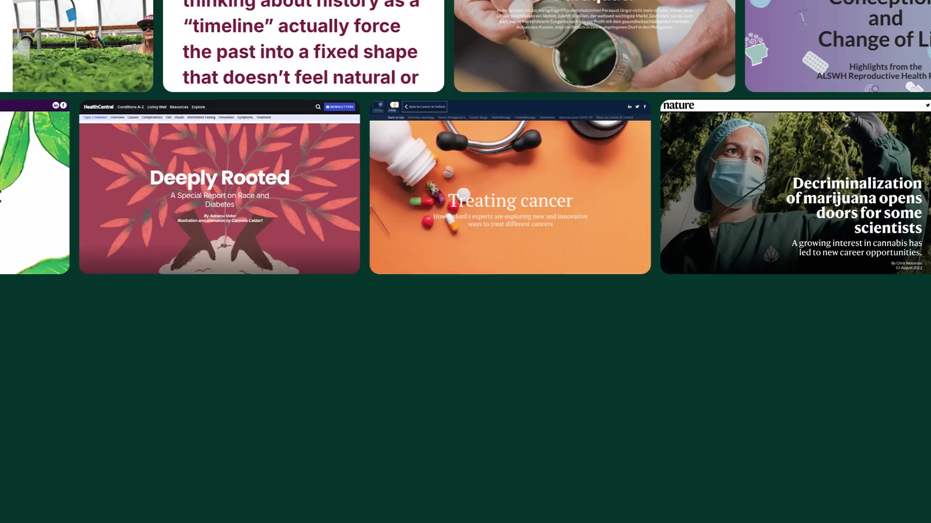
Why we picked this example: This news story from the Doherty Institute shares details of the AusTrakka platform, designed to help centralise real-time tracking of pathogens and outbreaks across Australia and New Zealand. As a whole, the content is broken up well, with a large selection of imagery to accompany the text.
My favourite aspect, however, is the visual demonstration of how the platform works. The imagery shows the tracker in action — it changes as readers scroll and includes short text blurbs that outline how each development helps genomic epidemiologists. For more about Doherty Intstitute's approach to storytelling, read this Shorthand case study.
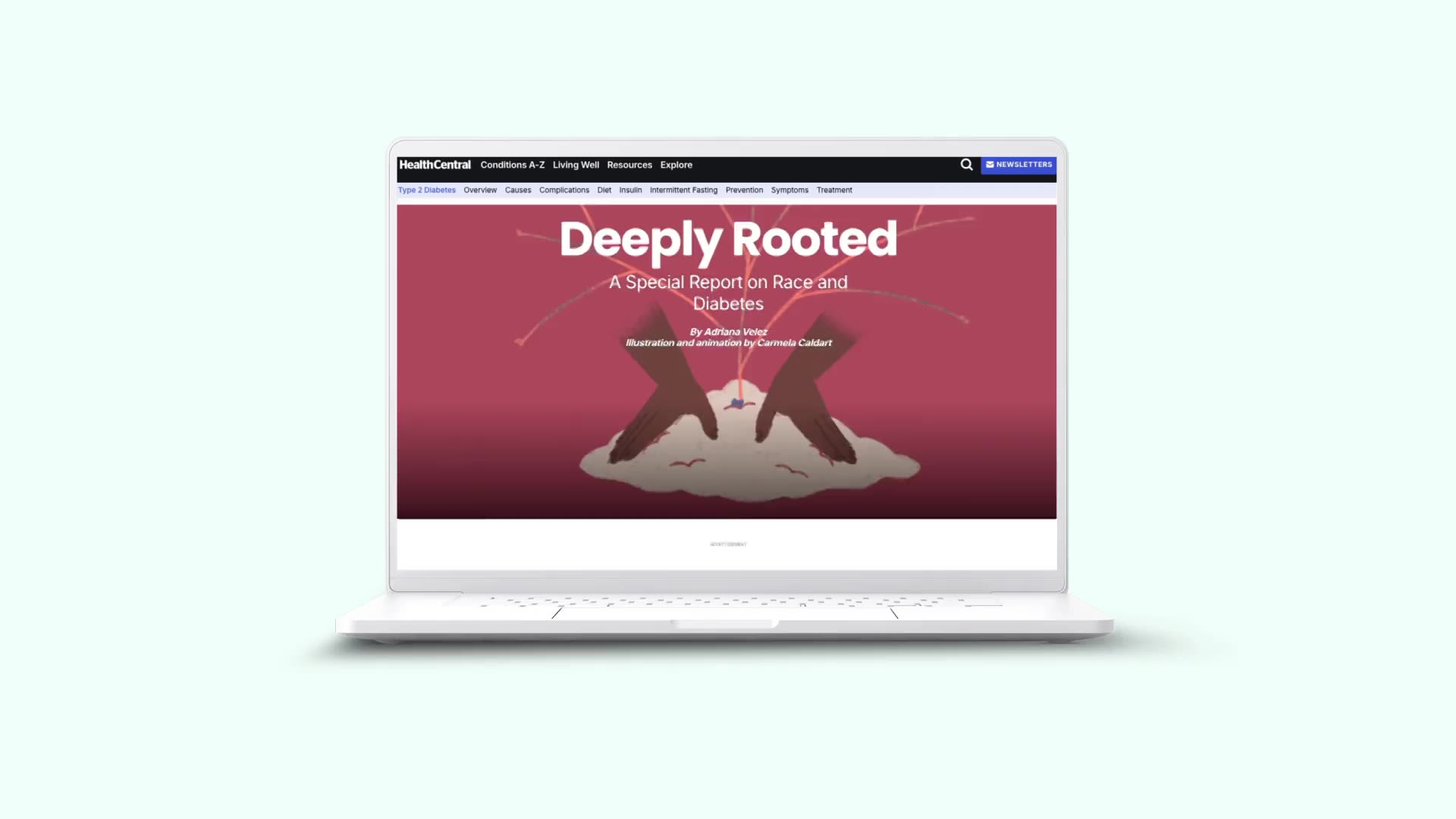
Deeply Rooted
What: a report on race disparities and diabetes
Who: HealthCentral
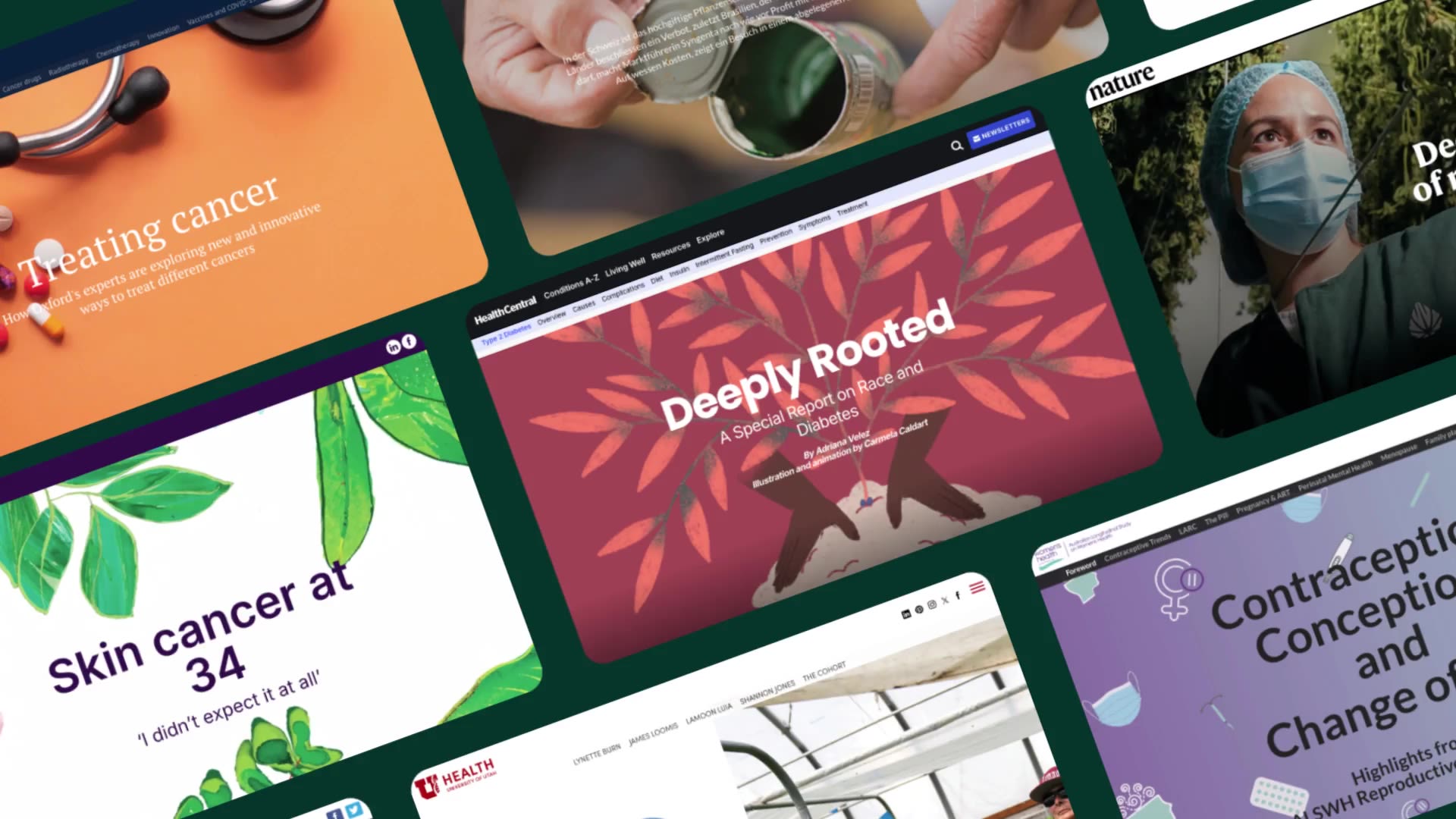
Why we picked this example: In addition to being a fascinating read, this report from HealthCentral is a phenomenal example of using imagery and visualisations to break up text and help readers more intuitively understand data.
New sections are delineated by cohesive illustrations and animations, while prominent block quotes help hammer home key messages. HealthCentral includes a number of large, clear data visualisations that accompany written text. Just by looking at these graphs and charts, you understand the argument made in the beginning section — even without reading a word of copy. For more about how the article came together, read the Remedy Health Media Shorthand case study.
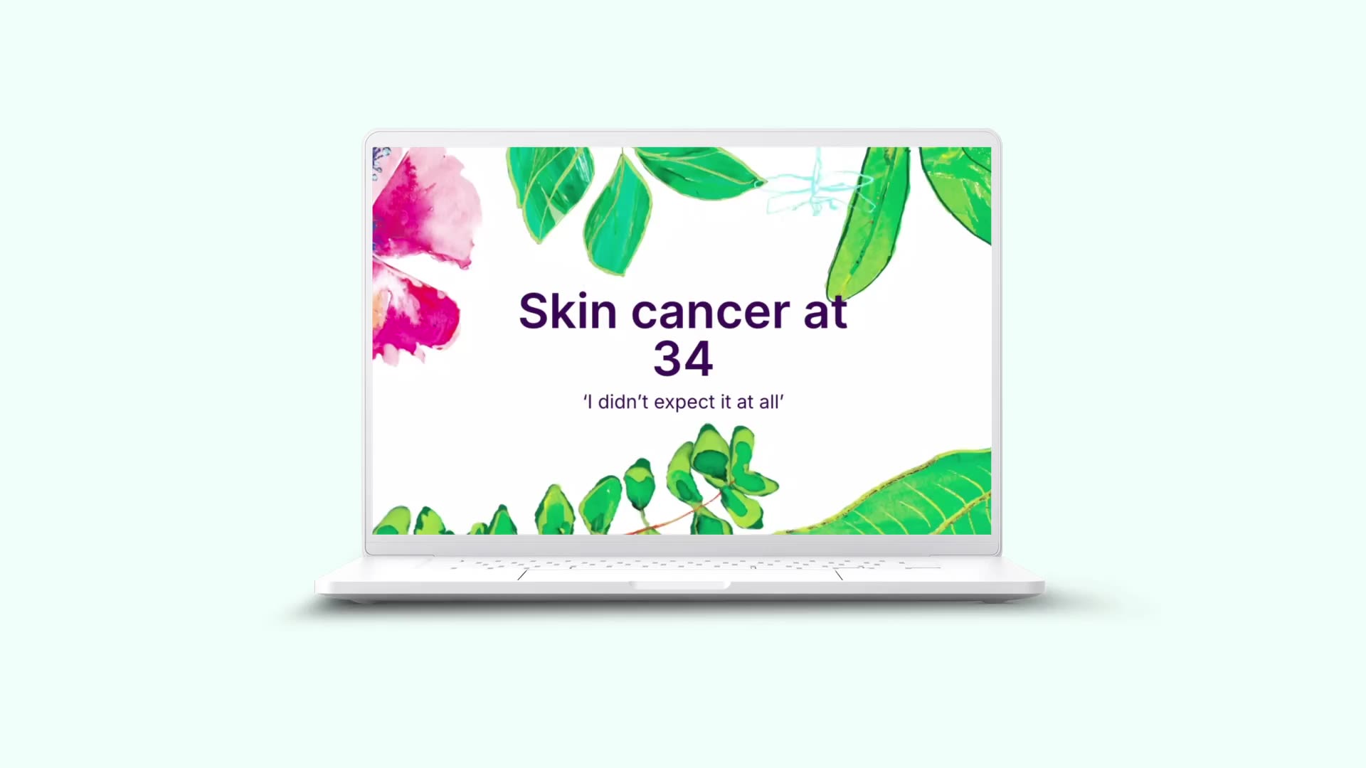
Skin cancer at 34
What: an account of one woman's experience being diagnosed with skin cancer
Who: Jean Hailes for Women’s Health
Why we picked this example: This account from Jean Hailes for Women’s Health details the health story of one woman who was diagnosed with melanoma skin cancer at 34 years old. It’s a heavy subject — but one with a happy ending — and the story does a great job of using lighthearted imagery to highlight that.
The story concludes with several skin cancer facts, using scrollytelling to load each separately, ensuring each one garners the reader’s full attention.
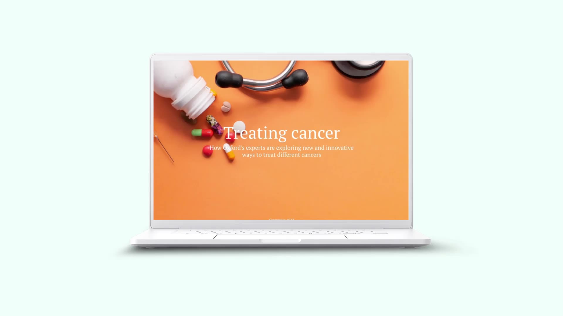
Treating cancer
What: an article on innovation in cancer treatment pioneered at Oxford
Who: University of Oxford
Why we picked this example: In this article on novel cancer treatments, the text is broken up into many concise sections with headings that both make the health information scannable and serve as a built-in break for the reader.
What stands out with this piece is the team’s multimedia use. The article includes images, photographs, video, and data visualisations, in addition to text. Taken together, they add variety to the content while ensuring all the information is presented in the best, most digestible way.
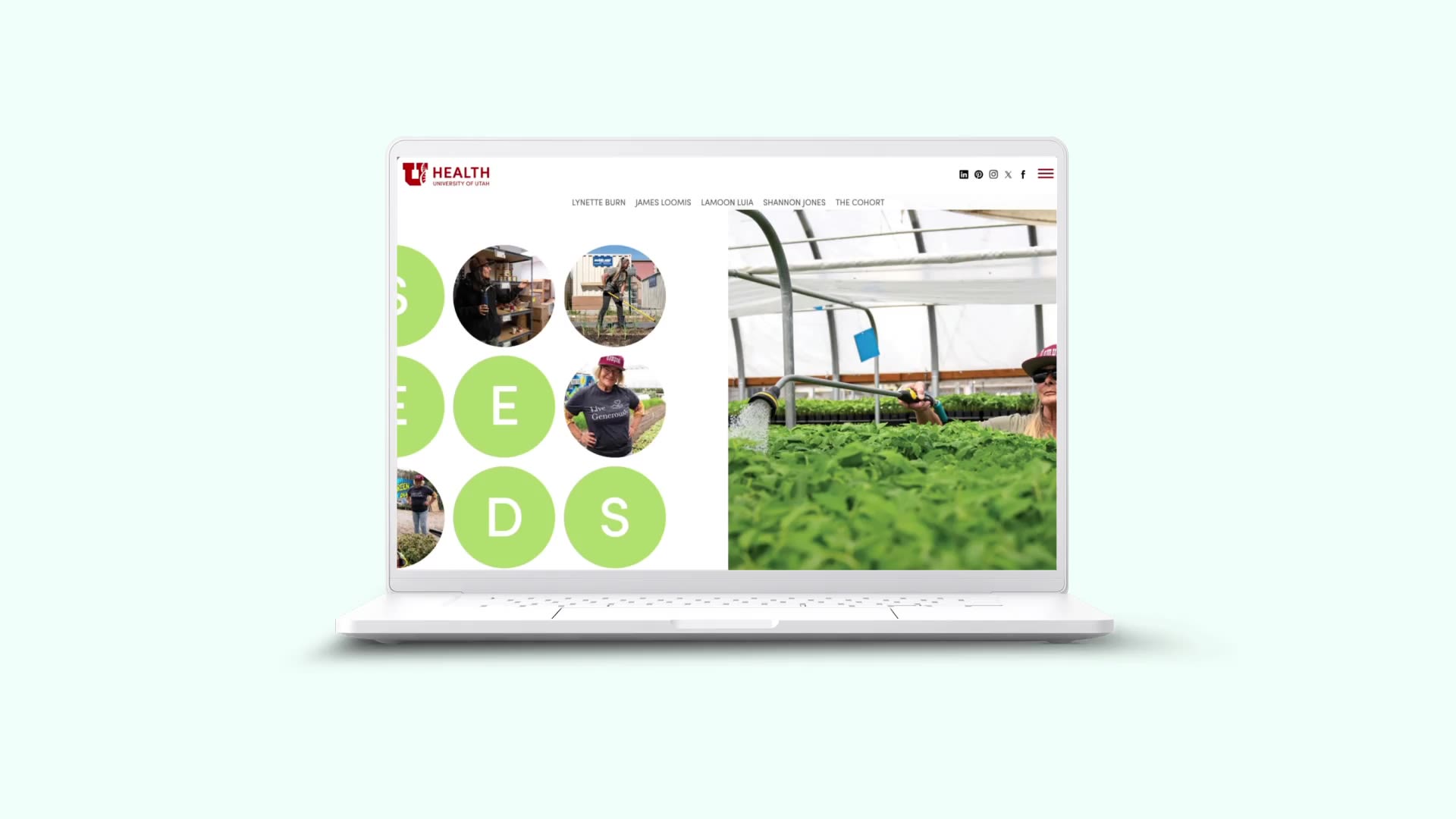
Seeds of Change
What: a feature story on one urban farm tackling systemic problems
Who: University of Utah Health
Why we picked this example: This feature story does a phenomenal job of weaving together photographs and written text. The story features a number of great photos of the farm and its staff, which help to break up written text, of course, but also set the mood for the story.
A consistent colour scheme and set of design elements keep the story from feeling disjointed with so many photographs.
Contraception, Conception, and Change of Life
What: a writeup on the highlights of the ALSWH Reproductive Health Report
Who: Women’s Health Australia
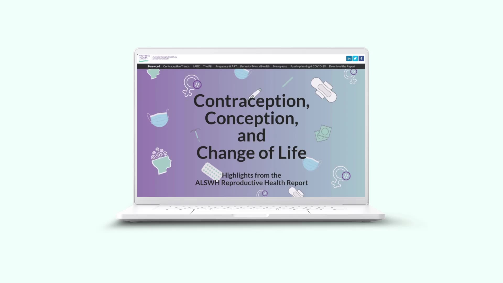
Why we picked this example: Women’s Health Australia’s extensive summary of the Australian Longitudinal Study on Women's Health (ALSWH) Reproductive Health Report is a mammoth piece of content. This could easily have become the Great Wall of Text, exhausting readers and obscuring some impactful data journalism and findings.
Instead, the publisher uses a clean design with interesting, but minimalist, illustrations and plenty of whitespace. What stands out, though, is the frequent use of dynamic, interactive data visualisations that focus the reader on the important numbers and add crucial context to keep the report’s findings digestible.
How long will Paraquat last?
What: an exposé on the impact of Paraquat, an herbicide, on a village in the Philippines
Who: Public Eye
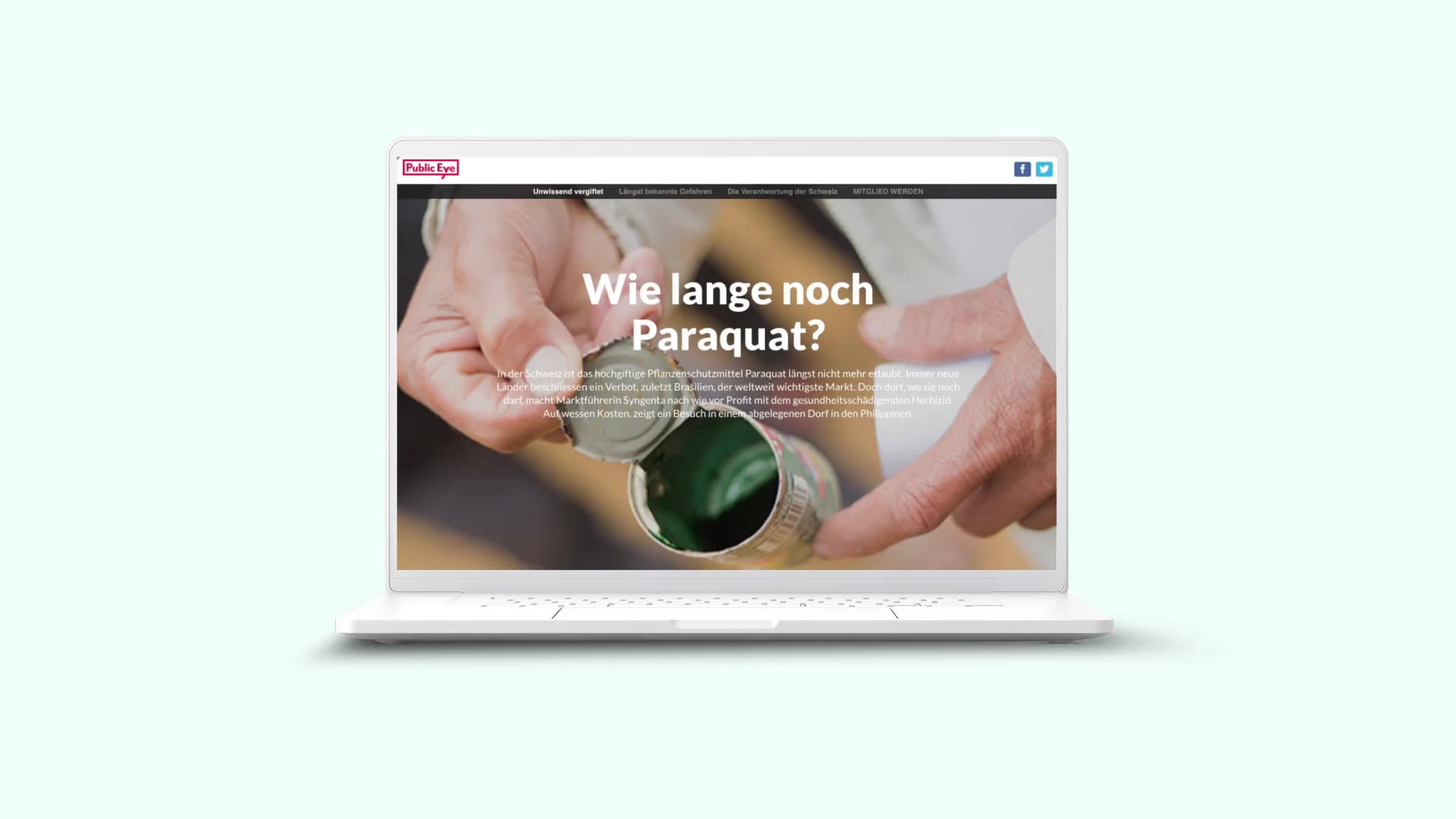
Why we picked this example: In this report, Public Eye takes an in-depth look at the impact of one toxic herbicide product on the people living in regions that are yet to ban it.
Medical journalists here draw on a long selection of of different media to make their case, including photos, videos, graphs, and even an interactive map. The imagery serves the dual purpose of breaking up text and adding aesthetic variety, while also making a compelling case against Paraquat all on its own.
40 years of HIV
What: an exploration of the framing of the 40-year anniversary of HIV/AIDS
Who: TheBody
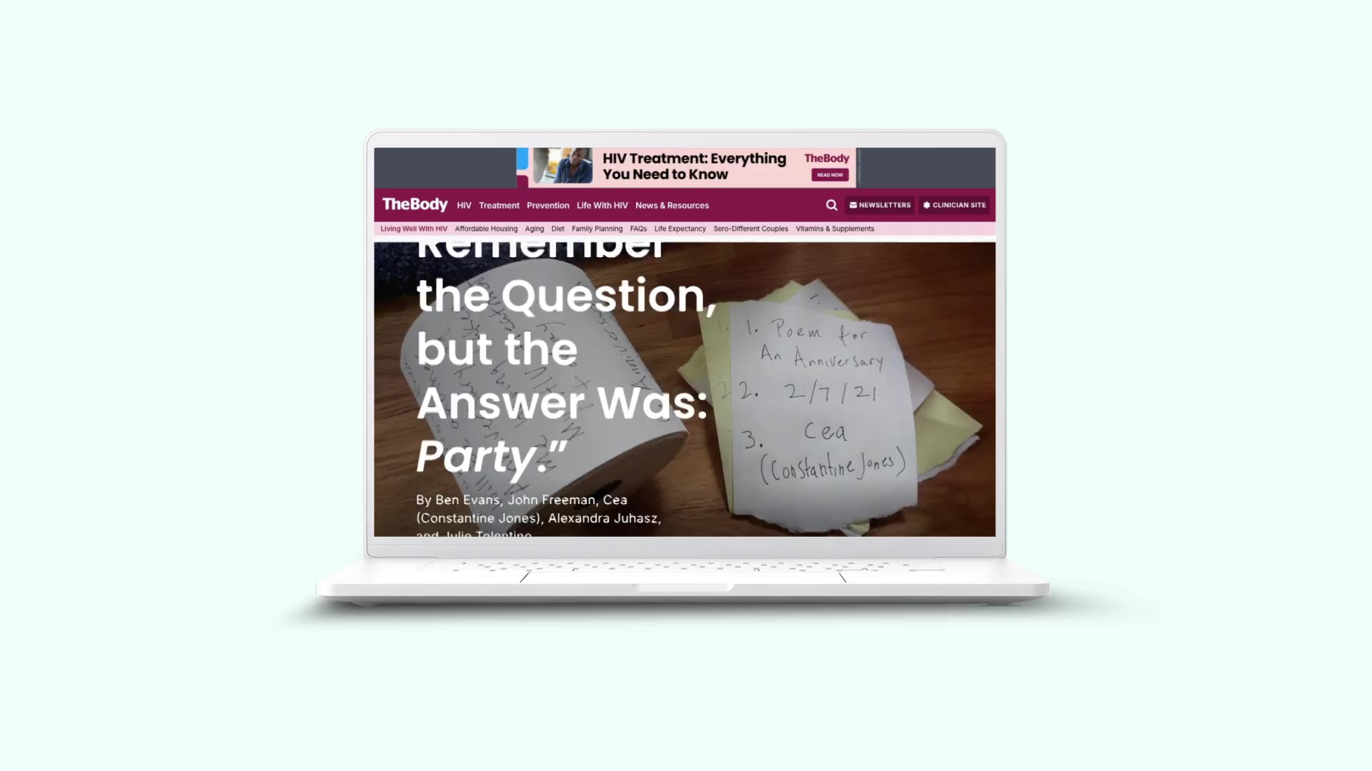
Why we chose this example: This unconventional piece explores the authors’ thoughts and reactions to the media attention surrounding the ‘40-year anniversary of AIDS.’ The article uses clear text and prominent pull quotes and headings for structure.
But the most powerful aspect is the series of photographs showing the poem that inspired the article. Presented on separate, sequential Post-It notes, as it was originally conceived, the poem draws a clear and intriguing narrative arc through the article.
Decriminalisation of marijuana opens doors for some scientists
What: an article on the scientific opportunity of marijuana decriminalisation
Who: Nature
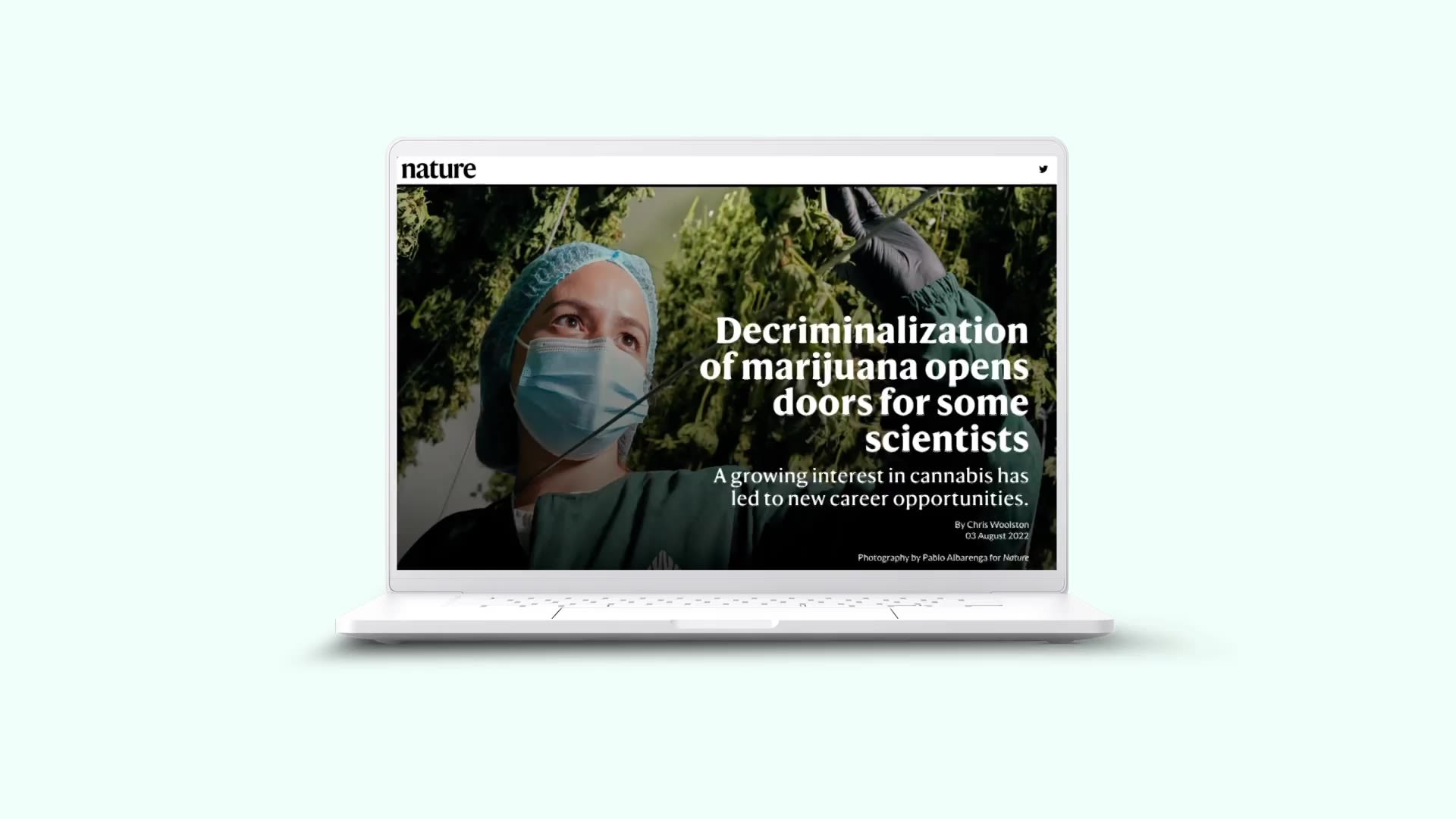
Why we picked this example: Nature’s article on the scientific study and career opportunities created by the decriminalisation of marijuana is aesthetically simpler than some on this list. But that simplicity and clean design is a big part of what makes the content so impactful.
The text is straightforward, in a no-nonsense font and colour scheme. Between sections, large, high-quality photographs add a visual element, as well as context for readers. Later, the article uses scrollmation to add captions to several images, which help readers make sense of what they’re seeing — without taking away from the impact of the photos themselves.
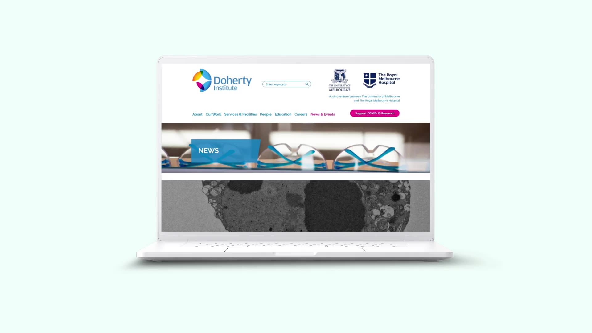
Looking for more inspiring examples? Check out our gallery of health and medical reports, built with Shorthand.
Try some storytelling of your own, with these free Shorthand templates.
Academic profile template
Science communication template
Science feature article template
