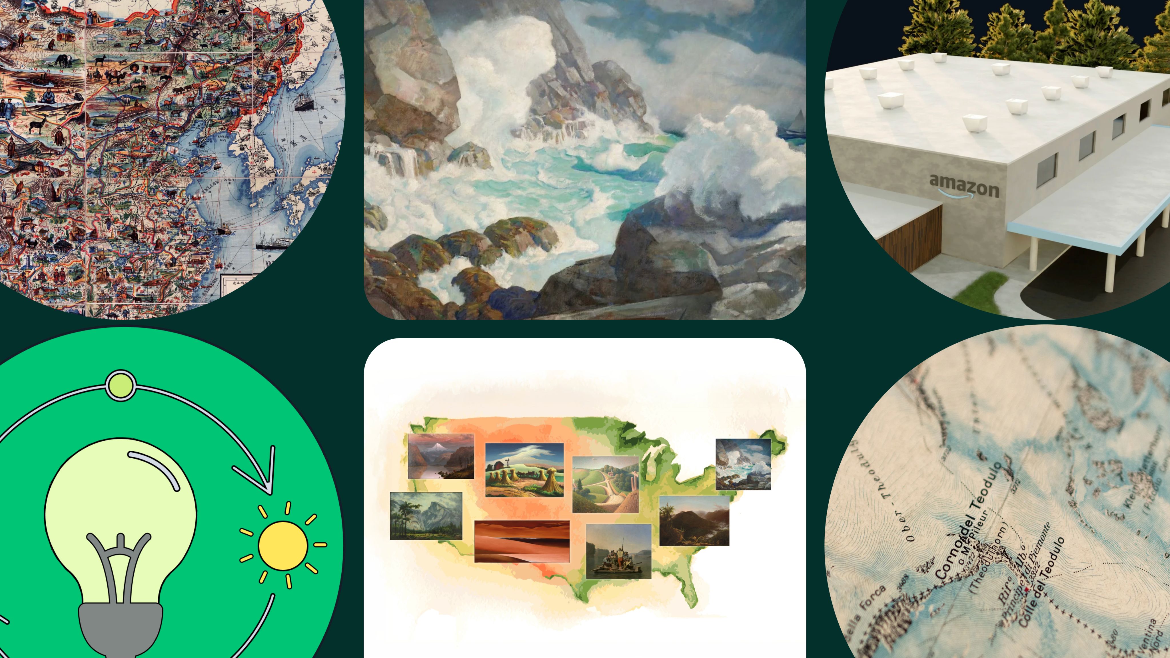
12 engaging scrollytelling examples to inspire your content
5 minute read

When was the last time you scrolled through content on the web and thought, 'WOW'?
If it’s been a while, you’re not alone. A lot of content on the web today is generic and visually underwhelming. Of course, that isn’t because publishers lack the creativity or desire to build impressive visual stories — it’s because most creators are hampered by limited resources and budgets.
Immersive content platforms are changing that. Now, the design techniques used in immersive and interactive content — such as scrollytelling — are available to anyone. This has led to some outstanding web content, with techniques and approaches you can borrow (or, with apologies to T.S. Eliot, steal).
Read on for a deeper dive into scrollytelling. We'll cover:
Start scrollytelling with Shorthand
It's the fastest way to publish beautifully engaging digital magazines, reports, internal comms, and more.
What is scrollytelling?
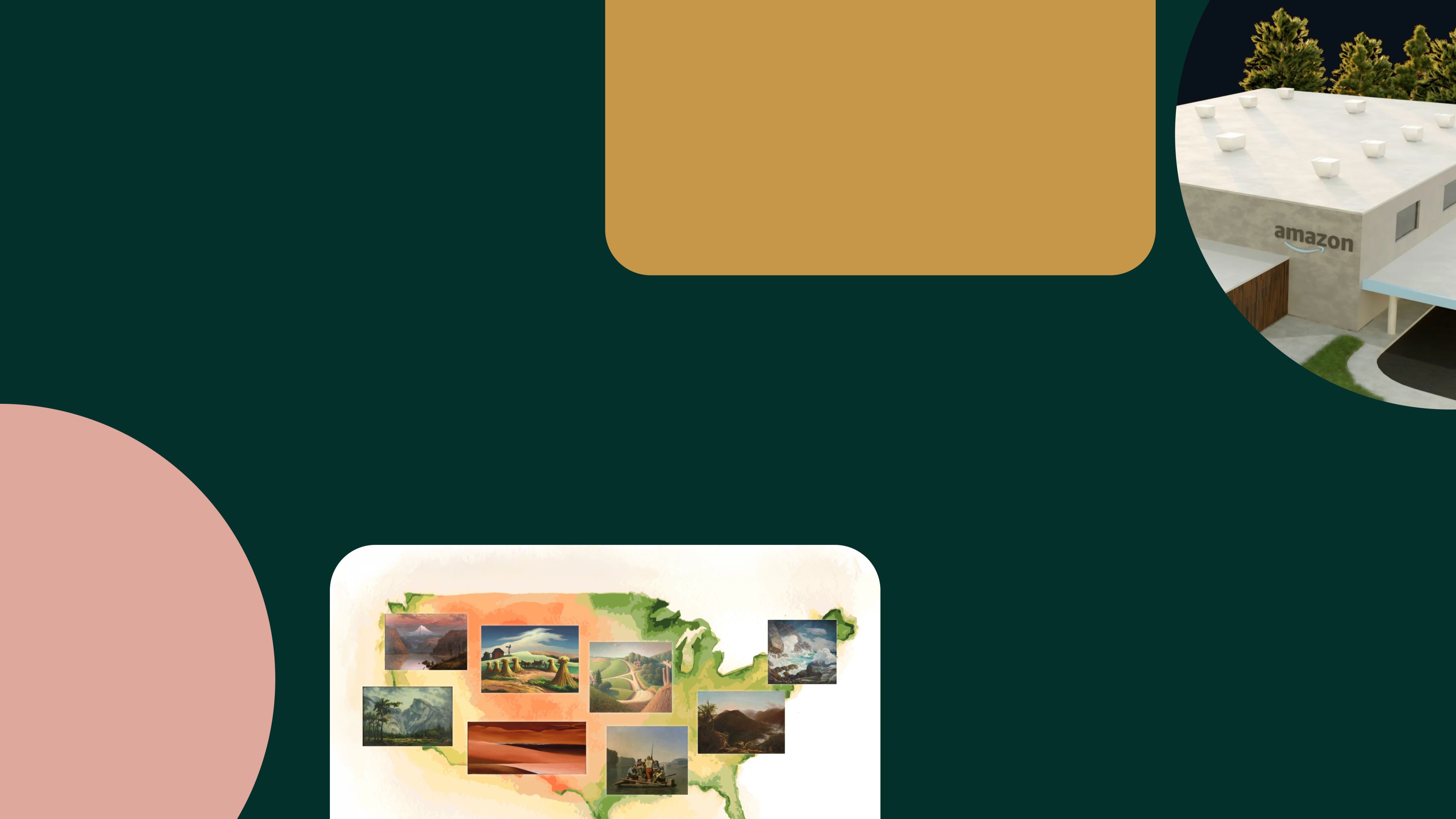
Scrollytelling is scroll-driven digital storytelling. It's when elements on a webpage appear, move, disappear, or otherwise change as the user scrolls the page. Think 'scroll' plus 'storytelling'.
Scrollytelling is:
- used to make web content more interactive and immersive
- used to enhance written text with multimedia like audio, video, and animation
- perfect for enhancing photo essays, interactive longform content, infographics, investigative reports, or content marketing.
For a full explainer, read our introduction to scrollytelling, or see for yourself in the examples below.
Using the scrolling motion to trigger dynamic multimedia elements offers a perfect confluence between text-heavy stories and more complex interactive content. It allows creators to use more compelling and varied content types while maintaining an easy-to-navigate user experience — even for those unfamiliar with the format.
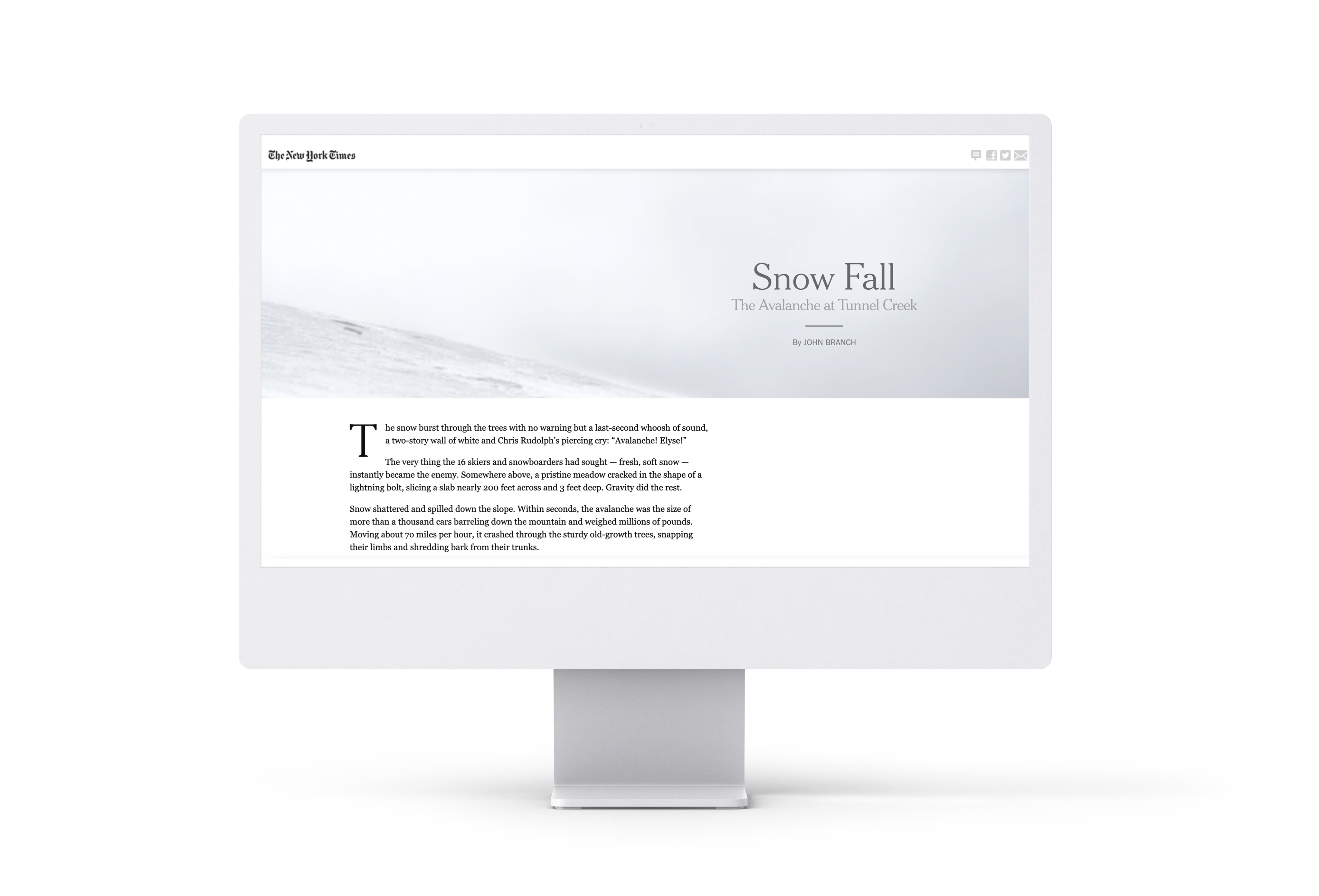
The New York Times published one of the first examples of scrollytelling with 'Snow Fall: The Avalanche at Tunnel Creek'. The in-depth report uses animated satellite and radar imagery and compelling audio testimony to translate a video documentary onto the page. In 2012, that kind of dynamic scrollytelling required NYT-level resources (including software engineers, graphic designers, writers, and data journalists, among others) and it took time.
Today, scrollytelling is much more accessible. Now, you can level up your visual stories with scrollytelling in a matter of hours — without CSS, JavaScript, or a 10-person team.
How to build scrollytelling
stories for yourself
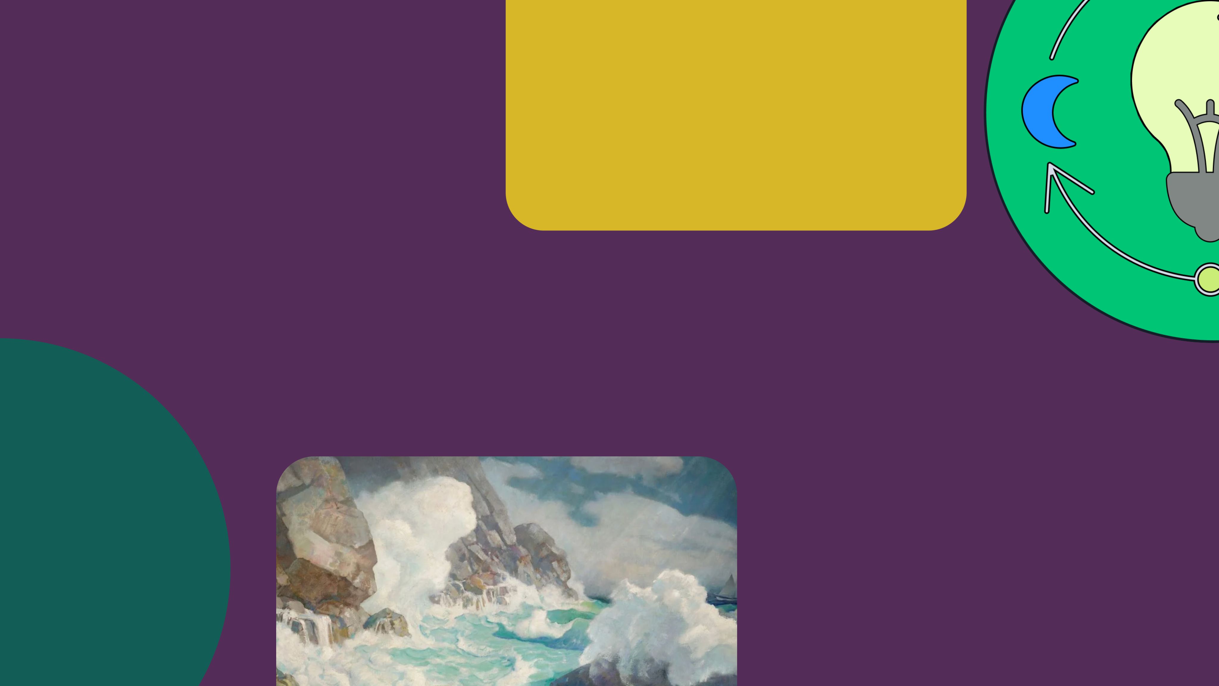
If you’re excited and ready to dive into scrollytelling, there are a tonne of tools out there to help, and they go well beyond traditional CMS and web builders like WordPress and Webflow.
Most fall into one of three categories:
- developer tools,
- web designer platforms, or
- immersive content platforms.
Developer tools are designed for developers and enable you to build totally bespoke web content from the ground up. However, if you aren’t adept with code (and neither is anyone on your content team) these can be a no-go.
Web designer platforms are built for graphic and web designers. They typically don’t require designers to write code or work directly with a developer but can still be complex and intimidating apps for non-designers.
Immersive content platforms (like Shorthand) are built for content teams and publishers — teams made up primarily of writers and editors. The no-code platform allows you to drag-and-drop dynamic, interactive elements and build stunning digital stories and other forms of web content without any coding or design expertise. If you do have developers and designers on your team, digital storytelling platforms allow you to move faster and reserve specialised bandwidth for tougher assignments.
Create scrollytelling content with Shorthand.
Build stunning scrollytelling content at scale — no code or web design skills required.
Get started.
12 of our favourite
scrollytelling examples

Looking for inspiration for your own scrollytelling project? The 12 scrollytelling examples below are our absolute favourites. They represent a cross-section of topics, formats, and goals, so you can get a sense of what’s possible with a powerful digital storytelling platform like Shorthand.
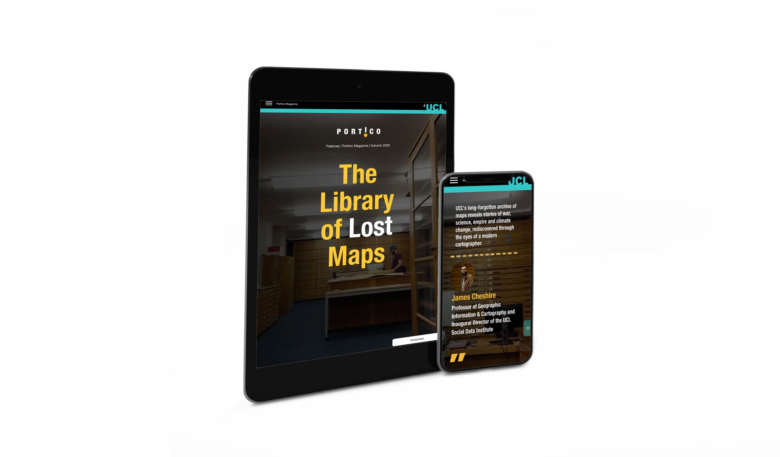
1. The Library of Lost Maps
What it is: A digital magazine article exploring a university archive of maps
Who created it: University College London’s Portico magazine
Why we picked this example
This digital magazine article just does such a fantastic job of encouraging readers to scroll. Starting with a full-width video inside an archives room, overlaid text introduces the author and the discovery: a long-forgotten archive of maps.
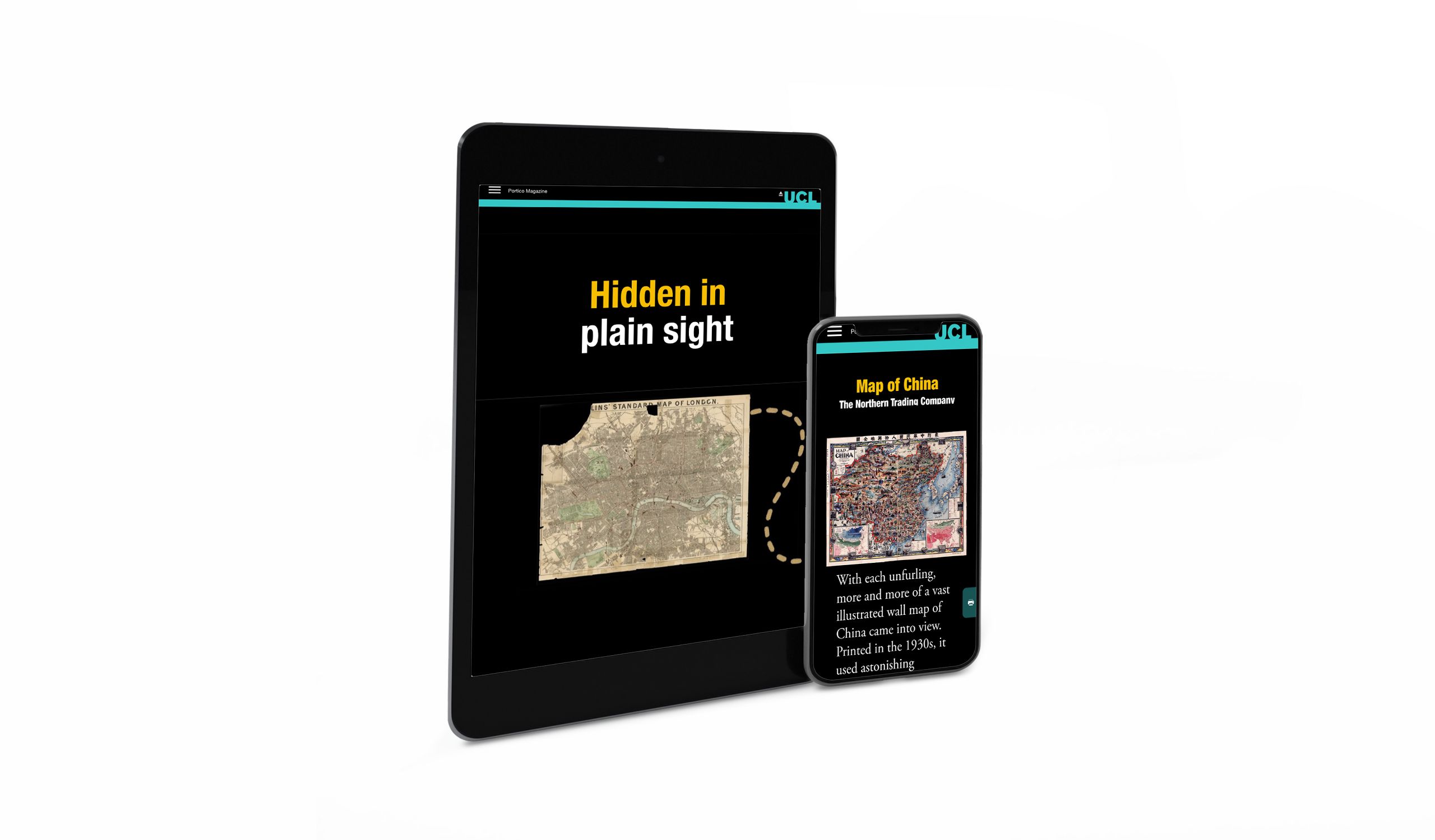
From there, it shares a few of these relics. Readers can scroll through historic maps of China, London, Milan, and the Eastern and Western Hemispheres.
In between these interactive experiences are further portions of the story and videos in the archive. It’s perfectly paced and delightfully interesting from start to finish, and gives the reader additional options to print it or listen to an audio version of the story.
Scrollytelling elements used: Scrolling Text on Reveal, scrolling maps, Scrollpoints, scroll-loaded copy.
2. America in Brushstrokes
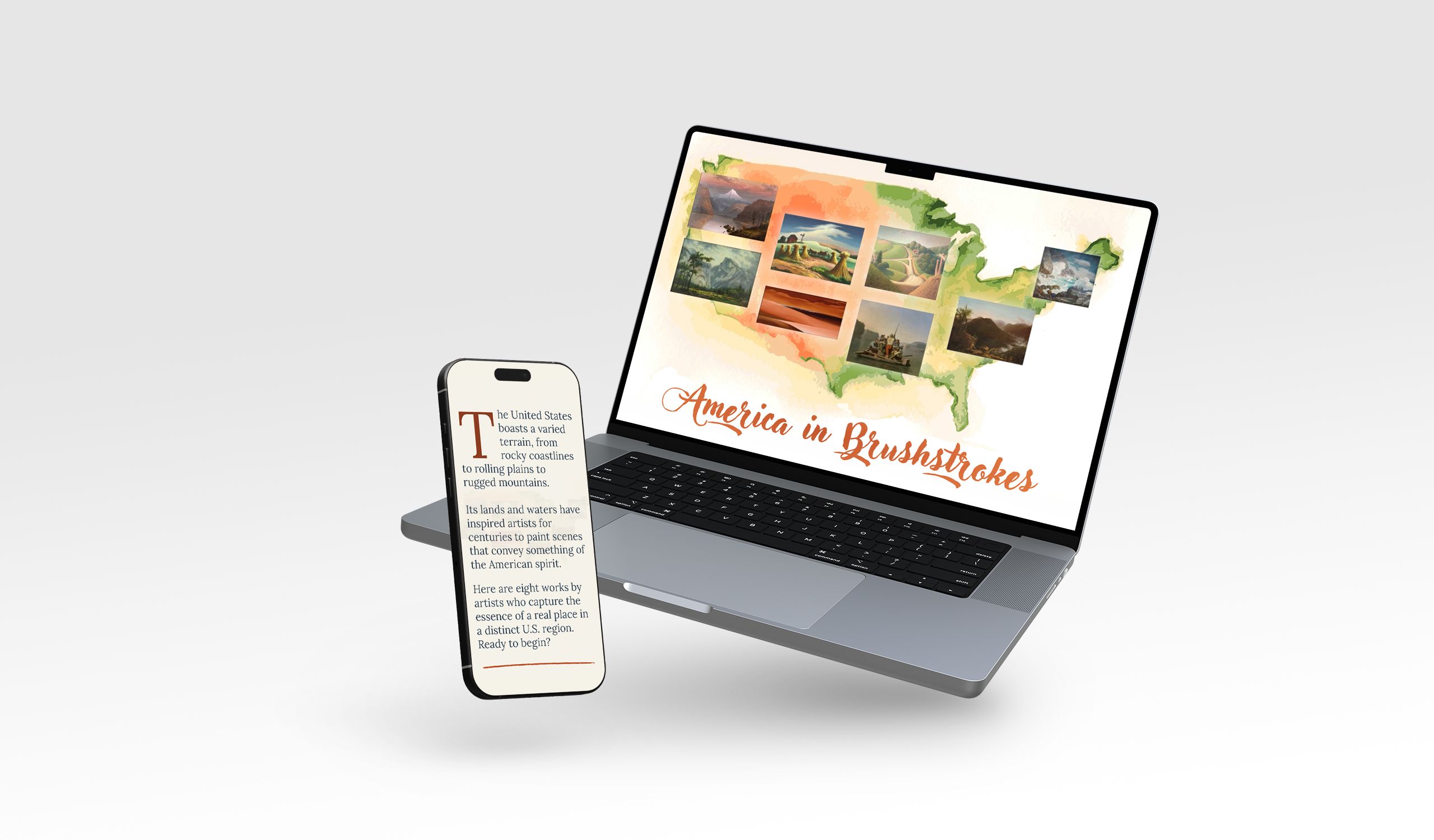
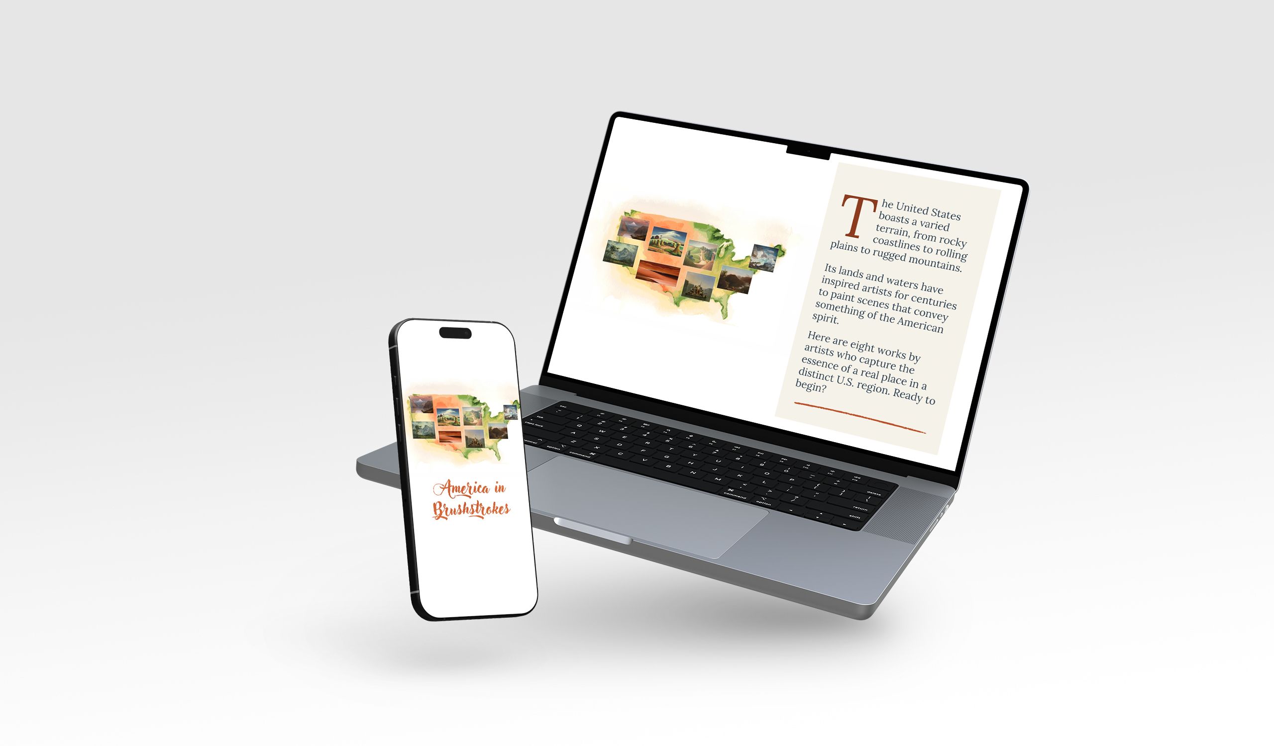
What it is: A tour through the contiguous United States with landscape paintings
Who created it: U.S. Department of State
Why we picked this example
Here’s another beautiful story that’s hard to stop scrolling through. Oil paintings of different regions of the United States are paired with full-width videos of the grand landscapes depicted. George Caleb Bingham’s 1847 painting Lighter Relieving a Steamboat Aground, for example, is followed by aerial footage of the mighty Mississippi and a short passage of scrolling text that explains its ongoing cultural and economic importance. We don’t know what’s more satisfying to scroll through — the paintings or the landscape videos. Why choose, though? Do yourself a favour and enjoy both.
Scrollytelling elements used: Interactive map, scrolling copy over media.
3. The science of beautiful buildings
What it is: An exploration of people’s changing taste in architecture
Who created it: The Conversation
Why we picked this example
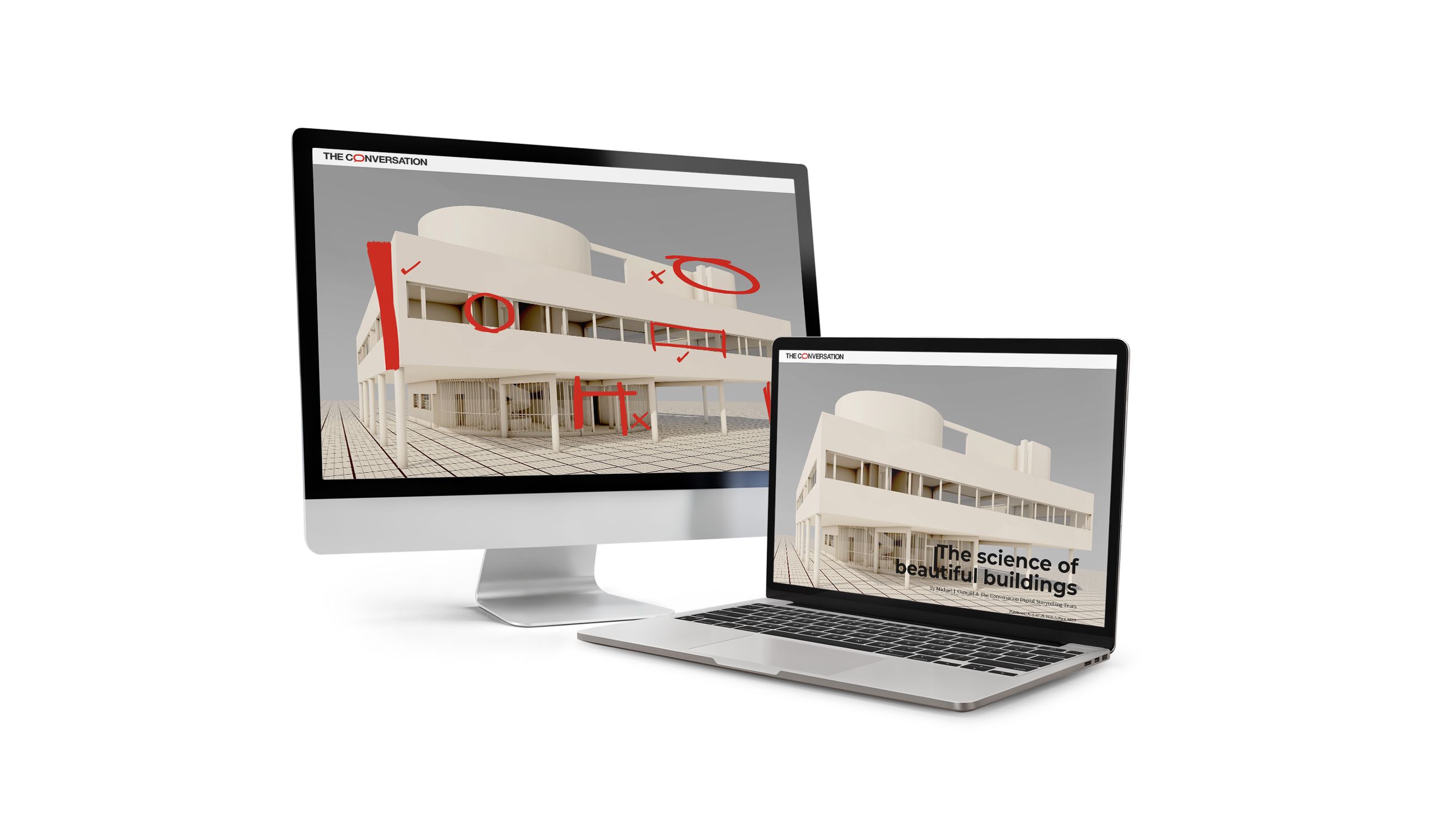
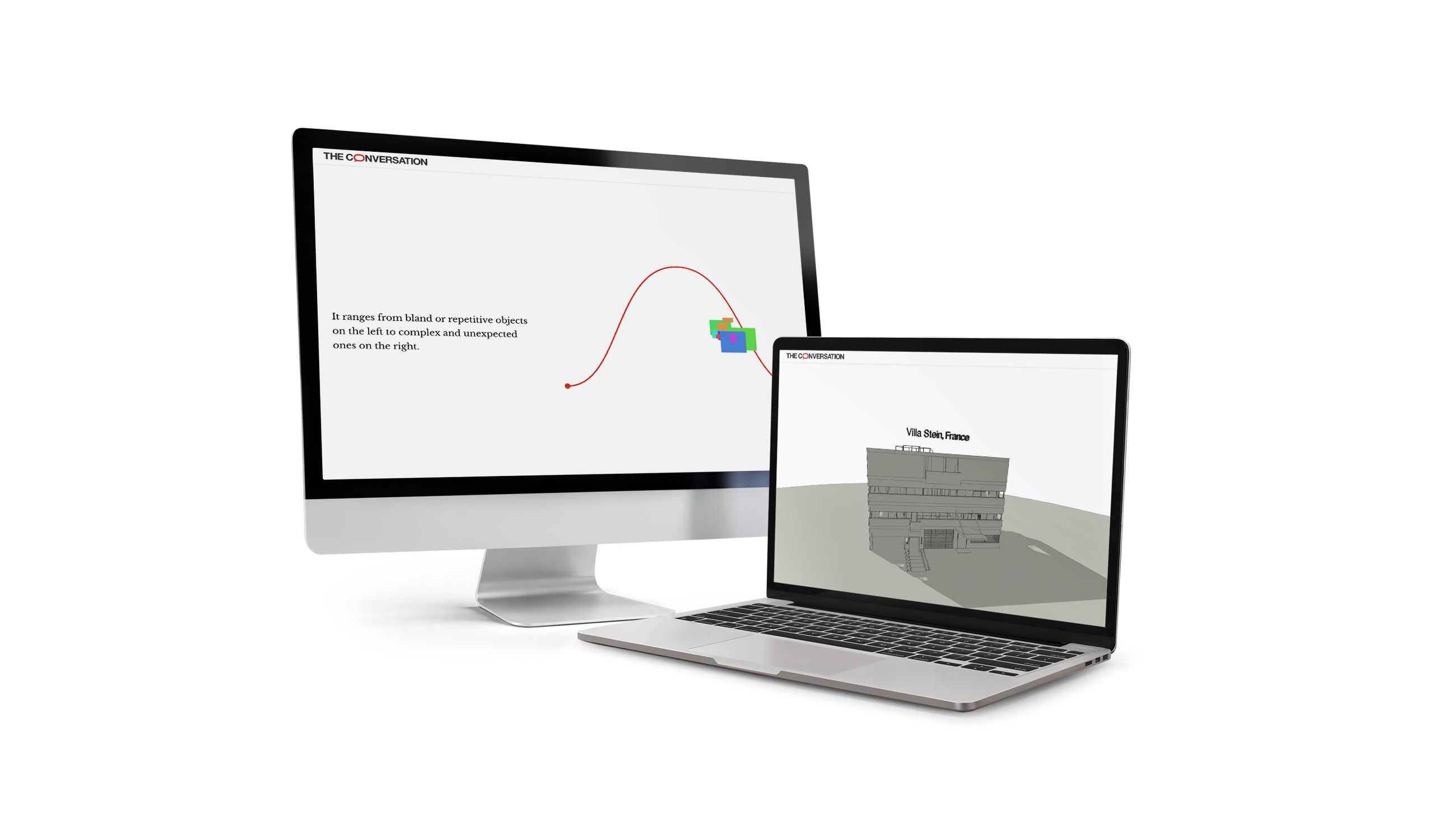
A bell curve with changing architectural shapes overlaid and 3D renderings of iconic buildings are just two of the cleverly designed sections in this story discussing the changes in trends and tastes in architecture. The piece is accessible too; one doesn’t have to be an expert in architecture to enjoy and understand it, in fact it deals a lot with the collective tastes of the public and their reactions to buildings and design.
We liked this story so much, we named it in our list of Best Shorthand Stories of 2025.
Scrollytelling elements used: Data visualisation, a scrolling bell curve chart, scroll-rotating 3D diagrams.
4. Inside the delivery station putting dozens of sustainability strategies to the test
What it is: A tour of Amazon’s delivery centre in Elkhart, Indiana.
Who created it: Amazon News
Why we picked this example
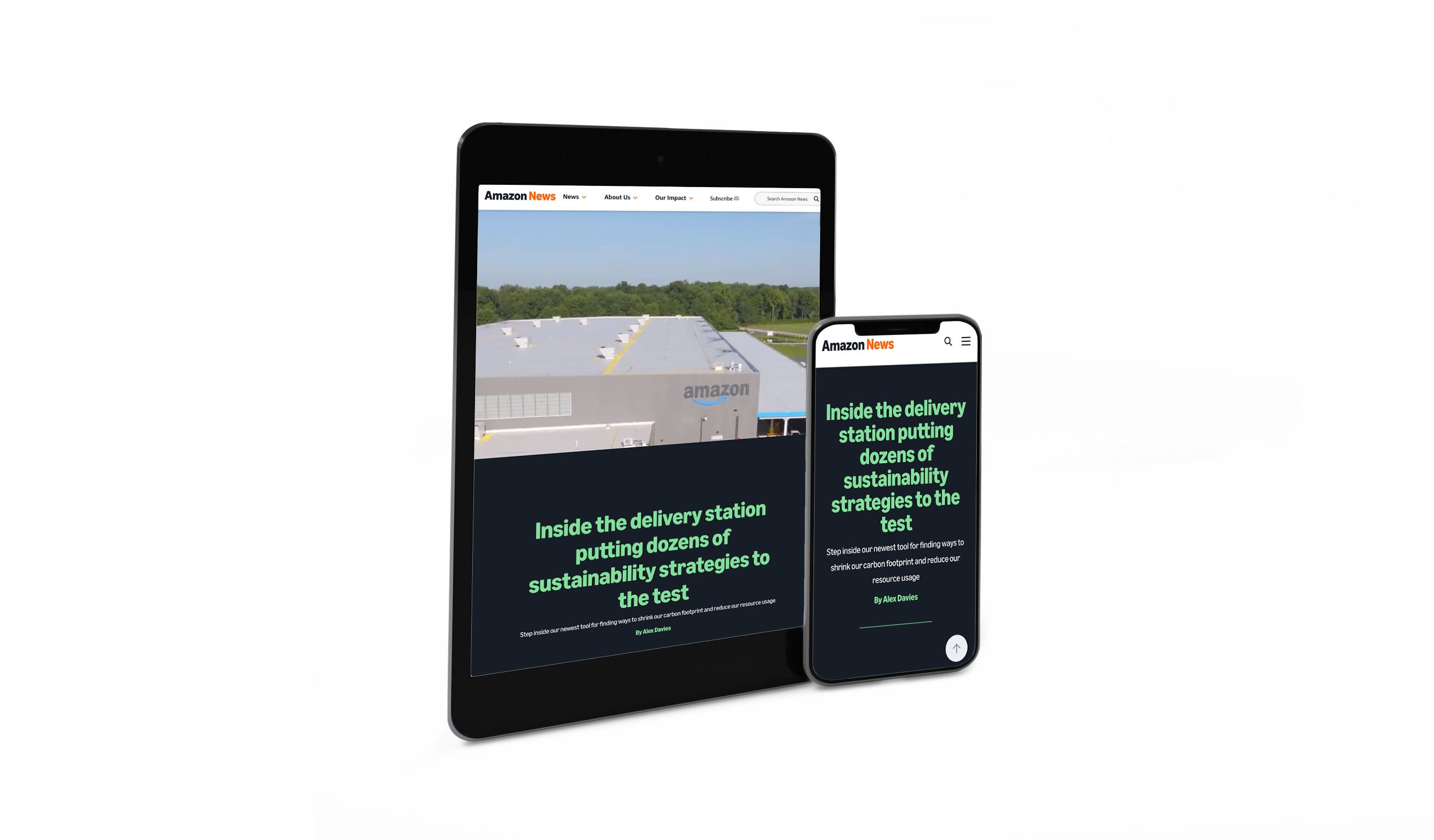
Let’s start with the animated scrollytelling element. A 3D rendering of this experimental delivery station lets the reader scroll through the layers of construction, from load-bearing columns, to sustainable timber walling, to cladding, and roofing.
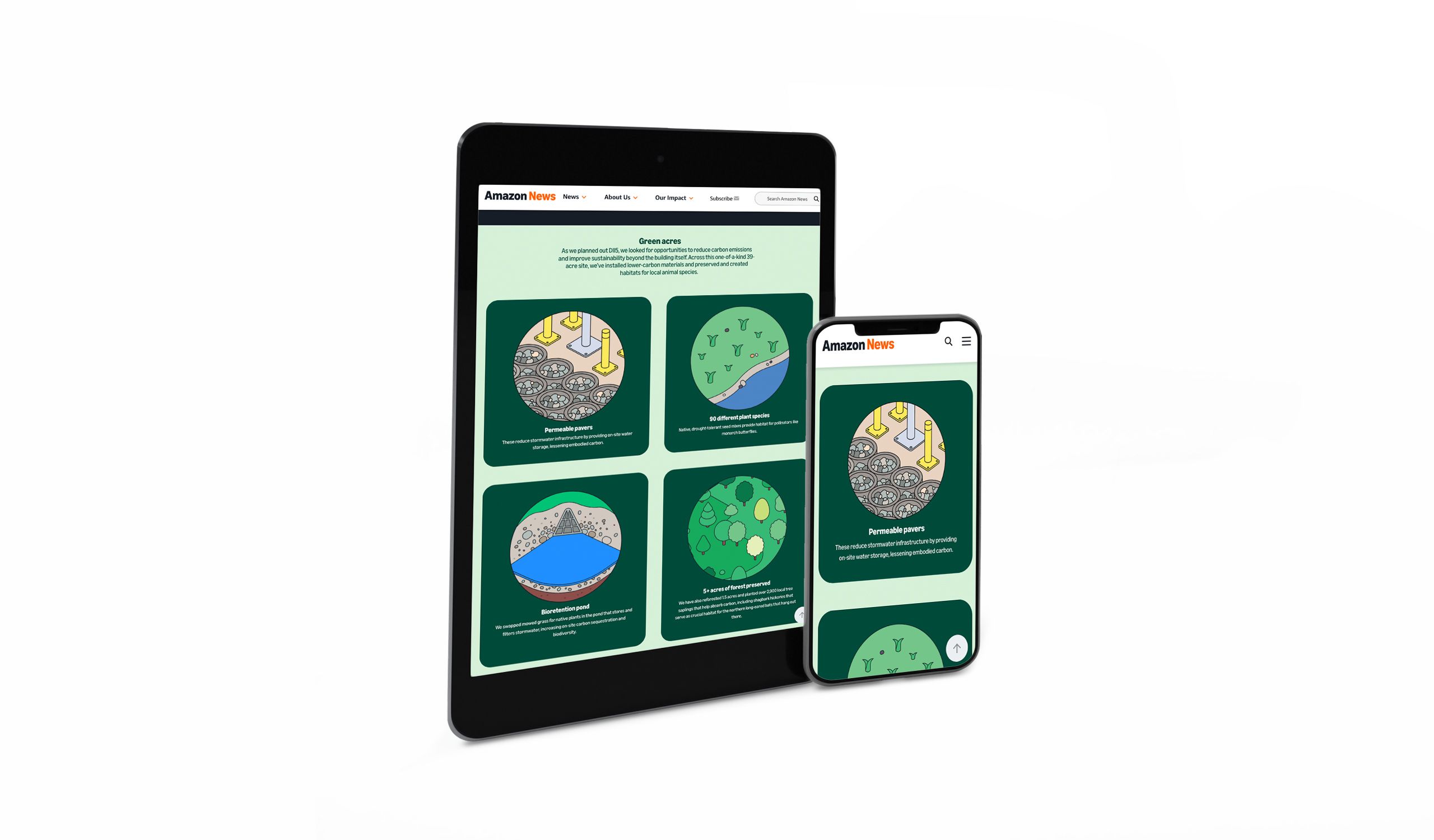
Surrounding this interactive section are videos, text explainers, and illustrated icons representing different parts of the building’s sustainable elements.
Scrollytelling elements used: Scroll-activated video, scroll-driven construction timelapse.
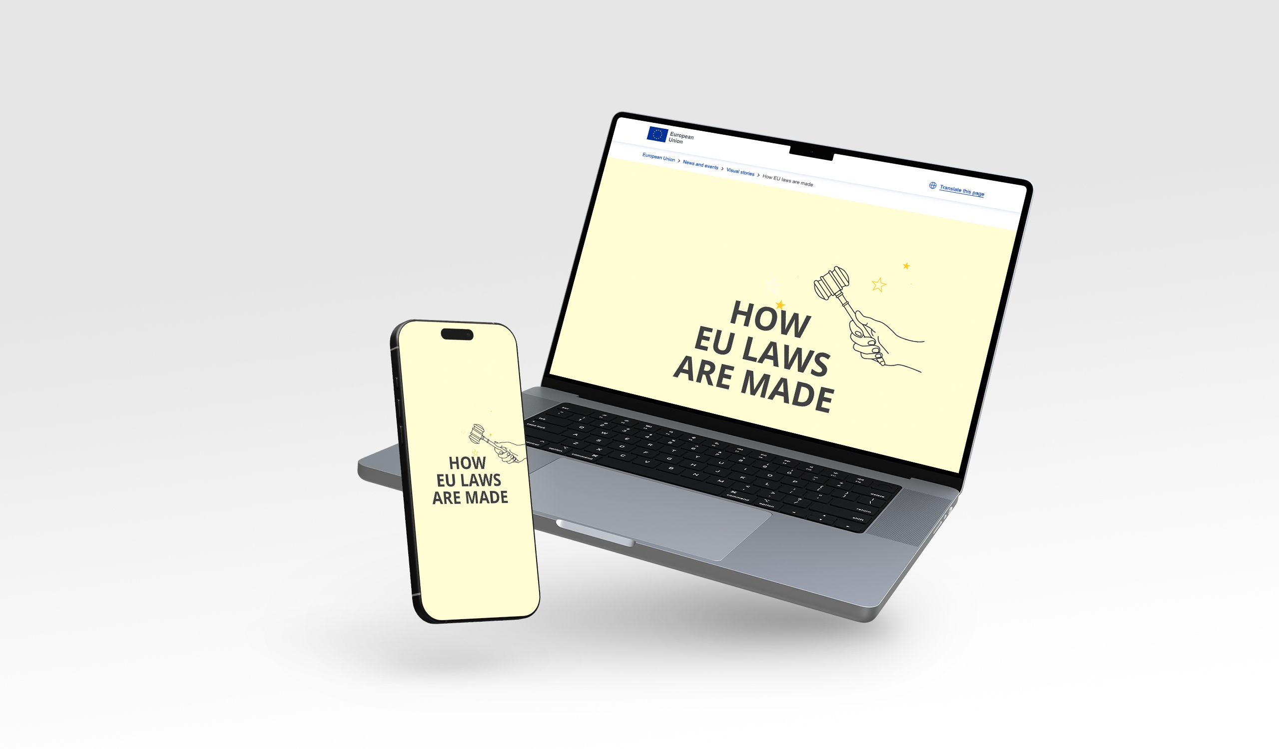
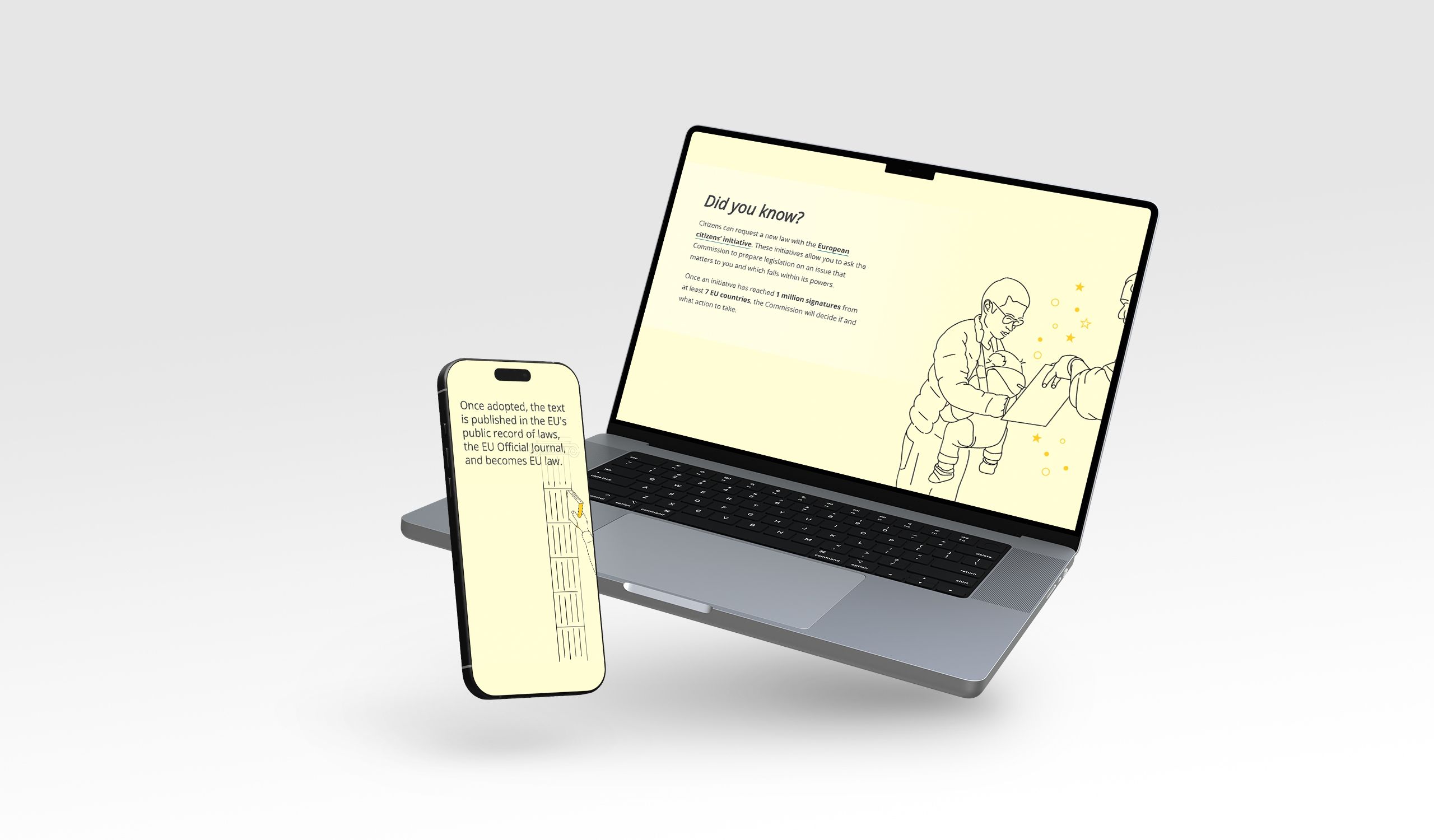
5. How EU laws are made
What it is: An explainer about EU laws and how they impact citizens’ daily lives
Who created it: EU Commission
Why we picked this example
Here’s one that stands out for its simplicity. With a plain background, a simple line, and a selection of small icons and illustrations, the reader is guided through EU laws, who makes them, how, and how to get involved. Scrolling lines of brief text ensure the reader isn’t overloaded with information, instead simply stepping through the journey to build their understanding.
This is a brilliantly designed, minimalist asset by a large institution, a perfect piece of government comms.
Scrollytelling elements used: Scroll-driven flow charts, scrolling comic illustrations.
6. Built to keep Black from white
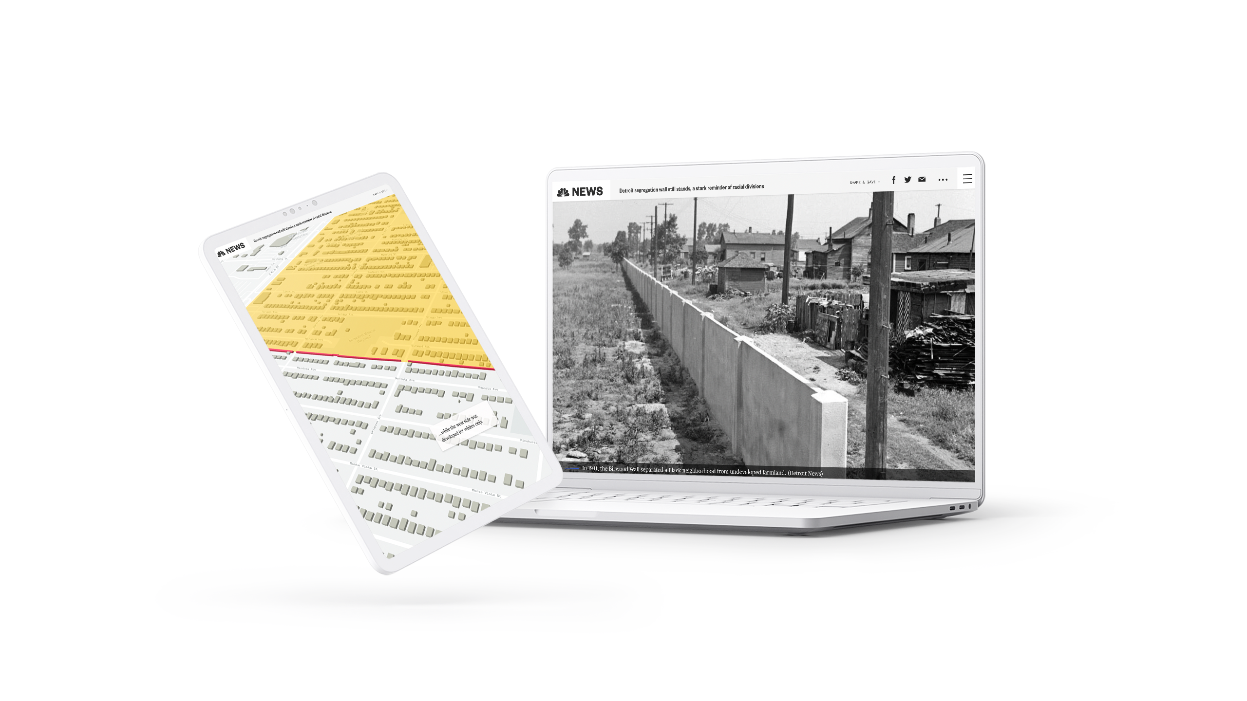
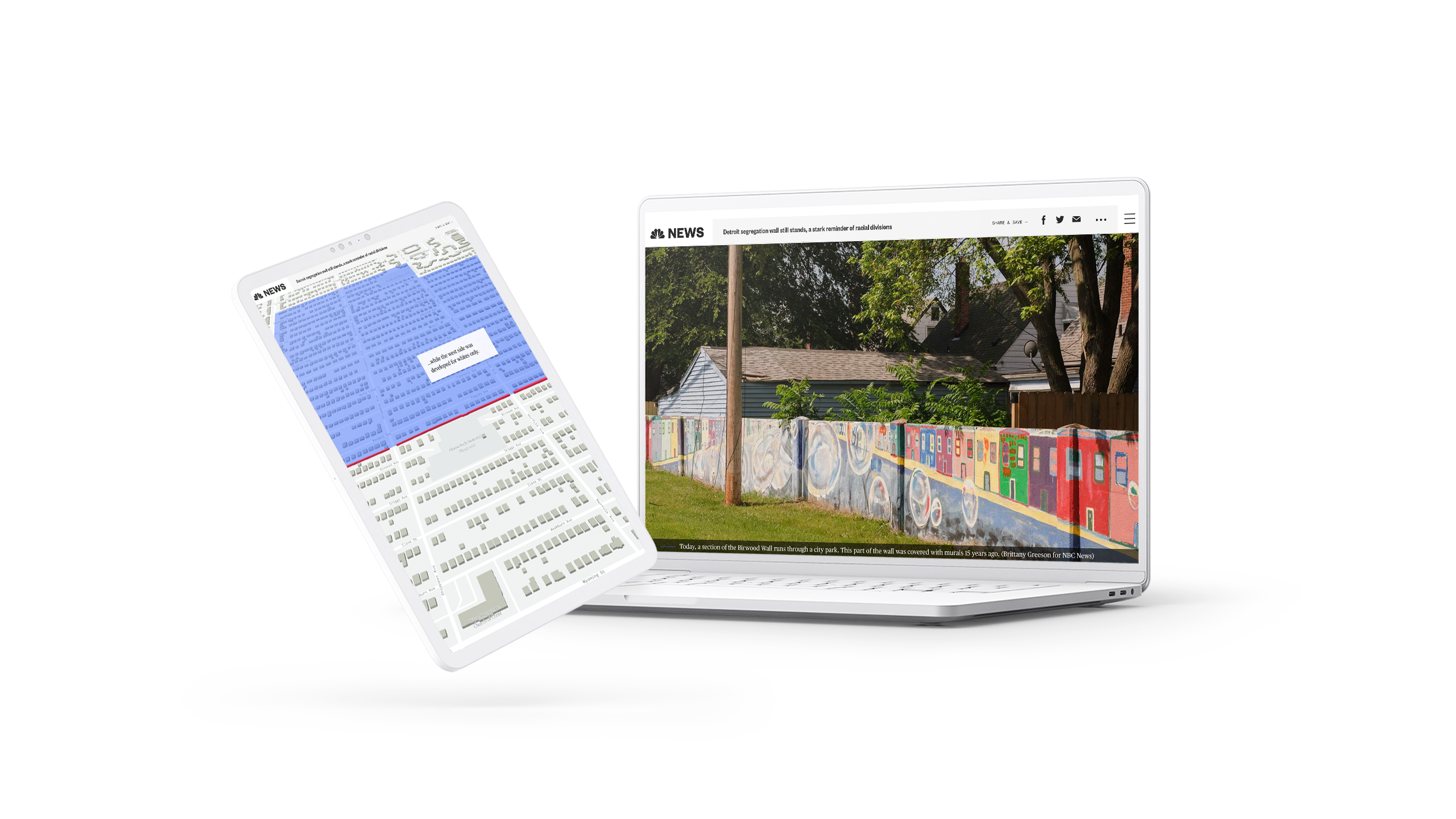
What it is: an editorial on the history of segregation in America and its legacy today.
Who created it: NBC News.
Why we picked this example
One of the best examples of interactive maps, this editorial from NBC News won a webby award for Best Individual Editorial Feature. The story uses scrollytelling to bring several maps to life, including showcasing continued racial segregation over time, from 1930 to 2019. In this piece, the maps really tell the story, so written context is added to the map — keeping the imagery visible to readers at the same time.
7. The road was long: a voice from Ukraine
What it is: a first-hand account of leaving Ukraine after the Russian invasion.
Who created it: Internal Displacement Monitoring Centre (iDMC).
Why we picked this example
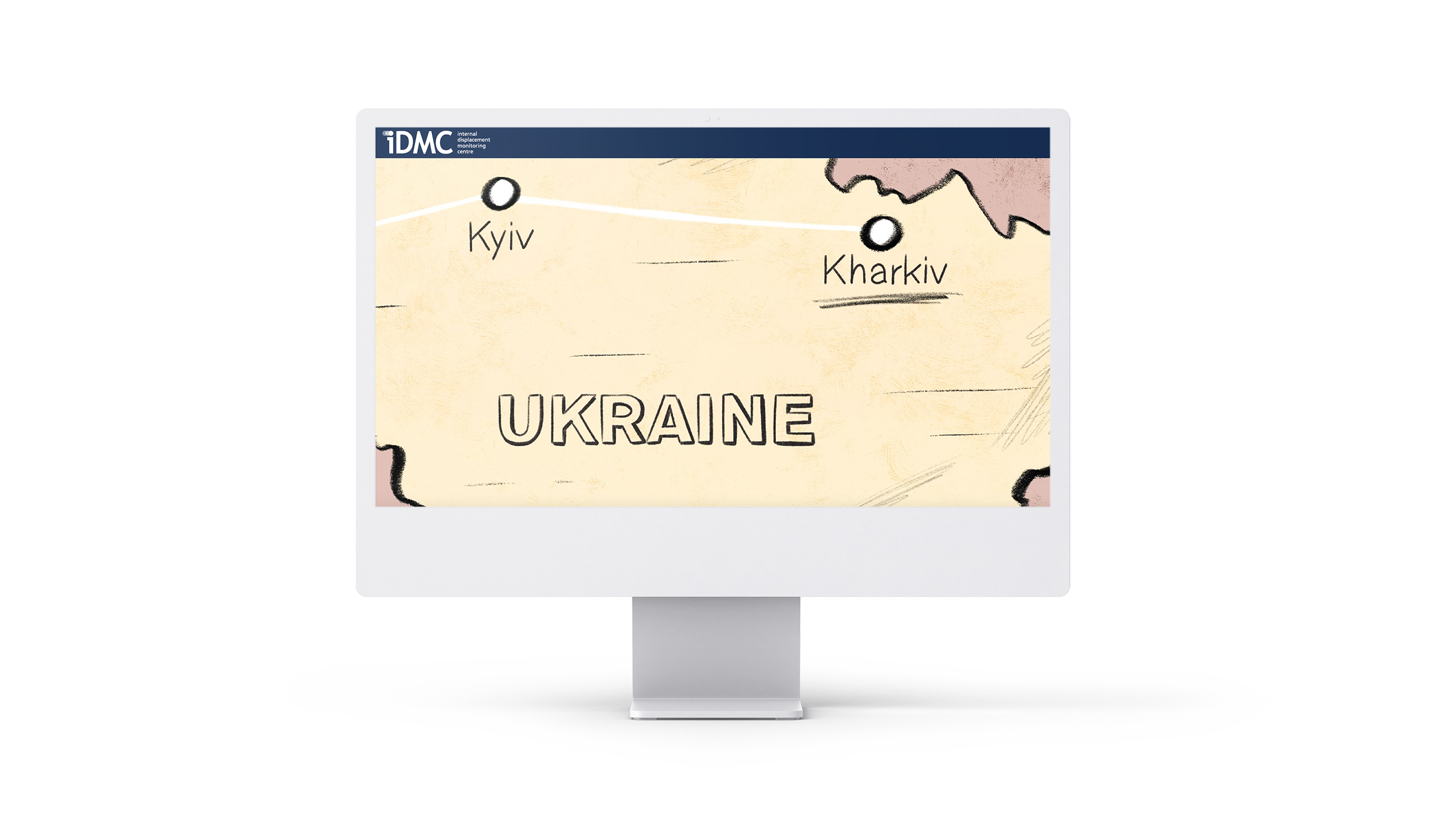
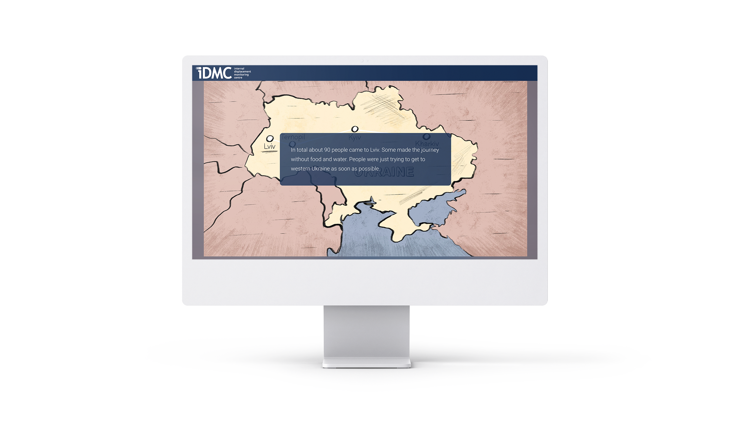
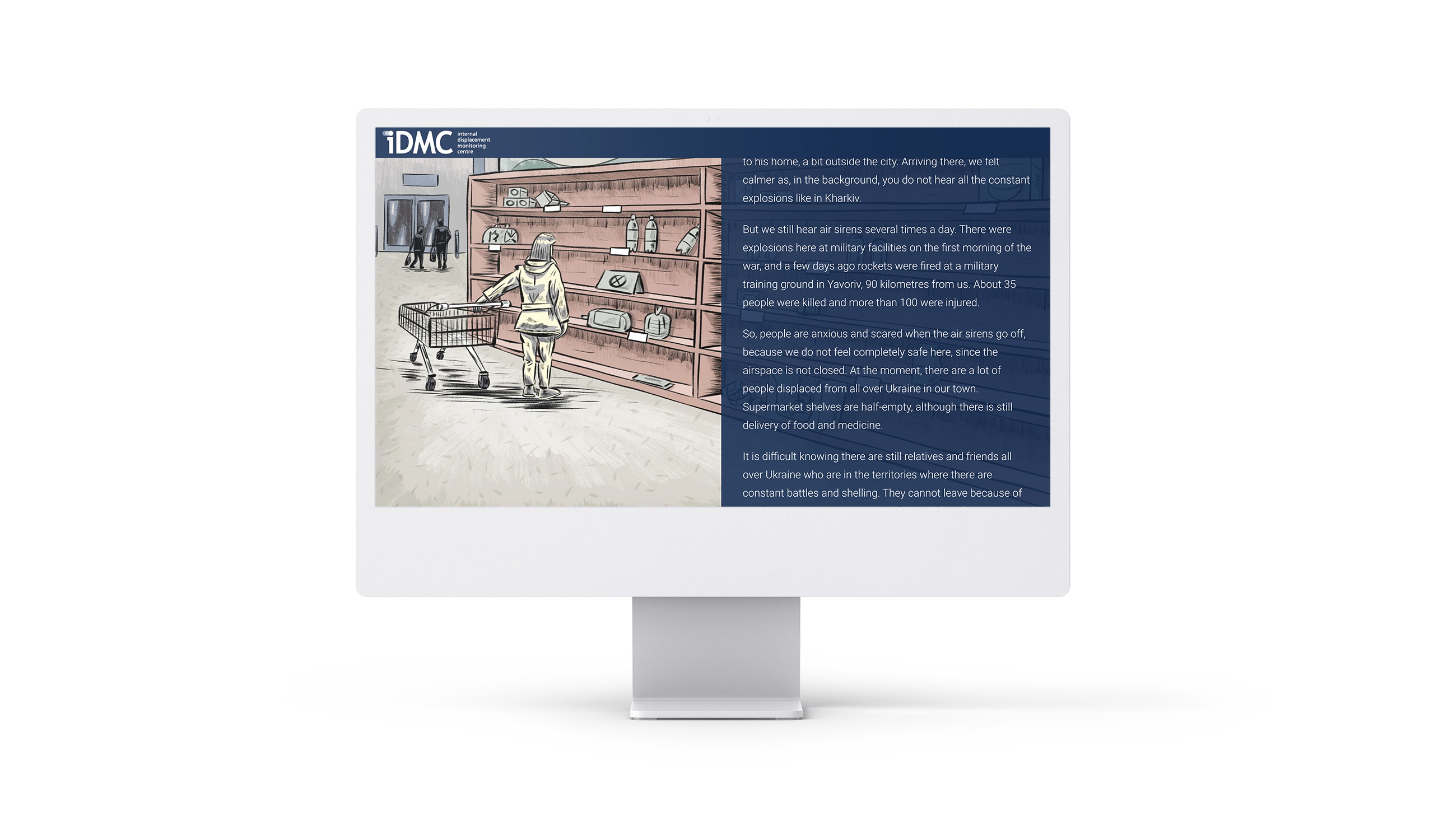
In this first-hand account, Kristina tells her story of being displaced from Kharkiv by the Russian invasion of Ukraine. Her words are the focal point here, but the publishers include illustrations to break up the text and bring life to the narrative. The article uses scrollytelling to load those illustrations in turn with text, giving an effect almost like turning the pages of a storybook.
8. L'impact du numérique sur les villes de l'Afrique de l'Ouest
What it is: a report on the impact of digital technology in West Africa.
Who created it: EPFL.
Why we picked this example
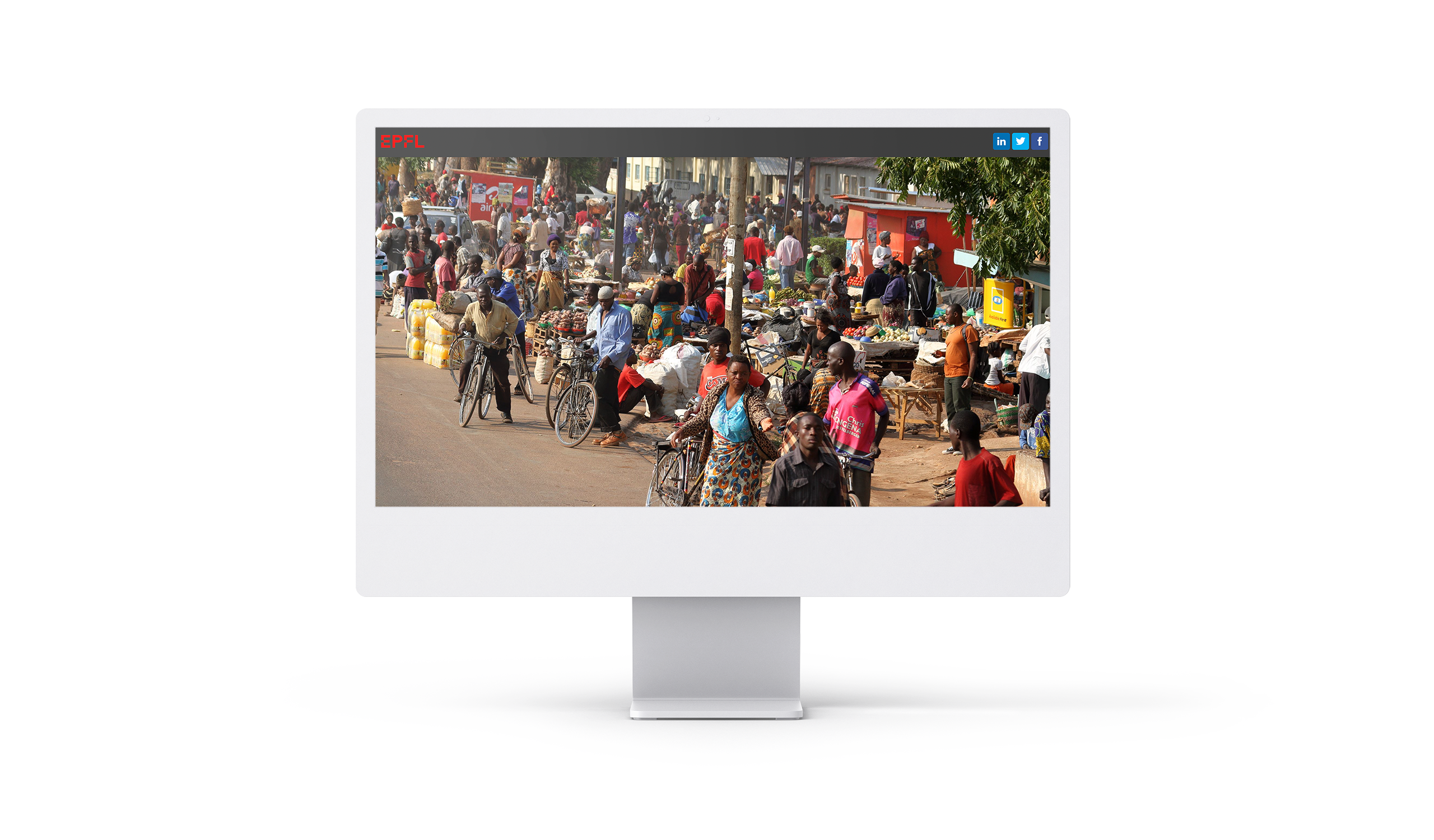
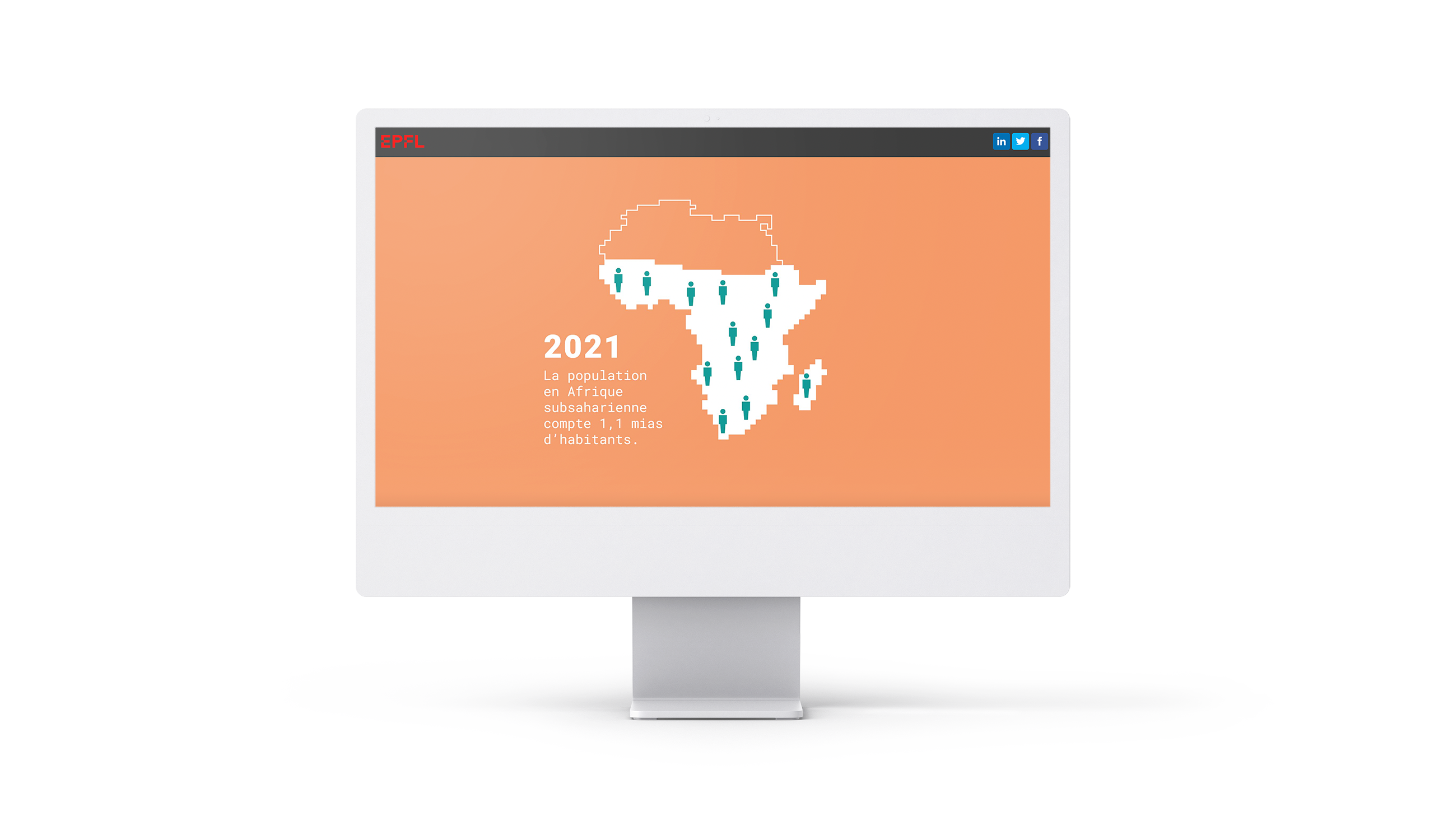
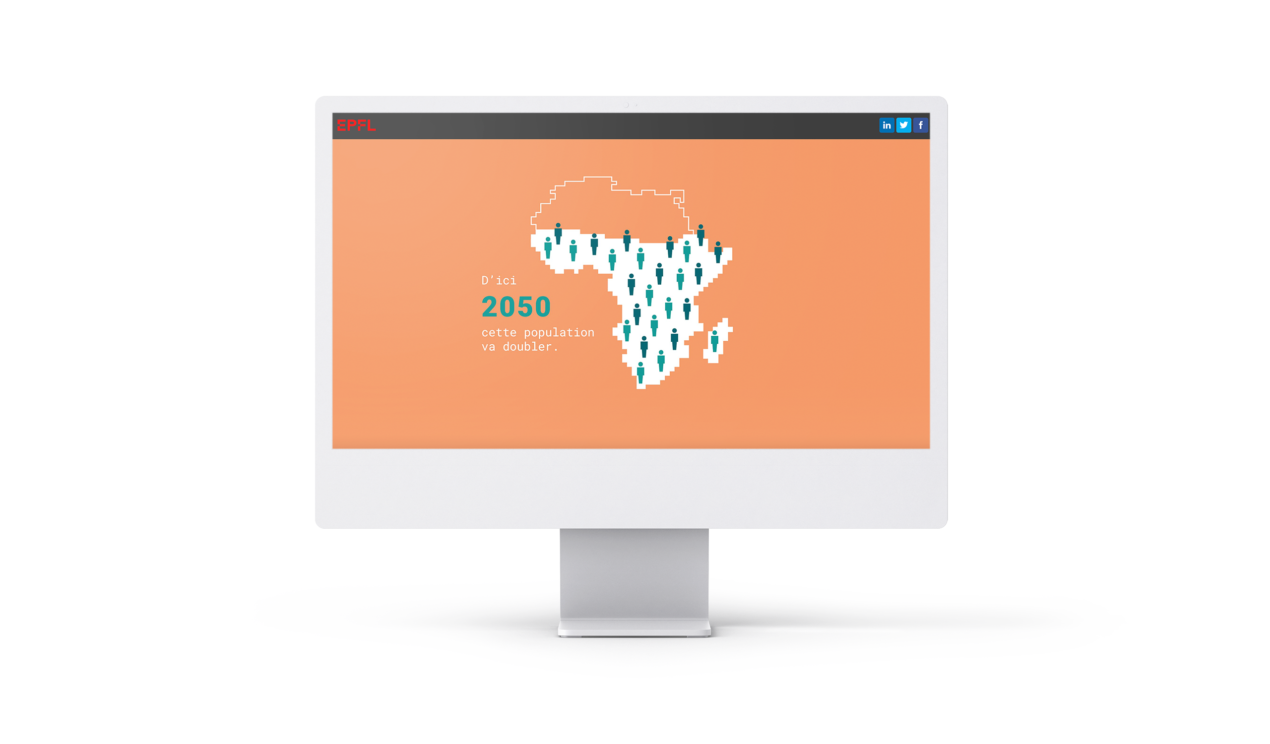
Here, EPFL uses scrollytelling to add compelling, dynamic data visualisations in a number of different ways, from maps to graphs to workflows. These contextualise the numbers and help readers make quick sense of the data, while making the overall report engaging and interactive.
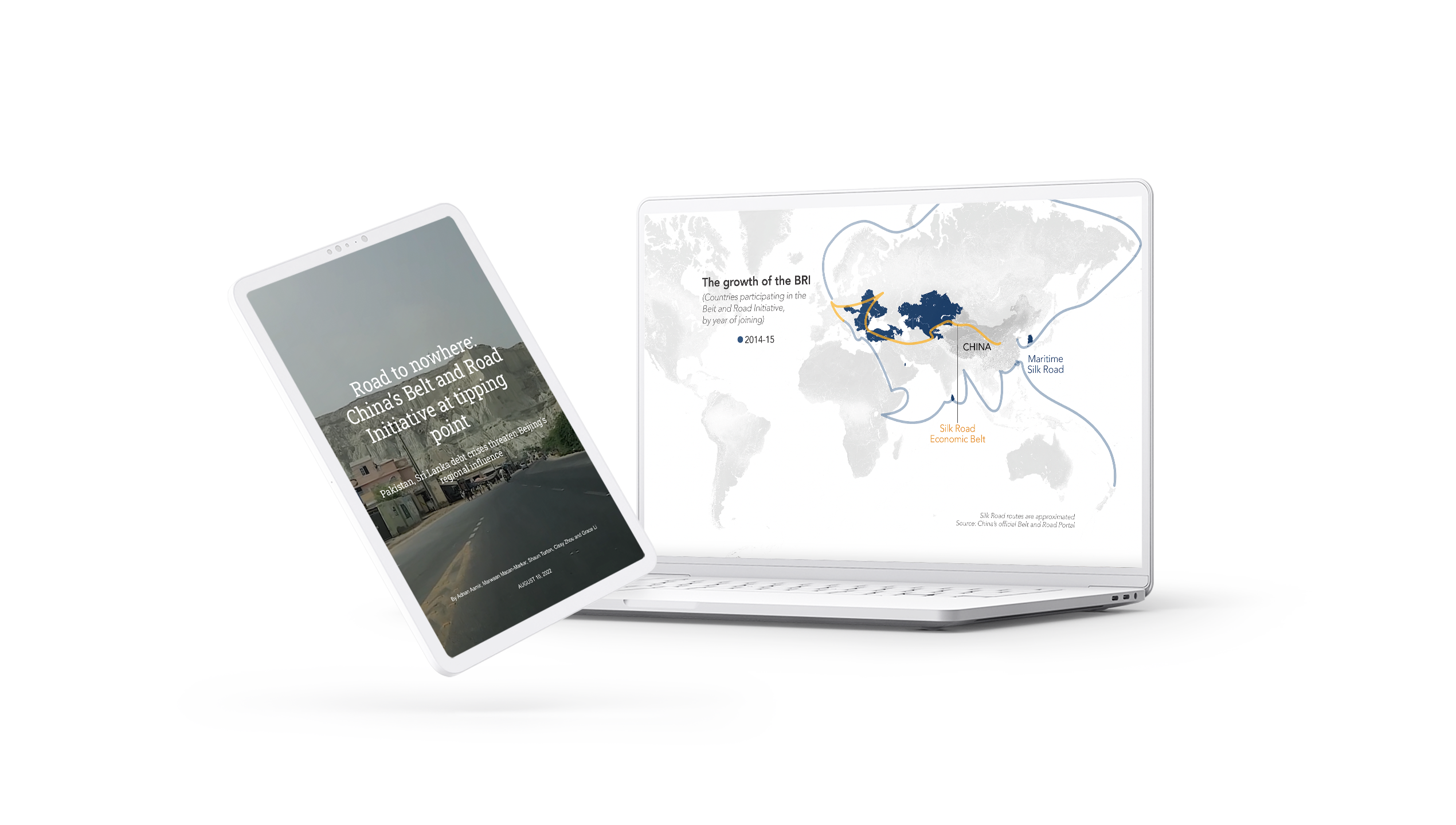
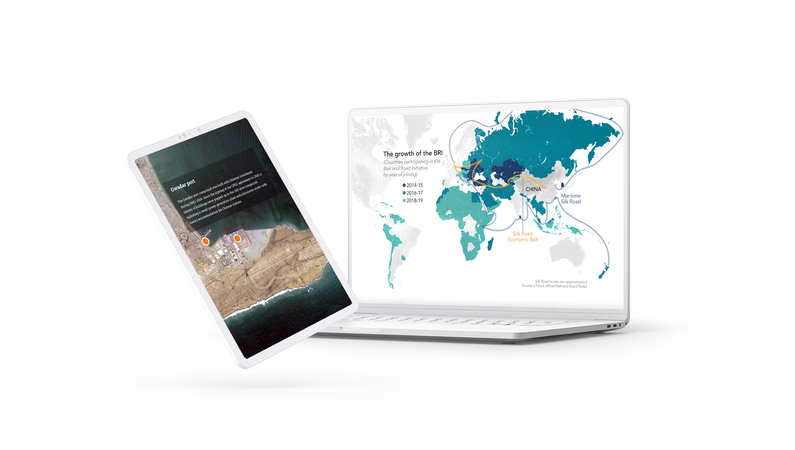
9. Road to nowhere: China's Belt and Road Initiative at a tipping point
What it is: an article on China’s Belt and Road Initiative (BRI).
Who created it: Nikkei.
Why we picked this example
This is another varied example of scrollytelling. The article starts with a dynamic data visualisation of China’s spending in various countries. An interactive map showcases the country’s grand ambitions for the BRI, plus actual projects completed. Plus, throughout the article, scrollytelling images help break up walls of text.


10. La carrera lunática de Musk y Bezos
What it is: a digital article on the new billionaire space race.
Who created it: El Periódico
Why we picked this example
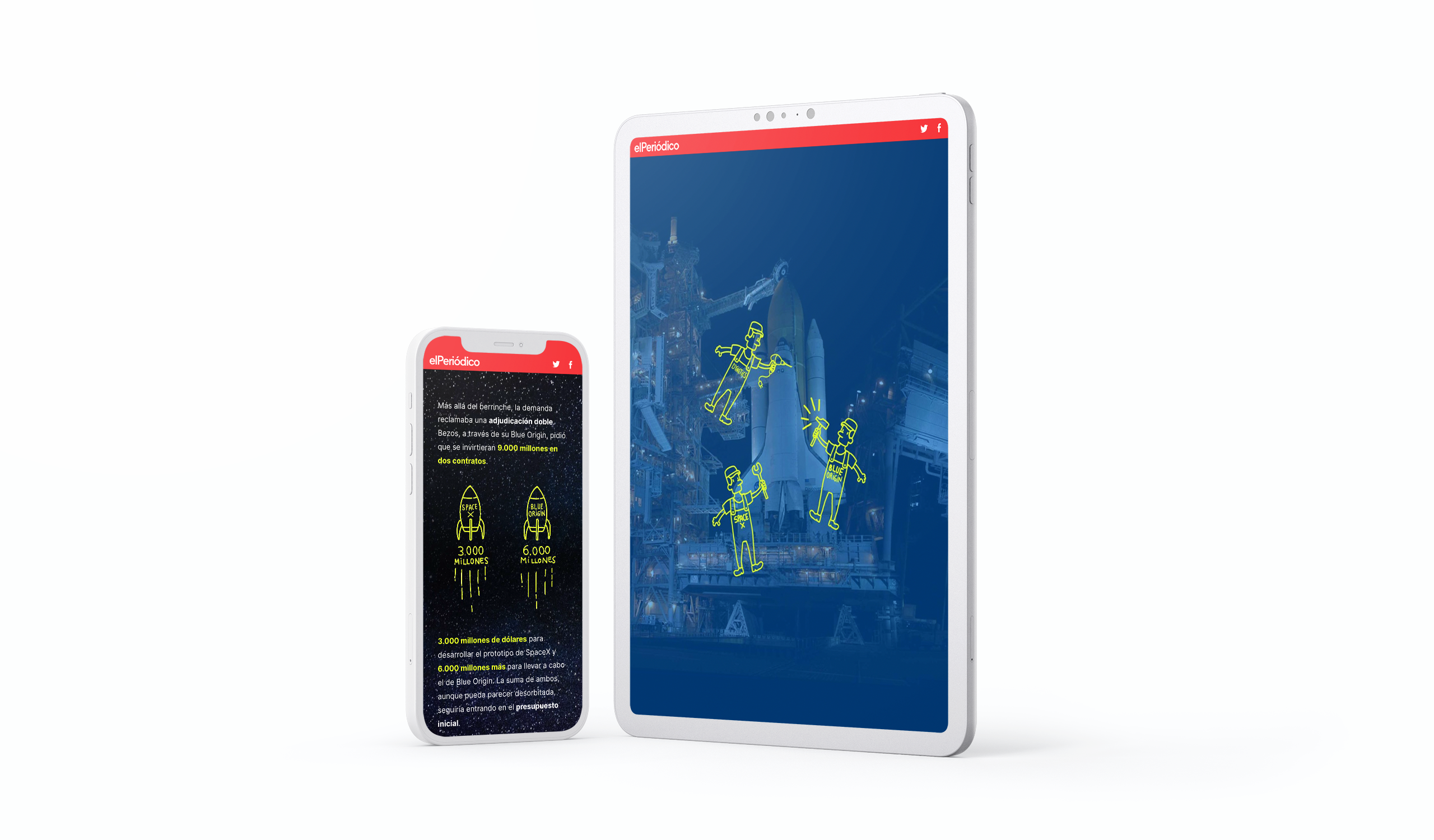
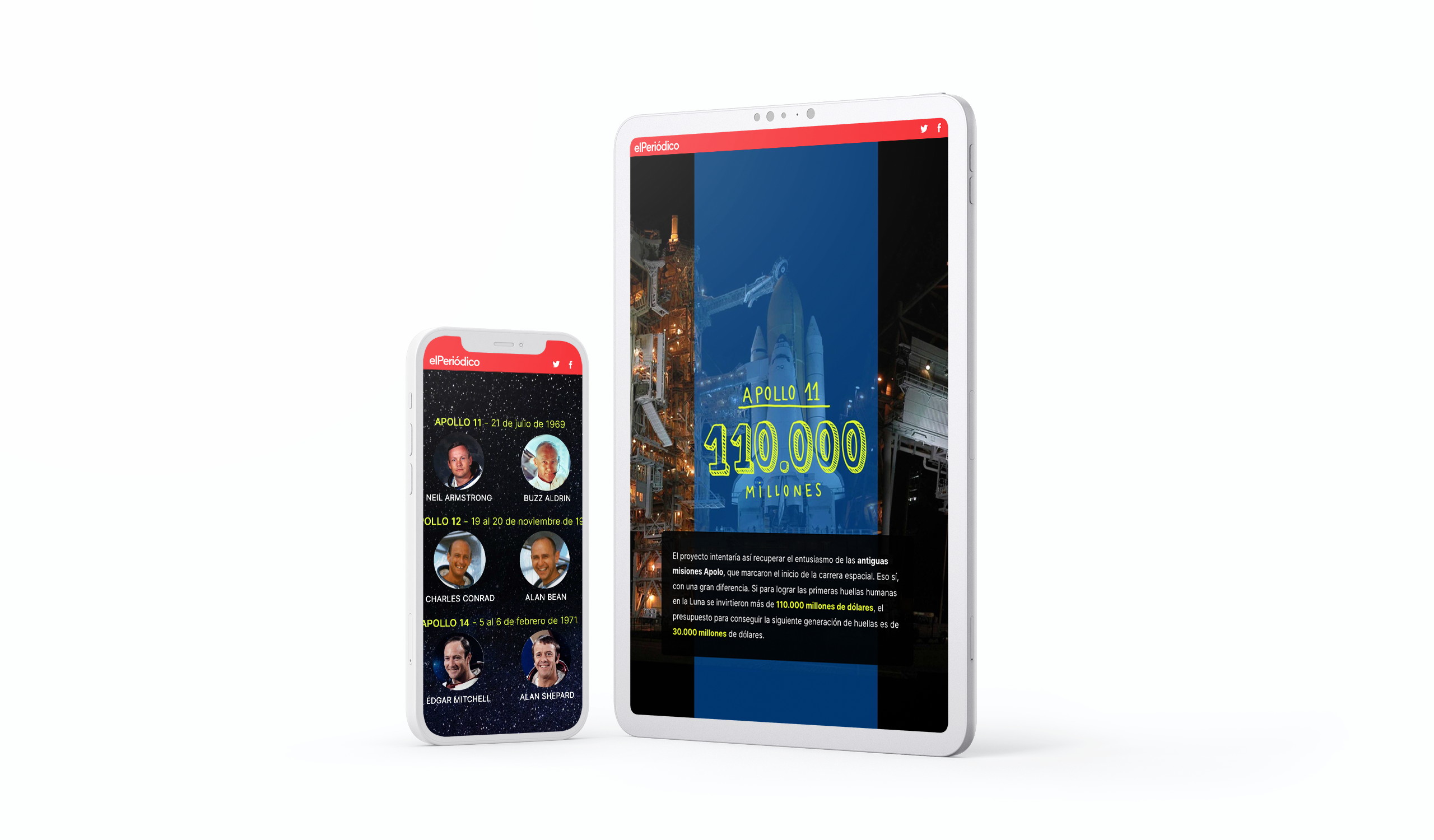
In this digital story from El Periódico, clever interactive design reinforces the tone and angle of the story (read: these billionaires are babies). The publisher combines illustrations with eye-catching imagery to make the story visually compelling, while adding clarity.
11. When marketing goes haywire: a survival guide for modern marketers
What it is: an actionable guide to help marketers weather crises and uncertain times.
Who created it: Smartsheet for Adweek.
Why we picked this example
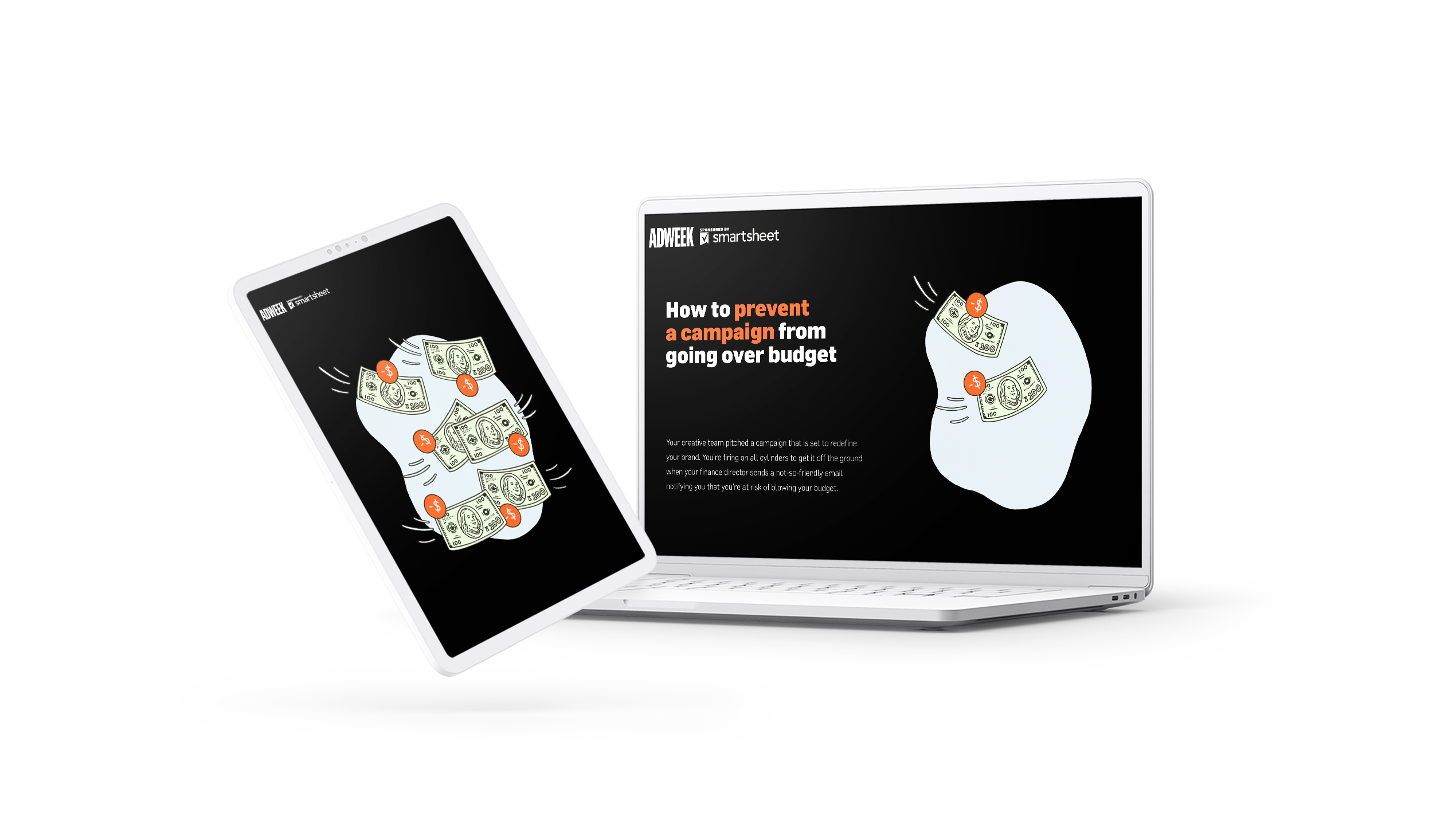
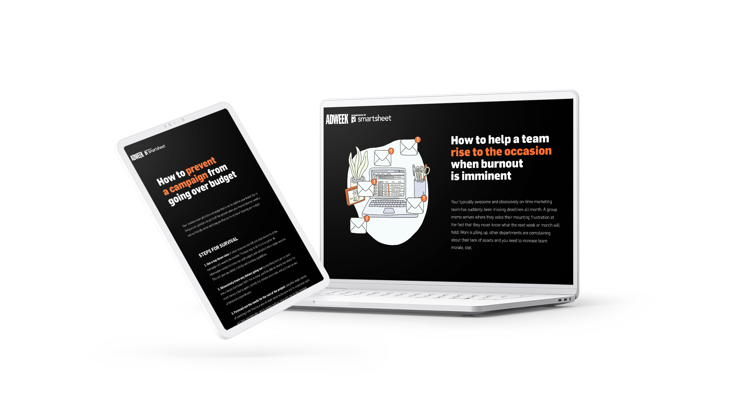
There’s a lot to modern marketing. This guide from Smartsheet and Adweek uses imagery and scrollmation to keep these actionable survival tips engaging, while adding levity to a serious topic.
12. The tale of two pandemics: COVID-19, Auckland and the Delta variant
What it is: a report on the impact of the ongoing COVID-19 pandemic in Auckland, NZ.
Who created it: Stuff.
Why we picked this example
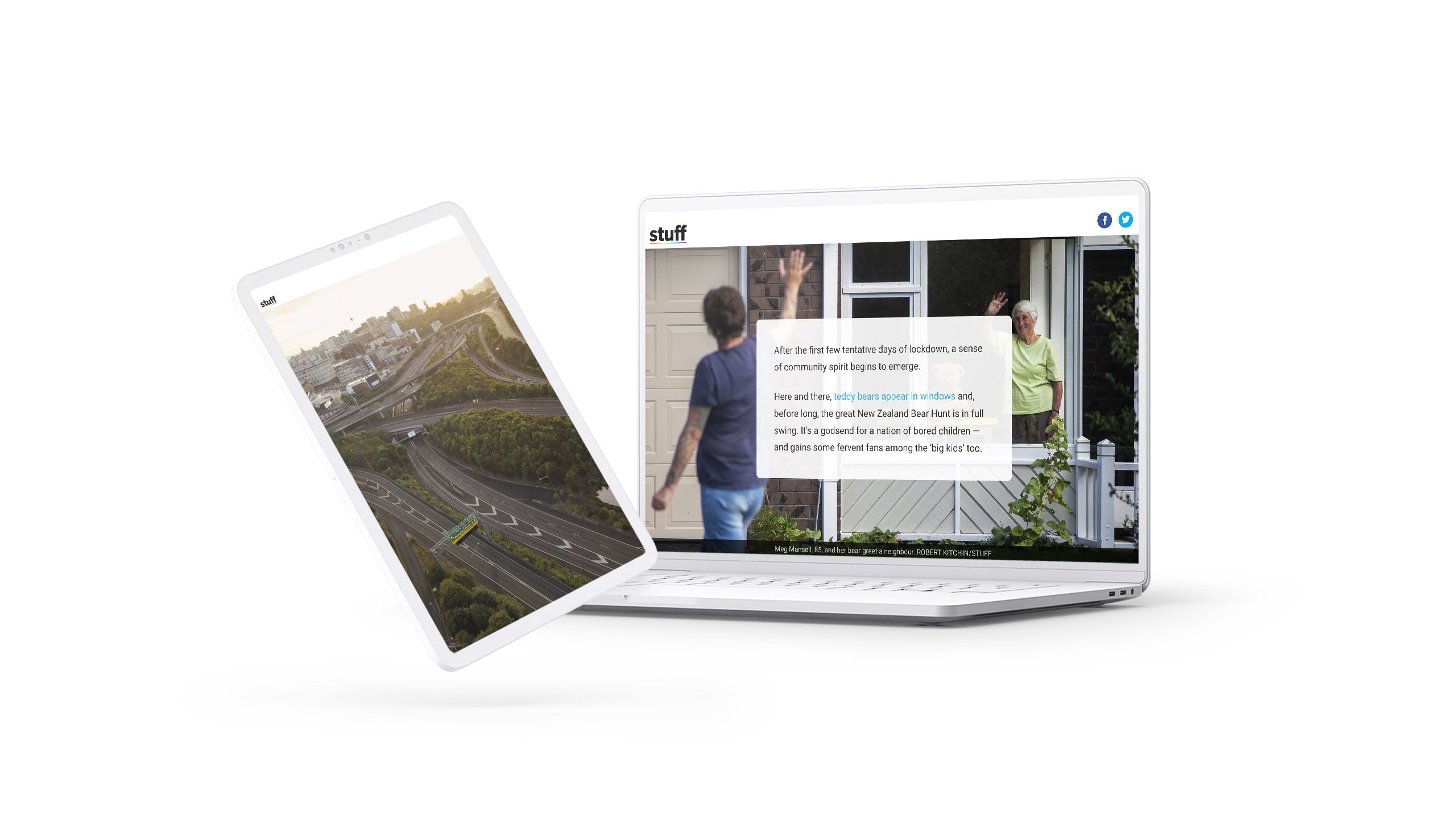
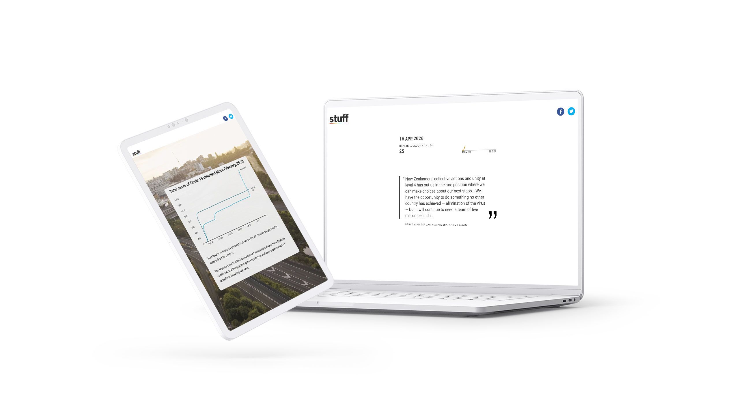
This report from Stuff uses scrollytelling in a number of ways, but we love the timeline scrolling effect throughout the meat of the report most of all. The date and “days in lockdown” counters increase as readers scroll through. To the right of those, a dynamic graph charts COVID-19 case counts and brilliantly illustrates the divergence between Auckland and the rest of the nation.
Frequently asked scrollytelling questions
What’s the difference between scrollytelling and interactive storytelling?
Scrollytelling refers to digital storytelling elements that respond to the reader’s scrolling. This could include shifting copy or media sections, animated images and videos, timelines, changing colours, or data in charts and infographics. Interactive storytelling refers to any storytelling element that the reader actively engages with. This could include quizzes, polls, or forms. A single story can include both scrollytelling and interactive storytelling elements.
What’s the difference between scrollytelling and parallax scrolling?
While ‘scrollytelling’ can describe a range of scroll-based effects, ‘parallax scrolling’ is a specific technique in which certain elements scroll faster or slower than others, creating the illusion of depth.
Do I need coding or design knowledge for scrollytelling?
No. Thanks to immersive digital publishing tools like Shorthand, people can create scrollytelling stories without coding or web design skills.
What makes a good scrollytelling story?
Along with being interactive and striking, good scrollytelling should serve the narrative. It should be designed with the story and the reader in mind, injecting a little digital magic, but only when it makes the content easier to understand and more enjoyable to scroll through. It should also be responsive, so before publishing your scrollytelling, check it across multiple devices — both desktop and mobile. Finally, it must be accessible: any scrolling elements you add should meet the same accessibility standards as the rest of your digital content. Read our full guide to accessible visual storytelling to find out more.
Is scrollytelling good for SEO?
Yes. When scrollytelling improves the reader experience, it can increase dwell time and engagement, signalling to search engine crawlers that your content is valuable and satisfies user intent. Scrollytelling content should still follow SEO best practices — including accessibility, performance (load speed), structure, and keyword optimisation — to perform well in search results. Read our full guide to learning SEO for more information, and check out our guide to how to optimise content for AI search, too.
When should I use scrollytelling, and when will a standard article be a better choice?
This depends on your product, your brand, your audience, and your resources. Media companies might reserve scrollytelling for deeper, longform features, while publishing standard news articles day to day. Brands, on the other hand, that produce content marketing may choose to invest more time and resources in planning, designing, and producing articles that delight and engage readers — and apply scrollytelling elements more frequently as a result.


