How does a leading cultural institution produce visually rich and immersive stories?
Opera Australia is the principal opera company in Australia, performing out of the legendary Sydney Opera House and Arts Centre Melbourne.
Opera Australia started using Shorthand towards the end of 2019 in order to produce beautiful, visually rich stories about their performances.
Since then, they have gone on to produce a stunning range of content, from behind-the-scenes stories and retrospectives to beautiful digital brochures.
We caught up with Ben Neutze, the marketing content specialist at Opera Australia, to talk about the growth of Opera Australia’s impressive content programme, starting with his impressions of using Shorthand.
An intuitive platform
“The further that we've gone on, the more possibilities we've discovered.”
Ben describes Shorthand as “a really easy and intuitive platform. It's great to use and spend time discovering all of the different things that you can do.”
As Ben explains, each of Shorthand’s section types has a “really clear purpose for what it’s for.” But there’s also room for experimentation and creativity.
“You can play around with it a bit and see what you can make out of each section by just adjusting some of the settings. It's easy to use and it's fun to discover the new functions as they come.”
This has led to Ben and the team exploring many more different use cases. “I think when we were first using it, we had a really clear idea of a few pieces of content that we wanted to be able to build with Shorthand.
“And then the further that we've gone on, the more possibilities we've discovered. Certainly throughout lockdown when we had to be really agile and find new ways of presenting old content. That's when we really discovered a lot of the capabilities of it.”
Cheat sheets
“By building them in Shorthand, we can ensure that the digital experience is in keeping with the experience that they get at the theatre.”
Opera Australia’s first use case for Shorthand was the digital version of the company’s ‘cheat sheets.’
As Ben explains, “Cheat sheets are a really quick and audience-friendly guide to each opera that we’re performing. They’re sent out to our audiences in a pre-show email.
“The cheat sheet includes a rundown of who the composer is, who the main characters are, what the songs are that the audience might know, and some funny and interesting stories about how the opera was written.”
Prior to Shorthand, the cheat sheets were produced using Opera Australia’s CMS, which was, as Ben explains, “just a lot more rudimentary, with limited capabilities for visual storytelling.
“We made it work as well as it possibly could, but obviously it's capabilities were very limited for that sort of content. While there were images, it was a much more basic presentation.”
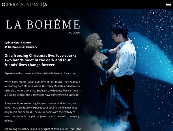
The same cannot be said for Opera Australia’s cheat sheets built with Shorthand, which are visually rich and immersive. One great example is the cheat sheat for the opera La Bohème, which combines historical images with an easily digestible introduction to the production.
Ben says that the cheat sheets built with Shorthand are “essential to our entire customer journey. Those cheat sheets allow us to communicate a lot of information about an opera. They allow us to have that relationship with a customer before they even set foot in the theatre.
“By building them in Shorthand, we can ensure that the digital experience is in keeping with the experience that they get when they actually arrive at the theatre.”
Page to Stage
The Opera Australia team also use Shorthand to produce a regular feature called ‘Page to Stage.’
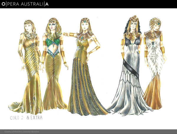
Ben says that Page to Stage gives a behind-the-scenes look at how a show is brought to production. “This shows costume and set sketches, and then the final product with production photos.”
With this range of visual media, Ben and the team are able to use Shorthand’s visual storytelling features — such as Scrollmation and Reveal image transitions — to bring the story to life.
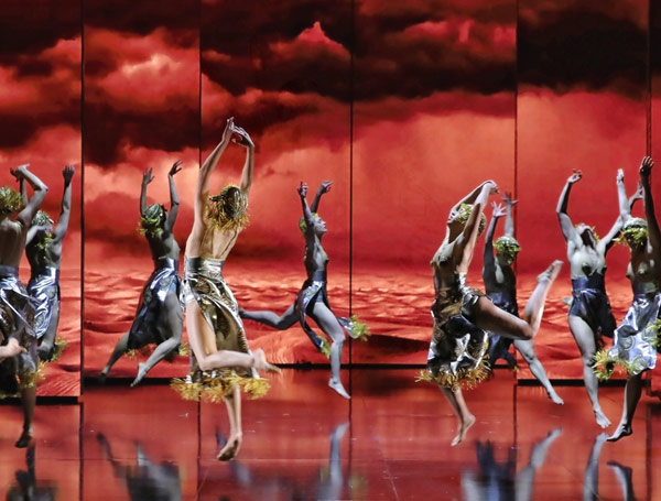
One impressive example is Page to Stage: Aida, which juxtaposes key elements of the production process — such as sketches from costume design — with photos from the live production.
Bringing an archive to life
Over the last two years, Opera Australia hasn’t been able to perform nearly as many shows — which has meant fewer behind-the-scenes stories.
Instead, Ben and the team have explored the company’s rich archives.
“Obviously, when we were in lockdown, we weren’t on stage and it was really difficult to produce new content. But we did have access to a really great archive of images,” Ben says.
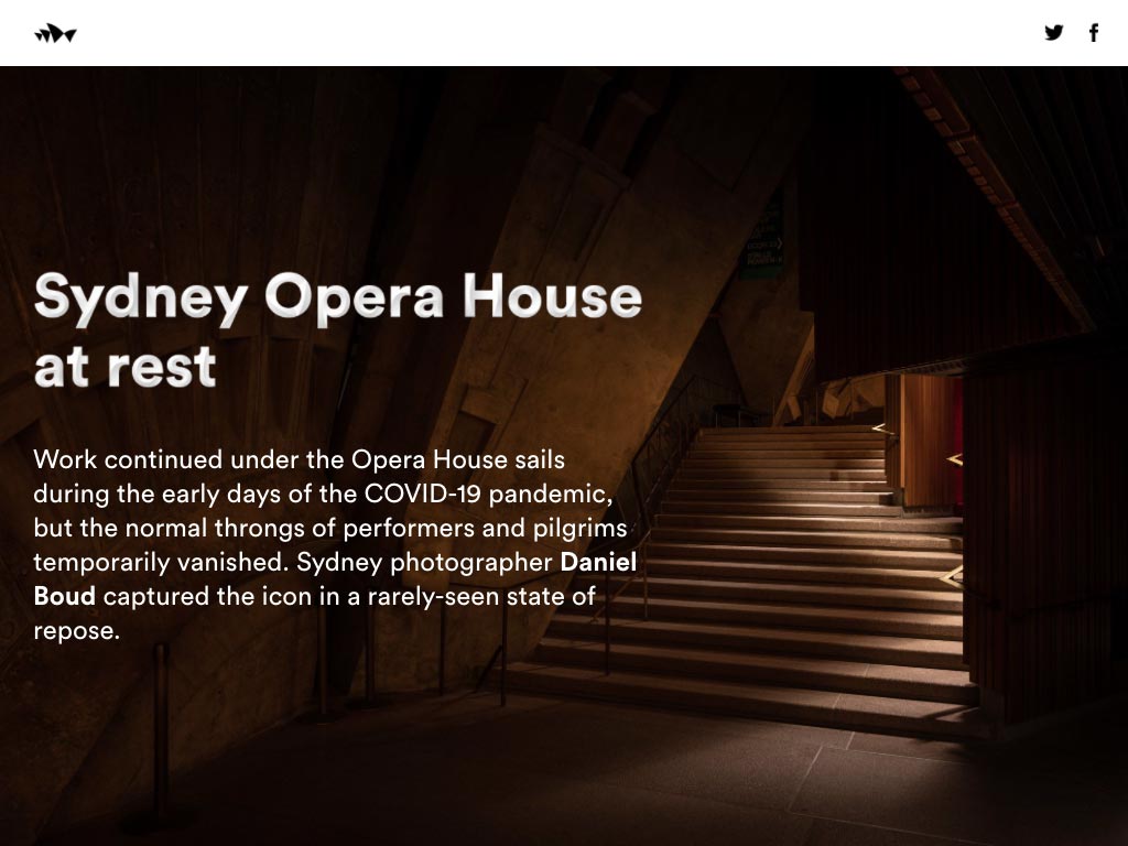
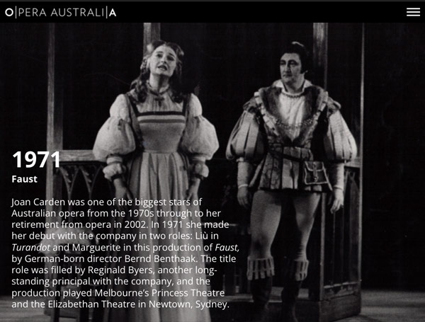
One story published from this archive was the spectacular retrospective, 50 years of Opera Australia. With evocative photos and historical anecdotes, the story brings the history of the opera company to life.
Ben and the team have also used Shorthand to showcase the historical performances of a specific opera. One great example is The Marriage of Figaro, which was the first opera the company performed, back in 1956.
The digital brochure
“Shorthand is just a really obvious answer to the problem that we faced.”
Each year, Opera Australia launches a new season of performances. At part of the launch, they send a physical brochure to subscribers and update their website with performance details.
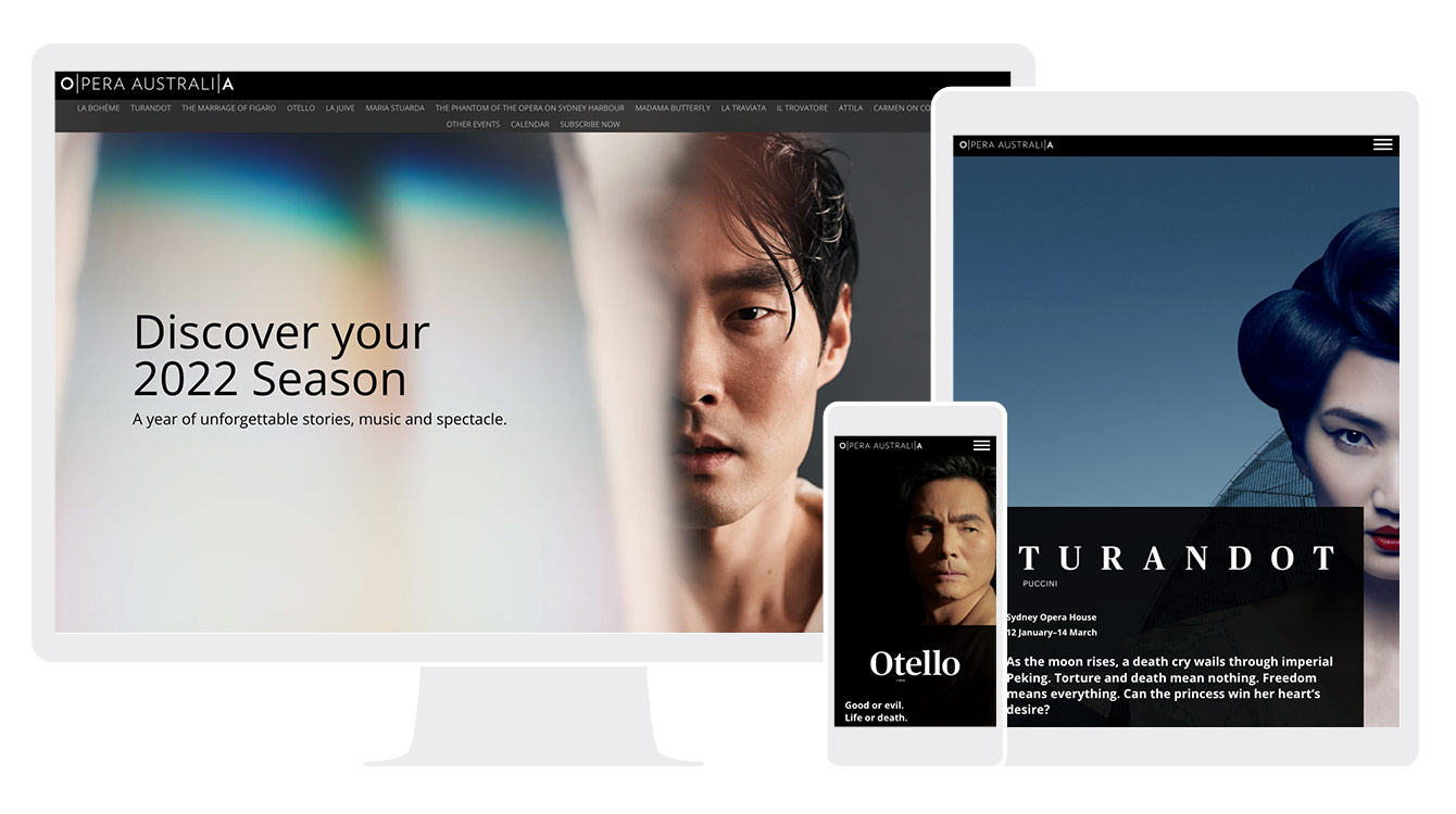
In 2021, Ben and the team decided to add a third element to their season launch: A digital brochure.
“We have been thinking for a while about the possibility of doing a digital brochure. There are over a dozen performances each season — and each of them always has their own production page on the website.
“But the user experience of jumping from production page to production page is not the best way of discovering a full season quickly. With the digital brochure, we wanted to help people discover the full breadth of performances for a season.��”
The team had been thinking about producing a digital brochure for several years, but were concerned about the costs of bespoke development and design. As Ben says, “we were concerned that it could turn out to be quite expensive to invest in producing.”
With Shorthand, the Opera Australia team were able to produce a great digital experience, without investing in additional custom development.
As Ben explains, “there was a point a couple of months out from launch where I just said, we have a platform that can do all of the things that we want to do.
“And Shorthand is just a really obvious answer to the problem that we faced. And I made a mock up and sent it across to the team. Everybody was really happy with it, and we just went from there.”
The results? “The digital brochure has basically been how the vast majority of our audience has explored the season this year, while we’ve been waiting for our physical brochure to land in mailboxes. And given that the results have been so strong, we'll definitely be doing it again next year.”
The default for digital storytelling
Opera Australia’s use of Shorthand has grown hugely over the last two years, and Ben is confident that the team will continue to experiment.
“We're continuing to develop and push the new features rolled out by Shorthand.”
Following the success of their recent content, Ben explains that Shorthand has become central to implement the company’s content strategy.
“Shorthand is now the default for digital storytelling. Unless we can think of a reason why it should live somewhere else, it lives on Shorthand.”

