9 examples to inspire your next annual report
9 examples to inspire your next annual report
5 minute read
Getting ready to write an annual report? The process doesn't have to be tedious. In this guide, we showcase nine exceptional annual report examples.
With no-code publishing platforms and free templates, designing a high-impact annual report has never been easier.
We'll cover:
Start creating with Shorthand
It's the fastest way to publish beautifully engaging digital magazines, annual reports, internal comms, and more.
What are annual reports for?
While you may be familiar with the basic definition of an annual report — a yearly statement summarising your organisation's accomplishments and financial health – there's much more to it.
A well-crafted annual report can serve as an essential reference, a flagship content piece, and a source of inspiration for employees, volunteers, and donors. As we've mentioned in The Craft, content is a critical component in most non-profit marketing strategies. Great annual reports have evolved into versatile tools, providing material for case studies, interviews, infographics, and statistics throughout the year.
Increasingly, annual reports feature data visualisation — from standard pie charts and graphs to more interactive graphics and maps.
For nonprofits where every cent and minute are valuable, annual reports present an incredible opportunity.
However, creating an in-depth, high-quality annual report requires thoughtful planning. Nonprofits must make their work relatable to readers and stakeholders who may not possess industry expertise. They must also showcase their values, real-world impact, and future mission.
The design should be anything but dull. Annual reports must be engaging and reflective of the organisation's exciting vision for the future.
How annual reports have evolved
In the past, annual reports were often distributed as printed brochures or PDFs , with a cover page and table of contents. However, these formats have their drawbacks.
Printed reports can be costly to produce and only reach a limited audience. While PDFs offer broader distribution, they can be cumbersome to navigate and are known for their inaccessibility.
Reading PDFs on mobile devices is challenging, a crucial consideration as mobile has accounted for over 50% of internet traffic for years. Google now actively penalises non-mobile-responsive pages, impacting the SEO value and readability of your annual report. Learn more about the limits of PDFs.
Nonprofit organisations must also consider their diverse range of stakeholders. It can be challenging to craft annual reports that effectively communicate with executives, investors, employees, clients, donors, and volunteers — while still adhering to brand guidelines
The solution? Create an accessible, visually appealing annual report that displays well on all devices, featuring your brand fonts, colour scheme, and typography. With beautiful writing, great graphic design, and a great content platform, your year-in-review is a potent marketing tool.
Achieve this without breaking the bank or becoming entangled in costly software solutions.
In this article, we highlight some of the best digital annual reports from nonprofits published with Shorthand — plus a few templates if you plan to get started right away. The no-code publishing platform enabled them to produce evocative and impactful reports without relying on an extensive team of developers and web designers.
So, here are nine exceptional annual reports selected by Shorthand.
Want to create your own annual report?
Get started with Shorthand, and use one of our free annual report templates to kickstart your creativity.
9 brilliant annual report examples,
selected by Shorthand
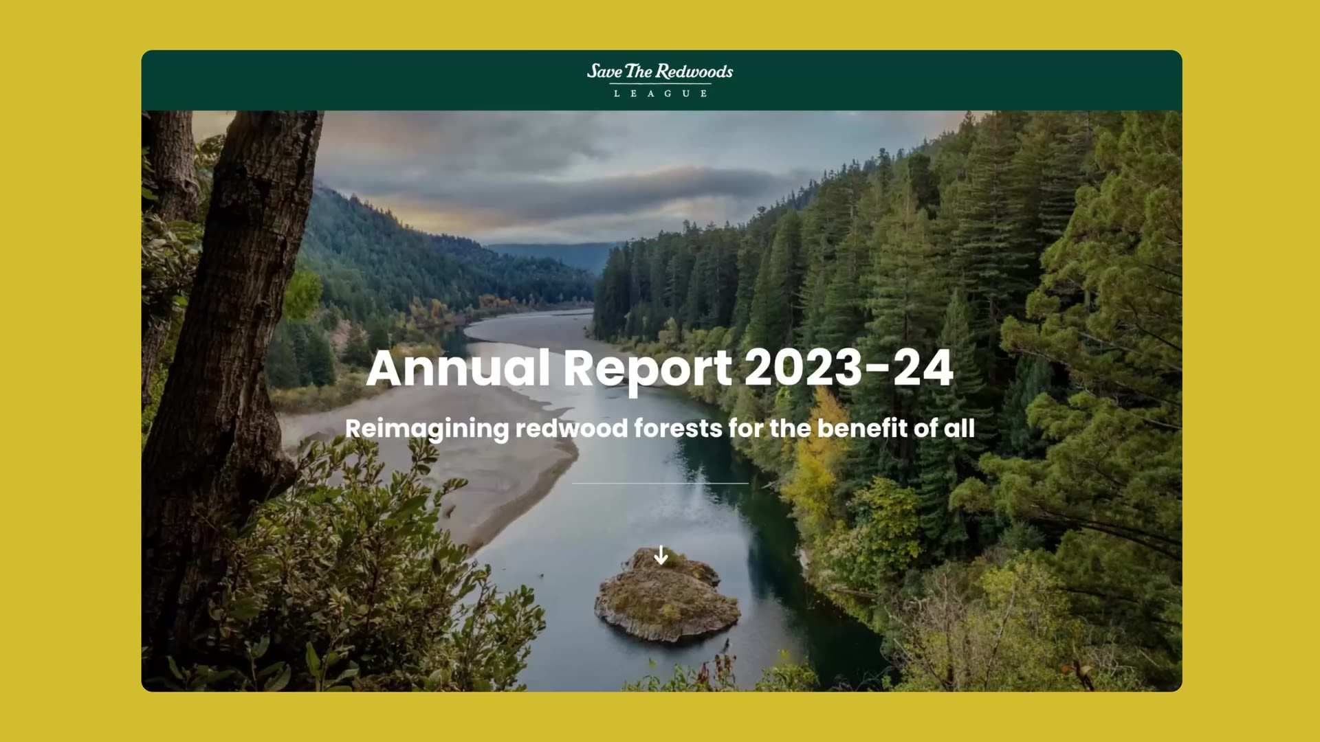
Save The Redwoods League (2024)
This interactive report pulls the reader in with beautiful forest photography and shots of the community at work in the woods.
It contains brilliant data visuals of the organisation’s impact, including protected areas, parks created, and student involvement.
It also includes a detailed scrolling map of its focus conservation zones, embedded video, and a scrolling timeline map.
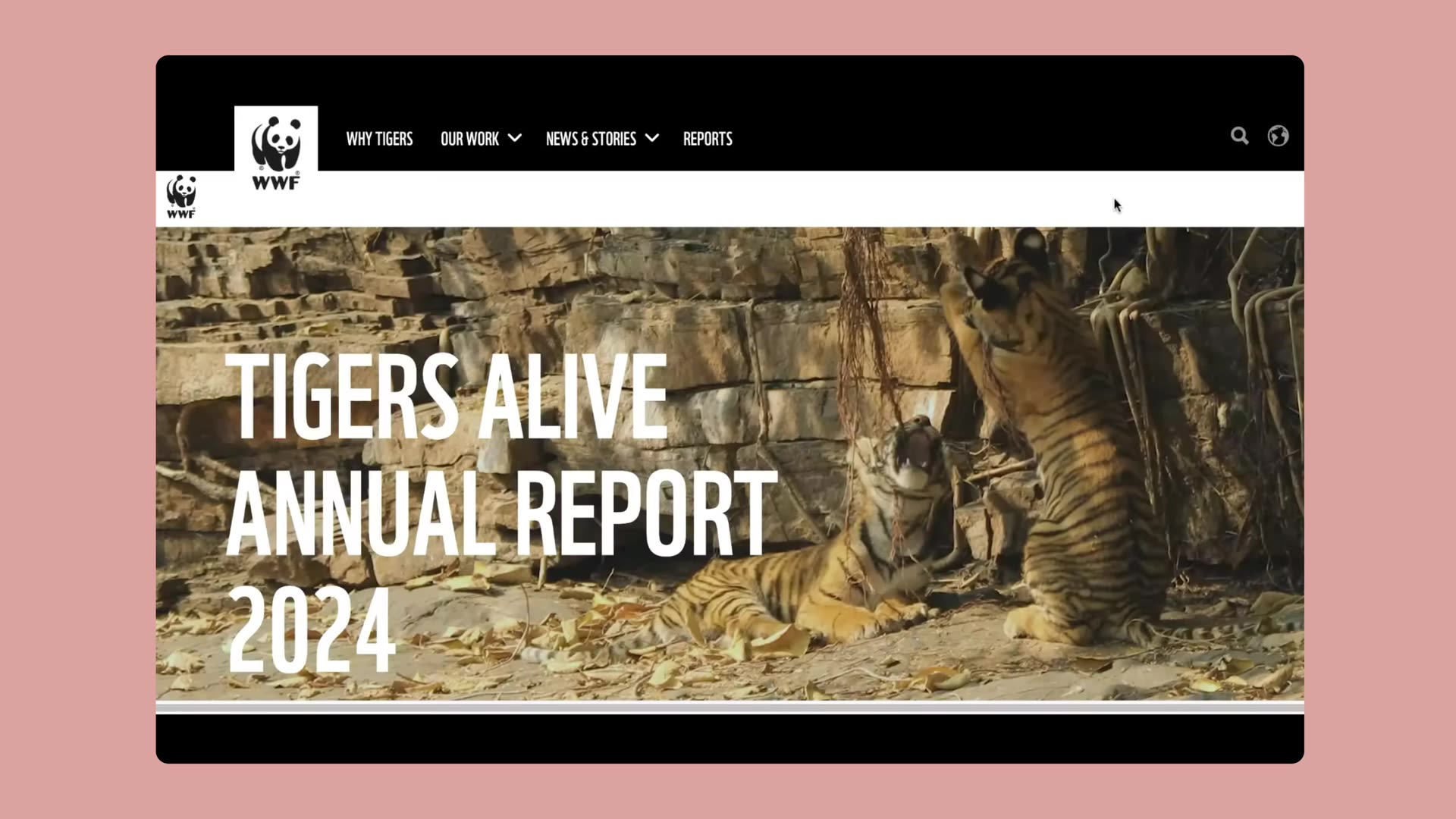
WWF
The World Wildlife Fund’s ‘Tigers Alive Annual Report 2024’ makes the most of its subject matter, using beautiful photos and videos of tigers interacting in the wild and in captivity to keep readers and donors interested.
Acting as a user friendly hub, it links out to six individual articles, all focusing on one area of the WWF’s tiger conservation efforts, partnerships, and milestones.
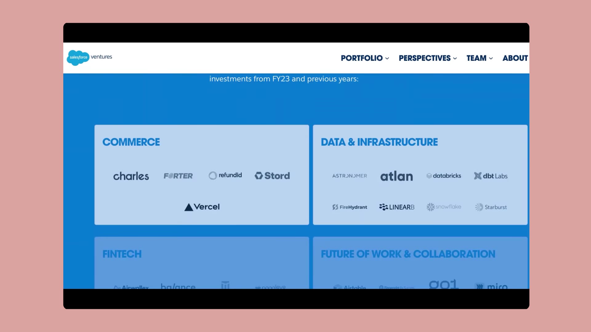
Salesforce Ventures
Salesforce Ventures’ ‘Year-In-Review’ is another on-brand winner, adhering to Salesforce’s recognisable blue colour palette.
With animated datapoints that come to the surface as readers scroll through, full-width photography, and celebrations of some of the company’s wins and appearances in awards events, it is an easier read than simply sharing dry metrics and financial information.
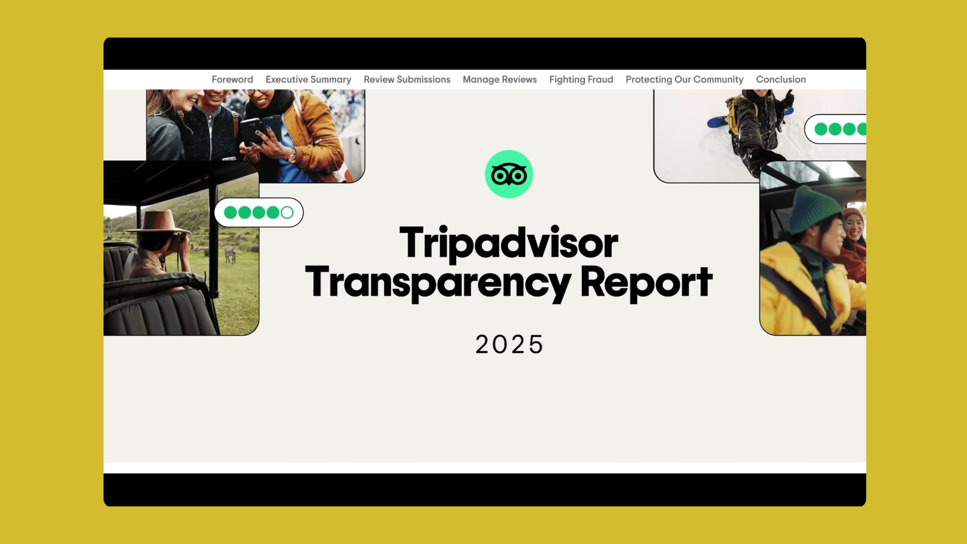
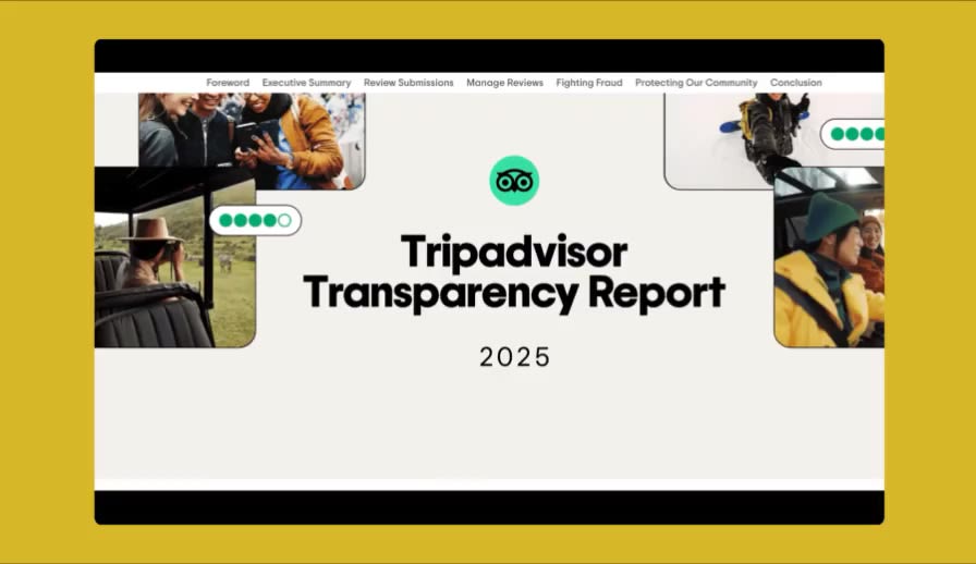
Tripadvisor
Tripadvisor’s ‘Review transparency report’ publicises insights from the last year of customer reviews.
For such a long article, it does an incredible job of breaking up heavy bodies of text with well-designed data visuals and fun travel photos.
Shorthand's non-profit annual report template
This annual report template will help you speak more effectively to shareholders, donors, and partners.
It's designed to share a lot of information, easily, with plenty of space for impactful images. We've used a simple, two-colour palette to reflect your brand without becoming a distraction. You can draw out key statistics in dedicated banner slots.
Like all our annual report templates, it includes detailed tables for your financial statements and performance data. And it ends with a farewell paragraph, CTA, and a button for more information.
Climate non-profit annual report template
This template helps organisations reach donors, shareholders, and supporters.
Get their with attention with images then sum up the situation with short blocks of text. Key quotes and statistics with text sections will fill the screen.
This simple template opens with space for a mission statement or personal message, and ends with a CTA and button — helping you convert inspiration into action.
Local arts organisation annual report template
Showcase artwork, creativity, and community in this template.
Bring your annual report to life with bright colours, immersive photographs, and animated illustrations. We've used a vivid, eye-catching colour scheme, and you can completely customise it to best represent your brand styles and mission. Slots for images and quotes mean your annual report can represent a wide range of voices. There's space for the facts and figures, too.
This template is perfect for demonstrating your impact in a way that's accessible to donors, funding sources, partners, and community members alike.


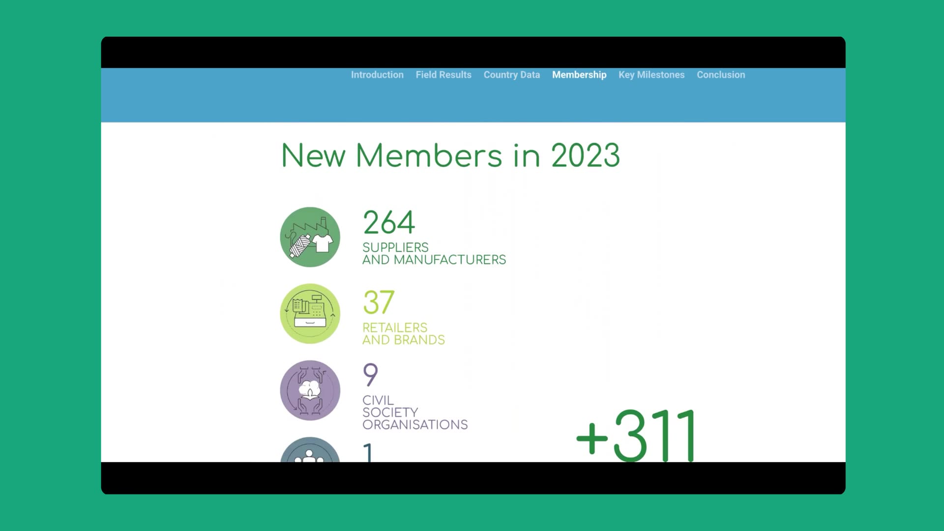
Better Cotton
Better Cotton’s 2023-'24 ‘Annual Report Key Highlights’ is an example of a clean and simple annual report. With a message from the CEO, followed by simple data visualisations and maps detailing cotton production around the world, it’s a fine example of a classic donor report that mixes copy, imagery, and infographics to help keep readers engaged without overwhelming with large bodies of text or numbers.
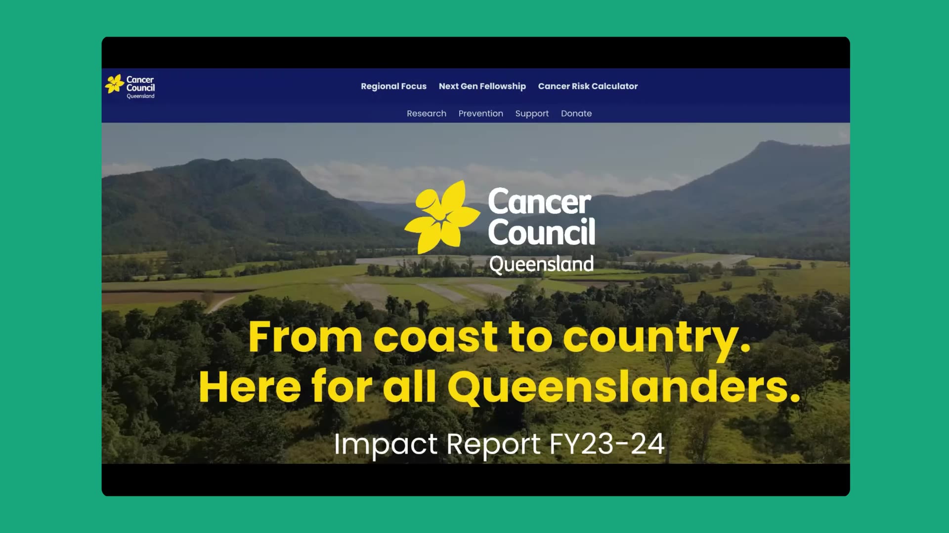
Cancer Council Queensland
This donor impact report stands out for its branding. The organisation’s yellow and blue colour scheme is used to fantastic effect in the report’s top navigation bar, headline copy, background, and also in fantastic animated icons that break down the fundraising and initiatives from the past year.
It also features full-width videos, photos of community members across the state, and strong calls to action for readers to join in support.
Your next annual report
If you want to create a report that makes a difference and tells a compelling story, hopefully these nine examples gave you some inspiration. To keep you moving, why not try these 10 free annual report templates — they're ready to host your content now. If you're after more inspiration, take a look at these 8 examples of donor impact reports.
For more design inspiration, browse our gallery of engaging digital reports, all built with Shorthand. You'll see examples from Tripadvisor, Rio Tinto, Penguin, Marine Stewardship Council, and more.