The best of web reports, with 7 stunning examples from leading comms & content teams

Let’s face it, you’ve probably read more than one mind-numbing report over your career. Whatever your industry, reports are a critical part of communication — for internal and stakeholder relationships, marketing, communicating important research, and more.
by Gilbert Ostini
by Gilbert Ostini
Traditionally, they’ve been a slog to get through, and this means they aren’t making the impact that they could.
Many companies have responded to this by turning their reports into immersive, visual web content — with great results, as this case study from RELX attests. Thanks to better web technologies, this isn’t a massive task. With no-code publishing platforms like Shorthand, you can make beautiful visual content on the web, without needing a web developer or designer.
Here, we’ve compiled a list of nine stories from across industries that present the necessary facts and information in elegant, engaging ways that people want to read.
Ready to be inspired in your report-writing game? Let’s crack on.
Here's what we'll cover:
Start creating with Shorthand
It's the fastest way to publish beautifully engaging web reports, stories, internal comms, and more.
What is a report?

You can add lots of bells and whistles, but, at the end of the day, a report is a written document that presents information in a systematic, orderly way for a target audience.
The work you do is important, but it’s no good if nobody outside your team knows what you’re doing. Plus, reports provide important accountability and transparency.
Gone are the days of printing off a tome for your boss’s in tray; companies have been presenting their reports as web-accessible PDFs for years. But, as we talk about elsewhere, PDFs have a host of associated problems (including poor accessibility, poor readability across devices, and the fact that they’re hard to optimise for search engines).
Many companies are now turning their reports — particularly white papers and research reports — into web content that is often shared on social media. This is a genre of its own, which we dive into in this practical guide. By doing this, they prove that reports can be as engaging and immersive as other premium web content.
Types of report
As we said, there are plenty of different types of reports — but whatever form they take, they should summarise, usually begin with a table of contents, or an executive summary, and step through your work in a logical, thorough way.
Below are some specific types of reports, alongside excellent examples.
Business reports
Business reports are essential in any workplace. Primarily a type of internal communication, they provide clear facts, figures, and recommendations so that your company can make informed decisions. This might look like analysing case studies and pointing out room for improvement, analysing success across KPIs, or suggesting ways to improve your internal marketing strategy.
Within this bigger grouping are sales reports, progress reports, and financial reports. Each focuses on a different aspect of your business and performance, but they’re all about looking at data and performance, and then communicating that to your company, human resources, and other stakeholders.
Check out the way that The University of Manchester uses timelines, images, and data-driven storytelling to analyse their performance after the COVID-19 lockdowns in 2020/21.
Research reports
As their name suggests, research reports convey key findings from research projects, including how that research was gathered and what it means in context.
Research reports are one of the most common types of reports to be turned into public-facing web content. Because of this, some of the best examples of research reports on the web make use of storytelling features like scrollytelling, data visualisations, and animations. Check out this research report from Stuff to see what we mean!
Annual reports
We go into much more detail in this guide, but an annual report is essentially a way for companies, including non-profits, to give a comprehensive summary of their performance. Graphs, immersive digital storytelling techniques, and other visual elements can elevate an annual report and turn it into a piece of brand storytelling in its own right.
Check out how this annual report from the Red Cross Climate Centre uses infographics, scrollytelling features, and other beautiful, immersive visual design elements to convey their work and mission in a fresh, engaging way.
White papers
In many types of reports, the stress is on providing objective information towards a specific goal. White papers are a little different. Although the reporting standards are just as high as in other types of reports, white papers explore a single, complex issue in-depth, including the reporting body’s stance on the particular issue.
They can be some of the most striking examples of web-optimised reports, as they’re fundamentally public-facing content.
For example, this longform piece from the Global Alliance For the Future of Food is impeccably reported alongside its clear social mission. It’s also very long — but by using video, illustrations and interactive data visualisations, it remains immersive and gripping all the way through.
Report examples

Below, we’ve drawn together some of our favourite report examples — all built natively for the web, with beautiful, purpose-driven design, and thoughtful communication.
These sample reports are great inspiration for the next report on your ‘to do’ list, and provide report templates, and writing tips that you can follow.
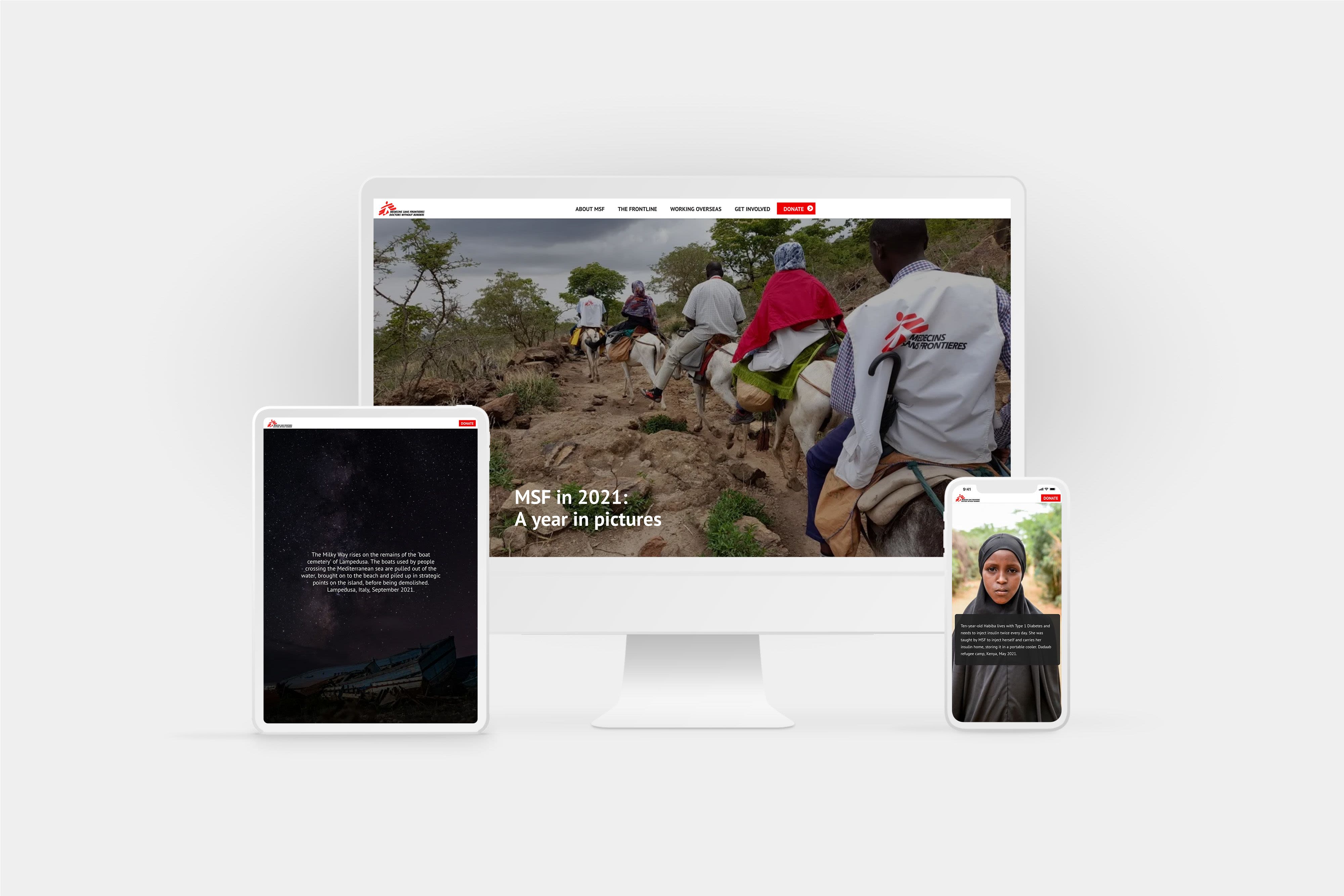
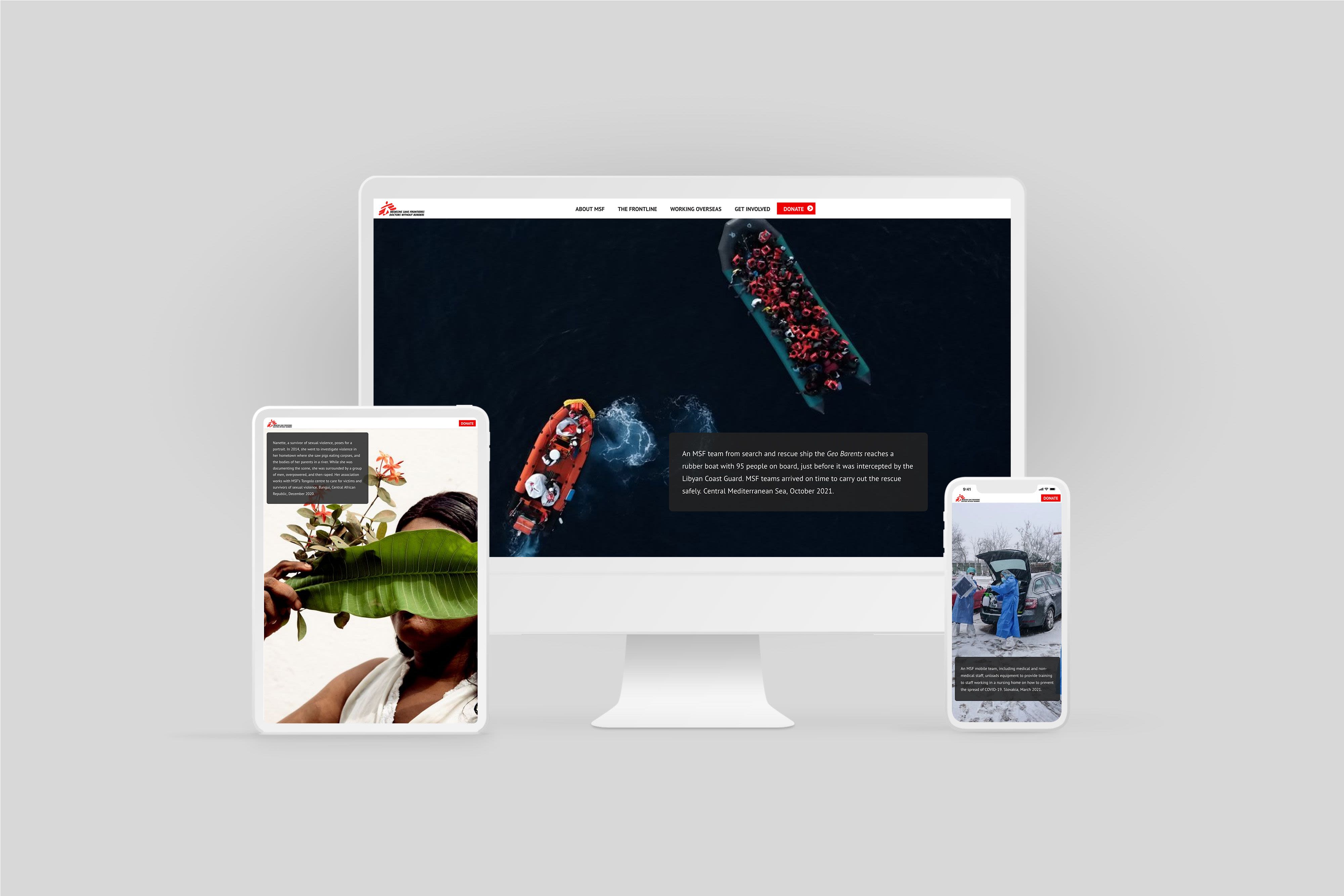
Medicins Sans Frontiers: A Year in Pictures
Doctors Without Borders makes most of its revenue from private donations, so it makes sense that it is finding innovative ways to communicate its work with its base. Instead of writing a lengthy essay, its 2021 annual report is told mostly through candid images.
Full-bleed pictures are overlaid with short explanatory snippets, focussing on individual stories of lives changed to illustrate broader trends and issues. While their headings and structure are less sophisticated than other examples, they’ve found an unconventional way to connect their supporters with their work in an upfront, personal way.
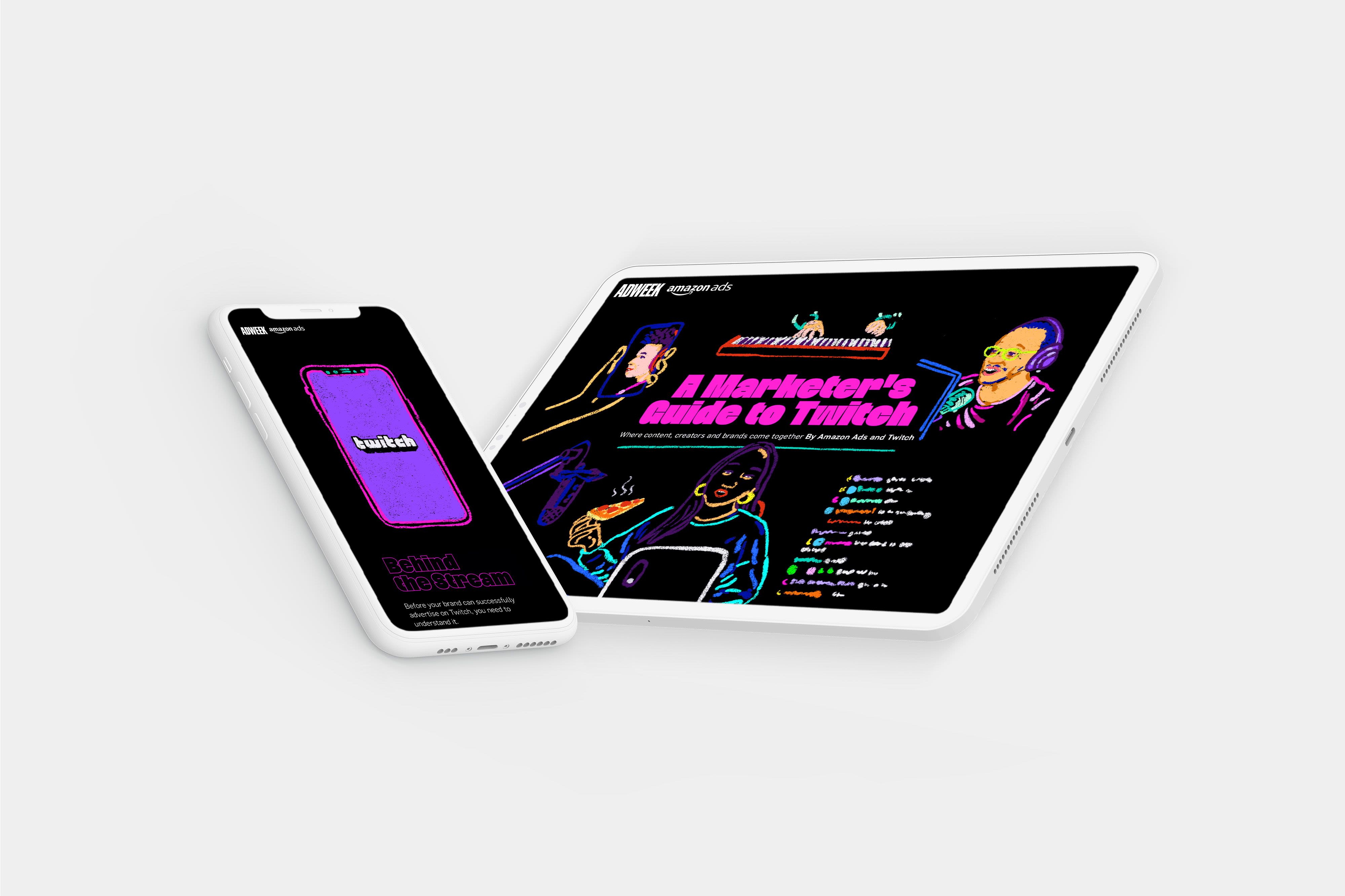
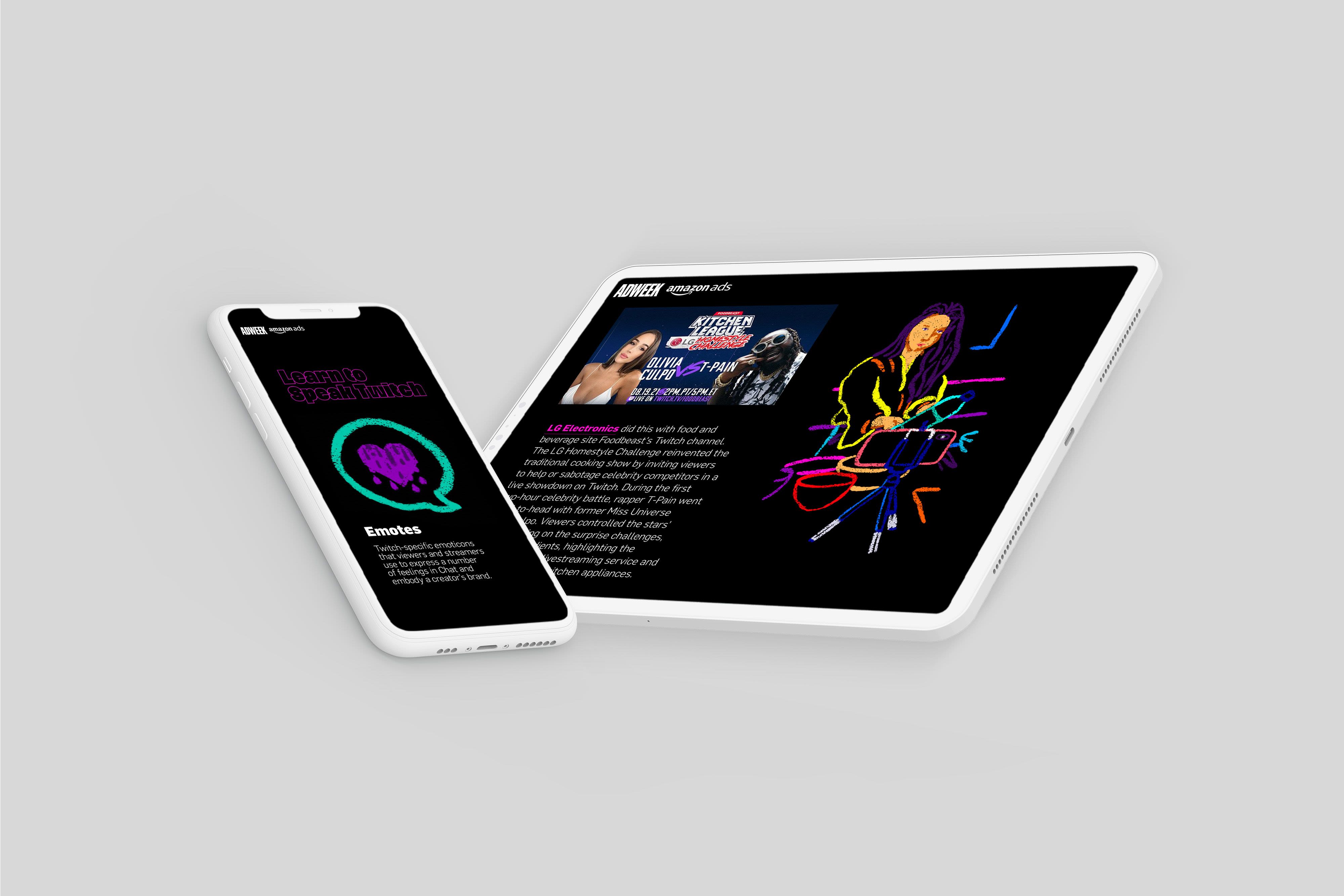
Adweek: A Marketer’s Guide to Twitch
A Marketer’s Guide to Twitch goes on a deep dive into the massive streaming platform. It explains Twitch’s structure and some of its jargon so that marketers can understand the service’s landscape before investing in targeted advertising.
As a piece of content, it’s incredibly visually arresting. Adweek has used bright fluoro colours against a black background, with animated drawings and select video snippets. Along with scrolling, comfortably large text, and additional embedded content, the whole report feels like an experience — and the reader reaches the end knowing a whole bunch about Twitch!
Sky News: Brexit By Numbers
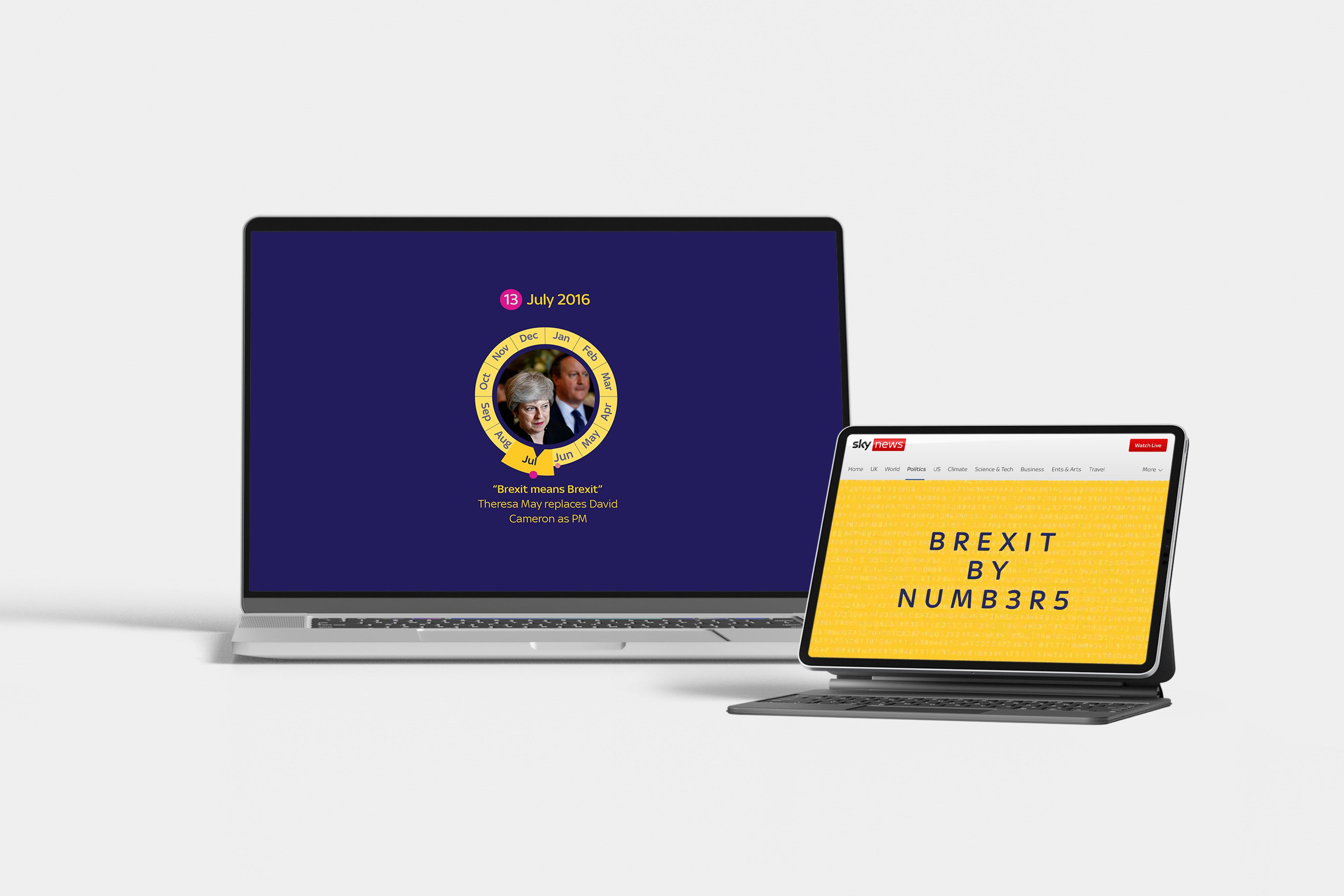
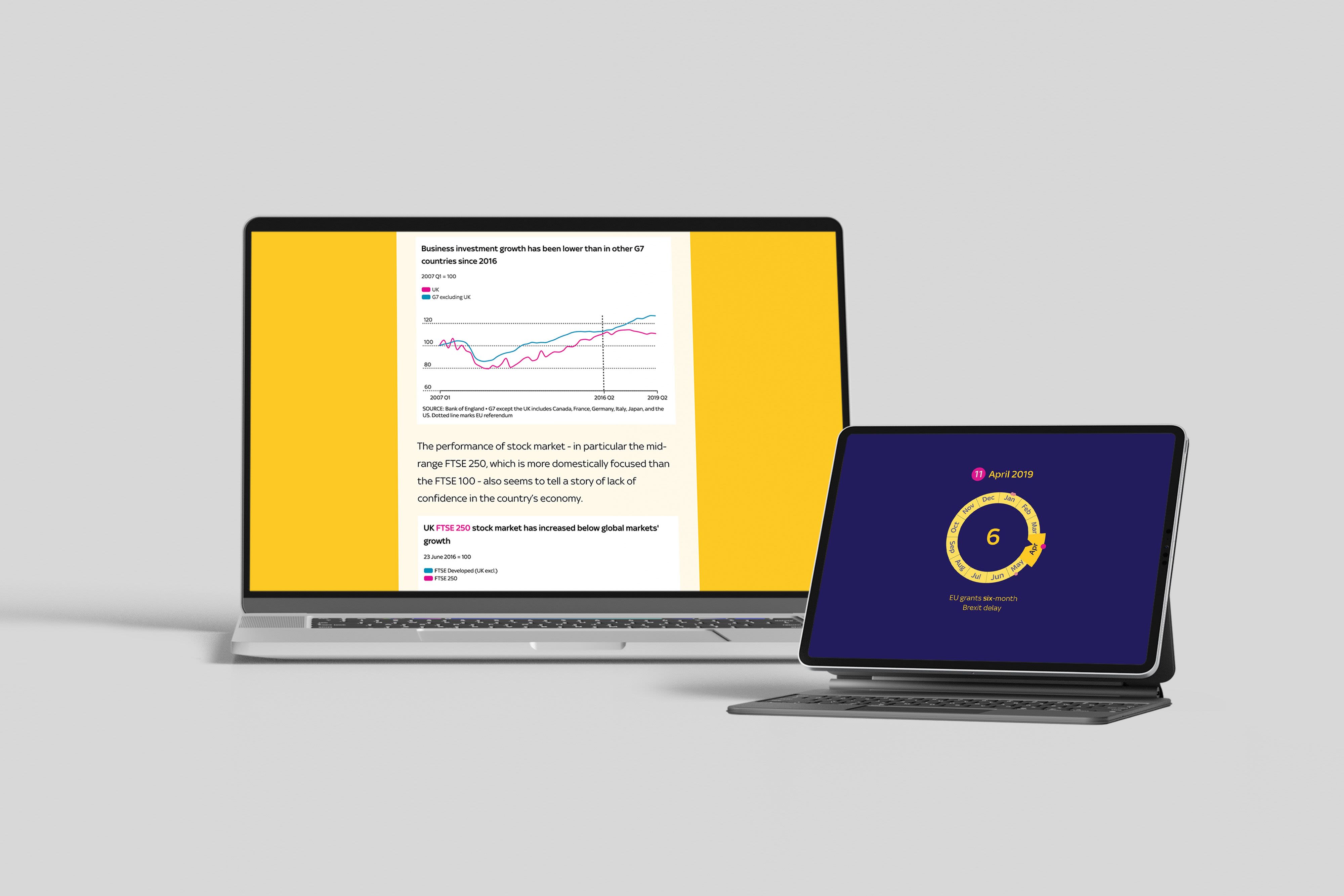
In 2016, Britain voted to leave the European Union. When they actually left in 2020, Sky News dove into the data, revealing what core voter issues changed in the UK in the four years between the referendum and ‘Brexit Day 1’.
A lot of data — and a lot of geopolitics — can be dense and alienating. This analytical report shows how infographics, maps, timelines, and careful design can help make complex issues clearer for audiences.
Between relevant background information and excellent data storytelling, the research report demonstrates the ways that data can powerfully complement social narratives, making them richer and more nuanced.
Gowling WLG: The Road to a New Normal
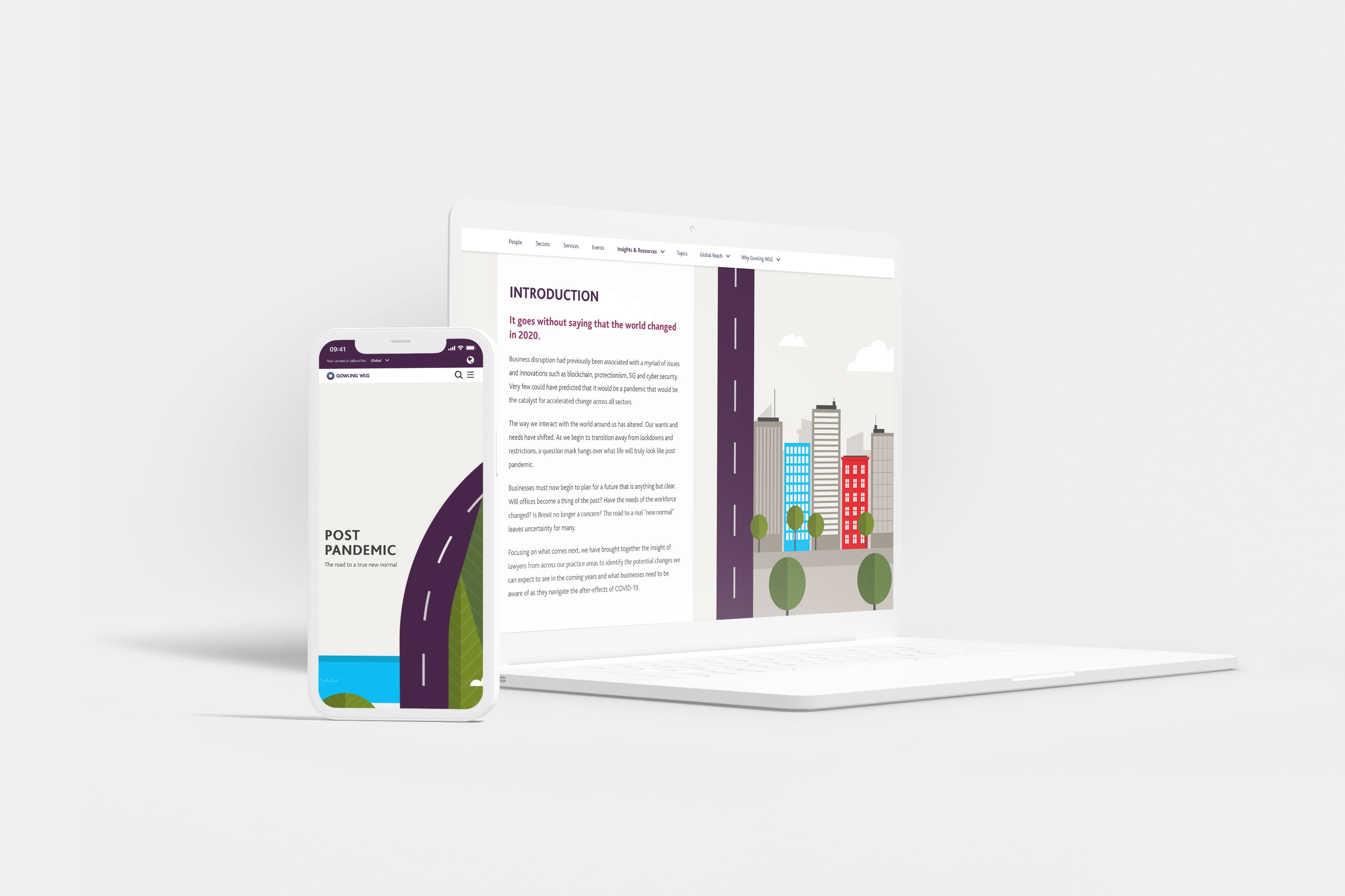
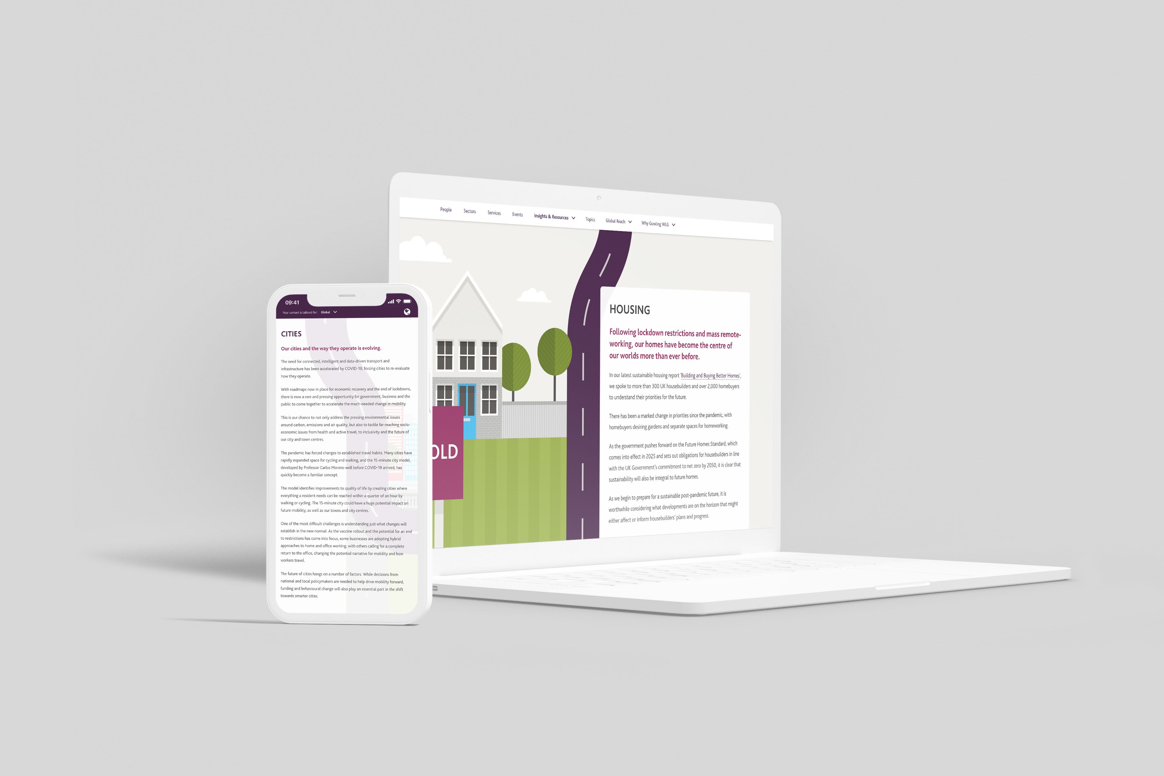
From law firm Gowling WLG comes this collection of insights into the impact of COVID-19 across their practice areas. Check out their beautiful road illustration that draws the reader through the business report’s overarching narrative.
Like some of the other report examples, Gowling WLG has chosen to provide links to extra contextual material so that the body of the report stays streamlined and on-topic. It’s a great example of how visual media can make something like a business report immersive and engaging to a broader audience.
Penguin UK: Lit in Colour
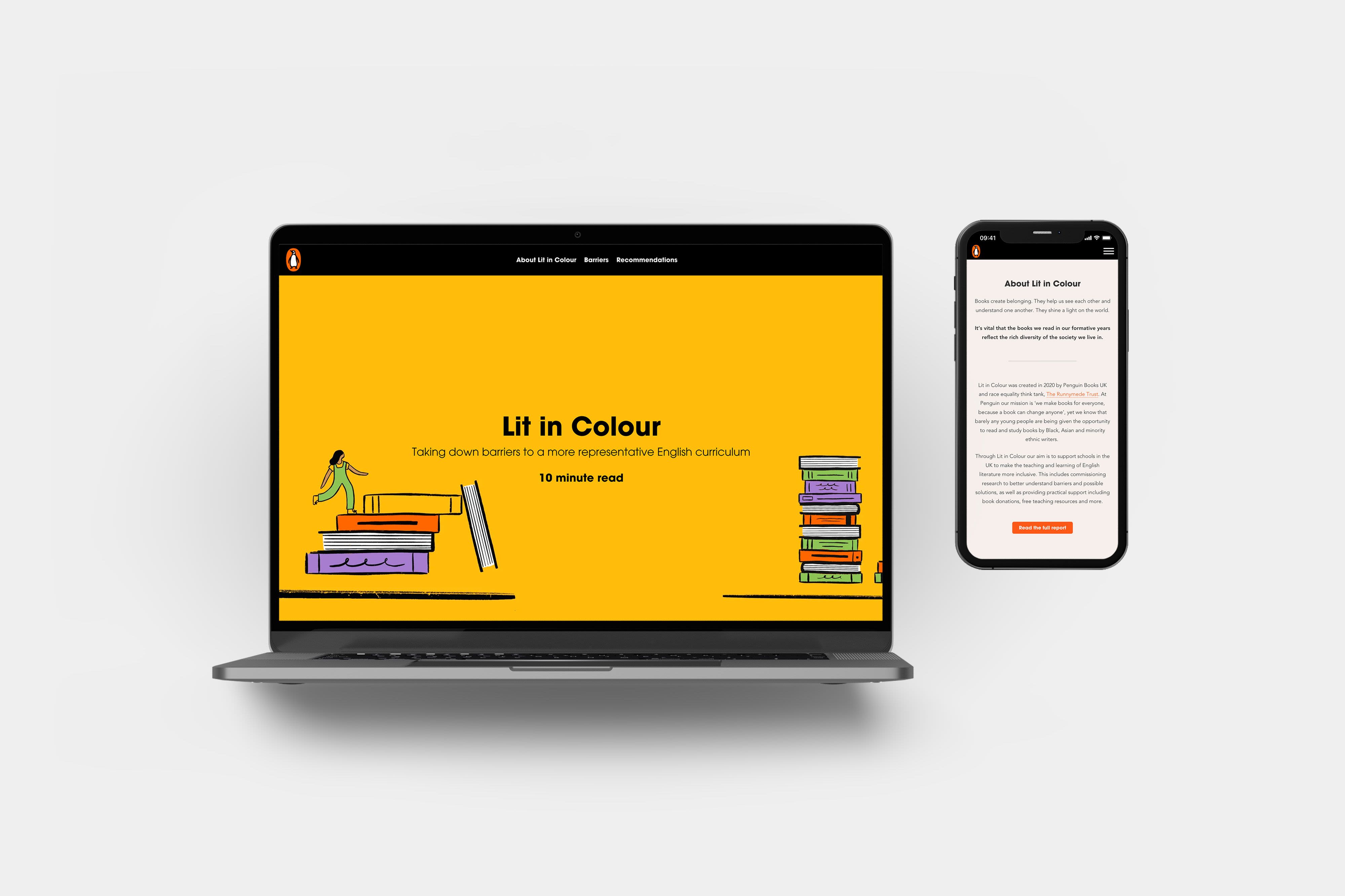
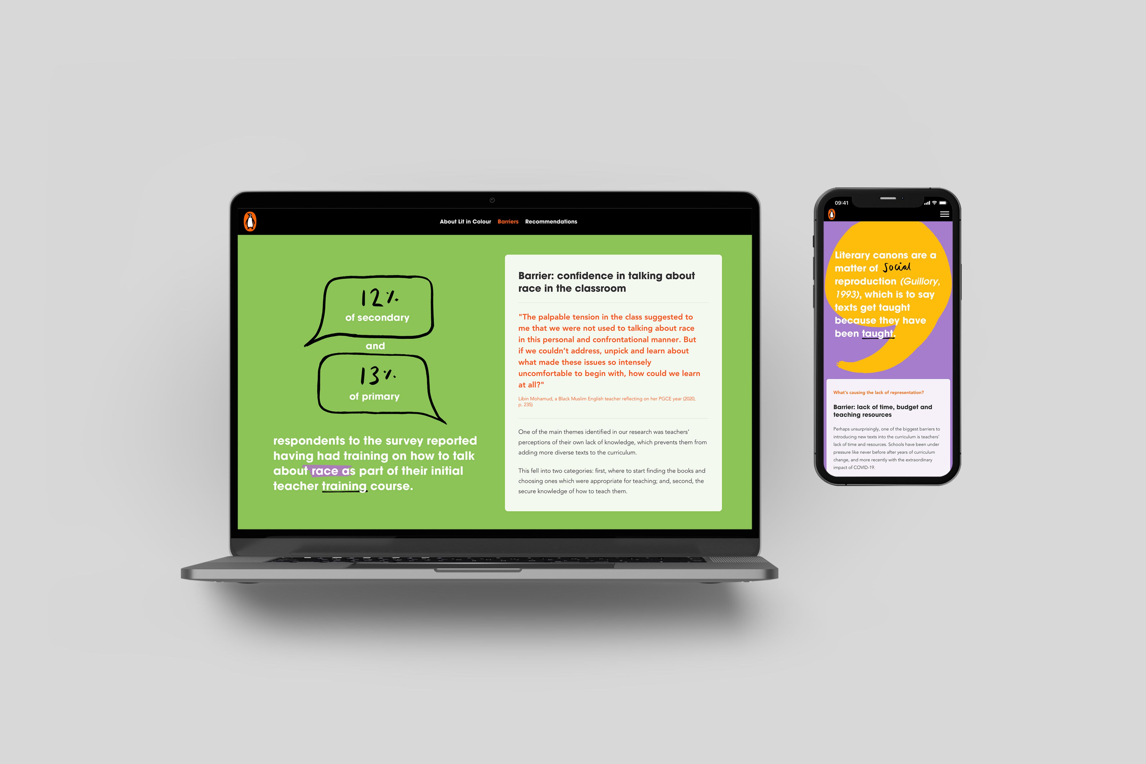
This report from Penguin UK (in partnership with race equality think-tank The Runnymede Trust) outlines their work to diversify Britain’s English curriculum. While the full report is accessible as a PDF, the web content allows Penguin to explore a range of animated data visualisations, bright and engaging infographics, and clever transitions.
The body of the report has a strong focus on causes and impacts, existing barriers and, alongside their achievements, what work is yet to be done. The internal headings make the direction of the report clear, and easy to navigate.
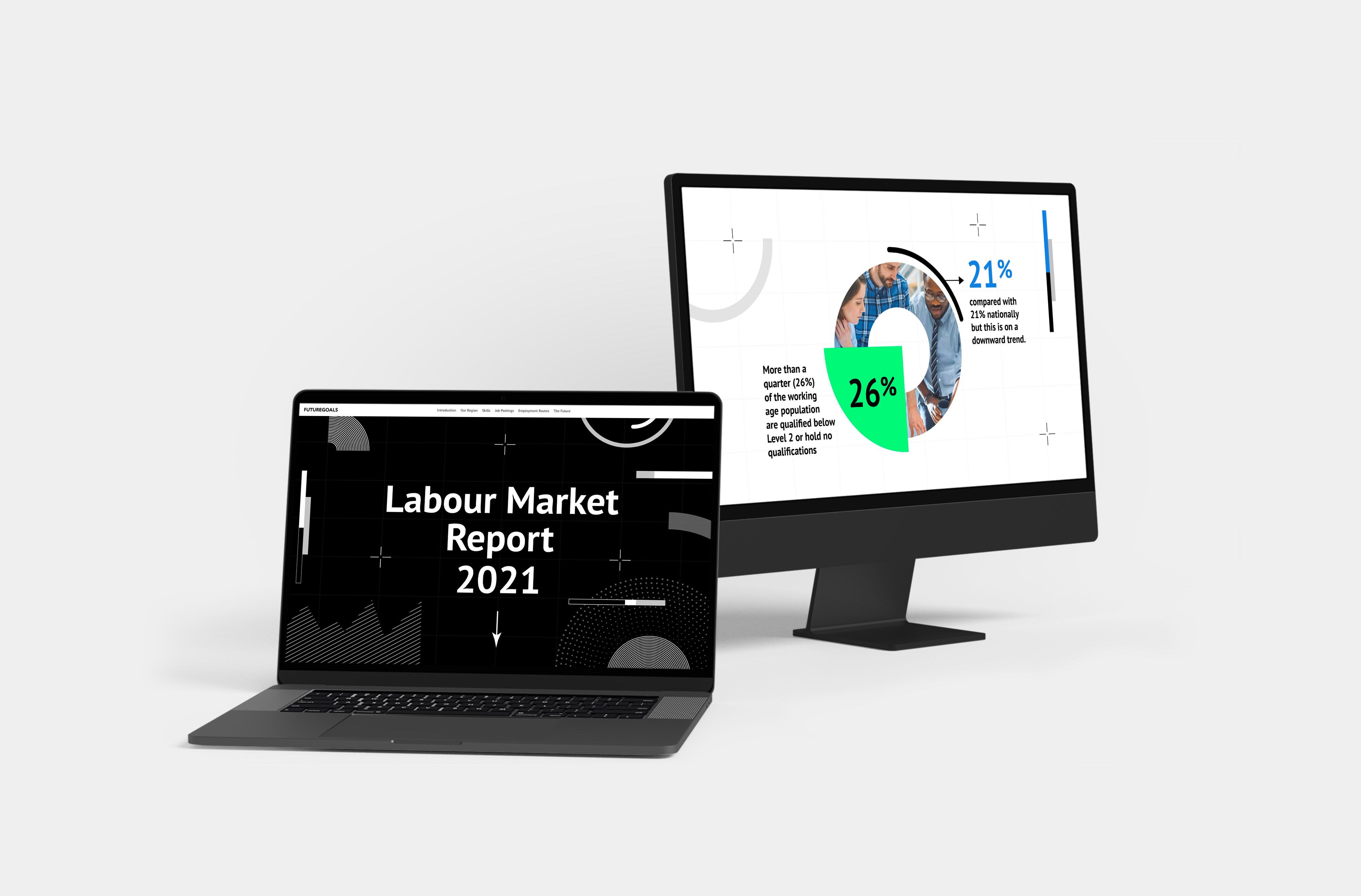
FutureGoals: Labour Market Report 2021
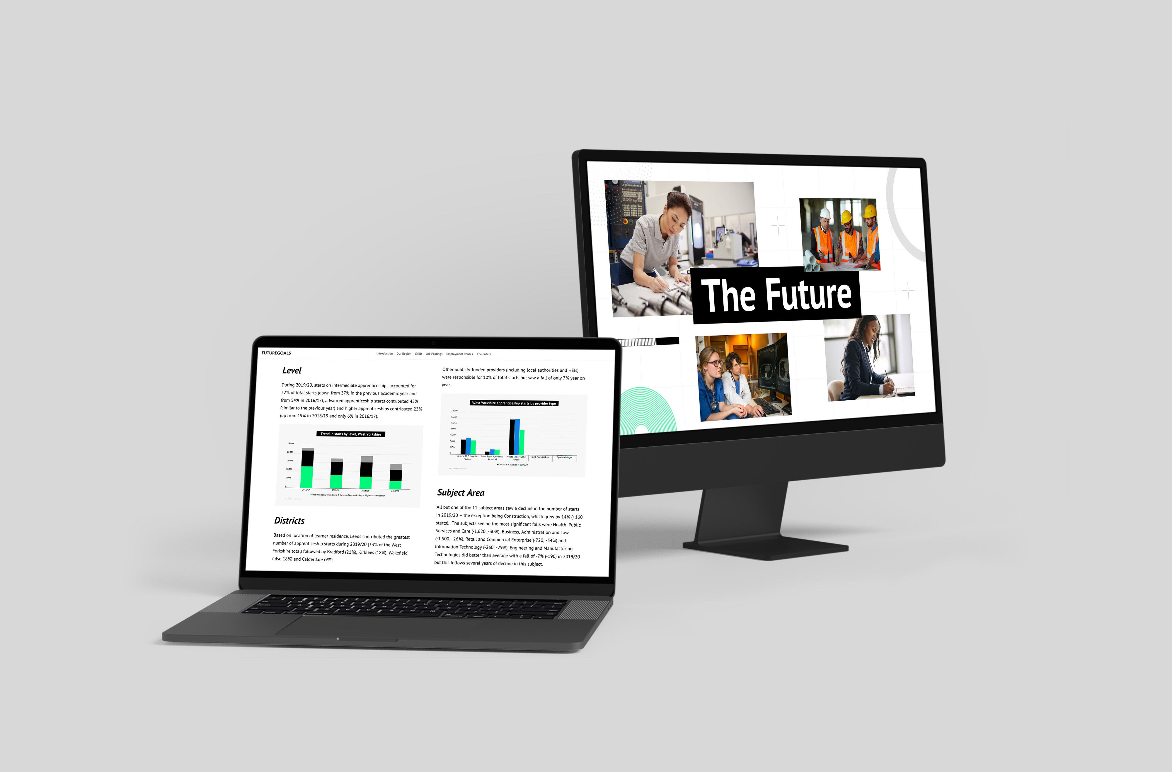
This report, delivered by the Leeds City Region Enterprise Partnership, explores the changing face of the district’s labour market, looking especially at the supply and demand of skills in the area.
Simple maps and more in-depth data visualisations help illustrate the diverse needs of the district. A nifty feature that brings up definitions when hovering over key words also makes the report more accessible. And, thoughtful subheadings break up the body of the report, making it easier to navigate and digest.
It’s a great example of how dense, data-rich detail can become engaging and immersive by investing in visual storytelling.
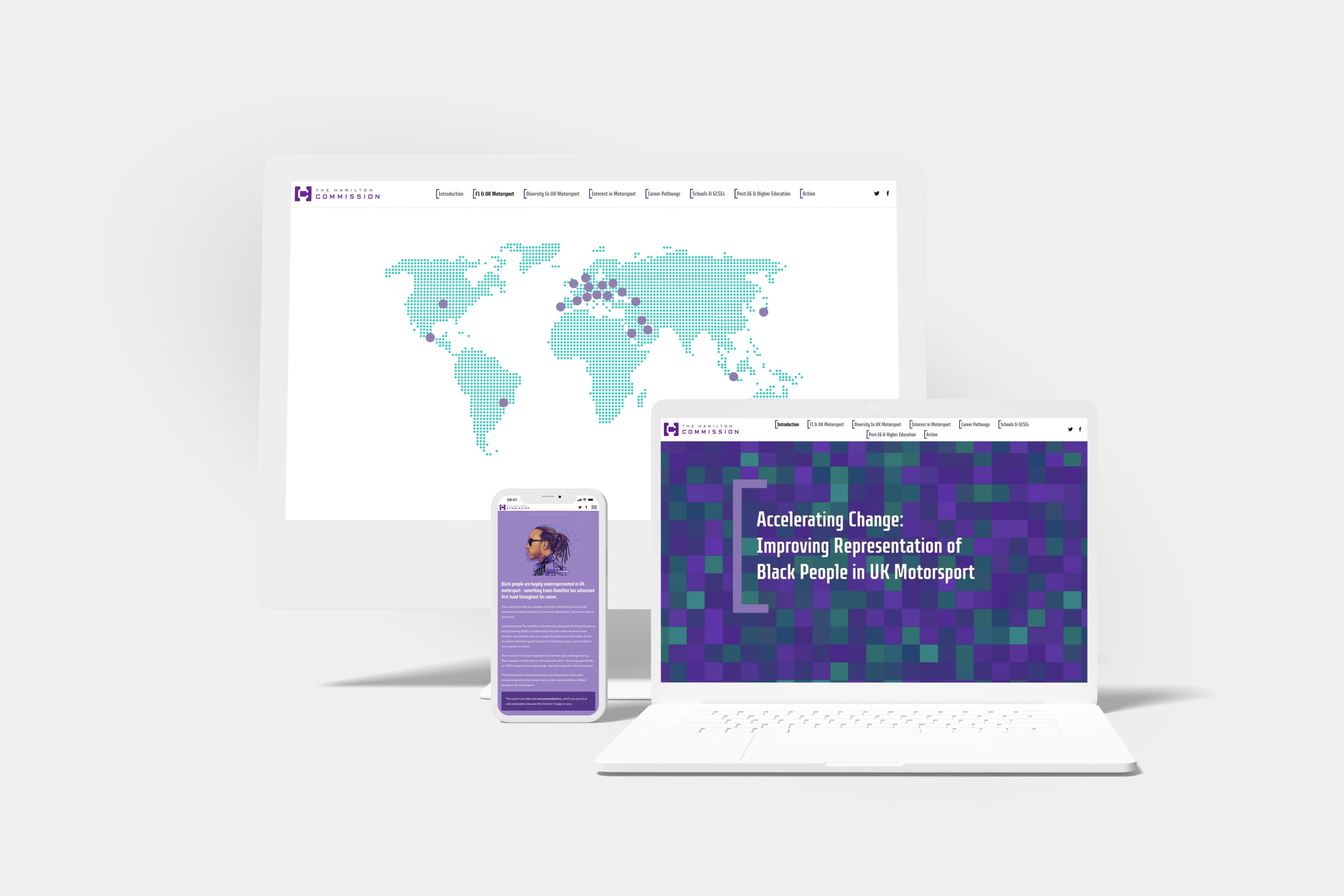
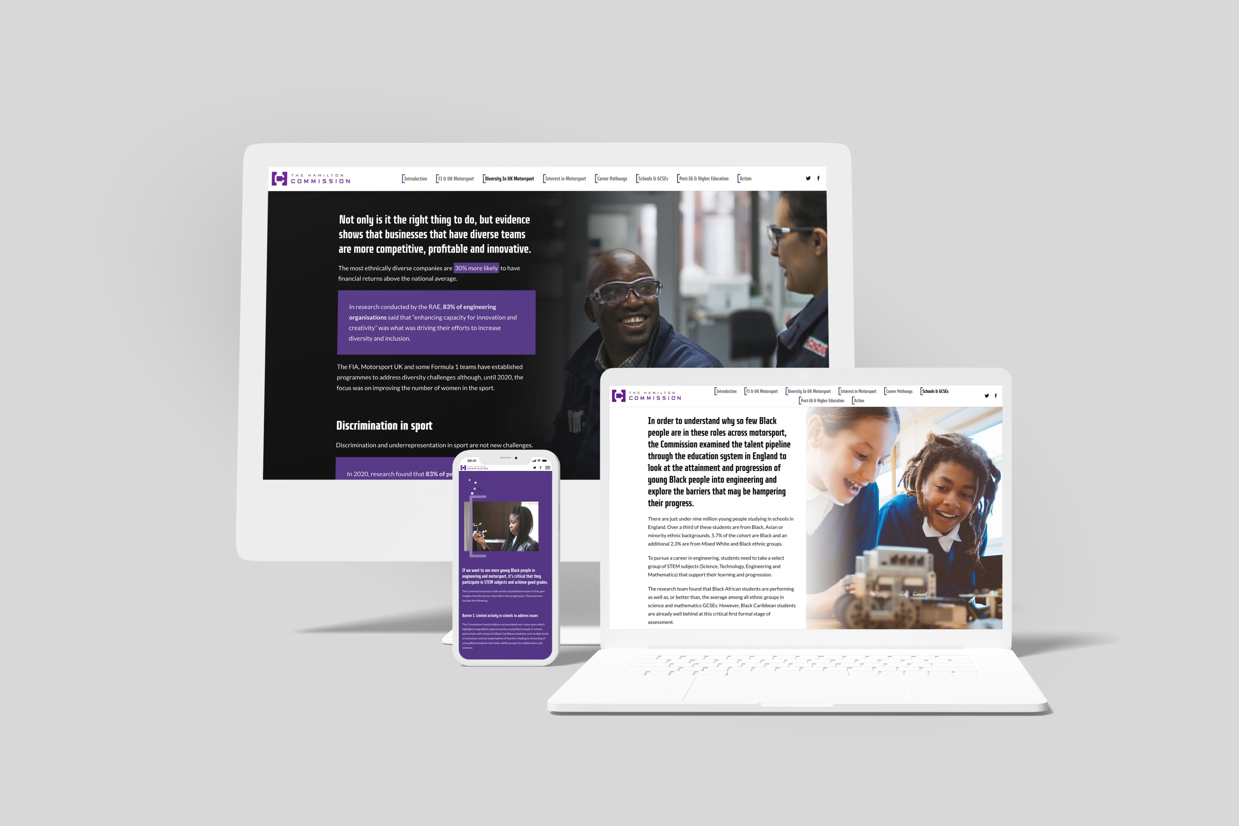
The Hamilton Commission: Improving Representation of Black People in UK Motorsport
This interactive summary from the Hamilton Commission summarises their work and research around racial diversity in UK motorsports. As well as outlining the historical context, it provides ten clearly signposted recommendations based on rigorous data collection and continued research.
Plus, by highlighting key individuals and providing embedded video and audio content, the readers feel connected to the personal outcomes of the Commission’s work.
And that, after all, is one of the most important parts of report-writing — using a defined format and your team’s writing skills to communicate why your work matters.
