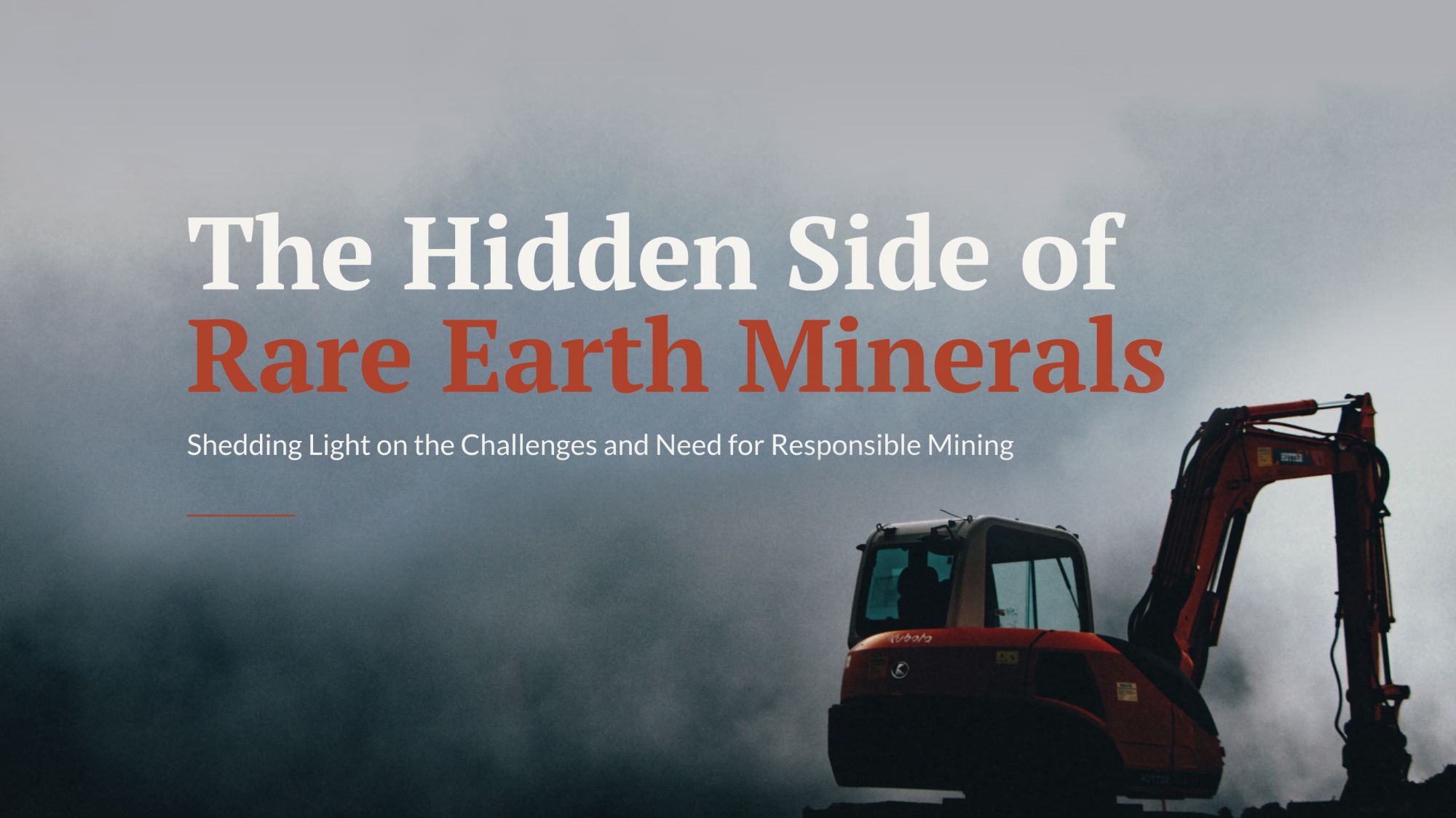
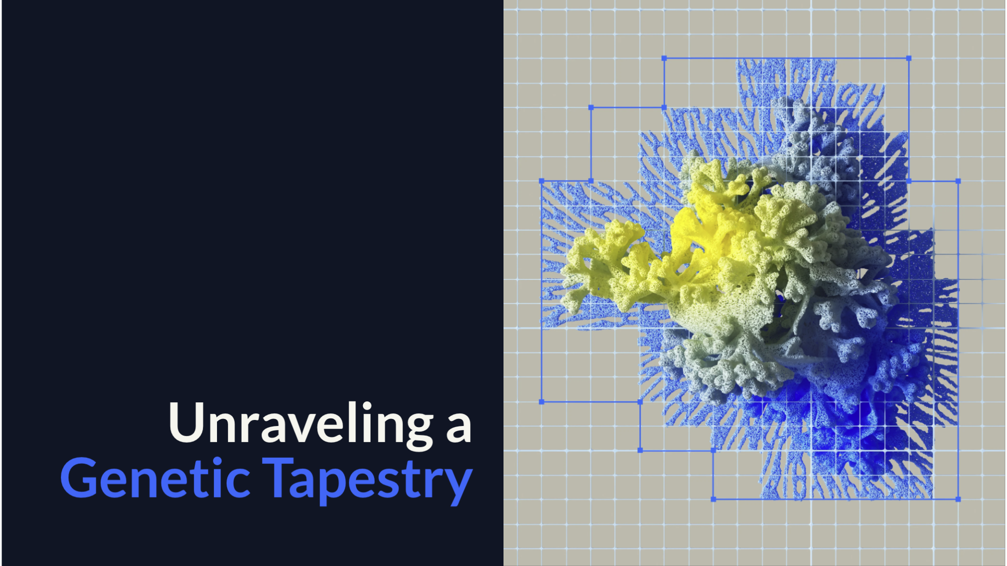
10 engaging examples of white papers that aren’t PDFs

What’s the first thing you think of when you hear the words, 'our new white paper'? You’re probably picturing a text-heavy PDF, or even a printed booklet. Static. Dense. Dare we say… boring.
But what if I told you things could be different?
The new generation of white papers is interactive, colourful, accessible, responsive, and a lot more fun to read.
Below are 10 engaging examples of white papers that reached a wide audience through strong design, compelling storytelling, and thoughtful distribution.
In this article, we'll cover:
Start creating with Shorthand
It's the fastest way to publish beautifully engaging white papers, reports, internal comms, and more.
A quick introduction to white papers

Before we dive into the good stuff, let’s cover some basics.
What is a white paper?
A white paper is an expert summary document, addressed to a wide audience, that reviews a situation and offers recommendations for what to do next. We've covered what a white paper is previously on The Craft.
The white paper format will be familiar to most readers, with a table of contents, executive summary of key takeaways, methodology, short sections, and it's usually — too often — published as a PDF.
White papers are examples of what we call premium content. Premium content offers more depth than quick blog posts, more readability than conventional reports, and more interaction than most web publications. As the name suggests, it’s content that’s very high value — whether you want to charge for access to content, gate your content, or simply use it as a demonstration of your organisation’s expertise.
What is the purpose of a white paper?
There are a wide range of corporate, governmental, scientific, non-profit, and business white papers. Each of these use cases has a different reason for existing.
Organisations produce white papers to:
- Explain their annual reports
- Open up scientific research to the public, to broaden scientific understanding.
- Provide the evidence behind decision-making, to ensure greater transparency — particularly common in government agencies.
- Showcase thought leadership and know-how from a subject matter expert.
- Campaign on social issues, as is the case with many nonprofit white papers.
- Rank in search engines like Google, which often rewards longform content.
- Generate leads for a product or service, and to broaden brand awareness.
Over the last 15 years, white papers have become a more central part of the content marketing strategy of many organisations, particularly those in B2B marketing. White papers have been increasingly published as gated content, with a landing page, CTA, and a lead generation form intended to capture contact information of prospects. They are also often used as marketing collateral to support potential customers along their buyer’s journey.
Learn more in our guide to how marketers are using white papers.
How has white paper design changed over time?
While white papers may seem like a dull format, their visual design and presentation has changed radically over the decades. This is particularly true of the last ten years, where new web technologies have allowed content creators to build immersive visual content, without needing web developers or designers.
Because the target audience of white papers can be broad, they don’t just have to be informative. They also have to be interesting. And today, that also means interactive, immersive, and shareable on social media platforms like LinkedIn.
How can I create a visually immersive white paper?
With Shorthand, you can build white papers as gorgeous as the examples below using our white paper template layouts. Get started using our built-in free templates, or use our simple drag-and-drop sections to build out your own original design. No code or web design required.
10 great white paper examples

We’ve chosen the case studies below to show off the best examples of white papers. From universities to industry bodies, healthcare outreach to fundraising campaigns, policy documents to professional advice, they all stand out for their immersive design. And because they’re just great reads.
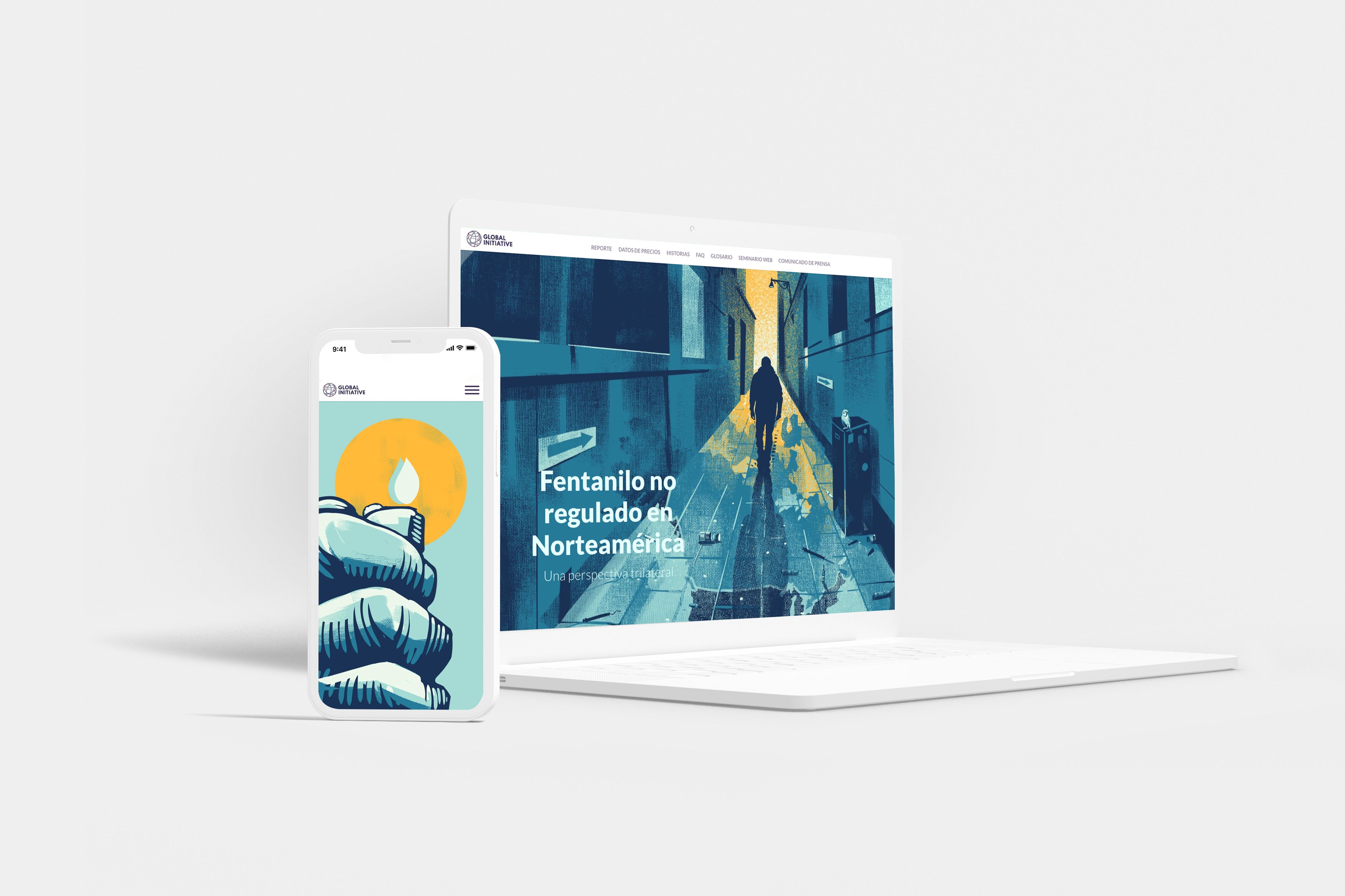
1. Fentanilo no regulado en Norteamérica: Una perspectiva trilateral
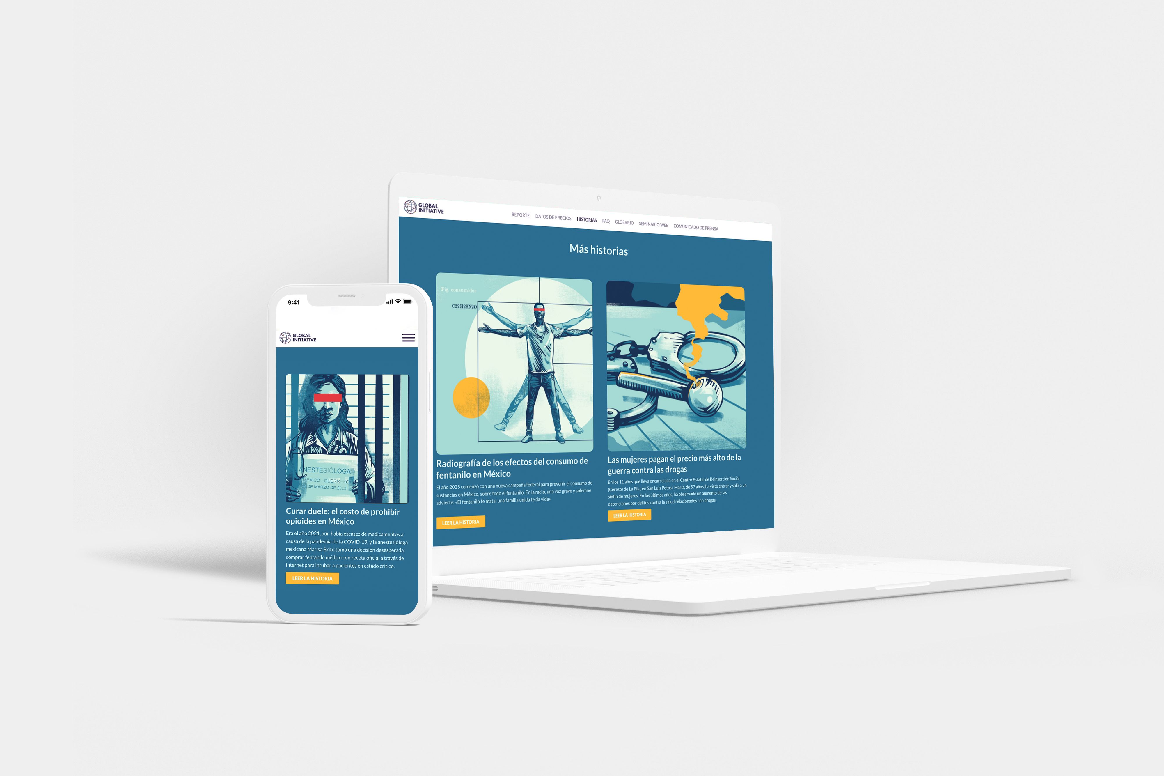
This white paper by The Global Initiative Against Transnational Organized Crime gives a trilateral perspective on fentanyl regulation (or lack thereof) in North America. It outlines the costly harms of unregulated fentanyl — weapons trafficking, gun-related homicides, and more — across Mexico, the United States, and Canada.
With custom scrolling illustrations, price data laid out on maps, and links to other resources, the document makes its case for stronger cooperation between the three nations to fight this scourge.
2. Cleaning carbon: the untold story of carbon’s circularity
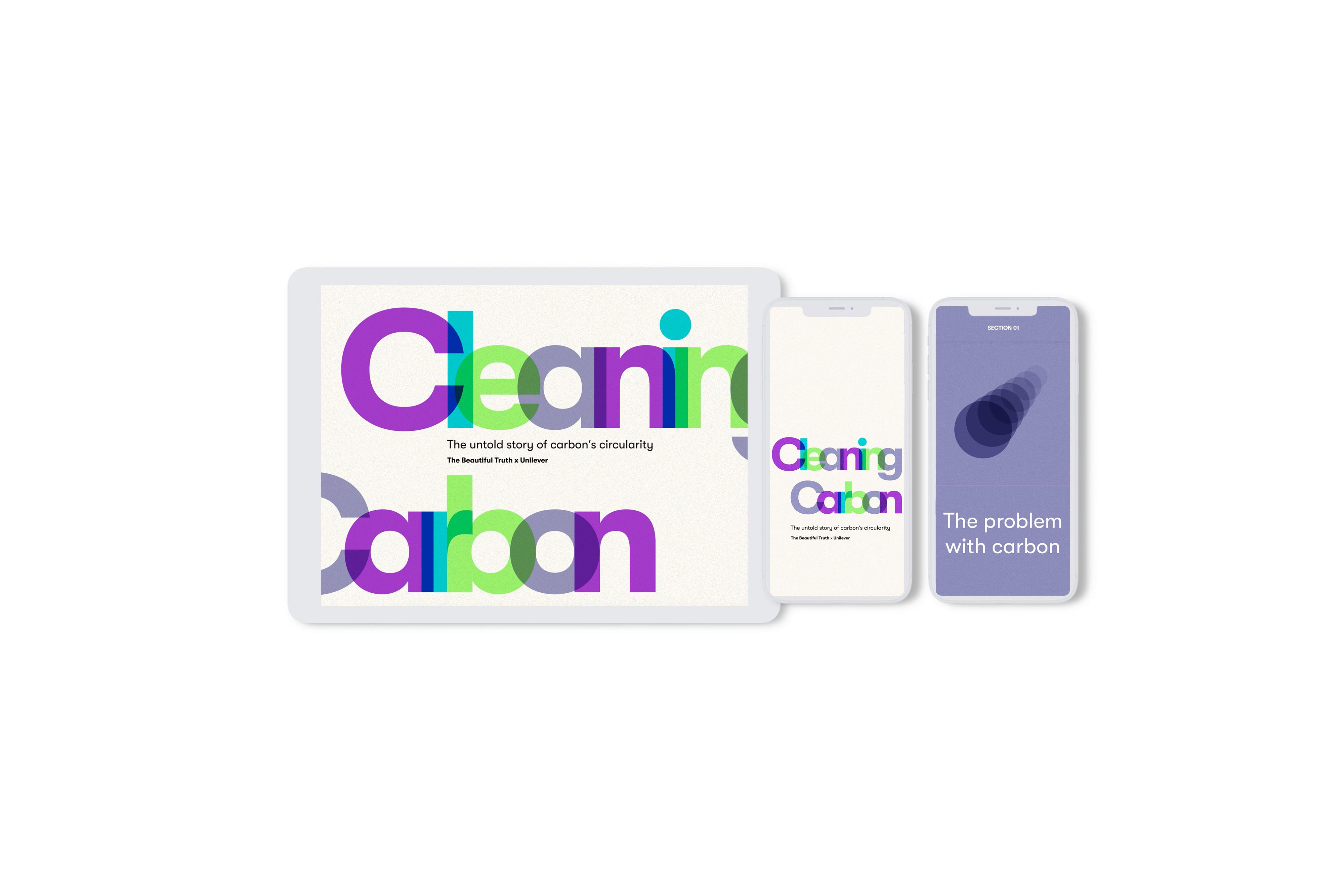
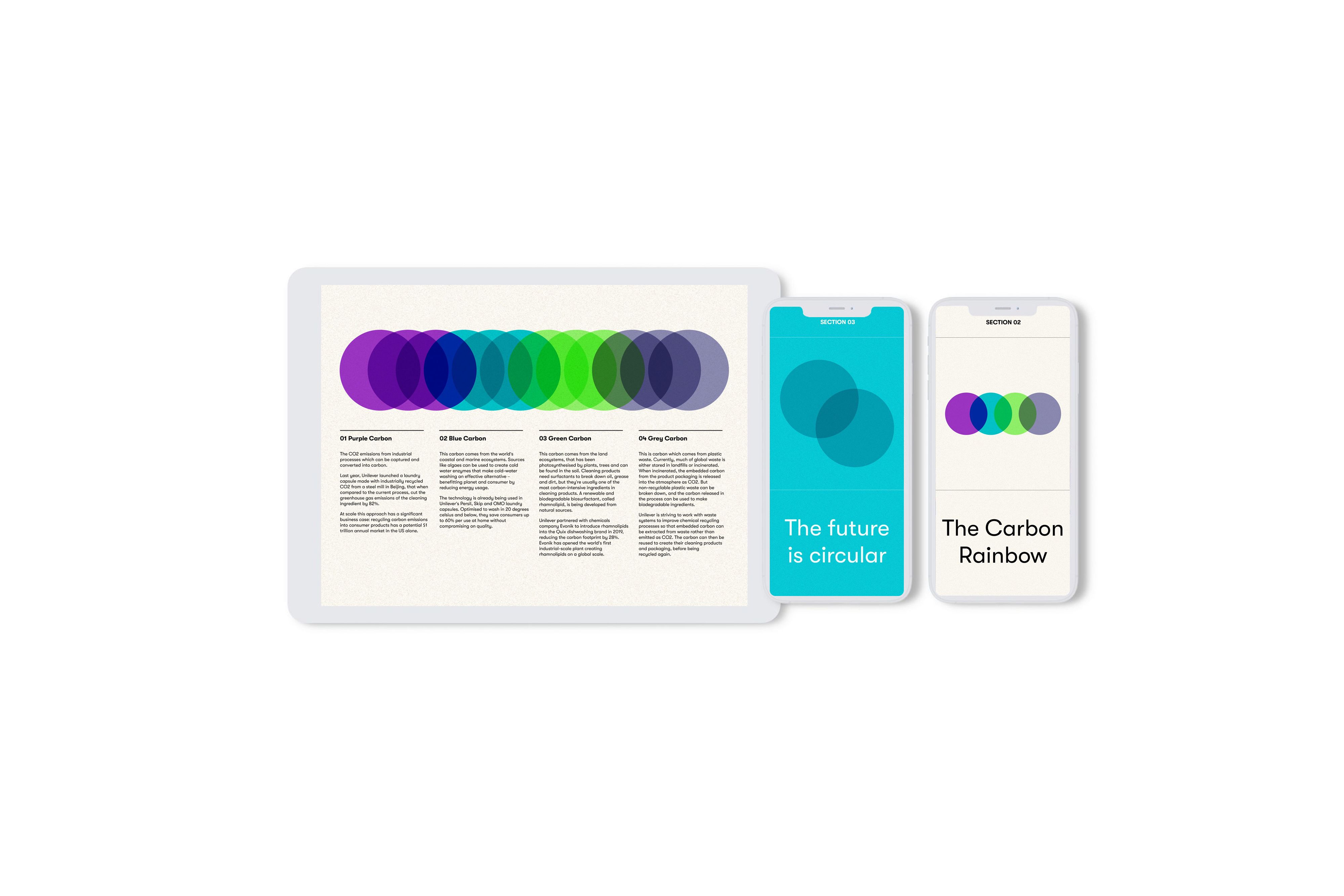
This co-branded online paper by The Beautiful Truth and FMCG (fast-moving consumer goods) giant Unilever outlines how, as the world phases out fossil fuels to reduce emissions, industries will also need cleaner ways to produce the carbon required to manufacture everyday products.
It introduces the ‘carbon rainbow’: four production methods that don’t require burning fossil fuels. With an animated title section, illustrations throughout, and easy-to-understand diagrams, it’s a clear and concise brand asset.
3. The misinformation epidemic
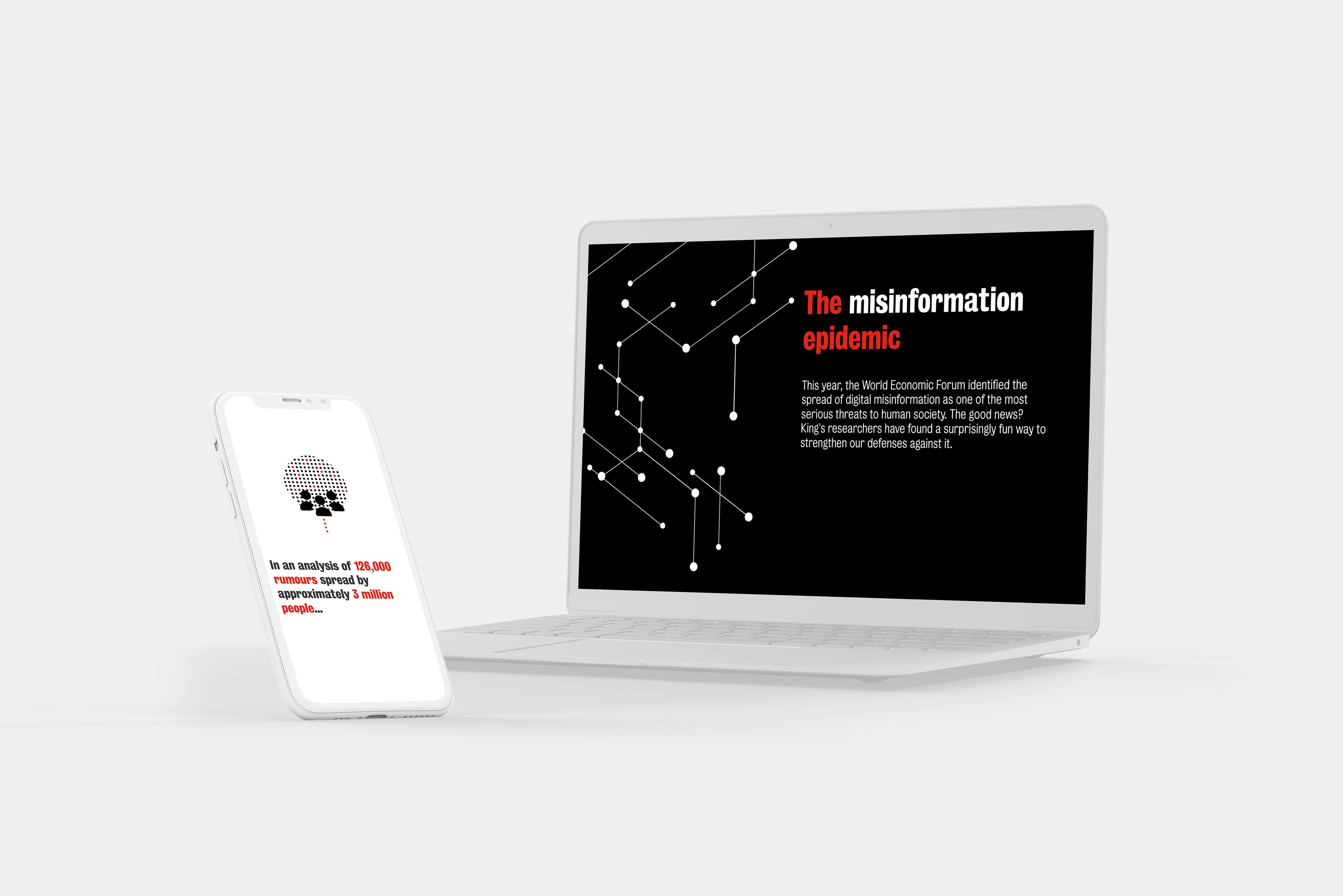
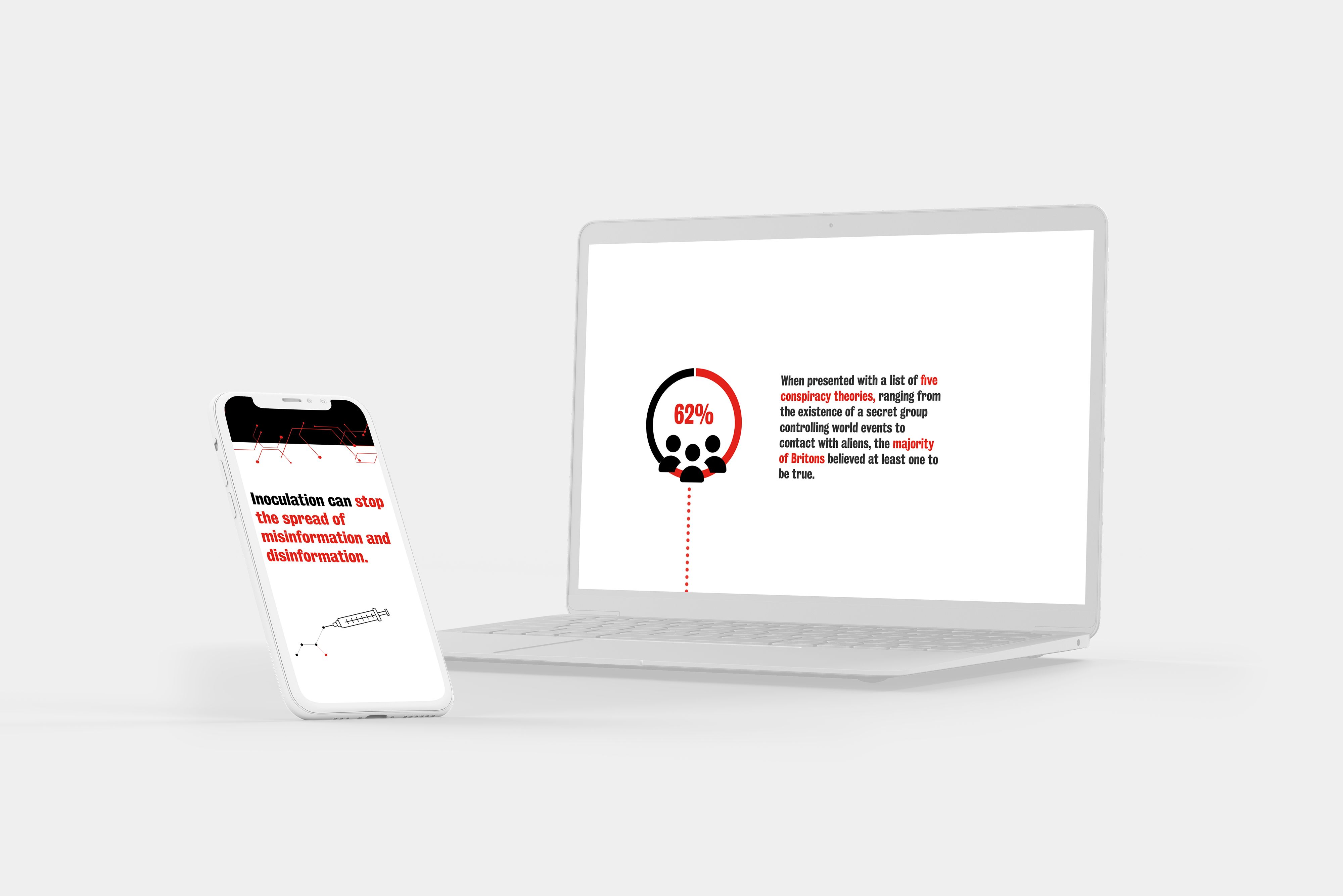
This story introduces new video games, built through a partnership between King’s College London’s Department of War Studies and the University of Cambridge’s Department of Psychology, to help users get better at spotting and fighting online misinformation.
After outlining the large-scale harms caused by misinformation and disinformation, it explains the difference between the two. Animated sections and custom icons are broken up with expert pull quotes and screenshots from three games — Bad News, Harmony Square, and Cat Park — in an engaging and memorable scroller.
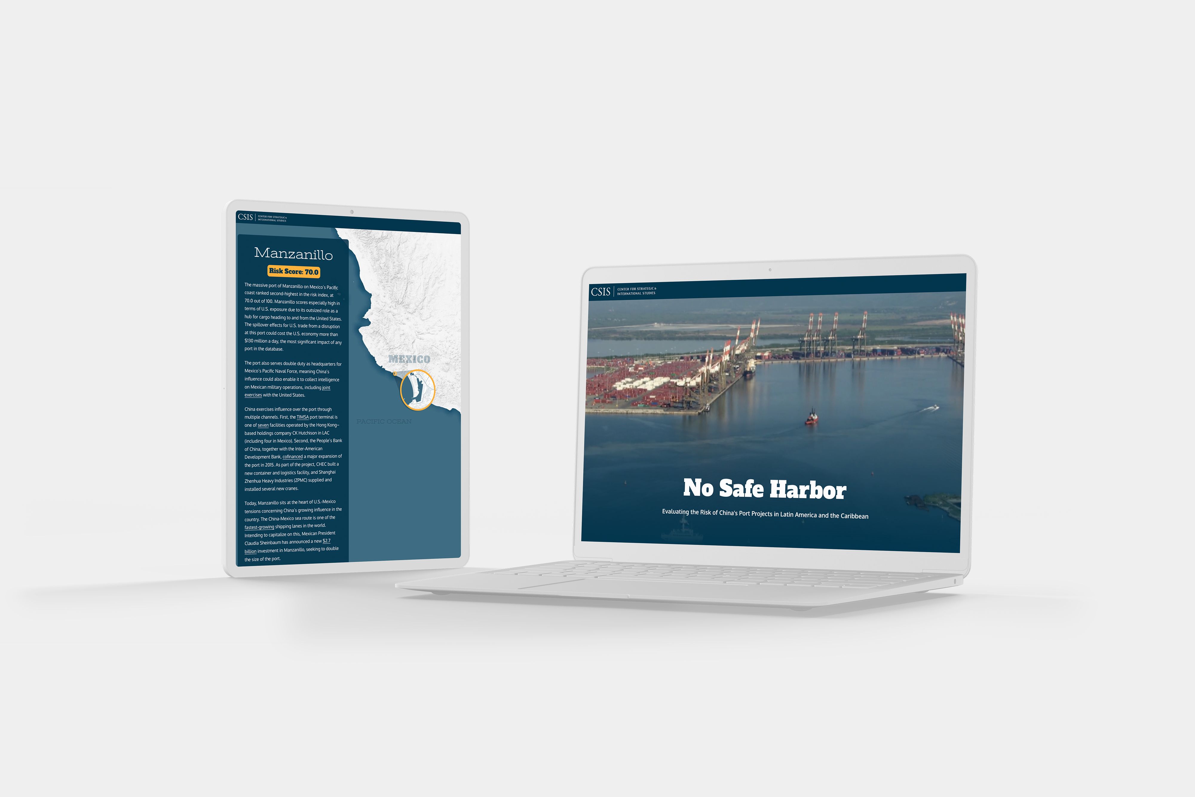
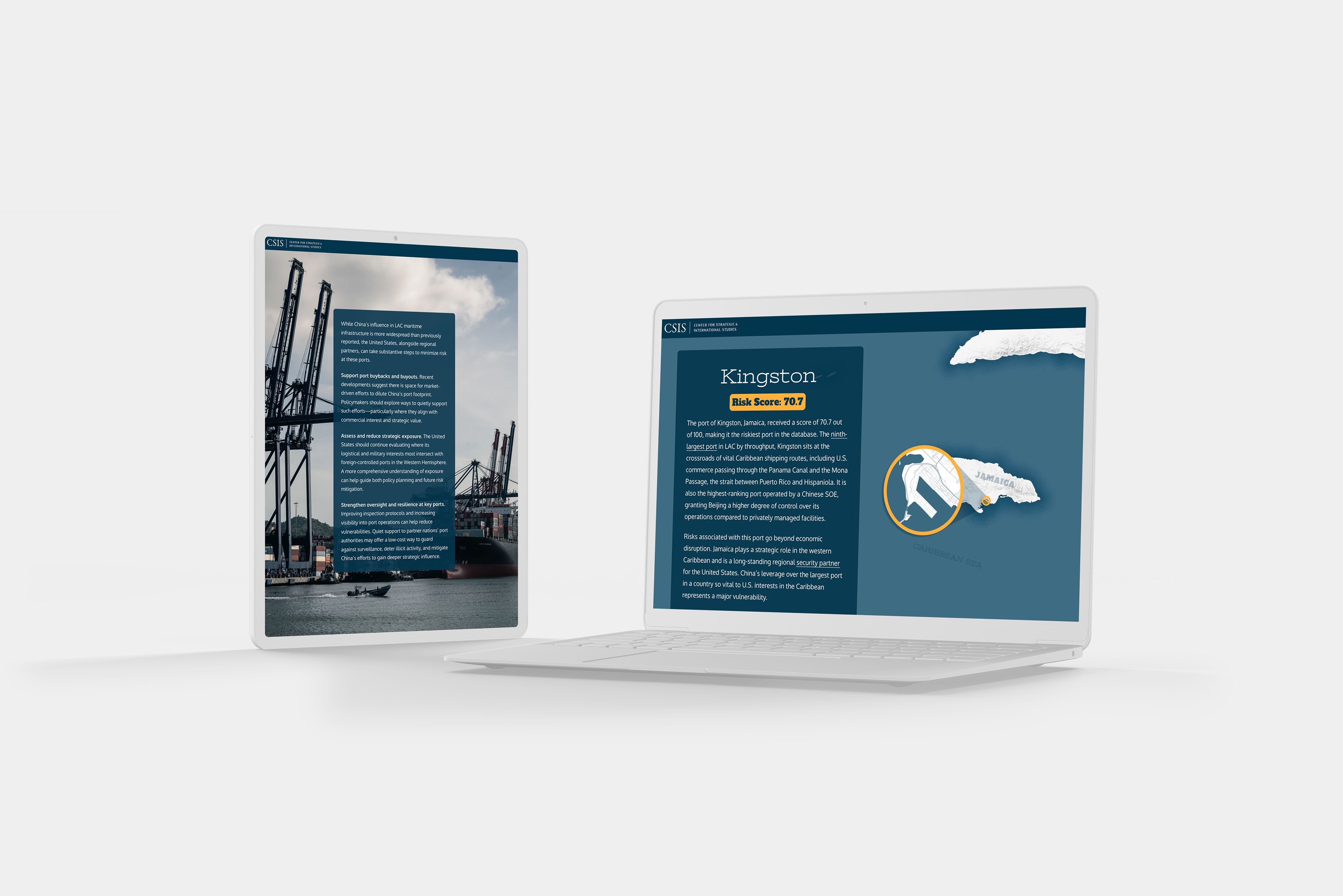
4. No Safe Harbour: Evaluating the Risk of China's Port Projects in Latin America and the Caribbean
This deep dive by US think tank the Center for Strategic and International Studies evaluates the security risks posed by China’s involvement in ports across Latin America and the Caribbean.
Its video title section, featuring aerial views of various ports, is fantastic — but the real highlight is its animated data visualisations. As readers scroll, points on an interactive map transform into data points on a chart. It’s a brilliant way to present two separate but related datasets, and the initial map overlay helps establish geographic context.
5. Lit in Colour’s Five-Year Progress Report
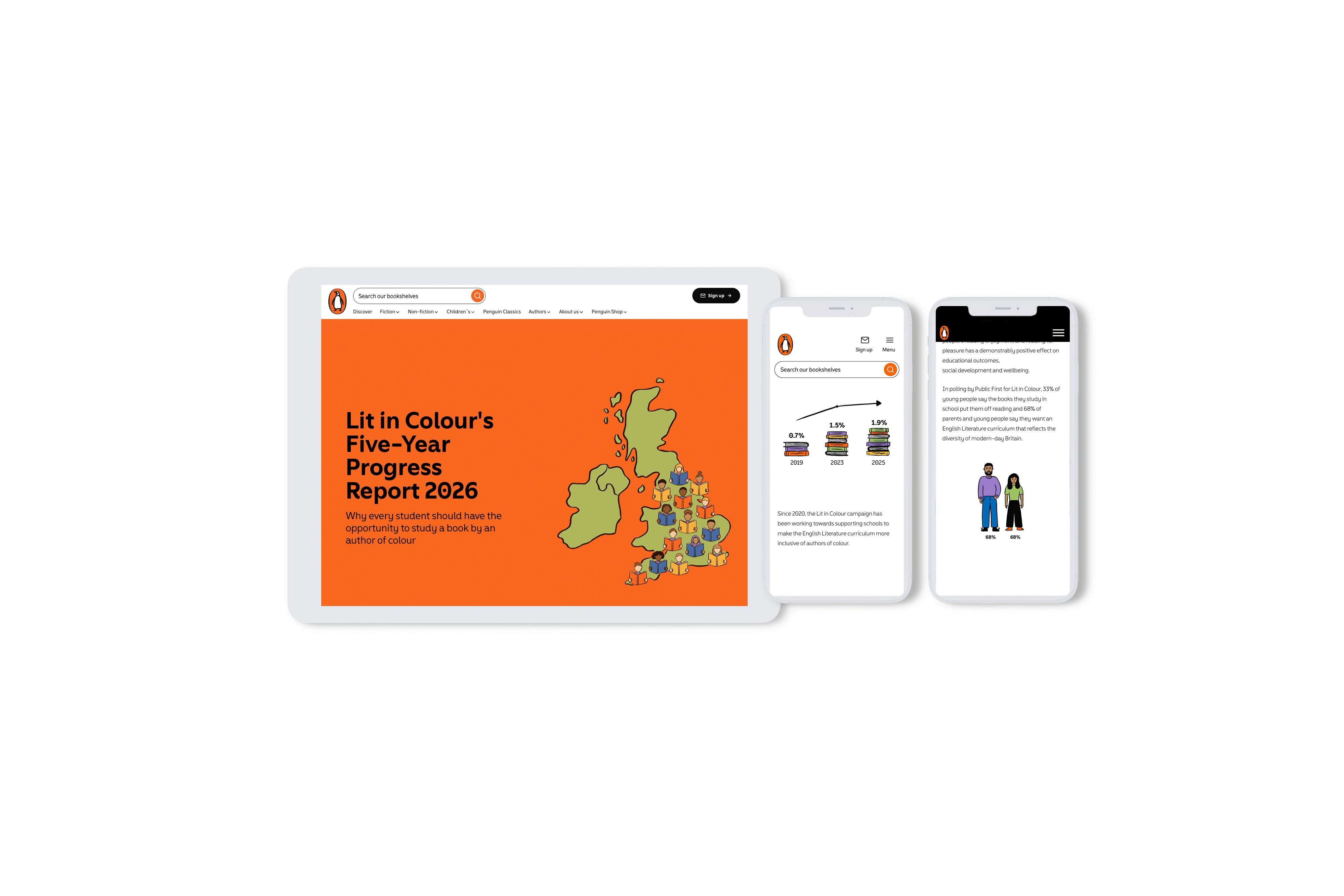
Back in 2020, Penguin launched its Lit in Colour programme, outlined in this brilliant Shorthand story. The programme aims to increase the number of books by authors of colour taught in the UK curriculum.
The five-year progress report starts by celebrating positive change: the proportion of GCSE students studying books by authors of colour has almost tripled, from 0.7% to 1.9%. But it then delivers a sobering reality check:
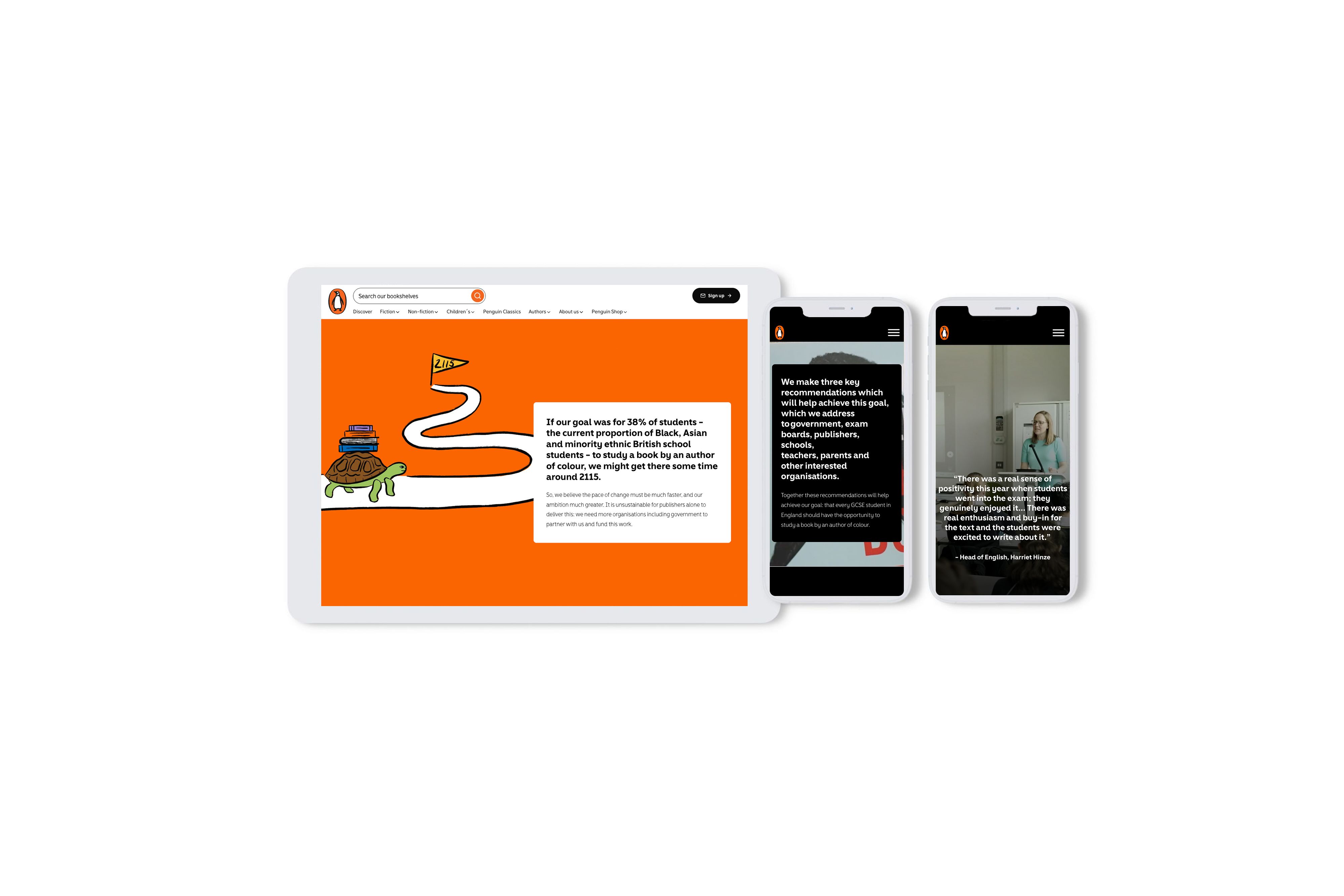
“At this rate, another two decades will pass before one student in ten studies an author of colour. If our goal was for 38% of students — the current proportion of Black, Asian and minority ethnic British school students — to study a book by an author of colour, we might get there some time around 2115.”
All of this data is presented in an illustrative and striking way, making it accessible and engaging. Penguin then outlines three recommendations to accelerate the pace of change, brought to life with videos of UK students in the classroom.
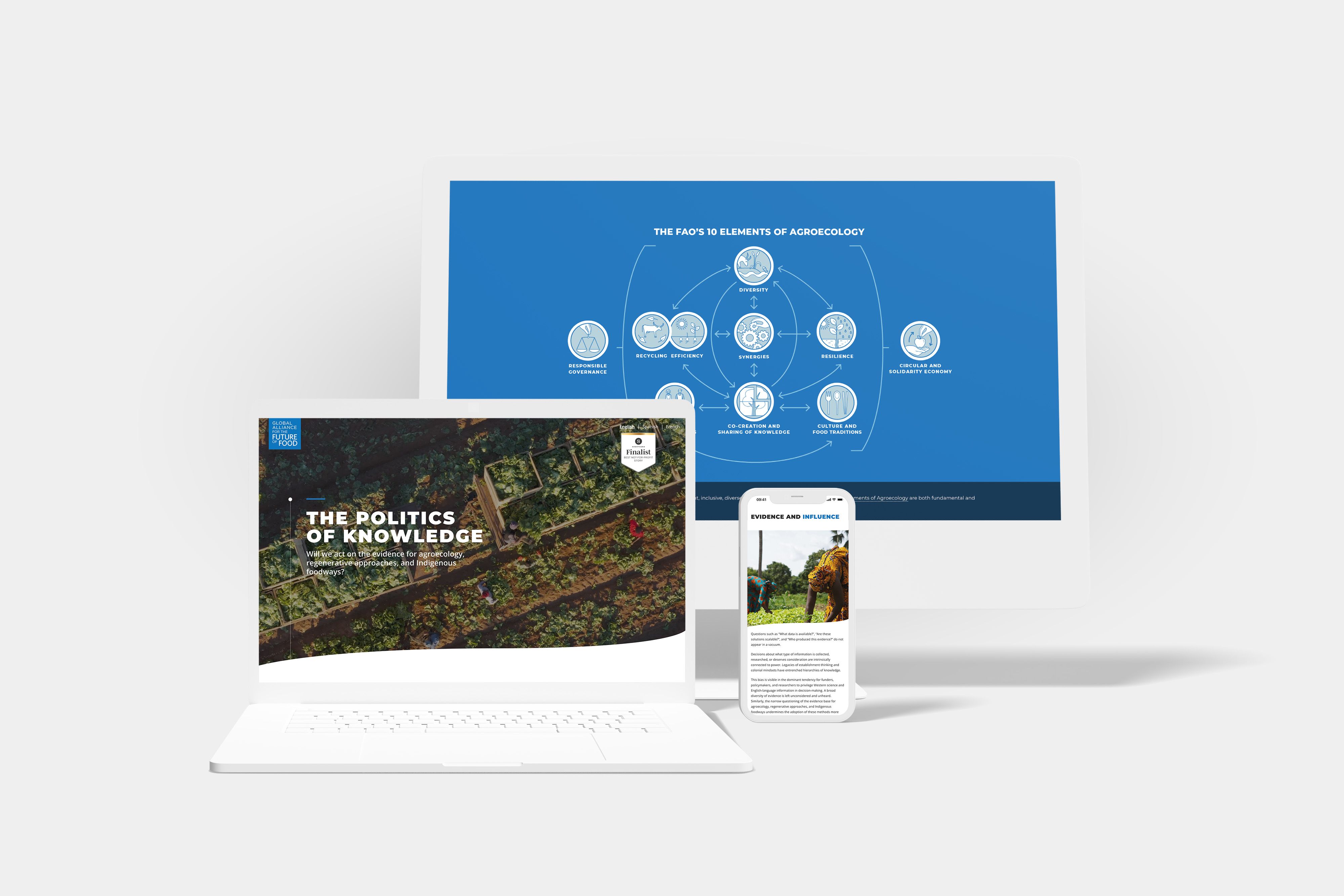
6. The Politics of Knowledge
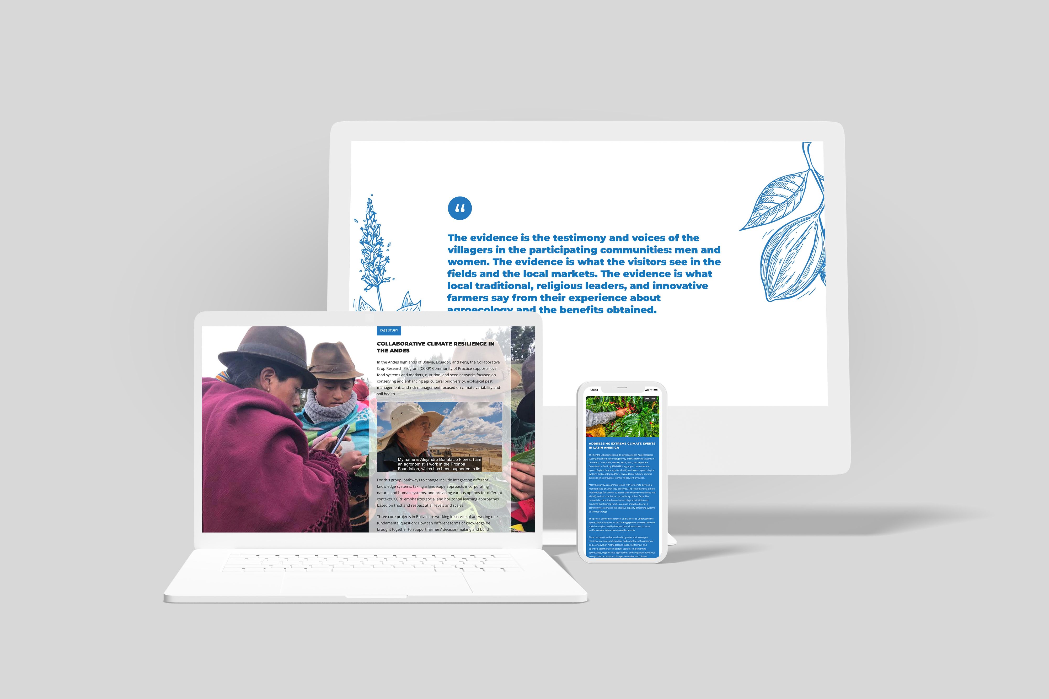
This white paper from the Global Alliance for the Future of Food discusses a vital issue: Can we use regeneration, ecological approaches, and indigenous knowledge to grow enough food for the world’s population?
It’s a pretty big question, so it presents its research as a “compendium” of evidence, case studies from around the world, and ideas for action. The report is divided into sub-questions, such as whether sustainable farming can work at scale or support enough jobs.
The report kicks off with a bird’s-eye GIF of people working in agricultural fields. It’s dynamic and it gives you an instant impression of the white paper’s goal: a bird’s eye view of our agricultural future.
7. Navigating Net Zero: How chemicals and energy firms are navigating the sustainability age
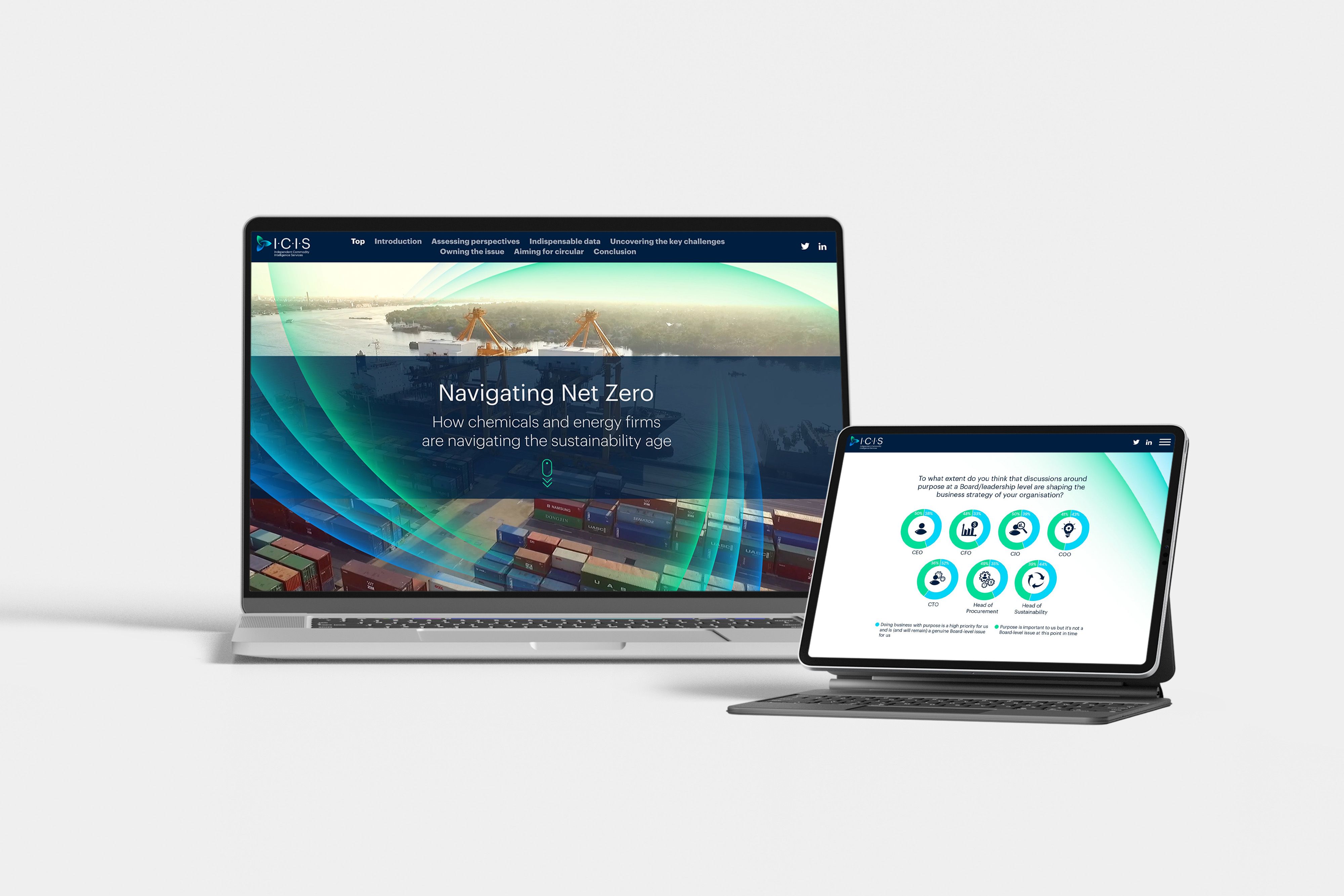
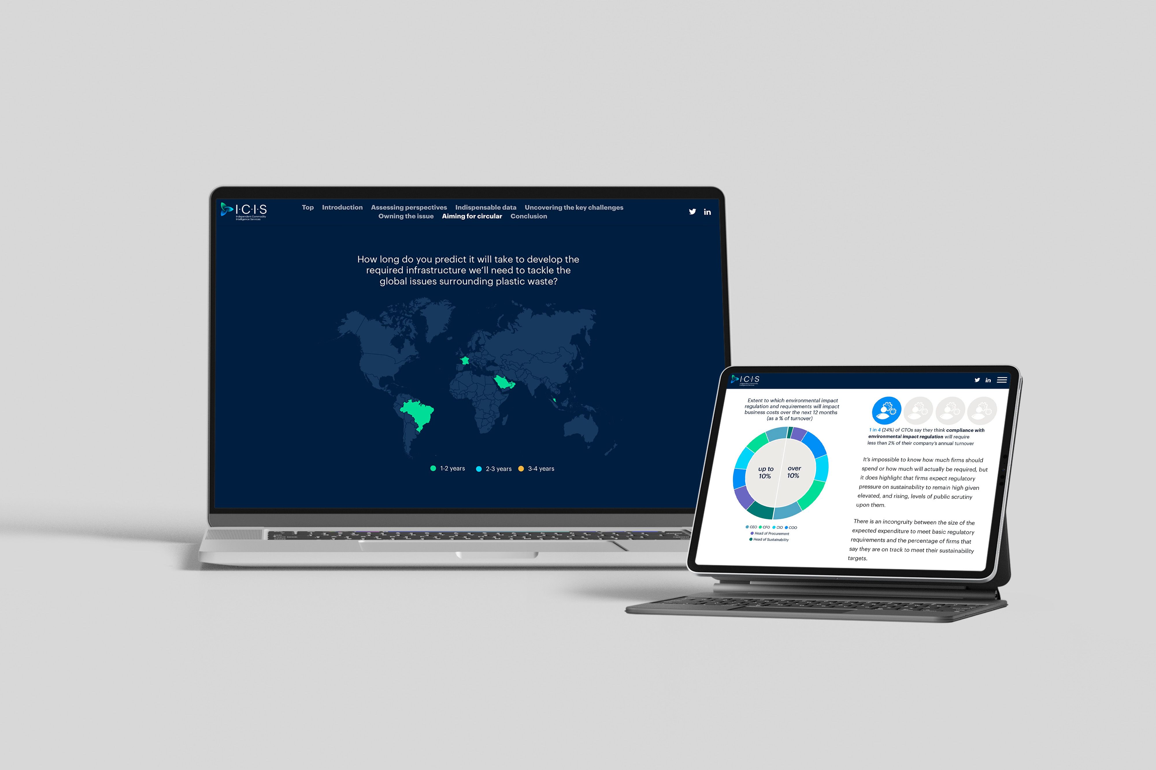
ICIS is a business research organisation that focuses on chemicals and energy firms. So it's perfectly placed to review the industry’s progress on sustainability, with this mega-survey of more than 1000 companies in five different continents.
The white paper has a fresh, modern design, combining digital effects with photos from work on the ground. It uses scroll-based animation to share a lot of data in a small space: for example, if you scroll down on a table, you can flip between data from different locations.
The writing style is also key to this report. As you’d expect for a professional policy document, it’s written with a strong editorial line, making strategic points that are backed up by the data.
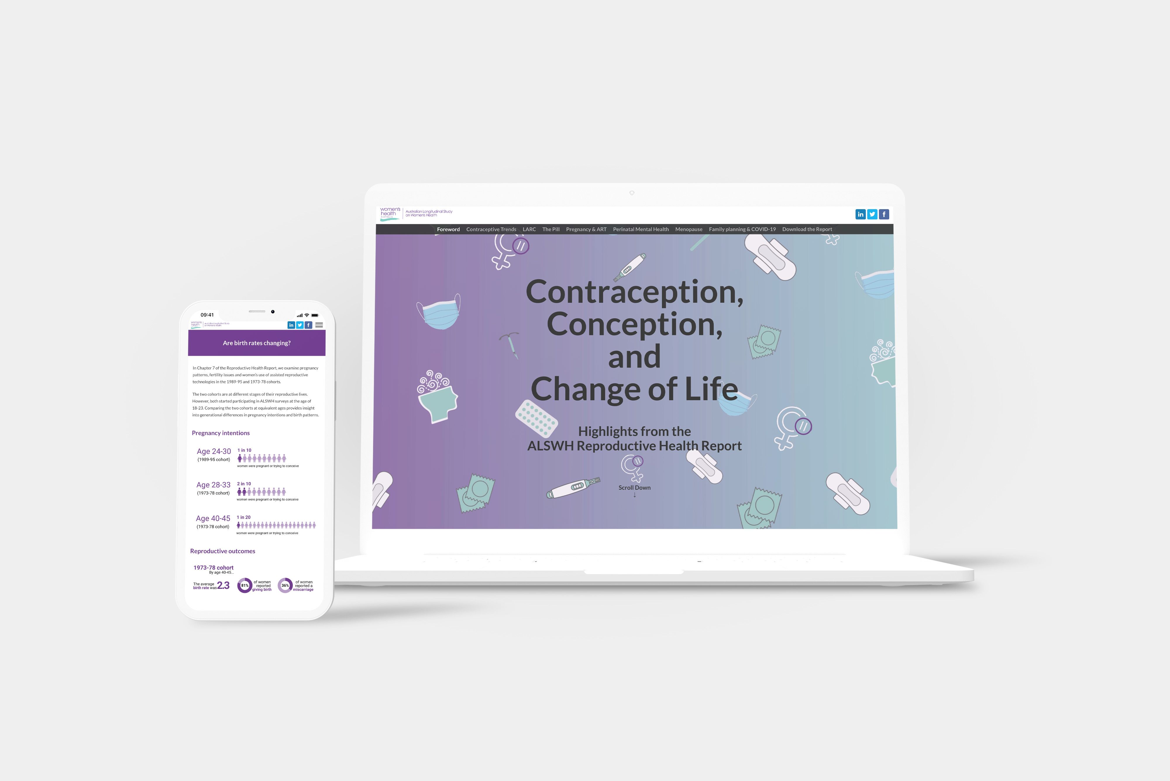
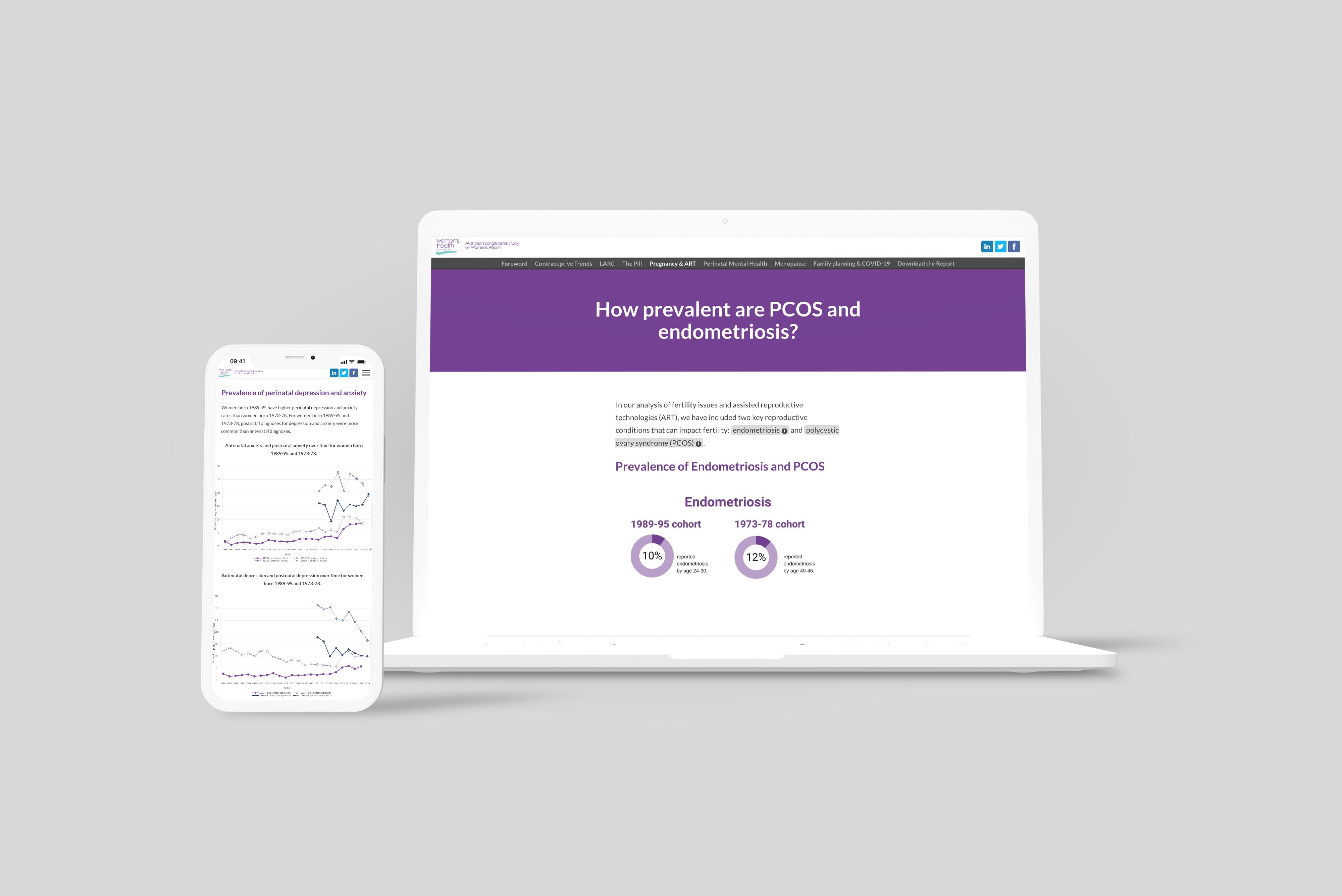
8. Contraception, Conception, and Change of Life
White papers are essential to reviewing and updating healthcare policy. This research report is based on a long-term investigation into women’s health: the Australian Longitudinal Study on Women’s Health. It covers every stage of adult women’s health, with vast amounts of supporting data.
But it’s still an engaging and accessible read. The authors have used everything available on the Shorthand publishing platform, from animations to illustrations and quick navigation menus, to help people find their way through the research. There are even automated prompts to switch between landscape and vertical views if you’re reading on mobile, so that graphs are easy to see and interpret.
9. The internal communications manual
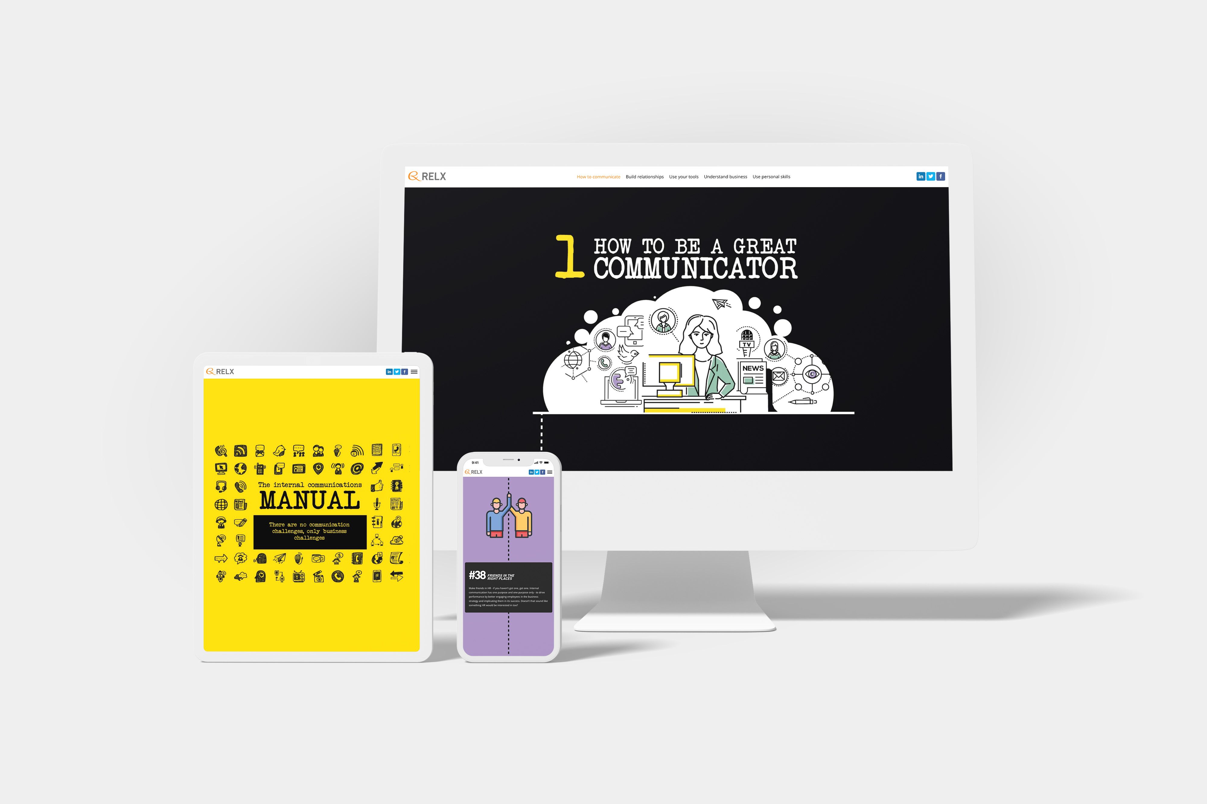
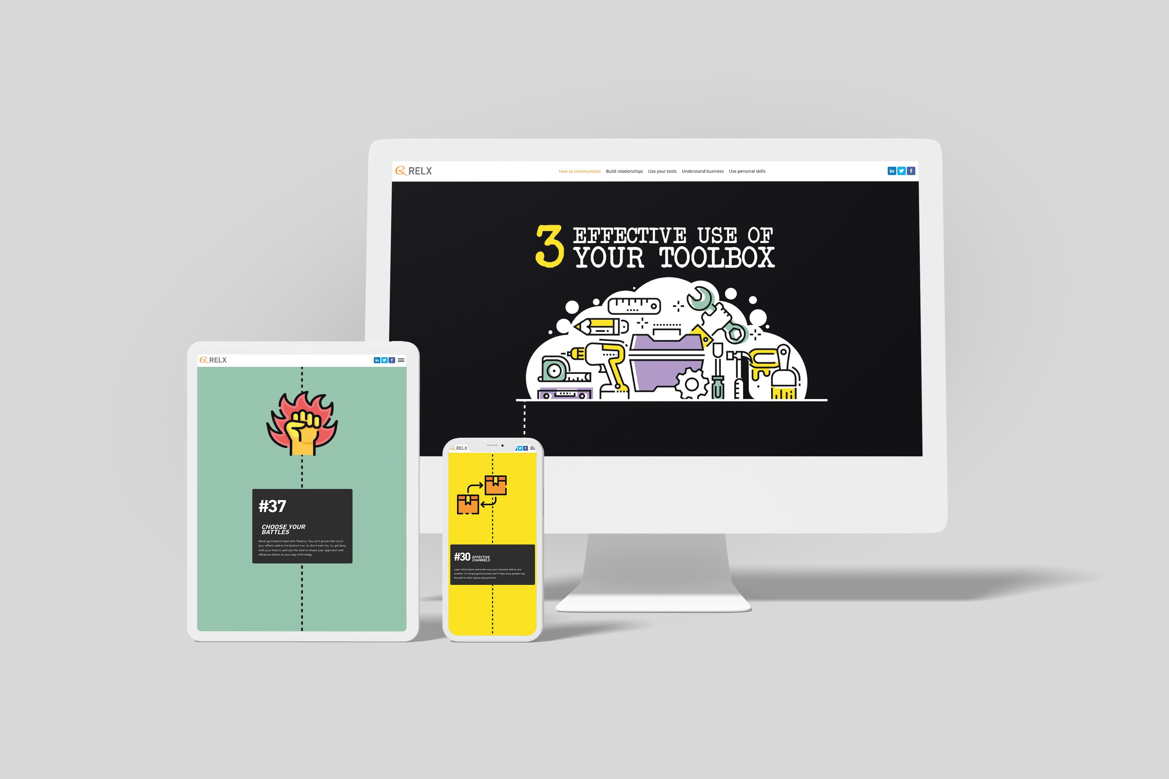
Speaking of writing style: if you’ve ever written a work email that didn’t get the desired effect, you need to read this guide. The consultancy RELX has used its in-house expertise to create the ultimate guide to effective internal communications.
It’s presented in a fun style, a bit like a DIY manual: the main colours are black and yellow, and the advice is broken down into 50 key points. And, as you’d expect from a comms guide, it’s written in a crystal-clear style.
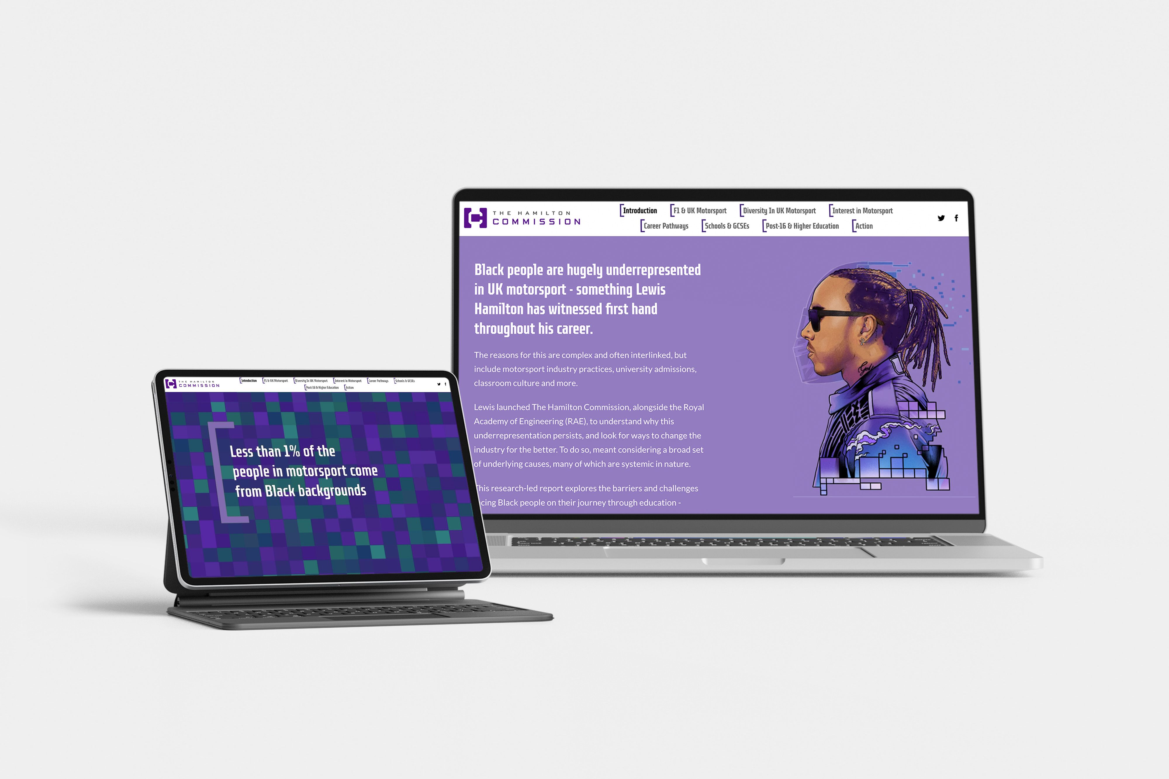
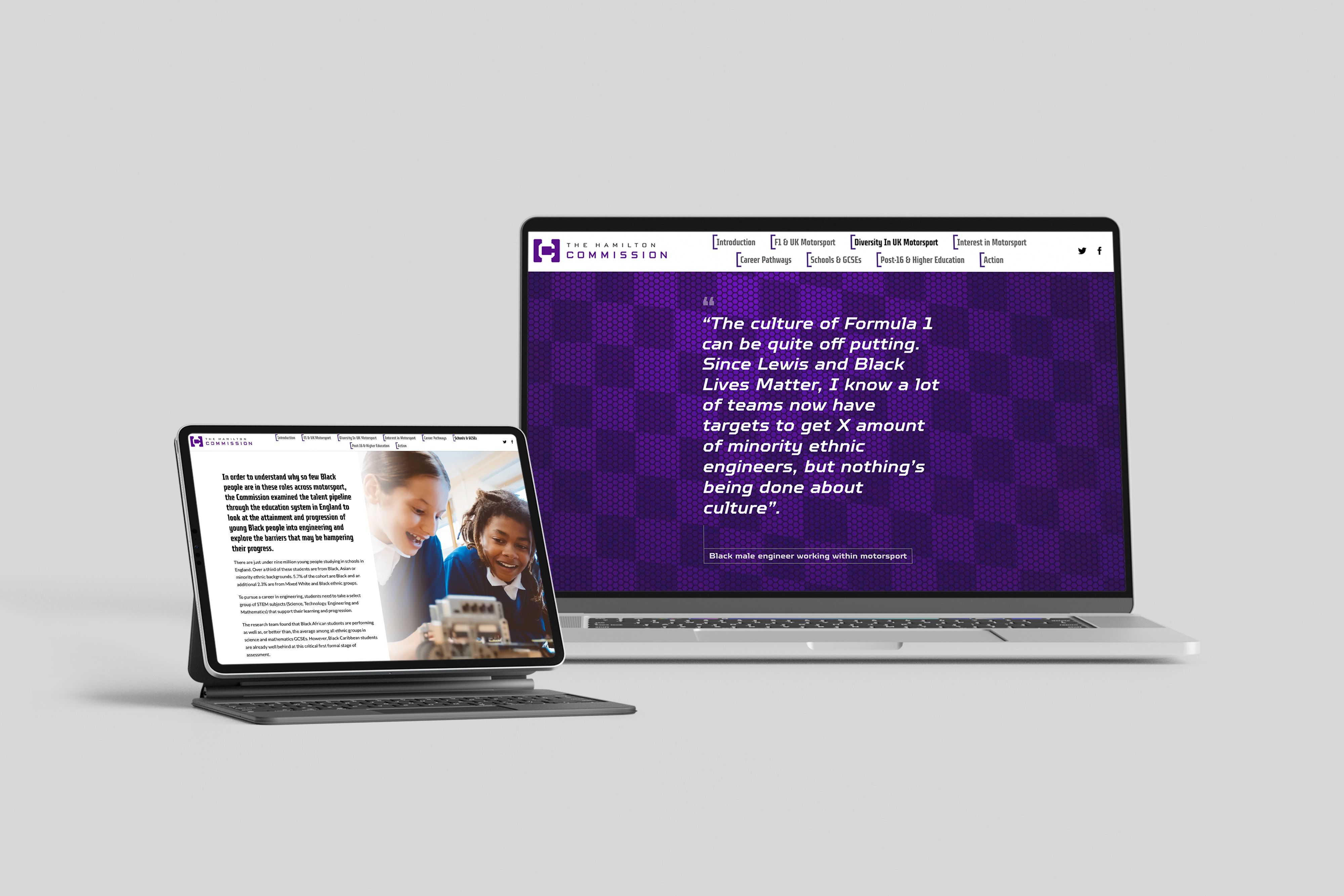
10. Accelerating Change: Improving representation of black people in UK motorsport
The Hamilton Commission was founded by Sir Lewis Hamilton to increase diversity in motorsports in the UK. And this white paper puts lived experience front and centre — from interviews with the Commission’s founder and CEO, to anonymous quotes from people of colour who currently work in the sport.
The report is structured around 10 key recommendations. Although it’s blunt about the current problems, it’s also framed positively: there’s data on the potential benefits of increased diversity, as well as statistics about what’s gone wrong. There’s a mix of content types to keep things interesting, including photos, illustrations, and video clips.
Frequently asked questions about white papers
How long should an engaging digital white paper be?
Long enough to say something meaningful. Short enough that readers don’t feel trapped. As a rough guide, many digital white papers land around 1,500 – 3,000 words, but structure matters more than word count. Clear sections, strong headings, and visual pacing make even in-depth topics feel easy to explore.
For more examples that show how to structure a white paper for maximum engagement, see our gallery of immersive digital reports.
What metrics should I track to measure the success of my digital white paper?
Start by looking beyond downloads. With web-based content, you can track what people actually do — like time on page, scroll depth, interaction events (plays, clicks, expand/collapse), and conversions (newsletter sign-ups, demo requests, downloads, etc.).
For a practical guide, see our article on measuring engagement with longform content. If you specifically want to measure how far people get, this walkthrough on scroll depth in GA4 is useful.
What types of teams benefit most from publishing a web-based white paper?
Any team that needs to explain complex ideas in a compelling way. Marketing teams use them for thought leadership, product teams for deeper explainers, and comms teams for reports and announcements that deserve more attention than a PDF attachment ever gets. (Your readers will thank you. Their downloads folder will too.)
How do web-based white papers fit into a wider content strategy?
Think of them as a hub, not a one-off. A strong digital white paper can be teased in email campaigns, broken into social snippets, linked from related blog posts, and repurposed into follow-up content. For a solid primer on planning content as an ecosystem, Hygraph’s piece on digital content strategy is a good refresher.
What types of content work best in a web-based white paper format?
Research reports, industry insights, strategic frameworks, surveys, and thought leadership with a narrative arc all thrive online. If the content benefits from storytelling, visuals, or progressive disclosure, web format usually beats “PDF, but make it vertical.” For examples of structure and presentation that go beyond the basics, see Shorthand's gallery of engaging digital reports.
How interactive should a digital white paper be?
Interactive enough to keep things interesting — not so interactive that it feels like a game of whack-a-mole. Subtle motion, embedded media, and clear navigation tend to work best. The goal is to support the story, not steal the spotlight. For accessibility-friendly interaction patterns, the W3C’s ARIA Authoring Practices Guide is a practical reference.
Do non-PDF white papers work for technical or complex topics?
Absolutely. Complex topics often benefit most from a web-native format because you can break information into digestible sections, add visual context, and guide readers through a clear narrative path — without oversimplifying. (It’s still rigorous. It’s just… nicer about it.)
What’s the typical workflow for creating a digital white paper compared to a PDF?
Surprisingly familiar. You still start with a strong idea, solid research, and a clear structure. The difference is that you think about the reading experience earlier — how content flows, where visuals add clarity, and how readers move through the story — rather than flattening everything into a PDF at the end.
Start creating with Shorthand
It's the fastest way to publish beautifully engaging white papers, reports, internal comms, and more.


