The essential building blocks of an annual report

Creating an annual report for a non-profit is a big undertaking. Your team has to pull together financial reports, highlights from the year, evidence of impact, and messages from senior staff — all while making sure that the report looks great and reads well.
By Corinna Keefe
But as with any major project, it’s worth breaking your annual report into smaller steps. In this guide, we’ve collected a list of the essential building blocks for an annual report. Once you have these building blocks in place, it’s much easier to write, edit and illustrate a coherent report that will perform well.
So let’s dive in, starting with one key question: What format will your annual report take?
What do the BBC, Tripadvisor, and Penguin have in common?
They craft stunning, interactive web content with Shorthand. And so can you! Create your first story for free — no code or web design skills required.
Sign up now.
1. Choose a format

There are four main methods of publishing an annual report. Whichever format you choose, it has to be capable of presenting lots of information, without sacrificing accessibility or good design.
Your options are:
- Printed reports. This is a classic way to publish annual reports, with added prestige. But print can be expensive, and it’s harder to share print reports with a wide audience.
- PDFs. PDFs are a stable file format that you can share with anyone via a link or download. However, PDFs are notorious for accessibility (and other) issues, and it can be tricky to make them interactive.
- Publishing to the web. You can publish reports directly as website pages or blog posts. This is quick, easy, and usually accessible — but your design and media options are limited.
- Digital storytelling platforms. The new generation of no-code publishing platforms are a new approach to online reports. You have all the convenience of a webpage, but with enhanced design tools and interactive features.
If you work on annual reports, you’re probably already aware that they can be, well, boring to the reader. It’s no one’s fault — there’s just a huge amount of information to process and present. However, the latest platforms for digital storytelling mean that annual reports can finally become visual and immersive.
Indeed, with the latest generation of digital publishing platforms, annual reports are becoming genuinely multi-media, easy to read, and available to anyone with an internet connection. As we’ve written elsewhere in our roundup of 10 inspiring annual reports, there are plenty of excellent examples of impactful reports to learn from.
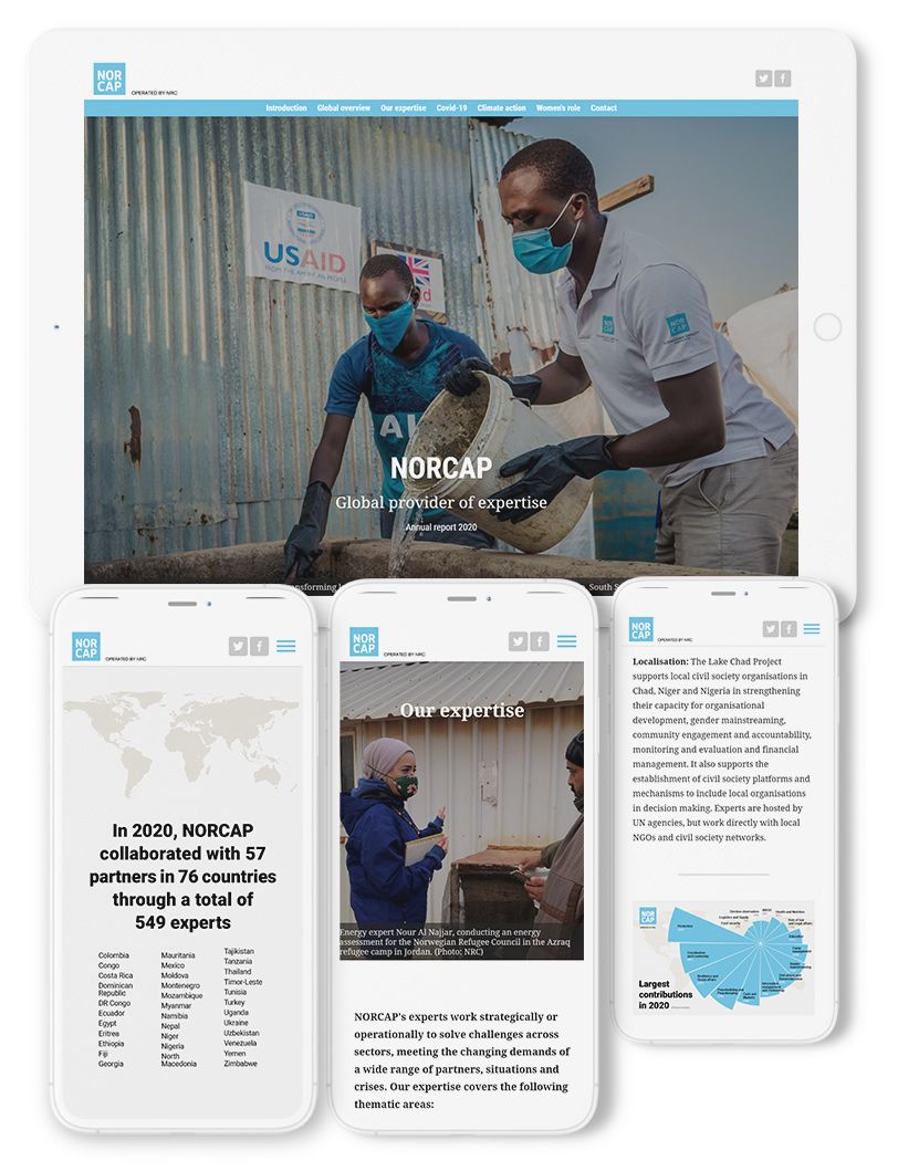
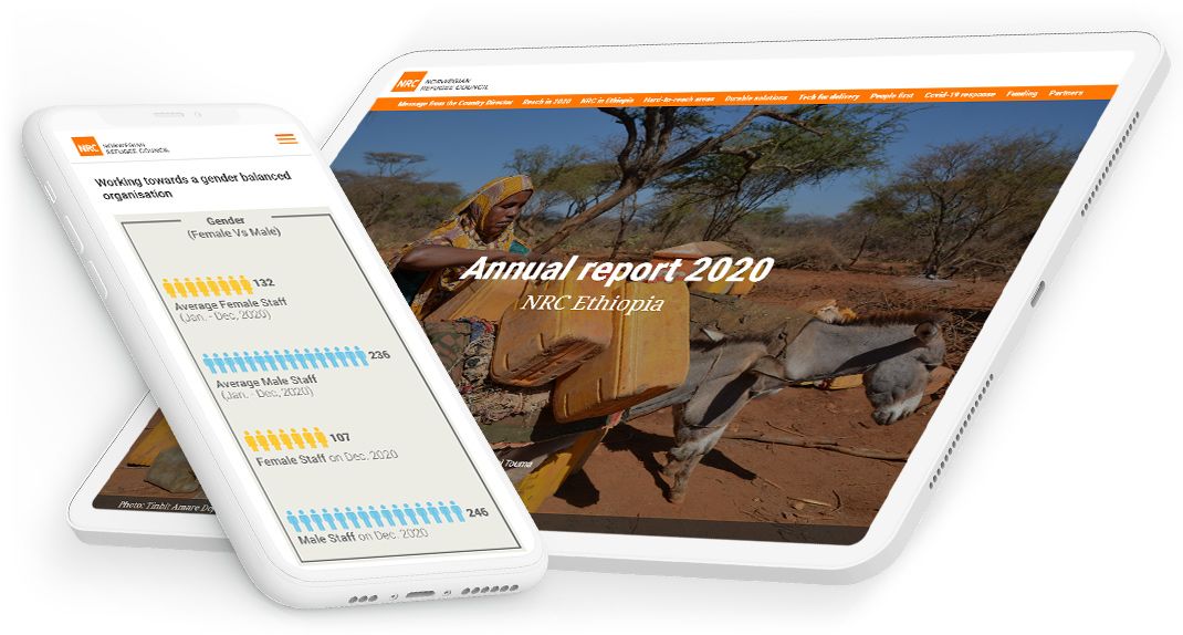
One example we’ll refer to in this guide is the Norwegian Refugee Council’s annual report.
2. Write an eye-catching title

Yes, I know we’re starting with the absolute basics here. But the title of your report matters.
Here are a few questions to ask yourself:
- Should the title of the report be factual or inspirational? Most non-profits opt for a simple title such as “Annual Report 2021”, but there is space for something more creative. For example, Habitat for Humanity named their latest report “homes, communities, hope, you”. The title sets the tone and the structure for the whole report.
- Does the title explain what’s in the report? Will people know what they’re reading? Even if you go for a catchy title, make sure you include the date and non-profit name somewhere.
- Does the title match your brand voice? Annual reports aren’t just an accounting formality; they’re also a flagship piece of content marketing for your non-profit. They should reflect your style and values accordingly.
3. Engage readers with an introduction

We all know the statistics: Most web pages are only viewed for 10 to 20 seconds at a time. Most people scan rather than read in detail.
However, with the right introduction, you can hold people’s attention for much longer. Think carefully about how your report opens. If necessary, test it on someone who’s spent less time than you have staring at the design.
A lot of non-profit annual reports open with a message from the director. This is great… so long as it doesn’t run on for 2000 words. Remember, you’re trying to create a memorable experience for the reader, so you don’t have to follow the same format as annual reports from decades past.
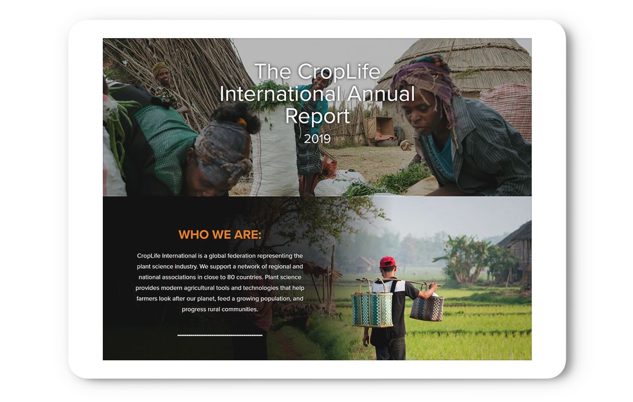
There are plenty of alternatives to a headshot and a lengthy letter. For example, CropLife opened their 2019 annual report with two short statements: “Who We Are” and “Our Values”. Right off the bat, they made their mission clear and got readers interested in what they had achieved.
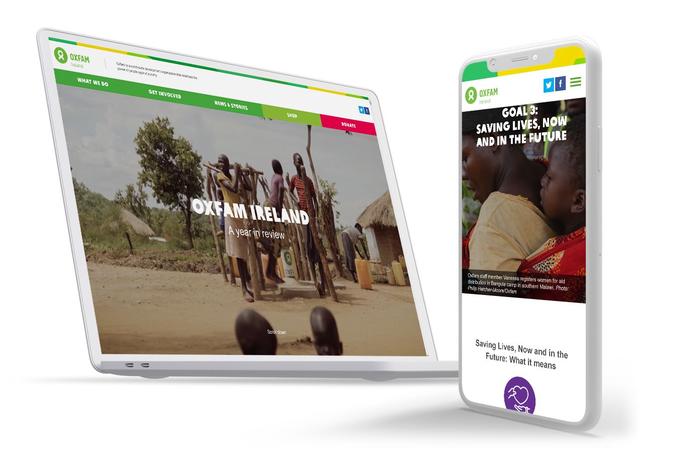
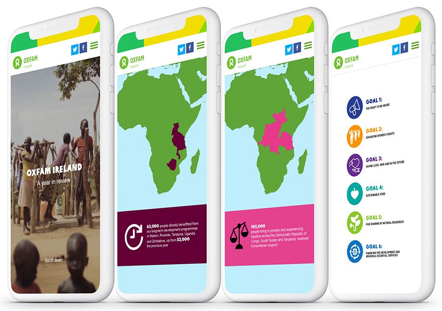
You could also consider flipping the annual report structure upside down. In a recent report, Oxfam Ireland left the messages from staff for the end of the report. They kicked off with a colourful map that showed the extent of their work, and finished the report with an inspiring call to action from their CEO.
4. Show highlights from the year

In your annual report, you’ll want to dive into the real information pretty quickly, before readers lose focus. This is why most annual reports now include a quick overview of their key goals, achievements, and statistics up top.
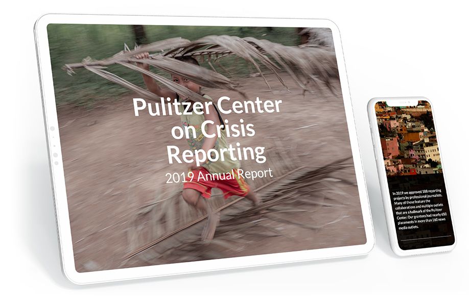
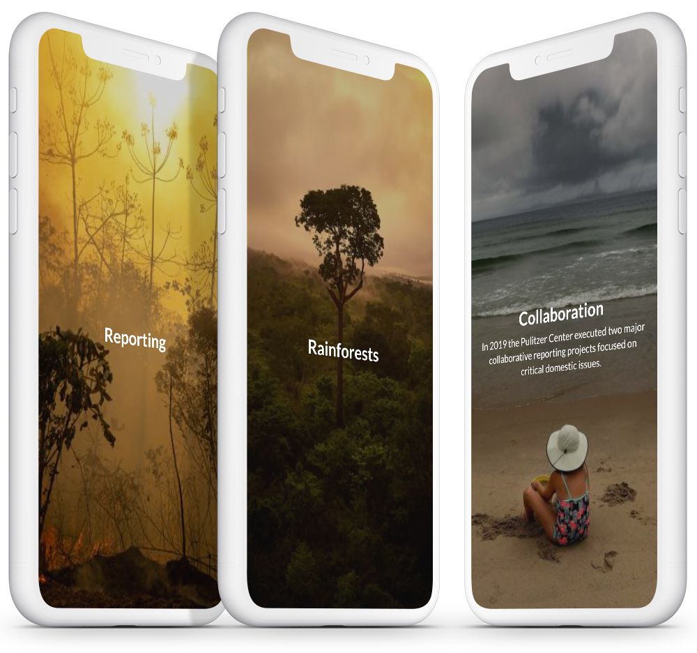
For example, the 2019 annual report from the Pulitzer Center begins with a highlight reel. As well as adding some variety to the report, this quick video is also a great piece of content that can be shared elsewhere or used as a calling card for the non-profit.
You can think of this as an executive summary, but a lot more interactive and colourful. It doesn’t have to be in video format, either.
5. Make the report easy to navigate

Now we’re getting into the real meat of the annual report. This is the point at which you could lose some readers, so it’s essential to give the report a coherent design and clear navigation.
One way to do this is to choose a single organising principle. The Oxfam Ireland report is structured around their goals for the year. The Pulitzer Center report, mentioned above, is built around a few key themes in international journalism.
Other non-profits choose to report on their activities by location, order of priorities, or a timeline of the year. Whatever organising principle you choose, it should make it easy for readers to find the information that is most interesting to them.
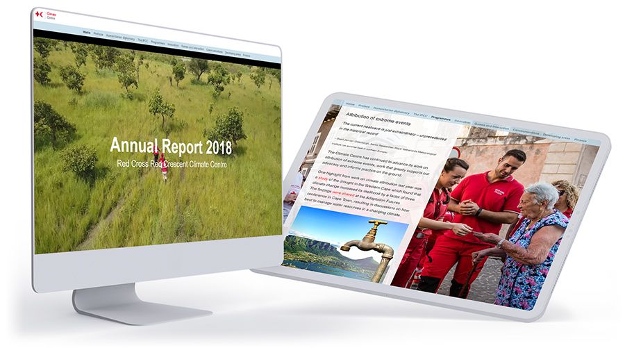
If there is a lot of data in your annual report, then you can also offer people shortcuts. For example, this annual report from the Climate Centre has a navigation bar running along the top of the screen. (You might recognise this quirk of design from longform journalism; the best annual reports often look and sound very journalistic.)
6. Put work in context

Annual reports go out to a huge audience, including other non-profits, donors, fundraisers, volunteers, industry experts, journalists, and more. Chances are that not everyone is going to be an expert in what you do, so it’s important to place the report in context.
That includes:
- Explaining any acronyms, industry jargon, or terms in other languages. It’s easy to get used to your own jargon in the office. For non-profits that work internationally, there may be local terms that you’re used to hearing — remember that your readers won’t be familiar with them.
- Sharing relevant links. The beauty of digital publishing platforms is that you can easily connect with other content. So add those links! Sharing links to more detailed content is a good way to make a report comprehensive without making it unnecessarily long.
- Referring to previous reports or programmes. You should be proud of what you’ve achieved this year — but again, your readers might need context to understand how impressive the work is. Use links or short summaries to fill readers in on any essential cultural background, previous work, or current affairs.
7. Show progress on past and present goals

Many non-profits use annual reports as a chance to state their goals for the coming year. While your essential mission may well be the same, the specific strategies and targets for each year will be different.
You might also want to remind readers of your goals from the year before. Did you achieve them? Do they flow naturally into the new goals, or have you changed tactics? Can you show the impact of those goals?
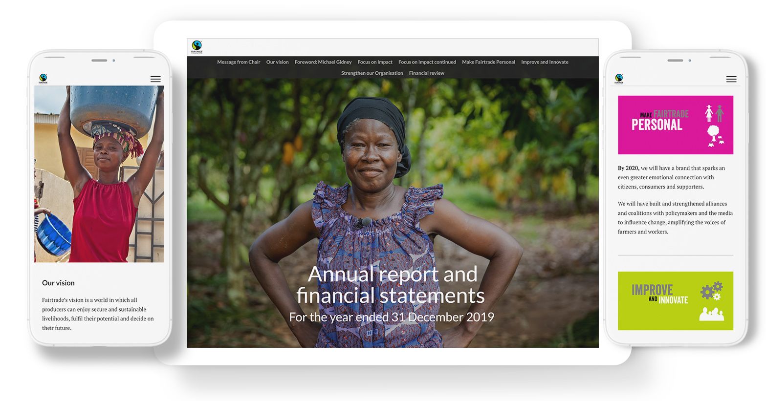
For example, in their 2019 annual report, Fairtrade reviewed each one of their goals in detail. They used colour-coded graphics to make clear which statistics were relevant to each goal. The goals were then illustrated with short case studies to demonstrate their impact.
8. Show internal processes and organisation

So far, we’ve mostly focused on the outward-facing elements of your annual report, such as your mission statement, goals, and impact.
But annual reports also cover internal information — such as your financial reports, organisational structure, and staff diversity. All of this data is essential for readers who want to assess your work as a non-profit. And, with the right presentation, it can become another way to demonstrate your values in practice.
For example, the 2020 report from the Norwegian Refugee Council in Ethiopia has a strong focus on gender equality. So their annual report includes charts showing the gender balance among their staff at different levels of seniority.
You can use data visualisation to share financial reports, too. We’ve seen annual reports from non-profits which use interactive pie charts, scrolling bar charts, and timelines of income/expenditure to make those figures eye-catching.
9. Speak to your donors and volunteers

Throughout the report, you’re always speaking to your audience, including donors and volunteers. That’s what an annual report is for.
However, it’s worth making this explicit at some point. A significant proportion of your readers will be donors or volunteers. This is your opportunity to highlight their efforts and thank them for their work.
You can also speak to any partner organisations or funding sources that you want to highlight. As well as maintaining a good relationship, this also gives them another reason to share or interact with the report.
10. Centre the people you support

Everything that a non-profit does is ultimately for someone — whether that’s children in need, students who receive grant funding, or farmers benefiting from the latest innovations in agriculture. Those users, beneficiaries, clients — or whatever else you want to call them — should be front and centre in your annual report.
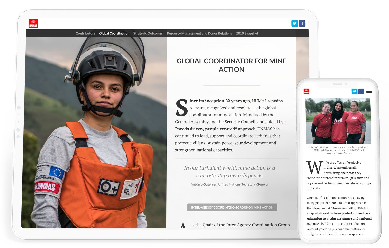
For example, the 2019 report from UNMAS (a UN organisation working to remove mines around the world) features a photograph of one of the first locally trained, female minesweepers in Afghanistan. The image humanises the report, reminding us of the people who really benefit from UNMAS — and who risk their lives to help others.
11. Showcase your best media

An annual report showcases your achievements and high points of the year. It can also showcase your very best media from the year, becoming a content hub rather than a static report.
Start by thinking about the media assets that you already have. Wherever possible, try to use original content from your work on the ground. For example, the Pulitzer Center marketing team illustrated their annual report with photos taken by the journalists they support.
You can also bring back key ad campaigns, images or events from earlier in the year. Fairtrade included a video of a pop-up event in their annual report. This short clip shows some of their best publicity work, reminds people of a fun campaign, and makes a serious point about the goal they wanted to achieve.
12. Pull it together with design

As we’ve seen, an annual report includes a lot of moving parts. And for non-profits, there’s the extra challenge of focusing on the people you help, while making space to recognise your staff, donors, fundraisers, and volunteers.
Great design will pull all those different elements together. It doesn’t have to be ornate or complex; it just has to be fully thought-through.
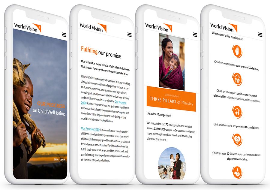
For example, World Vision use a consistent colour scheme throughout their 2017 report. This ties all the information together.
In contrast, Oxfam Ireland’s report uses lots of different colours. However, it’s still in a very recognisable style. The bright, rough-edged designs are absolutely consistent with Oxfam’s brand image. Different colours are used for different countries throughout the report, so by the end of it, readers can instantly spot which statistics are relevant to each location.
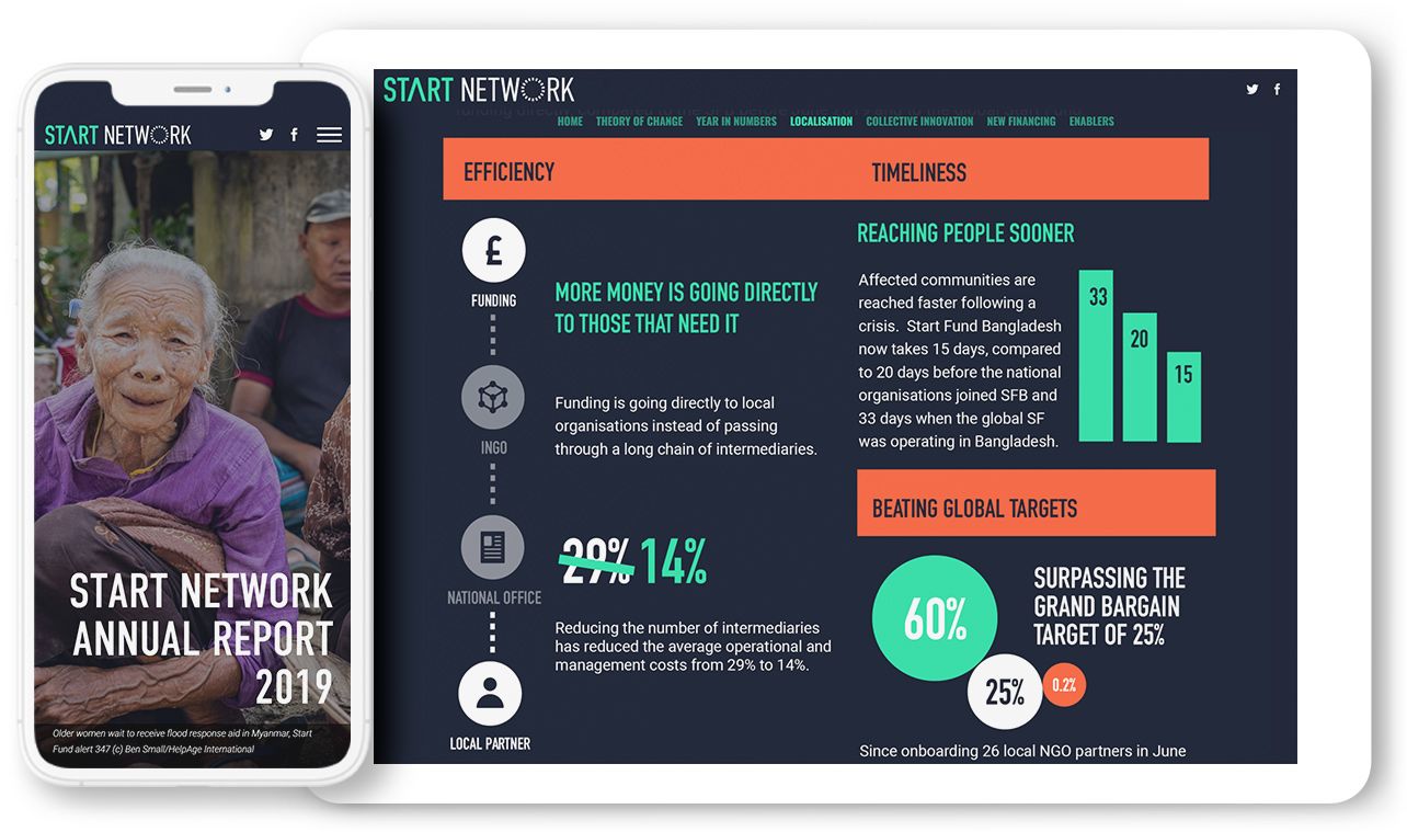
Another option is to use data visualisation, whitespace, infographics, pull quotes, images and headlines to break up your annual report. Remember, there’s a lot of information to get through, so you want to keep readers engaged. The flow of data should be continuous, but it should also refresh the eyes.
A great example of data visualisation in an annual report comes from Start Network.
It’s a good idea to consider your design carefully at the earliest stages of writing the annual report. If you integrate the design from the beginning, then it can be an informative part of the report itself. If you make the design decisions at the end, your report — and your reader numbers — will suffer.
13. Give readers a next step

Does an annual report need a call to action? Yes, it does — just like every other piece of content.
However, it’s up to you what that call is. You could direct people towards a download with more information. If your non-profit relies on donations, you could include a donation button. Another popular option is to invite people to subscribe to your newsletter.
As always, it’s best to stick with one CTA at a time. The important thing is to give your readers something positive that they can do at the end of the report.
After all, if they’ve read the whole thing, they must be a pretty engaged audience.
Speaking of CTAs, if you’re looking to create a digital annual report, you can get started with Shorthand today. Publish your first story free — no code required.


