Visual Storytelling
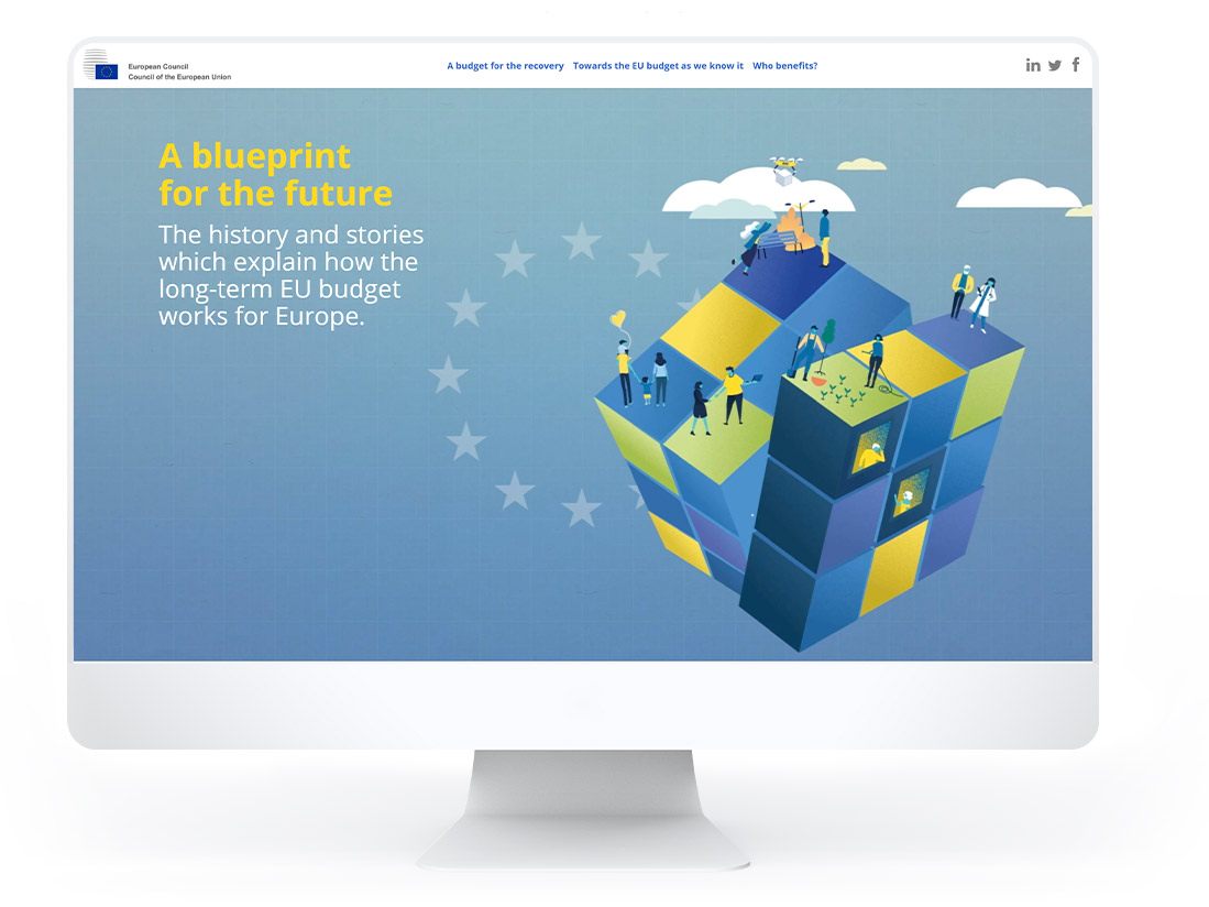
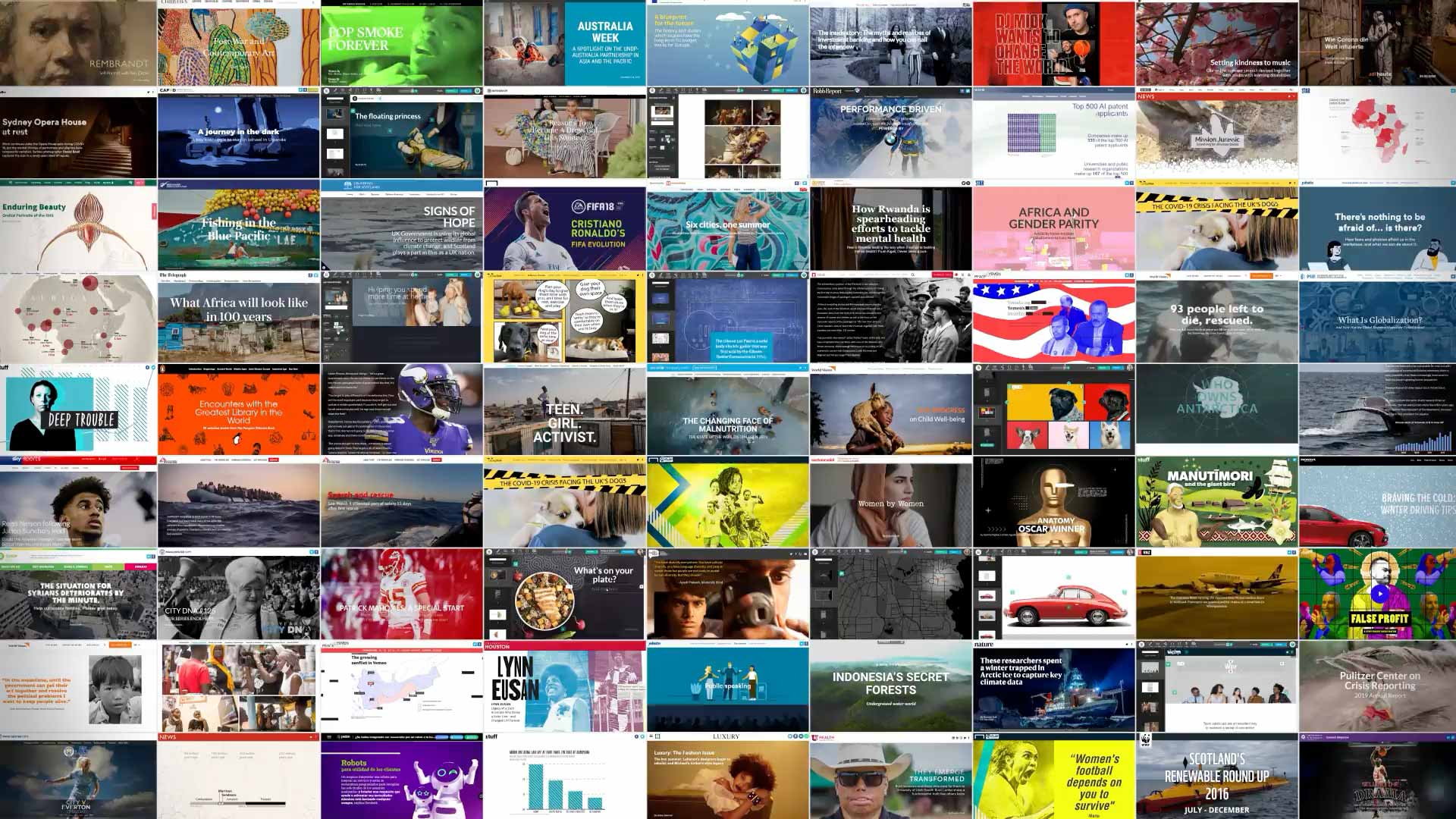
Create beautiful visual stories for all devices.
We handle the hard part
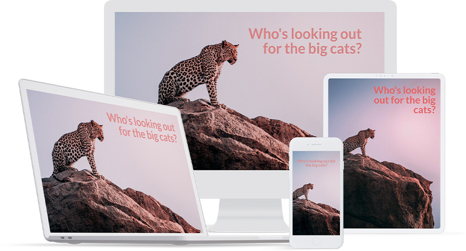
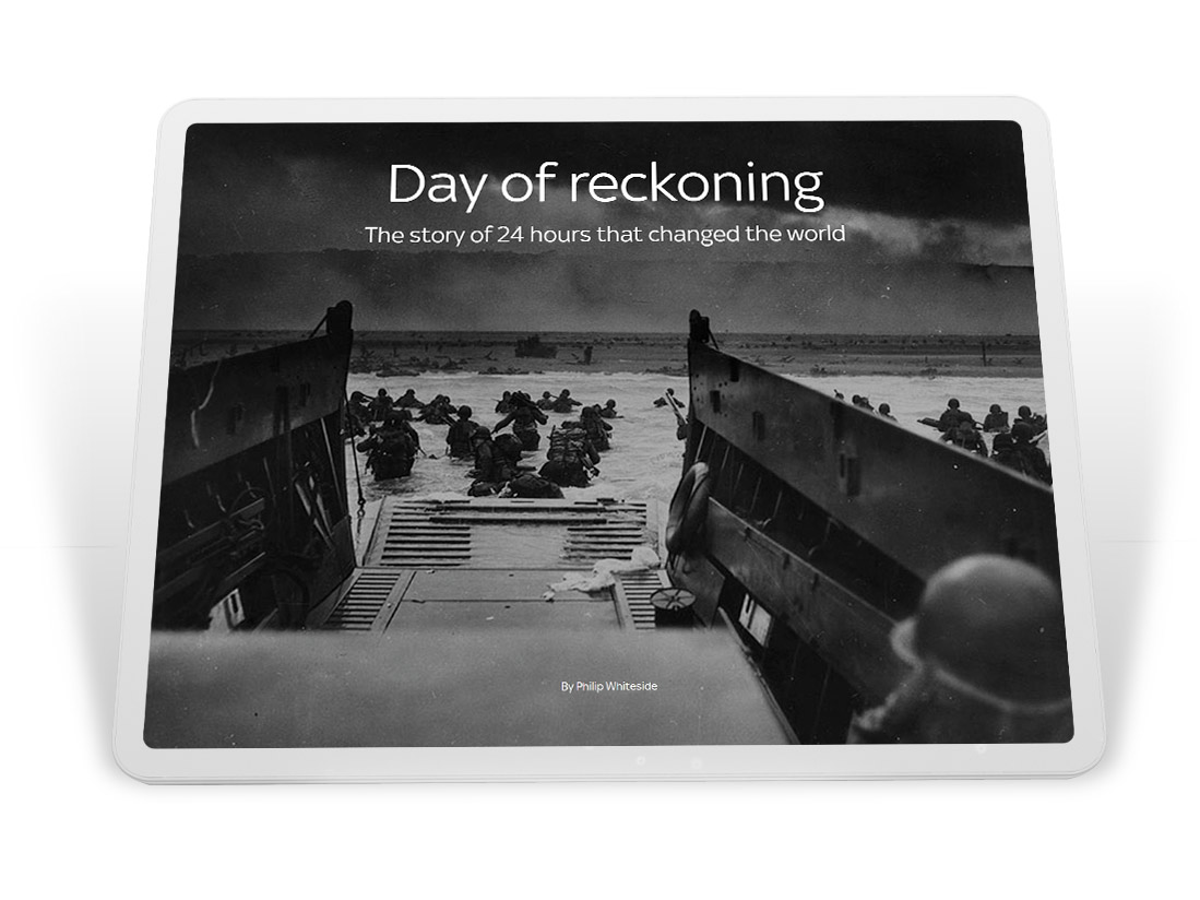
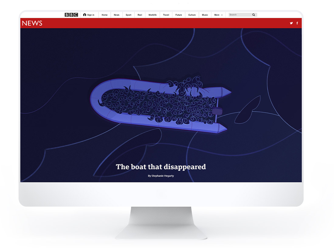
Shorthand creates multiple versions of your uploaded images and ensures the most appropriate version is served for each screen size.
- Have confidence that your scroll-based animations work on all phones, tablets, and monitors.
- Set ‘focus points’ to make sure that the most important parts of your images are always shown.
- For bespoke illustrations, optionally create separate treatments for mobile screens.
Media Gallery
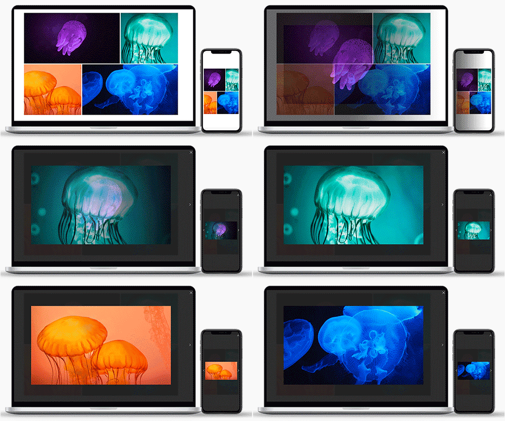
Incorporate galleries of images and video into your story.
- Showcase multiple images and video in a fully responsive grid.
- Drag-and-drop multiple media files into the Shorthand editor and resize and arrange them as needed.
- Your readers can select individual images or video to view in a full-screen lightbox.
Simple testing
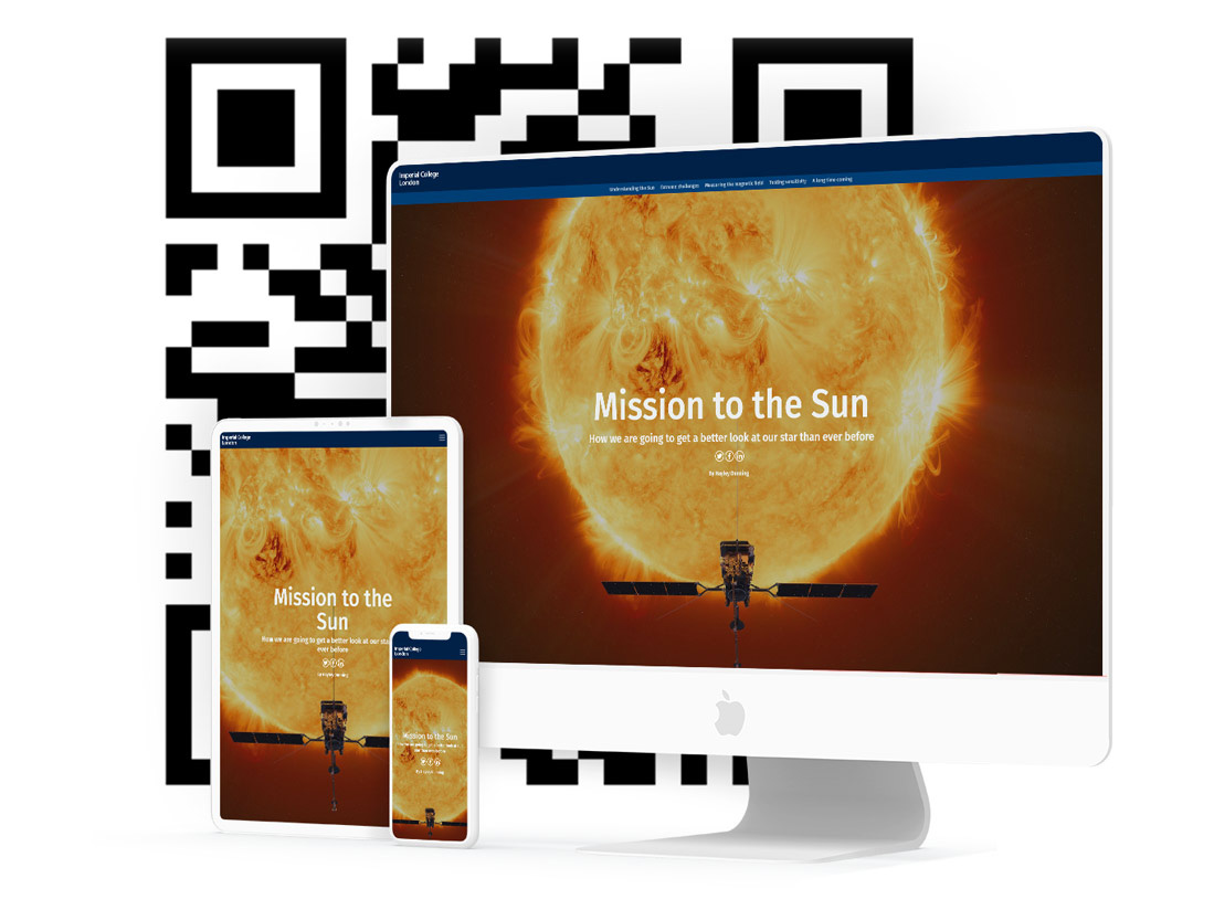
Streamline your QA and easily test your stories on all screen sizes prior to publication with a simple preview link or QR code.
- Remove the guess-work from testing on mobile and tablet screens.
- Get feedback and sign-off from your colleagues and collaborators — even those outside of your Shorthand organisation.
“Shorthand removes all the technical complexities involved with digital storytelling. The platform allows non-coders to build a creative that has that deep, immersive feel — and in a fraction of the time.”Scott Peakcocke | Senior editor for data journalism | AJC
