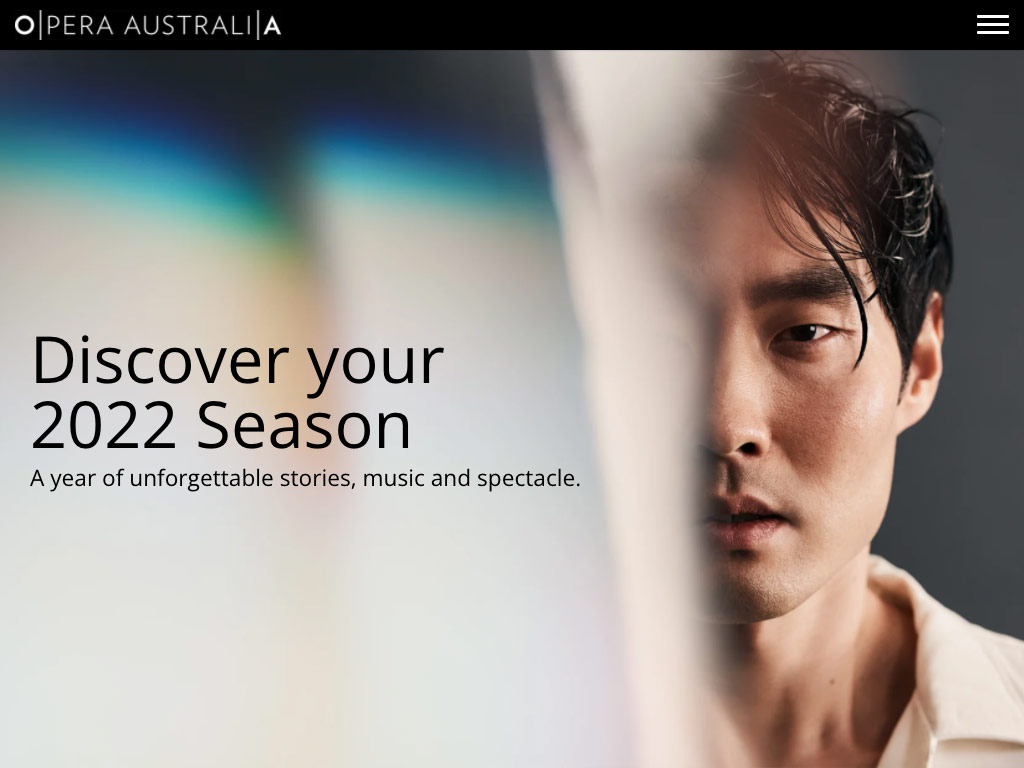
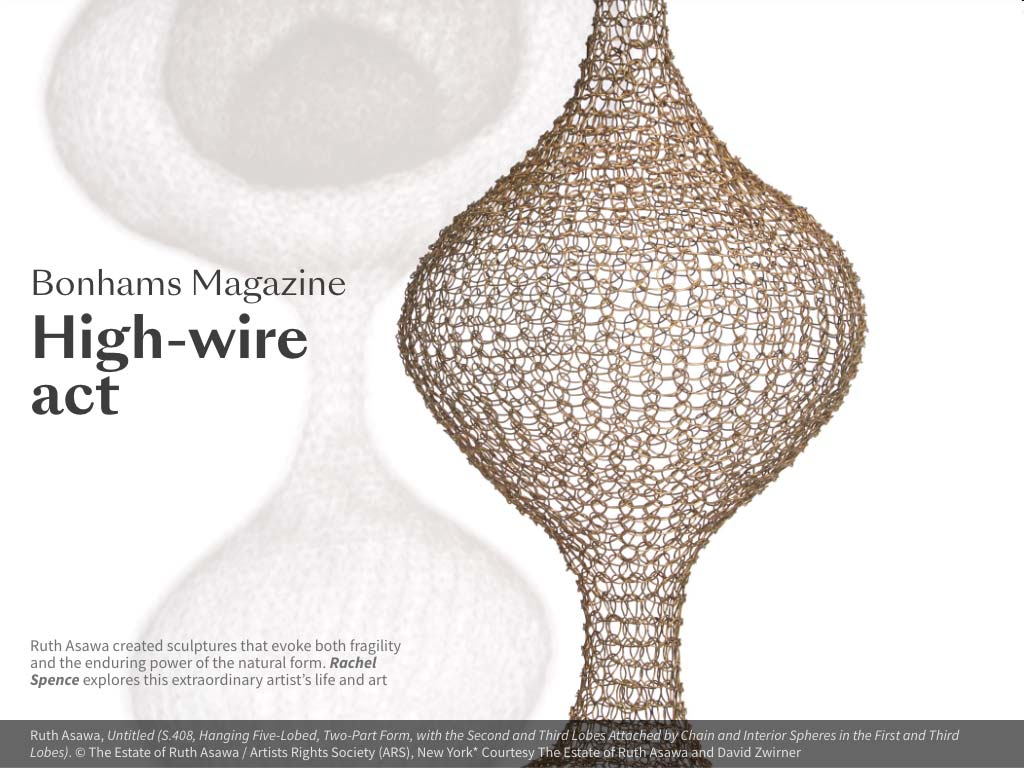
How does a leading scientific research institute communicate complex, data-rich information to a general audience?
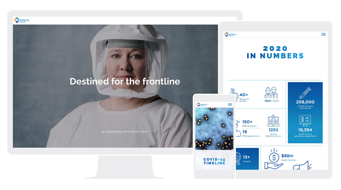
To answer this question, we talked to Natalie Booth, Marketing Communications Officer at The Peter Doherty Institute for Infection and Immunity (Doherty Institute).
The Doherty Institute is a joint venture between the University of Melbourne and The Royal Melbourne Hospital, where leading scientists and clinicians collaborate to improve human health globally.
As a purpose-built and conceived centre of excellence in infection and immunity, the Doherty Institute has been at the forefront of the global response to the COVID-19 pandemic. The Institute’s multidisciplinary activities include diagnostics, epidemiology, clinical management, and research into the immune response, potential treatments and a vaccine against SARS-CoV-2, the virus that causes COVID-19 disease.
With such critical — and hugely public — work occurring within its walls, the Doherty Institute has put a premium on effective science communication. The team publishes a variety of reports, stories and long form, data-centric pieces, all aimed at making their research accessible to a broad audience.
Science communication for a general audience
“We want to make our research as accessible as possible for a general audience.”
As Natalie explains, one of the difficulties with scientific research is that it can be highly technical. This can make it challenging to communicate with a broader audience.
“The main idea for us in using Shorthand was to add a bit more life to long-form research pieces,” Natalie explains.
“It can be difficult to disseminate really technical information. I think having something as engaging as Shorthand has helped bring a bit more life to some of those stories.”
Natalie says that stories with various forms of media tend to be much more engaging than stories that are just text — which is critical for effective scientific communication.
“Having the ability to add in imagery like graphs and animations is a really helpful way to give a little bit more detail and visual element for people.
“We know that people do drop off reading stories that are just a wall of text. So, that's a big priority for us. We want to make our research as accessible as possible for a general audience.”
AusTrakka
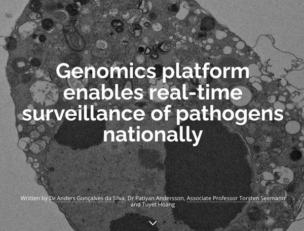
One impressive example of the Doherty Institute’s science communication is Genomics platform enables real-time surveillance of pathogens nationally, which outlines the development of their AusTrakka platform.
AusTrakka is a platform designed to enable real-time sharing, analysis and reporting of pathogen genomic data across public health labs in Australia.
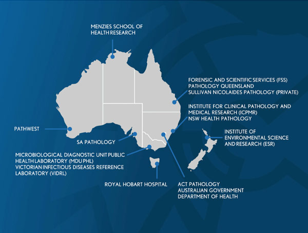
As Natalie explains, “AusTrakka is used as part of the COVID-19 public health response for rapid sharing and analysis of SARS-CoV-2 genomic sequences.It has been utilised by public health laboratories throughout the COVID-19 response to track and trace the virus across Australia and New Zealand.”
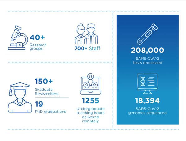
The tool has been a critical part of the response to COVID-19 in Australia — but communicating this can be a challenge.
“It's quite a technical platform. So it was great to tell this story in an innovative and visually interesting way, given the importance of the tool.”
The people behind the science
“We think having a more innovative way to showcase work means that people who're doing the really innovative work are proud to share it.”
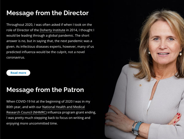
In addition to communicating research, the Doherty Institute has showcased first-person stories of the experts driving the organisation’s work, in their 2020 Impact Report.
“We've noticed that when we've been promoting those sorts of people-centric stories, our staff and their family and friends are really proud to share them.,” Natalie says.
“We think having a more innovative way to showcase work means that people who're doing the really innovative work are proud to share it.”
One recent example is Destined for the frontline, a short piece by Julie McAuley, PhD, a Senior Research Officer at the Doherty Institute.
Julie started 2020 uncertain of her career’s future, but very soon found herself deep in the trenches of coronavirus research. The Doherty Institute used Shorthand to publish the story, with an impactful contrast between two photos: one with Dr. McAuley in her PPE and one without.
“Her expertise in viral infectious diseases—she previously worked on influenza—was put to work as part of the COVID response,” Natalie explains.
“The pictures we used in the story were really powerful. They were taken by a local photographer, Phoebe Powell, who captured portraits of 52 people from across the medical precinct for the Metro Tunnel Creative Program in Parkville.
“It's really simple. It was just flipping between two of the pictures, but it felt like it really worked telling Julie’s story.
“At the end of the day, there are people behind all this PPE that are on the front lines, doing the hard work and helping us all.”
Cutting out the middleman
“Shorthand just worked out-of -the-box. That cut out that middleman for us, which was ideal given we're a really small team.”
Before Shorthand, the Doherty Institute published their content using a generic CMS. Like most CMS’s, this didn’t allow for a lot of visual enhancements without enlisting a web developer.
The other option for content creation was to hire an agency to build a bespoke visual experience, however this came at a price, and wouldn’t allow the Institute to publish at the same scale or velocity.
Given the cost of developers and bespoke content from digital agencies, Shorthand was a much more economical choice for the Doherty Institute.
As Natalie says, “Shorthand just worked out-of -the-box. That cut out that middleman for us, which was ideal given we're a really small team.”
Creativity and ownership
Not only is Shorthand the more viable option economically. As Natalie explains, her team has found that it’s also incredibly easy to use, even for those without a web development or animation background.
By removing the middleman, Shorthand gives small teams autonomy — or “ownership of design,” as Natalie calls it — to make more creative decisions. This is because the folks on her team can build and experiment without having to outsource the design of complicated features, which slows down the creative process.
One particular feature Natalie likes is the Scrollmation image transitions. “I like that you can animate without actually animating. The ability to upload images and make them appear to animate is an excellent feature.”
Natalie also appreciates Shorthand’s Collection feature, which makes it possible to group and categorise stories. “This really worked for us because we have so many different themes and pillars of work. It was great to be able to showcase the breadth of work that's done at the Doherty Institute. And that's something that I think really made it especially appealing to us, because it showcased all our work equally.”
Our view of the future
“It just looks so much more engaging than what we were doing previously.”
Natalie says she is delighted with the Doherty Institute’s use of Shorthand so far — and says they have plans to keep growing the use of Shorthand going forward.
Compared to content produced with the Institute’s CMS, their Shorthand stories are much more visually immersive and appealing for their audience. As Natalie says, “It just looks so much more engaging than what we were doing previously.”
Because of this success, Natalie and her team are republishing older, evergreen content using Shorthand.
“It’s been great to see that additional traffic. And it’s also been great to see people reacting and getting used to the new visual style of our content.”
Natalie looks forward to continuing to produce visual stories using Shorthand. “That’s our view of the future. We want to keep producing these highly visual explainer pieces using Shorthand.”
