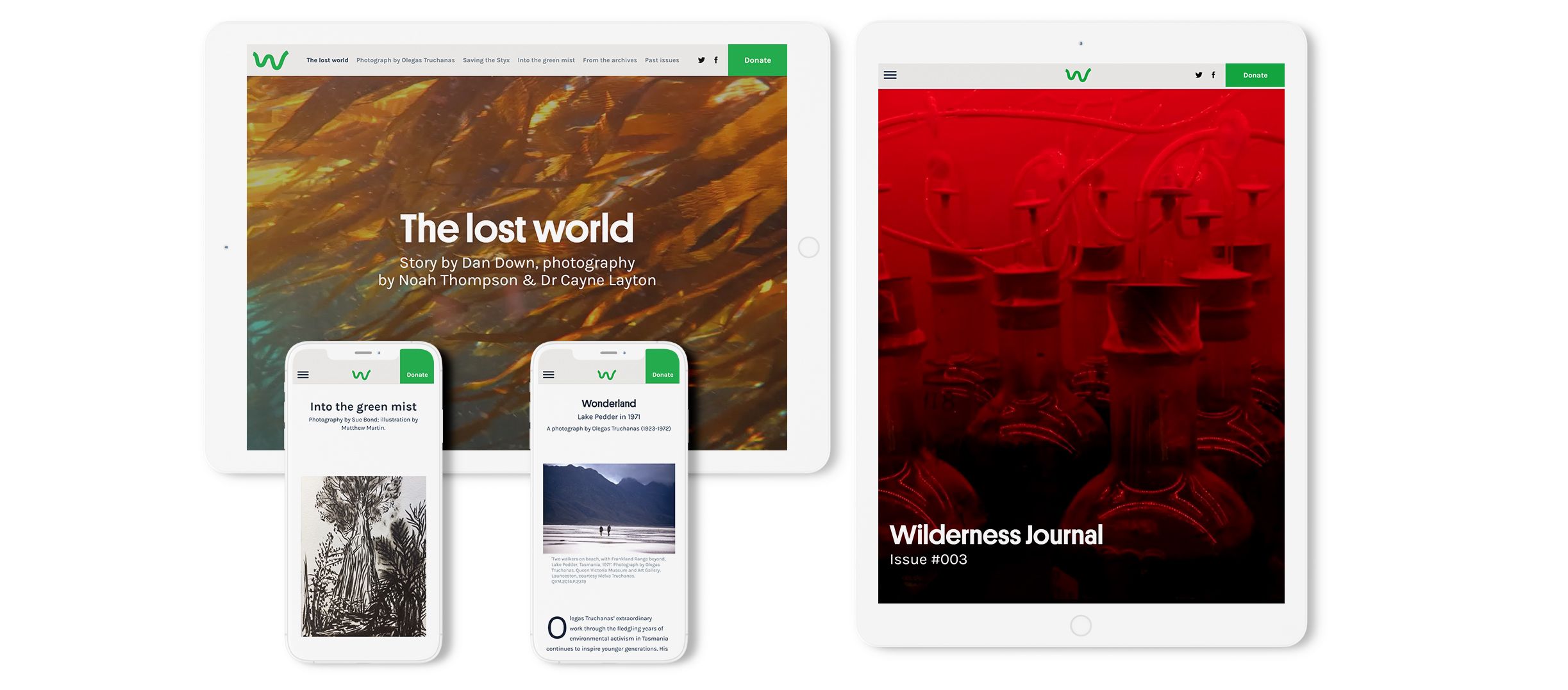
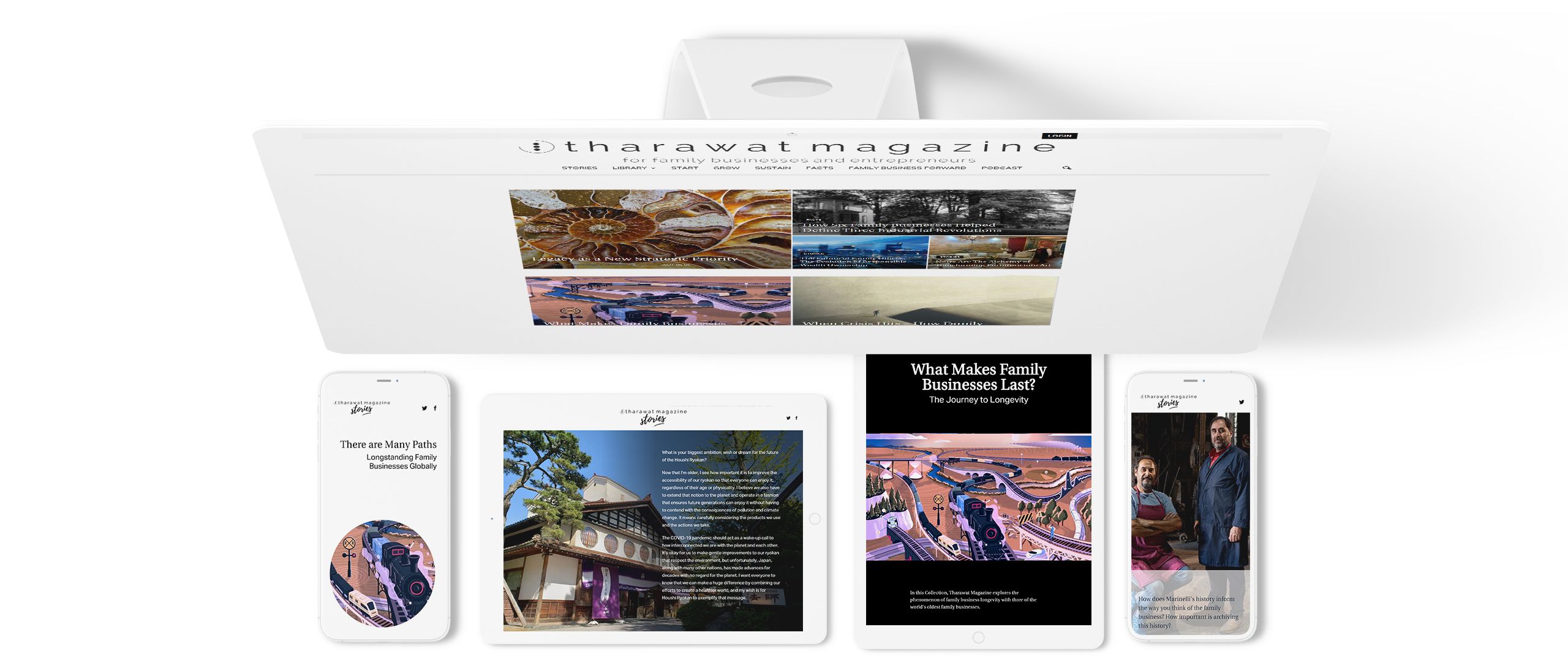
The definitive guide to making a digital magazine
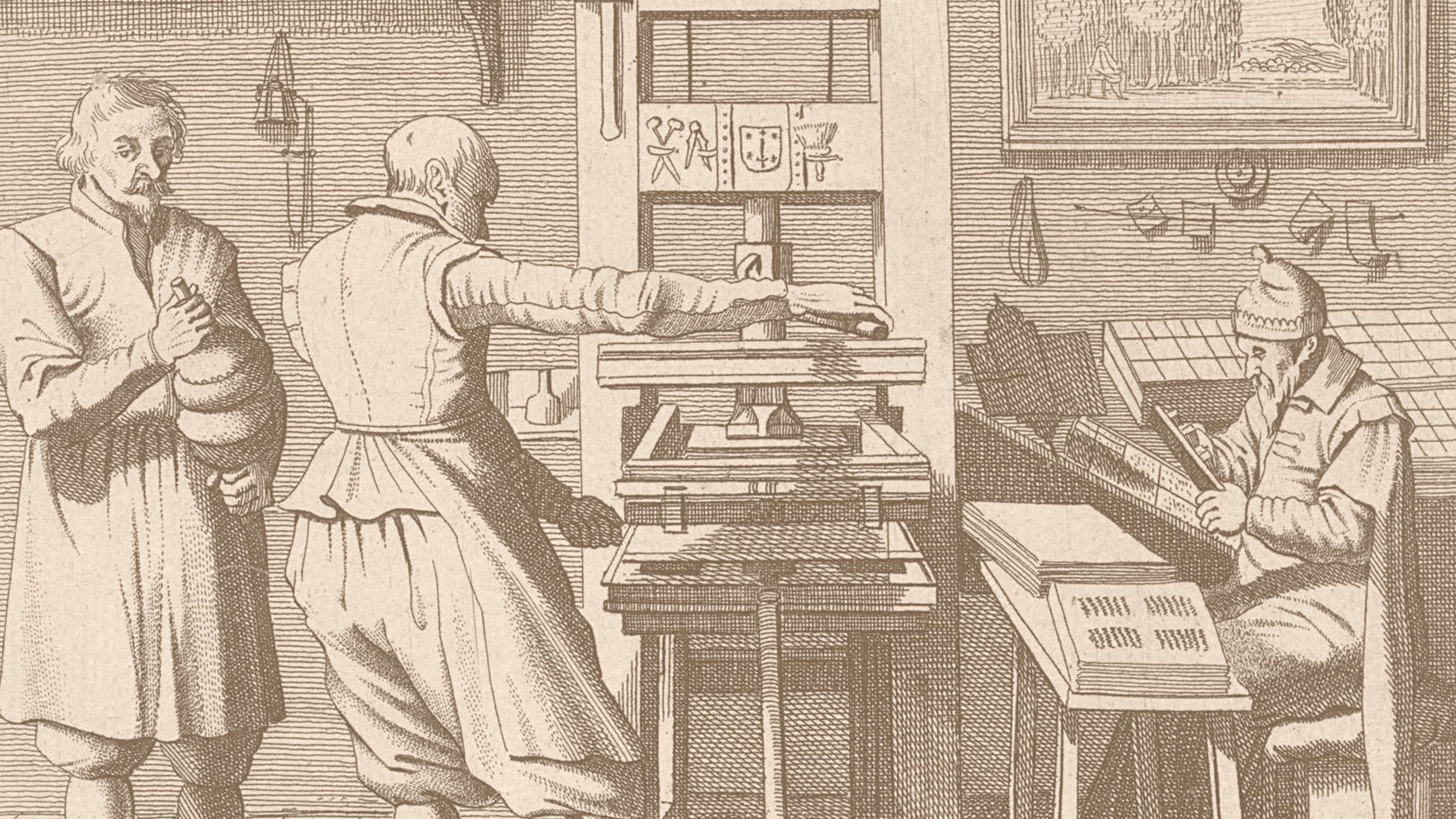
Digital magazines are making a comeback. To most readers, this might sound strange. For many years, digital magazines have represented some of the worst aspects of digital publishing.
Many digital magazines feel like a poorly implemented afterthought, and are hard to find, clunky to read, and visually uninteresting.
Usually, digital magazines read like a print magazine, but worse.
The good news is that this is changing. Publishing and marketing teams are increasingly investing in high quality content, which has helped drive a resurgence in digital magazine publishing. You can learn more about the rise of digital magazine platforms in our guide.
This article covers:
And expands on ten tips to create a great digital magazine:
- Making it easy to read
- Embracing the digital
- Maximising quality
- Avoiding developer and web design bottlenecks
- Adding animation
- Work from themes and templates
- Don't build an app
- Don't start with a PDF
- Automate the hard stuff
- Reward yourself
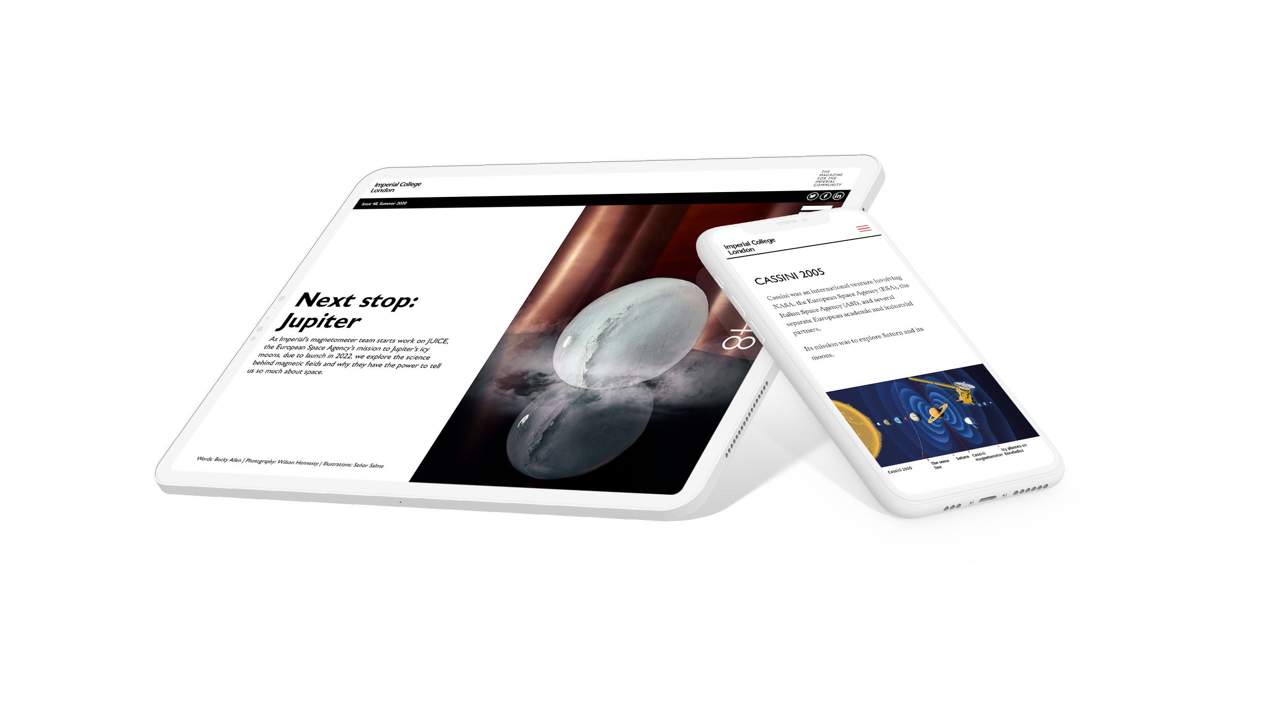
Content teams are focusing on building immersive reading experiences natively on the web. They’re a far cry from the all-too-familiar ‘web PDF’ feel of many digital magazines. A great example comes from Imperial College, London.
After nine months of publishing digital stories, Imperial saw 142% higher average unique pageviews and 50% higher average time on page.
In this guide, we’re going to give you ten tips on how to make a great digital magazine — and get great results. We even practice what we preach. You can read about how Shorthand killed its blog and launched a magazine.
First things first, though: What is a digital magazine?
What is a digital magazine?

A digital magazine — otherwise known as an online magazine or, once upon a time, an e-magazine — is a magazine that has been published digitally using the web or an app.
Unlike print magazines, digital magazines can include links, more high-resolution images, video, audio, and web animations. They can also take advantage of cheaper and potentially wider distribution than print magazines.
Digital magazines have been embraced by a diverse array of organisations, from corporates and universities, to non-profits and more traditional magazine publishers.
If you're looking for examples, check out this collection of excellent digital magazines.
Types of digital magazine

Digital magazines have been around since the dawn of 'digital' itself, and have passed through a range of stages since that point, from floppy discs to Flash (RIP).
Today, there are five main methods for creating a digital magazine. The model you choose will depend your readership, budget, marketing strategy, and business model.
An embedded PDF magazine
We've all experienced clicking through to an online magazine and seeing — with a sigh — that it has been published as an embedded PDF.
There are a range of services that allow PDFs to be embedded in a website, and organisations in a rush to create a 'digital' version of their magazine often use this method first.
The result is often a flip-book style copy of a print magazine, or a link to a PDF file.
Unfortunately, embedded PDFs — and PDF files in general — make for a terrible digital user experience. They're especially poor on mobile devices. They don't give reliable analytics, they're also not usually accessible, they aren't great with SEO, and they generally won't perform as well as the alternatives.
Conclusion: We know content teams sometimes love PDFs, but they simply aren't suitable for modern digital audiences. We've published more about their limitations in our article on the decline of the PDF.
An Apple or Android app
The next option for creating a digital magazine is to build a magazine app. The great thing about apps is that they make for a great experience on mobile, including iPhones, iPads, and Android devices. They also have built in distribution though the App Store and the Google Play Store.
However, the cost of building a bespoke app is prohibitive for most content teams, and the generic app templates — which are cheaper — won't always meet your needs. If you are interested in building an app, you also need to be sure that you can have a rock-solid strategy for getting that app in front of your readers.
Conclusion: Apps can look amazing, but they are very expensive to create and maintain. It can also be difficult to get your app to stand out from the crowd.
A Kindle e-magazine
With the rise of Amazon's Kindle, many traditional publishers opted to distributed electronic versions of their magazines using the Kindle news stand. These magazines are very easy to read on Kindle devices, and make for a great reading for those tired of reading on brightly-lit screens.
Unfortunately, Kindle e-magazines are extremely limited in their functionality. You won't be able to include many images, and many readers won't experience them in colour.
Conclusion: This is a good model for established magazines that publish very 'writerly' content. But the visual experience is poor, and the audience is generally limited to Kindle power users.
A collection of posts published to a CMS
For those wishing to simply get their magazine content online, a simple option is to use your existing CMS and publish each post to a unique URL path. With a landing page representing that magazine's 'table of contents' and cover, readers can navigate your magazine in the same way as they would any other content on the web.
Your magazine, though, is typically different than short-form content published to your blog. Generally speaking, magazine articles have more attention — and resources — paid to their production. This results in higher quality content, which is intended to have a greater impact than ordinary blog or news articles.
For this reason, many content teams are reluctant to publish this content using the vanilla visual presentation of their CMS.
Conclusion: This is a good option for content teams looking to simply get their content on the web as quickly as possible, though it is unlikely to match the impact of more visually impressive and immersive content.
A digital publication of visually immersive digital stories
The final option is to create a digital publication of visually immersive stories. These stories typically have a distraction-free visual presentation, with high-resolution media. They also often use advanced visual storytelling techniques, such as scroll-based animation.
The benefits of immersive storytelling include higher time-on-page, lower bounce rates, and better click-through-rates and conversions. You can read more about these benefits in Shorthand's case studies.
Immersive digital stories are usually built using a digital publishing platform. There are a range of factors to consider when choosing a platform, which we've outlined in this post: An introduction to digital storytelling platforms.
Conclusion: Immersive digital storytelling is fully responsive and accessible, and is a great way to get better results from your magazine content. Some platforms have plans that allow unlimited stories, which makes it easier to scale your digital magazine content production.
Why create a digital magazine?

There are six key reasons why you might wish to create a digital magazine
1. You want to move away from print
Print magazines are great, but they're also expensive to produce. Also, younger generations increasingly engage primarily — and even solely — with digital products.
2. You want to supplement your print magazine
Sometimes, print is perfect for much of your existing readership, especially if they are predominantly from an older generation. In this case, many organisations create a 'digital edition' of the print magazine, which can sometimes act as a lead-generator. This is a good way to boost your reach without alienating an existing print readership.
3. You're launching a new magazine
Unless you have a strong distribution channel in place, your best bet from launching a new magazine is to go digital-first.
4. You want to ensure unlimited access
Print is a great format — but it can't easily scale. If you want your content to be seen by as many people as possible, digital is best approach. As many legacy publishers have discovered the hard way, it's hard for a print article to go viral on social media.
5. You want to generate revenue
As the last two decades of media have shown us, the best way to generate revenue from digital content is to create 'premium' content for subscribers. Pricing for a digital magazine subscription can vary hugely depending on your niche. Regardless, people aren't going to pay for content that looks and reads as everything else on the web. Read more about generating revenue from content in our guide to content monetisation.
6. Brand storytelling for your product or service
The final reason to create a digital magazine is to create content that will help you sell your product or service. Immersive brand storytelling is a great way to educate and entertain potential leads as you drive them through your sales funnel. Learn more about brand storytelling.
Now that we've covered the basics, let's move on to the remainder of our guide with ten tips on how to make a successful digital magazine.
1. Make it easy to read

Too many digital magazines are little more than PDFs, optimised for modern web browsers.
While these publications successfully mimic print magazines — including the ability to horizontally ‘flip’ through pages — they generally have a poor reader experience.
Why is this? The first generation of digital magazines were, in effect, derivative versions of print titles. Rather than repurpose their magazine for online readers, publishing teams went with the easiest solution, which was to simply export a PDF of their magazine into an online magazine builder.
While this makes sense for busy publishing teams, it has produced a swathe of magazines that can be frustrating to read.
One solution is to build your magazine content using software designed and engineered to make the most of the modern web. Modern digital storytelling platforms allow publishing and marketing teams to create great reading experiences — without requiring you to hire a web designer or developer.
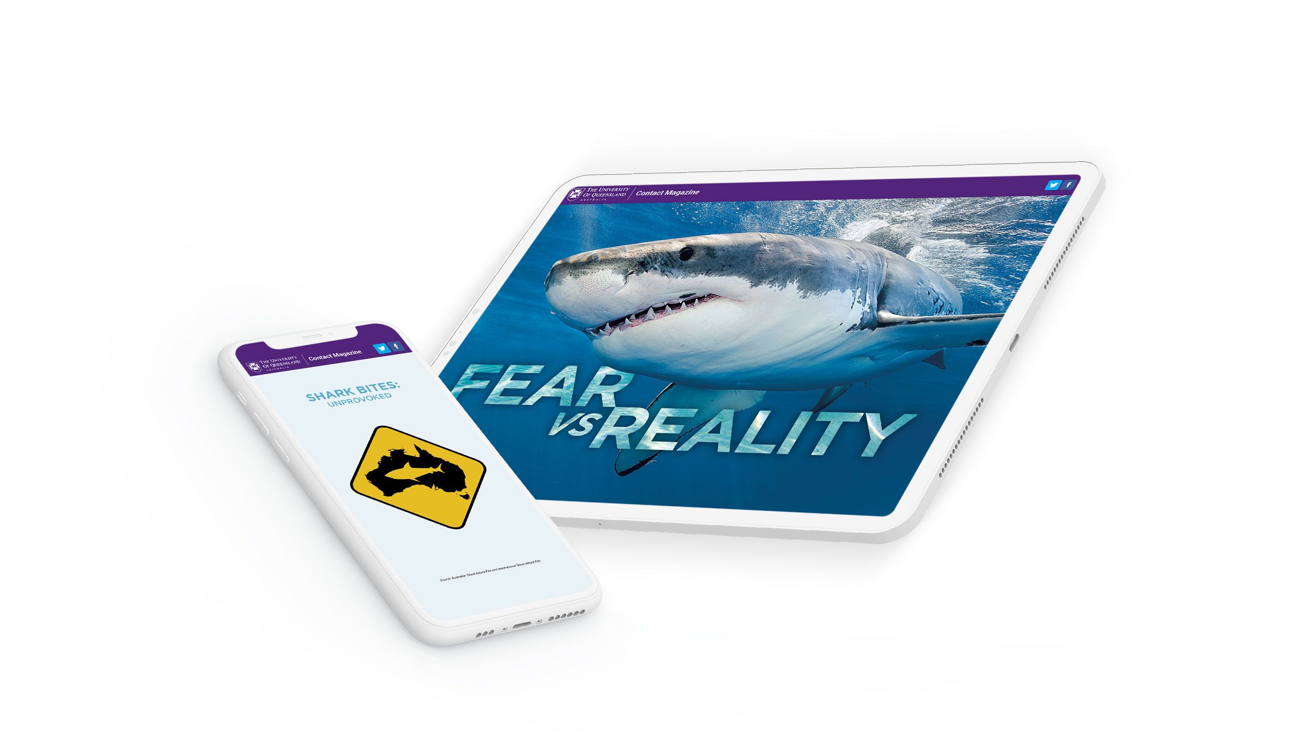
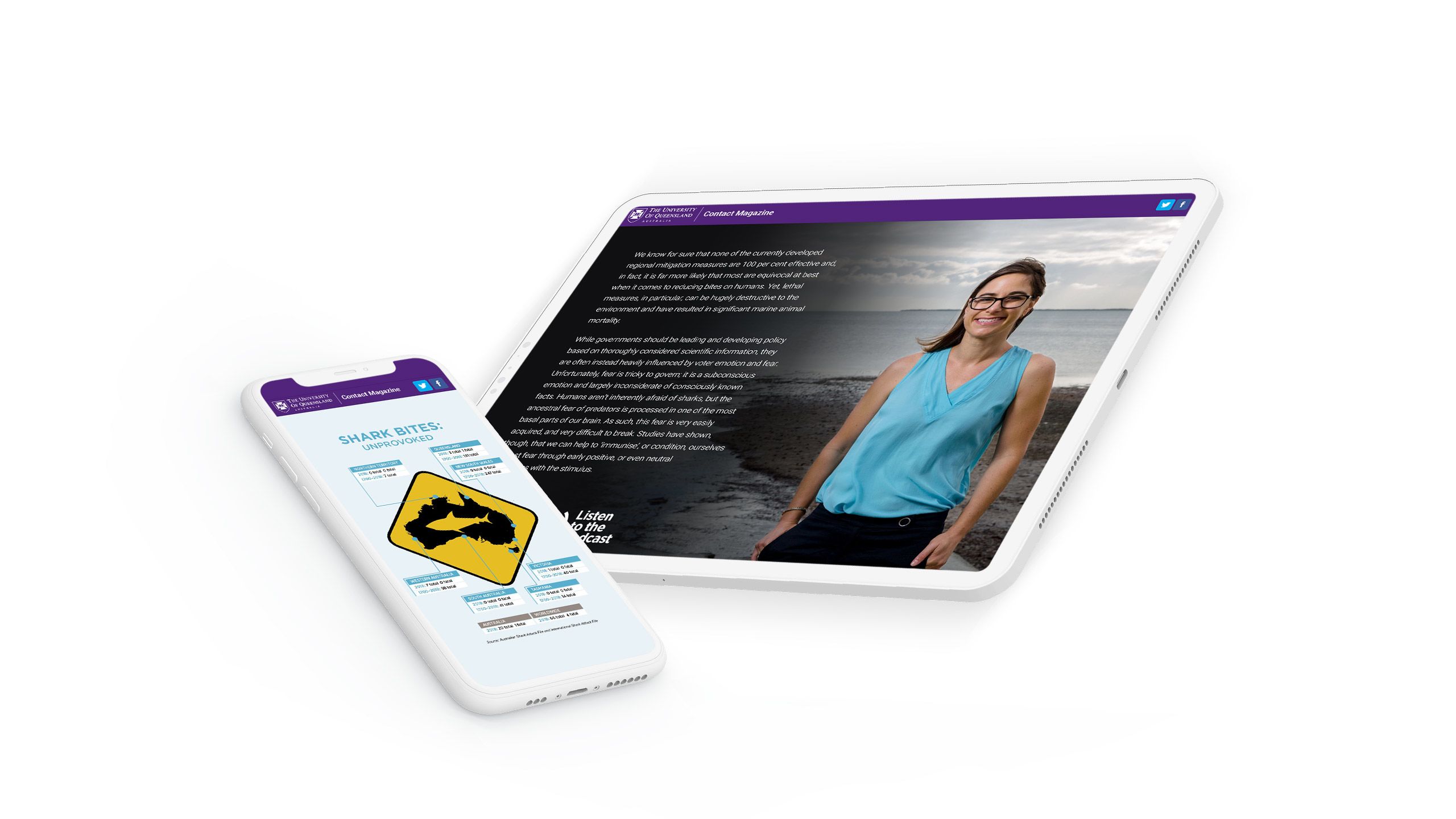
The University of Queensland has long published Contact Magazine, and has produced some amazing digital stories. One favourite of the Shorthand team is Fear versus Reality, covering research into shark encounters in Australia. The piece makes great use of video, photography, and animated maps — all beautifully rendered on whatever device the reader happens to be reading on.
2. Put the ‘digital’ in digital magazine

The classic magazine layout — a few dozen or more pages, stapled together in the middle — is a great format for print. But let’s face it: it’s a terrible layout for digital.
If you’re looking to make a digital magazine, don’t try to mimic the behaviour and layout of print.
Instead, embrace the norms of web publishing. Publish each piece of content to its own URL. Interlink as needed. Incorporate high-resolution images, video, and data visualisations. Animate natively in the browser. Create interactive infographics and other interactive marketing elements. Ensure quick page loading. Optimise for all viewports and devices.
It’s already a long list, and we were just getting started. Unfortunately, none of this can be done — or done well — with an uploaded PDF.
3. Embrace quality

A digital magazine is not a blog. Typically, magazine stories have progressed through an editing and quality-assurance process — particularly feature stories. A designer may have also worked on illustrations and other visual assets.
A magazine publication is also much more of an ‘event’, with hard deadlines and — depending on the title — dedicated marketing campaigns attached.
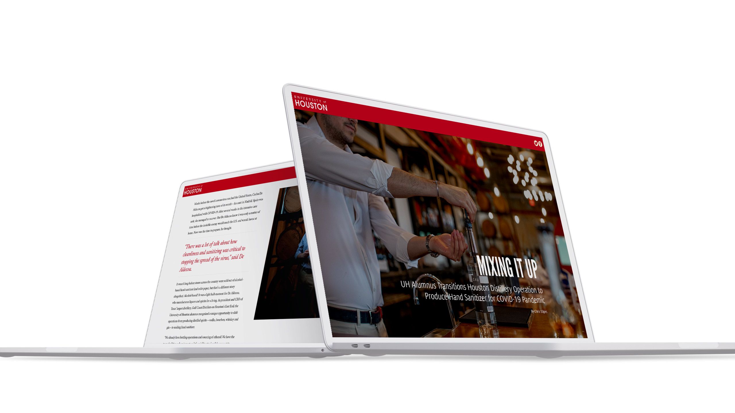
This emphasis on quality should extend to its publication on the web. A digital magazine should have a ‘premium’ look and feel, with text cleanly presented and easy to read. Images should be high resolution, and optimised for all browsers and devices. Ideally, feature stories should also incorporate scroll-based animation techniques to maintain the attention of the reader.
While magazine content doesn't need to be longform, there are some reasons to go long, which we outline in our guide to longform content.
4. Avoid developer and web design bottlenecks

One reason why so many digital magazines are published as PDFs or flipbooks is that alternatives have been simply much too expensive. Bespoke web templates require both developers and web designers to be on hand, which is not always possible in publishing and marketing teams.
The good news is that some digital storytelling platforms use flexible ‘content blocks’ or templates, which will allow you to build great and visually impressive magazine stories — without hiring a developer. This makes it much easier (and cheaper) for your team to build stories that look amazing on the web.
5. Animate your stories

Don’t sell your stories short. As we’ve argued throughout this guide, digital magazines aren’t just print magazines that happen to be on the internet. Make the most of cutting-edge web technologies for your magazine, including those that empower non-developers to implement compelling storytelling techniques.
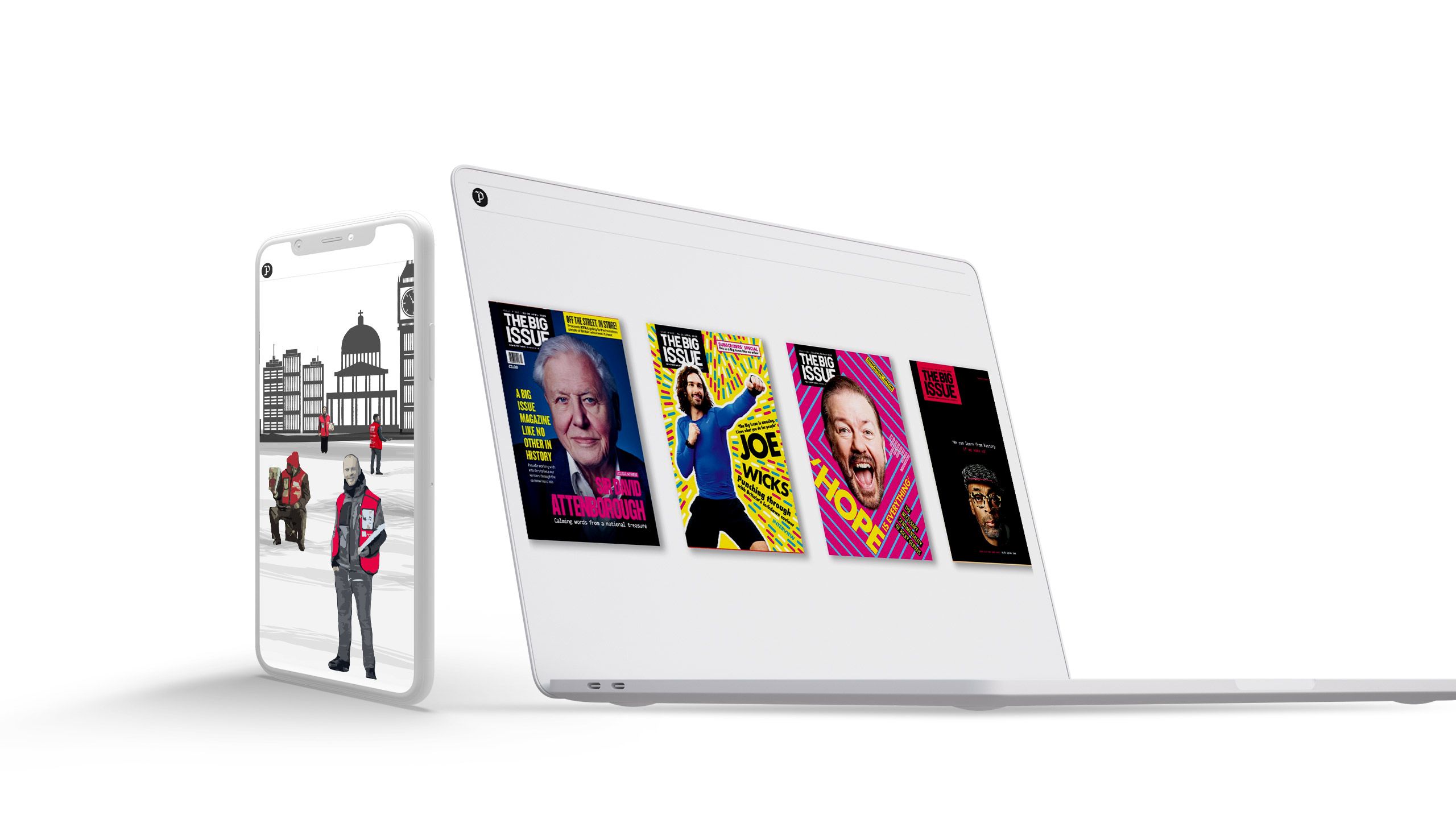
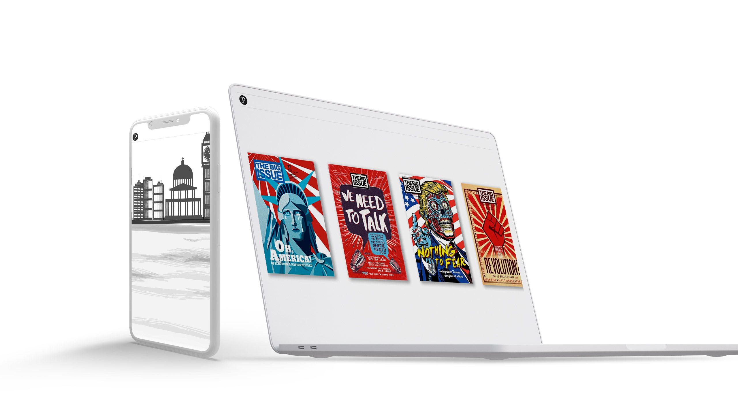
One technique used by the world’s best digital storytellers is scroll-based animation effects. For example, in a little bit of magazine inception, the social enterprise magazine Pioneer's Post animates its story on The Big Issue magazine with several pairs of static images. It's a very simple technique for adding life to stories, and can be created and implemented without writing any code or learning any animation programs. It can be just as easily applied to graphs, maps and photos as to illustrations, as we outline in our guide to data storytelling.
6. Work from themes and templates

Digital magazines have the potential to suck up an inordinate amount of time, particularly with designers beavering away on layouts in software like InDesign.
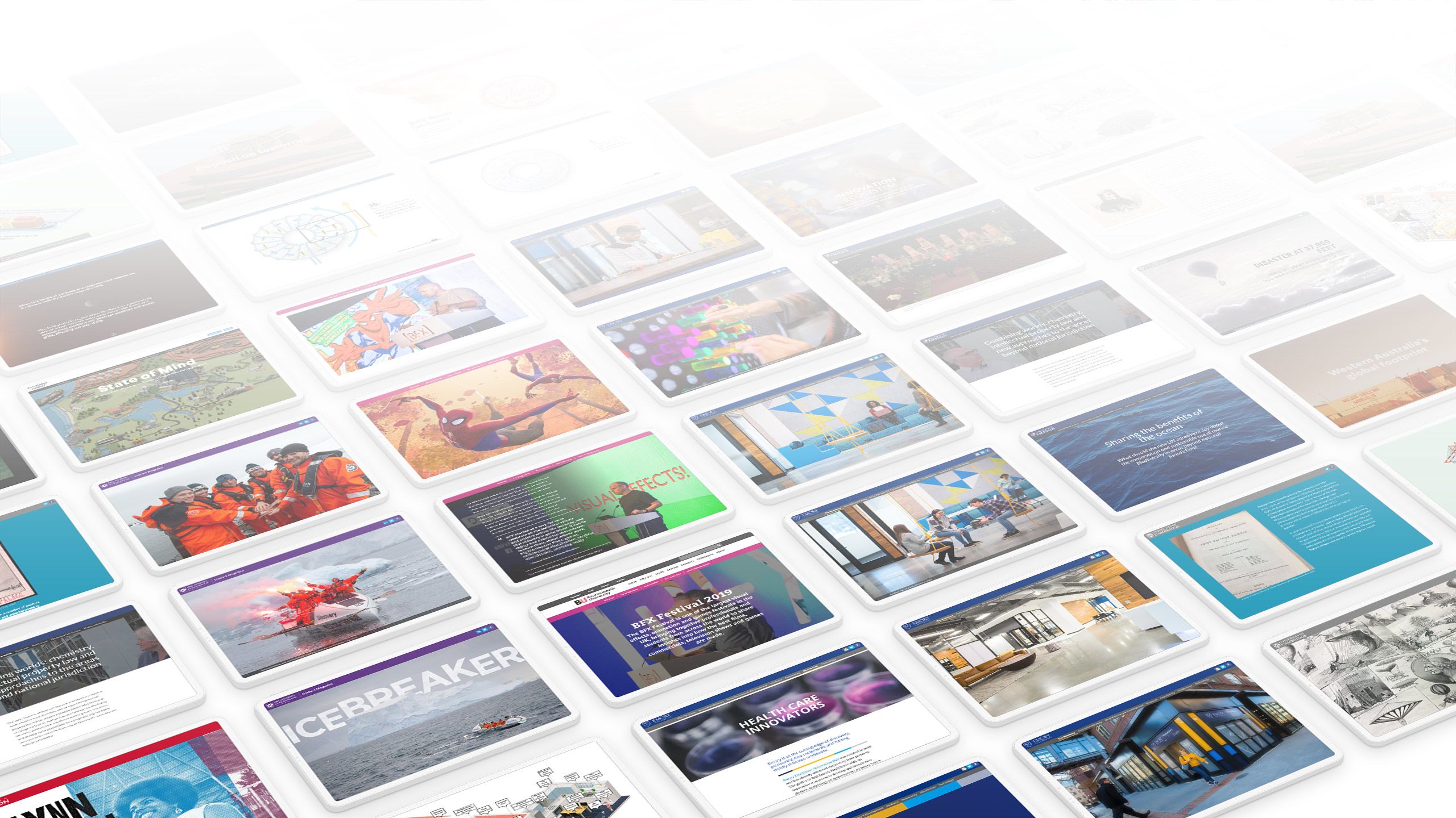
When building content for the web, though, it’s best to work with pre-existing templates and themes. This will make it possible to reliably produce great-looking stories with your brand identity — including colours, fonts, logo, and more — automatically applied, and automatically fully-responsive.
Try Shorthand's free digital magazine templates to get you started.
7. Don’t build an app

A few years ago, it seemed like nearly every publisher was building an app — for better or worse. To put it mildly, not all of these investments paid off. The rise of ‘app overload’ meant that most apps on most devices are never opened.
The lesson is clear: unless you’re the New York Times, most people aren’t going to download your app just to access your content. And even if they do, they probably won’t open it more than once.
Done well, app development is expensive — and, done poorly, it’s a major reputational risk for your brand.
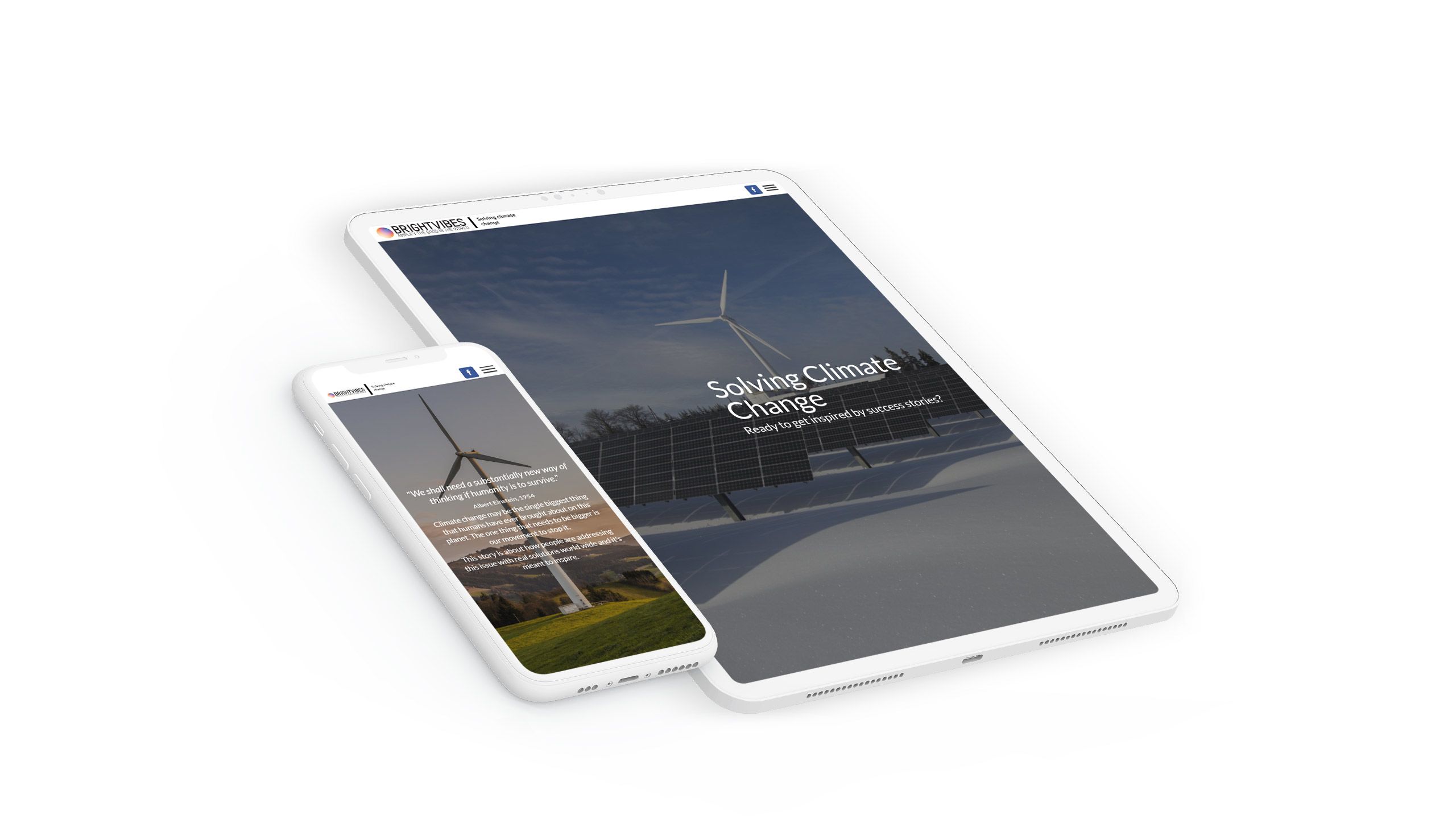
These days, publishers can tell amazing stories natively in the browser. Digital storytelling platforms can automatically optimise stories — including their visual assets — to look amazing on phones and tablets. This is good for SEO, and it’s great for your readers. No app required!
Web content can also live behind a paywall, which means you can publish great digital content online and keep your existing subscription model.
8. Don’t start with a PDF

Desktop design software isn’t necessarily fit for purpose for the production of digital magazines. If you have design capacity, focus your efforts on designing stories within the parameters of an existing storytelling platform.
This will automate many of the fiddly things — like responsive design — and enable a more impressive reading experience. Crucially, this experience will be optimised for readers on the web, and won’t just be a print-afterthought PDF.
9. Automate the hard stuff

Our final tip is important for publishing and marketing teams working on a budget. Digital publishing is tricky to get right. Standards are rising, browsers are becoming more powerful, and readers are accessing content on multiple devices and screen sizes.
Unless you have a developer and web designer permanently on hand within your team, it’s best to let specialist storytelling platforms handle the backend magic — along with all the tech wizardry that goes into handling browser and software updates. This will save you money in the long run, and ensure that you can focus your efforts on the creative side of publishing amazing stories for your digital magazine.
10. Reward yourself on a job well done!

Up next: how-to video
See how easy it is to create stunning digital magazines using Shorthand
Ready to join the leading publishers and brands creating standout digital magazines with Shorthand?
Loved by the world's most iconic brands
Loved by the world's most iconic brands

