8 examples of immersive visual stories


All great brands understand the power of visual storytelling. As the (true) cliché goes, human brains process images must faster than words.


by Kimberlee Meier
This is why marketing teams are increasingly investing in the use of visual media in their digital marketing activities.
But, it hasn’t always been easy.
Until recently, there have been major barriers to creating high-quality visual stories on the web that effectively convey your brand story — including the need for developers and complex software. As a result, immersive visual stories were often one-offs, relegated to PDFs, or excluded altogether from most content marketing strategies.
Fortunately, those barriers are starting to fall, thanks to the rise of new no-code platforms designed for writers and content creators. These platforms enable companies to create visually stunning stories that capture their target audience's imagination and improve user experience.
Perhaps we can also give those dusty PDFs a well-earned retirement 🤞.
In this guide, we’ll cover:
Start creating with Shorthand
It's the fastest way to publish beautifully immersive visual stories, reports, internal comms, and more.


What is visual storytelling?


Visual storytelling is a form of content that uses elements such as images, infographics, animated videos, comics, illustrations, data visualisations, maps — and even GIFs and memes 😬 — to tell an engaging, compelling story.
Visual stories typically perform well on metrics measured by most content teams, as they hold the reader's attention, encouraging them to spend more time on the page and click through to other content.
Visual stories, like photo essays, are also great for sharing on social media platforms and email newsletters, enhancing the impact of your brand's message.
Until recently, visual storytelling was reserved for those with developer resources, big budgets, or both. However, technological advances have made it more accessible, allowing even small companies to create powerful examples of visual storytelling.
Thanks to new technology, such as no code storytelling tools and apps, ambitious forms of digital storytelling, like scrollytelling effects, video, and interactive maps, can now be implemented on a website without a developer. This means content creators can publish visual stories online without hiring an outside developer or waiting for their tech team to have space in their schedule to build (and then maintain) a custom visual experience.
As visual storytelling becomes increasingly popular, readers are treated to more engaging and interesting content, making the most of the power of visual communication.
Yes, a picture tells a thousand words. But there's an art to visual storytelling — and a lot that can go wrong when you first start out. Learn more about the pitfalls, best practices, and visual storytelling techniques in our guide, 8 tips for powerful visual storytelling.
7 elements to include in your visual storytelling


One of the best parts about visual storytelling is the freedom it gives content creators.
Instead of just relying on text, creators can add images, data visualisations, and scrolling infographics to a piece to help bring it to life — and capture and keep the audience's attention. Here are seven elements that you'll typically see inside a visual story 👇
1. Photos
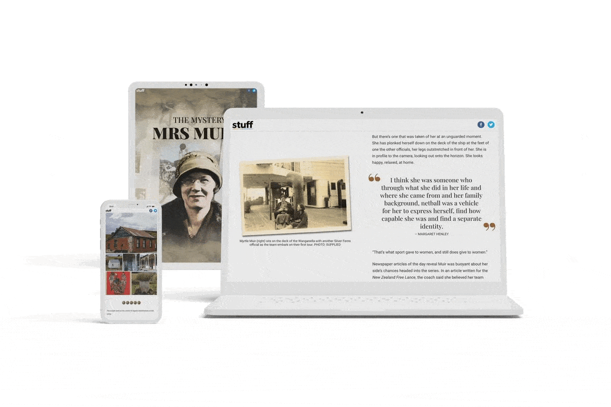
Photos are typically used in visual stories by news outlets and media companies to bring subjects to life. Here is an example from a visual story from Stuff on New Zealand netball coach Mrs Muir, where photos are used alongside text to help the writer put a face to the main character.


2. Illustrations
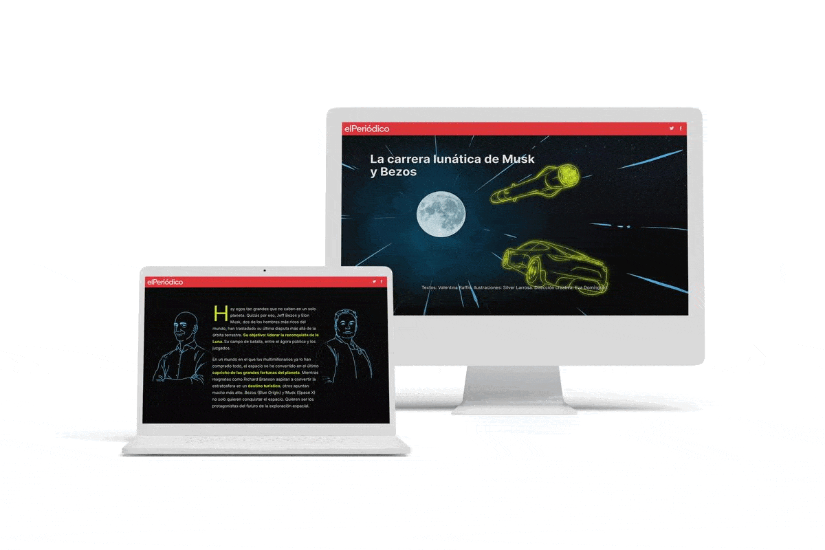
Illustrations can be used in visual storytelling in many different ways, like sketches and comic strips. They are a great way to frame a story sequence within a single image. Here's a good example of incorporating illustrations from El Periódico, on the 'lunatic' space races between billionaires Elon Musk and Jeff Bezos.

3. Infographics
Infographics help a reader understand complex topics in an easy-to-understand way. Many of the most popular infographics use illustrations, fonts, and data visualisations like graphs, charts, and maps. With new online apps, they are becoming easier than ever to create and embed in your visual story.
Want to learn about how to create infographics? Check out our guide, How to make an infographic.
4. Animation
Animation helps bring visual elements within a story to life. Custom animations can make a brand instantly recognisable, and can also help explain products or give the reader a better understanding of a concept in the story.
While bespoke animation can be expensive to produce, many content teams use scrollytelling techniques to create animation effects triggered by scrolling. You can read more about scrollytelling here.
5. Video
Video is one of the most compelling media you can include in a visual story. Outlets like The New York Times and The Washington Post have embraced this type of visual storytelling to create videos of in-depth investigations.
6. Data visualisations
Data insights are a great way for content creators to highlight key insights within their story. Here is an example from a Sky News article, where data visualisations are throughout to help readers understand the impact of the 2016 Brexit vote on the United Kingdom's economy.
Check out our guide: How to turn stats into stories people want to read
7. Maps
Maps are an excellent way to summarise key information in complex stories. While live web maps can be complicated and expensive to produce — often requiring expertise in GIS and web development — most visual stories can produce a very effective interactive map with scrollytelling.
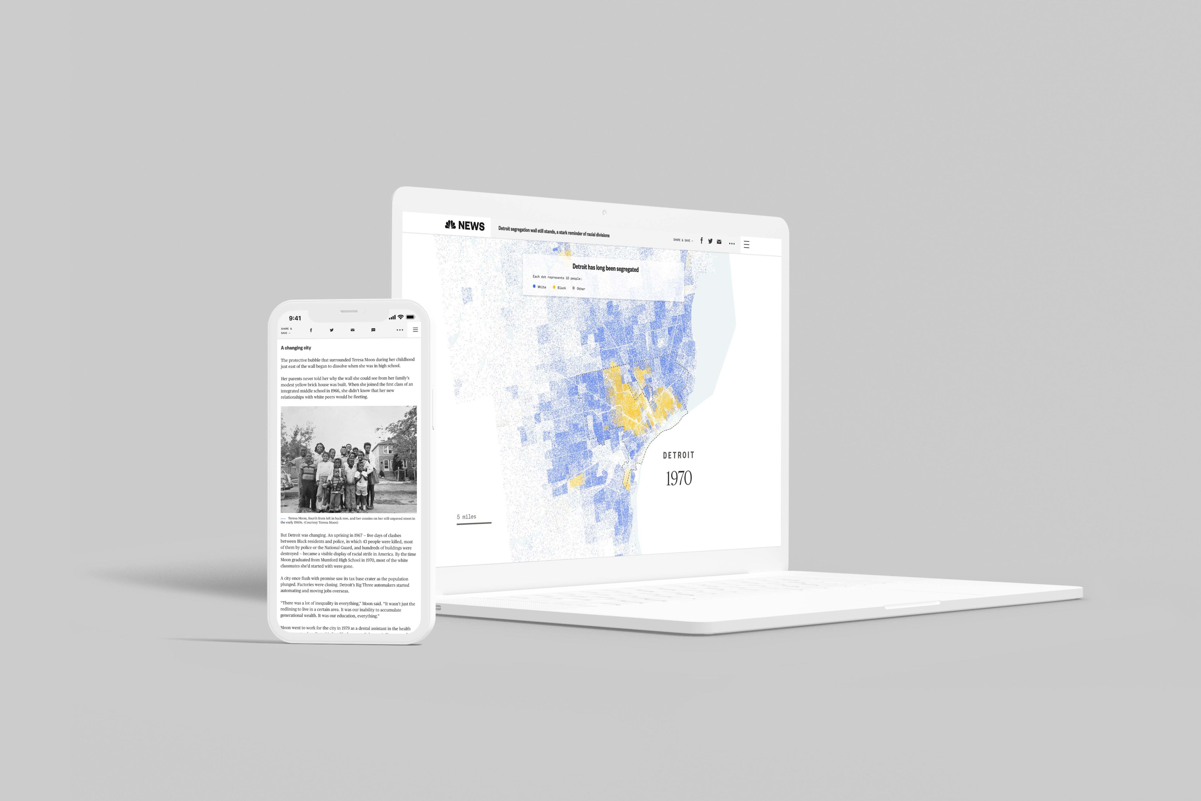
Take, for example, this story from NBC News about highway inequality. When the reader scrolls down the story, the map changes and continues to tell a story using statistics and colours.
In the past, companies turned to PDFs to put together reports or long pieces of content like eBooks. So, what happened? 🤔
Wait, what about PDFs?


Look, we aren't the biggest fans of PDFs.
What was once the go-to format to display visual content is now well past its sell-by date. PDFs haven't had a bad run. They were first launched by Adobe in 1993, and have come a long way since then.
But what a fall from grace the PDF has had. Companies are now looking for alternative ways to create more captivating content for their readers, and PDFs aren't cutting it for many reasons:
They're not mobile-friendly
For most websites, over 50% of web traffic comes from mobile phone users. Using PDFs to tell stories means that a good chunk of a website's readership could bounce.
They're not great with images
Using images in PDFs can be underwhelming as they lose their quality, and the reader has to manually zoom into information to get a better look.
They're not usually search engine optimised
Search engines like Google can technically crawl and index PDFs, but they're not usually surfaced when competing with HTML web pages.
They're not what readers want
Audience expectations have evolved since the 1990s. The standard of (some) content on the internet has risen dramatically over the last few years, with an increasing number of creators producing immersive digital stories to give readers a better experience.
With the rise of digital storytelling platforms, these immersive digital stories are becoming increasingly interactive and dynamic. Let's take a look at 8 examples of content that use visual storytelling to elevate their stories.👇
8 examples of immersive visual stories


1. NBC News tackles segregation in Detroit
NBC uses a range of visual elements in its in-depth reporting around historical segregation in Detroit, Michigan. This piece draws on scrollytelling maps, data visualisations, and historical photographs to tell this complex story.


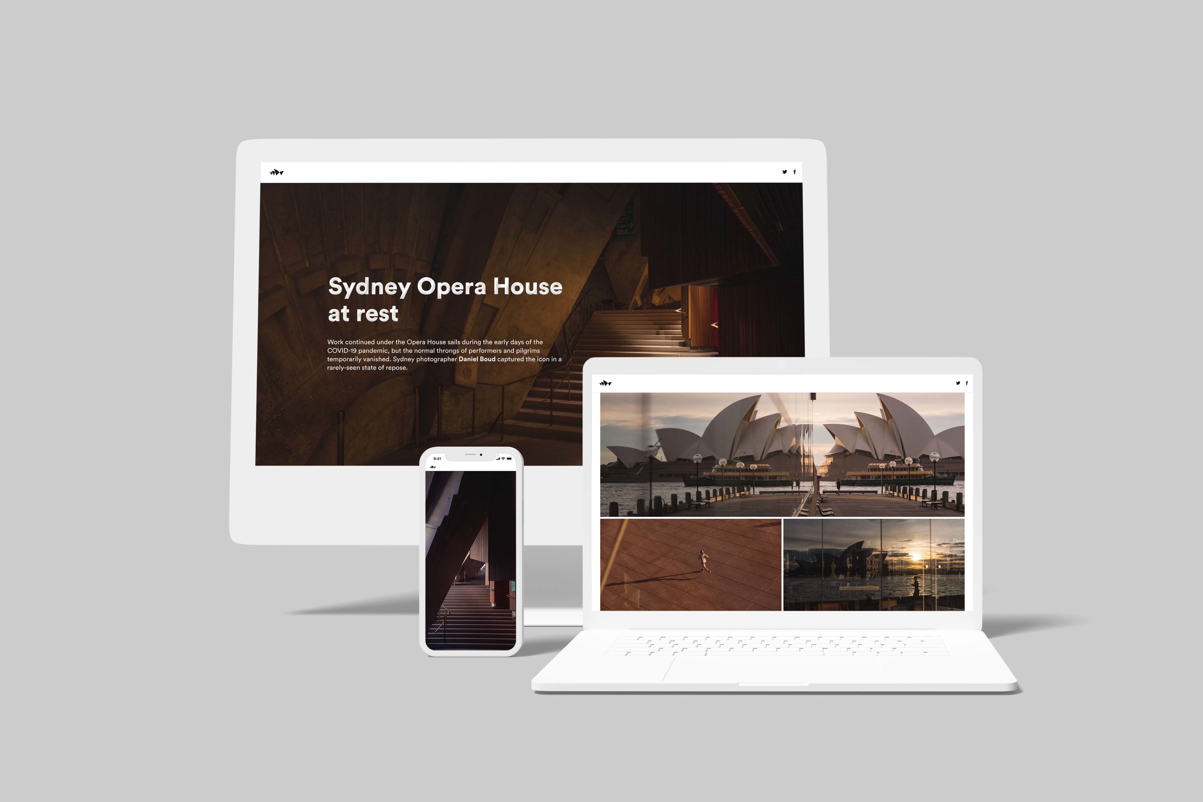
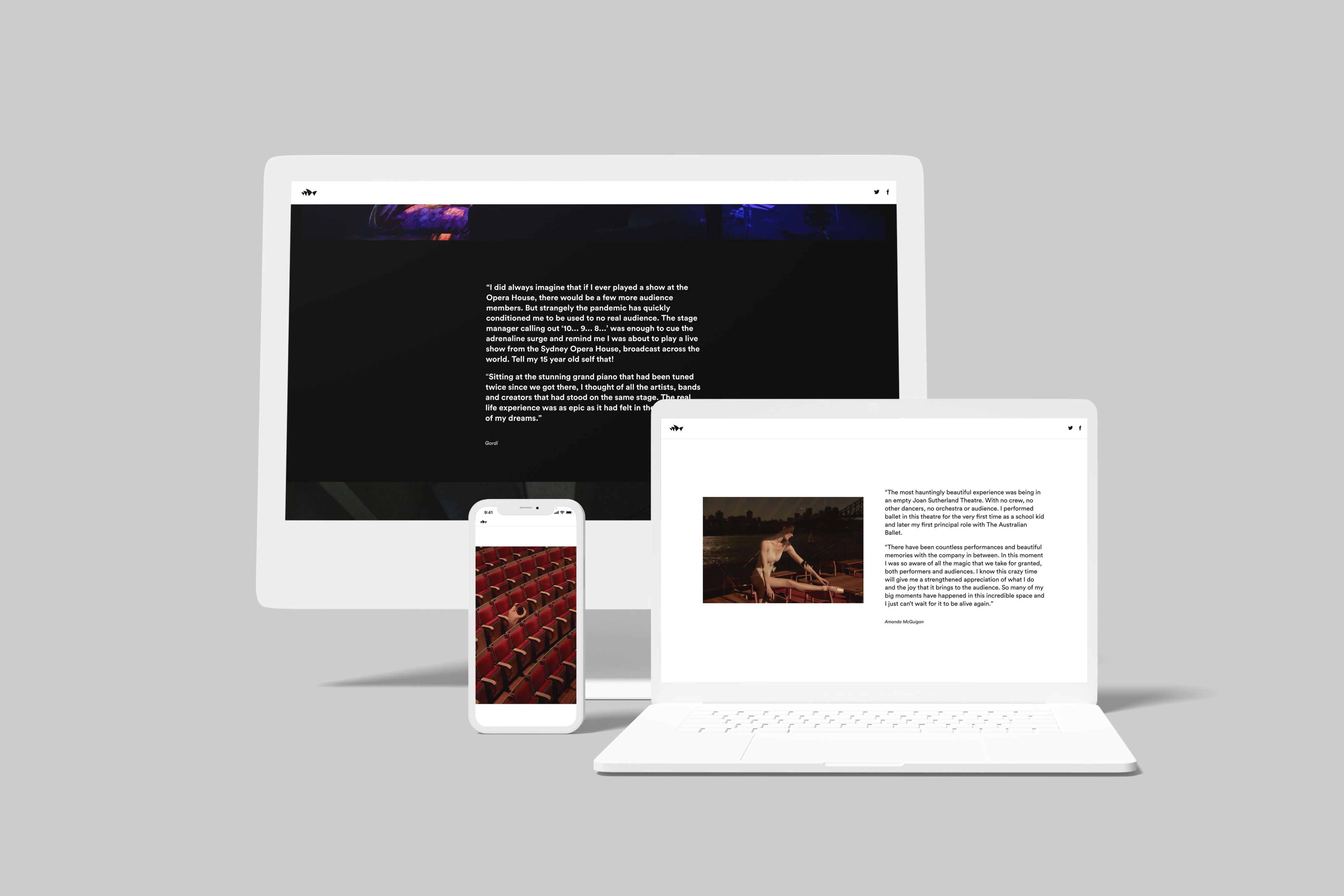
2. The Sydney Opera House is shown in a different light
When COVID-19 sent the world into lockdown, the Sydney Opera House fell silent. No more visitors, no more performances.
So, the venue took the opportunity to get a much-needed facelift, and contractors began refurbishment work. Local photographer Daniel Boud was invited inside. The result was a rare insiders look at one of the world's most historical performance venues at a moment of quiet that we possibly won't see again.


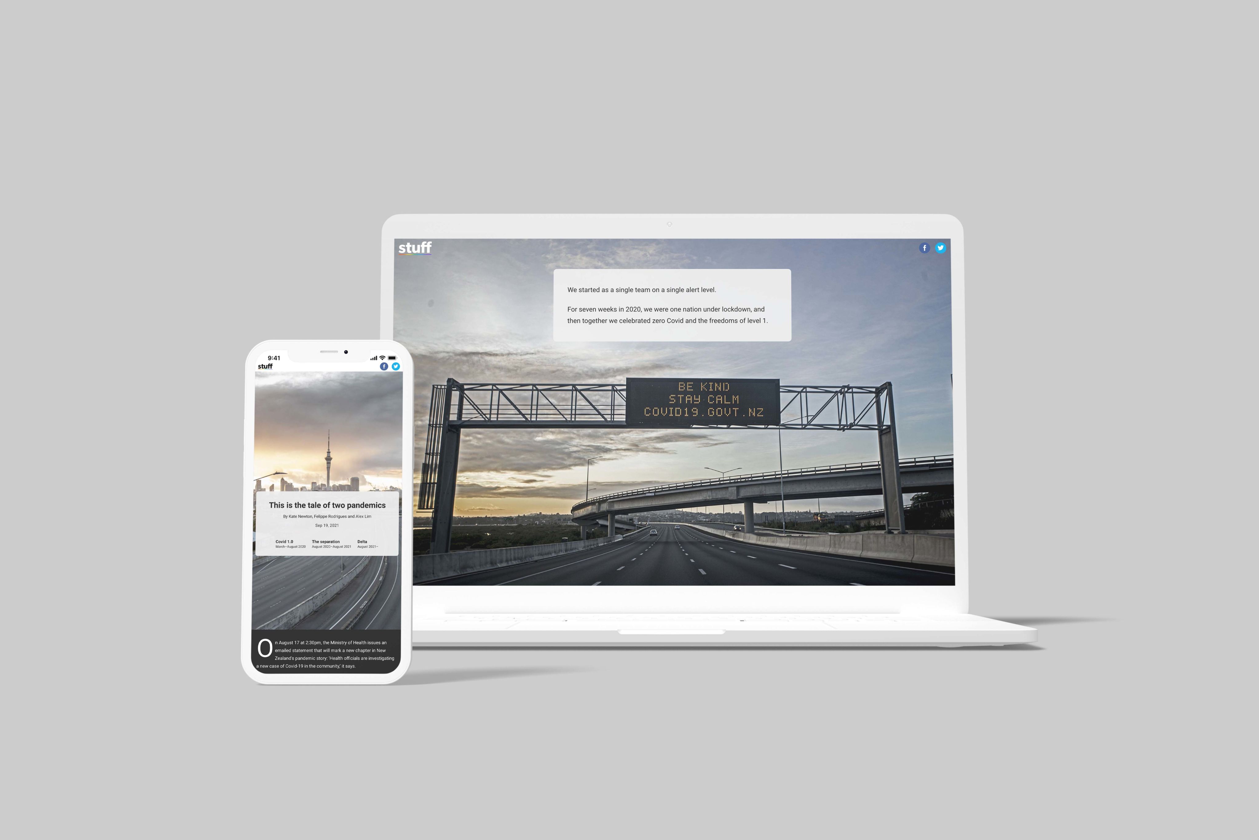
3. Stuff's emotional series documenting New Zealand's lockdowns
For seven weeks in 2020, New Zealanders were plunged into a total lockdown.
Stuff's photographers mixed snapshots with statistics to capture the situation, from empty highways to families interacting through windows, alongside interactive timelines and graphs that keep a running tally of positive cases and deaths.


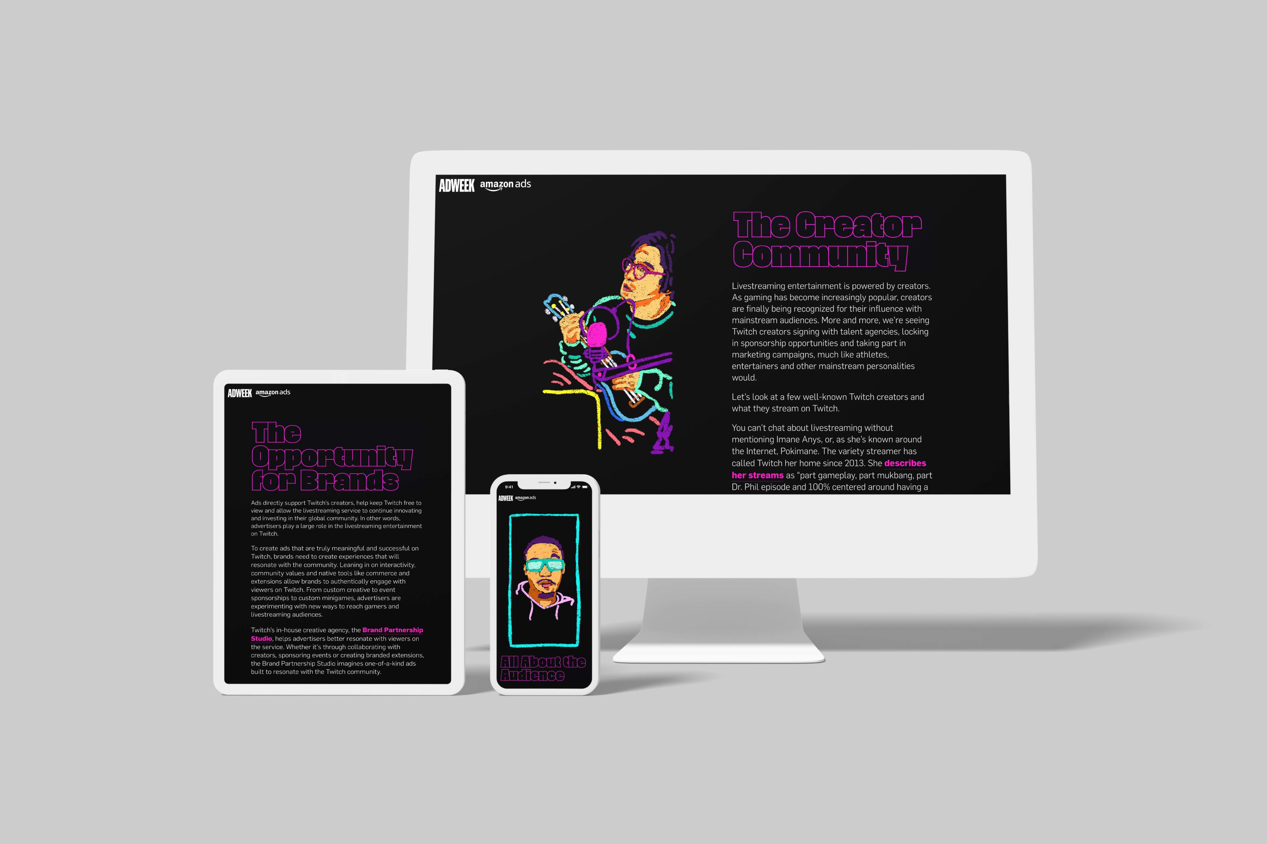
4. Marketers learn about Twitch through storytelling
Before a brand can successfully advertise on Twitch, they need to understand it.
Twitch has turned to visual storytelling to explain how its product works, using visual elements like illustrations and video. The landing page also uses video to keep the reader's attention.


5. Heute takes on Spotify over artist royalties
Consumers are looking to make more ethical decisions around the products they buy, so Heute put together a visual piece explaining who benefits from music streaming subscriptions.
The piece looks at the current payment system of streaming services like Spotify, and explains that musicians are only paid based on the percentage of views in all clicks. It can be a complex payment model to understand, so Huete uses illustrations and simple data visuals to break down what an average artist will make on Spotify compared to other platforms.


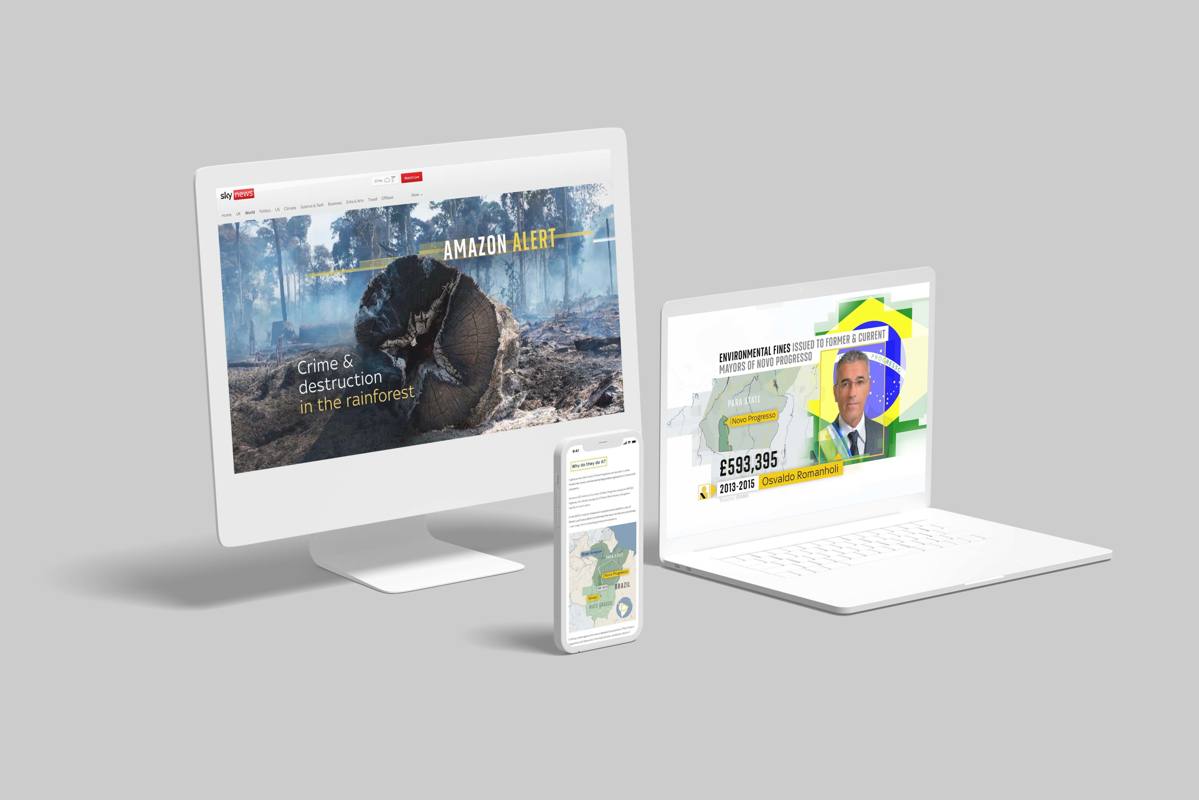
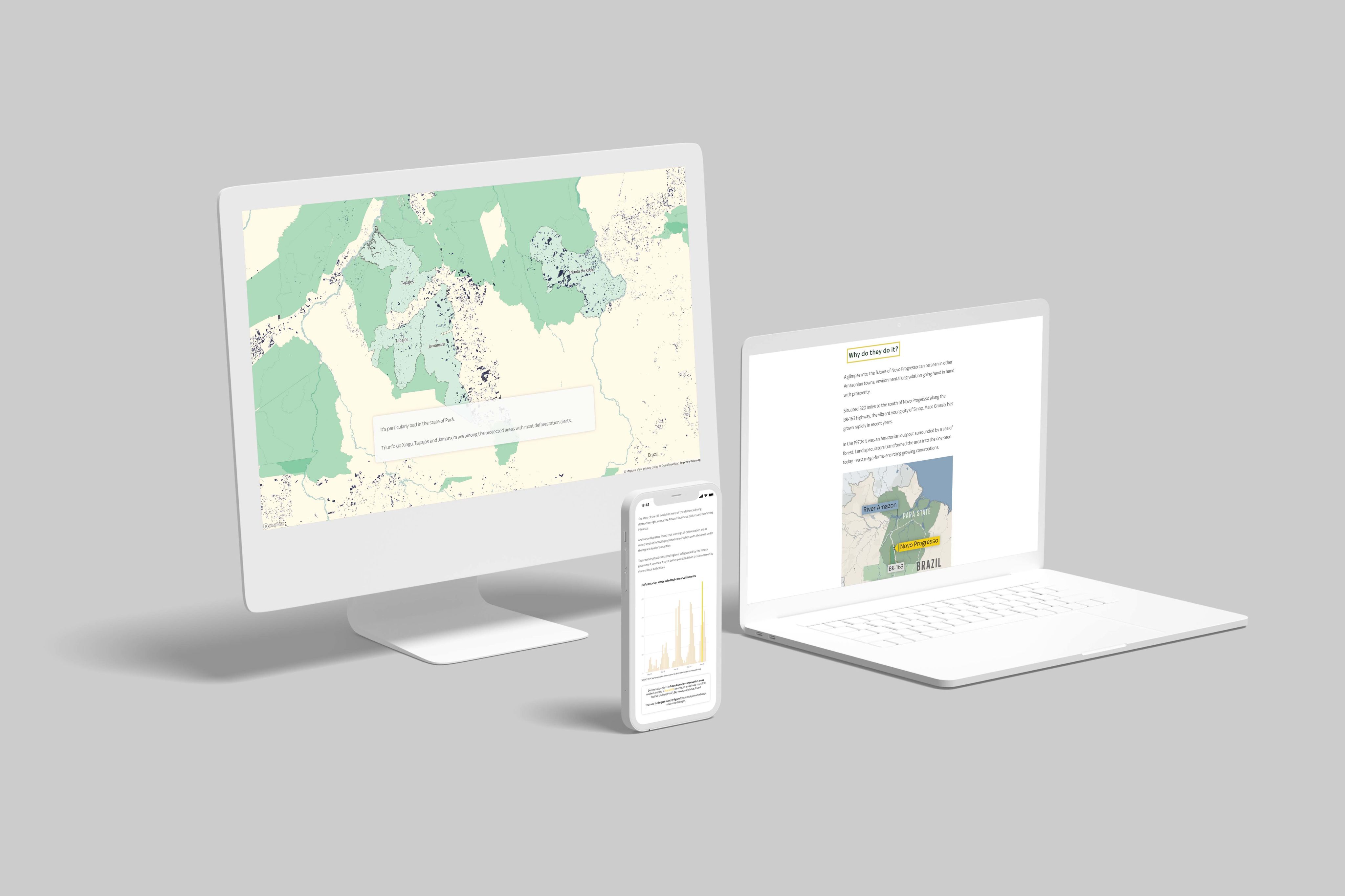
6. Sky News rings the alarm bell on deforestation in the Amazon
Sky News' in-depth reporting about the rising levels of deforestation in the Brazilian Amazon is another excellent example of using scrollytelling maps to explain a complex subject.
The article uses statistics, photographs and data-filled maps to explain how deforestation in parts of the Amazon has increased by over 16%.


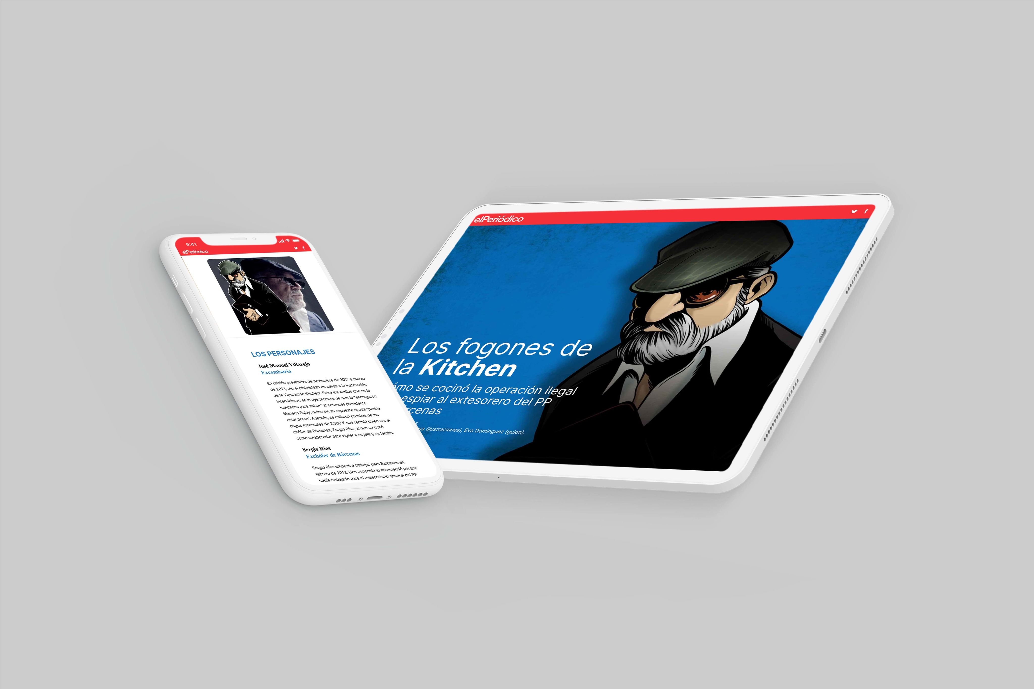
7. El Periódico uses comics to bring its story to life
An investigation into government corruption that uses… comics? Yep. That's how El Periódico, a morning daily newspaper based in Barcelona, reported on an illegal operation to spy on the former PP treasurer Luis Bárcenas.
The content is framed like a comic book. It starts at the very beginning of the newspaper's investigation and uses illustrations and scrollytelling technology so the reader can digest the story at their own pace.


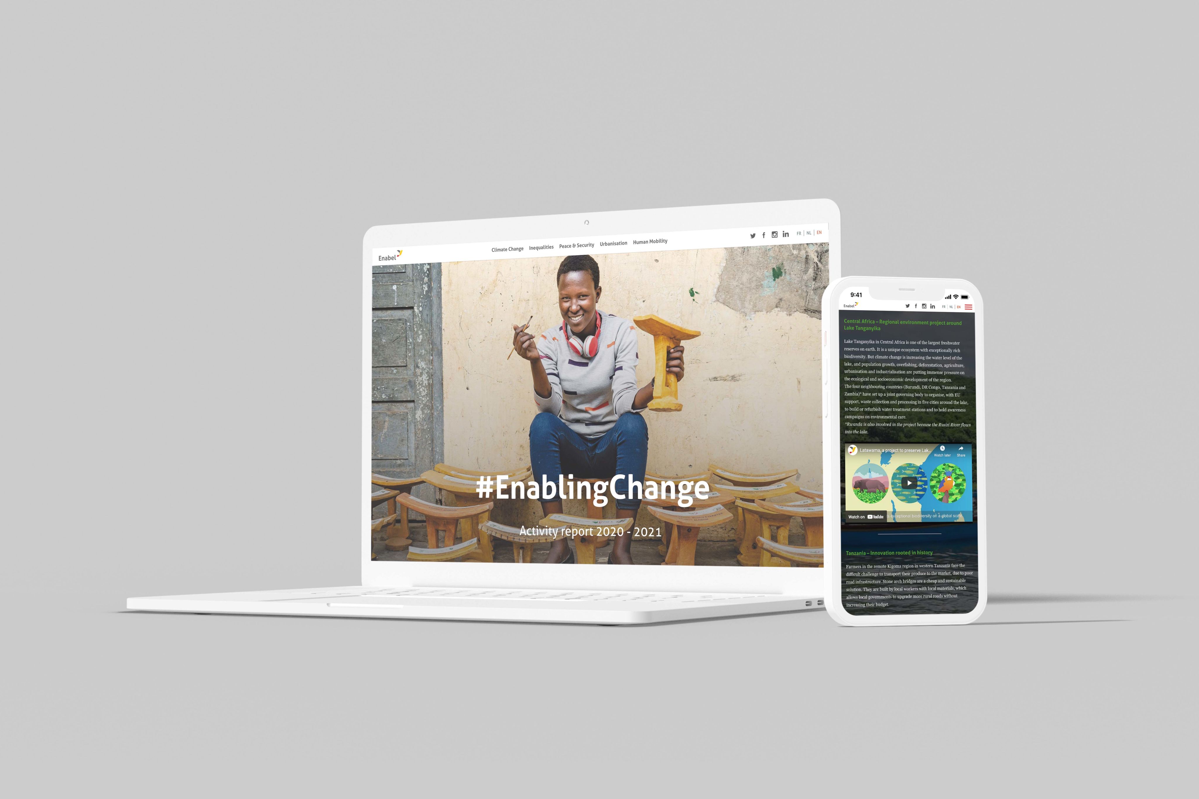
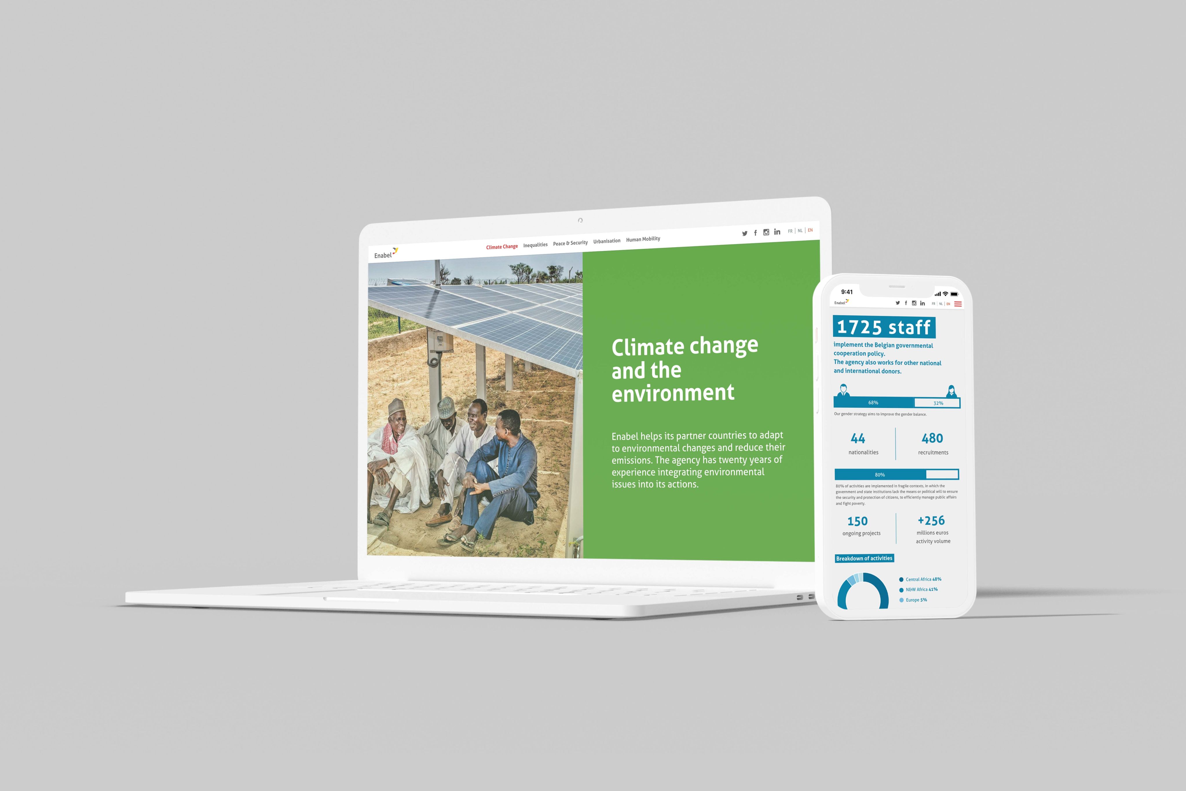
8. Enabel uses visual storytelling for its annual report
Annual reports are usually housed inside a PDF, where page after page readers scour blocks of text, graphs and graphics to soak in information.
Enabel decided its 2020/21 report would have a different approach. Using infographics, photographs and data visuals, the report is a great example of a company rethinking PDFs and modernising its annual reports to make them more readable for clients and investors.


Takeaways

Readers are expecting more from the content they consume online, and visual storytelling is a way for brands to answer that call.
Stories can now be brought to life using high resolution images, interactive maps and data visualisations. And the best part is that creating a visual story no longer requires the help of a developer.
No-code tools are giving content creators the freedom to experiment with visual storytelling without having to retrain as a developer.