8 examples of outstanding data journalism


For over a decade now, media commentators have been celebrating the rise of data journalism, and it’s easy to see why.


We have a tangible need for beautiful feature stories that craft compelling narratives about our world out of statistics. And, given the quantity of data out there, it makes sense that journalists are experimenting with how to understand and represent these big data sets.
This article covers:
News organisations around the world are investing heavily in data-driven storytelling as appetite for longform journalism grows. Audiences now expect sophisticated data visuals and interactive reporting from publishers such as the Financial Times, Reuters and The Wall Street Journal. Alongside these major newsrooms, specialist outlets like The Markup and The Pudding have shown how focused data journalism and visual storytelling can thrive as standalone editorial products.
The impact is difficult to dispute. Over the past decade, many of the world’s most consequential stories have been shaped by investigative reporting grounded in data. International collaborations such as the Pandora Papers revealed how political leaders and billionaires continued to exploit offshore financial systems well into the 2020s. Elsewhere, journalists have used satellite imagery, open-source intelligence and large datasets to document war crimes in Ukraine, track illegal deforestation in real time, and expose the environmental and human costs of global supply chains.
But, there’s a problem.
The challenge (and opportunity) of data journalism today


In many newsrooms, data journalism comes with heavy expectations and limited support. Reporters are often asked to analyse data and publish complex stories on their own. For general reporters, the challenge is even greater. Producing rigorous, data-led investigations without access to developers or technical support can feel out of reach.
That raises an obvious question. What if your newsroom doesn’t have the budget or scale of organisations like the New York Times or ProPublica? What if building and maintaining custom data visualisations isn’t realistic?
The answer is more encouraging than it once was. Today’s storytelling tools are more powerful and more accessible than ever. Tasks that once required custom development can now be handled with tools built specifically for editorial teams.
As a result, many of today’s most engaging data-driven features are created with platforms like Shorthand. They help journalists bring together data, visuals and narrative into polished longform stories — without needing a data science background or a fully resourced development team.
Start creating with Shorthand
It's the fastest way to publish beautifully engaging data journalism, reports, longform feature stories, and more.


8 outstanding examples of data journalism
These data stories show excellence in the fundamentals of journalism, using good data to tell good narratives. We’ve brought together ten of the most compelling data stories out there, crafted by journalists from teams large and small.
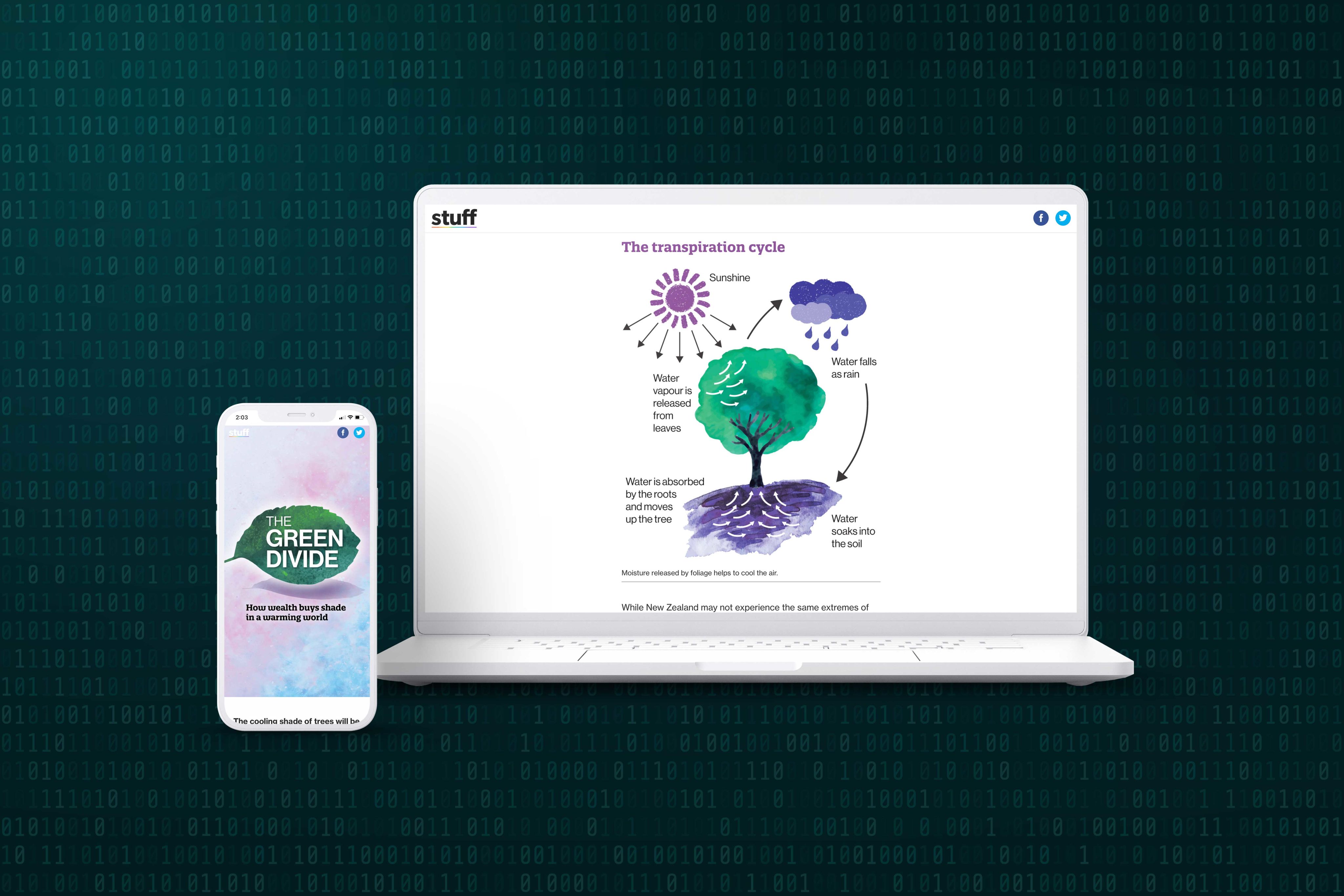
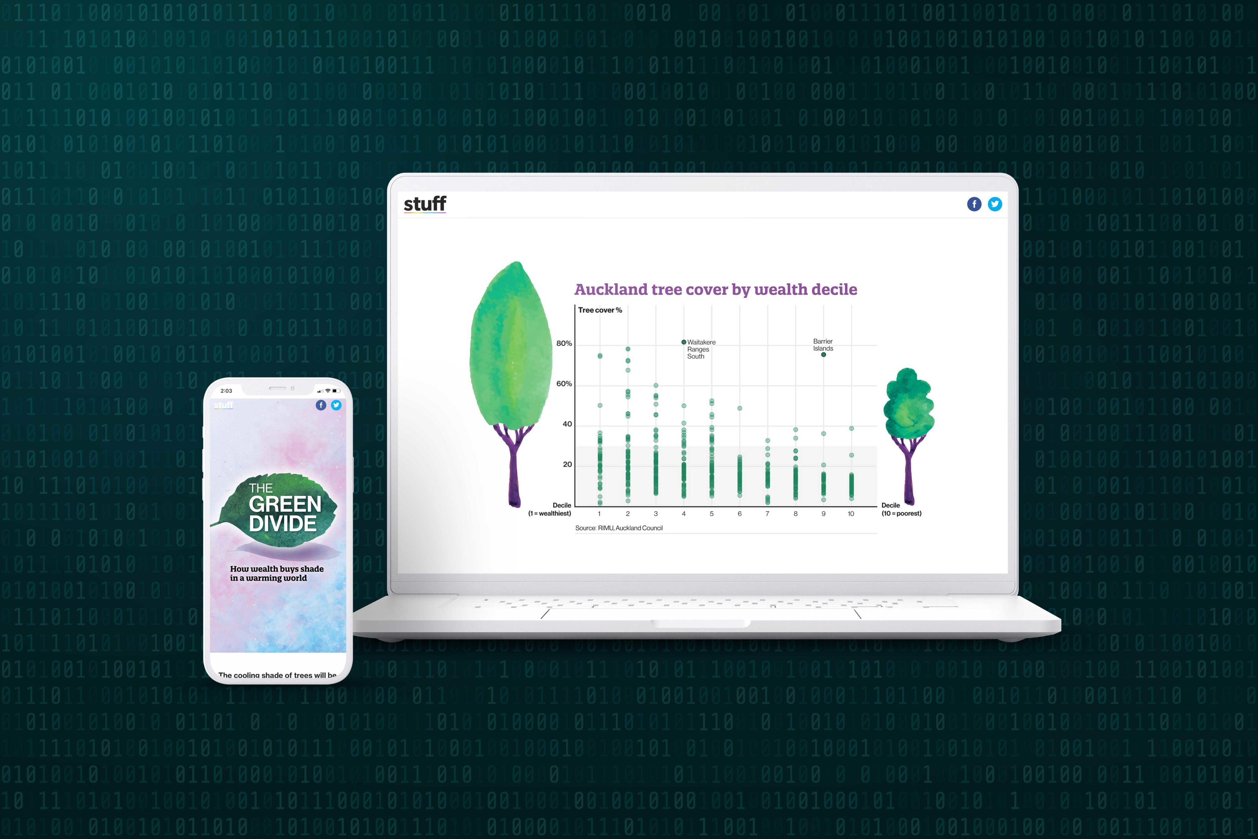
The green divide: How wealth buys shade in a warming world | Stuff
On the topic of economic inequality, this interactive data story from Aotearoa news outlet Stuff shows how tree cover— vital to adapting to climate change — is often dictated by the wealth of a suburb.
With a range of illustrated graphs showing data from Aotearoa’s major city centres, it dives deep into the phenomenon of “leafy suburbs”, a term commonly used to describe wealthy, tree-filled residential areas. The trick is that, unlike buildings, “trees don’t just cast a shadow — they help actively cool the air by releasing moisture through a process called transpiration.” So, while a central area might have lots of shade from tall buildings, they still get much hotter than tree-filled and less densely populated areas.
The council projects mapping tree cover are still developing, but Canterbury University associate professor Justin Morgenroth is pushing for more detailed investigations. As it stands, these visualisations map the relationship between complex data sets in a clear, compelling way. The story itself is clean and appropriately colourful, with text going in depth to explain the data and quote experts.


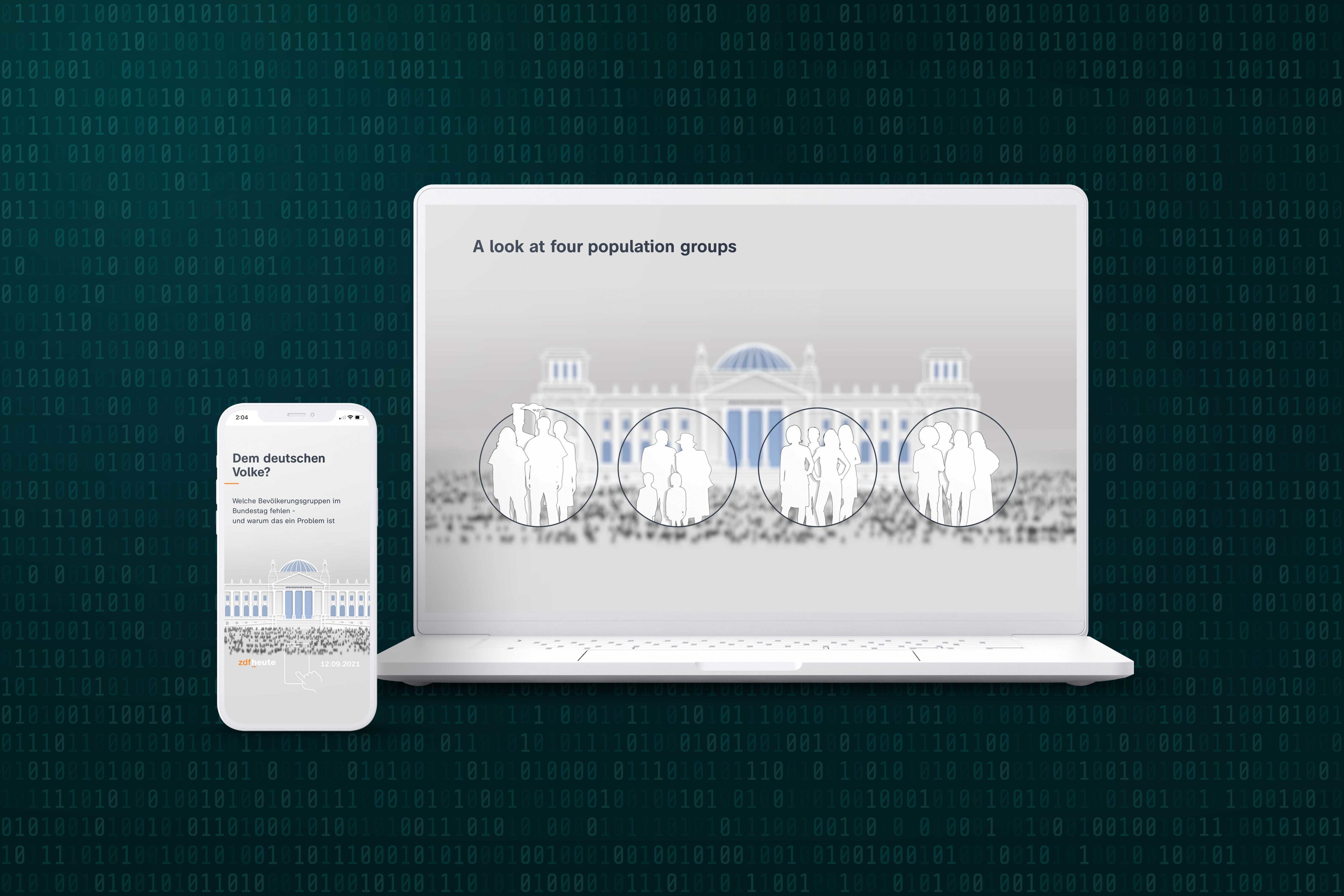
Muss der Bundestag diverser werden? | ZDFheute
This in-depth piece of investigative journalism from ZDF News asks one critical question: is the German parliament representative of the German people?
Combining statistics with data visualisations, the story moves through hypothetical and real questions of the demographic make-up of the Bundestag, Germany’s federal parliament.
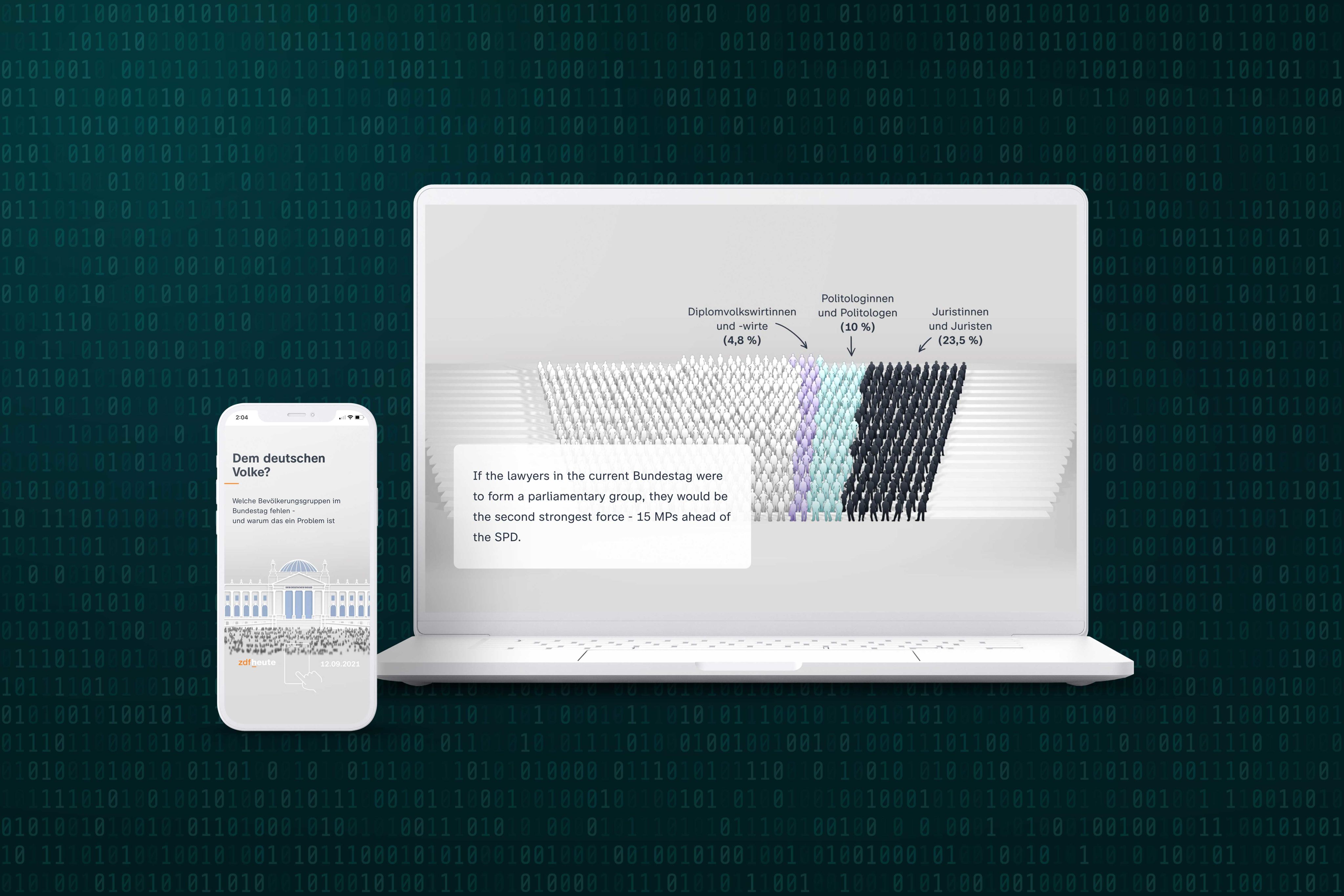
The story’s main visual feature are outlines that represent Germany’s 598 federal MPs, which are highlighted and annotated in different ways as the reader scrolls through the story. It is a colourful and clear depiction of how Germany’s demographics line up with their parliamentary representation.
For example, lawyers are proportionately overrepresented — but, as Dr Andrea Dorothea Buehrmann explains, their expertise in understanding the potential social implications of decisions means this can be an asset. The key, Buerhmann says, is to combine specialist expertise with knowledge gained from diverse lived experiences.
By using a simple visual tool to engage with big questions, ZDF Heute has crafted a thoughtful, engaging example of how journalism can use data to tell complex stories.


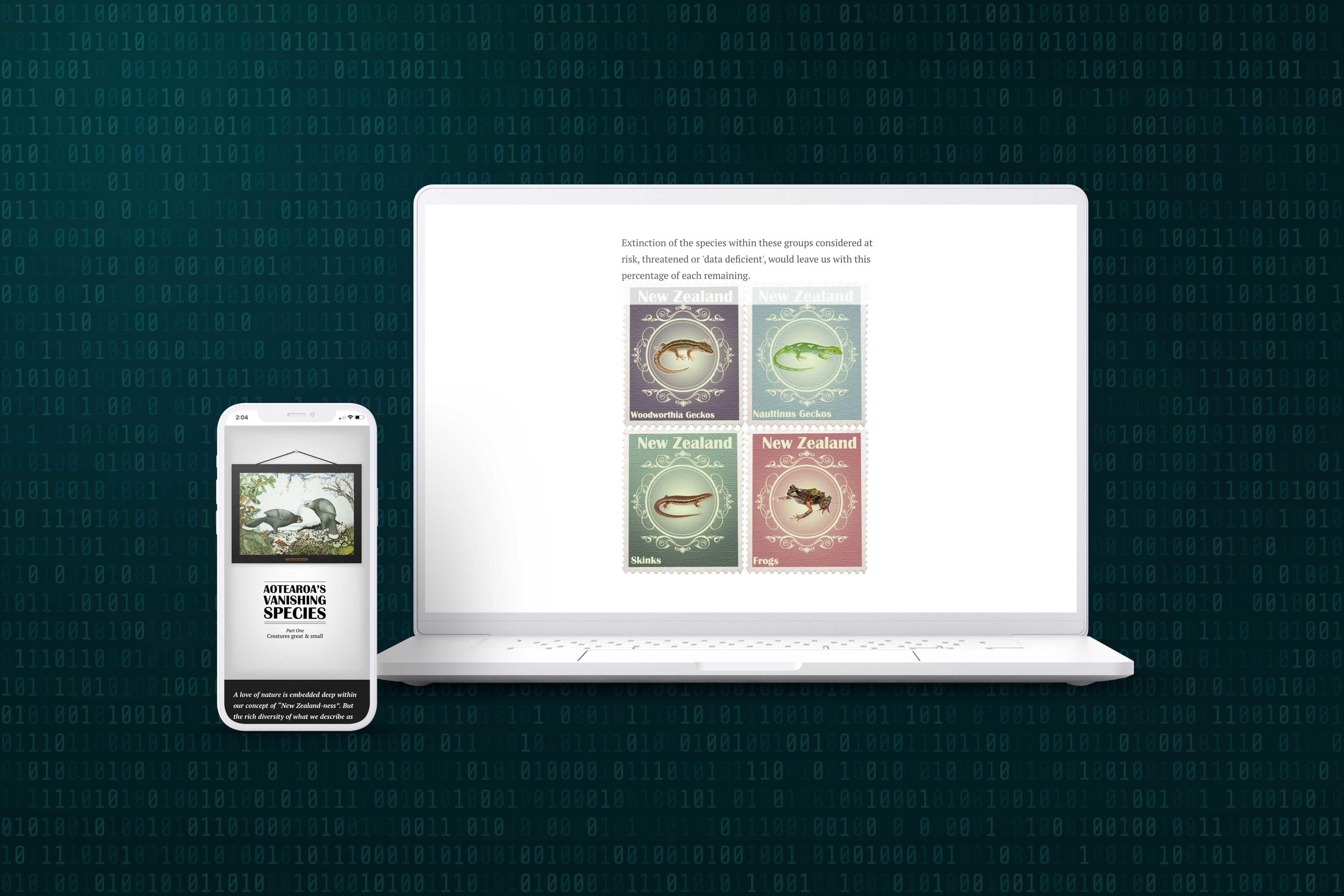
Aotearoa's Vanishing Species | RNZ
Nature is at the heart of many New Zealanders’ sense of national identity, but what does this mean when the country’s biodiversity is under threat?
This story from RNZ investigates the difference between Aotearoa’s self-perception as a “lush, verdant country” and the reality of the statistics, which show that after human arrival on these islands, “Wildlife has suffered blow after blow. We’ve eaten away at their habitat, imported predators and weeds, failed to create laws to protect them, and now we’re turning the thermostat up on the world.”
To make the point, the RNZ team visualises data from the New Zealand Threat Classification System — a dry name for a critical, dynamic project. As Professor Peter de Lange explains, “The system provides a rolling summary of threatened species, rather than a snapshot in time.”
The simple data representations in the story provide a clearer visual perception of what can seem like static numbers, and the moving counter of assessed species reinforces that this is a continuing project of tracking and assessing the threat to Aotearoa’s endemic species.
In terms of presentation, wide margins and old-timey art prints of threatened species contribute to the clarity, urgency, and elegance of the story.


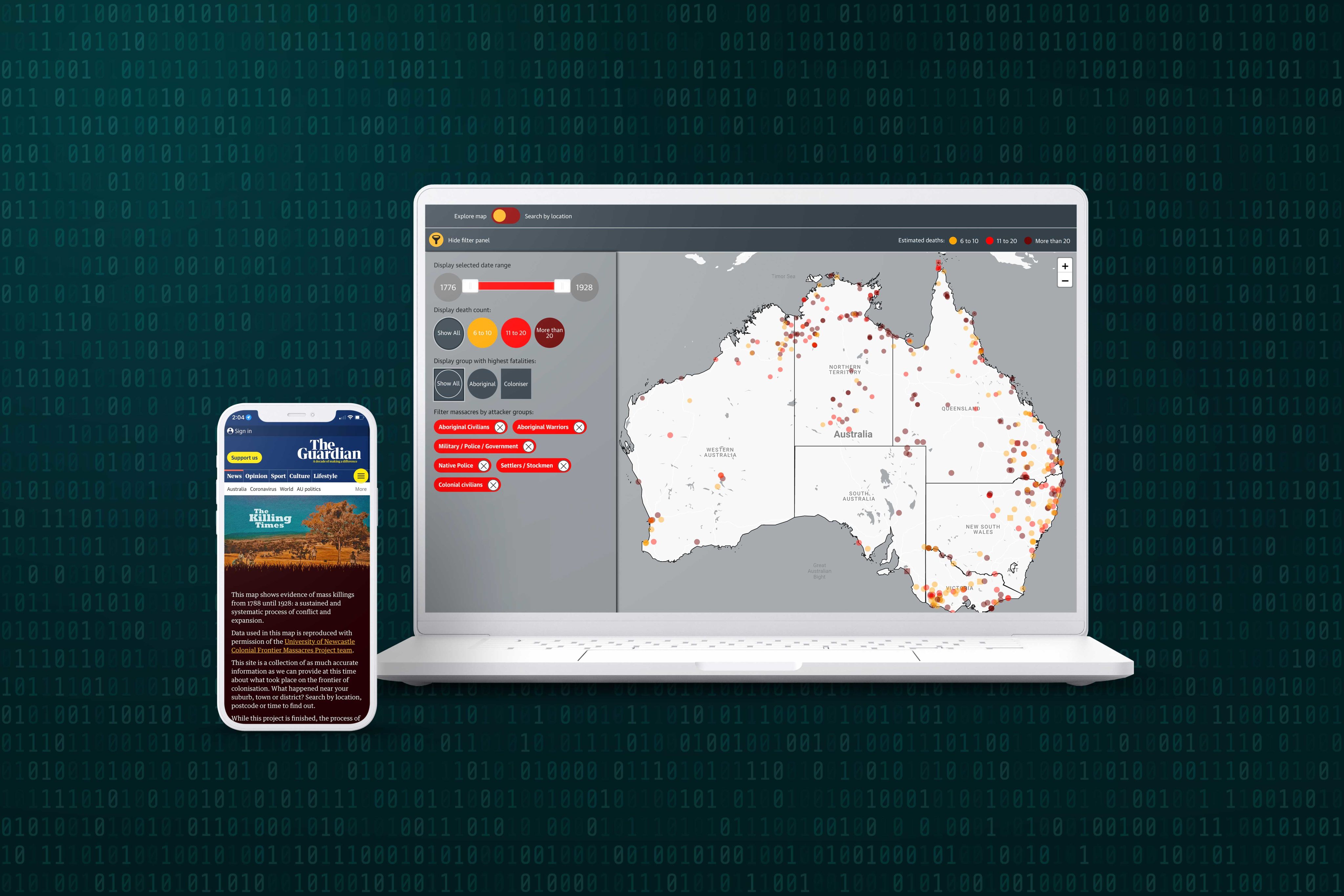
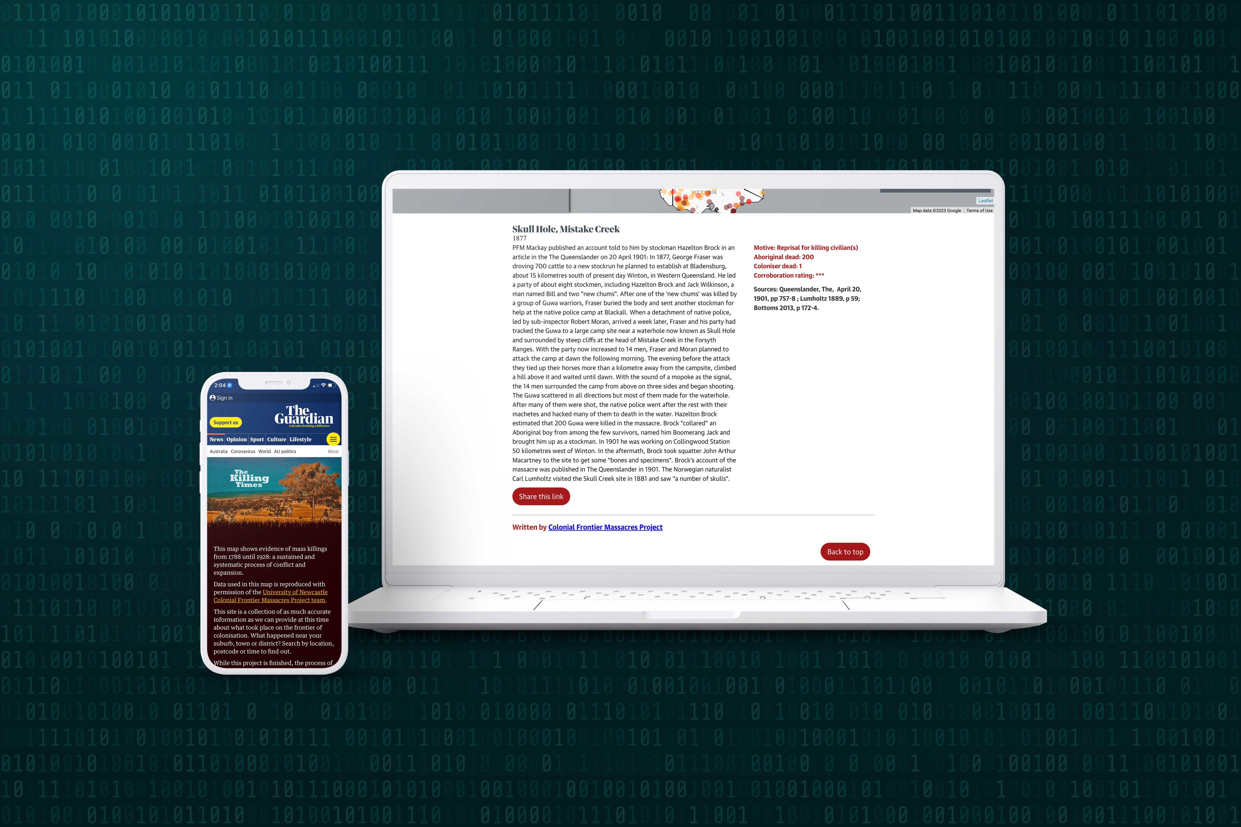
The killing times: a massacre map of Australia's frontier wars | The Guardian
Crucial to the role of journalism is uncovering and reporting truths in the public interest, no matter how confronting. This set of stories from The Guardian shows how data journalism speaks into this mission. It draws together historical data from journals, maps, oral testimony, and newspapers to illustrate the scale of colonial violence against Indigenous Australians since 1788.
An interactive map is at the heart of the story, covered in dots that represent instances of frontier violence, colour-coded by the number of fatalities. A range of filters allows the viewer to observe patterns and details, while clicking on a data point brings up details of the conflict and where the information was sourced.
Much of the data was gathered from a University of Newcastle project, as well as the research of journalists and historians. Several editorial stories are built out from the core map, which is part of a larger journalistic project of confronting the violent, but often-hidden reality of frontier conflict in Australia.
The visual impact of that densely-covered map is enough to give anyone pause, and is a stark call to truth-telling about Australia’s colonial legacy.


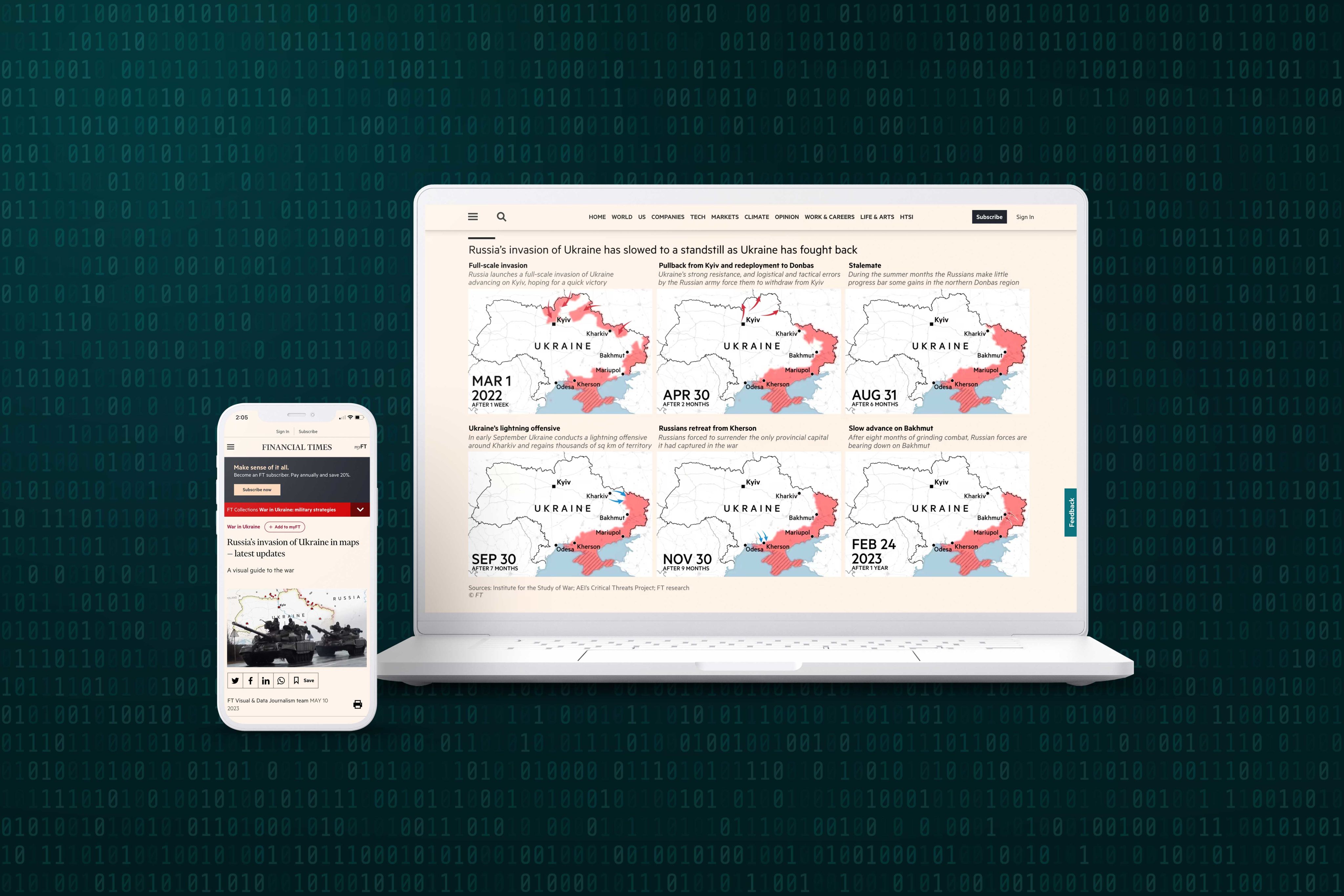
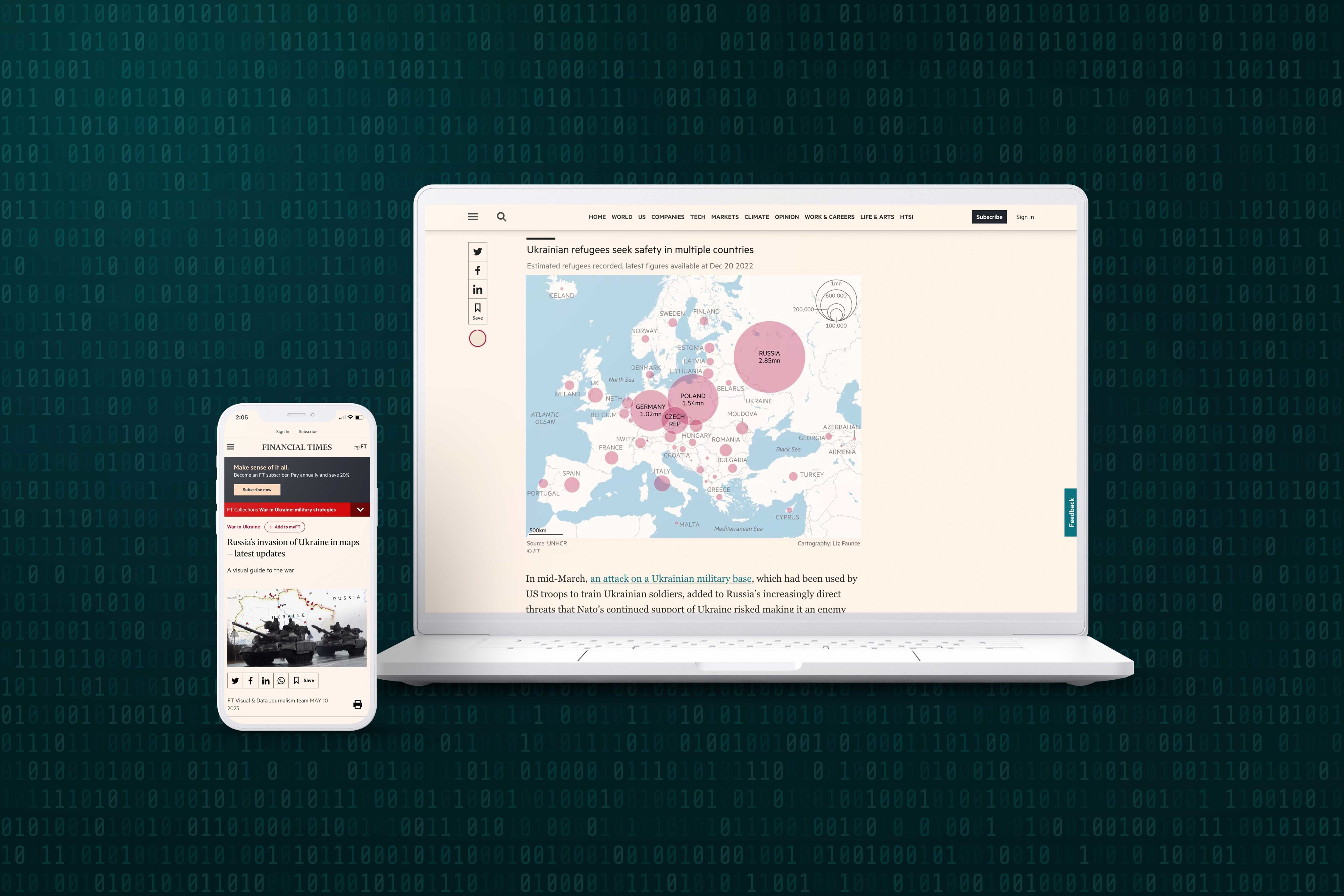
Russia’s invasion of Ukraine in maps — latest updates | Financial Times
As with the group of stories from The Guardian, this Financial Times story uses geographical maps as a starting point for reporting on a complex human narrative.
In a series of 10 different maps, data visualisations, and map sets, the Financial Times has pulled together a ‘visual guide to the war’ in Ukraine — particularly helpful for those who are unfamiliar with the region, but want to visually track what they may have read or heard from other media sources. It’s updated regularly to provide the most recent and relevant information, as well as historical context to the continuing conflict.
The most compelling maps are those that combine geographical information with social data, like the proportional symbol map that shows the distribution of Ukrainian refugees across Europe. Even something as simple as the size of a bubble on a map can transform a flat story into something that translates the scale of human displacement and loss.
The Financial Times has sourced their data from a range of institutions, including the UN High Commissioner for Refugees (UNHCR), the Institute for the Study of War, and the AEI’s Critical Threats Project. The diversity of these sources shows the role of data journalism in researching and synthesising raw data into understandable public interest narratives.


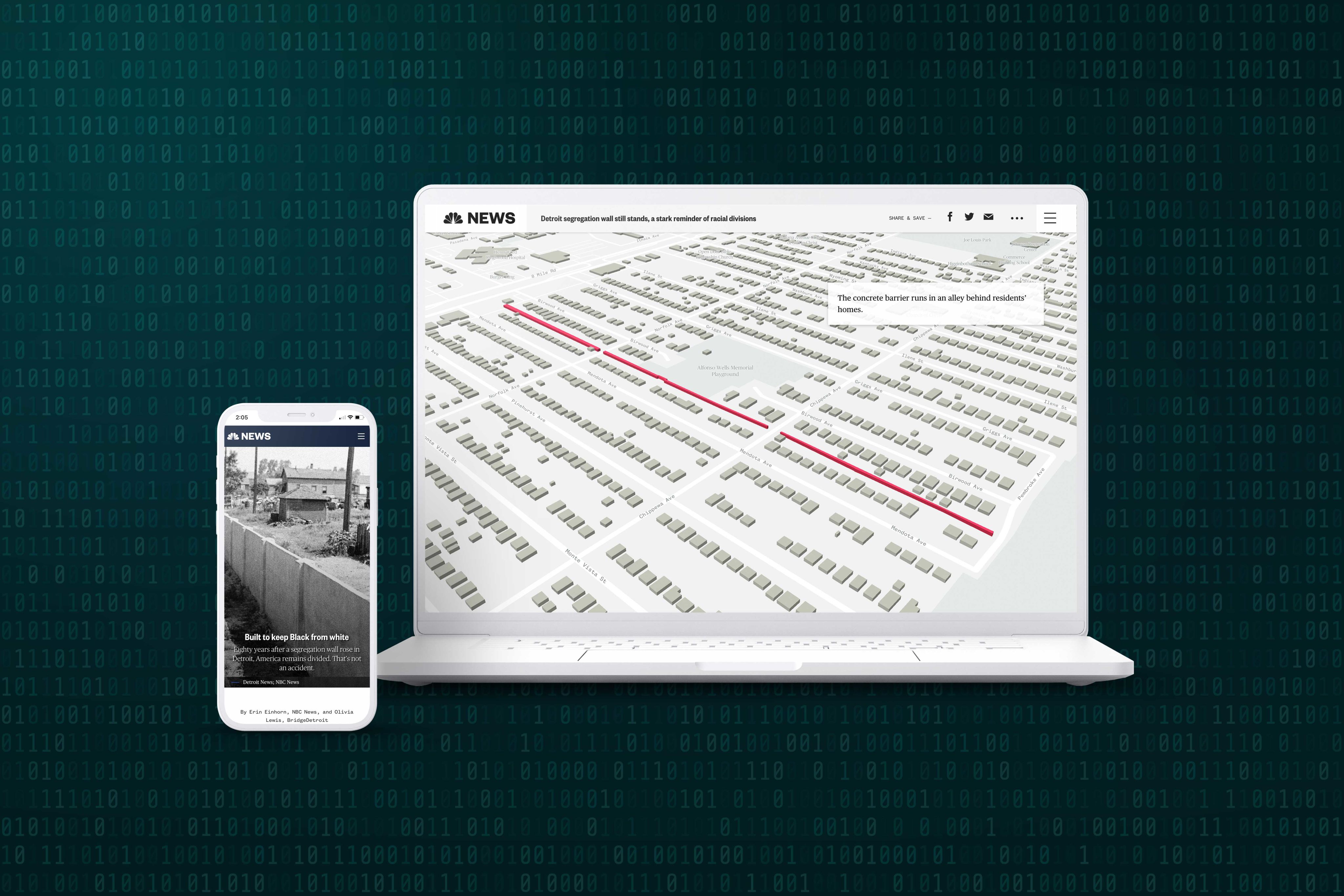
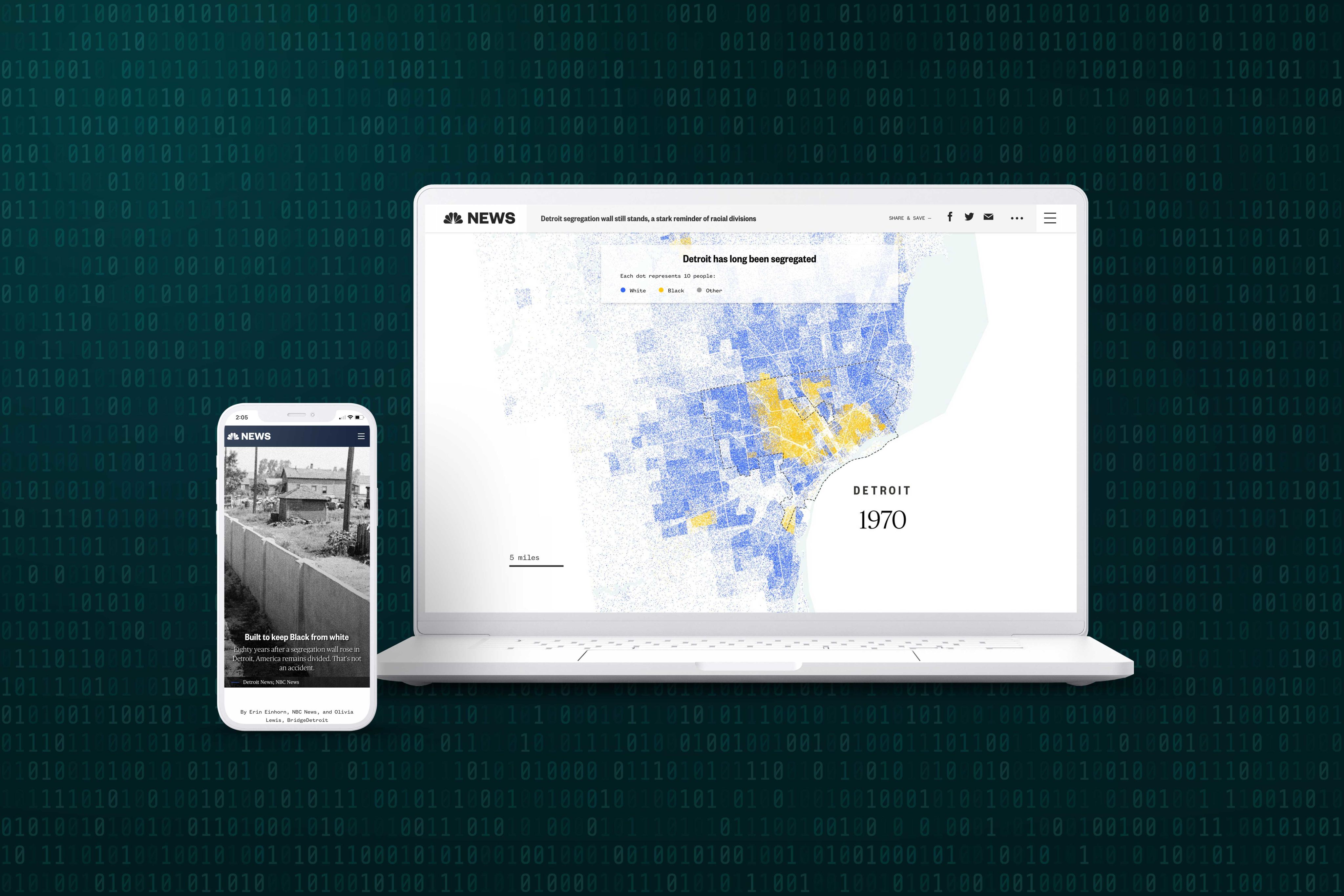
Built to keep Black from white | NBC News
It runs down an alley between homes; kids play next to it and it’s covered in colourful graffiti. But the Birwood Wall — also called the Eight Mile Wall and the Wailing Wall — bears physical witness to Detroit’s history of racial segregation, and its ongoing effects.
The wall was erected in 1941 by real estate developers to try to ensure higher property prices when attracting white families to the area. To the west were white families, to the east were Black. But, 80 years later, the NBC and BridgeDetroit tell a story in data that shows the economic and cultural legacy that remains.
In a series of scroll-triggered and animated maps, NBC News uses historical data to tell the story of continued, intentional racial division. When combined with data around house prices and historical context of government ‘redlining’ policies, it shows clearly how racial segregation was a deliberate economic choice by white policymakers, to the continued benefit of white citizens and disadvantage of Black communities.
Telling that story with data — supplemented with a documentary, interviews with long-term residents and experts, and an array of historical and contemporary photographs — is compelling and confronting.
As journalists Erin Einhorn and Olivia Lewis write, “The divisions set down in concrete on a spring day in 1941 are an enduring reminder of the reasons this country remains so starkly divided… And none of that was an accident.”


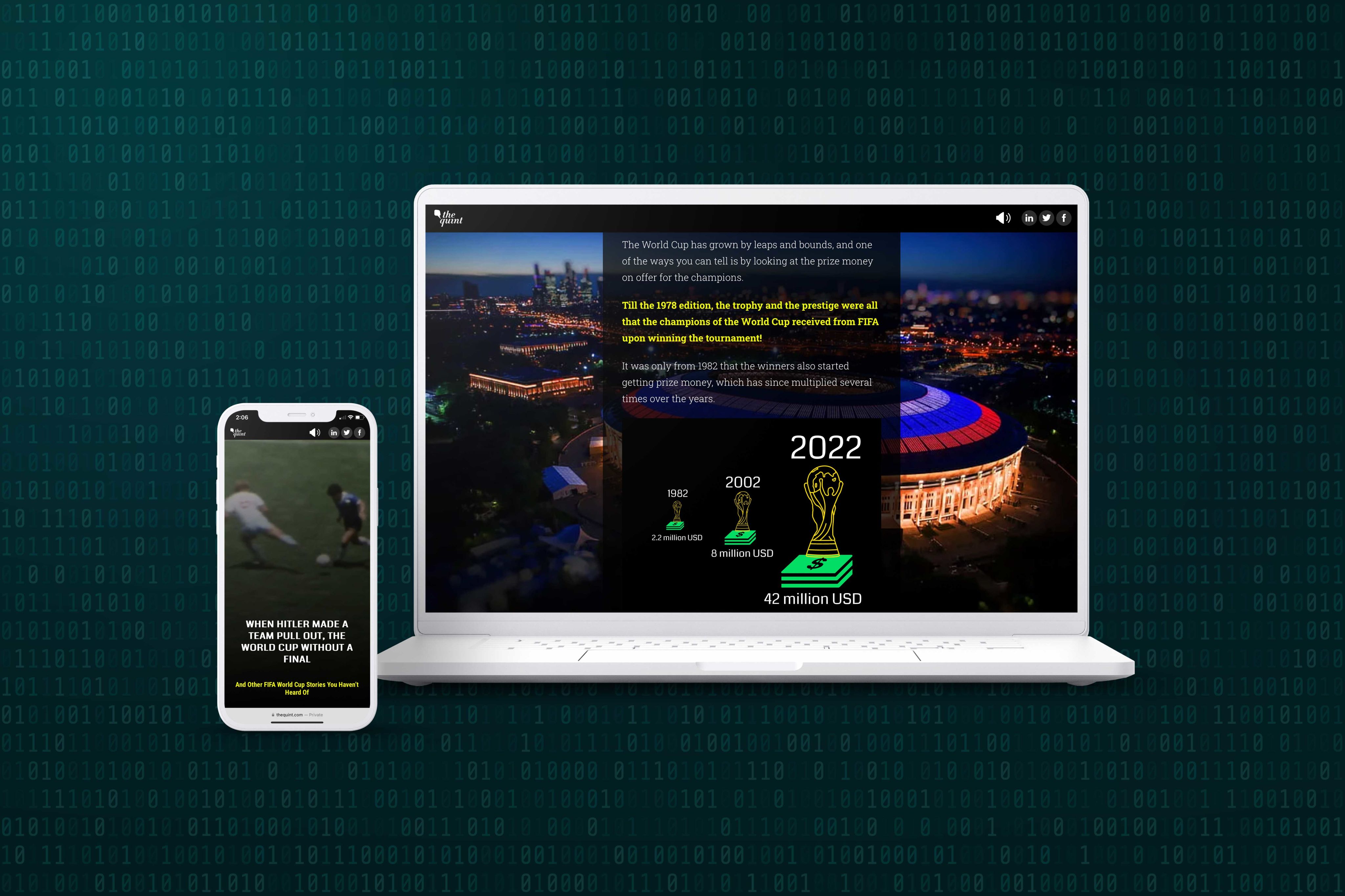
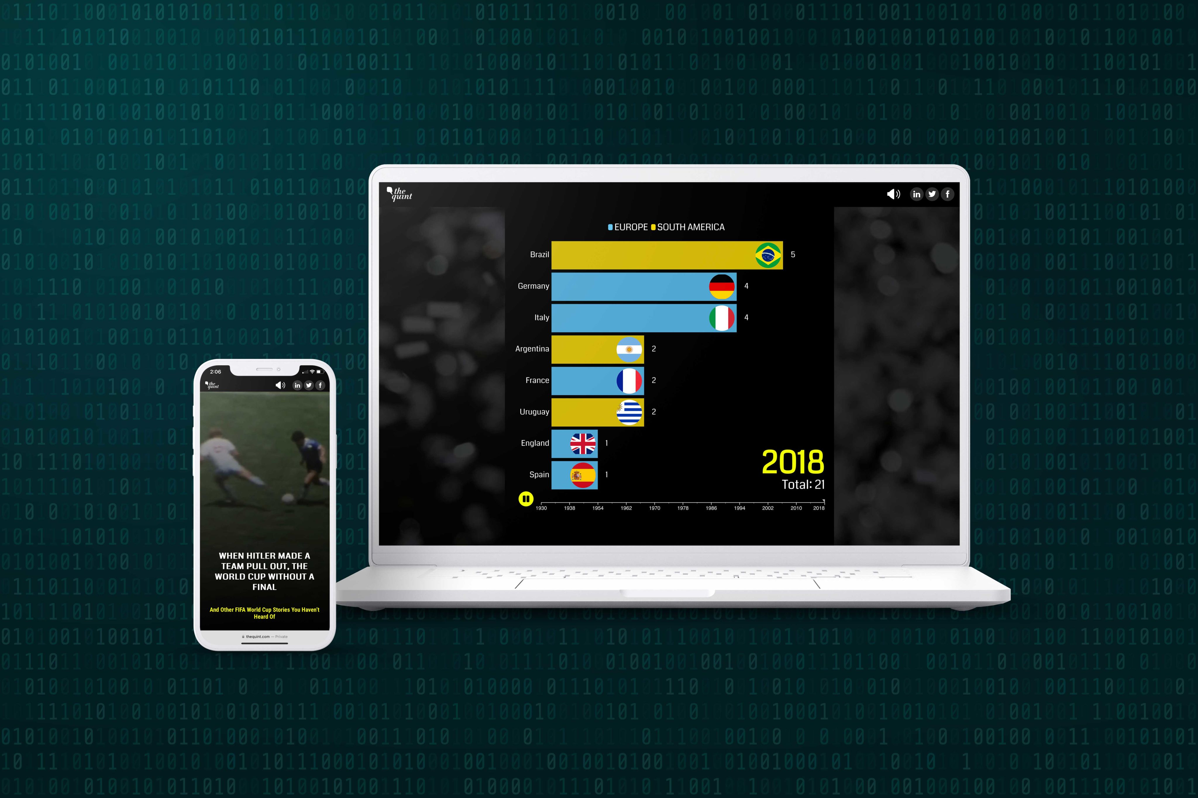
FIFA World Cup: They Won the World Cup Without a Final & 12 Other Astonishing Stories | The Quint
While data journalism is a powerful tool for exposing and exploring inequity, it can also be used to delight and entertain. This story from The Quint is packed with fascinating, little-known stories from across the history of the football World Cup.
Video embeds and historical photos make the story visually engaging, but the real stars are the data visualisations. A spinning football resolves into a globe, demonstrating the percentage of global viewers (in 2018, about 50% of the world’s population tuned in!), while colourful graphs show the exponential increase in prize money for the winning team.
From the greatest goal-scorers to bar graphs of the participating countries split by continent, these twelve tales draw together different types of data to tell a joyous, thoroughly-researched story of the so-called “beautiful game”.


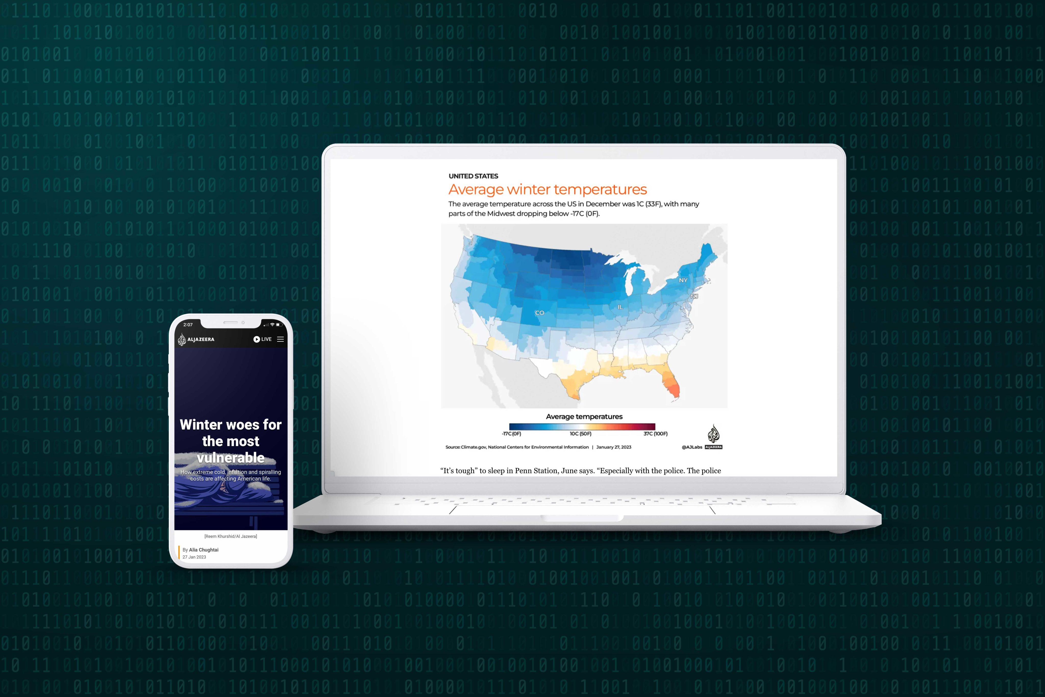
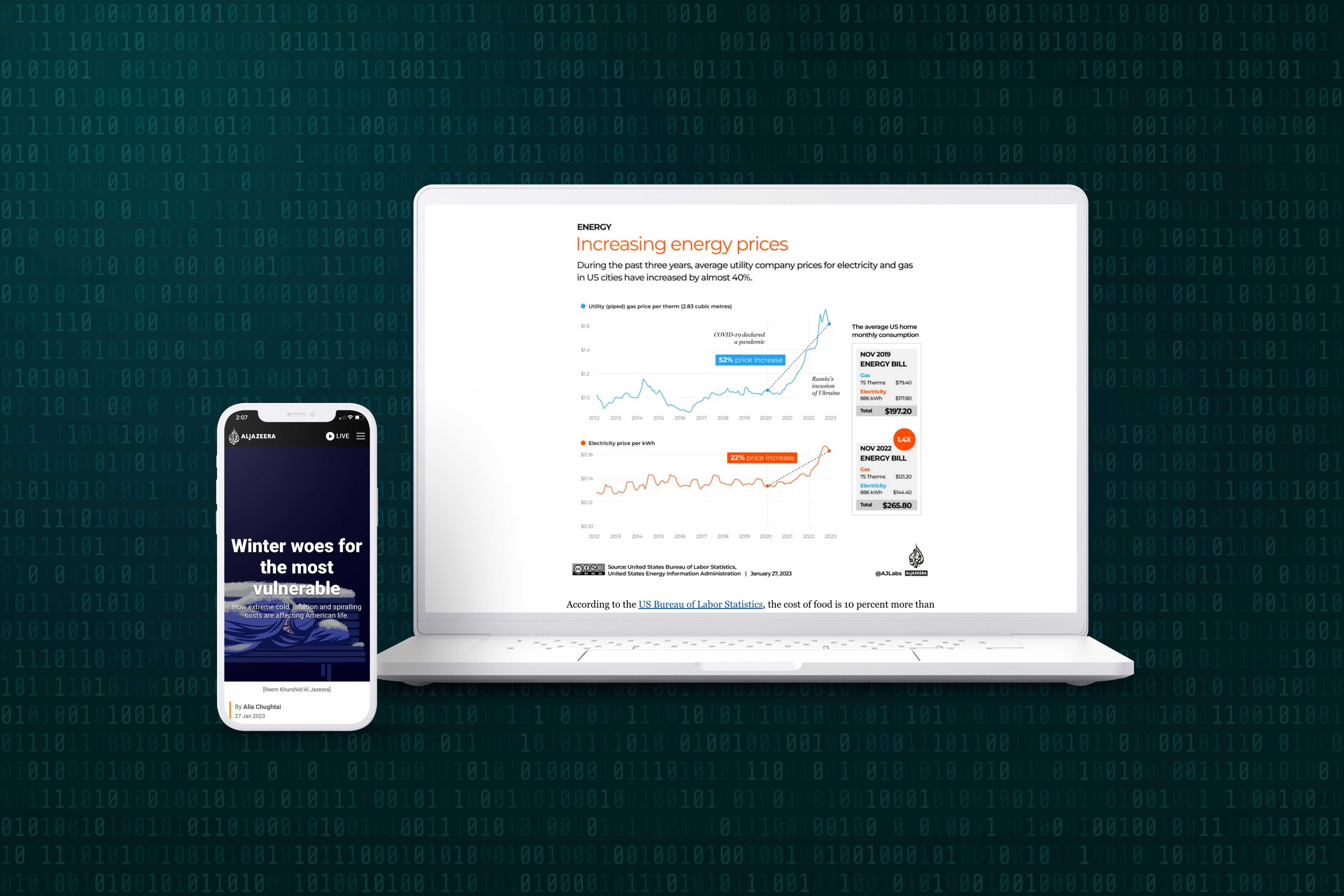
Staying warm this winter: How cold affects those most vulnerable | Poverty and Development News | Al Jazeera
The second in a three-part series on staying warm in 2023’s winter, this Al Jazeera story moves seamlessly between macro and micro, weaving together personal and national stories of how America’s vulnerable are affected by winter, and escalating costs of living.
Al Jazeera uses data and maps to tell the big stories — average winter temperatures across the country, rates of homelessness, and energy prices. But alongside these national narratives sit the personal stories of people like June, who shelters from New York’s bitter winter in a Manhattan train station, and a group of mothers in suburban Colorado finding innovative ways to keep costs down.
The data is drawn from a variety of sources, including the US Bureau of Labour Statistics, the Mayo Clinic, the US Energy Information Administration, and Al Jazeera investigative reporting.
Infographics provide tips on saving on energy costs, graphs track prices of different necessities from 2012 to 2023, and large pop-ups combine images and weather data to illustrate what winter looks like in major US cities for the country’s most vulnerable.


Conclusion
Numbers aren’t everyone’s jam, but they can be an invaluable way of interpreting and communicating big, important stories — and smaller, more personal ones, too.
Simon Rogers, the punk-rock godfather of The Guardian’s DataBlog, inspired journalist Pamela Duncan to think beyond her discomfort with maths to the bigger possibilities of data journalism. From him, she realised there was a “different way of doing journalism. And you didn’t have to be a mathematician: you just have to be a storyteller.”
Whatever your relationship with data journalism, we hope you’ve found something inspiring or thought-provoking in these ten exceptional examples.
Ready to start creating your own data storytelling feature articles and more? Check out 10 free feature article templates.
Image sources courtesy of Innovated Captures, vectorfusionart and Fotomay via Adobe Stock.