How to tell stories with maps
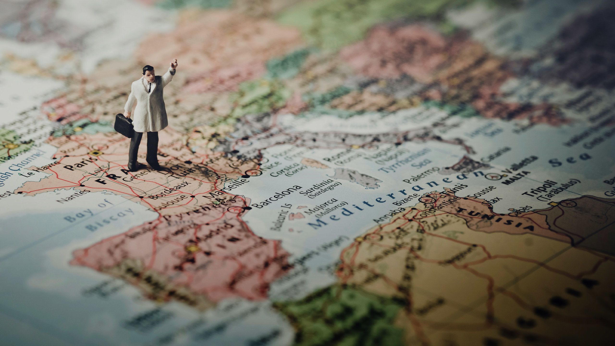

Let’s begin with a famous story about the power of maps.
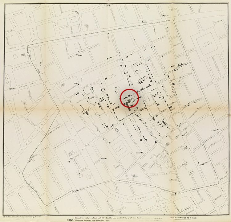
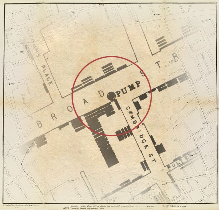
In 1854, London was beset by cholera. The epidemic would go on to claim over 10,000 Londoners, with most people believing that the disease was spread by airborne contagion — the so-called ‘Miasma Theory.’
One of the worst hit areas of London was Soho, where an estimated 10% of the population was infected. In August 1854, epidemiologist John Snow travelled to Soho to collect data on cholera infections, aiming to test the ‘Miasma Theory’ with real-world data.
The result was the famous Cholera Map, which proved that infections were concentrated around a specific water pump — which was itself connected to a local cholera-ridden cesspit.
John Snow’s findings transformed how public authorities responded to the disease. They also contributed to the revolution in sanitation infrastructure in London — and other cities around the world — in decades to come.


What do the BBC, Tripadvisor, and Penguin have in common?
They craft stunning, interactive web content with Shorthand. And so can you! Create your first story for free — no code or web design skills required.
Get started.
The rise of modern web maps
As the case of John Snow proves, maps are a uniquely powerful form of data visualisation. Done well, they’re beautiful, informative, and — with the rise of web-maps — interactive.
So, why don’t we see interactive maps on every digital story?
Web maps aren’t difficult for specialists to produce. However, they require a combination of domain-specific knowledge — from Geographic Information Systems (GIS) and computer science — that is relatively rare. Software developers are often frustrated by the arcane formats and processes of GIS mapping, and shocked by the expense of proprietary software.
For those working in marketing, comms, and media, the problem is even greater. The 5-figure cost of enterprise mapping and data science platforms far exceeds their discretionary budgets. And the expertise required to implement online maps — even using newer platforms like Mapbox, open source tools like Leaflet and R, or some combination of the two —simply doesn’t exist on most teams.
Where the expertise does exist, it’s expensive, and doesn’t scale beyond an occasional special project.
You can read more about this problem in our guide to data storytelling and in our roundup of 10 tools to creative online maps.
Looking for more digital storytelling inspiration? Sign up for our newsletter and get the best digital stories in your inbox.
Scroll-based map animation
The solution for many teams is scroll-based map animation. This technique uses several static images or illustrations to produce dynamic, interactive maps animated by the scroll of the mouse.
This allows teams to create stories for their digital publications and interactive marketing campaigns, without engaging expensive developers.
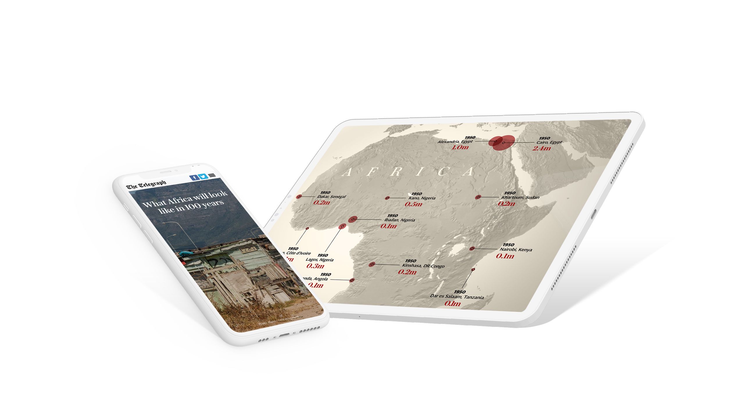
With a digital storytelling platform, non-developers can produce these maps — without writing a line of code. See, for example, this story from The Telegraph, depicting the projected growth of cities in Africa.


Why are these teams embracing scroll-based animation?
- It’s simple.
Scroll-based maps can be implemented by non-developers without extensive training. All they require is media assets that many storytelling teams develop as a matter of course. - It scales.
Bespoke web maps have to be built for each and every story — which means they’re always going to be relatively rare. But scroll-based maps can be implemented for every relevant story, without ballooning costs or delays. - It’s flexible.
Scroll-based maps can be produced from illustrations, satellite or raster photography, or vector points and lines drawn on a base map. And unlike web maps, you don’t need to worry about geospatial data formats, storage, performance, maintenance, or data projections. Your maps can be as precise or illustrative as you’d like. - It helps with the flow of your story.
Often, embedded web maps are produced to be impressive standalone artefacts — regardless of the logic or requirements of the story. An embedded web map requires users to pinch and zoom to explore the relevant data, which can distract from a typical reading experience. Scroll-based maps, though, simply require a reader to scroll. - It’s mobile friendly
Many web maps will claim to be fully responsive. However, it’s one thing to technically ‘work’ on an iPhone SE; it’s another thing to actually improve a story. Scroll-based map animations allow storytellers to present critical information on all devices — no pinching or zooming required.
Not yet convinced? Let’s look at some examples of scroll-based map animations from some of the world’s leading media, communications and marketing teams.
If you're looking for more examples and inspiration, check out our guide, 8 examples of powerful data stories.
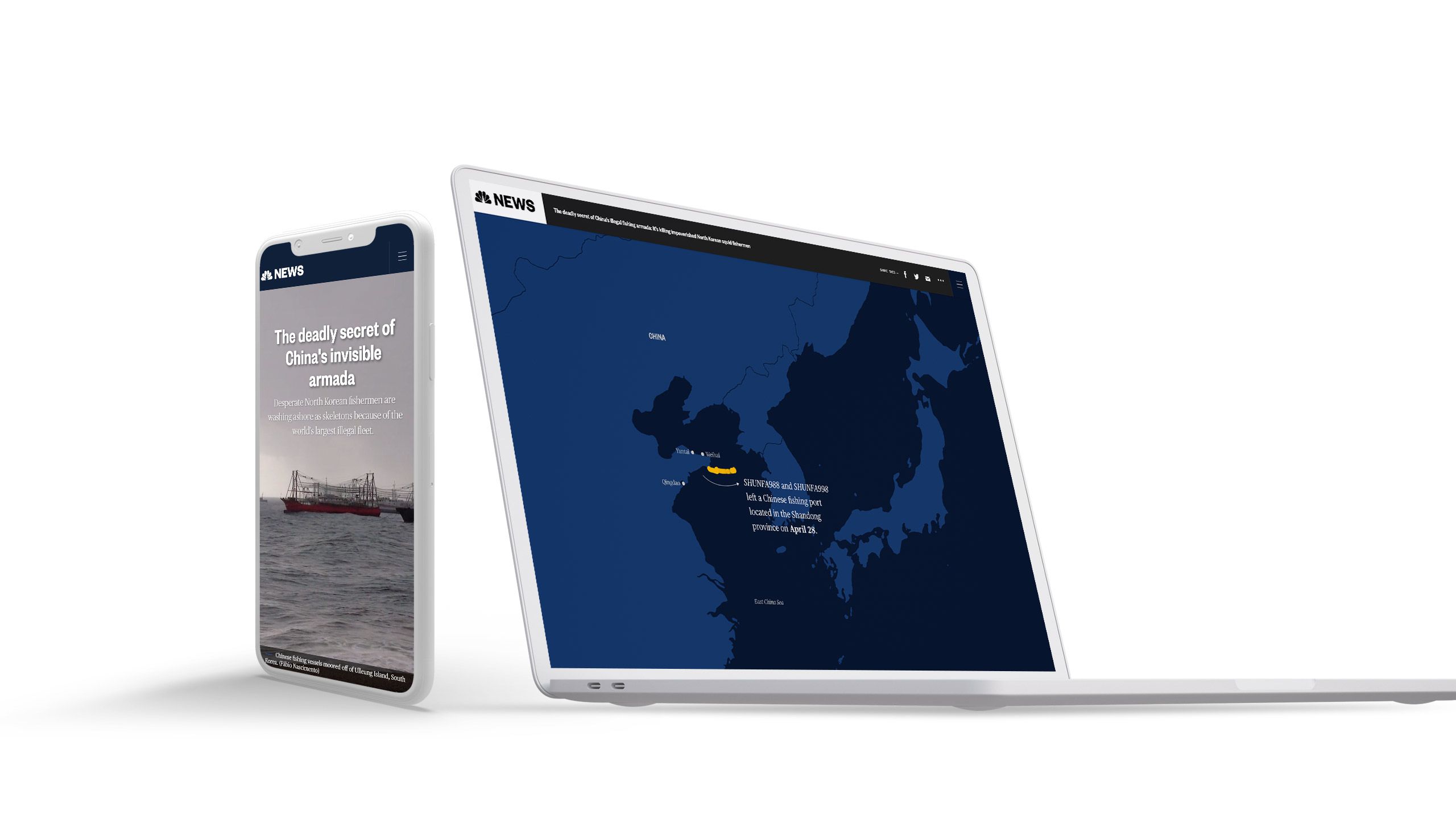
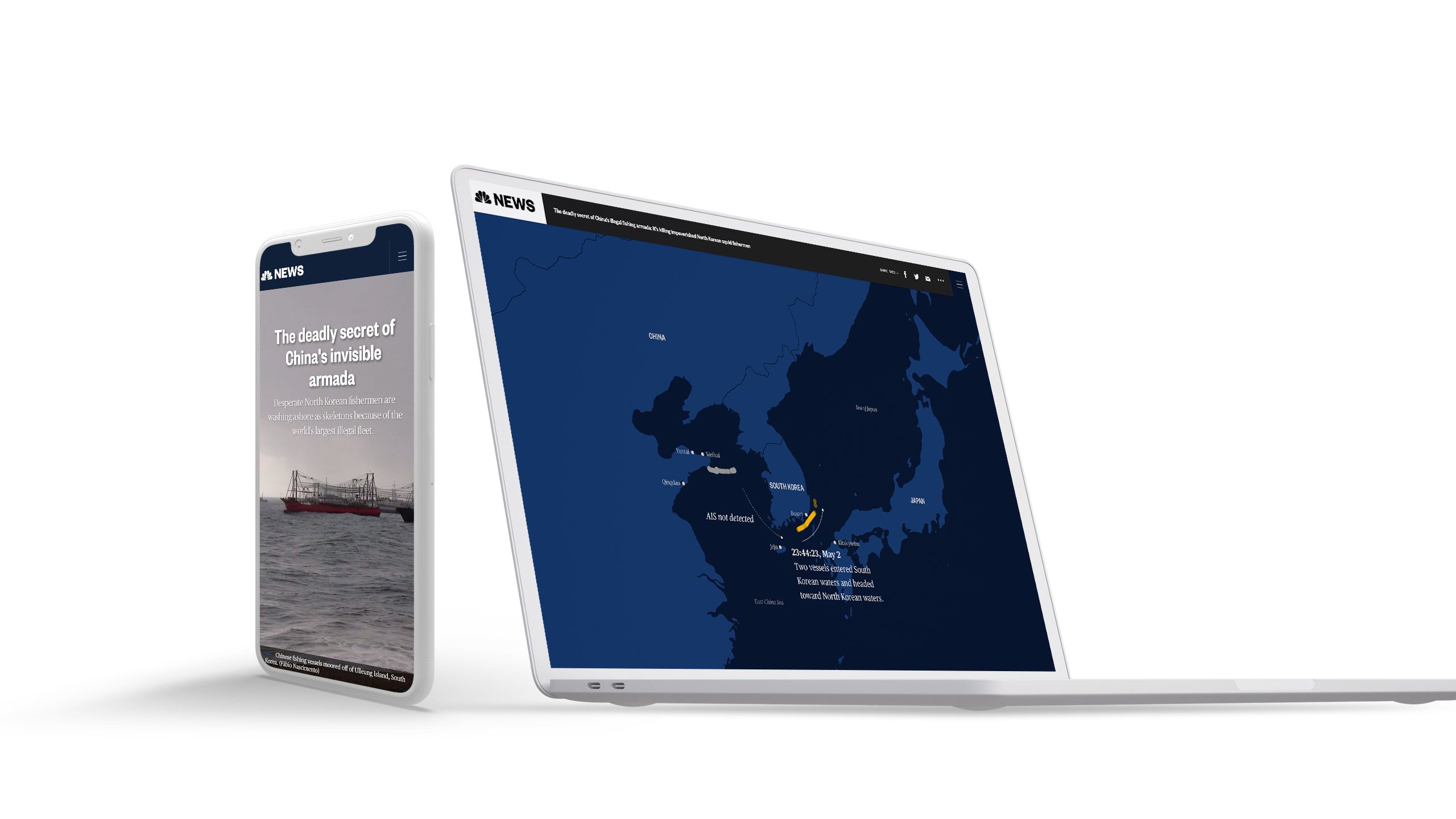
NBC News
Let’s start with a big story — one that used maps to expose the crimes of the world’s largest nation-state. Ian Urbina of NBC News used satellite imagery to track the movements of Chinese fishing fleets, proving that they had been operating illegally off the coast of North Korea.
These fleets had crowded out the tiny vessels used by North Korean fishermen, potentially contributing to starvation and the rise of ‘widows villages’ along the coast.
The team at NBC created illustrated maps to show the movements of these Chinese fleets into North Korean waters.
This is a great example of data journalism using maps. You can learn more about how to create great data journalism in our guide.


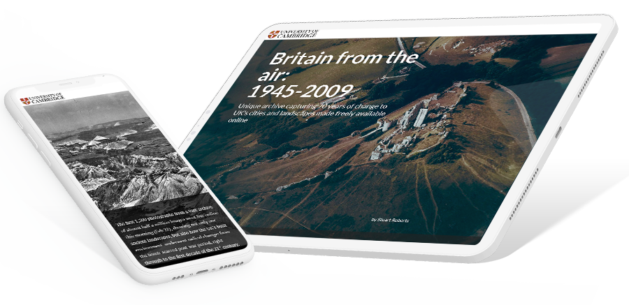
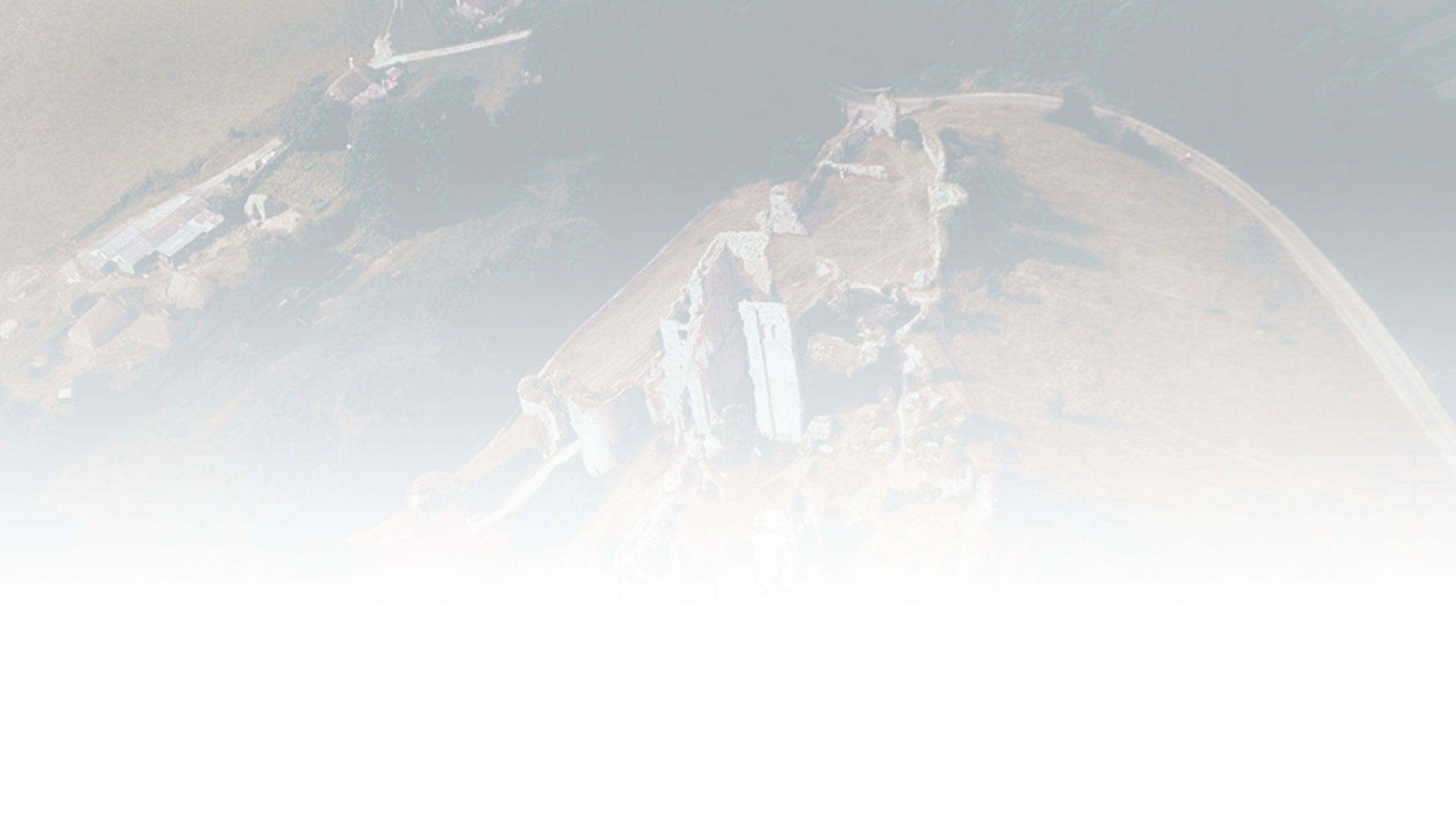
University of Cambridge
Over the last seventy years, human beings have utterly transformed our planet. The scale of this change is astounding, even in places that were already heavily developed.
This change is difficult to capture in words — which is why the University of Cambridge used aerial photography. Like many research universities, the university library has an extensive archive of aerial photos captured from the middle of the twentieth century onwards.
While not strictly speaking a ‘map’, the University of Cambridge uses scroll-based storytelling techniques to showcase the scale of the transformation in their story, Britain from the air: 1945-2009.


Norwegian Refugee Council
Some of the most powerful maps show the movements of people. Today, the most dramatic movements of people are movements of refugees, especially as a result of war and persecution in their home countries.
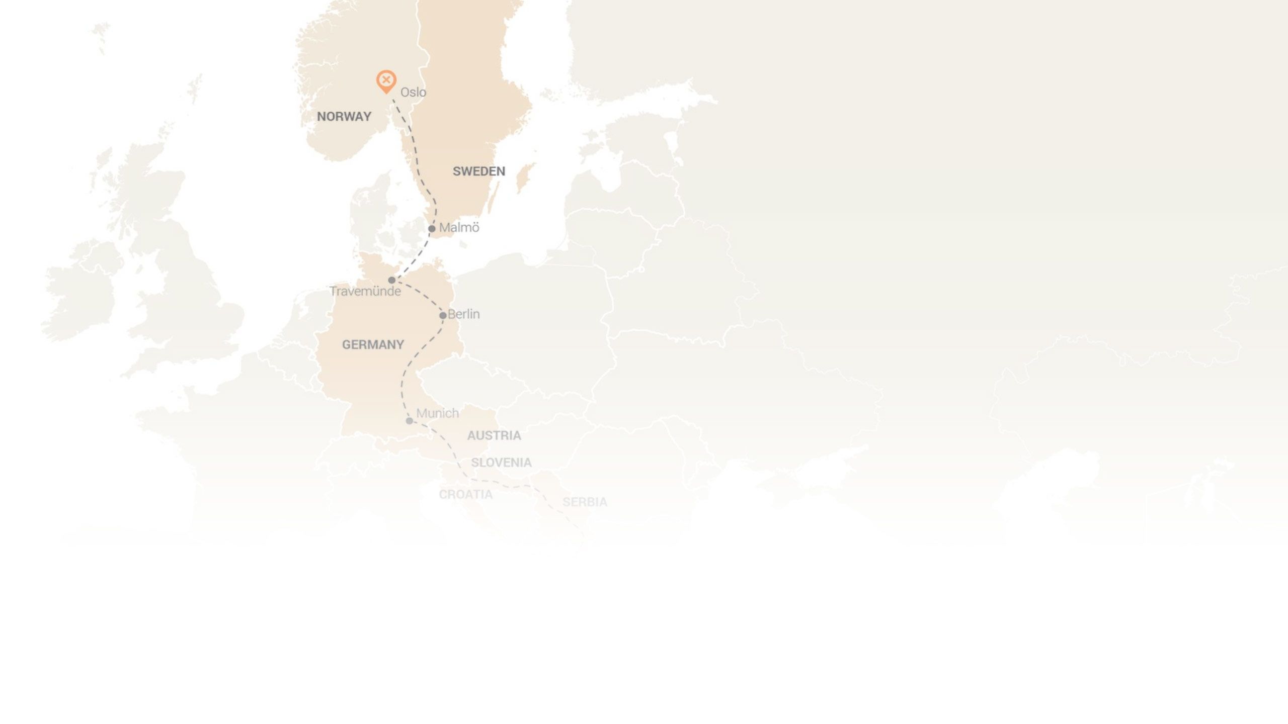
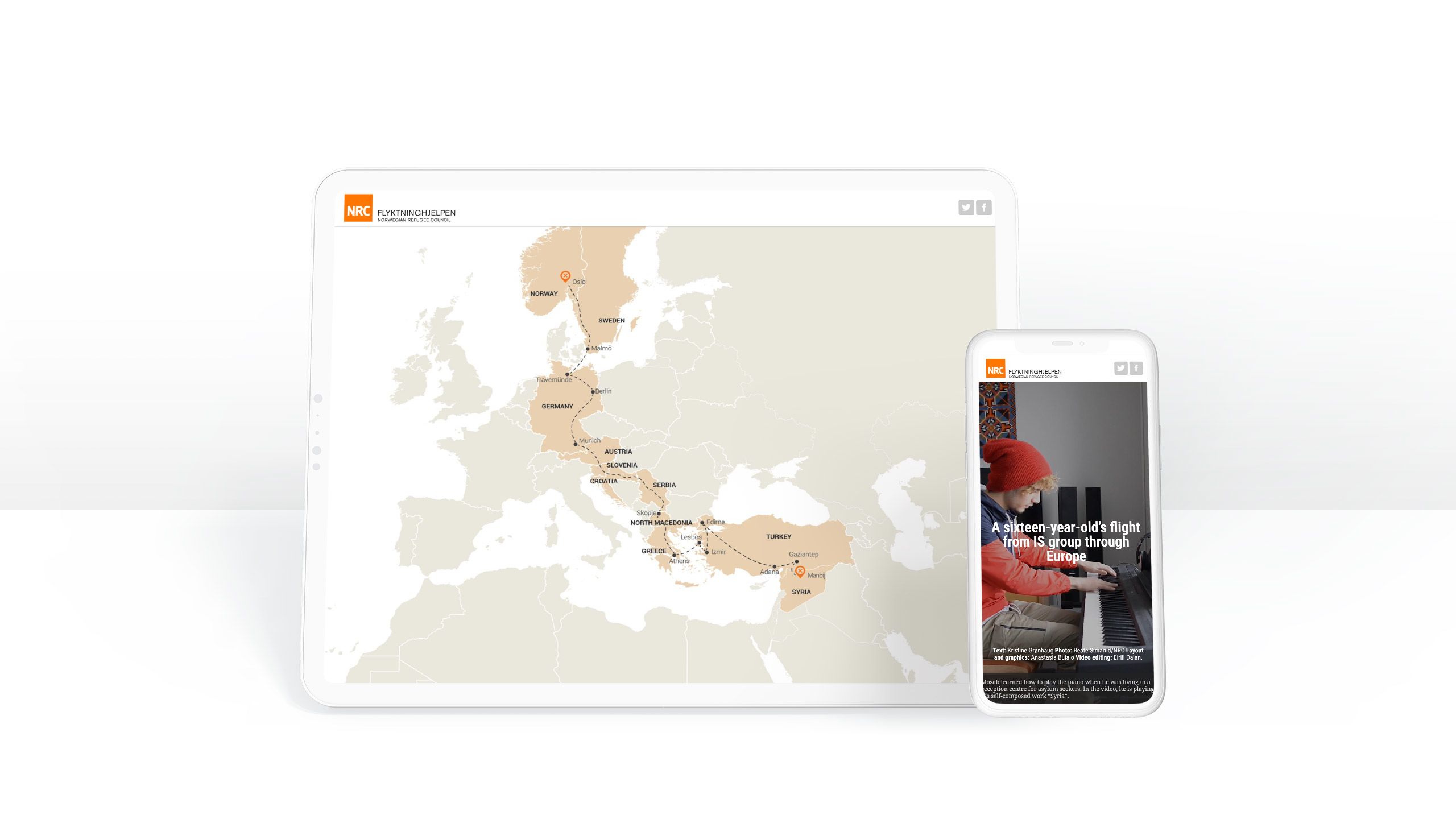
In 2019, the Norwegian Refugee Council highlighted the story of 16-year-old Mosab, who fled from Islamic State group in Syria. The NRC used scroll-based maps to show his dramatic journey across Europe.
The maps are perfectly executed in the context of the story, and are one reason why this won the ‘Best not-for-profit story’ in the 2019 Shorthand Awards.


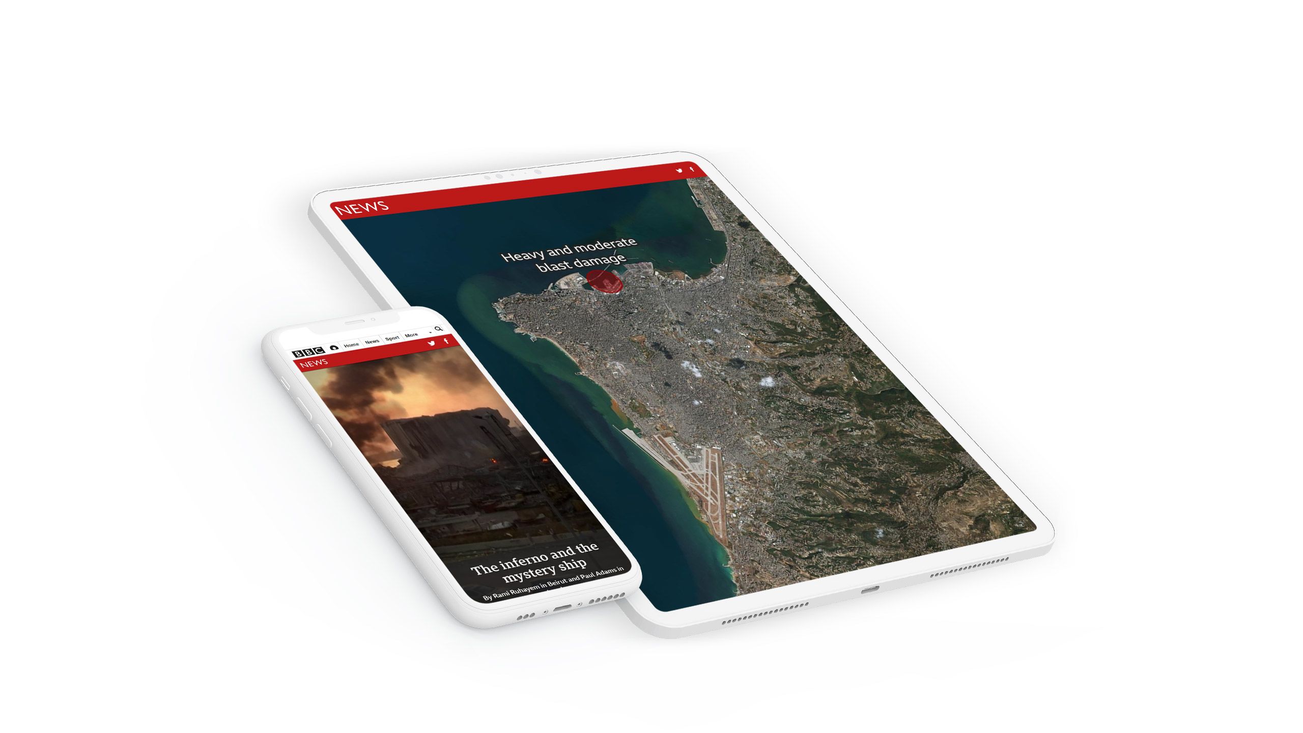
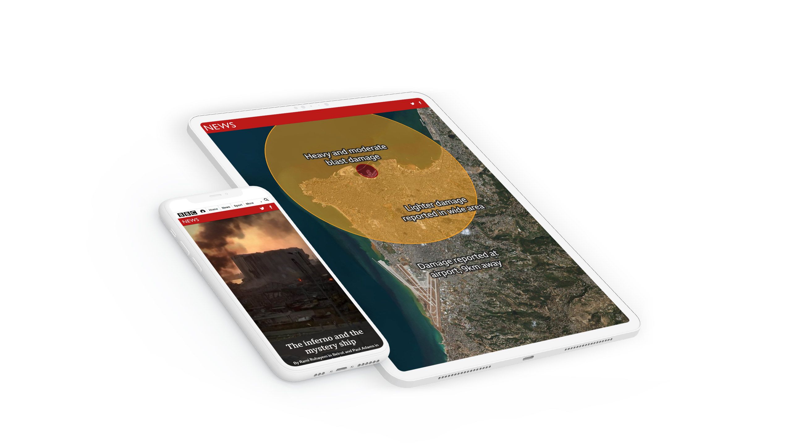
BBC News
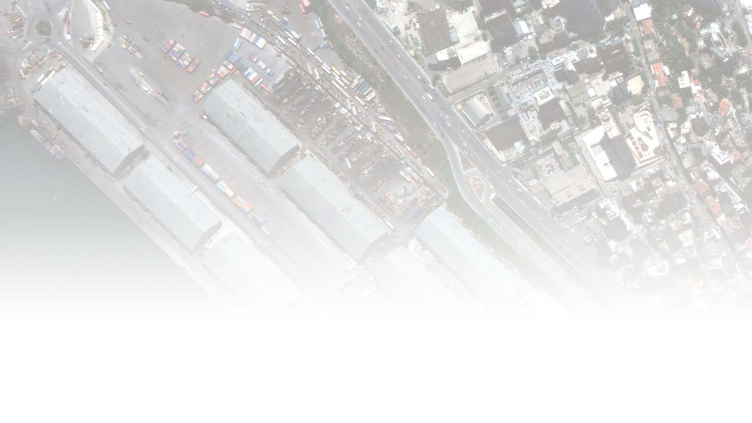
Some stories are too urgent to wait for a developer to build a bespoke web map. In the aftermath of the tragic explosion in Beirut, BBC News rapidly published an investigation into the source and impact of the blast. With simple illustrations on satellite imagery, the team developed several maps to illustrate the extent of the blast.
Instead of spending days — and potentially weeks — developing a custom web map, they were able to produce a highly effective scroll-based map in a short amount of time.


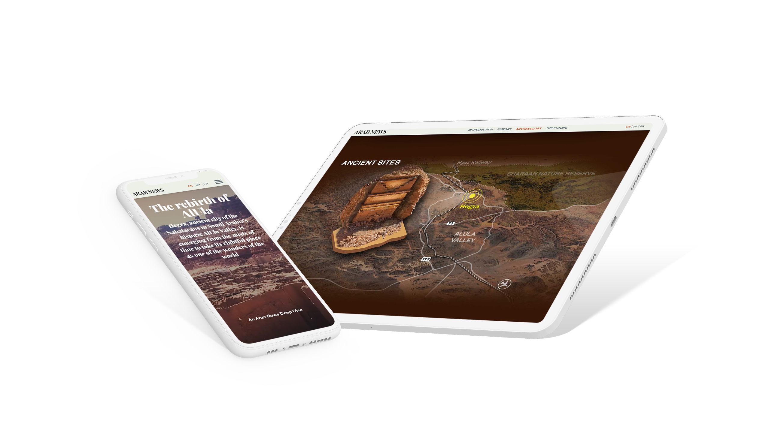
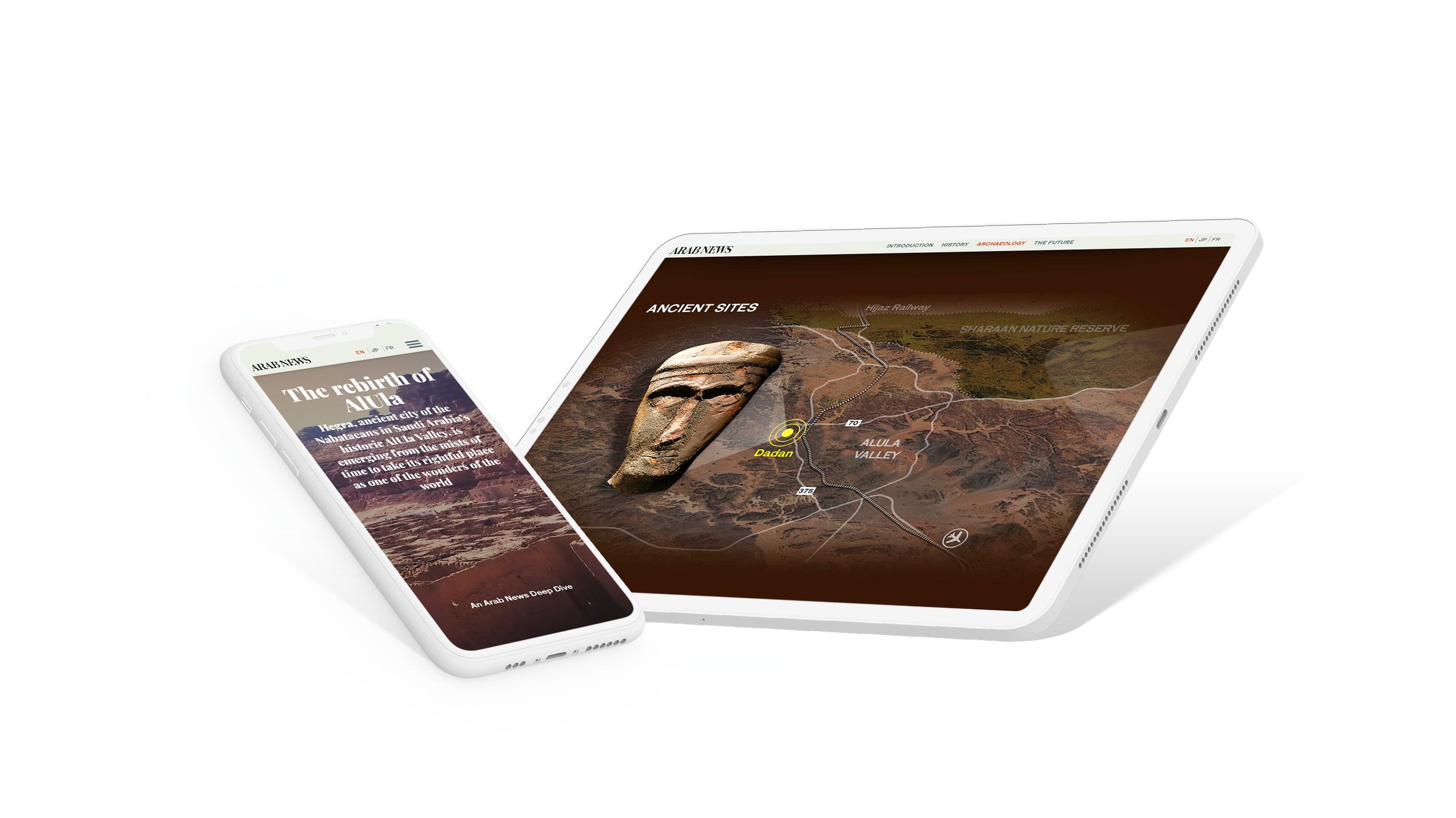
Arab News
More than 2,000 years ago, the Nabataeans built the city of Hebra in the AlUla Valley in modern day Saudi Arabia. For the last ten years, archeologists have been rediscovering the lost city — including astonishing tombs carved into the rock.
In The rebirth of AlUla, the team at Arab News celebrates the plans to reopen the area to the public as a tourism destination. Throughout the story, the team use maps to show the historical significance of the AlUla Valley, and showcase the treasures that have been discovered in the area.


What about web maps?
Scroll-based animations are a great solution for many digital stories. But if you do have developer resource at hand, web maps — used well — can still be a powerful option.
While it’s still relatively uncommon to see rich web maps in digital stories, the rise of open source tools like Leaflet and R have made web maps more accessible to marketing, communications, and media teams. As I mentioned above, even web maps built with free open source tools require non-free bespoke development, which means it’s not an option that scales.
That said, a well-executed web map is hard to ignore.
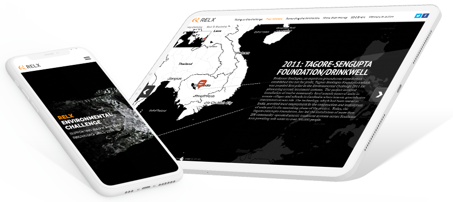
Take RELX, a company with over 33,000 employees around the world. To its credit, RELX has spent years investing money in impactful environmental projects. In Environmental challenge, it used an open source project called StoryMaps to embed a web map showing the geographic scope of its environmental donations around the world.
The map works as a ‘story within a story’, encouraging the reader to stop and click through the various locations.


Which option is best? Digital storytelling platforms like Shorthand support both scroll-based maps and embedded web maps. This means that non-developers can regularly implement great looking interactive maps, while also producing web maps — when developers are available — for special features.