7 examples of stellar digital magazines

Looking for the best digital magazine examples to inspire your next project? Whether you're a content creator, marketer, or publisher, these stunning online magazines show just how engaging and interactive digital storytelling can be.
by Corinna Keefe
by Corinna Keefe
Picture this: it's a sunny morning and your coffee is hot. You're sitting in your favourite chair. Hours of fresh time stretch out in front of you. You open a magazine and start to read.
This is the best way to read magazines. They’re not just news sources or a vehicle for advertising: they’re an enjoyable experience. They’re meant to be savoured.
And from a marketer’s point of view, they’re a great way to hold your audience’s attention. A good magazine will make people think, smile, frown, learn and take action by the time they’ve finished turning its pages.
So far, so idyllic. But does the magic of magazines translate to the digital world?
In this post, I’ll argue that digital magazines can be amazing experiences too. I'll cover:
Start creating with Shorthand
It's the fastest way to publish beautifully engaging digital magazines, reports, internal comms, and more.
1. The sports mag

A team’s official magazine has always been a must-have for diehard fans. Going digital with it only increases ease and spread of distribution.
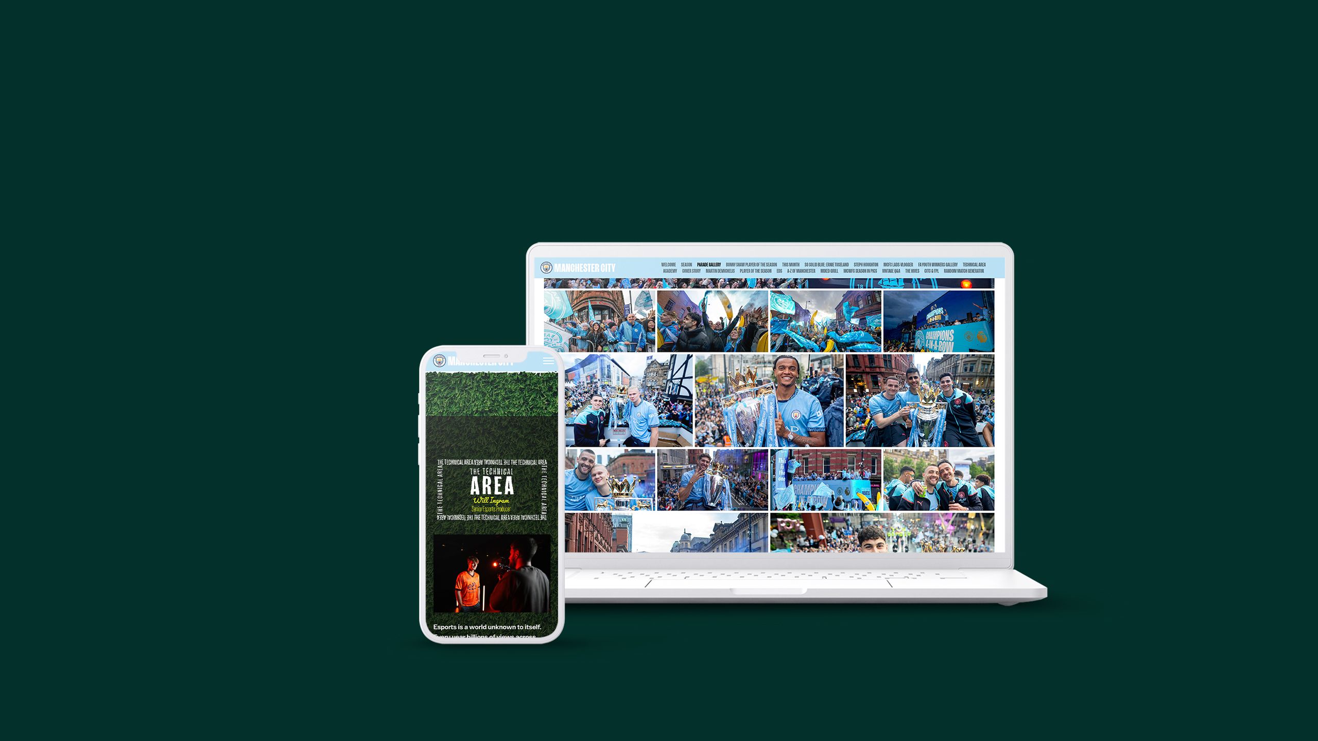
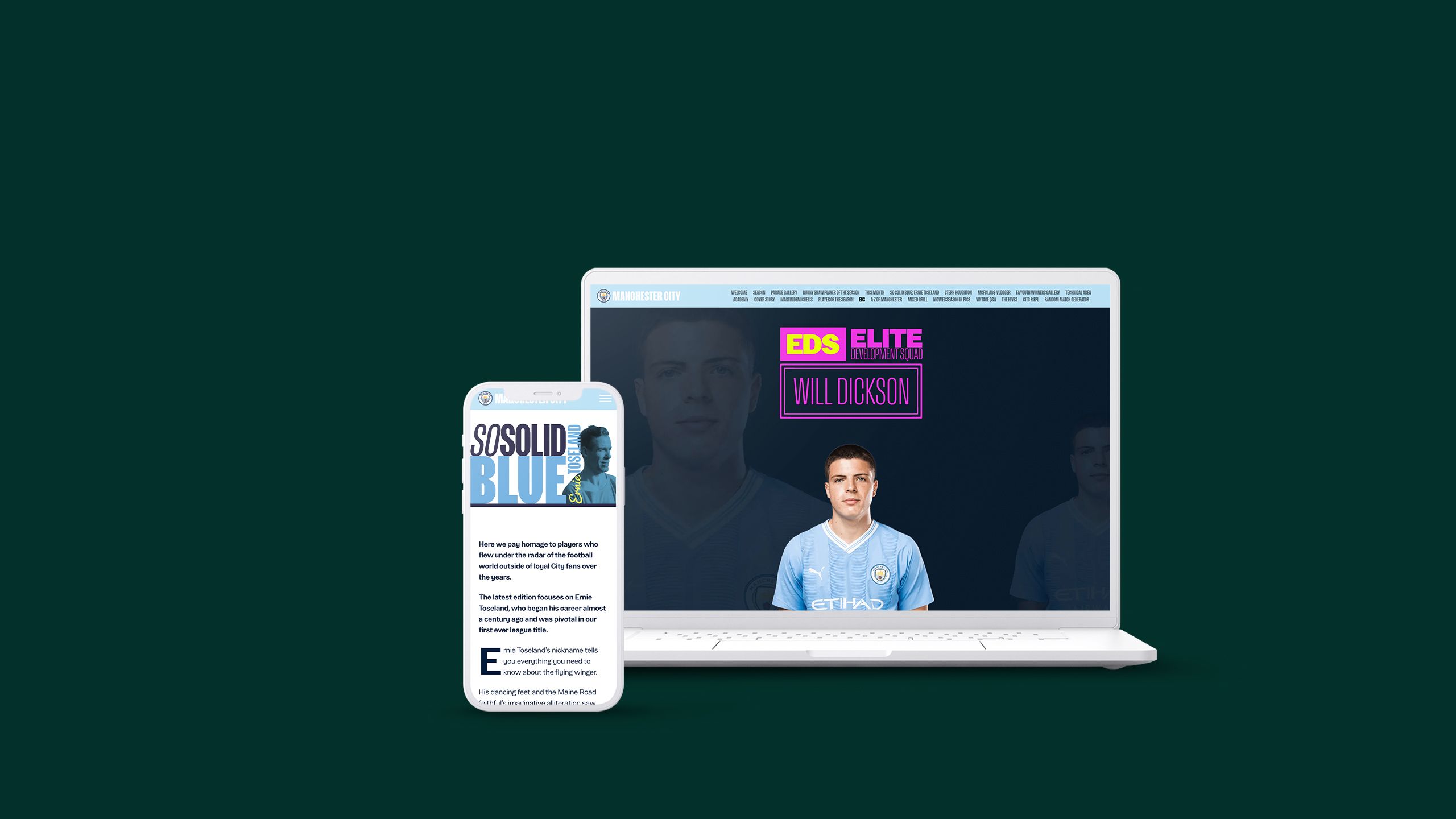
Manchester City’s magazine is a masterclass in using Shorthand to house a brand’s colours, logos, and assets. This June 2024 issue, released straight after the club’ League triumph, is a standout, with a Media Gallery section following the team through the streets on its celebration parade.
2. Article hubs

Publishers won’t always want to load an entire magazine’s worth of copy and media onto one page. Issues shared as content hubs, linking out to separate articles, are a fantastic way to keep the reading experience tailored to the individual, who can pick and choose what they want to read, without having to scroll through the rest.
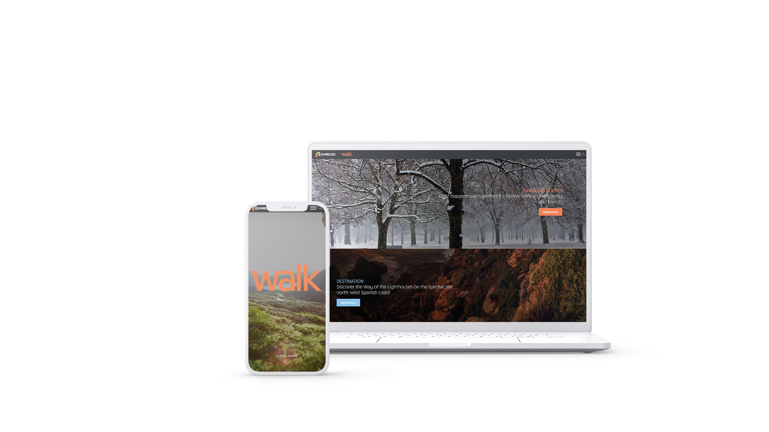
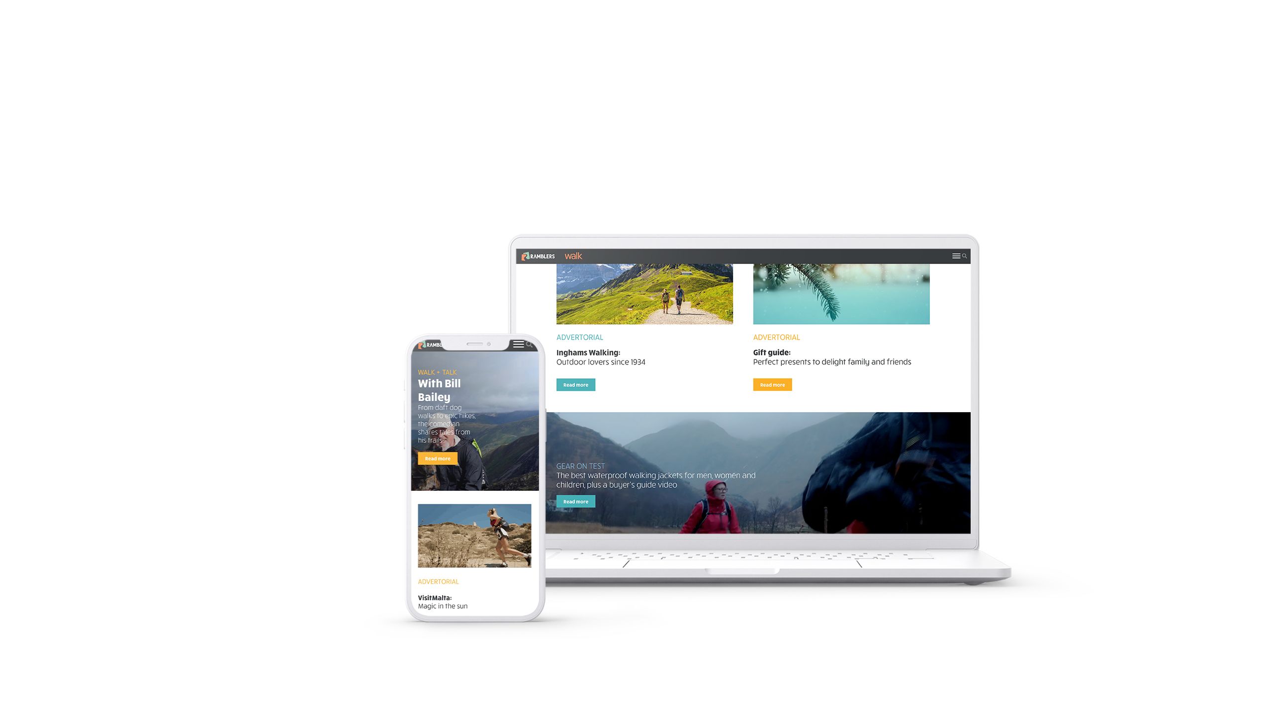
Walk, by Ramblers, a UK walking charity, features a welcome note from the editor, followed by a contents section, with each article option treated with enticing imagery — or even video — and a button to read more.
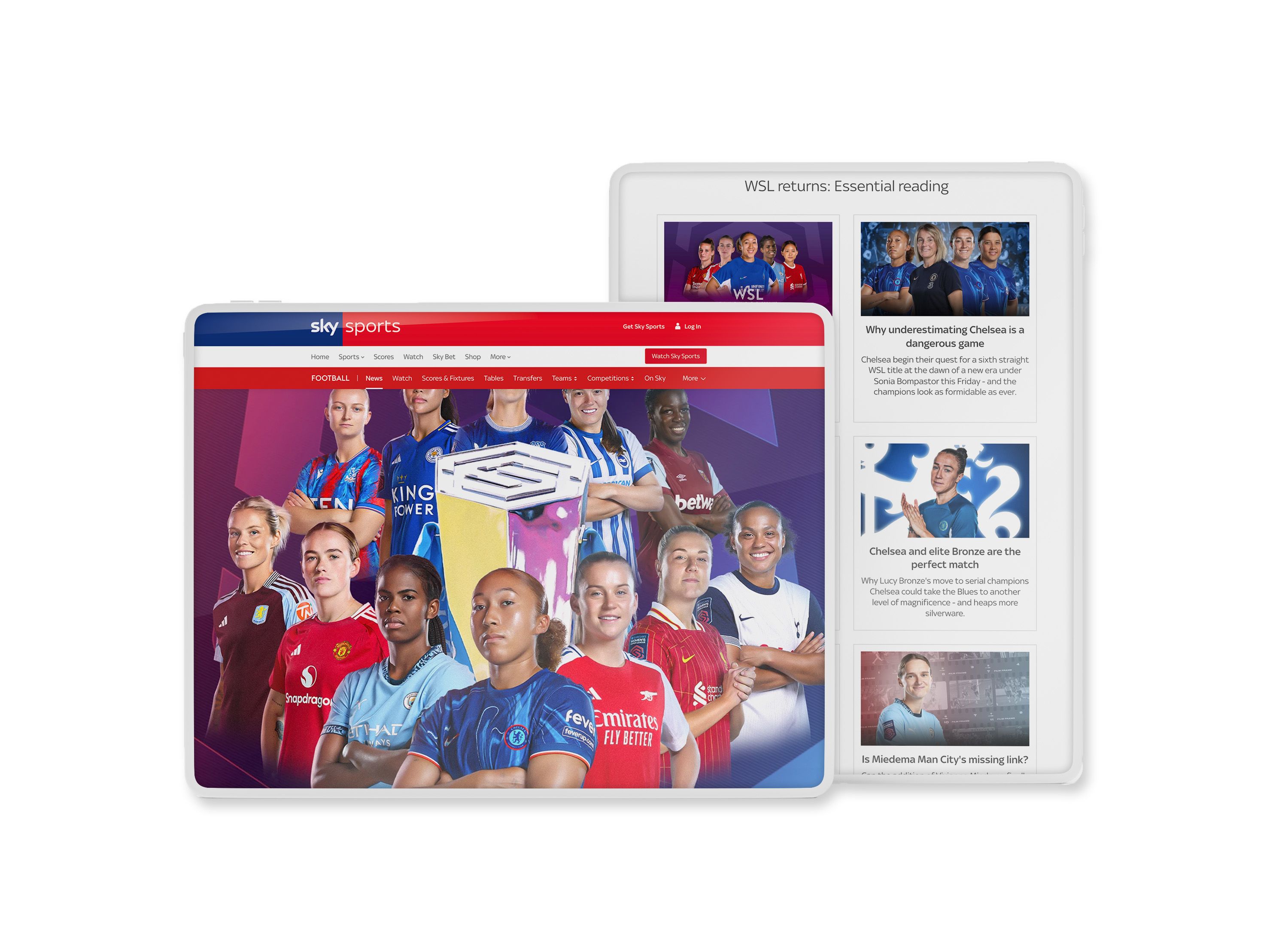
While not an intentional digital mag per se, this WSL essential reading log from Sky Sports is another fine example of how related content can be compiled into the hub format.
3. The university magazine

Campus magazines are a time-honoured method for keeping student and faculty communities connected and informed.
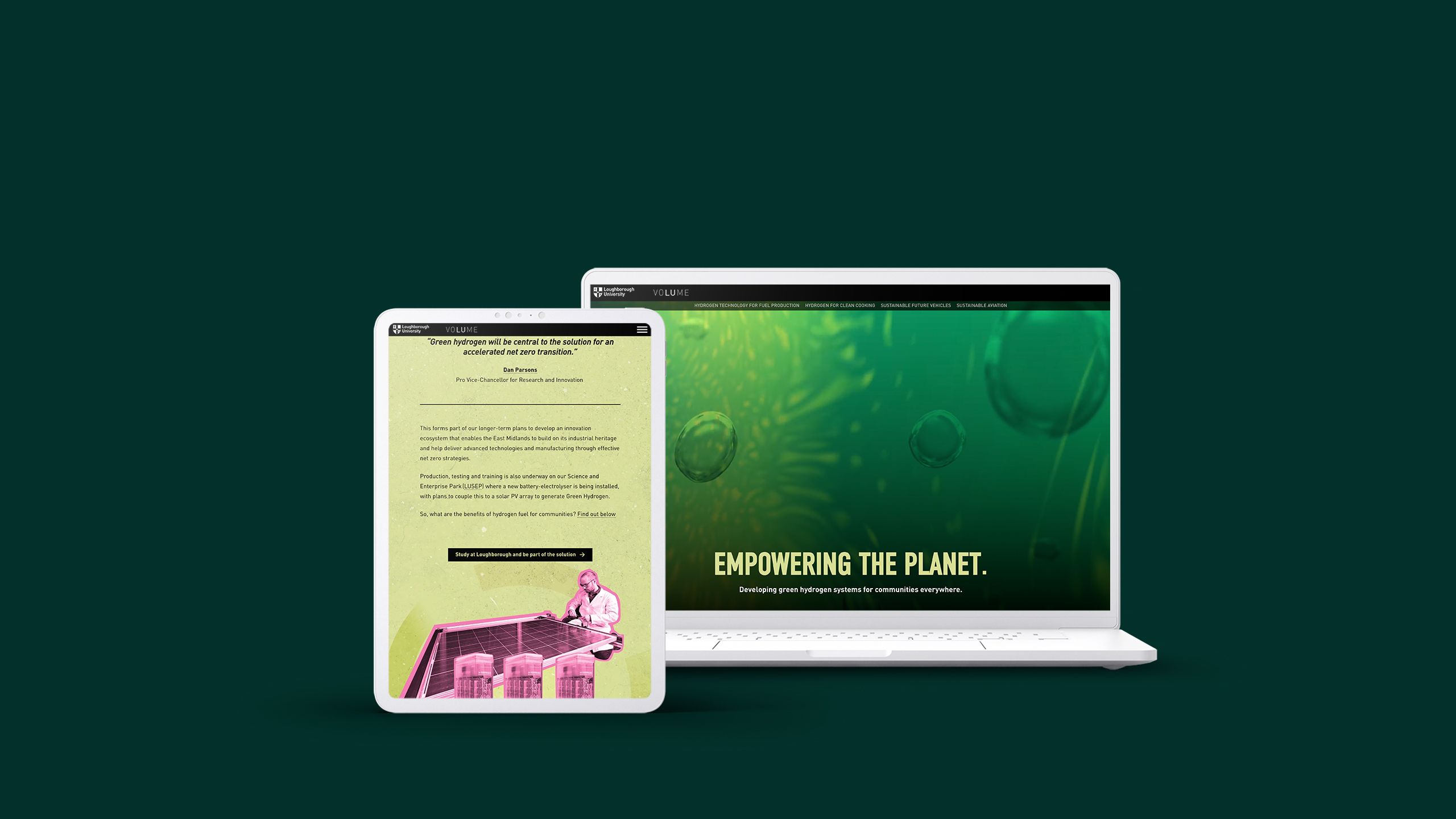
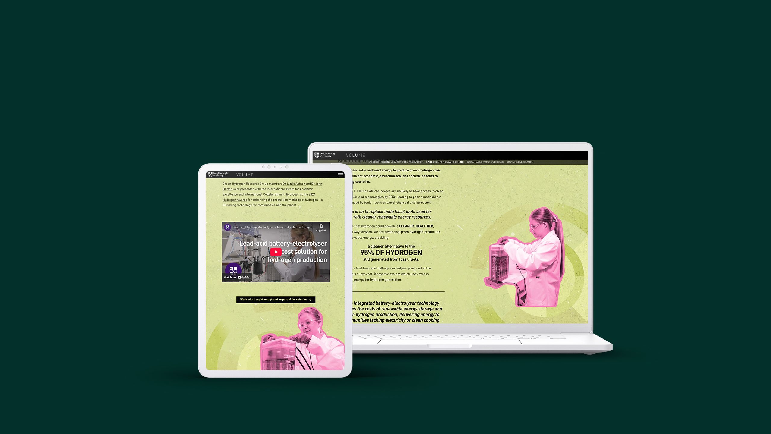
Issues of Volume, Loughborough University’s magazine, act as content hubs linking out to a selection of well-designed stories on a number of updates and explorations like ‘Empowering the planet’, which reports on the University’s program to drive hydrogen technology skills and innovation.
4. The travel magazine

Another classic that’s been around for as long as magazine publishing, the travel magazine is popular among readers and advertisers alike.
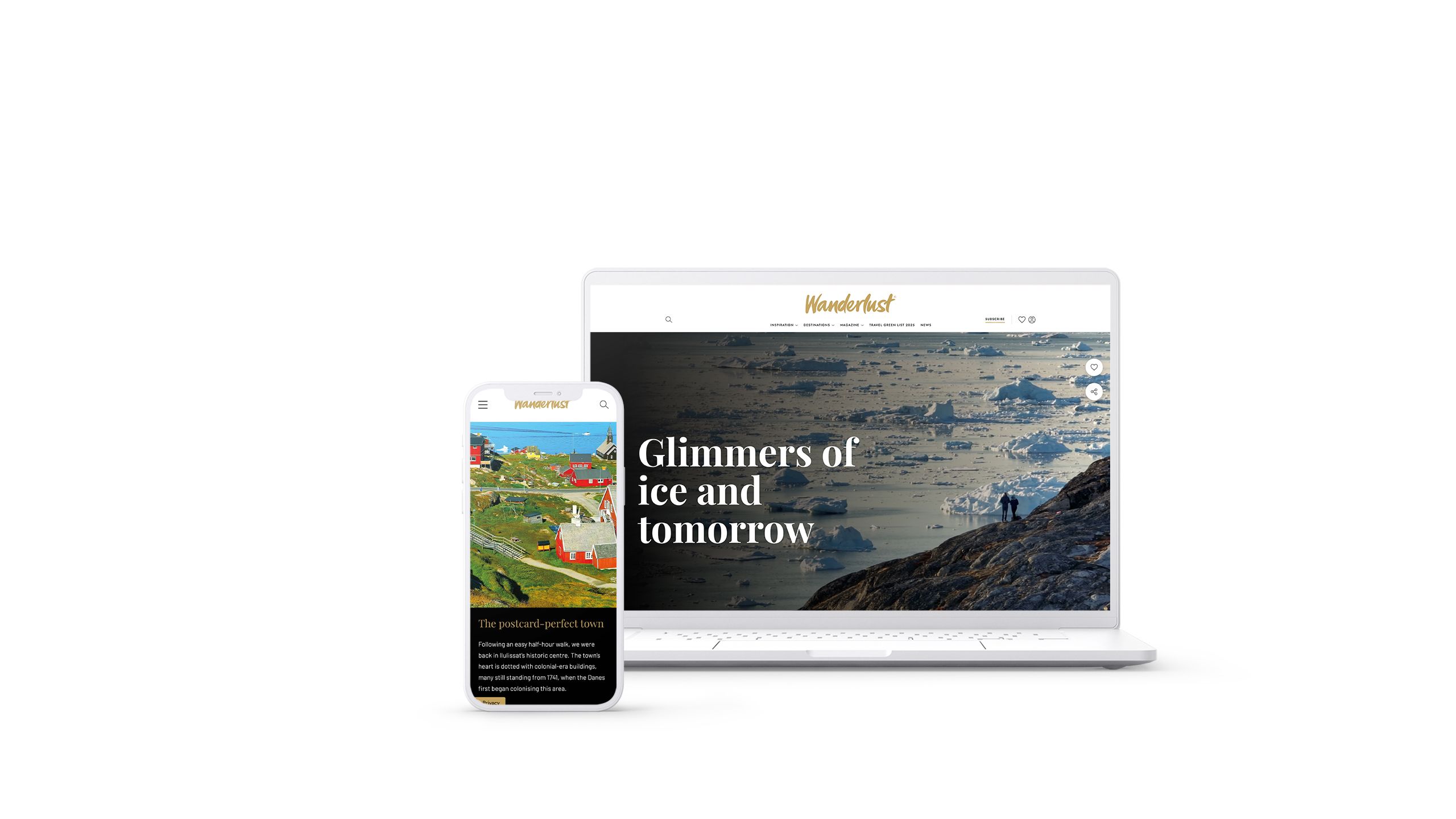
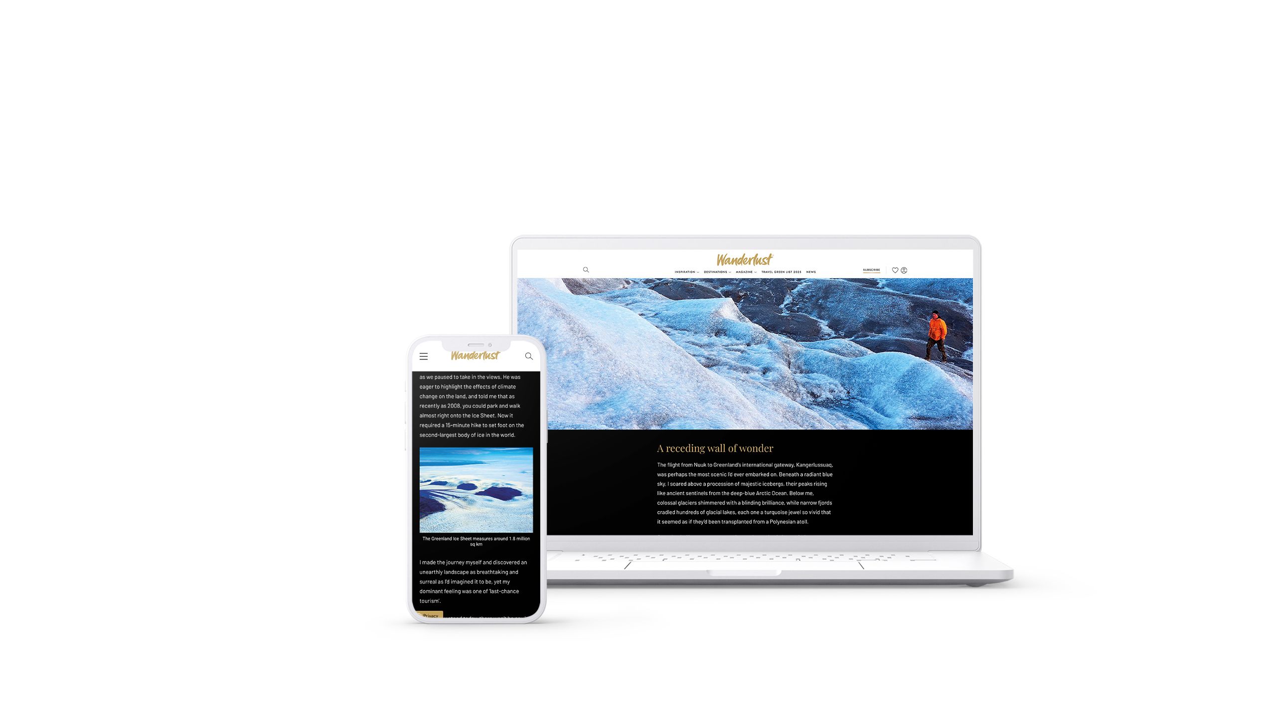
‘Glimmers of ice and tomorrow’, an article in Wanderlust travel magazine, includes the tried and trusted travel article appearances of enticing photography of beautiful landscapes and towns, but does not shy away from the reality of climate change and the effects of tourism on this Greenland community.
5. Sponsored content

The interactive media and immersive experience on offer from digital publishing are attractive selling points for brands hoping to entice and engage a media publication’s audience.
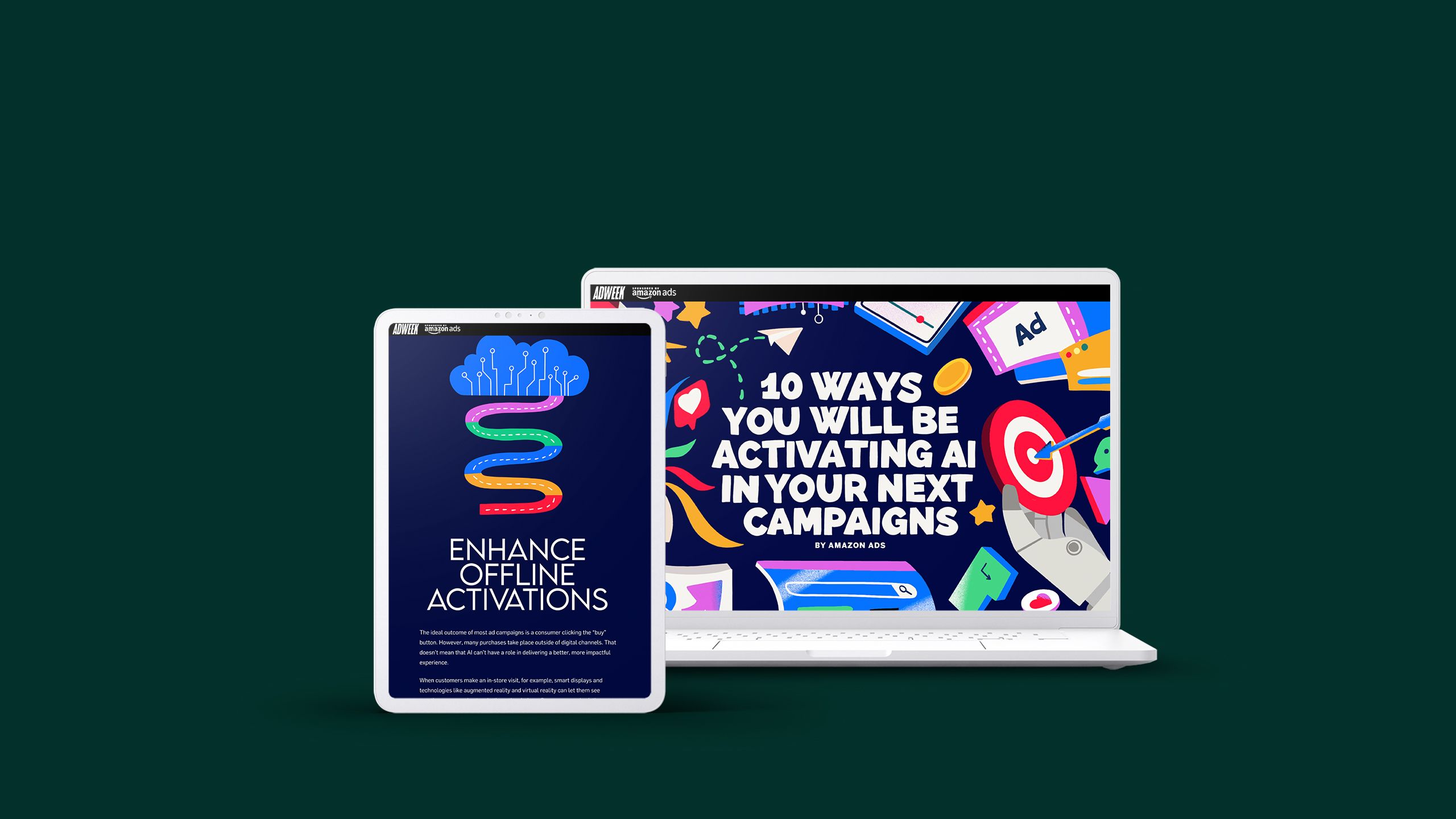
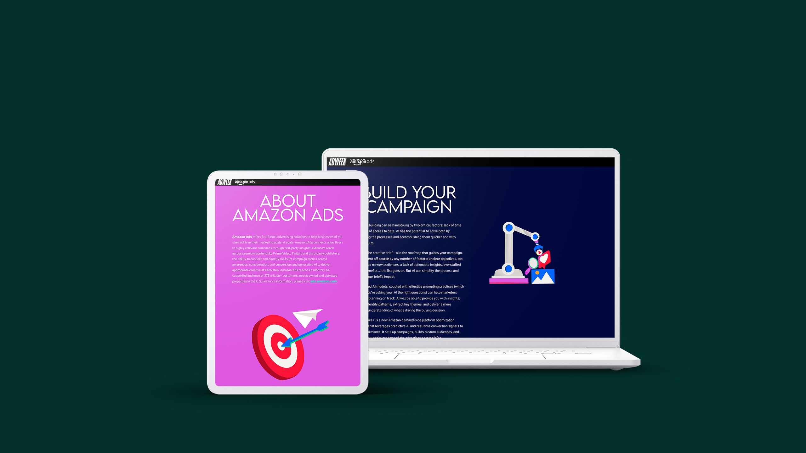
Amazon’s ‘10 ways you will be activating AI in your next campaigns’ sponsored piece goes big with bright colours, animations and illustrations.
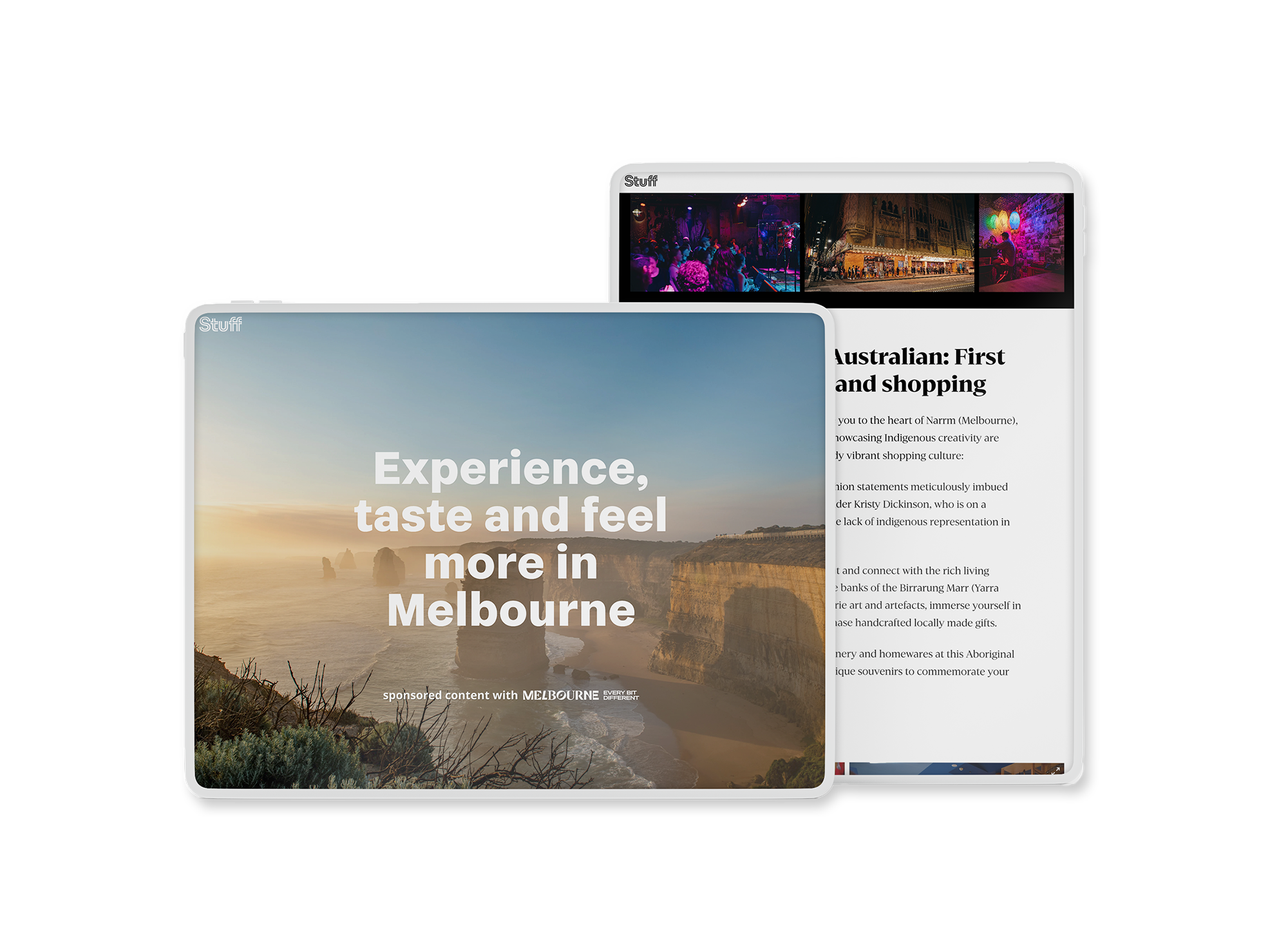
‘Experience, taste and feel more in Melbourne’ on the other hand, lets the photography do the talking, opting for a more simple copy and media style, in a travel promo article style.
6. The alumni magazine

Universities go to great lengths to maintain the connections fostered with alumni, long after graduation day. Magazines are a fantastic way to celebrate school history with some nostalgic lookbacks, while at the same time showcasing what graduates are up to out in the world.
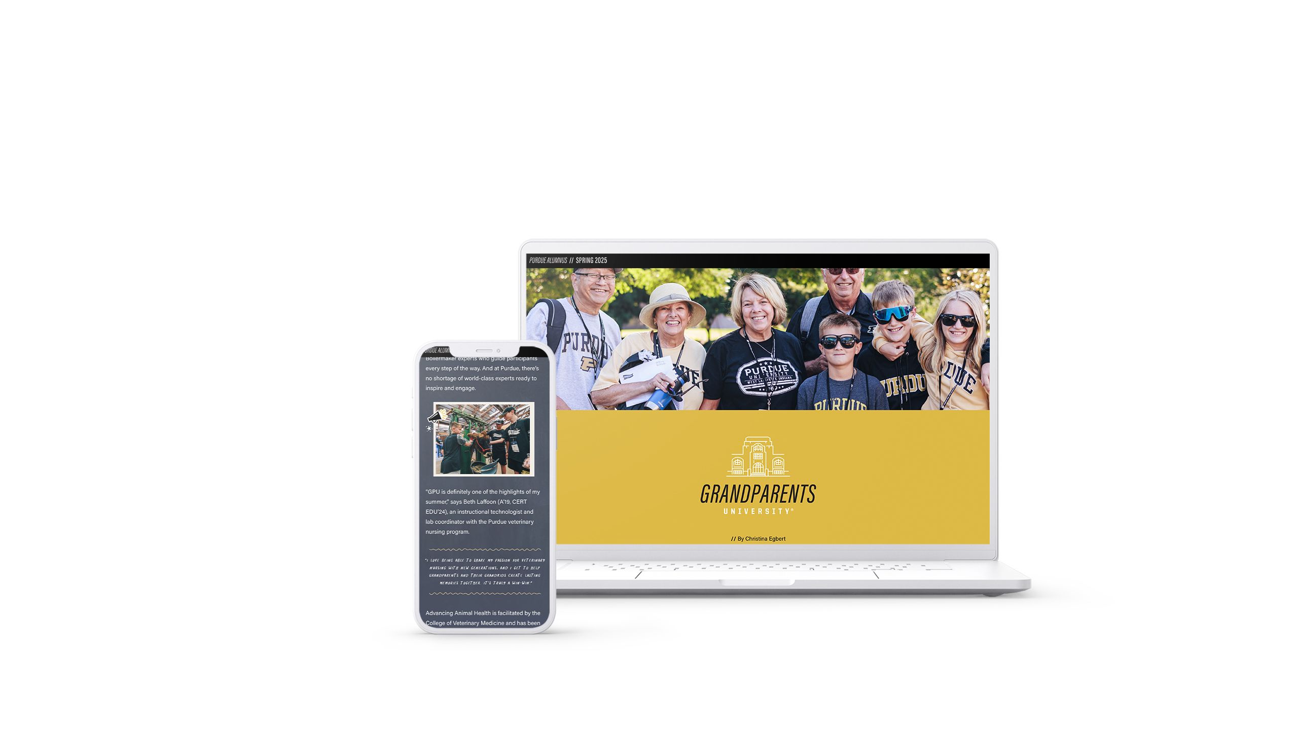
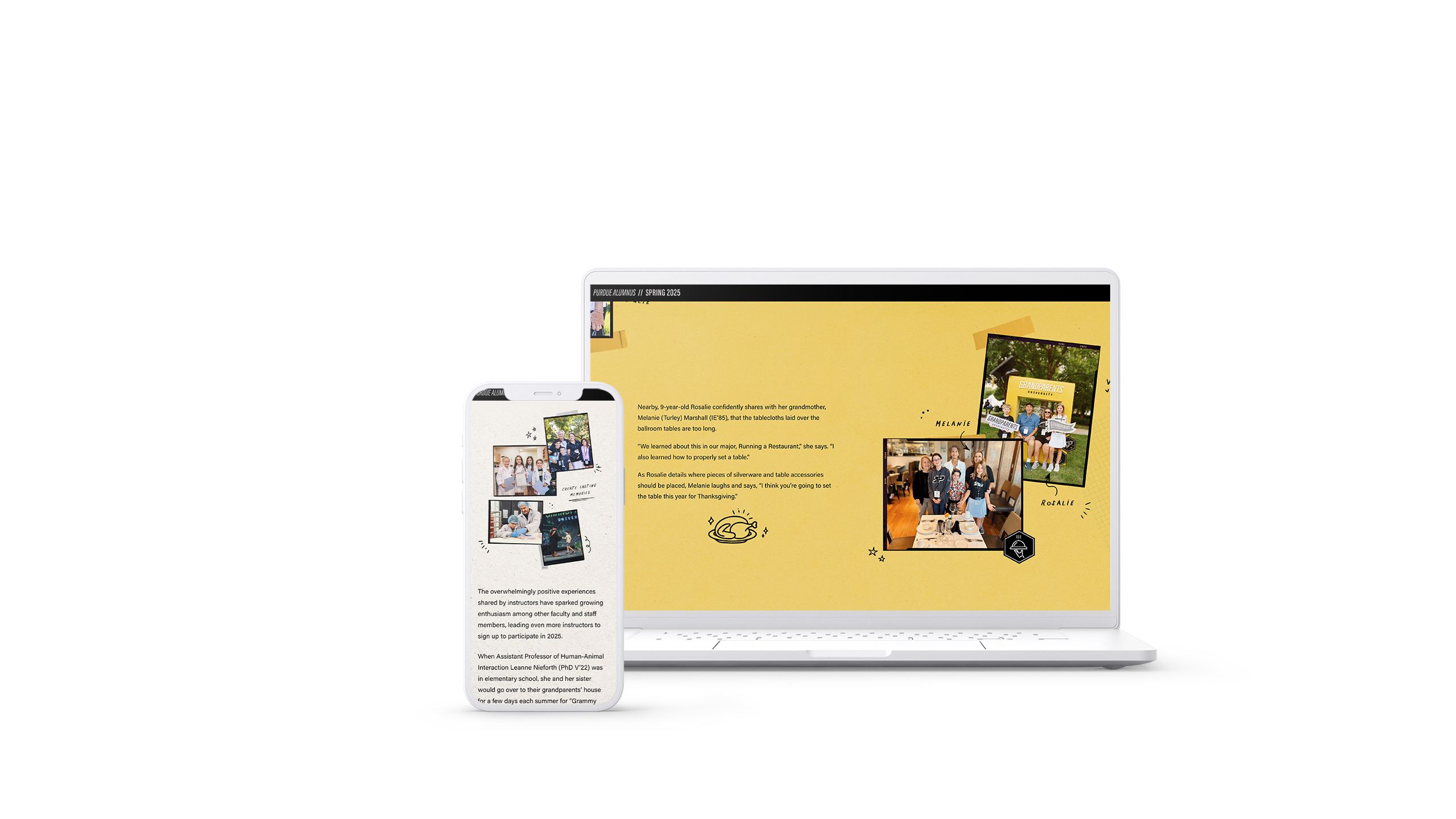
Purdue Alumnus magazine is published in the hub style, linking away to fantastic, well-designed in-depth articles like ‘Grandparents University’, the story of Purdue’s two-day program for grandparents and grandchildren.
7. The professional association newsletter

A magazine or newsletter is an important part of keeping any professional community engaged and informed about what’s going on in the network, and new training, technology, research, and skills.
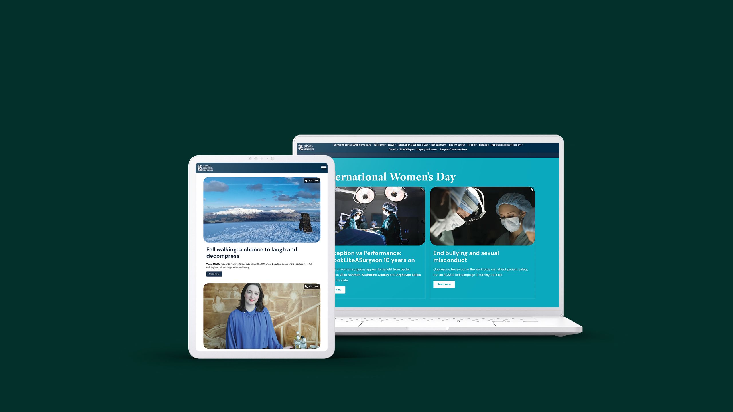
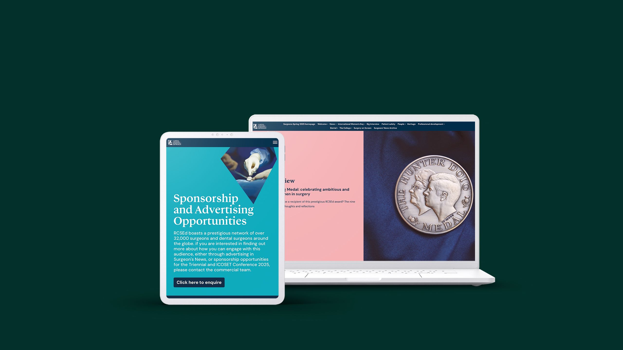
Surgeon’s News, by The Royal College of Surgeons of Edinburgh links out to news briefings, noticeboards, and a number of explorations of global issues relating to the surgeon community. This Spring 2025 issue, for example, largely revolves around International Women’s Day.
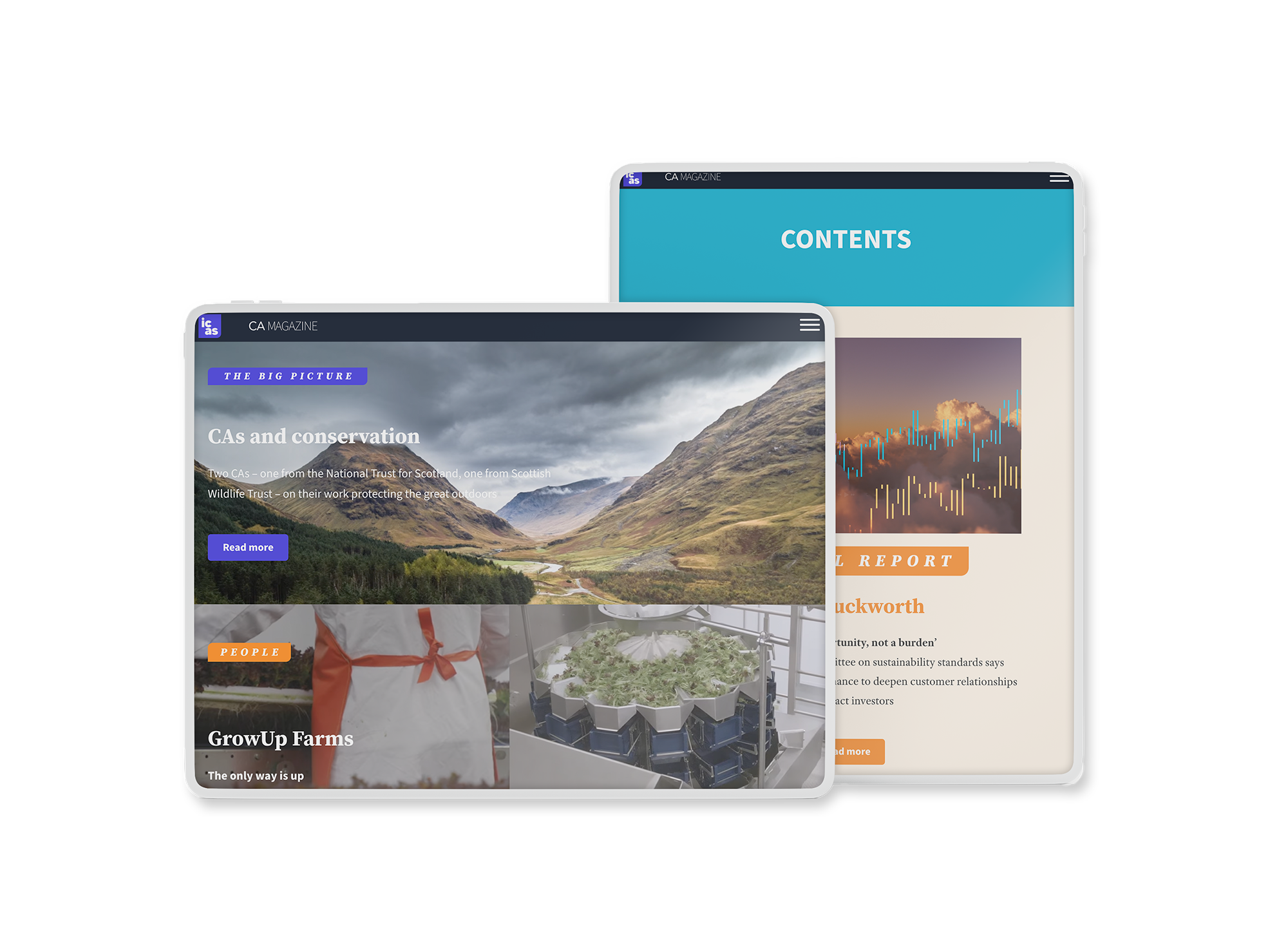
ICAS has transformed its CA Magazine into a standout example of effective digital publishing for business professionals. Another publication that adopts the hub or scroll style, it allows the reader, with minimal interaction, to absorb the key insights from each edition through the summary previews, visuals and clear headings.
The dismal history of digital magazines

Digital magazines make a lot of sense for content marketers. They can achieve a much wider distribution than print, without the expense of printing and postage. With the right format, they can include more media than ever before, from sound files to videos and scroll-based animation.
But let’s be honest: digital magazines haven’t always provided a great user experience. In fact, they've usually just been digital editions of print publications. The most popular formats for online magazines have historically been PDF magazines, flipbooks and slideshows. In other words, some of the most inconvenient and SEO-unfriendly formats known to humankind.
There are other formats — including those available in Apple's App Store for reading on an iPhone or iPad — which can perform well for mainstream digital publications. But most marketing and communications teams aren't specialist magazine publishers. They're usually producing content for niche audiences, and are unlikely to have the business model to support a bespoke iPad magazine.
Magazines are fun to read because they combine detailed writing and reportage with gorgeous images, visual storytelling and design. You can read a magazine from cover to cover, or flip through the pages to read the features that interest you most.
That’s harder to achieve with a PDF or a slideshow. I’ve lost hours of my life to pinching-and-zooming on PDF files and clicking through endless slides weighed down with ads. And – the killer blow – it’s hard to read these formats on a mobile phone. Magazines are a leisure activity; no one wants to be stuck reading them on a desktop computer.
If you're interested in learning more about how these digital magazine examples are made, check out our guide to choosing a digital magazine platform.
The bright future of digital magazines

So what are the alternatives? Some digital publishers have experimented with building their own magazine apps. A purpose-built app gives you more control over the design, plus lots of audience data (although that changed in 2021).
On the other hand, a magazine app takes a lot of developer time and money to build. For many marketing teams — especially in the non-profit, government or education sectors — that’s just not feasible.
What content teams needed was a new format that combined digital ease of access with high-quality content, readability and design.
Enter the new generation of digital storytelling platforms: a flexible way of creating digital magazines utilising the best features of the modern web, including interactivity, html5, and templates for simple creation at scale.
And the ultimate proof that digital magazines work? We’re finally seeing content marketing move beyond just reproducing print magazines on screen. Instead, they’re starting to innovate with social media, new ways of telling stories, and bold designs.
Digital magazine publishing is becoming a core part of the marketing strategy for leading content teams.
Start creating with Shorthand
It's the fastest way to publish beautifully engaging digital magazines, reports, internal comms, and more.


