Accessible visual
storytelling in Shorthand stories


The strength of the Shorthand platform is the ease with which it allows the storyteller to masterfully weave together text and media to fashion engaging narratives.
In The Craft, we have written extensively about the art of visual storytelling: how to leverage photographs, maps, infographics, and videos to bring stories to life.
The visual nature of Shorthand stories makes them deeply compelling, but at the same time erects barriers to access — particularly for the blind and people with low vision. To help lower the barriers, we've implemented new features that we hope will make Shorthand stories more accessible to everyone. Many of our storytellers have told us that producing accessible and inclusive content is a priority for them. Likewise, our own Shorthand team is committed to increasing our adherence to the web accessibility principles set out by the W3C Web Accessibility Initiative (WAI).
In line with the WAI's most recent Web Content Accessibility Guidelines, Shorthand now offers greater control over the metadata used to describe visual information in Shorthand stories to users of screen reading software. In this article, we give an overview of our media controls and discuss inclusive web design considerations that are common to Shorthand stories.
Producing accessible stories requires not only that the Shorthand tool deliver a clear, easy-to-navigate story structure and correct markup, with consistent descriptions of visual material — but also that you, the storyteller, make thoughtful choices in the textual narrative, layout, media assets, colour schemes and other custom design elements. We outline some general principles to guide these choices, offer pointers to further resources on inclusive design, and demonstrate how thoughtful design and media choices can enhance the accessibility and enjoyment of visual feature pieces.
Learn more about accessibility in our sister piece to this guide, The art of accessibility. While you're at it, check out our deep-dive guide to using alt text.
Defining accessibility


Accessibility is often framed in terms of supporting or overcoming disability, but in reality all of us differ in the ways we use and interact with the web, and accessibility is simply about supporting the rich diversity of people and technologies now connected to the internet.
Because the web is such a visual medium, accessibility endeavours often focus first on supporting the vision impaired. However, writing accessible stories also means catering for other natural variances between humans, including differences in hearing acuity, dexterity, literacy and cognitive ability. Supporting diverse ability has beneficial flow-on effects in making content more accessible to groups like the very young, the very old and foreign language speakers.
When thinking about how our writing and visual storytelling will be received by our audience, it is natural to imagine readerships that by-and-large resemble ourselves. To provide a broader perspective, the WAI helpfully provides resources to assist with designing for inclusion, including sample stories of web users, and a characterisation of the diverse abilities that should be expected amongst people using the web.
The World Health Organisation estimates that 15% of people globally live with some form of disability, and the prevalence rate is much higher when considering only adults. In total, Shorthand stories are read by millions of people each month. Applying conservative estimates, this places the size of the global Shorthand audience with some form of sensory, motor or cognitive impairment in the hundreds of thousands. By working in partnership with our amazing storytellers, we can better serve everybody who comes into contact with your Shorthand stories.
Image controls and tips for alt text


Our redesigned Shorthand editor offers greater control over images and the way they are presented to readers. In the editor's redesigned media controls, you will notice the addition of an alt text (alternative text) field, which can be set with a descriptor made available to users of screen readers and anyone viewing a text-only version of your story.
The alternative text should differ from the media caption, bearing in mind that screen reading software may read (or render in braille) the two image annotations in sequence. Whereas the caption may simply provide attribution or context, or may be omitted altogether, the alternative text field should reflect the content and purpose of the image for anybody who is unable to see it. Some experts suggest that you should not provide both a caption and alt text, however this applies only when the caption is descriptive and can stand alone.
When writing alternative text:
- be succinct. In most cases, the alternative text can be a few words, and it should almost never be longer than a sentence or two. It is not necessary to begin with phrases such as "image of..." or "photograph of..."
- for a sequence of related images, consider just labeling one image with alt text to avoid repetition. Describe the purpose of the overall sequence.
- consider the function of the image, not just the content. If the image conveys purpose (e.g., of a clickable element), and there is no other descriptive text, the alternative text must communicate this purpose clearly.
- take into account the surrounding text. If the text is sufficiently detailed, the alternative text can be brief. There should be little or no redundancy.
WebAIM provides a comprehensive guide to writing alternative text, covering context, function and advanced examples such as maps and background images. Another useful resource is the WAI's tutorial on image accessibility, which includes a handy alt decision tree outlining heuristics for annotating different image types.
To better understand how your alternative text descriptions are experienced by those who rely on them, consider perusing a text-only version of your story before you publish it, or trying out screen-reading software for yourself. Text-only browsing is supported innately by some browsers, and with others is possible with browser extensions. On Apple devices, you can try out screen reading simply by enabling VoiceOver in the Accessibility or Universal Access System Preferences. VoiceOver can be challenging for a beginner to navigate, so we recommend taking Apple's interactive tutorial before jumping in. On Windows computers, try JAWS or NVDA.

Shorthand version 2.0 provides an additional field for alternative text.
Shorthand version 2.0 provides an additional field for alternative text.
Shorthand version 2.0 provides an additional field for alternative text.
Shorthand version 2.0 provides an additional field for alternative text.
Shorthand version 2.0 provides an additional field for alternative text.
Shorthand version 2.0 provides an additional field for alternative text.
Guidelines for alt text in media sections


Not all media assets in Shorthand stories are equal — and not all require alt text. We provide a brief rundown, by section type, on how to tag your media so that core content is accessible to your audience and decorative content causes minimal distraction.
Title section
If Title section images or videos are purely decorative, and not an integral part of the storytelling, the alternative text can be omitted. Don't retype any of the title text into the alternative text field, because this will result in the text being read or rendered twice by screen reading software.
Text Over Media sections
As with Title section media, consider whether the images and video in Text Over Media sections contribute to the overall narrative. In some Shorthand stories, such as this one, Text Over Media sections are used as dividers or section headers. In this case, the images are essentially decorative, and the alt text can be omitted.
Reveal, Background Scrollmation and Two Column Scrollmation sections
These section types are some of the most challenging for visual accessibility. When Reveal or Scrollmation sections are used to present sequences, such as slideshows of photographs showing a trend over time, or a series of overlaid maps showing a progressing journey, you need to think carefully about how to best to convey the crux of the visual story without tedious repetition.
If you have a sequence of two or three related images, you may want to tag or caption each one. However, when there are more images, it is likely a better choice to present a single textual description. If it's brief, it can be placed within one of the alt tags; however, if the description needs to be longer, such as to describe a complex progression captured in a series of charts or maps, the description may be placed within the caption or the main body of text. The WAI's recommendations on groups of images apply.
Media sections
Media sections contain still images, native video or YouTube video. Alt text can only be set for images. Time-based media, which includes video, is more challenging from an accessibility standpoint, and we cover this next.
Accessible audio and video


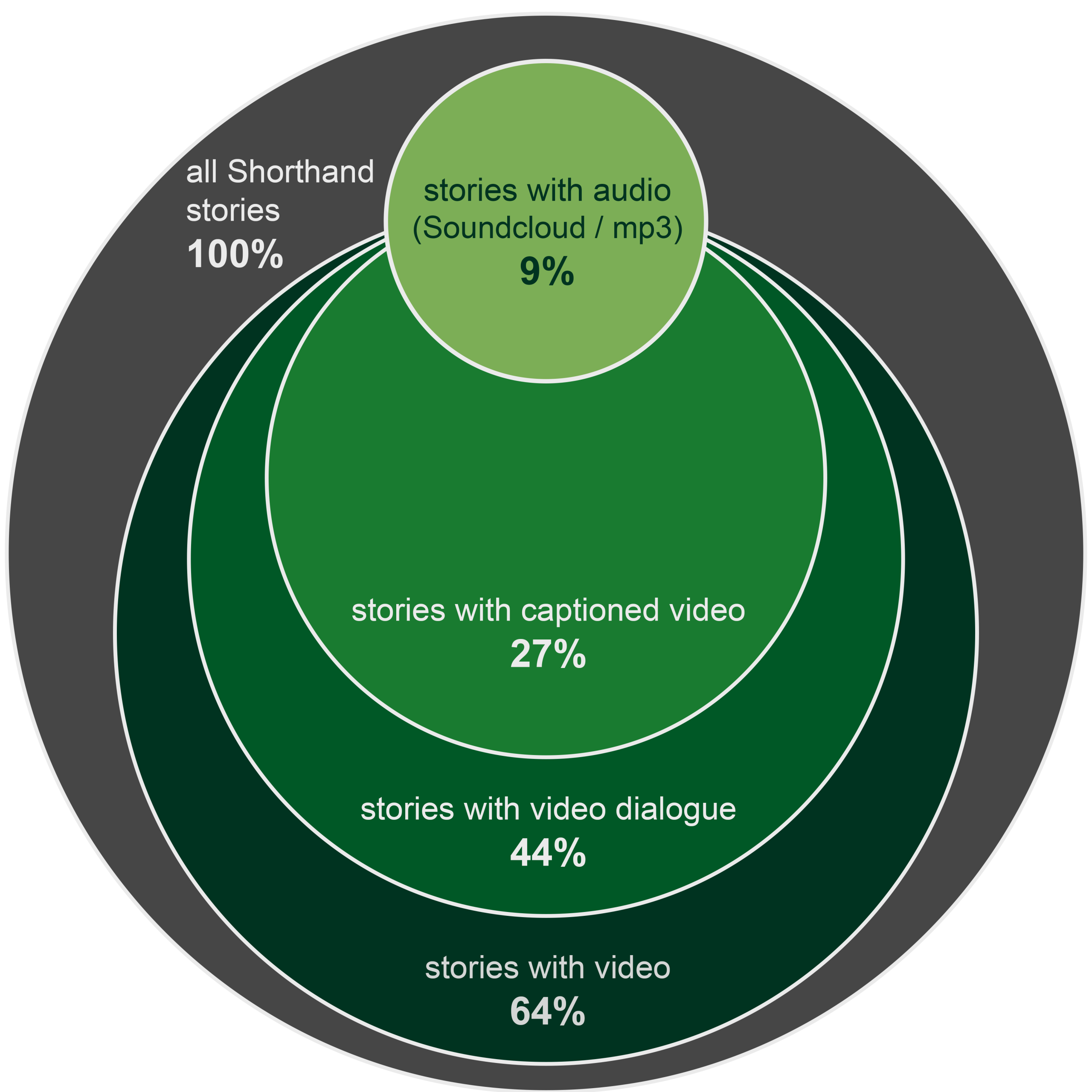
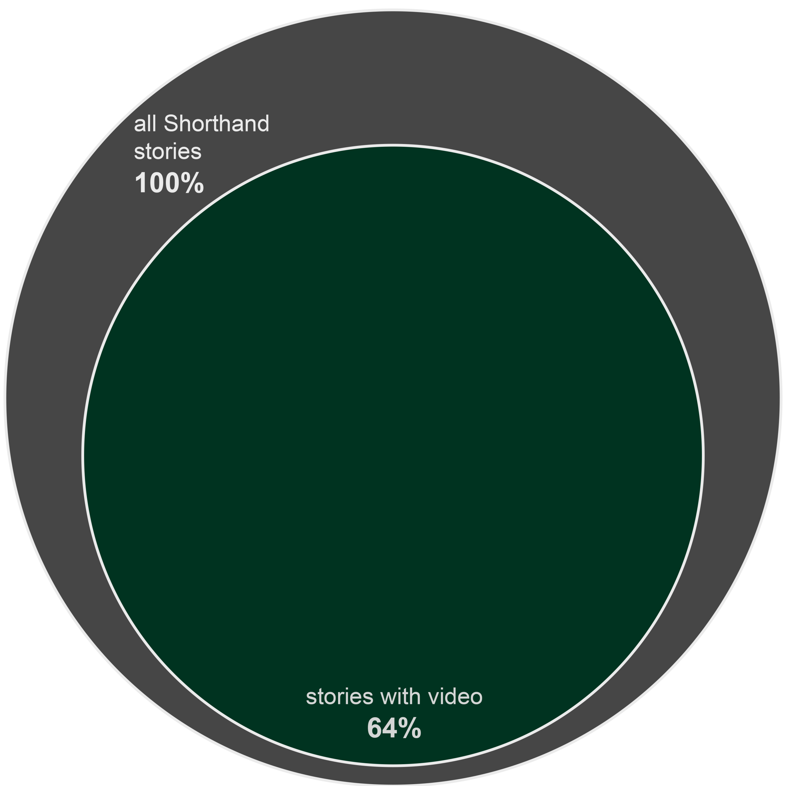
The majority of Shorthand stories contain video or audio. Our most recent review of published stories revealed that nearly two-thirds contained video of some kind, while around 9% contained audio.
Video and audio content primarily present accessibility challenges for people with auditory, visual and cognitive impairments. The Web Content Accessibility Guidelines describe a range of appropriate alternatives and additions to time-based media, including textual transcripts, captions, audio description and sign language interpretation. Though transcription and captioning services have traditionally been very expensive, the barriers to entry are being lowered through improvements in speech recognition technologies. For example, Google now provides automatic captioning of YouTube videos in numerous languages.
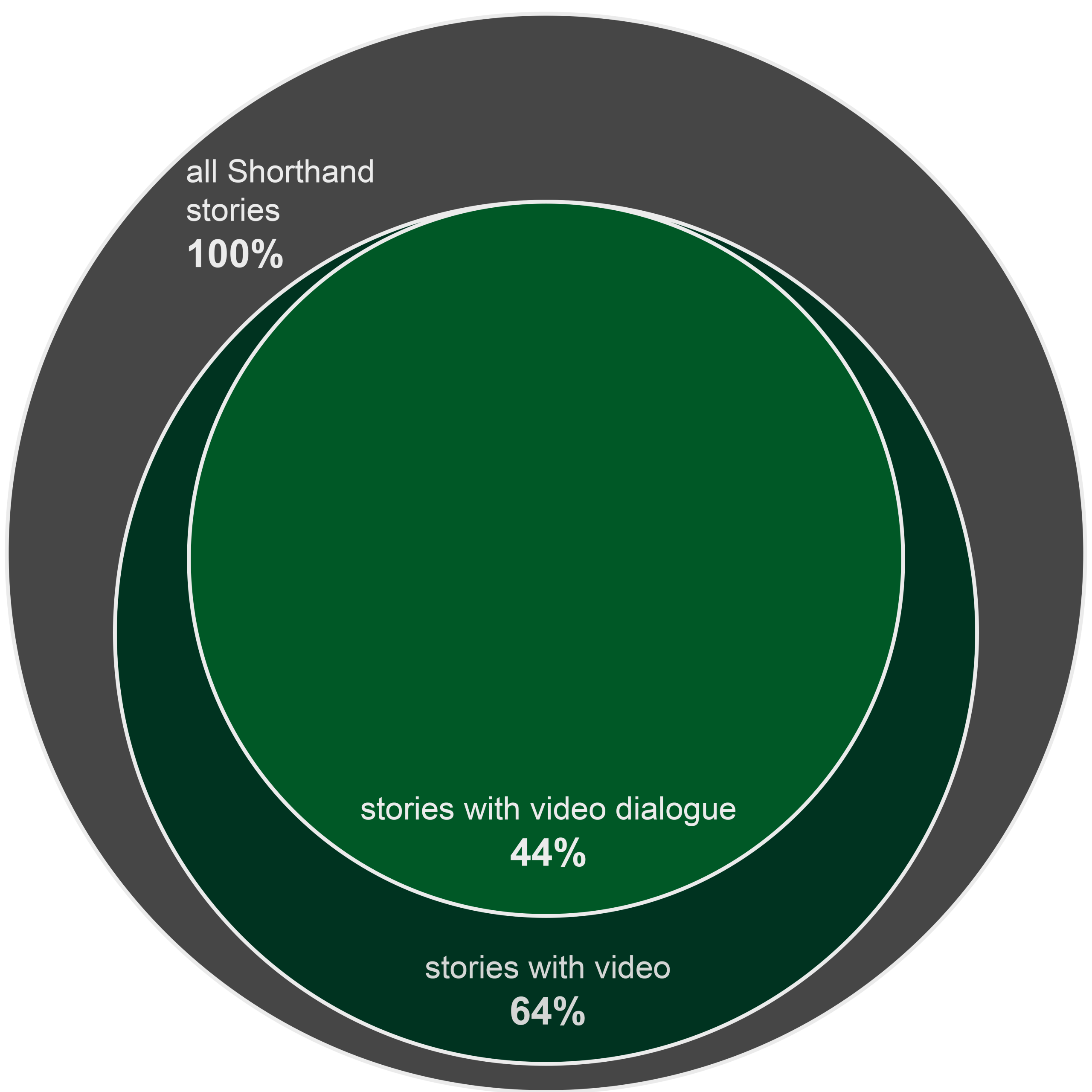
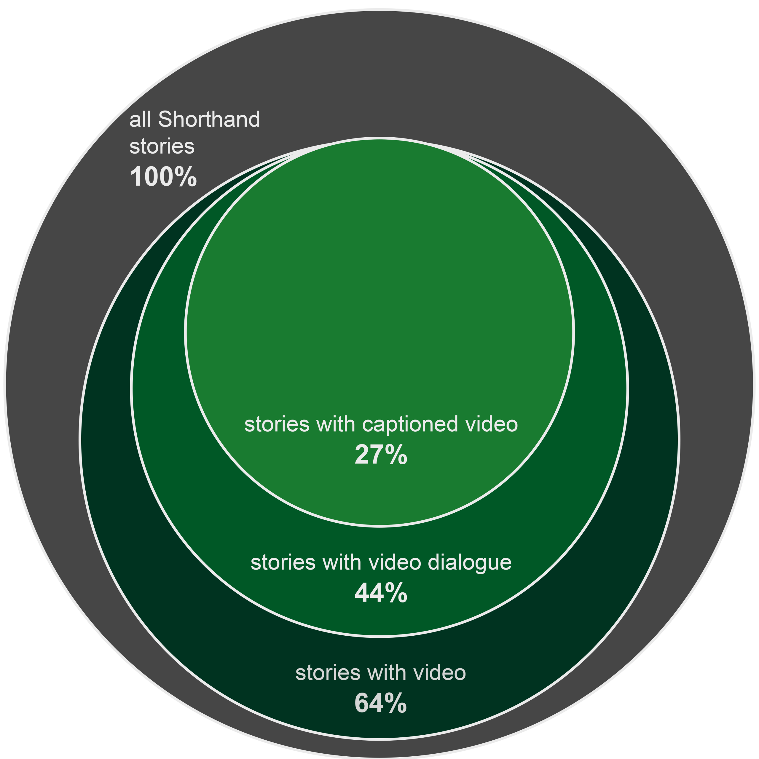
According to our review of Shorthand stories, many storytellers utilise open or closed captioning on a subset of their videos; in contrast, very few provide transcripts or audio description, and none provide sign language interpretation. Captioning is appropriate for around half of all Shorthand stories: this includes stories with videos containing speech, and most stories with audio-only assets. The actual captioning rate sits at around 27%. Though this statistic is encouraging — and increasing — the quality of captioning is variable. The majority of captions found in Shorthand stories are YouTube auto-captions containing uncorrected speech recognition errors. The accessibility of captioned media is only as good as the quality of the captions. If you choose to employ YouTube captions, be sure to carefully review the captions all the way through to the end of your video, and then follow Google's instructions for editing captions that contain transcription errors.
When using native HTML video, as well as custom media players such as JW Player, Brightcove and Able Player, you can provide captions by supplying one or more WebVTT files — timed track files containing marked-up text to be displayed alongside the media. WebVTT not only enables captioning for the deaf and hard-of-hearing, but also addition of subtitles for foreign language speakers. The WebVTT syntax is simple to use, and is described comprehensively in the W3C WebVTT candidate recommendation.
You can handcraft a WebVTT file or use software to assist with the correct markup. WebAIM provides tips on captions, transcripts and audio descriptions. At present, the Shorthand editor doesn't provide built-in support for attaching WebVTT files to videos in media sections; however, the custom HTML code to add a video element with a WebVTT track is straightforward — or get in touch with us if you'd like help with this.
The blog of web developer Ian Devlin covers a variety of WebVTT captioning examples, ranging from the conventional to the creative, including captioning of audio (mp3) with the HTML5 video tag.
As a final note on media accessibility, we would like to make brief mention of media that plays automatically. By design, Shorthand stories will not autoplay audio, unless you add custom code to switch on this feature. Audio that begins automatically is not only unpopular with readers — it also presents accessibility challenges, especially for users of screen readers, as it competes with other voice output and can be challenging for the user to switch off. If you do include audio that plays automatically, consider the WCAG success criterion on audio control in terms of the length of your sound clip and the affordances of your audio player.

Media in Shorthand stories, based on a review of published stories.
Media in Shorthand stories, based on a review of published stories.
Media in Shorthand stories, based on a review of published stories.
Media in Shorthand stories, based on a review of published stories.
Media in Shorthand stories, based on a review of published stories.
Media in Shorthand stories, based on a review of published stories.

Media in Shorthand stories, based on a review of published stories.
Media in Shorthand stories, based on a review of published stories.
Colour, structure and design


Colour and contrast
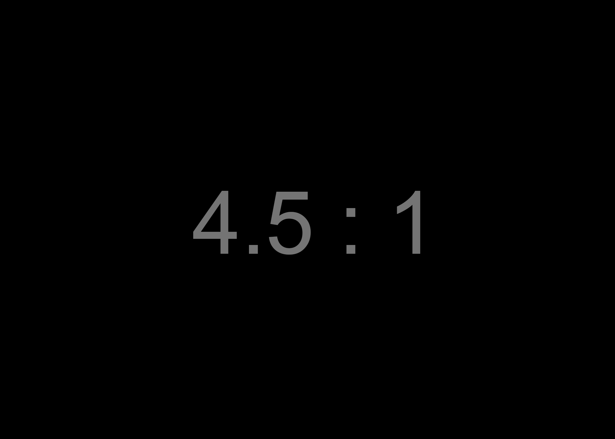
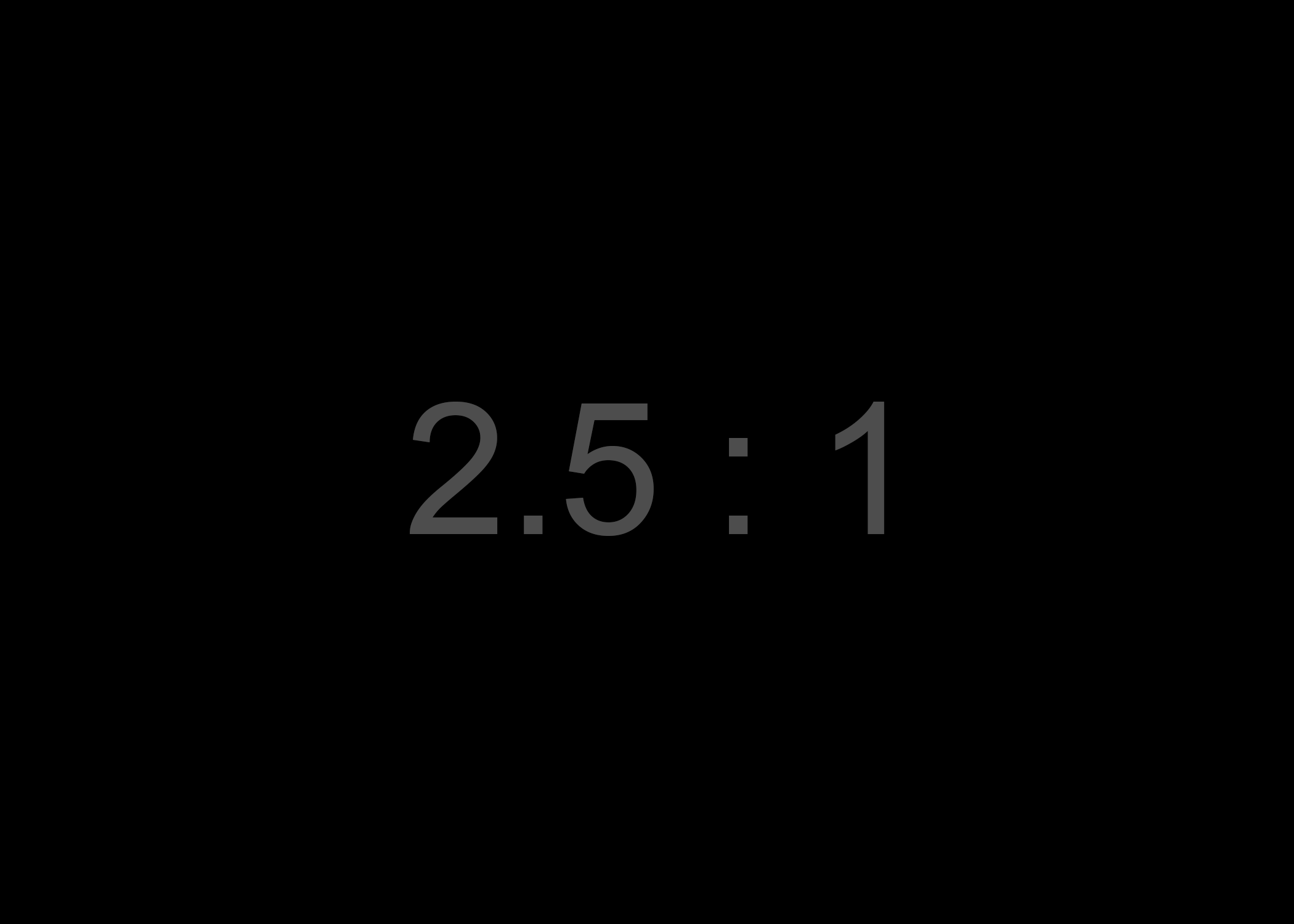
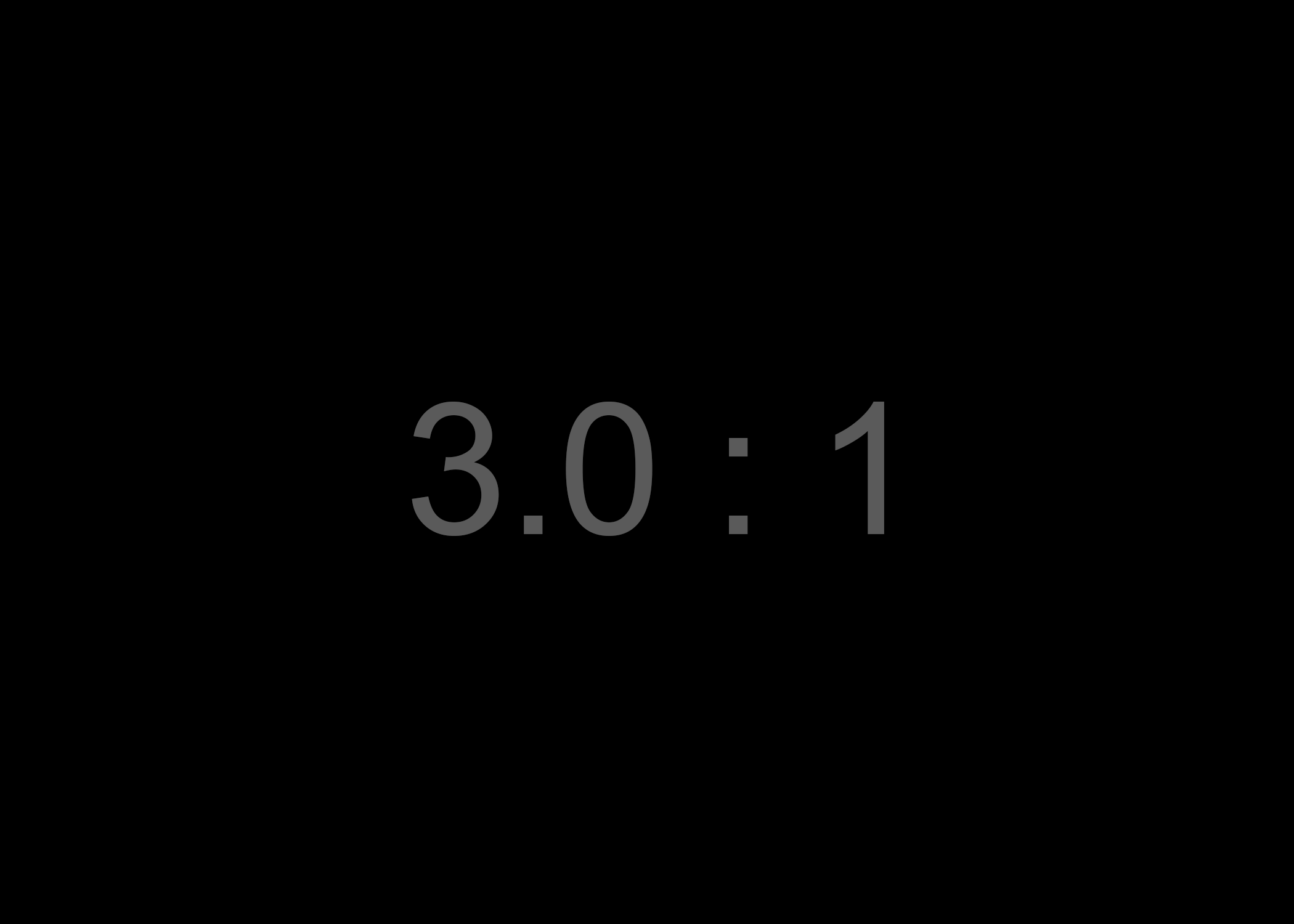
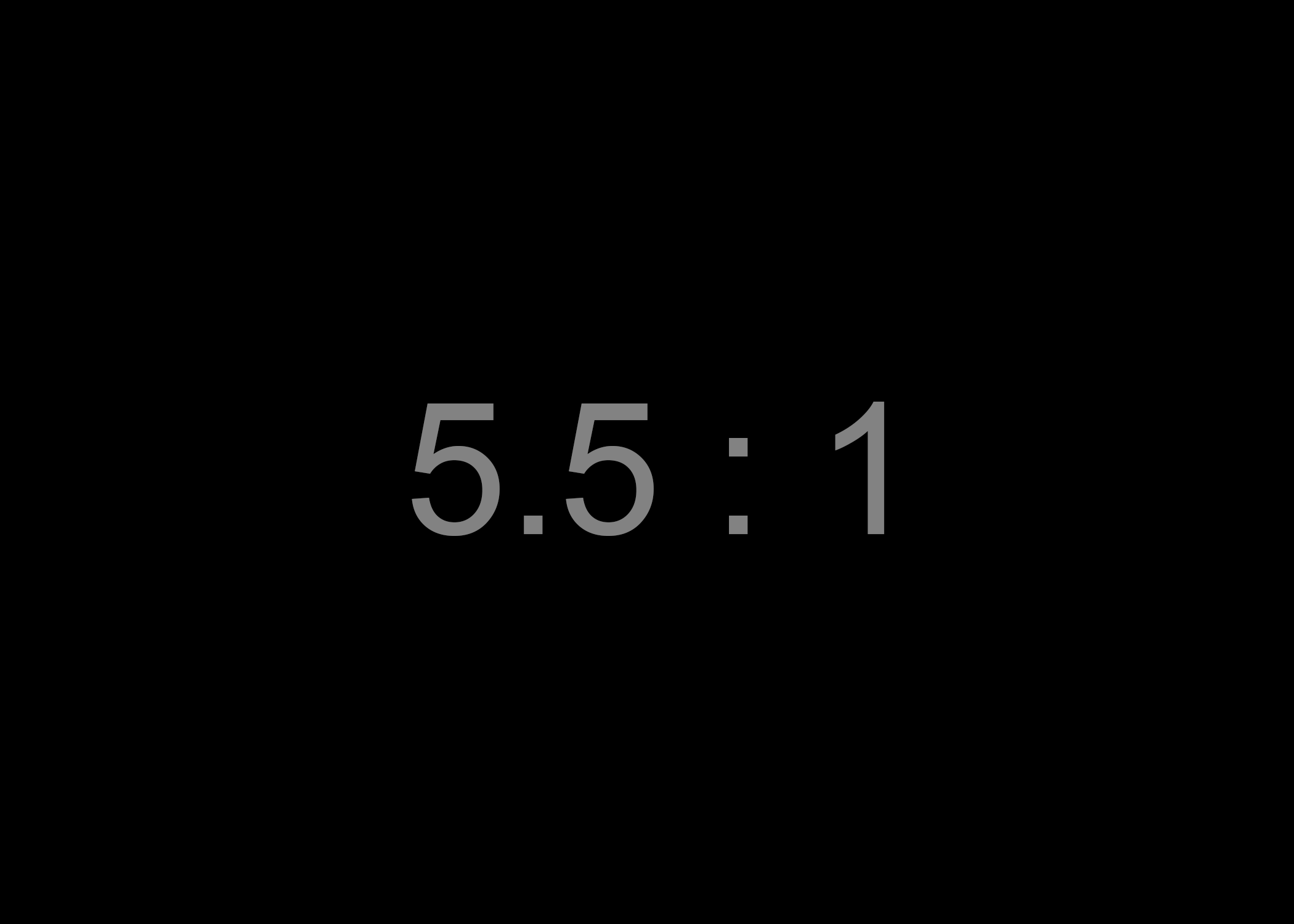
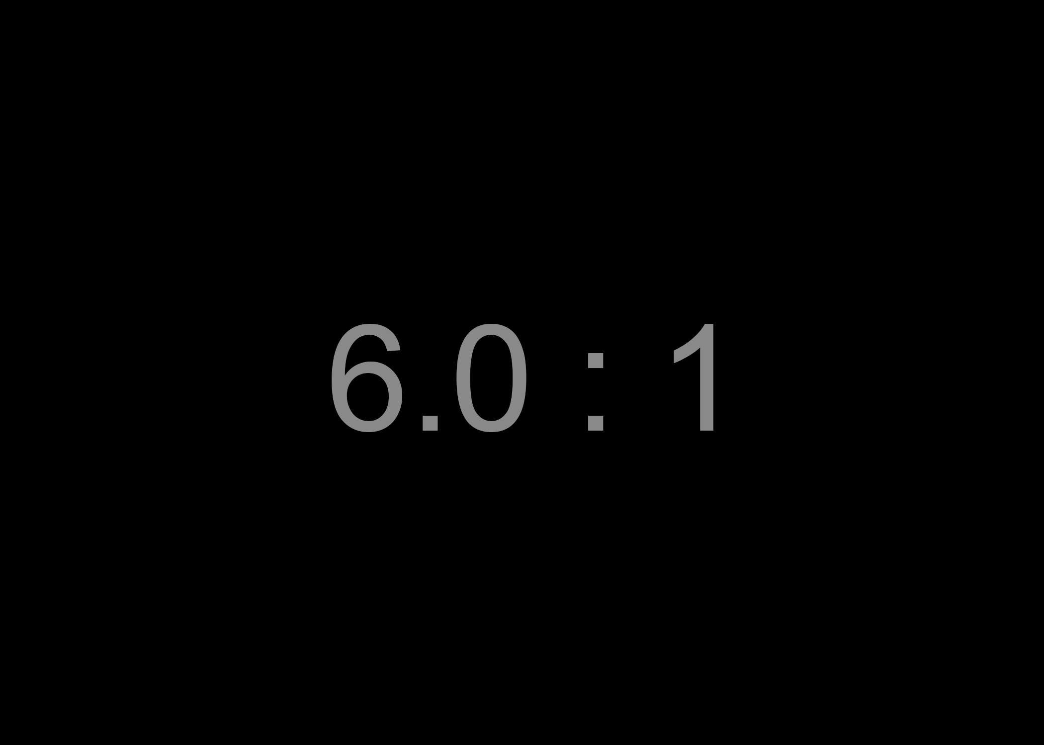
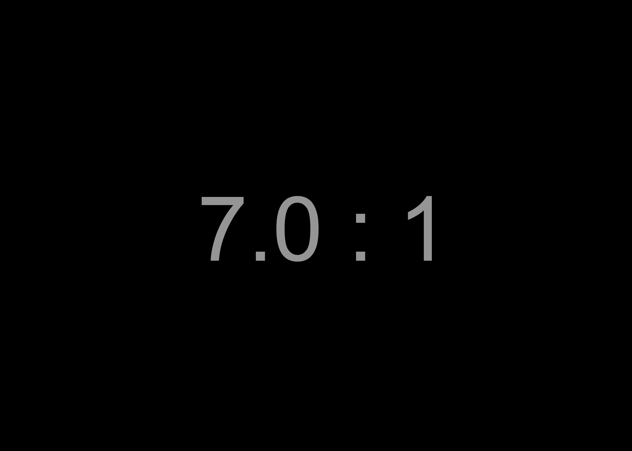
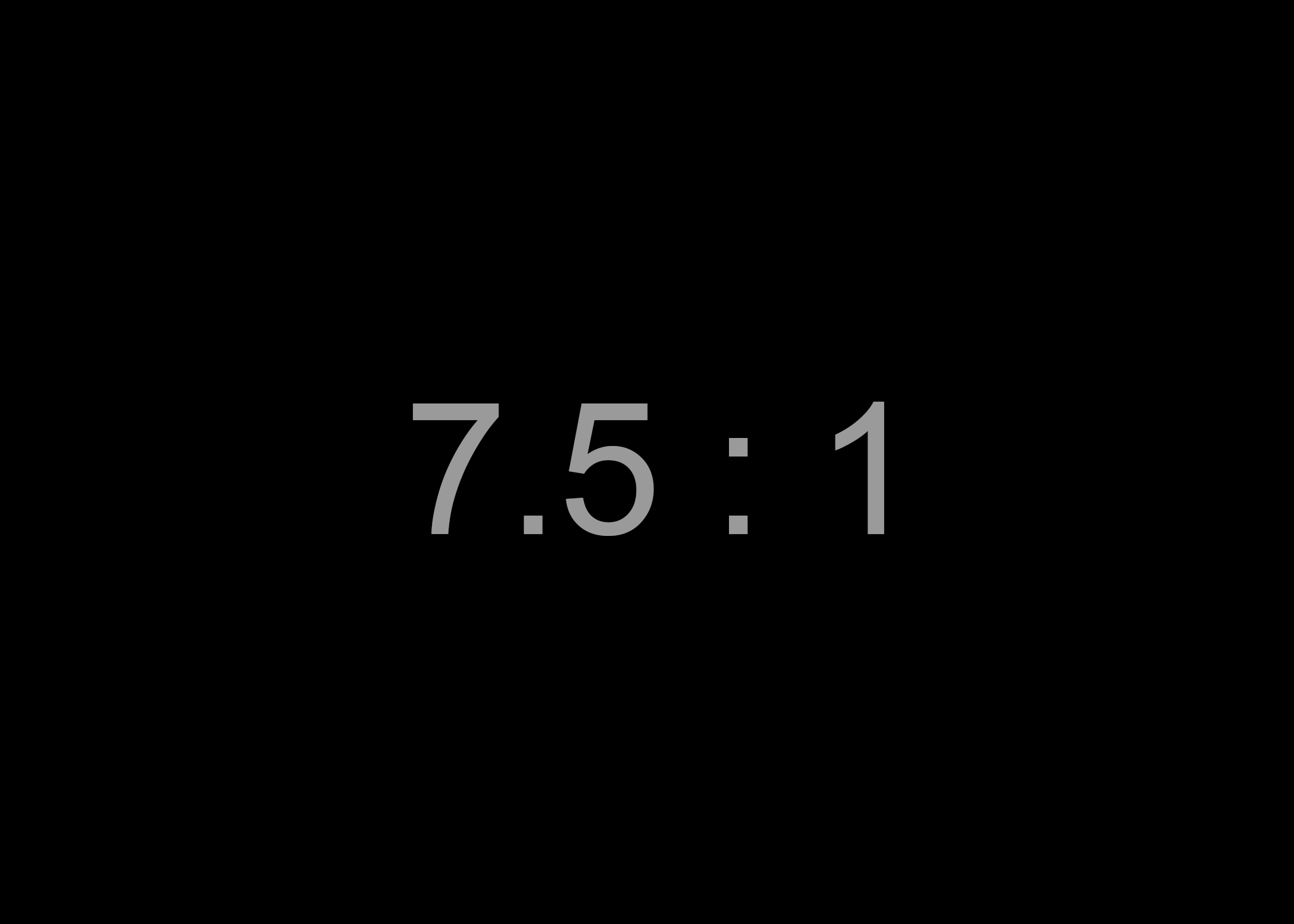
Choices of colour and contrast affect readers with low vision and colour blindness. To promote readability and achieve AA compliance with WCAG 2.1 requirements, regular text and images need to be presented with a contrast ratio of at least 4.5 : 1 (four-and-a-half to one). The contrast ratio reflects the difference in luminance between the foreground and background, and a full discussion and rationale can be found in the W3C success criterion on minimum contrast. Large text (18 points and over) requires a contrast ratio of at least 3 : 1. For AAA compliance, the ratios are 7 : 1 and 4.5 : 1 for regular-sized and large text, respectively. The WCAG quick reference guide discusses what this means in more detail. In order to calculate the contrast of any colour pair you can use a free online tool such as the this one by Leserlich.
When preparing custom themes, our designers work carefully to incorporate colour palettes that are on brand for each client, as well as provide good contrast. However, while composing your story, you also need to be mindful of creating graphics that observe the contrast requirements, and you should ensure that you provide sufficient contrast between the text and backgrounds in Title and Text Over Media sections. We provide an overlay slider in the Section Options that you can use for this purpose.

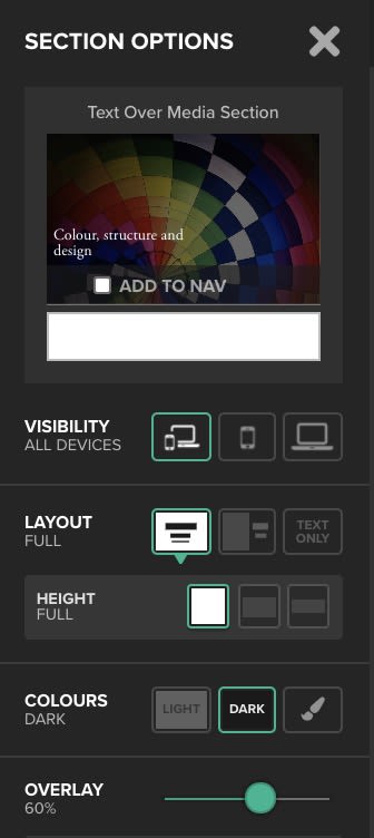
Use the overlay slider in the Section Options pane to help with controlling contrast in the your Title and Text Over Media sections.
Use the overlay slider in the Section Options pane to help with controlling contrast in the your Title and Text Over Media sections.


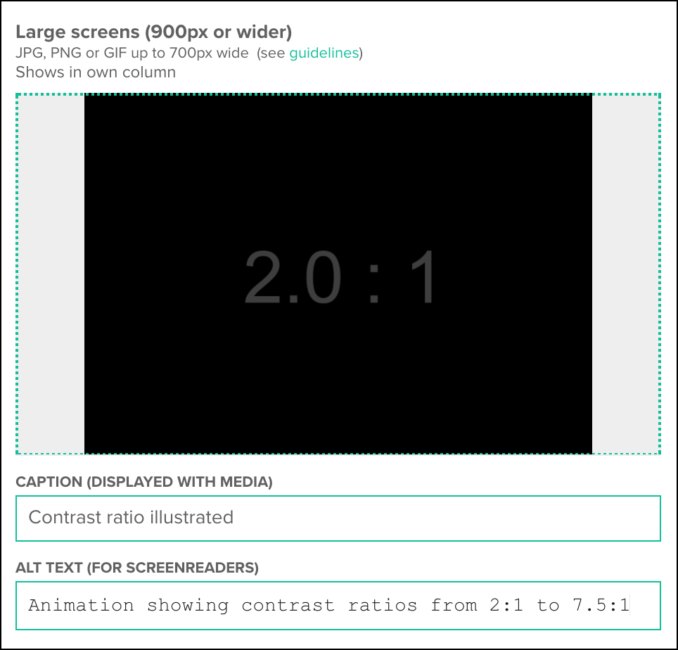
Contrast ratio illustrated.
Contrast ratio illustrated.
Contrast ratio illustrated.
Contrast ratio illustrated.
Contrast ratio illustrated.
Contrast ratio illustrated.

Contrast ratio illustrated.
Contrast ratio illustrated.

Contrast ratio illustrated.
Contrast ratio illustrated.
Contrast ratio illustrated.
Contrast ratio illustrated.

Contrast ratio illustrated.
Contrast ratio illustrated.
Contrast ratio illustrated.
Contrast ratio illustrated.
Contrast ratio illustrated.
Contrast ratio illustrated.

Contrast ratio illustrated.
Contrast ratio illustrated.
Contrast ratio illustrated.
Contrast ratio illustrated.
Contrast ratio illustrated.
Contrast ratio illustrated.
To accommodate colour blindness, which affects about 4.5% of the population, it's important to think about whether you're using colour to convey meaning. Does your story include maps, charts, infographics or other images that are difficult to understand without full colour discrimination? If so, consider redesigning them to provide secondary visual cues that are not colour-dependent — such as distinguishing patterns or shapes, or proximity to convey relatedness. Ensure that you clearly label your graphics and use high contrast. Similarly, think about whether your links are clearly visible without relying on colour cues alone.
There are many handy resources you can use to better understand how your story will look to the colour blind: for example, you can upload images to the Coblis colour blindness simulator to see how they appear to people with a variety of different colour vision deficiencies; you can install a purpose-built browser plug-in; or, on a Mac, you can view your story without colour by switching on greyscale in the Accessibility settings. Further tips can be found in the comprehensive Smashing Magazine article on improving accessibility for colour blind users.
Structure and design
The structure and layout of a web page critically determine how easily readers can extract meaning. This is particularly true when readers have certain vision or cognitive impairments. A simple linear structure is typically more accessible than a layout laden with extraneous material, or a design that utilises excessive pagination, such as a slideshow.
All of the Shorthand section types are designed such that vertical scrolling is the only navigation mechanism required to move through the page. You can ensure that your stories work in concert with this design by:
- making sure that any widgets you add via custom HTML sections retain the vertical scrolling paradigm, and, if possible, support control via the keyboard;
- placing peripheral material — such as interstitial ads — thoughtfully, so as to not confuse the reader;
- paying attention to the length of text blocks, and using a variety of section types to ensure that your longform stories are broken down into portions that are easy to digest; and
- marking up section headings correctly to signpost navigation. Never embed critical text directly into images; instead, use the Title and Text Over Media sections to overlay your text onto videos or images. This will ensure that it's accessible to screen readers. Within text sections, mark the headings and sub-headings using the "H" tags.


Mark headings using the "H" tags.
Mark headings using the "H" tags.
When including links, consider how they will be experienced by users of screen readers. Links should be unambiguous, so that blind readers can navigate through them with a keyboard and understand the purpose of each one out of context. To support this, the text associated with each link should succinctly describe the linked content. Avoid content-free text such as as "click here". WebAIM provides helpful tips for accessible hypertext.
As a final note, the size of a link's clickable area is important: if it is not sufficiently large, it may pose challenges for people with dexterity issues.
Additional reading and resources


In this Craft article, we have outlined some of the fundamental principles of accessible storytelling and web design. We hope to seed further discussion on this topic within the Shorthand community. Bringing inclusive design to our platform — and, by extension, your stories — requires ongoing work on our part and an open dialogue with our storytellers. We'd love to receive feedback on our accessibility features, or to hear about your successes or pain points. Similarly, if you have any comments about the accessibility of this article itself, or any of our other communications, please get in touch.
Below, we list some additional accessibility tools and resources, as well as articles that address or exemplify inclusive design, which which we hope will further inspire you to join us on our quest for increasingly accessible storytelling.
Additional resources
- The A11y project is a community-based endeavour aiming to make web accessibility easier. On the A11y site, you will find an accessible widget and pattern library for web developers, advice, how-tos, and primers on a variety of core accessibility topics.
- Wave from WebAIM is a tool that evaluates the accessibility of web pages. You can submit a URL and receive a report on your page's HTML5 and web accessibility compliance.
Further reading
- Making News Websites Accessible to All, by Aude van Ryn, discusses the push in American journalism towards greater accessibility.
- The New York Times story, Notes on Blindness, by Peter Middleton and James Spinney, provides a beautiful example of accessible media.
- If you're relying heaving on animations or parallax effects, be sure to check out the article Designing Safer Web Animation For Motion Sensitivity, by Val Head. It addresses accessibility considerations for people with visually-triggered vestibular disorders.
- Alt-texts: The Ultimate Guide, by Daniel Göransson, provides first-hand insight on how people with vision impairment experience alt text.