15 web accessibility tools for testing and creating content

What can your website do? Every web page and mobile app out there is designed to share information, perform tasks, or provide entertainment. Any web publisher can throw up a blog and add a few links.
But that's not enough. The best content is flexible, not static. It moves and changes to accommodate every user.
Can your website take that blog and read it out loud — smoothly and seamlessly? Can it switch effortlessly between different screen sizes and shapes? Can it interact with clicks, taps, keyboard commands, and voices? Can it work on an ancient Mac, or a Chromebook that's suffering from terrible internet speeds? Can it translate visual storytelling for users who can't see?
Accessibility is exciting. It gives a better user experience and a better creator experience. It can upgrade your entire website… if you have the right tools for the job.
In this post, we'll explore 15 web accessibility tools that help make accessible web pages, apps, and plugins — all in line with current web accessibility standards.
We'll cover:
Start creating with Shorthand
It's the fastest way to publish beautifully accessible digital magazines, reports, internal comms, and more.
Why is accessibility important?
Web accessibility is the practice of making websites, web applications, and interactive content that can be accessed and used by everyone.
Accessibility is most important for people with disabilities, who make up as much as a quarter of our society. But it also helps to create better, more effective, and more visible content for everyone.
Here are just a few of the mutual benefits that come with accessibility…
- Accessibility is inclusive. Ensuring that everyone can access your content, regardless of their abilities or disabilities, creates a fairer and more inclusive society.
- It's essential for legal compliance. If you publish content which is accessed in America, it should usually adhere to the Americans with Disabilities Act (ADA). Most other countries have similar regulations, too.
- Accessibility means better usability. Accessible websites are more user-friendly and easier to navigate — for everyone! They also receive higher ratings for user satisfaction.
- Digital accessibility means that your content can have an impact across different devices, internet speeds, and operating systems (including Microsoft Windows, macOS, and Android).
- There are SEO benefits, too. Search engines tend to favour accessible websites, because their clearly-structured content is easy to crawl and index.
As content and experience designer Cat Prill explains, accessibility is an upgrade, not an add-on.
"Is the solution that I've actually provided… better? Is it more usable, does it delight, does it provide a better experience? Have we just solved [an accessibility] problem, or have we made a better product?"
Understanding basic web accessibility

Web accessibility is a big, ever-expanding field. There are so many different formats to think about, from web pages to mobile apps. There are so many different media, with different effects on accessibility, from images to text, video, audio, and interactive functionality.
Fortunately, there's one organisation keeping track of it all. The Web Content Accessibility Guidelines (WCAG 2.1), from the Web Accessibility Initiative, provide standards that all web publishers should follow.
The WCAG standards are organised around four main principles:
- Perceivable: Users must be able to perceive the information being presented, including text, images, and multimedia content. This includes providing alt text for images, ensuring proper colour contrast, and organising content with clear headings.
- Operable: Users must be able to navigate and interact with web pages using various input methods, such as keyboard, touch, or voice commands, and experience smooth, interactive functionality with technologies like JavaScript.
- Understandable: Users must be able to understand information on the website, and how to use it, with clear language and consistent navigation.
- Robust: The website must work well with current and future technologies, including assistive technologies like screen readers. It should give users a consistent experience across different platforms and operating systems.
To truly fulfil the guidelines, you should think about accessibility at every stage of content creation, including testing. Aim to consult with people who have first-hand experience of disabilities and accessibility issues; and to understand, through empathy and user testing, the experiences of the gloriously diverse people whom you're designing for.
Accessibility tools can help you achieve most of this; they can also help with the remediation of any errors. That's why every content creator and web publisher should have accessibility tools at their fingertips.
What are web accessibility tools?

Web accessibility tools are software which support or enable more accessible content. There's a vast range of them on the market, from platforms with multiple features to highly specific tools.
We're looking at three different types of accessibility tools:
- Create. Use these tools when you're planning, designing, and editing content to make sure it's accessible from the start.
- Test. Even if you've tried to create accessible content, it's easy to miss small details. You also can't necessarily predict how your content will interact with different operating systems, browsers, devices, and assistive technologies. Content that's already published should still be reviewed from time to time with an accessibility audit. Some of this can be handled by automated accessibility testing tools; others may require manual testing.
- Experience. There is no substitute for asking testers with accessibility needs whether your content works for them. But, as part of your testing — and as a general exercise in thinking accessibly — it can be helpful to simulate the experience of different users, or to try using accessibility software yourself.
Tools for creating accessible content

Contrast checker and contrast ratio
Colour contrast is extremely important for visual accessibility. Some colour combinations are harder to read for people with visual impairments, including colour blindness, and learning difficulties such as dyslexia.
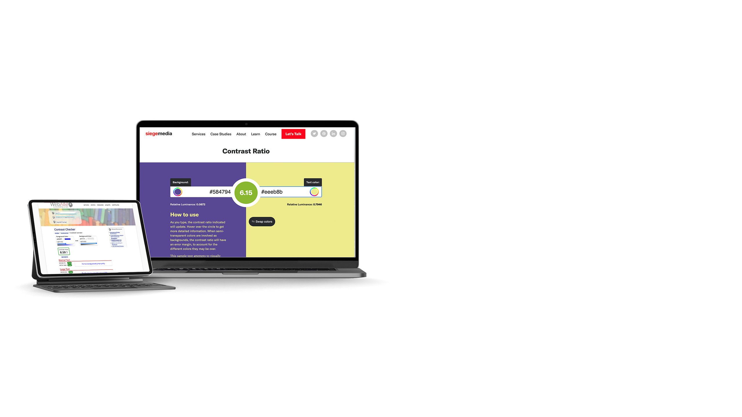
One simple option is the web-based colour contrast checker from WebAIM, which gives you a pass/fail rating for using colour palettes in different page elements.
Contrast Ratio is another tool that does something similar, but with an interface that's more friendly for visual learners.
ARIA landmarks
You may already have heard of ARIA. The acronym stands for 'Accessible Rich Text Applications'. It's a form of additional code which provides extra clues and signposts for screen readers.
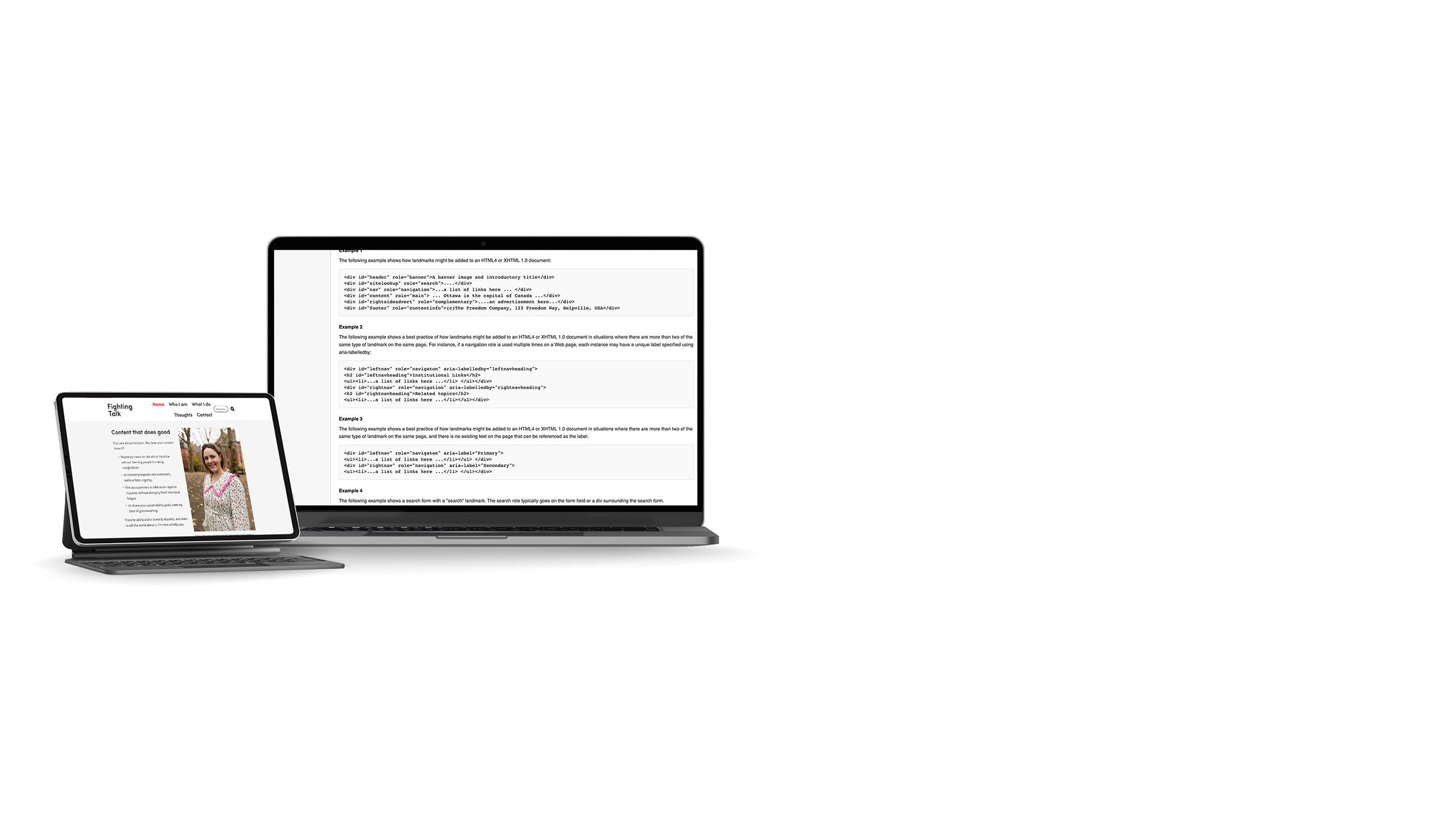
One of the most useful ARIA features is landmarks. They programmatically identify sections of a web page so that users can get oriented easily — and even skip content blocks which are lengthy or repeated across pages. This helps users save time and energy while they're interacting with your website.
According to Ettie Bailey-King, communications consultant and founder of Fighting Talk Communications, many brands and institutions are put off because they assume that creating accessible content will be expensive.
“So many accessibility changes are absolutely free,” she says.
“Accessibility is actually just about building good, clear, solid, flexible materials that will work for as many people as possible… It’s never been easier or more affordable to make your content more accessible.”
Fear of making mistakes is another factor that holds people back.
“People are frightened to get it wrong,” says Prill.
“There’s this need to get it right immediately [but] even the most mindful and considerate content designers are probably still going to make mistakes somewhere.”
They emphasize that accessibility and inclusion are processes: you shouldn’t expect to achieve them overnight.
Doing the work to understand accessibility and inclusion can reduce the number of mistakes made, while making the financial and business case for better content. Knowledge is power, after all.
“The biggest obstacle is ignorance of what makes a piece of content inaccessible,” says Alice Orrù, a translator and advocate for inclusive and accessible language.
“We live in an environment where we can communicate in dozens of different formats — long and short texts, images, video, audio, links, emoji, hashtags… It is challenging to become aware of what makes content inaccessible and why.”
But Orrù insists that it's possible to navigate these challenges and create content that’s accessible from the very beginning.
“There are many people explaining how to create accessible content and how to embrace a more inclusive vision. Let’s listen to them.”
Web accessibility testing tools

Browser features
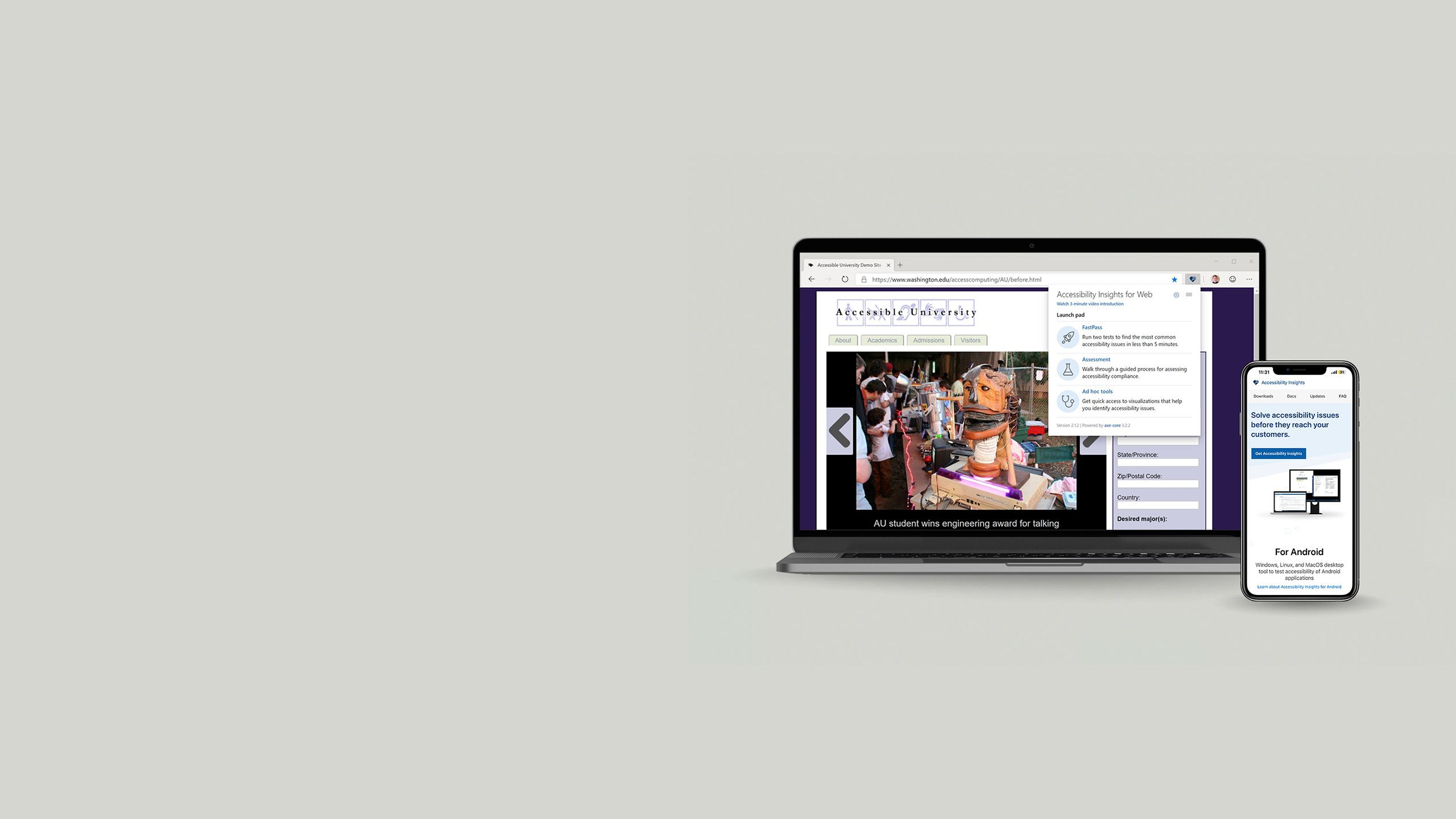
Most browsers these days also have some basic tools for spotting accessibility errors, either built-in or available as extensions.
Microsoft has the Accessibility Insights for Web extension for Edge, Firefox has an Accessibility Inspector tucked away in the Developer Tools tab, and Safari can audit some accessibility issues with its Web Inspector. These can be added to your browser toolbar for easy access.
However, most of the web browsers' own tools are pretty basic. If you want to dive deeper, it's worth looking into more advanced testers.
WAVE
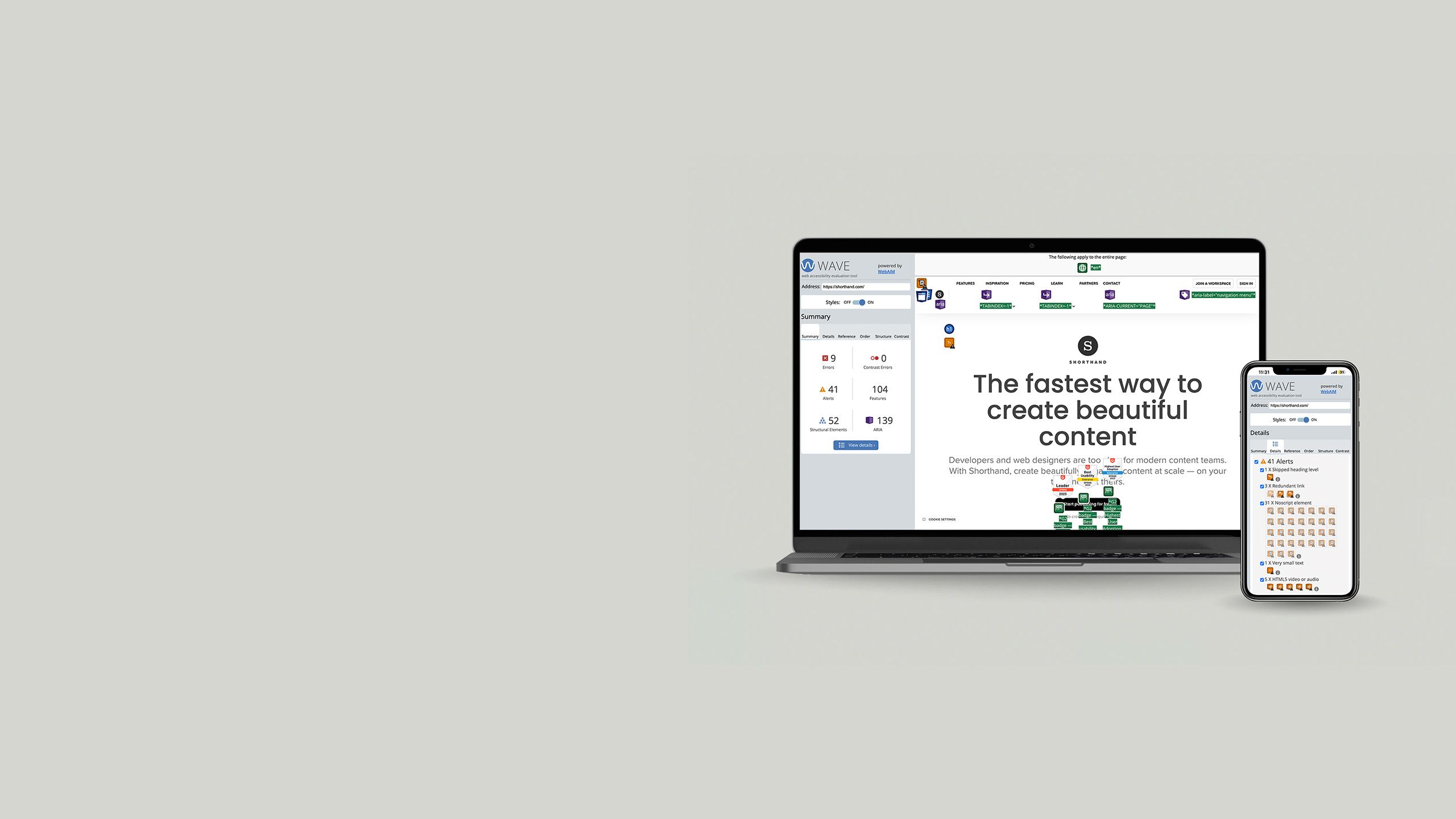
The Web Accessibility Evaluation Tool (WAVE) is a free browser extension for Chrome, Edge, and Firefox that checks web pages for accessibility issues; there’s also an API you can use.
It's extremely popular for its comprehensive approach and clear reporting. It gives you colour-coded visual feedback on errors, alerts, and features that can be improved.
SiteImprove
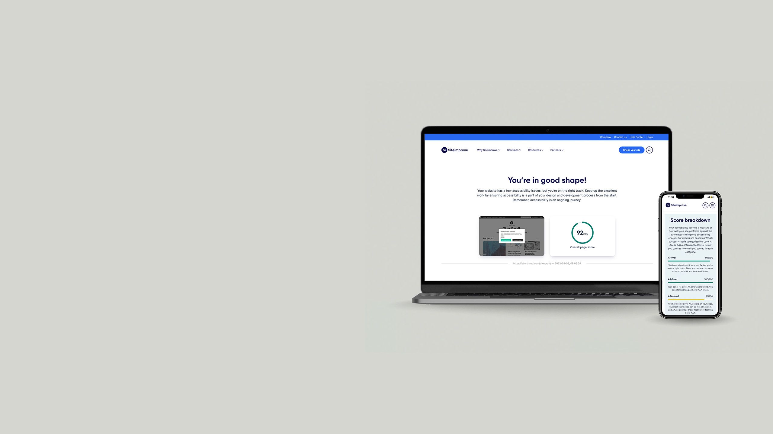
Similarly, the SiteImprove Accessibility checker is a browser extension that scans web pages and provides recommendations for fixing them.
It also calculates an overall score so that you can get a quick idea of how you're doing. The tool tests against WCAG 2.1 standards and helps web publishers ensure conformance.
Lighthouse
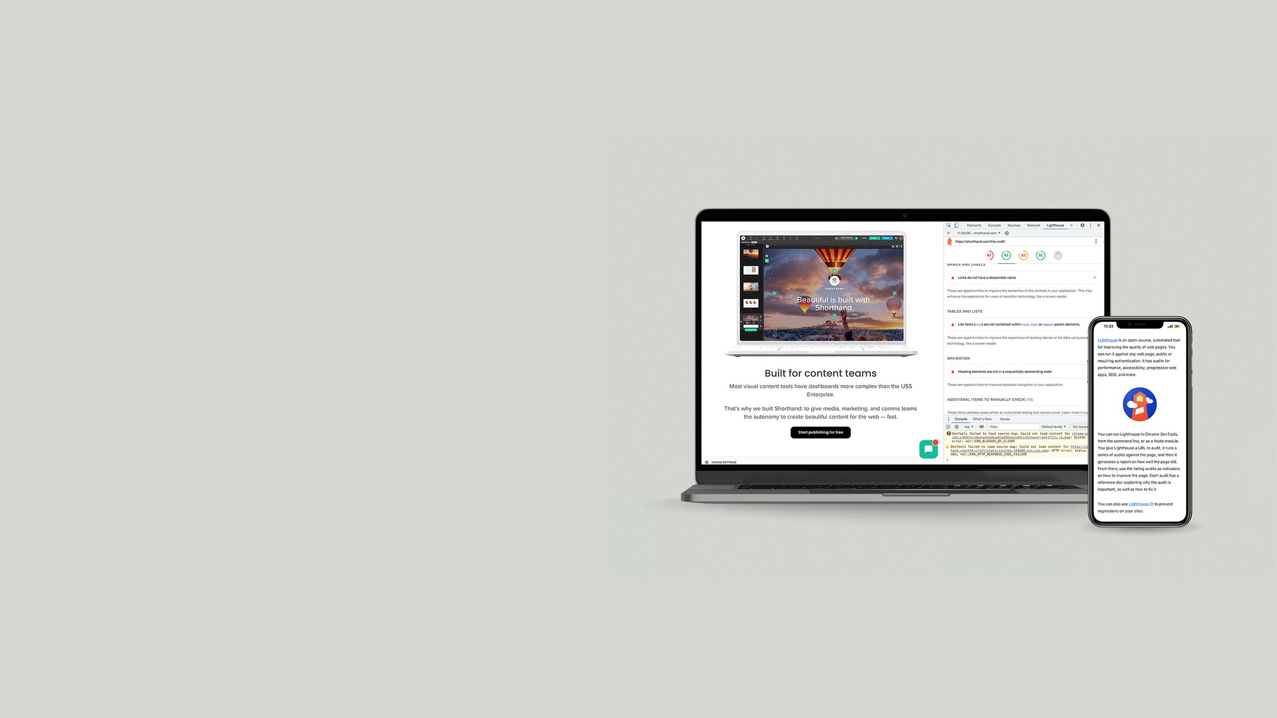
Chrome has a free tool called Lighthouse built into its Developer Tools, which you can also run as a browser extension, in Node.js, or on the command line. It evaluates pages for performance and SEO, as well as accessibility.
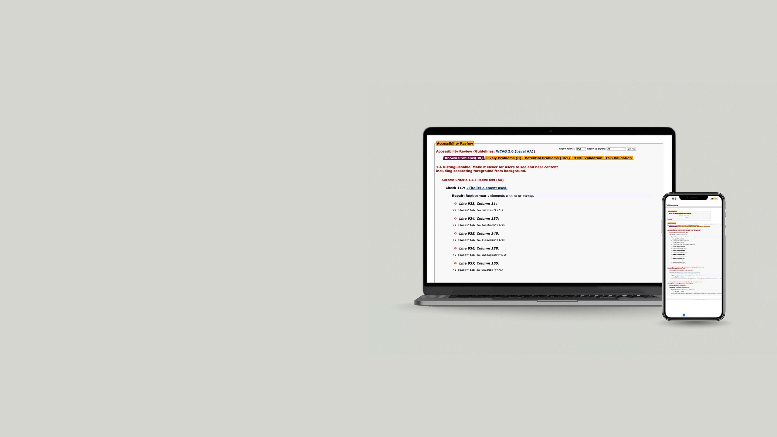
DYNO Mapper
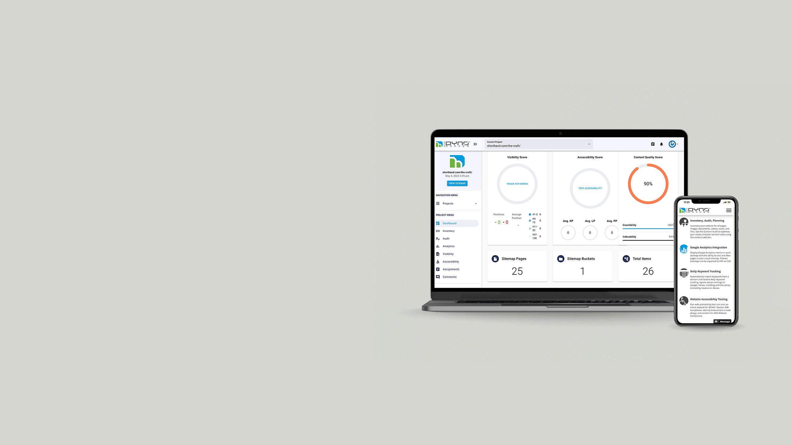
DYNO Mapper is a powerful and comprehensive tester for web accessibility, particularly aimed at public and educational institutions.
It marks up your web pages for 'known', 'likely', and 'potential' accessibility violations, and can also be set up to run regular, automated audits.
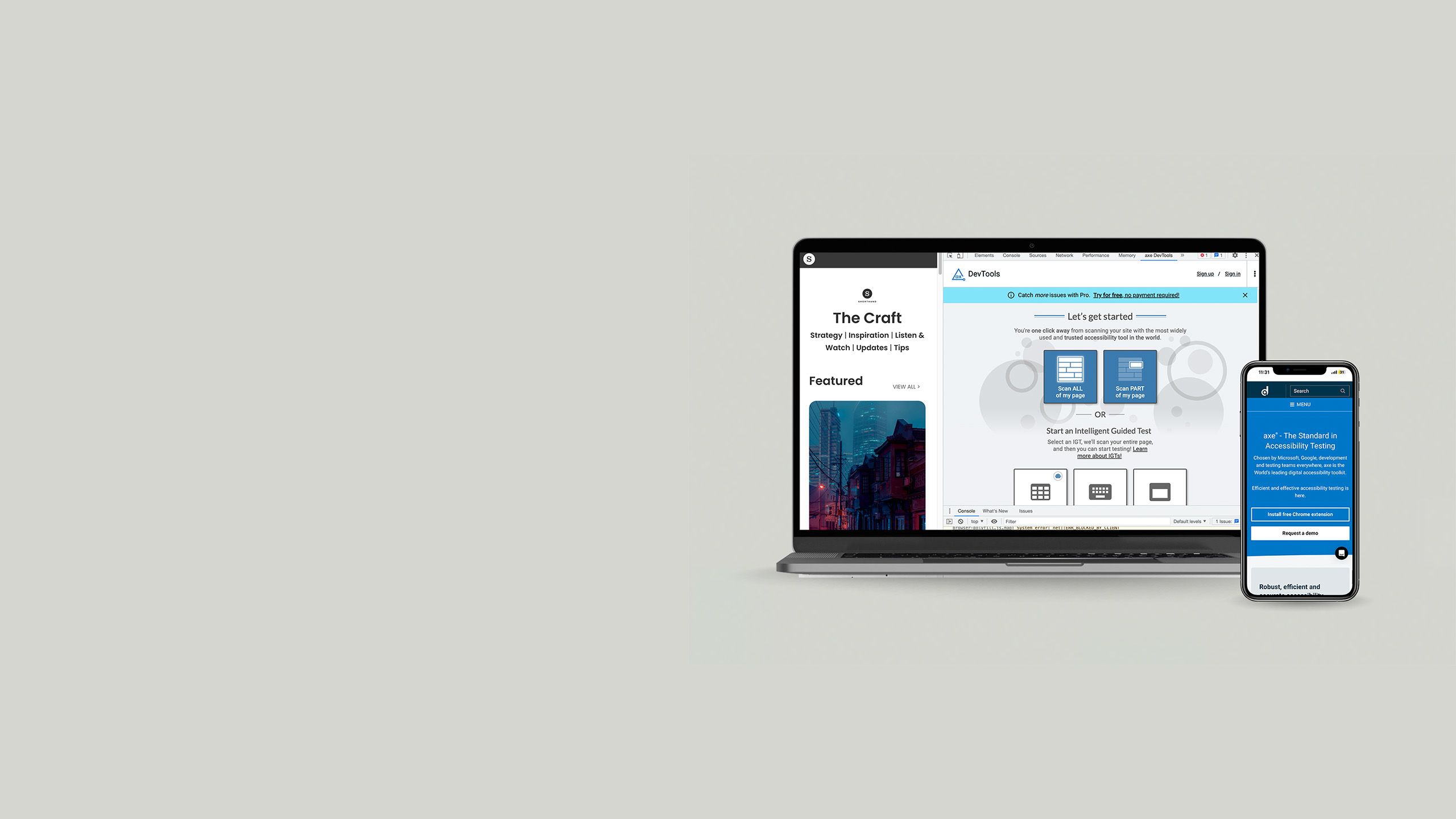
Axe
Axe is an open-source, automated accessibility tool that's available as a free browser extension, or as a more sophisticated testing engine.
It claims to catch 80% of accessibility issues, which is an extremely high success rate for testers. There's a reason why axe is one of the most widely used testing tools for web content.
AChecker
AChecker is an extremely simple, bare-bones accessibility tester. You can input a URL, or simply paste in your website's HTML, to get a report on your accessibility performance.
You can also choose to test accessibility compliance against a range of accessibility standards and regulations, and with or without validators.
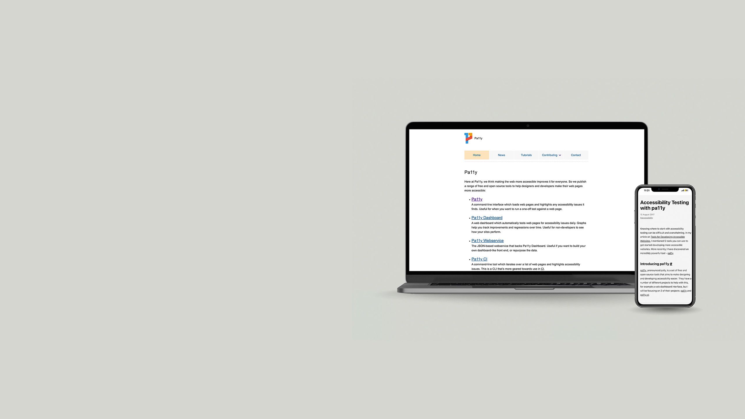
Pa11y
Pa11y is a suite of free, open-source accessibility tools. It has different options depending on whether you want to run a one-off test on a webpage, get an accessibility report for a list of web pages, or set up daily automated testing to monitor performance over time.
Tools for experiencing accessible content

The most valuable insights in accessibility come from users: the people who use assistive tech every day. But, when you're building accessibility into your content and work culture, being able to empathise with their needs is also important.
With that in mind, here are a few tools which might help you walk a mile in someone else's shoes.
Browser features
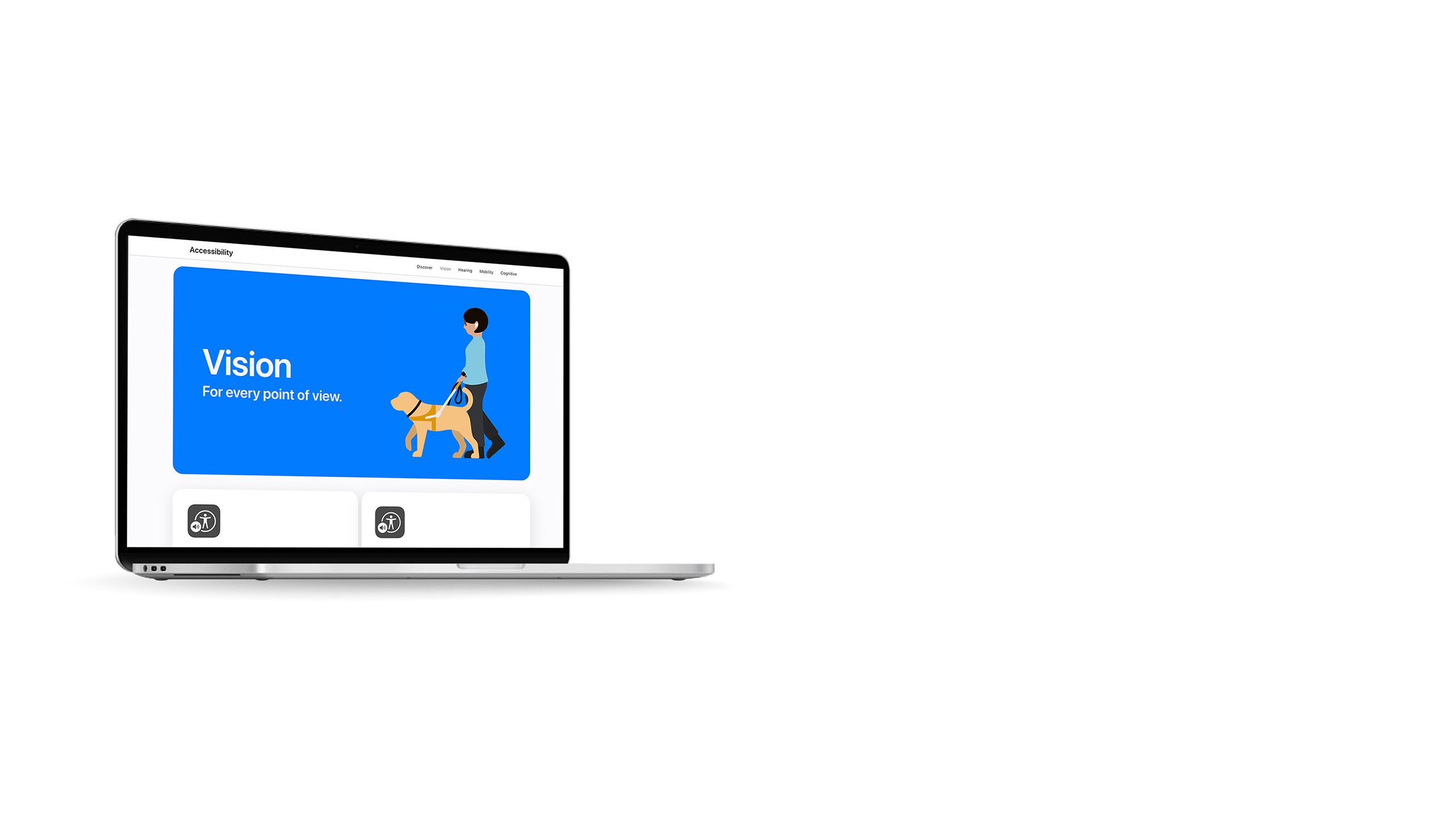
If you want to get an insight into how your website feels for some people with accessibility needs, start with browser features.
Most browsers now have built-in screen readers and options to change how content appears. These tools aren't on the same level as dedicated screen reader software, but they'll help you see some of the challenges that your users are dealing with.
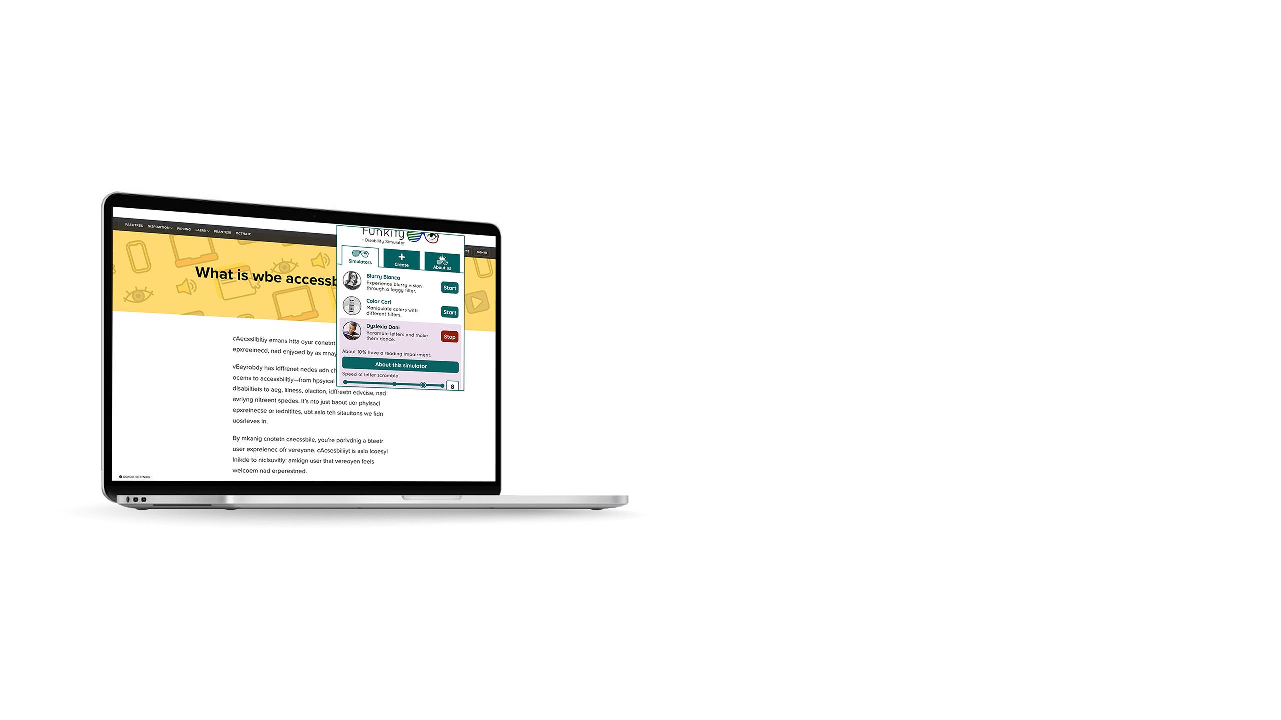
Funkify
Funkify is a Chrome extension that simulates various disabilities and impairments, such as dyslexia, tremors, and colour blindness.
It can help you see how people with a range of disabilities experience your website, and tweak your content accordingly.
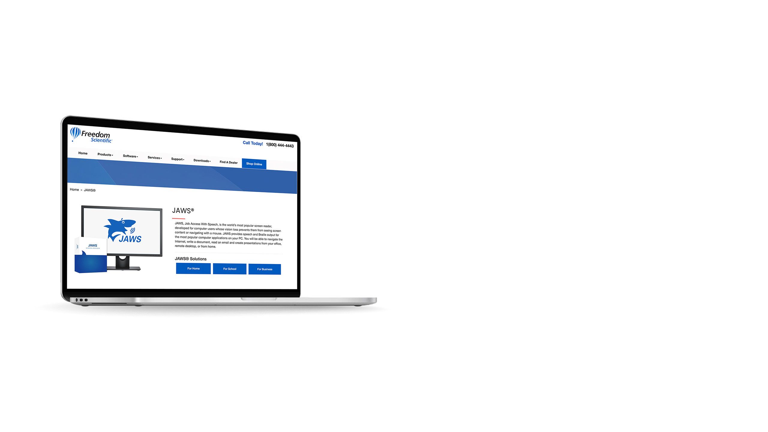
JAWS
JAWS stands for Job Access With Speech. It's designed to open up the web for anyone who can't view a screen or use a computer mouse, and it's the most popular screen reader currently available.
You do have to pay for an annual licence, but it can be worth it just because so many of your disabled users are likely to use JAWS too. WebAIM even offers recommendations for using JAWS as a testing and experiential tool.
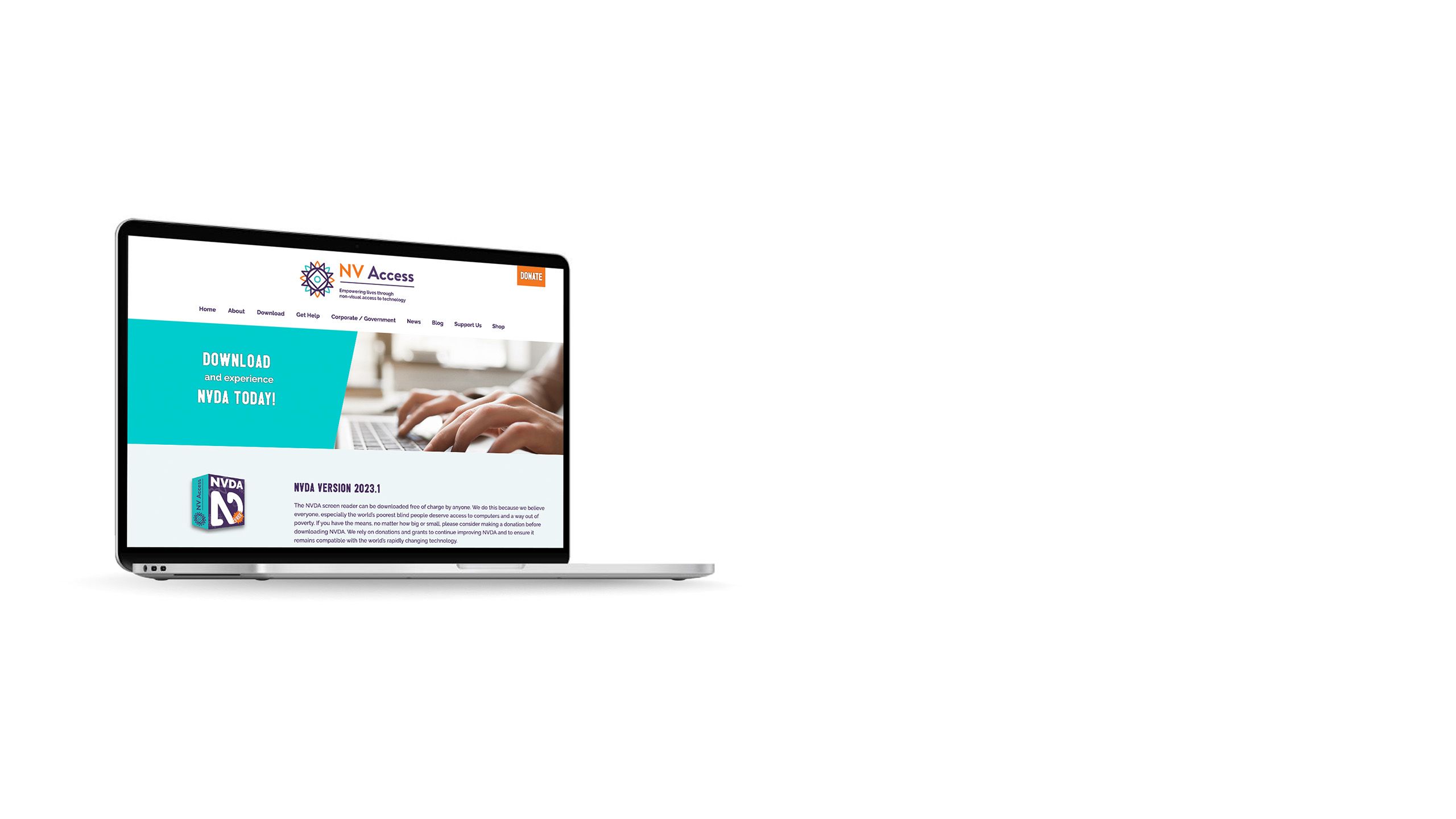
NVDA
NVDA is an open-source screen reader. If you're working on a budget, this can be a preferable option to JAWS: it's less widely used, but free to download.
You can also choose to make a donation to NV Access, the non-profit which created the screen reading software.
What about accessibility overlays?

There also accessibility tools which you can add onto your content later, such as accessibility overlays. Just like the name suggests, they 'overlay' your content with an accessible interface.
But these aren't always recommended. Accessibility tools which try to do everything at once, or add accessibility as a superficial cover over an inaccessible website, can often fail. While they might sound simple, they're not a one-and-done solution to accessibility.
"[Publishers] are better off allocating a couple of hours of staff time to following best practice," explains accessible communications consultant, Ettie Bailey-King.
"If you're not in the accessibility space, you think: 'Fantastic. They've solved all my problems for me.' If you are in the accessibility space, you quickly find out that a lot of overlays basically break the code of the website and create an absolute mess for anyone who's using assistive tech."
You'll get better results by including accessibility in your content from the start, then using tools and tests to catch anything you've missed.
The bottom line

Accessibility tools are there to help you at every stage of publishing content online: creating it, monitoring it, and experiencing the final product — as well as being open to feedback from users.
With the right tools, you can create better content and a better world. When everyone is included, everyone benefits.


