
How to use alt text to make more accessible
web content

What is alt text? Why does it matter? And how can we use it to make a better, more accessible web for everyone?


Effective alt text has few hard and fast rules, but there is a growing set of guidelines and recommendations to help you produce helpful, engaging writing that assists your readers — and, crucially, doesn’t reinscribe inaccurate assumptions about people’s gender, race, and identity.
The key is to always return to the main purpose of alt text, which is to make your work accessible in an engaging, thorough way, to the broadest possible audience of readers and viewers.
Below, we'll cover
Start creating with Shorthand
It's the fastest way to publish beautifully engaging digital magazines, reports, internal comms, and more.


Loved by the world's most iconic brands

Loved by the world's most iconic brands


What is alt text?

Alternative text, commonly known as alt text, describes an image for people who use screen readers. Screen readers are an assistive technology that describe non-text content aloud, usually for people with some form of visual processing disability.
Alt text is also indexed by search engines, so is sometimes used for SEO purposes (including occasionally keyword stuffing, which is completely at odds with the goals of web accessibility and may, in fact, incur penalties from our Google overlords).
Unlike a caption, alt text isn’t normally visible, unless images fail to load. For screen reader users, however, it is read aloud, or translated into braille, alongside the main body text and any image captions.
Nomensa, a digital agency in the UK, describes how screen readers actually work as a technology: “A screen reader uses a Text-To-Speech (TTS) engine to translate on-screen information into speech, which can be heard through earphones or speakers. A TTS may be a software application that comes bundled with the screen reader, or it may be a hardware device that plugs into the computer… In addition to speech feedback, screen readers are also capable of providing information in braille. An external hardware device, known as a refreshable braille display is needed for this.”
There are two practical implications of this for writing your alt text. Firstly, you don’t need to write ‘image of’ when you’re describing the image. A screen reader will differentiate between the types of images and surrounding text it’s describing, so if you say ‘image of’, it might read out ‘image of an image of…’ However, if it’s something particular, like a painting or a comic, feel free to specify that.
Secondly, this means that alt text shouldn’t repeat anything already written.
You might be tempted to write a long, friendly description of every visual detail of an image, but this actually undermines the overall accessibility of a piece, since it will take a long time for a screen reader to parse. If you want to provide the option of a longer, more in-depth description, you can code for the longdesc (long description) attribute, which embeds a separate page with as long a description as you want inside the webpage’s HTML.
For more information, this document has lots of friendly but technical details for using the longdesc attribute.
In fact, if there’s enough context in the body of your text, you mightn’t need very much alt text at all. For example, if you’ve spent three paragraphs describing the visual details of Anne Rice’s portrait of Katherine Mansfield in your article, your alt text could just be, “Detail of Rice’s portrait, zoomed in on Mansfield’s hairstyle.”
The trick to really good alt text is to reimagine the visual medium of your work as audio: what would it sound like if everything, including the pictures, were read aloud or described? This helps you get past the idea of ‘Ugh, I’d better add alt text’, to actually putting yourself in someone else’s shoes and trying to make the best reading experience for them.
How to do alt text well
I know I said there are few hard and fast rules, but there is one golden rule: be clear and concise. In fact, the Australian Government style manual suggests that you keep it under 100 characters (which, as a verbose English Lit student, I struggle with). People using screen readers don’t have all day to listen to an extended image description, particularly if your media is quite picture-heavy. On that, you don’t need to add alt text to purely decorative images or background images that don’t add anything to the experience of your story.
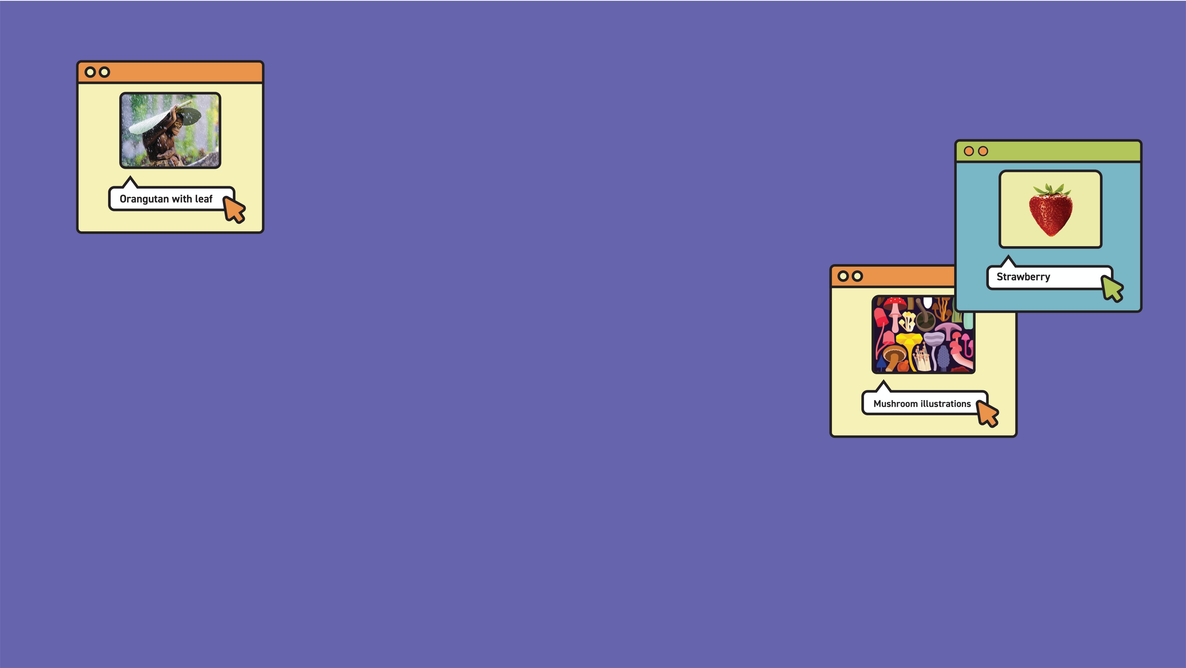
While ‘clear and concise’ should be your north star, you don’t have to describe things blandly and at a total remove. Someone seeing the image would gain a lot of emotional context from visual cues, so giving someone using a screen reader a similar experience might mean getting creative. Consider this adorable baby orang-utan:


Andrew Suryono, 2015 National Geographic Photo Contest
Andrew Suryono, 2015 National Geographic Photo Contest
Simply describing it as ‘an orang-utan holding a leaf over its head’ does not cut the emotional mustard. Nor does it need to be ‘small orang-utan seated on a log, gripping on with their toes. It is pouring with rain, and they shield themselves from it by clasping a large monophyllae leaf above their head with one hand. They are positioned in the centre of the photo, but their soulful, patient eyes gaze out to the left, with existential ennui, into the seemingly-endless monsoon.’
If you think it’s important and you have the time and resources, use the longdesc attribute — but remember, the aim is to make an enjoyable experience for someone using a screen reader. If your story has a lot of complex images, make sure you’re contextualising them in the body text so that you don't have to cram too much additional information into the actual alt tag.
So, what would be appropriate? Something like this is a good emotional and practical description: ‘An orang-utan holds a large leaf over their head, protecting themselves from pouring rain. Their large, soulful eyes gaze to the left of the camera.’
On that, alt text is often written in present tense, since it expresses the immediacy of an image in the way that a screen reader can communicate well. I can’t think of a situation where using present tense wouldn’t be a serviceable go-to, but I’m always pleased to be proved wrong!
Katie Parry, director of Supercool Design puts the general point well: “Being aware of context means you can allow yourself to write more creative alt text from time to time. But, while there are occasions that allow for more creativity than basic 'best practice' guidelines suggest, tip #1 – Be specific and succinct – still stands true most of the time.”
How to describe diverse identities
When considering best practice for alt text, it’s important to consider how we describe people, particularly in terms of visual identifiers of race and gender.
For example, Tolu Adegbite points out that, because whiteness has been so built in as the ‘norm’ in Western societies, not describing race in alt text actually reinforces this quiet, structural racism. We push the idea that what our societies deem as the default actually is the default.
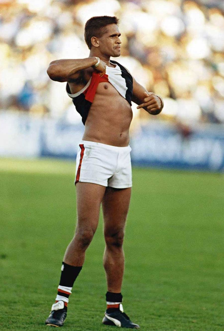
Plus, it can be directly relevant. For example, the iconic image of Aboriginal footy legend Nicky Winmar lifting his shirt and pointing to the Blackness of his skin after enduring racial abuse would miss much of its context and potency if the alt text just read ‘football player lifts shirt and points at their chest.’
What should we say, then? Others have pointed out that racial characteristics like skin colour should be noted, but in a non-assuming way: for example, describing ‘dark brown skin’ rather than trying to guess an ethnicity.

Nicky Winmar, Victoria Park, Melbourne, 17 April 1993. Wayne Ludbey, The Age
Nicky Winmar, Victoria Park, Melbourne, 17 April 1993. Wayne Ludbey, The Age
Of course, if you know how someone identifies and what their ethnicity is, and it’s relevant, then including them is appropriate. In that case, good alt text for the Nicky Winmar photo might be, “Winmar, an Aboriginal man, raises his shirt and points to his chest, looking defiantly into the crowd.” Presumably, the body text would explain the context and someone using a screen reader would therefore have the full experience of reading the story.
With regards to gender, the same point about knowing how someone identifies stands: stick to general terms if you don’t know the specifics. For example, this generic image of a work meeting can just say ‘three people of different genders and ethnicities gather, smiling, around a laptop.’ It’s important because it doesn’t just assume that ‘normalcy’ looks like a white dude, but it also doesn’t put possibly-inaccurate labels on people. They/them pronouns and the word ‘person’ have pretty broad utility! But, as with race, if someone’s gender is relevant, known, and adds meaning, it can definitely be included.


The point isn’t to have a prescribed set of rules dictating every possible outcome; rather, it’s to have a general approach, grounded in the understanding of the impact of our words. If we’re trying to use alt text to expand and democratise access to web content, then we have a responsibility to take care that our words don’t reinscribe the same old harmful systems.
Start creating with Shorthand
It's the fastest way to publish beautifully engaging digital magazines, reports, internal comms, and more.