What is content design?


Content design is a new discipline that uses research to make content better for people. Content designers believe that content should be simple and clear, with a laser-focus on the highly specific needs of the actual humans that interact with it.


by Corinna Keefe
Whatever kind of content you produce, from microcopy to media-rich digital storytelling, content design has valuable lessons on how to reach and help your audience and stakeholders.
In this article, we’ll take a close look at what content design is and what its core design principles are. We’ll follow the process of content design and see how it can be useful to content creators in every field, from government to the arts, education, nonprofits, and business.
What do the BBC, Adweek, and Penguin have in common?
They craft stunning, interactive web content with Shorthand. And so can you! Create your first story for free — no code or web design skills required.
Sign up now.
The origins of content design


Content design was pioneered by Sarah Winters (née Richards) and her team of content strategists in their work for the UK government’s online services, before they produced the cult book Content Design.
This tells you a lot about the origins of content design: from the very start, it’s been all about providing services and clear information to the widest audience possible. And it’s grown over time to become useful for anyone working in content creation, web design, digital products, storytelling, marketing, and communications.
Content design defined


In Govt.uk’s definition, good content design “allows people to do or find out what they need to… simply and quickly, using the most appropriate content format available”.
Content designer work combines many different functions — including research, copywriting, graphic design, product design, UX architecture, information architecture, detailed analytics and user journey mapping, high-level strategy, and publishing software to create the most useful experience possible for the user. It can be applied to everything from longform writing like this article, to a ticketing process, to a full website or app.
Content design teams focus on how to organise and present information so that it is clear and understandable.
If you work in marketing or communications, you probably already work on content design without realising it. But learning the principles of content design can help you improve your UX writing and UX design, tighten up your workflows, clarify your design thinking, and connect with your audience more effectively.
User stories


Content design is always evidence-based. That doesn’t just mean based on vague buyer personae. Content designers take detailed analytics, feedback, and research into user behaviour on board. This is really what differentiates content design from other related disciplines, such as content marketing. The user comes first, and the experience is built around what the user needs, not what the content creator assumes or wishes.
When building a digital service, one way that content designers focus on user needs is through writing 'user stories'. The basic template goes like this:
“As a [description of the user],
I want to [action or information required],
so that [their ultimate goal].”
For example, if I was writing a user story for this article, it would be something like:
“As a marketing and comms professional,
I want to learn more about content design,
so that I can create more impactful content.”
Notice that there’s no mention about my own personal goals, as the person writing this article. The only thing that matters is what you, the reader, need. That approach can be applied to any industry and any field.
Content design and digital storytelling


There is crossover between content design and digital storytelling. Digital storytelling is interactive, multimedia, and focused on the best possible user experience to retain attention. As we’ll see in the next few sections, both content designers and digital storytellers have to think critically about the best ways to share information for specific audiences, and they can learn a lot from each other's ideation.
Whatever your job title, you can probably already think of some cases where clear communication and impactful storytelling make a big difference. The greatest strength of content design is that it makes complex information accessible to a wider group of people.
That’s valuable in a huge range of use cases: from making the case for non-profit donations, to teaching, offering government services, professional development, campaigning for causes, and organising large-scale events.
The strategy behind useful content


In previous posts on The Craft we’ve talked about the strategy behind creating great content. Before you start working on a piece of content — a blog post, poster, or programme — you need to have your building blocks in place.
The content design process outlined below can be implemented by adapting and expanding on your current content workflow, which will likely include:
- Content strategy is about your objectives. A content strategy outlines your goals, resources, audience, and priorities for a set period of time. Content design is about how you implement all of that information in practice.
- Content planning means collecting a list of the formats, topics, and keywords you want to use.
- A content calendar sets out your workflow and publication schedule. It can help to organise your content creation.
What do content designers do all day?


In their original work, Sarah Winters’ team set out a basic process of 7 steps for content design. Other content designers have taken up the method to expand and adapt it, bringing content design to a broader range of disciplines — from nonprofits to educational institutions and businesses, and we’ve augmented Winters’ list here with one extra step.
- Research. Collect evidence about what your target audience wants and needs. This starts with trying to understand and empathise with your audience, but it also involves a lot of hard data. User interviews, focus groups, web analytics, surveys, journey mapping, and competitor analysis can all be useful here.
- User needs. Summarise your findings in a useful format, such as one of the user stories we looked at above.
- Channel and journey mapping. Decide what the most helpful content format will be for your audience, and think about how they engage and move through content. Designing the right content structure will be immensely important in supporting your audience.
- Language and emotion. Your user research should also have given you some ideas about how your target audience likes to communicate. Your content should be clear, easy to understand, and pitched at the right tone and level for users. A relevant style guide is crucial. You’ll also need to think about accessibility and search engine optimisation.
- Creation. This is where everyone gets involved! You’ll be prototyping with writers, designers, programmers, and many other disciplines to design good content with high usability. Content design means working across teams instead of siloing different approaches.
- Publication. This step includes both physically putting your content online, and distributing it to your audience via social media and other platform. How do you make sure that your target audience gets to see your carefully designed content? How can you signpost it for them?
- Sharing. You want to get as much feedback as possible: from colleagues, focus groups, testing, analytics, and anywhere else you can gather data. Once you have that feedback, try out new ideas and test them all over again until you have the best solution.
- Iteration. Content design is never complete. Your content calendar should include regularly scheduled dates to review, replace, or deprecate old content. To do this effectively, you’ll need to define what successful content looks like, and set measurable goals and metrics for your content.
This might sound like a lot of work! And there is a reason why “content designer” has increasingly become a stand-alone role, instead of tasks being shared ad hoc among a content team.
However, it doesn’t have to be an overwhelming task. A lot of content design can be implemented by improving or expanding your current content workflow. And, as with any skilled job, having the right tools makes a big difference. A publishing platform which accommodates writing, design, no-code customisation, accessibility, and analytics will take you a long way.
What good content design looks like online


Not all content design is on the web. You can apply all the values and processes above to print marketing to newspapers, textbooks, and even road signage!
But let’s face it — if you create any kind of content in the twenty-first century, then publishing online is a big part of your skill set.
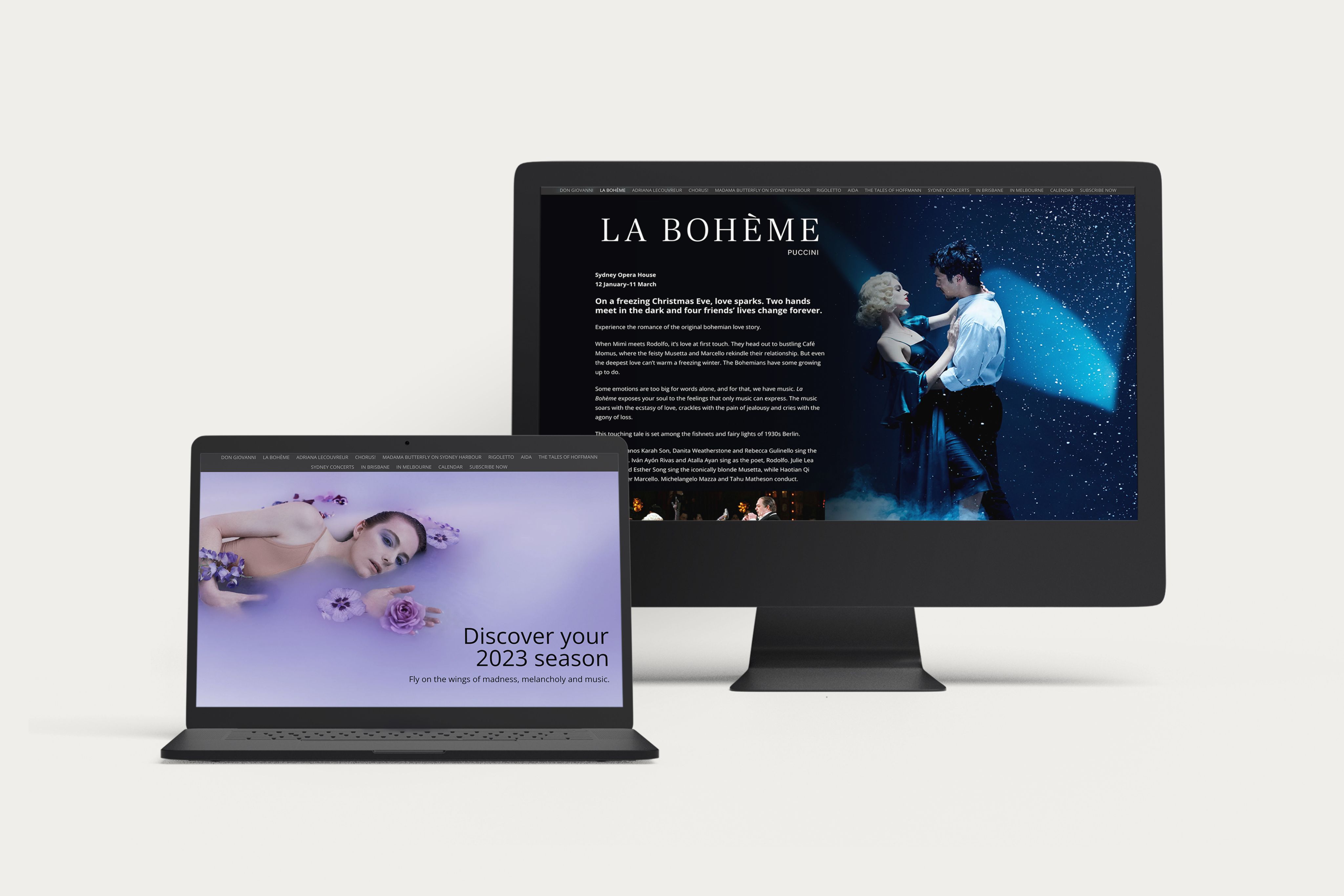
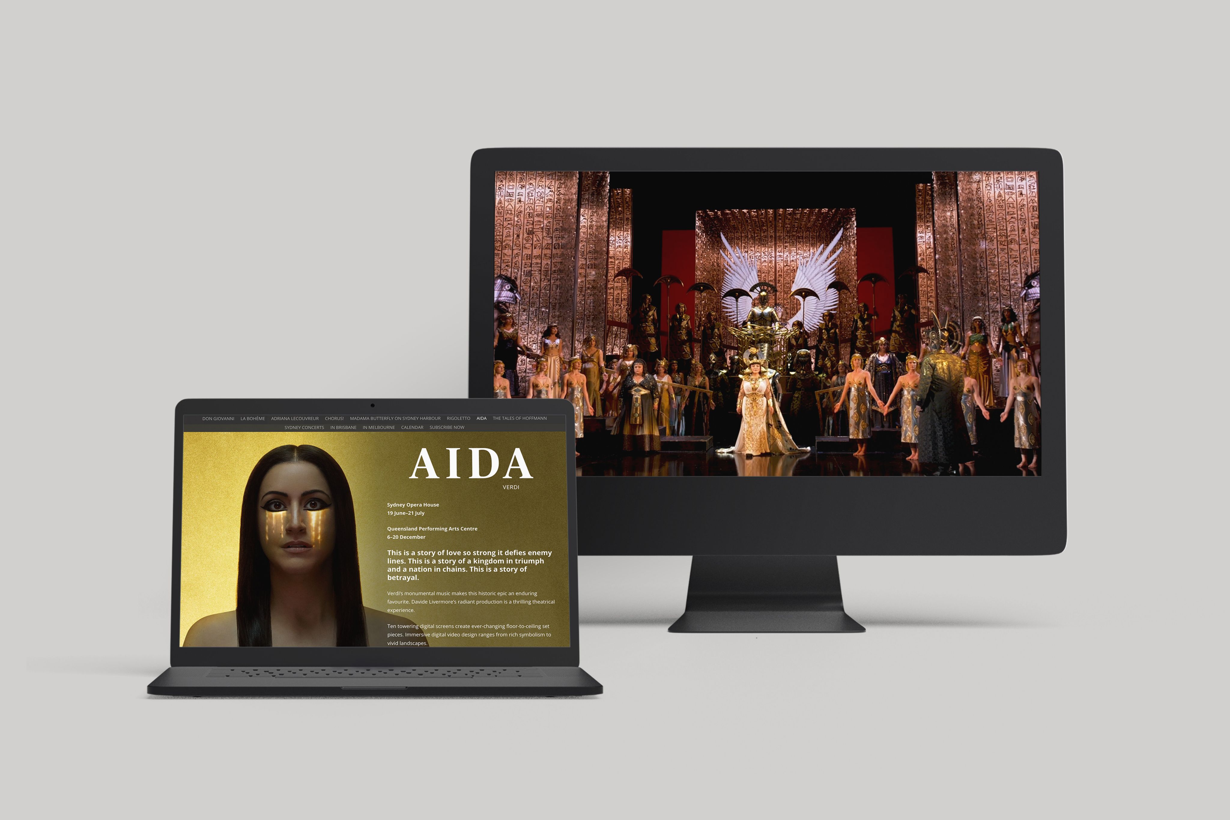
This programme from Opera Australia is a good case study of clever content design combined with elements of immersive digital storytelling.
If we tried to reconstruct the user story for this programme, it would go something like this:
“As an arts enthusiast, I want to see all the shows Opera Australia is staging in 2023, so that I can pick a show to go to.”
Crucially, the content design of this programme wasn’t about delivering highly specific information about each show, or the ticketing buying process; it was about giving a scrollable, shareable overview of what was on in 2023.
This programme used striking images to make the clear distinction between each show, and has titles, dates, venues, and buttons to get more info. As the reader scrolls, each section is consistently designed, and videos allow people to get info about a show in another format.