How to be a better storyteller
Here are seven deadly sins: what not to do in content.


As someone who helps our customers get started in Shorthand, I often get asked about the art of storytelling and what makes a compelling story.
By Dawn Murden
But I also get asked about what makes a bad story. And when working with new digital storytelling platforms, this is arguably a more important question. Great storytellers with amazing storytelling skills can still make serious mistakes when working with an interactive and visual medium like the web, no matter what types of stories they’re telling.
In this article, we’re going to run through seven storytelling sins, so you can capture your audience’s attention and delight them with your impressive storytelling technique.
What about how to be a good storyteller? There’s plenty of technical advice you can find online, but for web content, there’s one takeaway think of your readers as real-life audience members — human beings that are restless but eager to enjoy the power of storytelling. From creative writing to feature stories, storytelling has so much potential to delight an audience. Respect their time and personal experience.
What do the BBC, Tripadvisor, and Penguin have in common?
They craft stunning, interactive web content with Shorthand. And so can you! Create your first story — no code or web design skills required.
Start storytelling.
1. Not optimising images or videos for the web


Forgetting or failing to optimise images, files, videos, or podcasts on your own stories can be hugely detrimental to your readers’ storytelling experience. It could mean that experiences across devices/browsers are inconsistent and that some audiences are starved of critical information, or — in the case of weighty video files — it could mean your readers never get past the first section as they get progressively hacked off with buffering or the 'wheel of death'.
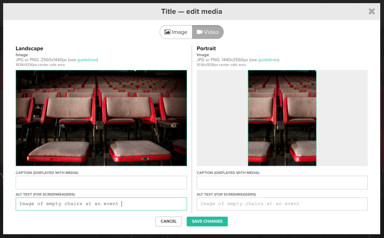
The first port of call to ensure all your stories are optimised for the web is to check out the optimisation checklist in our support documents. This gives a breakdown of how to prepare all media for Shorthand efficiently, whether it's a PNG file, JPEG or an MP4 for background video. It also links to our safe area guides, the transparent overlays we have prepared that help ensure your images take into account different browser and device sizes.
Finally, we have recently added media warnings into the editor so that if you upload a PNG where it should be a JPEG file, or your files are too large, it tells you.
Basically, just don't ignore the warnings!
2. Failing to test across different devices


If you track your readers' behaviour, you'll be best placed to know what browsers/devices they use to read your content, and where to focus your efforts. That's important, but so is producing a consistent experience across the breadth of devices in use.
When you're building your story in Shorthand and adding media, you can get a sense of how the landscape and portrait view are going to work and if you need to add an alternative crop for mobile.

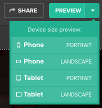
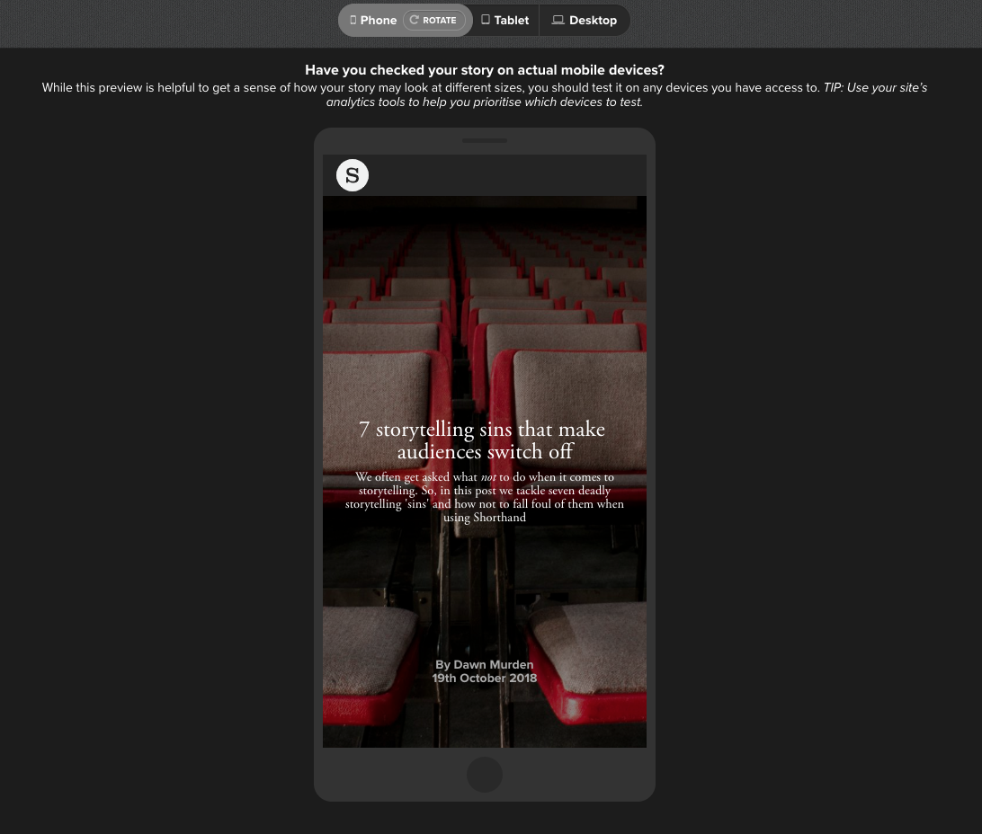
You can use the preview button in the top right hand side of the editor to get a sense of how your story is going to look once published. To the right hand side of this button, you will see a dropdown menu that enables you to use our simulator to check the experience across different devices too.


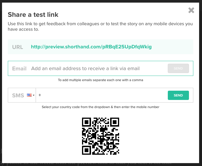
You'll also notice the share button to the left hand side of the preview button. With this feature you can send the preview link to any phone in the world via SMS, so that you can test the story quickly and easily.

3. Not promoting the story


The best storytellers promote their stories — whatever your metrics of success. A good promotional strategy should be at the heart of every story. How will your readers find it? Will you promote it on social media platforms like LinkedIn to be distributed via their algorithm, or will it feature in any regular communication like newsletters? (We'll be writing more about this soon.) Most importantly though — and often left to the last minute — how/where will it be published on your website?
Much of the last question depends on what subscription plan you choose with Shorthand. However, despite how/where it's published you can opt to use our story launcher embed to launch the story from your CMS.
You'll need to know the URL where your story is hosted first. To the right hand side of the publish button, you'll see a dropdown where you can open a new window for the story launcher. Simply enter the URL of the story to activate the embed and then paste that into your CMS.
Here you can see how the Financial Times Adviser has used the story launcher embed on its website.


4. Making the story too busy


Web design is a bit like body language in public speaking. Just like that Ted Talk public speaker that can’t keep still, overwhelming web design is massively distracting.
It's important to create stories with designs that are easy on the eyes and make people want to keep scrolling to the end.
Often the urge to fill your Shorthand story with all the content you have can be mighty tempting, but claw yourself back and question your motives. You should only be adding media and interactive elements that really add something to the story, such as breaking down a complex issue or process.
Think about the design and remember that whitespace or negative space is, in fact, a really positive thing (like the space either side of this text column). It can help with increased content legibility, interaction, ability to highlight call to actions, creates balance and can act as a separator, generally giving elements room to breathe. From a very basic point of view, think about how overwhelming reams and reams of text are.
Remember to treat the web differently from print too. If you are converting a PDF report or creating a digital abridge, think about this story in its own right as a standalone piece.
5. Believing that all third party HTML embeds work 'out of the box'


One of the core attractions of the Shorthand editor is that it enables you to design completely responsive stories for the web that look great on any device.
Our customers love that it gives plenty of flexibility when it comes to using other tools, such Infogram to create infographics, chart and maps, Thinglink for interactive images, or YouTube videos to enhance the narrative.
Though, a particular error many make is assuming that all third party embeds are responsive and will work automatically. Take Google Maps, for example, which is a frequently used and well-known tool. And yet, if you take the iframe code directly from there and embed it into a Shorthand HTML section, it looks like this on desktop...


This happens because the code in the iframe gives you a set height and width, and it does not 'respond' when it is viewed on different devices or screen sizes.
If in doubt, use our Rich Embeds feature to have your embedded tools or media looking great.
6. Careless use of the Scrollmation sections
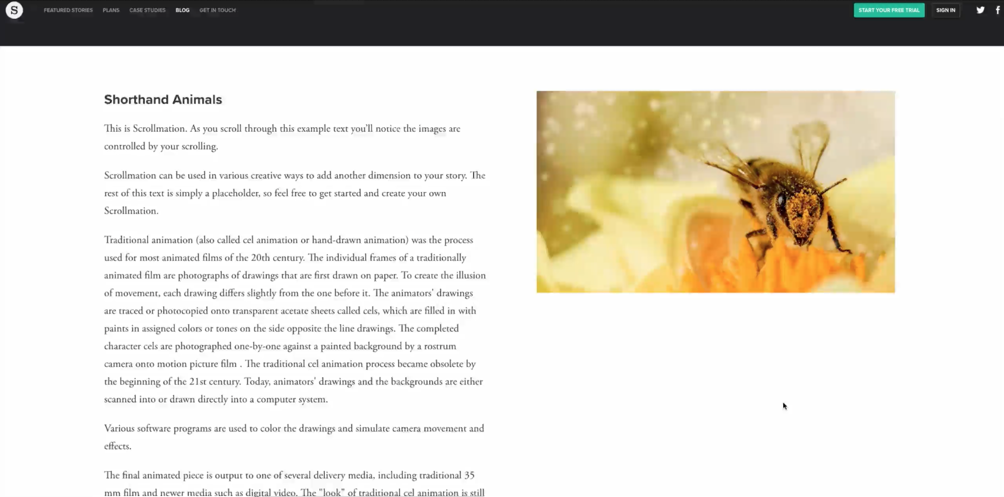

The Scrollmation and Background Scrollmation sections are really effective for storytelling when they are used well, whether you're adding context, extra information or a flipbook animation.
Using Background Scrollmation, you can have a full screen image/s sitting behind a column of text, and on desktop you can adjust the placement of that text column depending on where the focal point of your image/s is.
With Scrollmation, you can have a column of text on the left or right hand side and a column featuring an image/s on the opposing side on desktop. On mobile you can choose whether or not you want to opt for Scrollmation or have the images appear inline.
There are, however, a few tips to take into account when using these sections:
- Just because you can have more than one image doesn't mean you should. Does each image add to the story?
- Think about how much text you have and how that will work with the images. If you have a limited amount of text, your readers may not be able to see all images, or they may change too rapidly
- Think about the transitions between images in the Background Scrollmation. You can use the tortoise and the hare in the Section Options to add a fast/slow fading transition to make the change from one image to another gentler on the eye — especially if they are starkly different
- When using the Scrollmation section on portrait screens, to ensure that your image isn't cropped make sure it is in a 16:9 wide/landscape aspect ratio. Images that aren't at this ratio will be cropped to fit the space.
You can also read more on Scrollmation and Background Scrollmation in our support docs.
7. Not including a CTA or onward journey for your readers


More often than not, a call to action (CTA) and/or onward journey should manifest while planning a story and thinking through its objectives.
For example, if it's a shoppable story the CTA will be to buy products and then read past editions, whereas if it's an annual report the CTA may be to download the hard copy, share it with your audience and return to the main website afterwards.
Think through your goals and ask yourself: what do you want your audience to do while reading this story and when they've finished? Then, give them a sure fire way of doing exactly that.
In this Refinery29 example, it has attached links to images so that readers can click through to shop the look. IT has also added in its own ad tags using the HTML blocks, to encourage readers to subscribe to its newsletter.

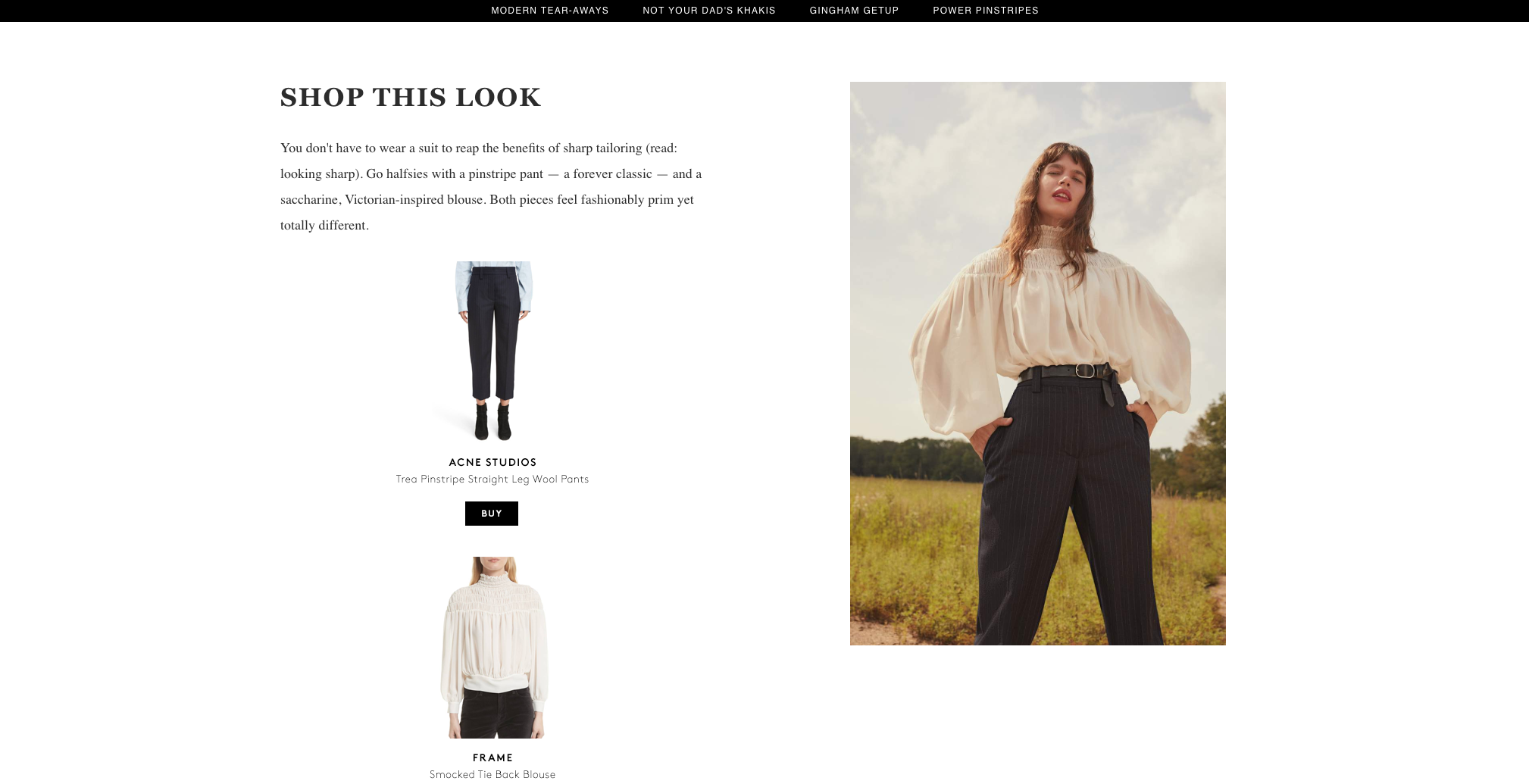
Example of a shoppable story by Refinery29
Example of a shoppable story by Refinery29
Shorthand's Collection Section makes it much easier to link to relevant stories or webpages at the end of a story. We have also seen some customers using this to create a landing page for projects.

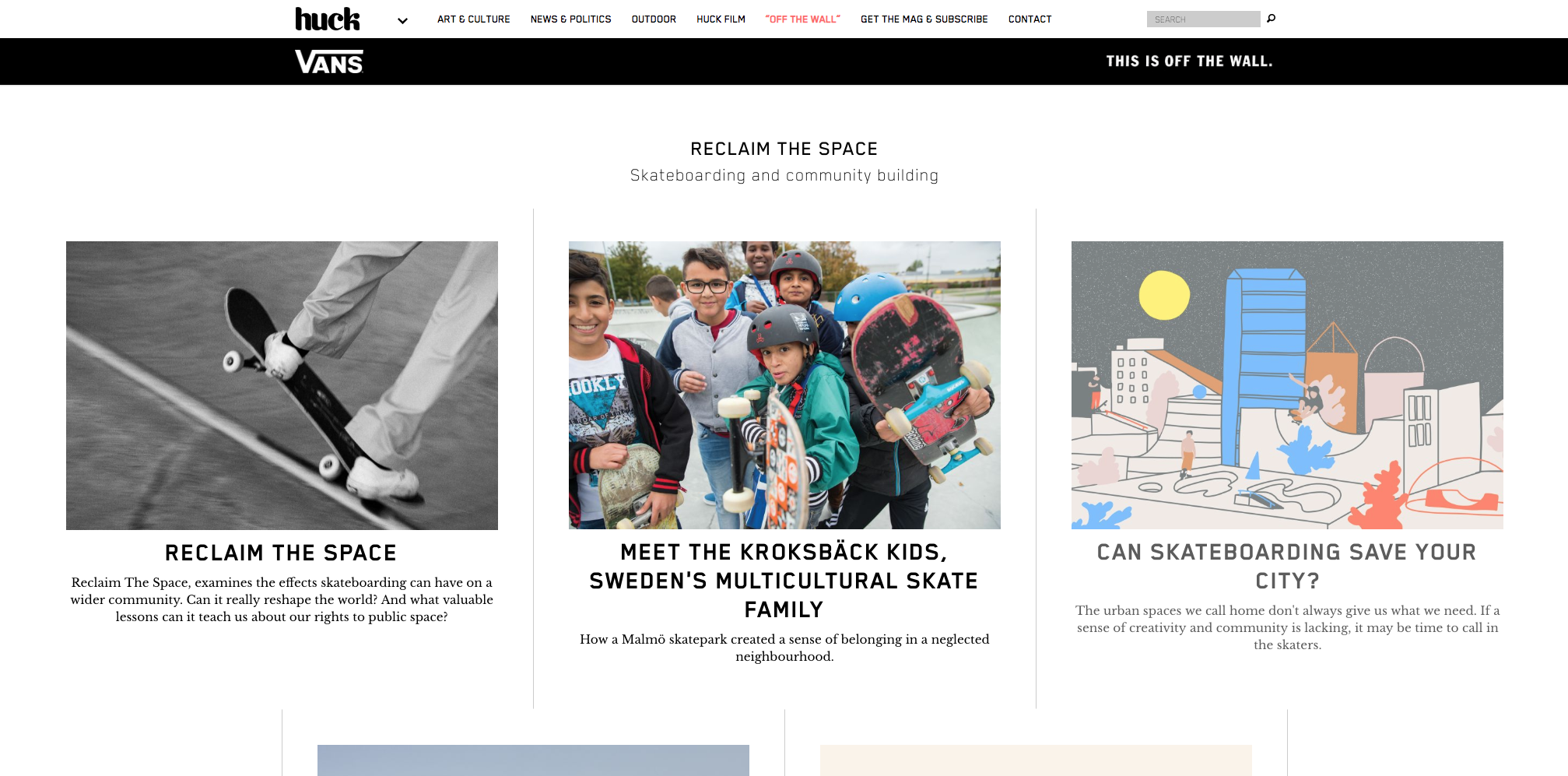
Example of Huck Mag's Vans Off The Wall campaign with a Collection Section
Example of Huck Mag's Vans Off The Wall campaign with a Collection Section
That concludes our seven storytelling sins. If you have any questions about Shorthand, the tips we've covered, or if you think we've missed a cardinal sin, get in touch.