A guide to powerful data storytelling


How do the world's most successful media and marketing teams get the attention of their audience? It's a major challenge. With global crises, distracting devices, and rampant disinformation, it's becoming harder than ever to get people to pay attention to the content that matters most.
by Ritiki Puri
An increasingly popular technique for marketers and journalists is to create data stories, which combine narrative storytelling and eye-catching visualisations. Done well, data storytelling can be captivating, credibility-building, memorable, eye-opening, and delightful — all at once.
In this guide, we cover:
- What is data storytelling?
- Why people like it
- The pitfalls of data storytelling
- Data storytelling for the rest of us
- Data storytelling tools
- Data storytelling examples
Let’s jump right in.
Want the latest thought leadership on data storytelling? Read Tim King's Death to boring data: how to turn stats into stories people want to read.
What do the BBC, Tripadvisor, and Penguin have in common?
They craft stunning, interactive web content with Shorthand. And so can you! Create your first story for free — no code or web design skills required.
Sign up now.
What is data storytelling?


Data storytelling is about using numbers and symbols to establish and advance a narrative. The goal of data storytelling is to embed beautiful data in a compelling story.
Data storytelling is an especially valuable technique for simplifying complex information, demonstrating patterns, explaining the reason for trends, showing states of change, and making “a bigger picture” more concrete.
As with photojournalism and design, the goal of great data storytelling is to show rather than tell. The nuts and bolts of data storytelling — including data analysis, design, and visualisation — should ideally sit in the background.
The most celebrated examples of data storytelling, such as those from the New York Times, Five-Thirty-Eight, and the recent award-winning data story on Brexit from Sky News — are from media organisations. But great data storytelling isn't just limited to media.
Increasingly, businesses are using data storytelling for their content marketing and internal communications with stakeholders. They're also using data storytelling to generate actionable insights for business intelligence and to make better business decisions.
Looking for examples of great data stories? Check out our roundup of 8 powerful data stories or our visual showcase of dozens of impactful data storytelling examples.
Humans: hungry for information
There's nothing new about data storytelling (or data science, for that matter). What we call 'data' in our modern culture is how ancient civilisations shared knowledge, warned each other of predators, maintained records, and created the foundations of modern commerce.
As anthropologist and University of Miami professor Caleb Everett explains in an interview with Smithsonian Magazine, “Numbers are this really simple invention."
Neuroscience researchers have uncovered that human minds have a map for numbers, which is why data is so powerful for making abstract and complex topics easier to understand. Numbers and symbols are relatable on a basic human level.
“It’s as if there is a number line in our heads,” writes Emilie Reas, a researcher, for Scientific American.
Mind-maps also exist for sensory and motor information, bodily space, and visual surroundings. Great data storytelling connects all of these capabilities together, which is why it can be so remarkably powerful.
The pitfalls of data storytelling
If you work in content on the web, you've probably heard about the rise in voice searches. A quick Google will reveal that 50% of searches were predicted to be made by voice from 2020 onwards.
This number sounds impressive, and has no doubt supported investment in audio by a range of companies around the world.
The problem? This number has no source. The apparent source — Comscore — never actually made this claim.
Data is a double-edged sword. When we use it wisely, we can take our audiences through a powerful narrative journey.
The problem with data, though, is that people often use numbers irresponsibly — often without realising there’s an issue. And as recent world events would suggest, misrepresented data has the potential to do a lot of damage.
The web today is rife with disinformation, poorly-supported opinions, and outright manipulation. The higher purpose of data storytelling is to create high-quality, well-researched, evidence-based stories for the benefit of your audience.
Data storytelling for the rest of us
The foundation of most data stories is data visualisations, including infographics and interactive charts and maps. The problem for many content producers, though, is that the tools for creating great looking data visualisations require significant developer resource.
One prominent example is the data journalism team at the New York Times. This expert team routinely creates groundbreaking data stories, such as the changing nature of middle class jobs.

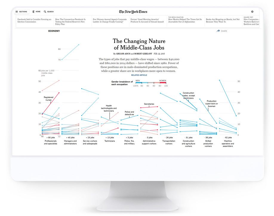
The problem? They have (literally) a team of developers working on these stories. There are few, if any, other content operations with the resources to invest in this level of data visualisation.
So what about data storytelling for the rest of us? The good news is that there are a range of ready-made tools and platforms available to creators, including javascript libraries, databases of symbols, infographic templates, and design resources.
Ultimately, there are many different techniques for communicating and visualising data stories. More often than not, we may feel limited by our technical capabilities, access to budget, and artistic abilities.
There’s a saying among artists, however, that constraints foster creativity. You don’t need to produce the most heart-stopping, visually innovative data visualisation to tell a good data story. You can make use out of what you do have.
Data storytelling tools
With that in mind, here are some tools, resources, and platforms to keep in mind when building your data story. To help out, we’ve included a comment about the skills required to get started.
Javascript libraries
These days, there are a range of javascript libraries that developers can use to create stunning visualisations. Depending on your publishing platform, these can be embedded within your narrative. Popular libraries include Highchart, d3.js, and Chart.js. You can read more about data visualisation javascript libraries in this post from Logrocket.
Skills required: You'll want to have a developer on hand to make the most of these libraries.
Tableau
Tableau is a data analytics and business intelligence platform, aimed at enterprise decision-making. You can add a range of data sources to Tableau to create dashboards and charts, which can then be embedded in third-party publishing software.
Skills required: Tableau is a mature product with many different features, though some expertise in data science is needed to make the most of the platform.
Mapbox
Mapbox is a platform for creating live, interactive maps — that is, maps powered by live data feeds. If you have a source of geospatial data, you can design custom maps that can be exported or embedded to your data story. Many of the most impressive maps on the web today have been built using Mapbox.
Skills required: Mapbox is aimed at geospatial professionals, designers, and developers — and to get the best results, ideally you'll have skills from all three fields, and some experience wrangling big data sets.
Flourish
Flourish is a data visualisation platform that has become increasingly popular with media companies and newsrooms. Flourish can be used to create interactive bar and line charts that look great embedded in a CMS or storytelling platform.
Skills required: If you're happy using templates, then anyone can add data to create interactive charts and graphs.
Venngage
Venngage is one of a handful of entry-level data visualisation tools. Cheaper and more accessible than tools like Flourish, Venngage can be used to create great-looking charts, graphs, and infographics in minutes. Venngage also provide an enormous range of templates for non-designers to use.
Skills required: No design or development expertise required.
Piktochart
Similar to Venngage, Piktochart is an entry-level data visualisation and infographic tool. It's trivial to create professional charts and graphs using templates, which can be easily embedded in your publishing tool.
Skills required: No design or development expertise required.
Shorthand
Shorthand is a digital storytelling platform that can be used to create interactive data stories. Data storytellers can either embed their choice of third-party data visualisation, or create animated data visualisations from static images using scroll-triggered animations.
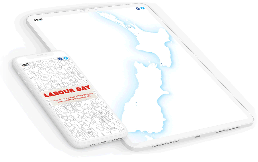
One great example of this kind of data visualisation comes from New Zealand media company Stuff, who used scrollytelling techniques to visualise trends in that country's recent elections.

Skills required: No design or development expertise required.
Examples of stunning data stories
The most successful data stories combine stunning visualisations with a compelling narrative. Here are a few examples to offer inspiration:
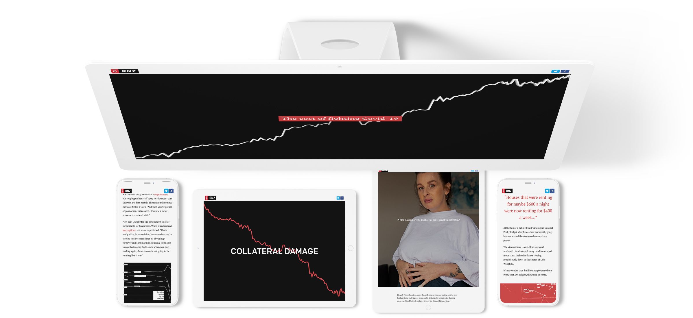
This investigative report from Stuff explores the widespread economic crisis of COVID related unemployment, on a human level. The narrative connects sociological data insights with individual stories, creating a link between the two perspectives.


This interactive infographic from Sky News provides an analysis of Brexit’s impact on the United Kingdom. It examines how the UK has changed over time — creating a comprehensive, longitudinal view of the legislation’s impact.


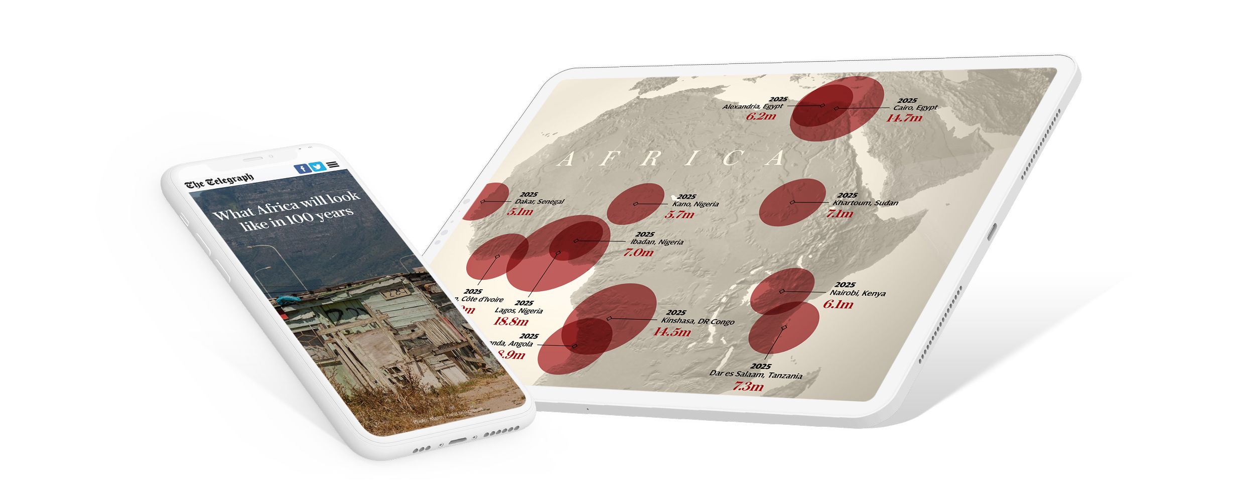
The Telegraph created a series of visualisations to help readers understand and envision what Africa could look like in 100 years. This piece connects data with photojournalism to bring greater storytelling depth to numbers.


Radio New Zealand published a report showing the economic effects of COVID-19 on the people of Aotearoa New Zealand.


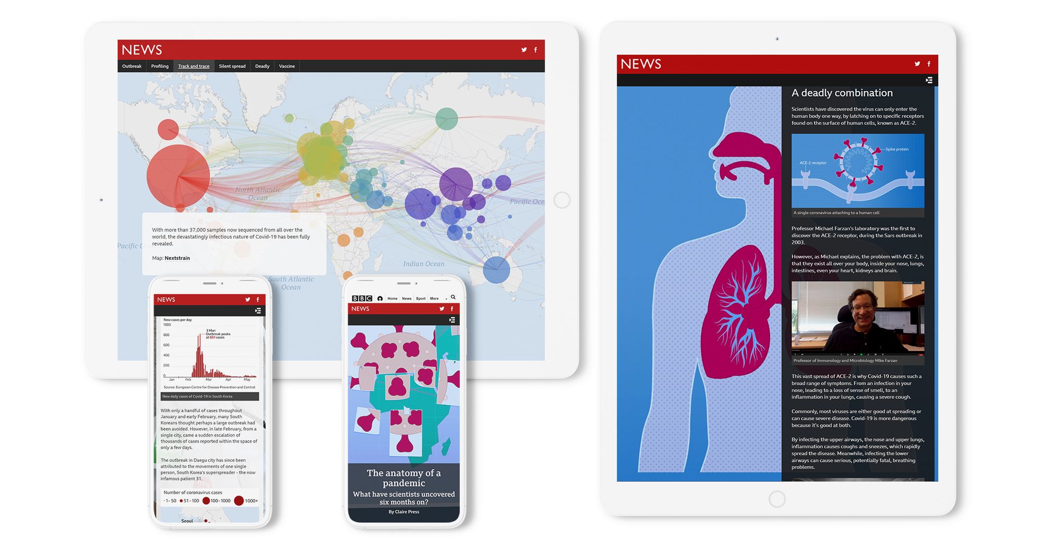
BBC created an interactive infographic to show audiences how the COVID-19 pandemic moved around the world. This report brings focus to key ideas, in a media environment where information has otherwise been scattered.


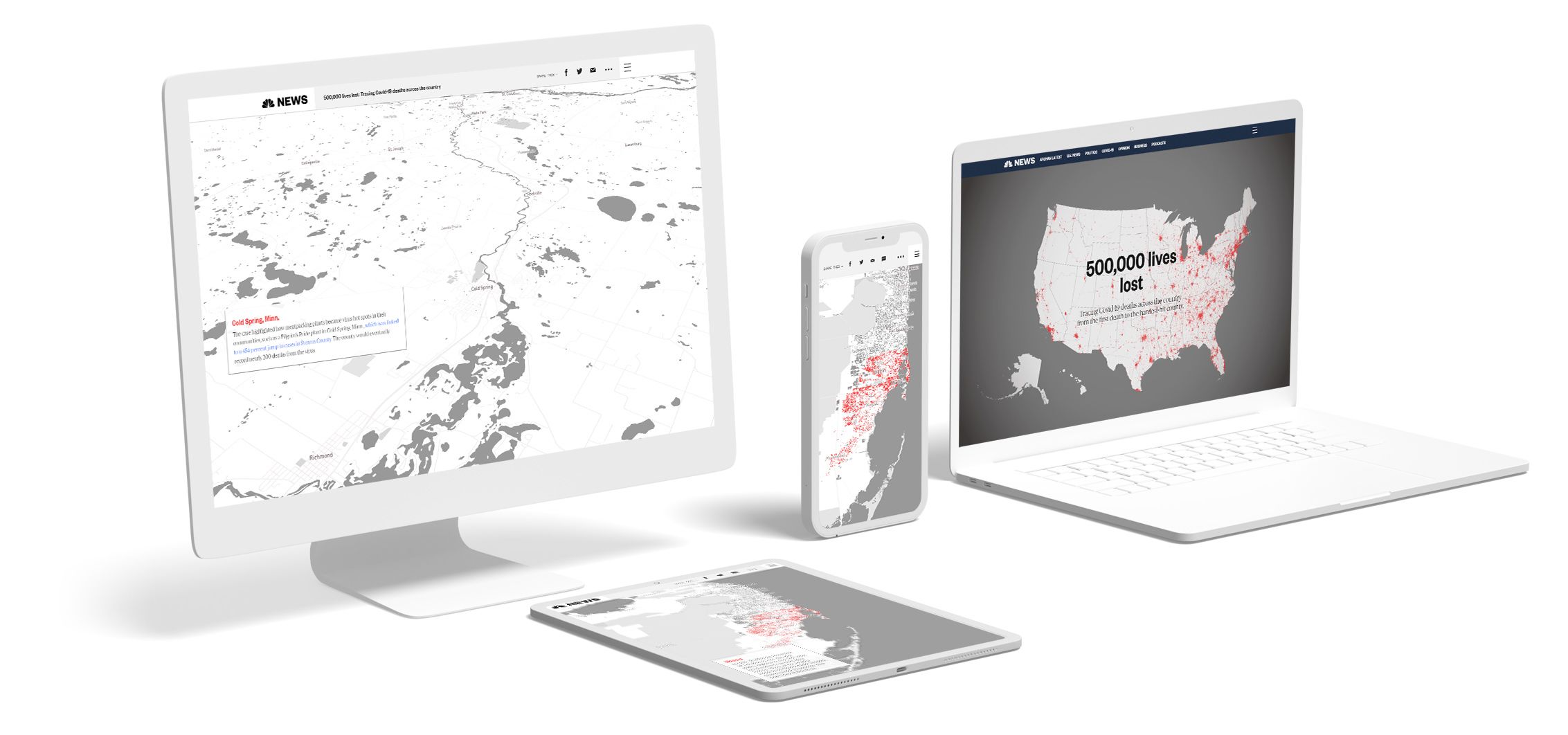
NBC released an interactive visualisation to help people grasp a pandemic death toll of 500,000 people in the United States. This insight brings a level of awareness that would be impossible to grasp with high-level statistics.


See more examples of data visualisations built with Shorthand in 8 examples of powerful data storytelling, or browse our visual showcase of dozens of impactful data storytelling examples.
Final thoughts
The ability to tell a story with data is a skill that is evergreen. With practice, data storytelling capabilities become more intuitive. If you’re just starting out, don’t worry. Historically, data storytelling and visualisation have been limited to trained data scientists with programming and quantitative experience.
These days, a range of new tools and software platforms are available to help you use the power of data to create compelling stories for your audience.