Design guide: 8 principles to help you create beautiful Shorthand stories


Beautiful stories draw readers in with elegant typography and powerful imagery, supported by thoughtful layouts and cohesive branding. This guide shows you how to do it with Shorthand, but the design principles apply anywhere.


by Dave Acton
by Dave Acton
Vox pop: I asked members of the Shorthand team what makes a truly beautiful story. Here are some of the things they said:
- Using interesting visual effects
- Choosing slick colour palettes
- Bringing text to life
- Keeping it visually coherent
- Less is more
- Creating a great user experience
You can use these ideas to craft beautiful Shorthand stories yourself. Below, I've distilled them into eight principles.
Prefer a video? Watch Dave's explainer now.
Start creating with Shorthand
It's the fastest way to publish beautifully engaging digital magazines, content marketing, and more.


1. Know your audience
Let's imagine, for example, we're running a restaurant, and the three core values of our restaurant are that it's:
- fast
- convenient
- tasty
Our branding might look something like this:


And our restaurant might look something like this:


Now, let's contrast that with a brand whose values are:
- relaxed
- sophisticated
- artisanal
That brand might look something like this:

And its restaurant might look something like this:


By knowing your audience, you’re able to speak directly to them. You can empathise with them, tailor your message, and design something that resonates — just as the above imagined restaurants do.
“Design is the silent ambassador of your brand”
Paul Rand
2. Have a theme
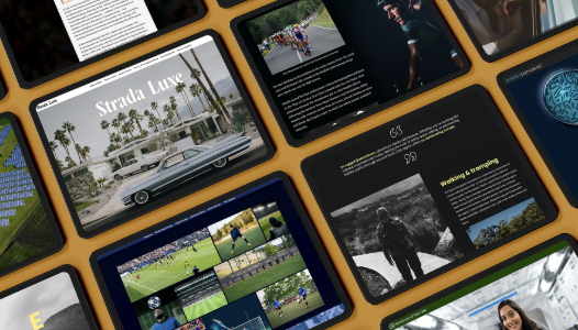
A theme creates consistency in your design and in your story. Consistency's important, because it helps build a sense of trust with your audience.
What makes a theme?
A theme is made up of elements such as:
- a logo
- colour palette
- typography
- photographic style
- illustration style
- iconography
- border radius
3. Keep it simple
Simplicity makes things harder to ignore. When we're creating a story it's tempting to add more, to say more, to include more; but that can overwhelm our reader. In an era of noise, with so much content being created, we need to make sure that we aren't ignored.
To do this, simplify.
How can we simplify?
- focus on what's necessary
- use clear, concise language
- exercise restraint with your design decisions
- choose the right media to help communicate your message
- use clear calls to action
There's a lot going on in this poster for a barber.


As an experiment I applied some of these simplification techniques to the poster, and this is what I came up with:

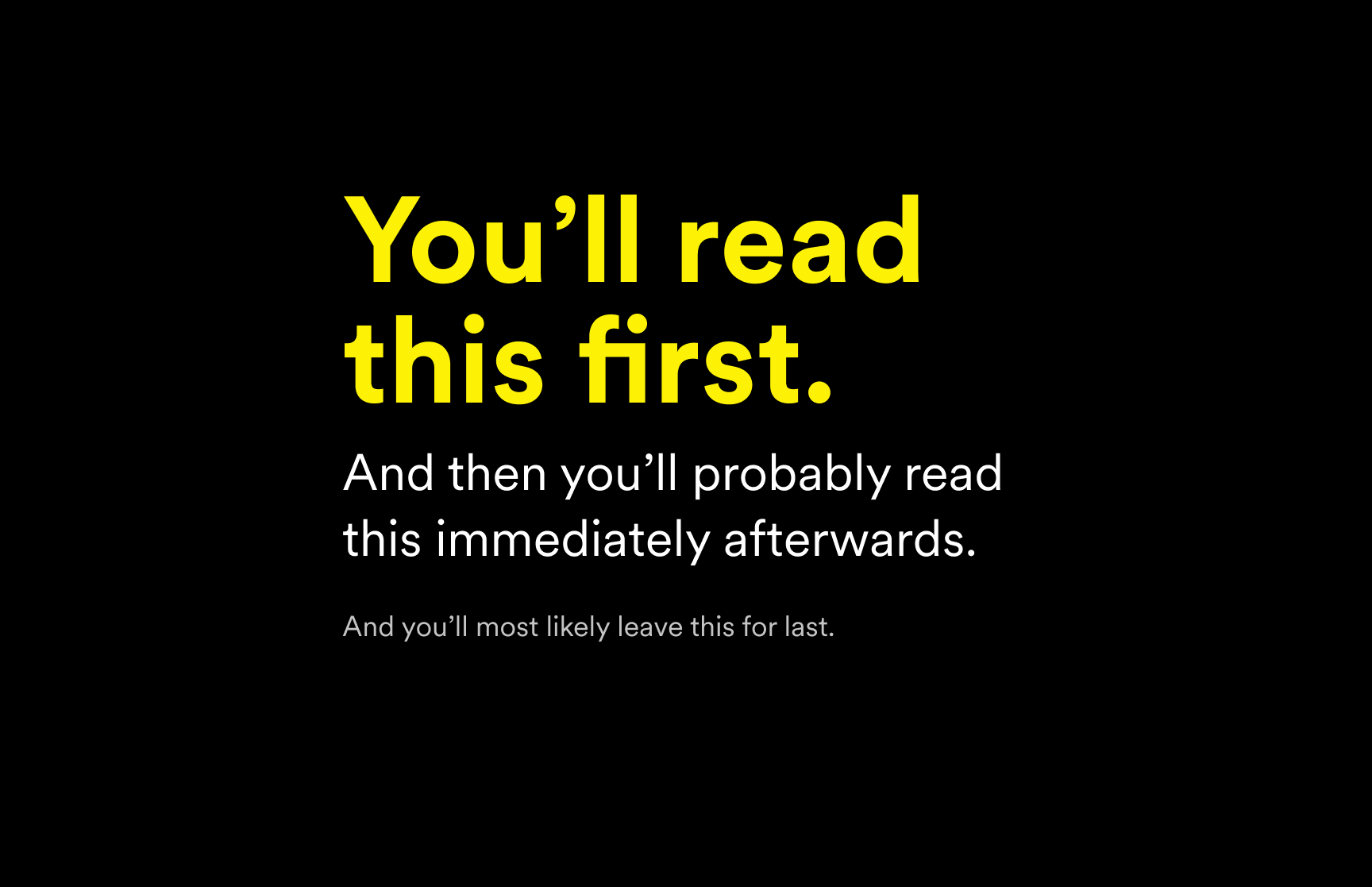
4. Use hierarchy
In this paragraph of text, all the words are the same style.
But when you apply hierarchy, it becomes a lot easier to read. It helps your reader work out what they should read first, what they should read second, and what they should read third.
5. Optimise for clarity
When something is visually noisy, it can distract us from the important message. We can help by choosing colours, typography, and images that work well together.
Here's an example of a title section in Shorthand using colours and text and a background image that make it difficult to read.


Here's that same title text with some contrast applied. You can see this is a lot easier to read.

For further information on crafting easy-to-read stories, read our guide to accessible visual storytelling →
“Motion creates emotion”
Saul Bass
6. Add movement
The images above the text in this example are set to animate in.
This creates more interest in the story, as it’s not so static.
“Numbers have an important story to tell.”
Stephen Few
7. Let data tell the story
Here are three paragraphs of text about coffee production around the world.

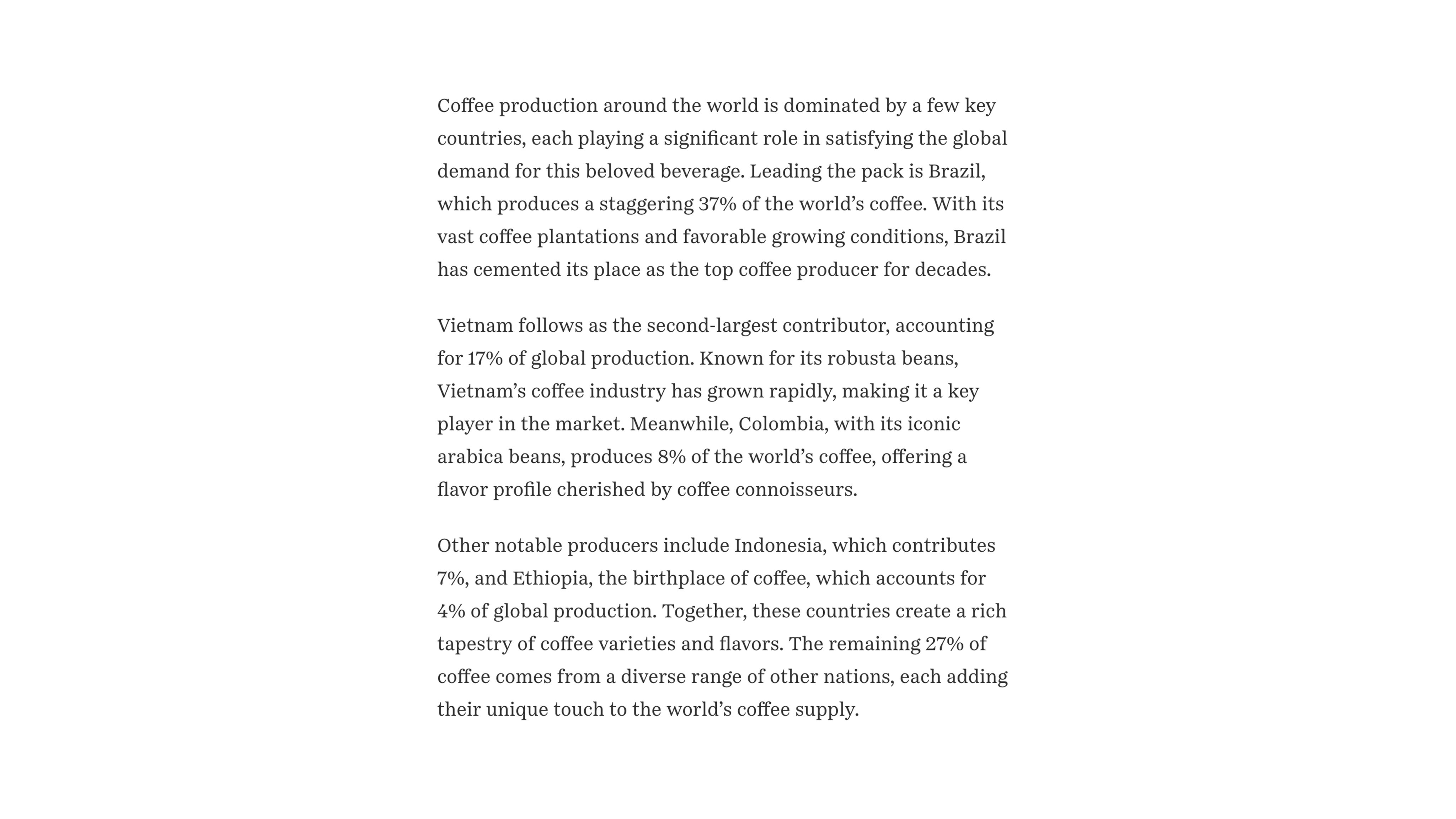
There’s some great data in there, but if your viewer is just skimming through, they might miss it.
The below example takes the same data from the paragraphs of text and uses the Chart tool to help us visualise it.
You'll easily see that Brazil is leading the pack with 37% of the world’s coffee production. Even if the reader is skimming through the story, they still take away the key points.
Want to turn your stats into stories people actually want to read? Try our data storytelling guide →
“If you don’t ask, the answer is always no.”
Nora Roberts
8. Inspire action
The end of our story is a great place to ask our viewer to take some sort of action. A simple way of doing this is by using a button, which you can easily add within your Shorthand story. Below are a few different brand styles to show how our notes from Principle 1 — know your audience — still apply.
Beautiful stories don’t happen by accident. Skill and consideration go into their strong visuals and purposeful structure.
The eight principles shared here will stand you in good stead. Start with your audience and a clear theme. From there, simplicity, hierarchy, and clarity remove distraction and guide your reader. Finally, movement, visual communication, and a clear call to action make your story unforgettable.
What's next?
You've learned the eight principles. Now, watch Dave's part 2 video to learn what beautifully simple storytelling actually looks like in practice
Resources for digital storytellers:
Free templates, inspiring examples, and data visualisation tools.