
10 examples of innovative
sports marketing

Today, sports marketing strategy is becoming increasingly digital. More and more sports teams are looking to build out their own owned media functions to better market and sell their brand and sporting events.


by Kiera Abbamonte
Social media marketing efforts have been central to sports brands for years, but cutting edge multimedia web content is growing in popularity, too, with the best clubs and organisations borrowing well-honed techniques and approaches to content from media and other non-sport brands.
That’s what we’re focused on here. In this piece, we showcase the best of the best examples of sports marketing — created by both brands and sports media — to help inspire your next sports marketing campaign.
We'll cover:
What is sports marketing?

Before we dive in, let’s talk about the two different definitions of 'sports marketing'. It can refer to both:
- marketing of sports — e.g. teams, organisations, events, and
- marketing through sports — done by regular brands like Nike or Adidas, via sponsorships, naming rights, or professional athlete influencers on social media.
For our purposes here, we’re focused on the former: the marketing of professional sports by clubs and organisations, sometimes in partnership with sports media outlets, instead of brands using sports to market their own products.
Start creating with Shorthand
It's the fastest way to publish beautifully engaging sports marketing, articles, internal comms, and more.


10 sports marketing examples
we love

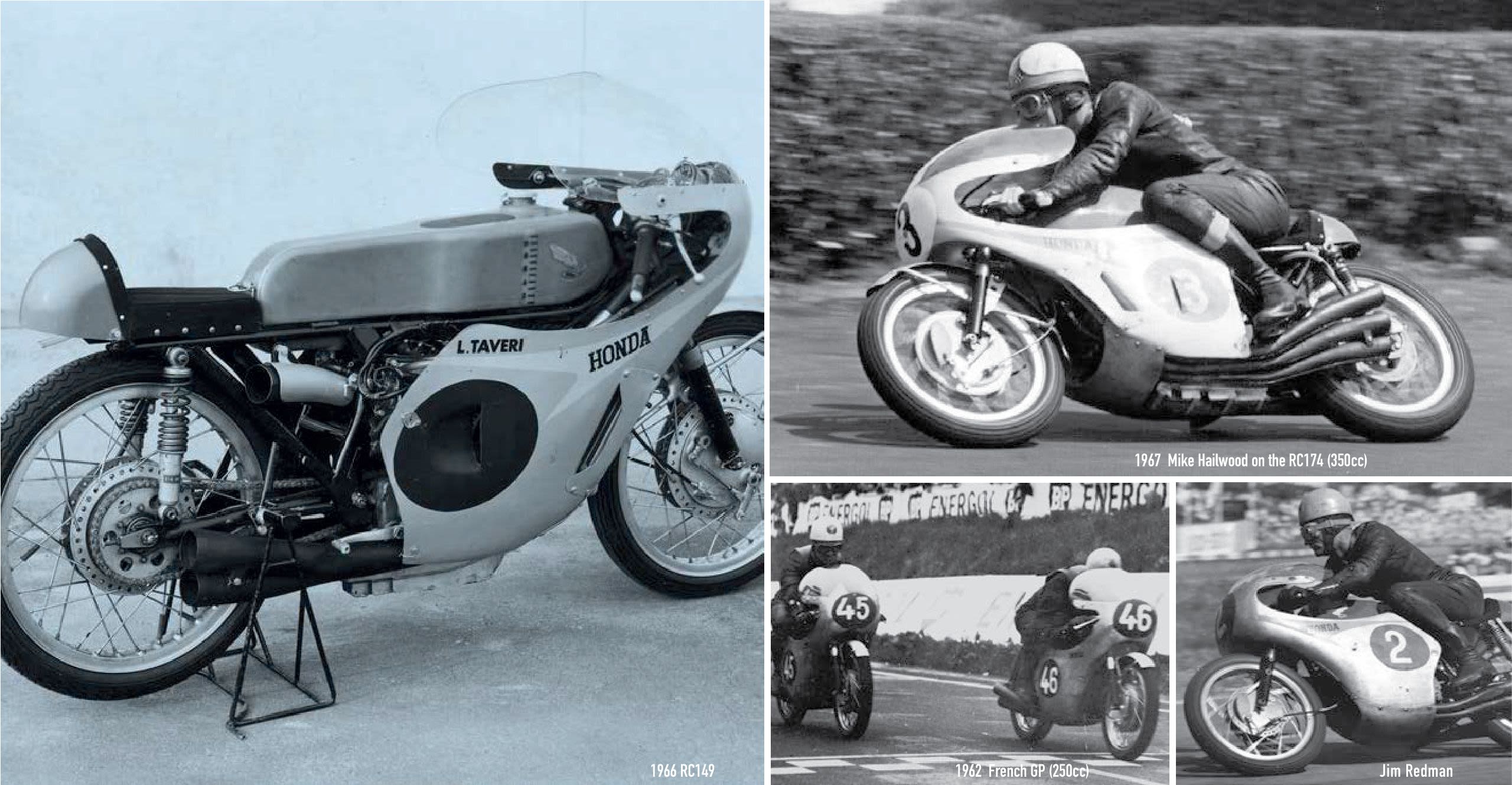
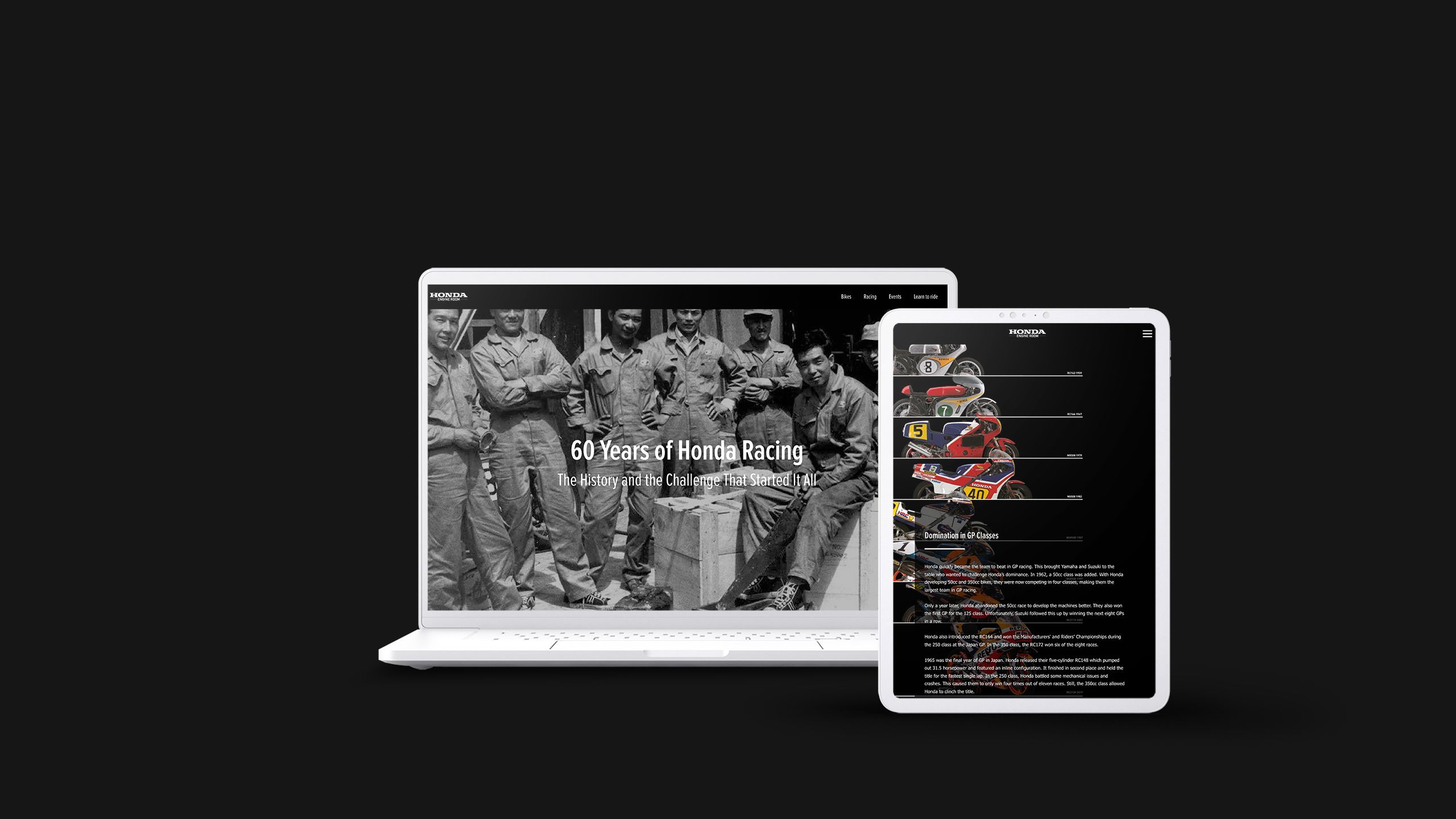
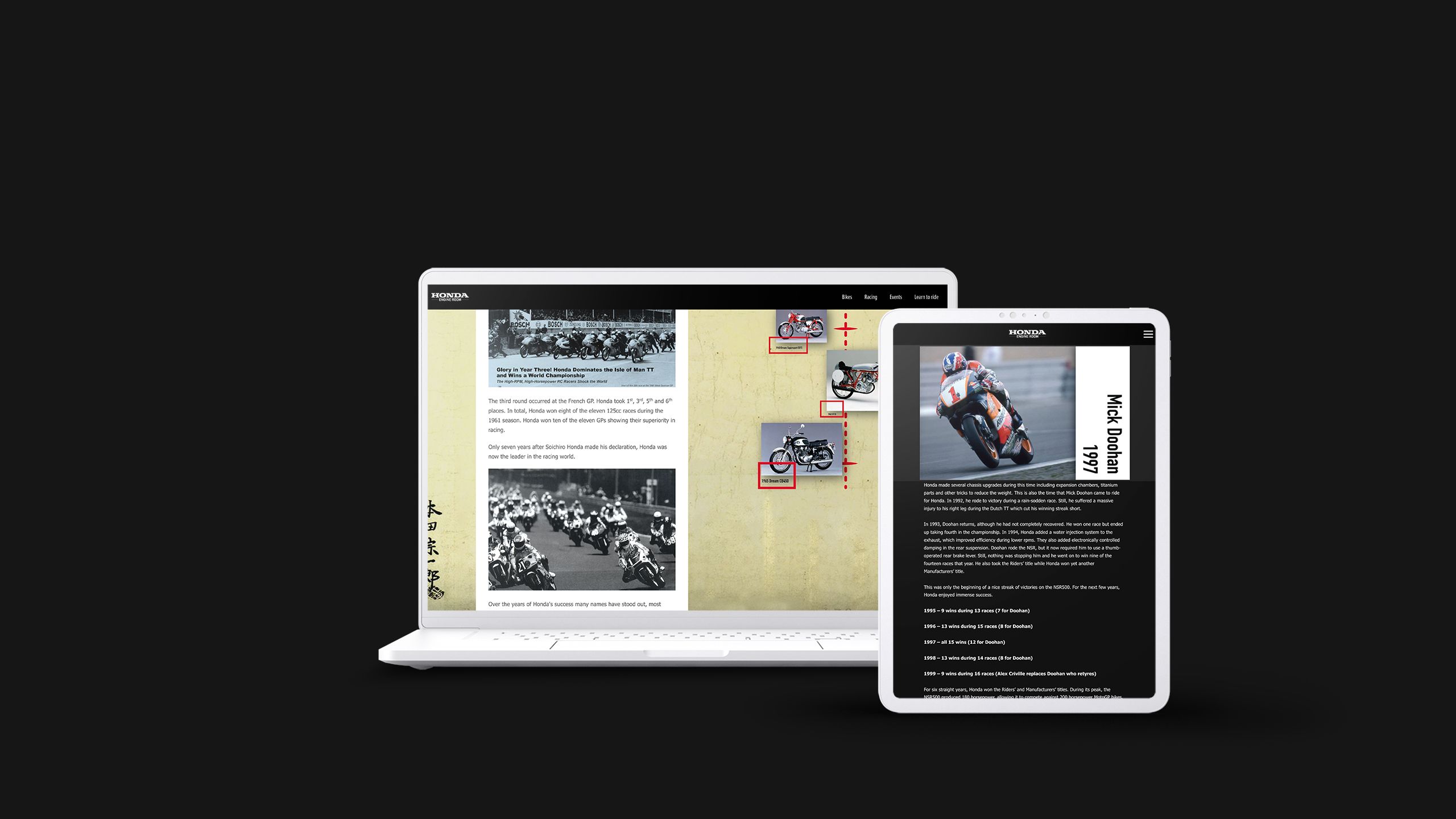
1. 60 years of racing
What it is: A celebration of Honda’s racing history
Who created it: Honda Engine Room
Why we picked this example: It’s a brilliant piece of brand storytelling, sharing the history, design progression, and glory, at Honda racing.


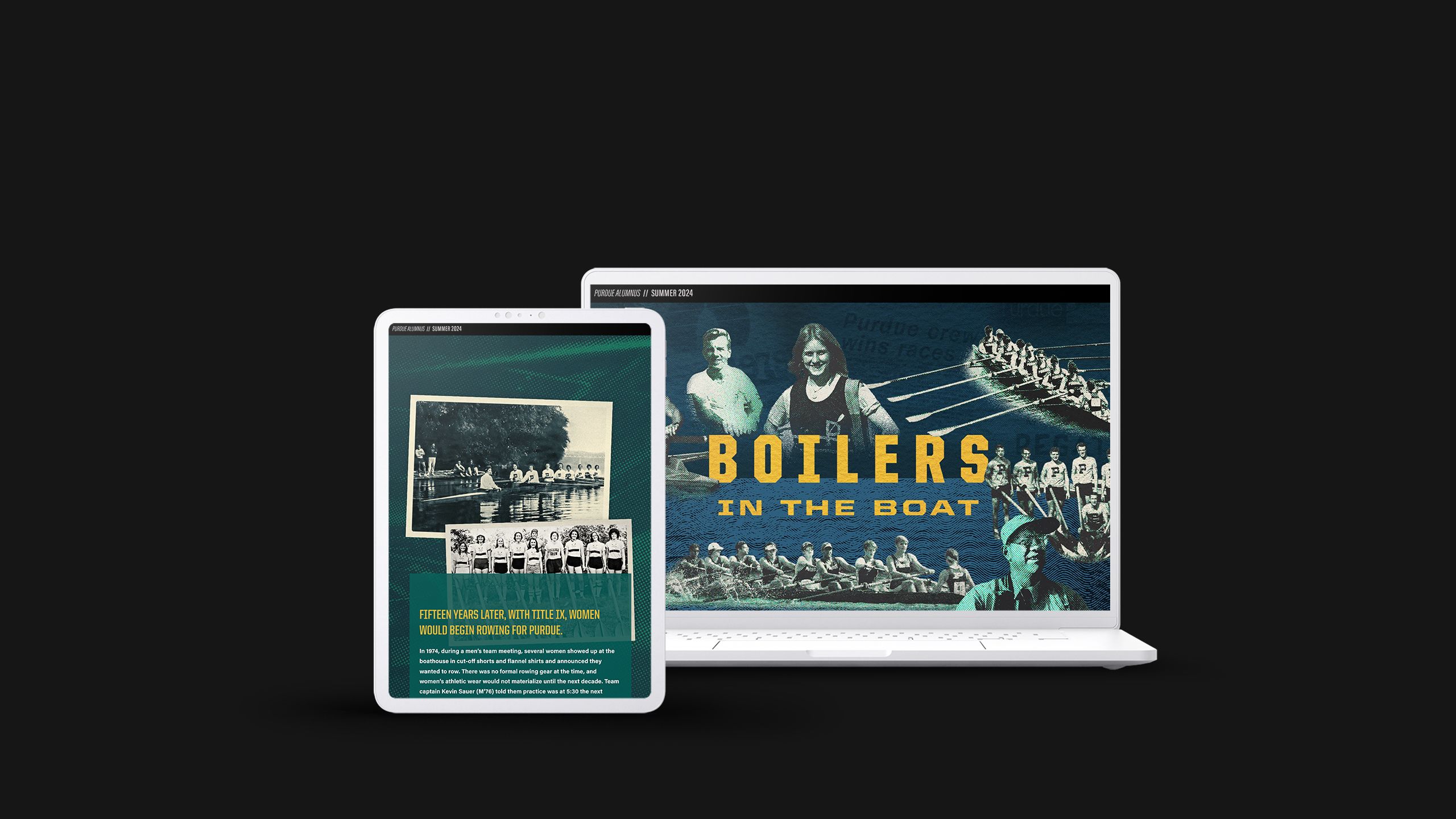
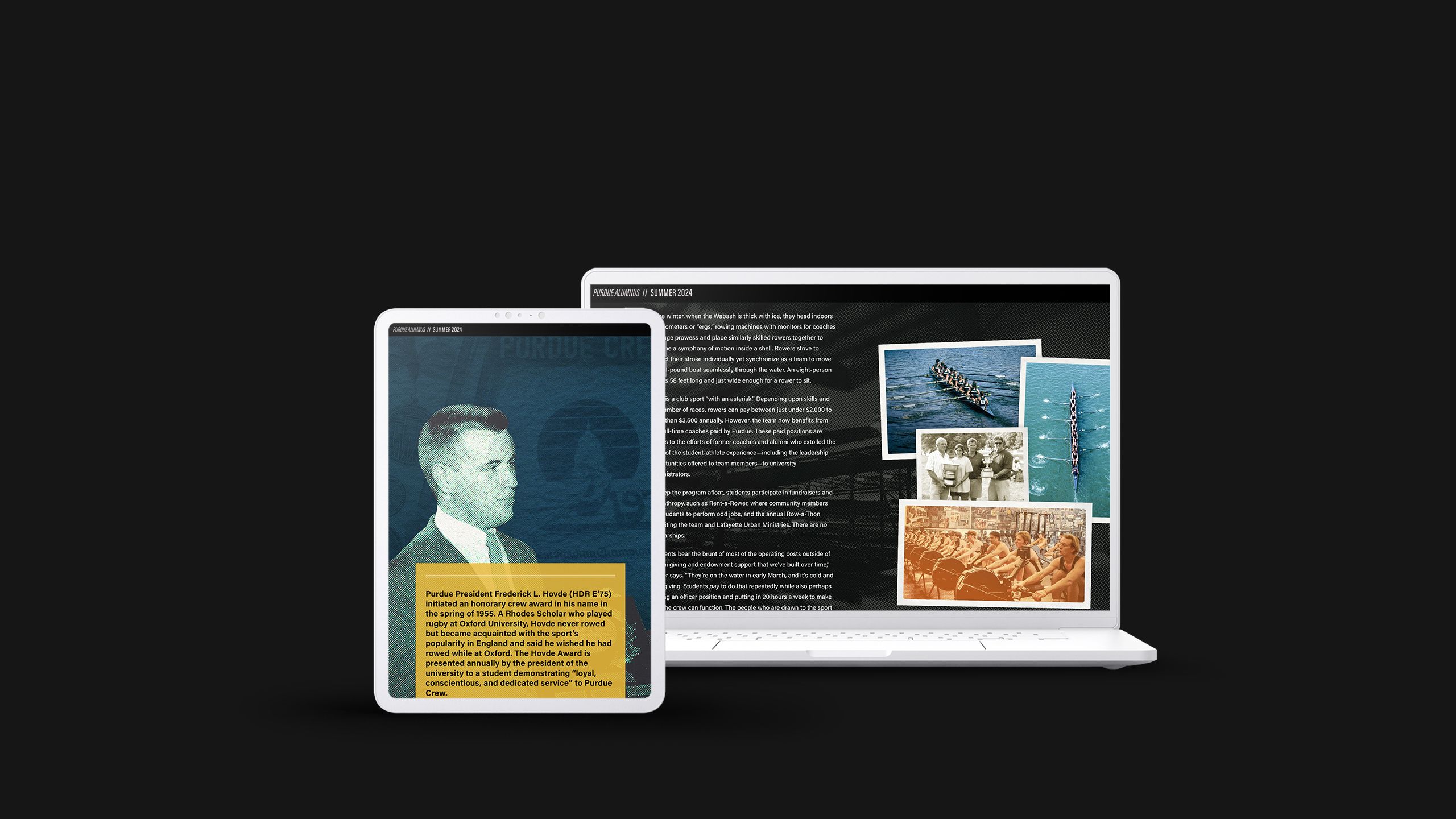
2. Boilers in the boat
What it is: A rowing team’s history
Who created it: Purdue Alumnus magazine
Why we picked this example: Another great example of leaning on a team’s rich history to build brand connections with followers, capped off at the end with a CTA to donate funds to the team, and to build engagement with Purdue alumni in general.


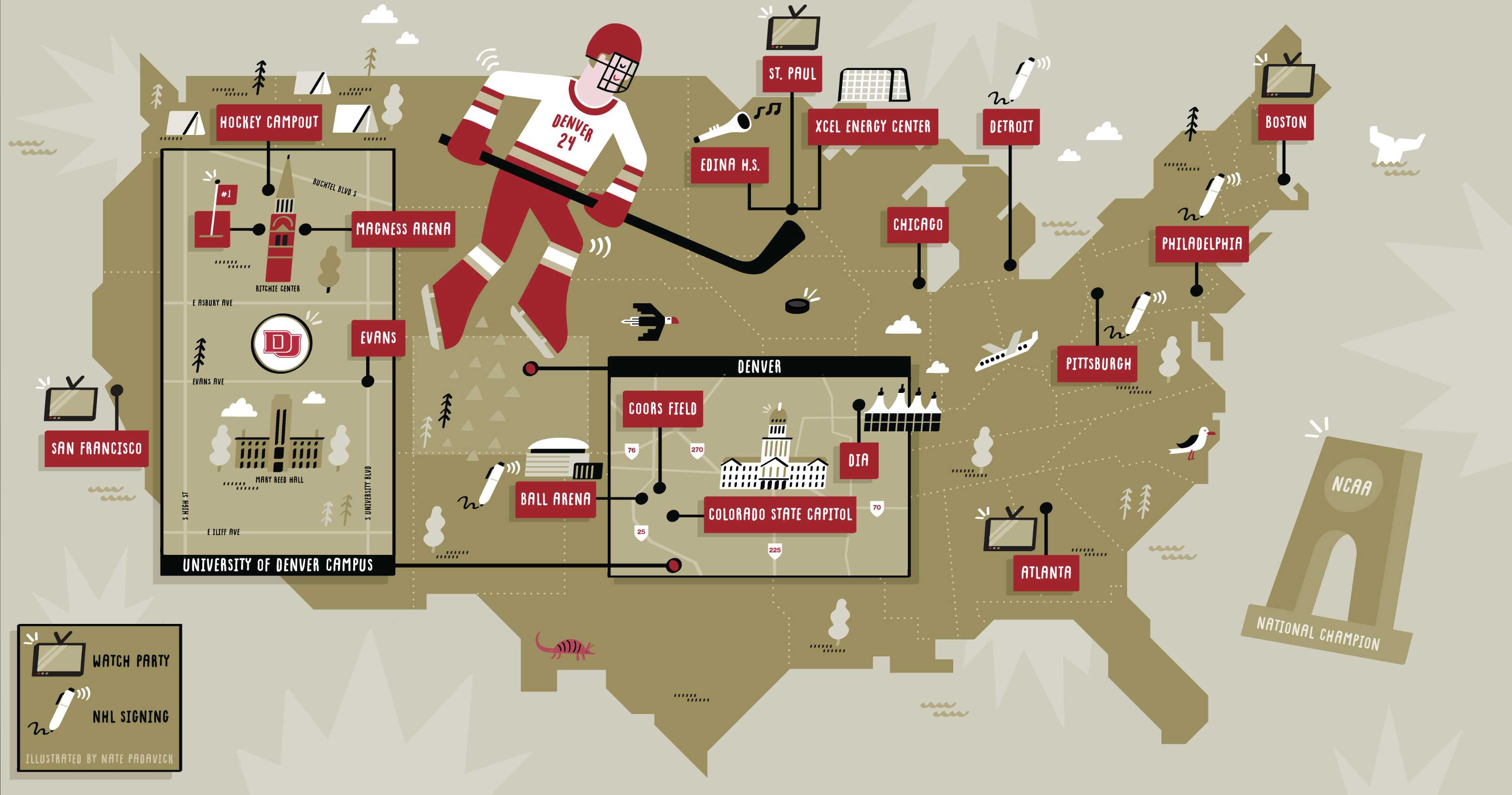
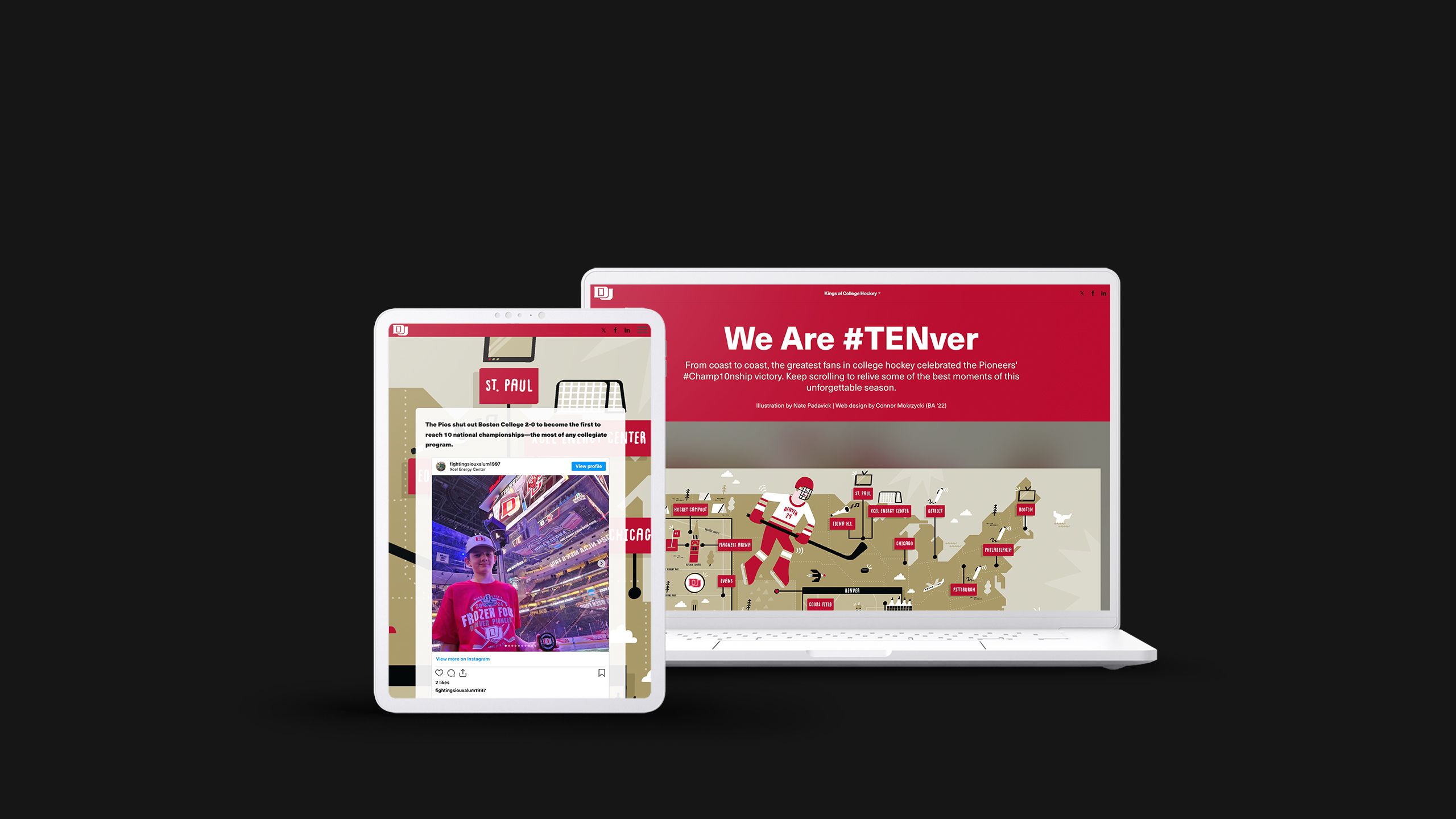
3. We are #TENver
What it is: A scrolling map showing social engagement from fans across the USA
Who created it: Denver University
Why we picked this example: While not necessarily a piece of marketing per se, it does build brand love, and leans on social media engagement of alumni fans scattered across the nation — in turn driving further engagement on social media.


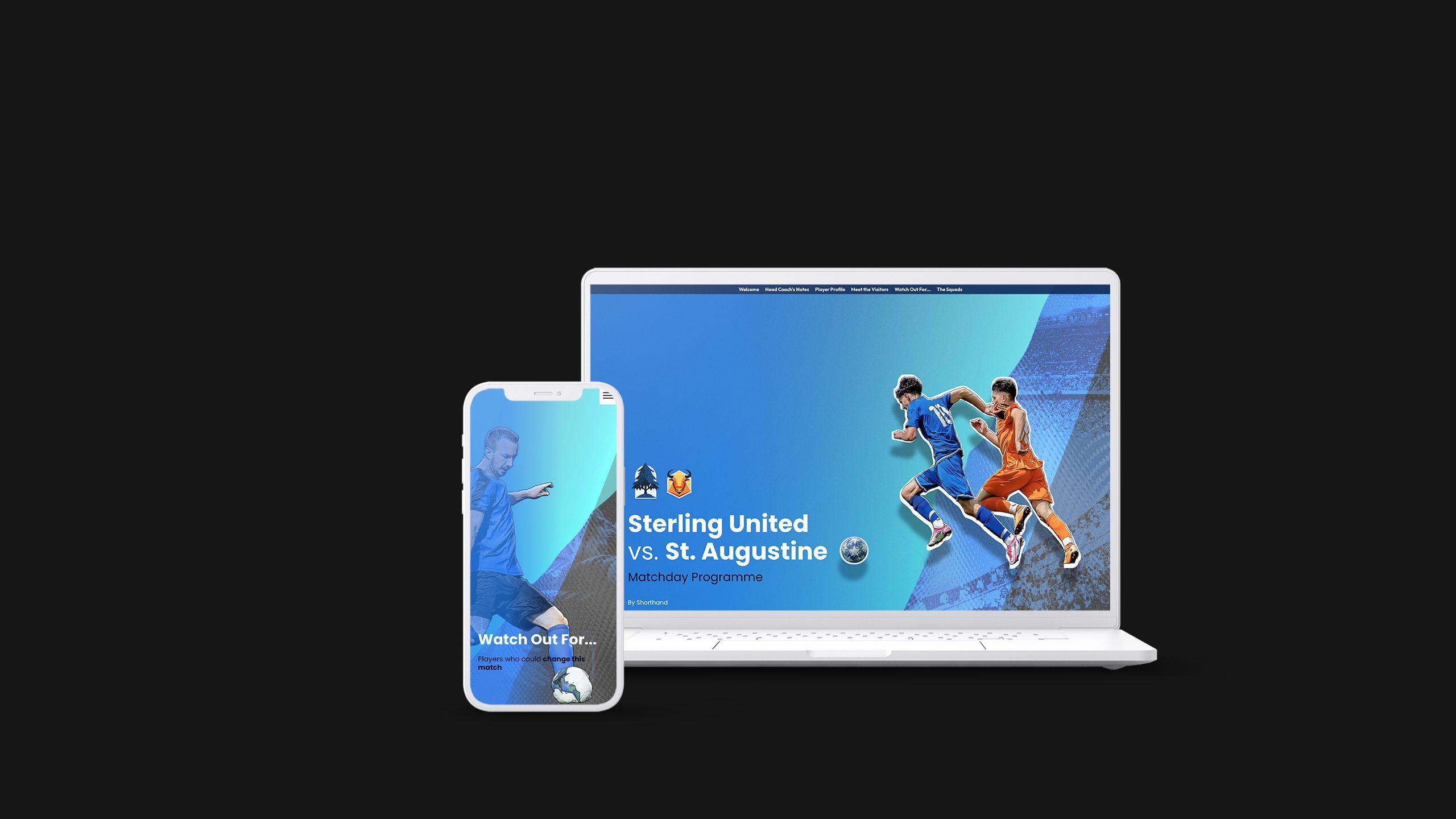
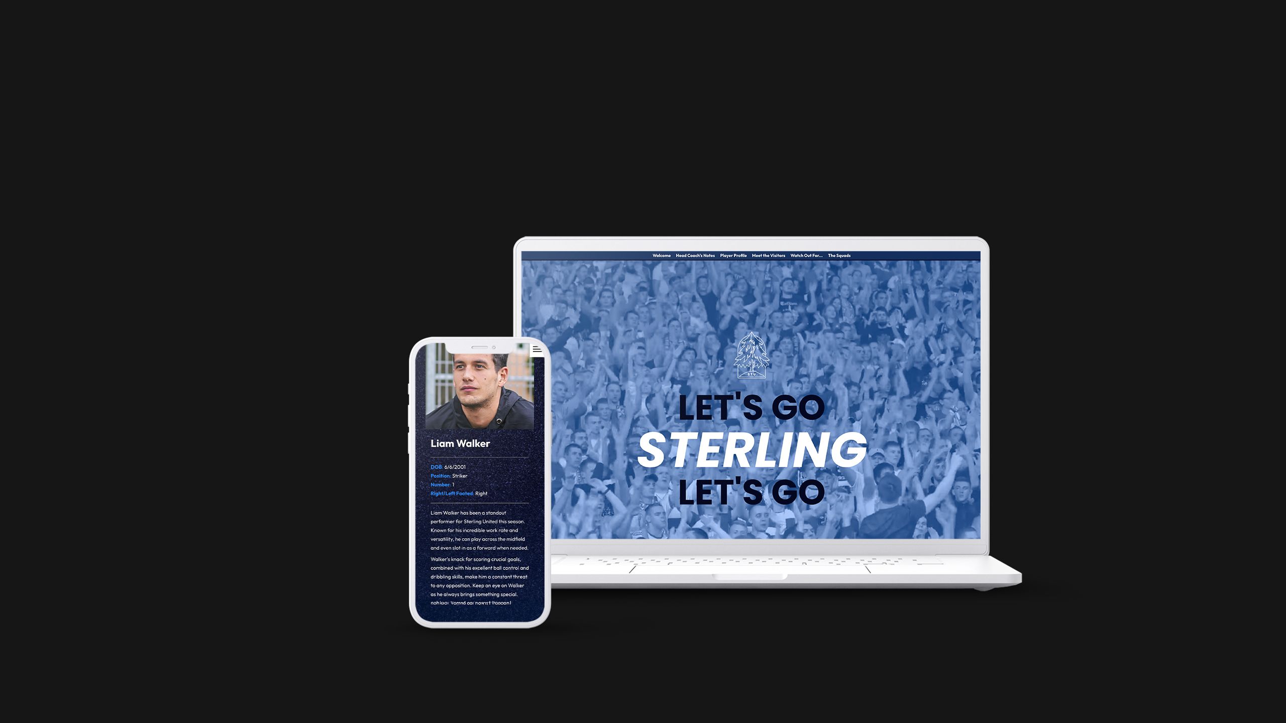
4. Matchday programme template
What it is: A magazine-style matchday programme for two fictional football teams
Who created it: Shorthand
Why we picked this example: A little bit of shameless self promotion here, but it could be the start of your next great sports marketing piece!
With an intro, word from the coach, team matchups and enticing visuals like full-width photography and media galleries, it’s sure to get your fans excited for the next big challenge.


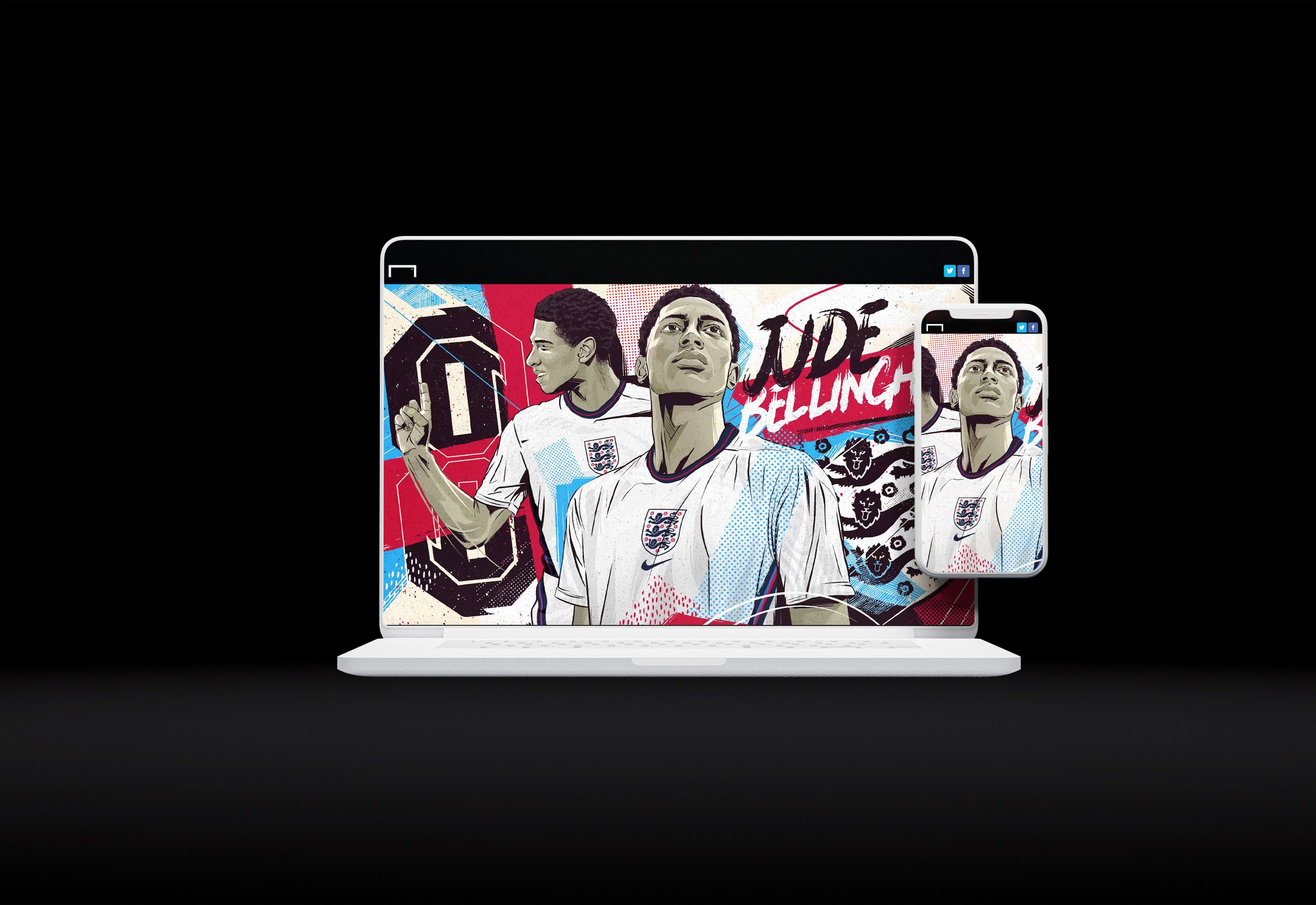
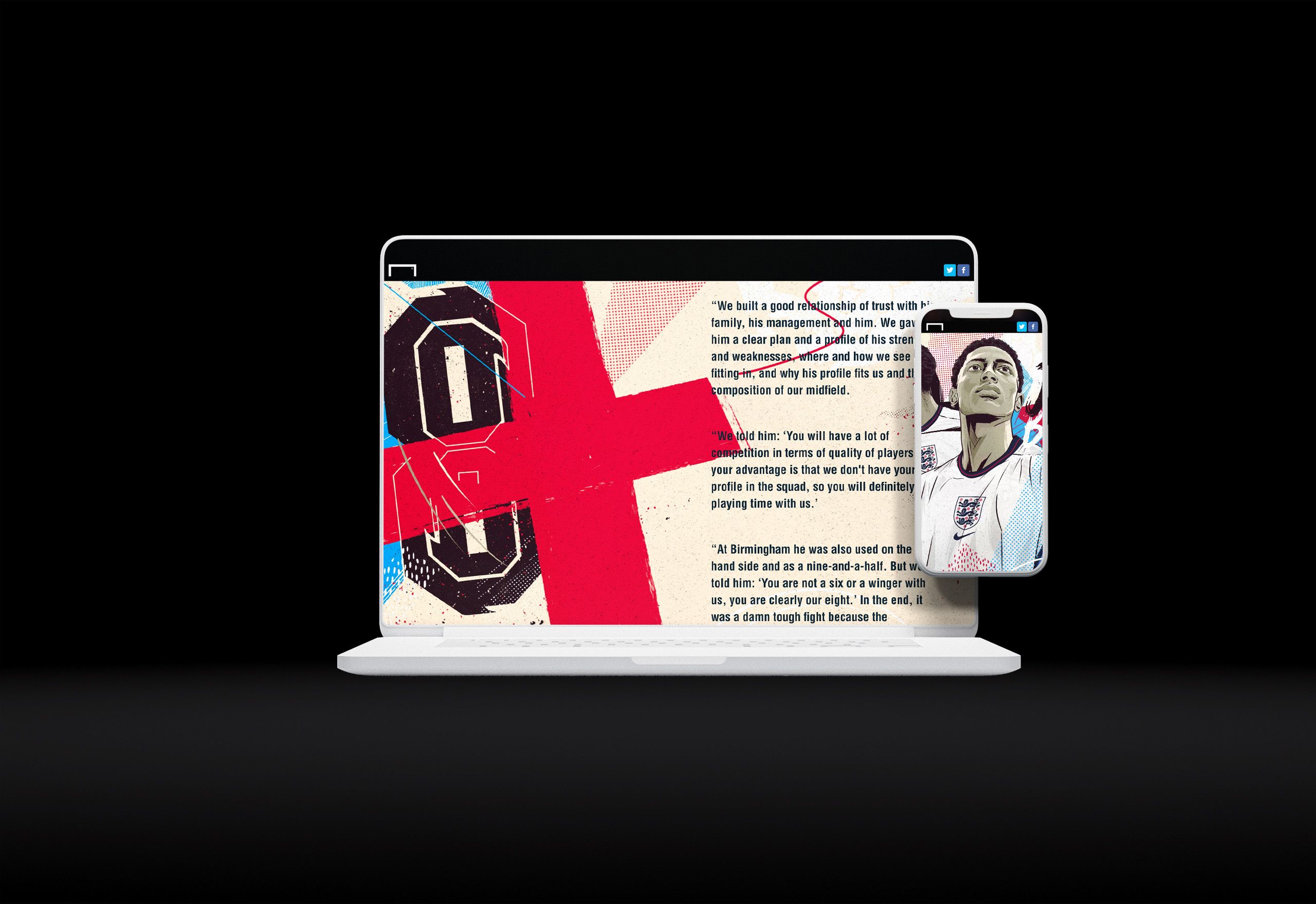
5. NXGN x Euro 2020: How Bellingham became England’s great young hope
What it is: a profile of Borussia Dortmund midfielder Jude Bellingham
Who created it: Goal
Why we picked this example: Author Ronan Murphy does a great job here of crafting a story around the rise of young footballer Jude Bellingham. Murphy’s warm and succinct writing is the foundation underlying this example.
But it’s the visual design that really elevates this piece above the realm of a standard athlete profile.

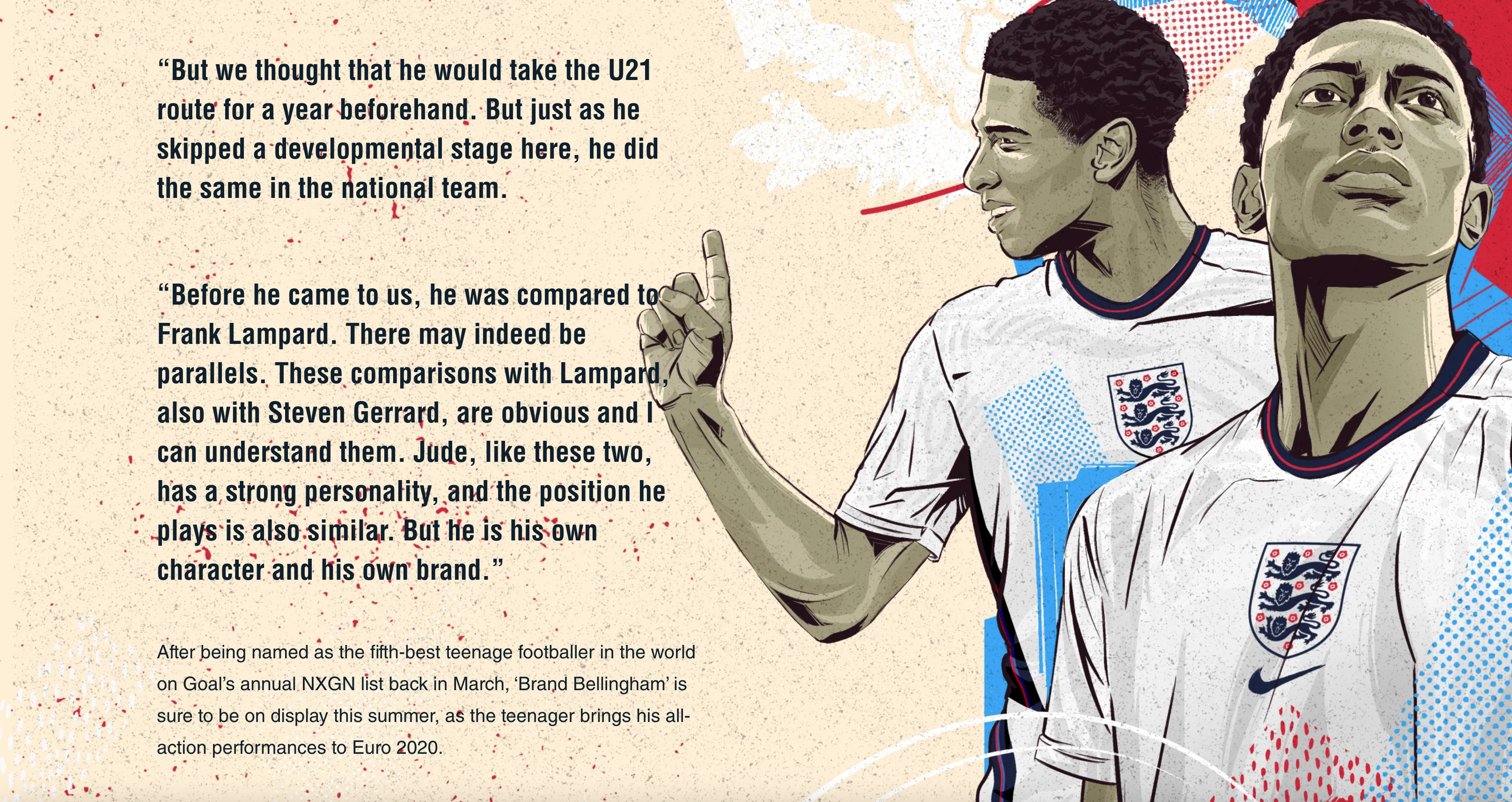
The article features rich, dynamic visuals and animation that help draw readers in and provide a visual break from the text. Plus, the interactive scrollmation keeps the audience engaged while the written content moves the story forward.


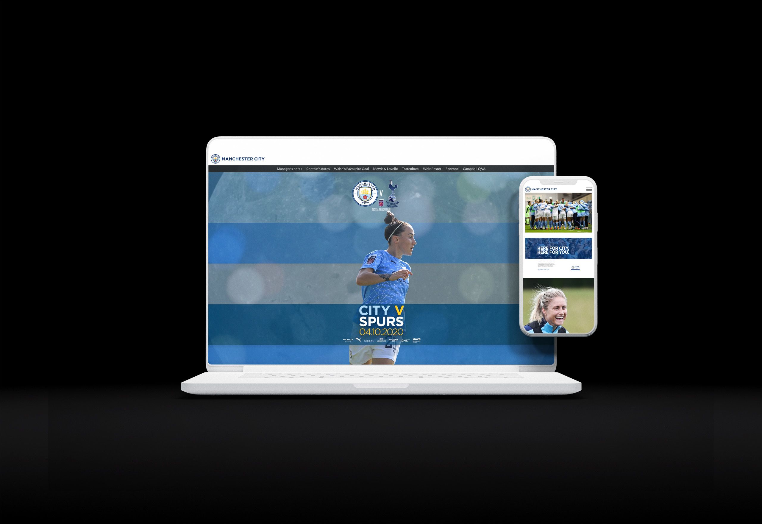
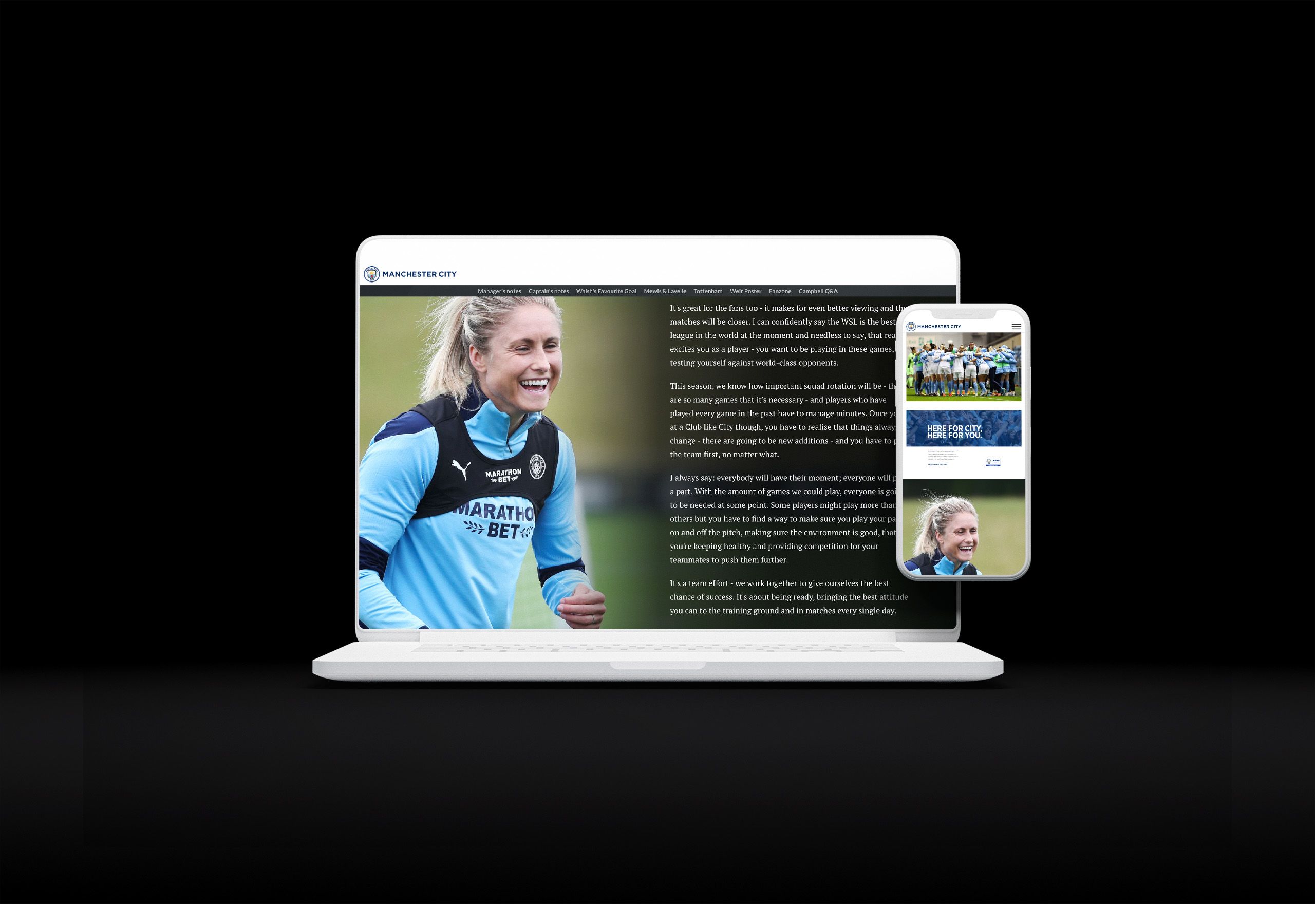
6. City v Spurs: Free digital matchday programme
What it is: a virtual program for a particular Manchester City versus Tottenham Hotspur match
Who created it: Manchester City
Why we picked this example: Man City’s virtual program is a great example of how diversity of content can help immerse audiences into a story-driven narrative and make readers feel the atmosphere of a major sporting event. The program uses text, photos, and video content to that end.

Designed to help get readers up to speed and ready to watch the match, it strikes an ideal balance between catering to devoted sports fans and ensuring football newbies have all the details they need to understand the context around the match.
Written content draws heavily on the words of both the manager and several key players, including captain Steph Houghton.


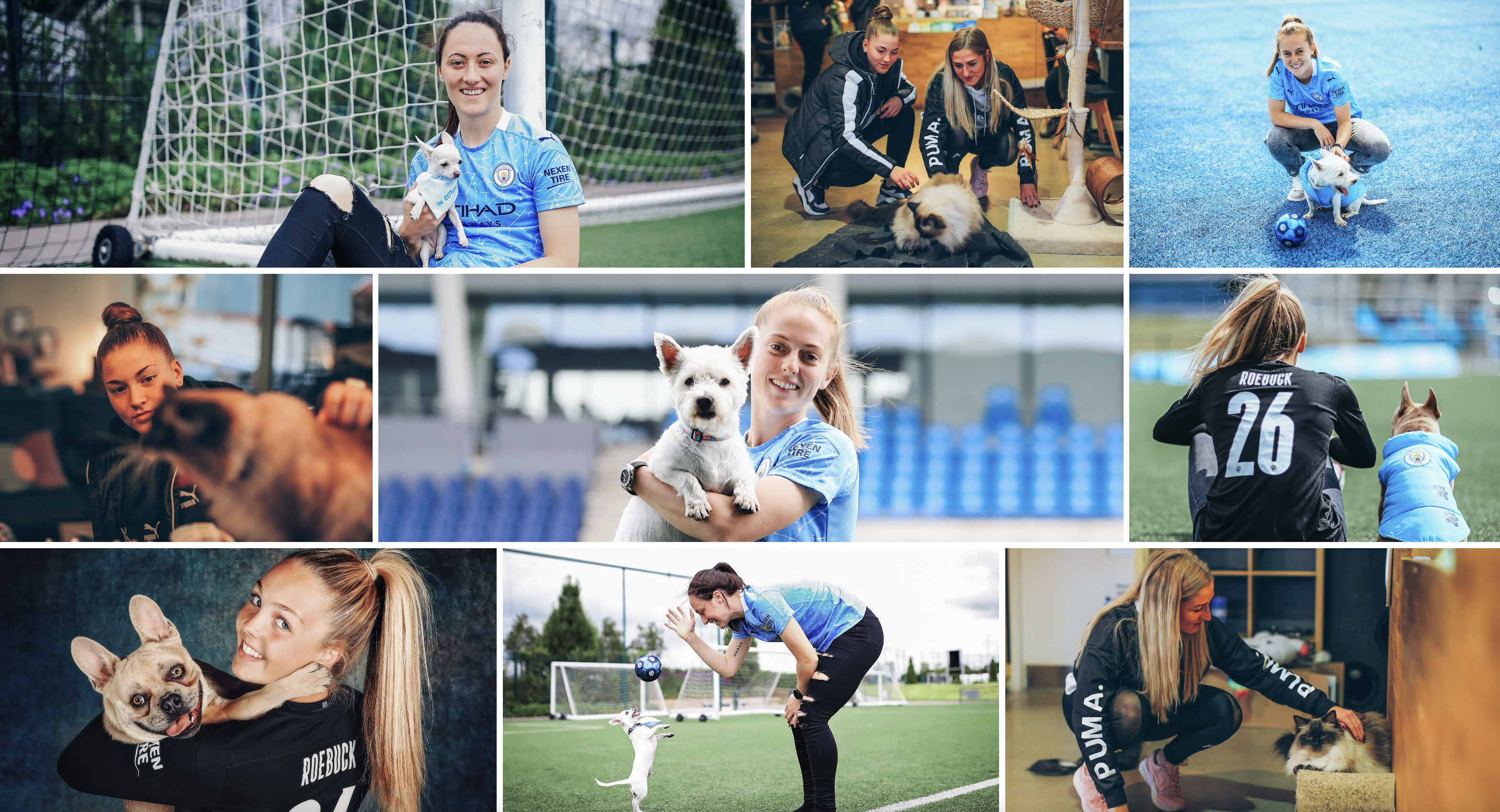
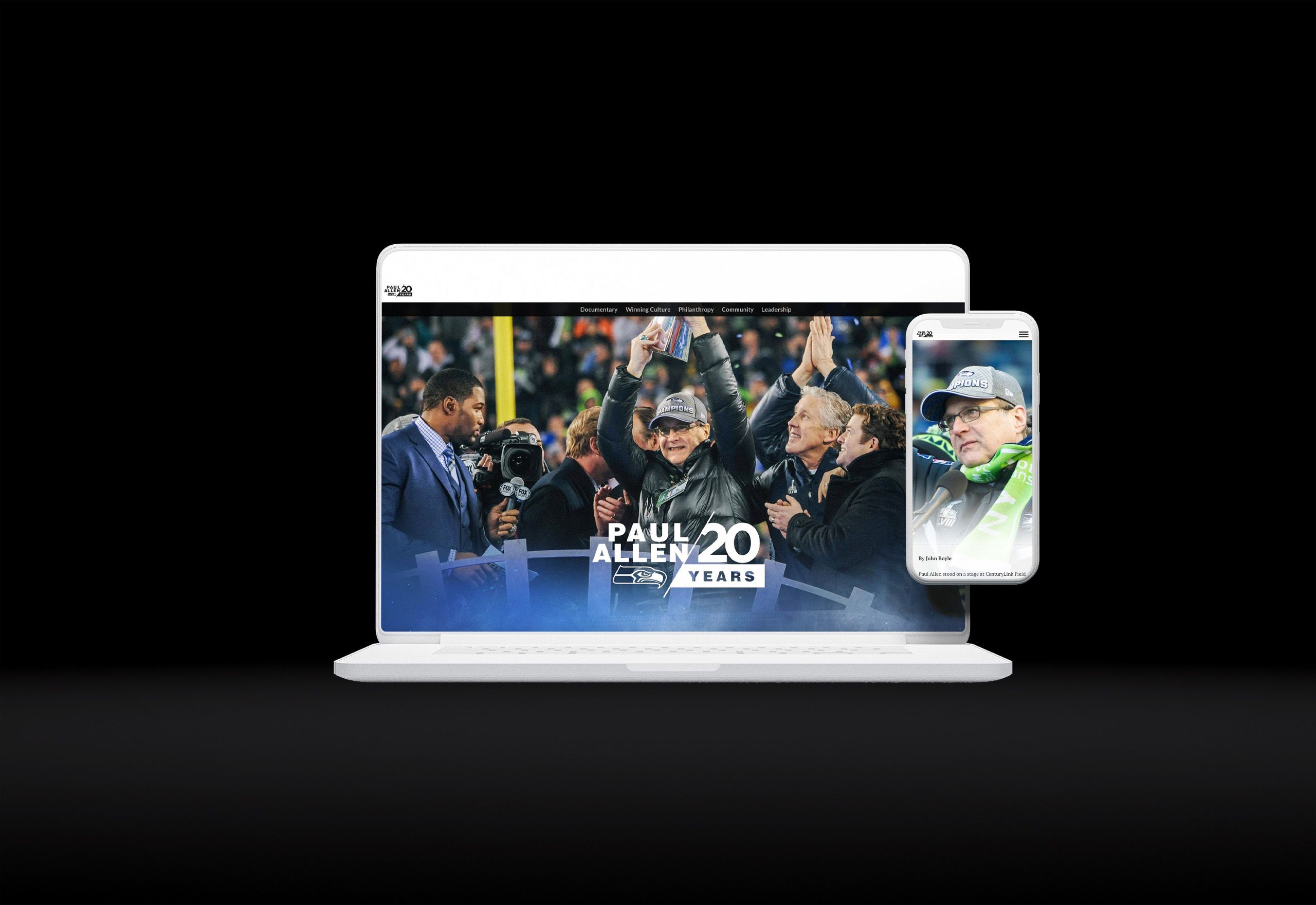
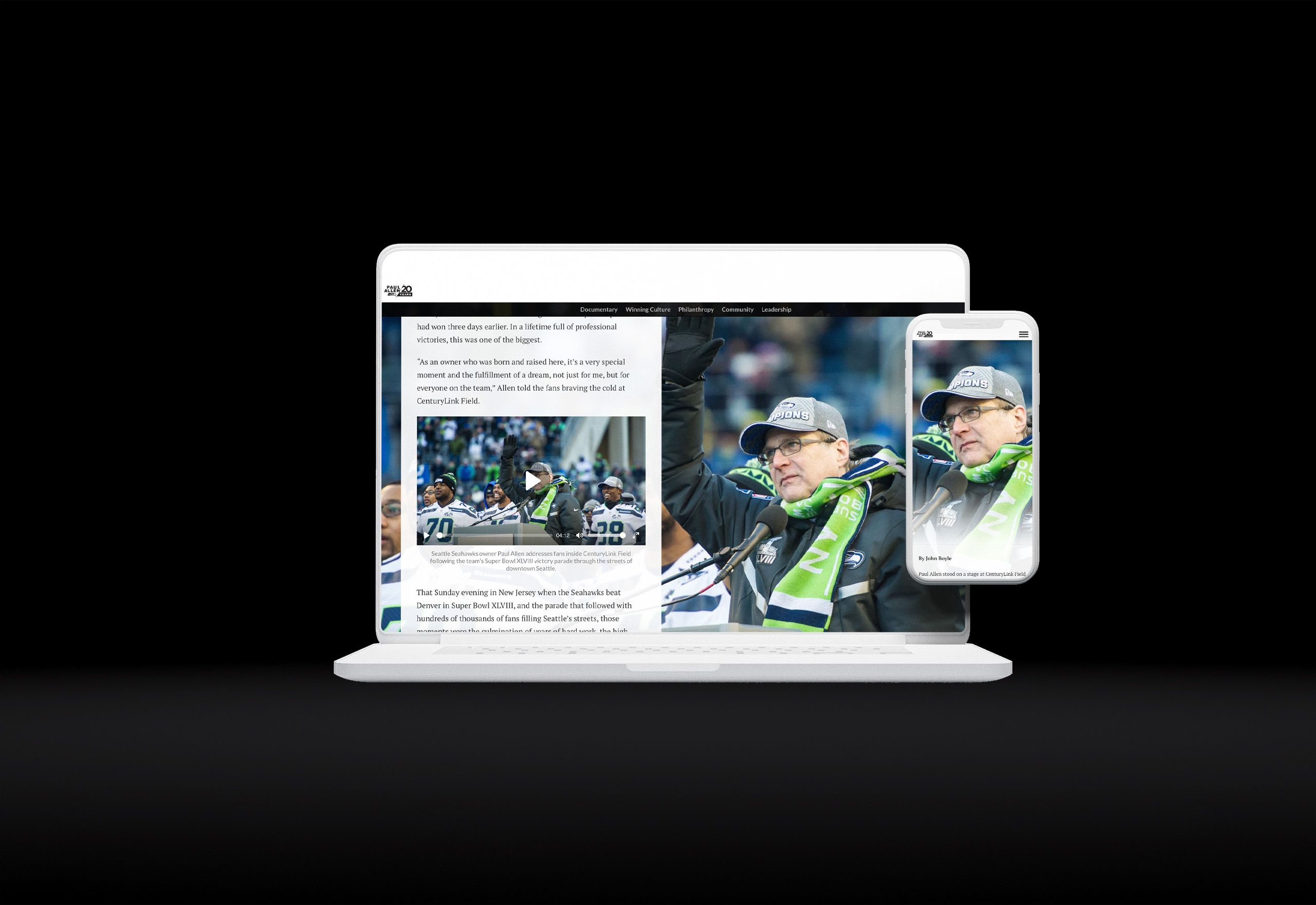
7. #ThanksPaul — 20 Years of Paul Allen Ownership
What it is: a tribute to celebrate Seahawks owner Paul Allen’s 20th year as owner of the organisation
Who created it: Seattle Seahawks
Why we picked this example: A lot can happen in 20 years in the NFL, including a Super Bowl win, two NFC West wins, and several division titles. As a thanks for the success and direction he’s brought to the organisation, the Seattle Seahawks put together an in-depth tribute to the owner who helped make all that happen.
The resulting content is a masterclass in using visuals to break up what would otherwise be a very long, very dense block of text. It starts with video tributes from several key members of the organisation and continues with plentiful photographs throughout.
On the written side, bold headings combine with clear section navigation to make this big article easy to navigate and skim.


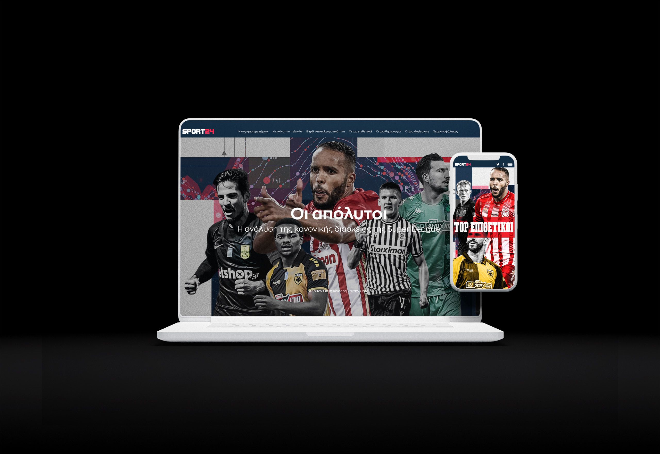
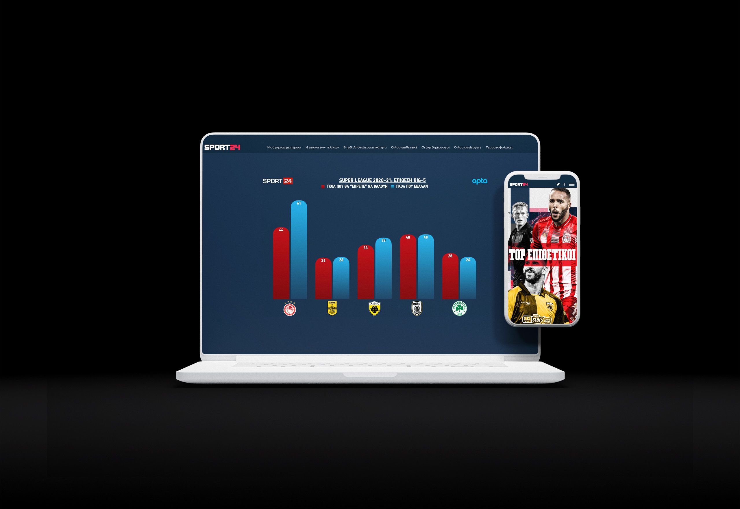
8. Οι απόλυτοι: Η ανάλυση της κανονικής διάρκειας της Super League
What it is: an in-depth analytics breakdown of the Greek championship
Who created it: SPORT 24 and Opta
Why we picked this example: When SPORT 24 partnered with Opta to break down the Greek championship capping of the Super League season, they had a lot of data at their fingertips. This example is a masterclass in how to present data in a way that both engages the audience and adds clarity.
The article promises to dive deeper than the highlights and scores, so readers can better understand the why behind the season’s results. It does so using a number of clear and visually appealing data visualisations, which load interactively as readers scroll to maintain clarity and ensure readers understand what they see.
Plus, clear navigation along the top makes it easy for readers to parse what is otherwise a very in-depth piece of content.


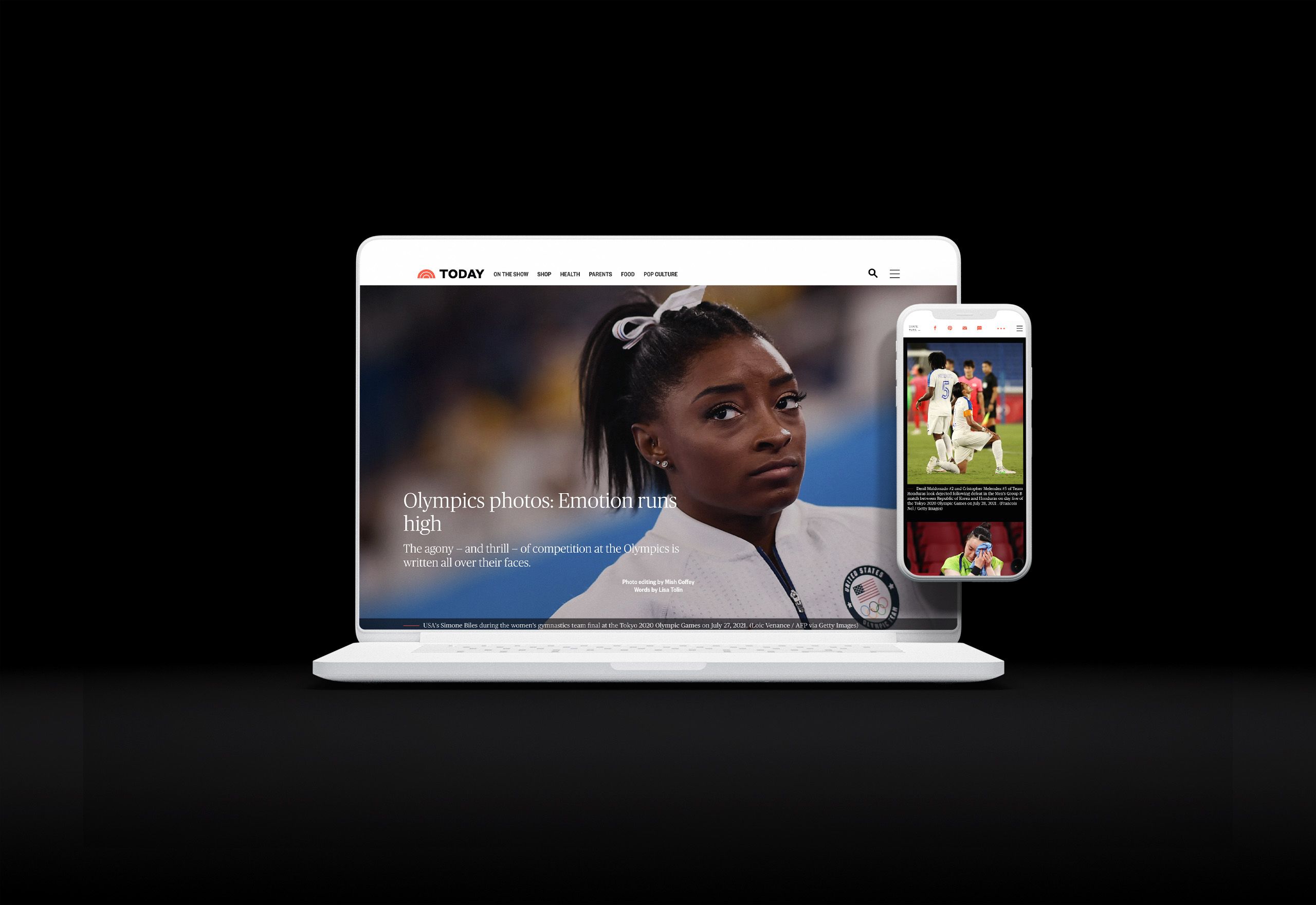
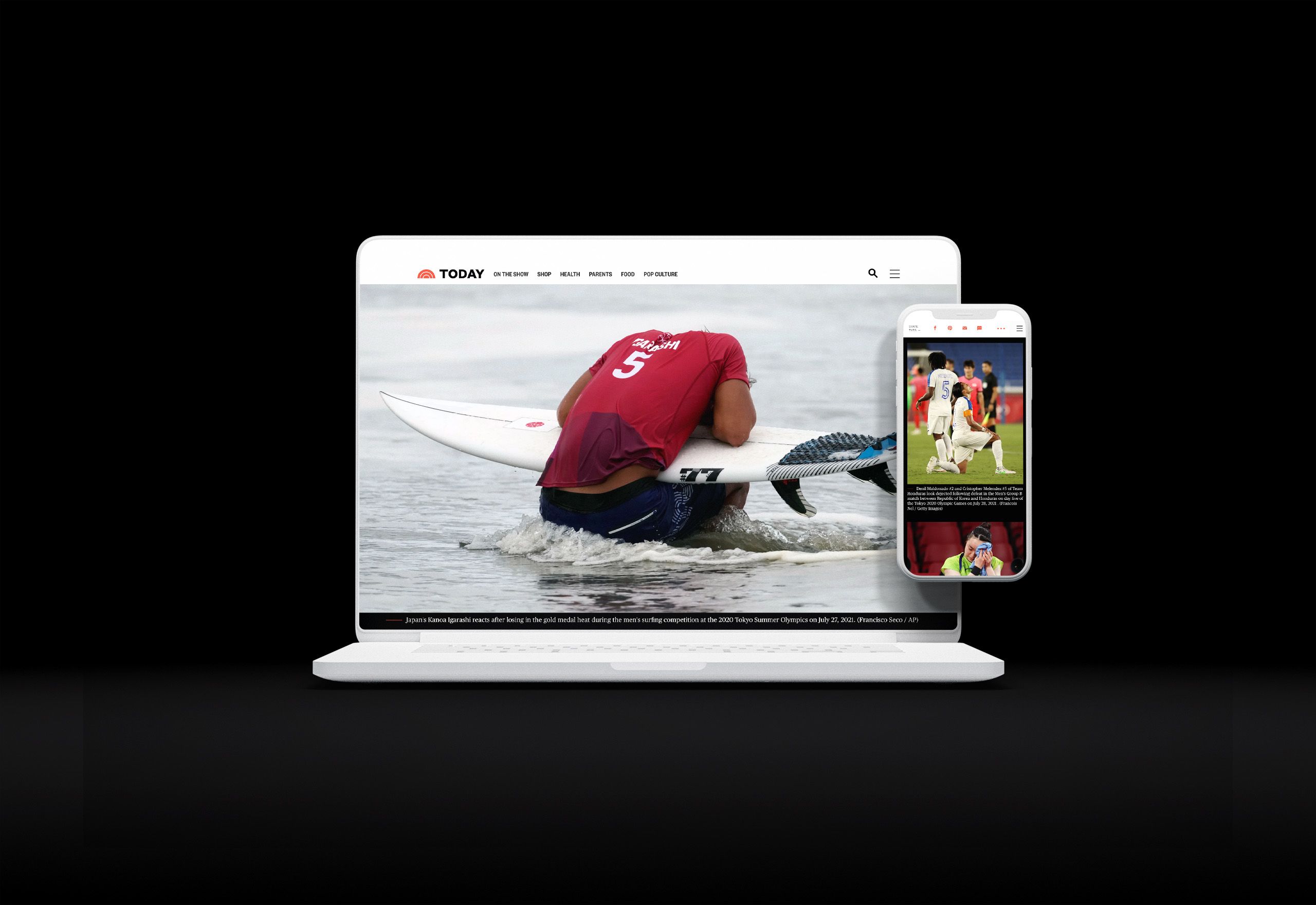
9. Photos at the Tokyo Olympics: emotion runs high
What it is: a photo compilation chronicling the 2020 Olympic Games in Tokyo
Who created it: Today
Why we picked this example: When years (or decades) of dedication and training collide with a weeks-long competition and all the stresses of a global pandemic, emotions run high. The 2020 Olympic Games in Tokyo (which actually took place in 2021, thanks to the COVID-19 pandemic) were no exception.

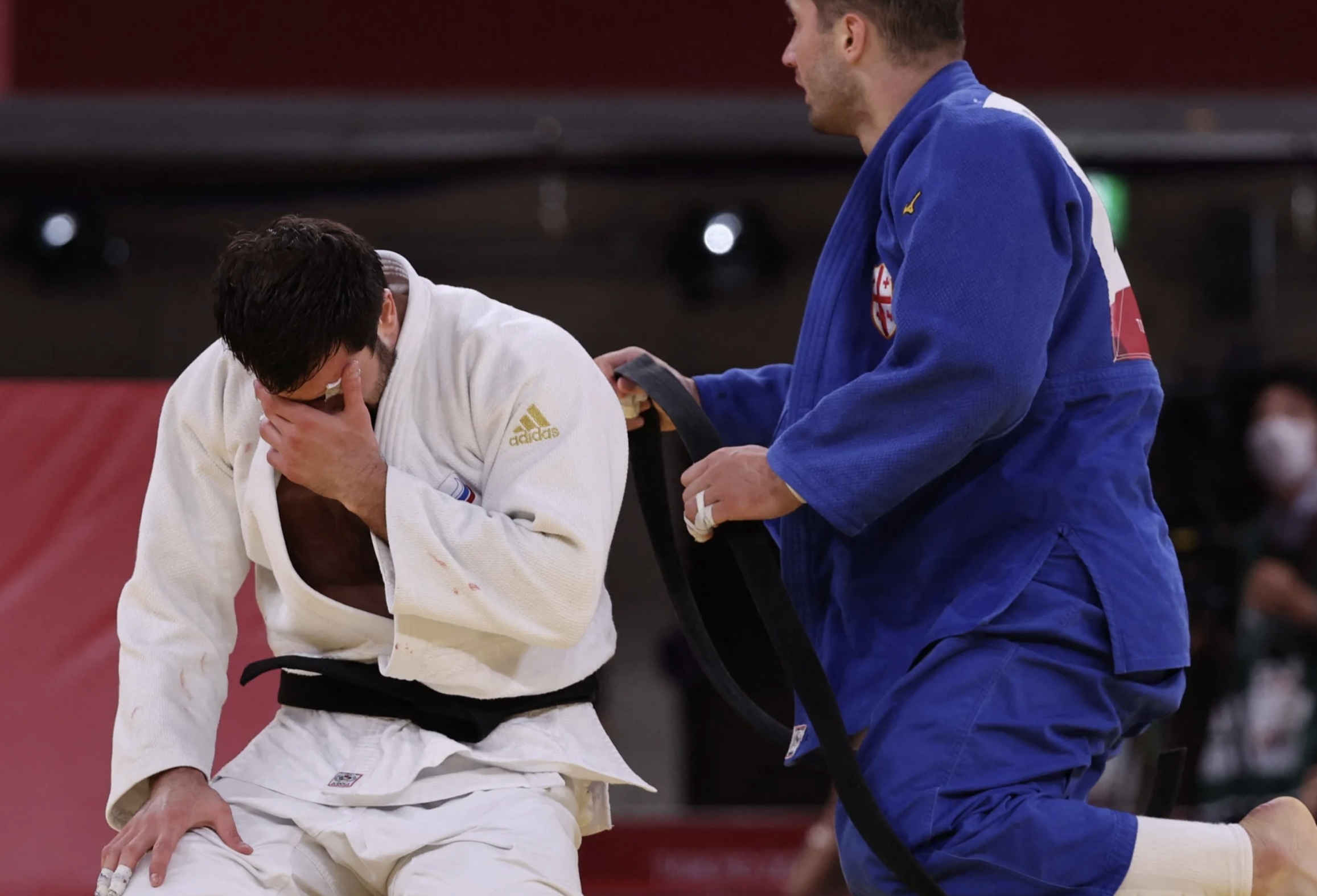
Photographers who attended the games did a fantastic job at capturing those emotions, and this photo essay from Today does an even better job at letting those photographs speak for themselves. After a brief written introduction that contextualises the images, the piece gives those photos full reign by going full screen and keeping captions minimal.


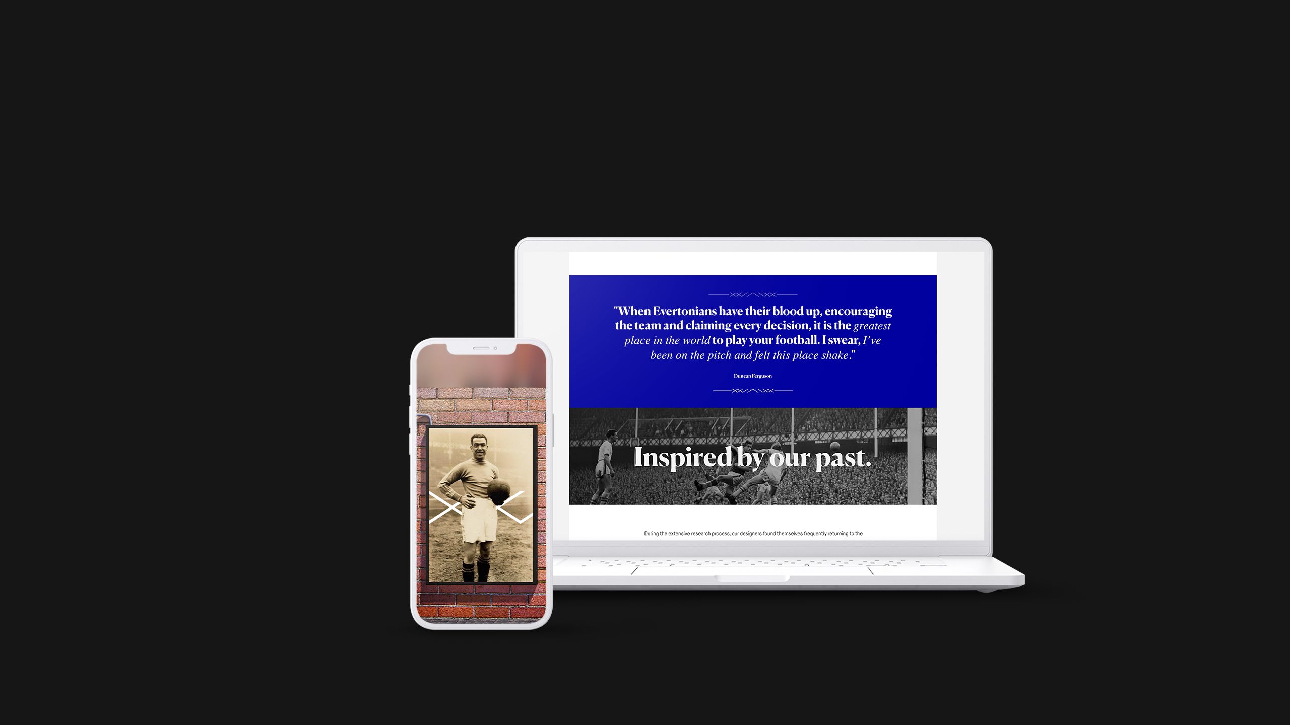
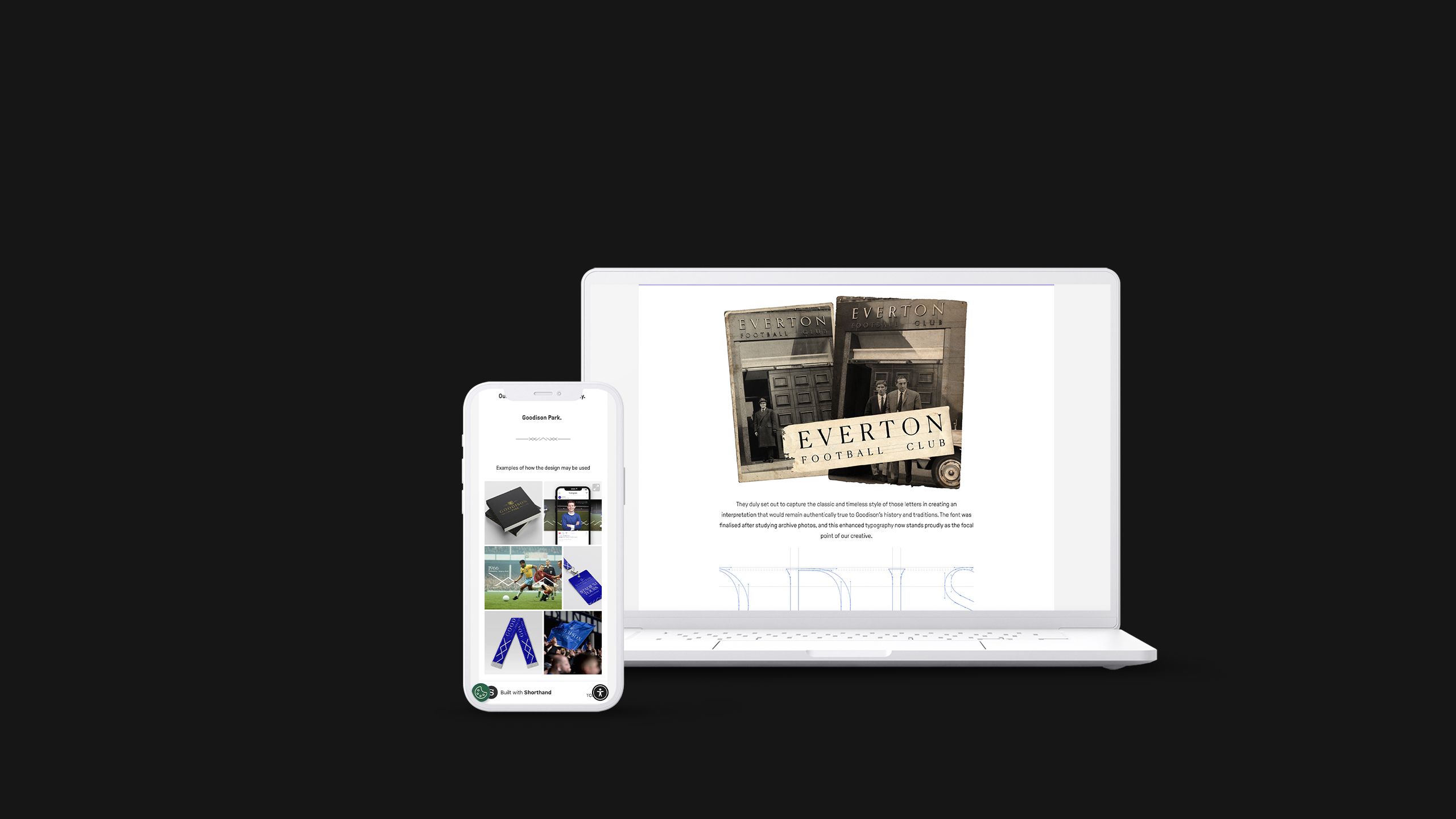
10. 1892-2025 Goodison Park
What it is: A historic celebration and design exploration.
Who created it: Everton FC
Why we picked this example: As Everton relocates from Goodison Park, its home ground for more than a century, this piece revisits the venue's history. Sports fans love learning about the roots of their favourite clubs, and this story adds a bonus nod to the future. Some of the old stadium’s design notes, such as its signage and architectural features, act as a sort of brand guide; the article's scrolling displays show how Goodison Park's fonts and panel angles will be used in the design and branding of the club’s future comms.


We hope you liked the examples; who knows, maybe they’ll inspire your next sports marketing campaign.