10 of the best visual timeline examples on the web

Here are ten examples of fantastic timeline stories from around the web to help inspire your next piece of visual storytelling.


by Kiera Abbamonte
by Kiera Abbamonte
Timelines are everywhere today, and as you’ll see below, they are an incredibly powerful asset when it comes to creating compelling visual narratives.
We’ll cover:
Start creating with Shorthand
It's the fastest way to publish beautifully engaging digital timelines, reports, retrospectives, and more.


What makes a great timeline? Here are four key principles


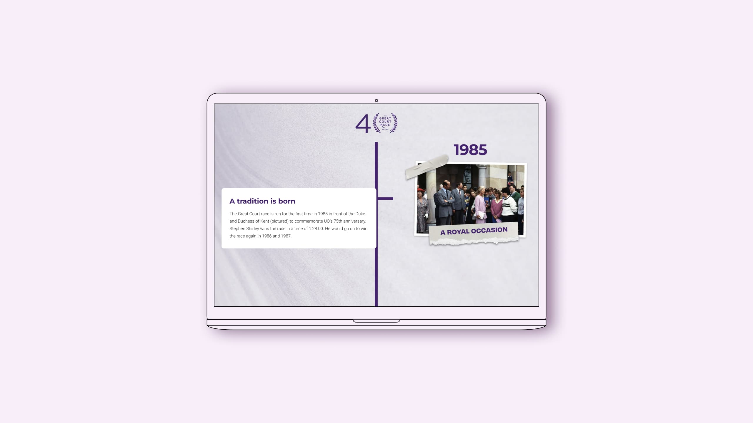

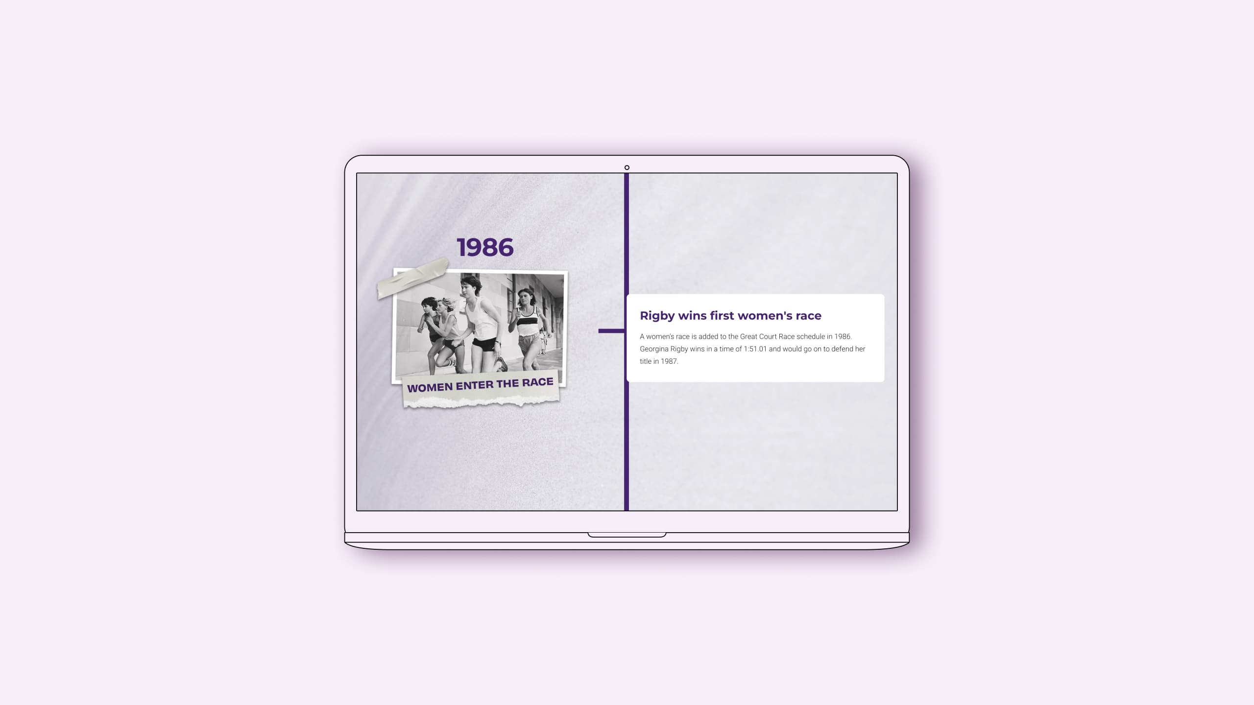

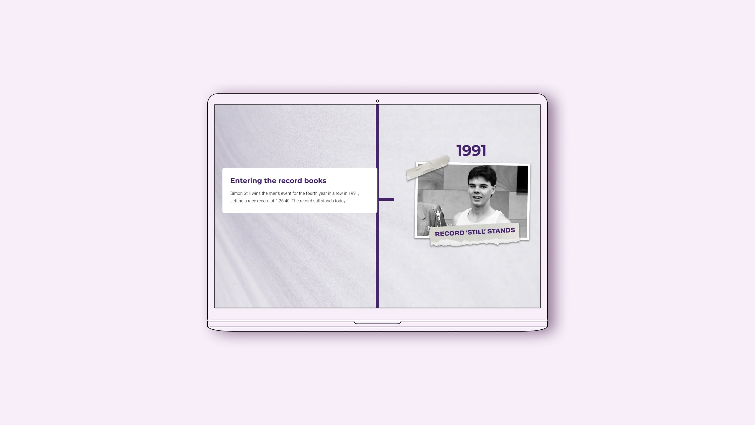
Timeline articles are as unique as the brands and publishers that create them, but some common themes run through the strongest examples below. Like the University of Queensland’s ‘The Great Court Race’ above, they create an interactive scrolling experience and follow a clear, predictable path.
4 key principles of effective timeline design
1. Ensure a timeline is the best way to present the information
First, ask yourself whether a timeline is truly the best way to present the information you’re sharing. It seems simple, but choosing the best template for what you present is an important first step.
2. Make the timeline progression easy to follow
A timeline template should follow a predictable path — both visually and chronologically. Even readers quickly scrolling through should be able to easily pick up on and follow the timeline’s path.
3. Use design elements and interactivity to keep the reader engaged
The best examples below use a mixture of timeline design and interactive elements to break up text, keep the reader engaged, and add visual interest.
4. Offer both zoomed in and bird’s-eye views of the timeline
Zooming in on individual milestones allows you to add crucial context and explain the importance of that event, while a zoomed out, 1000-foot view helps readers keep things in context of the larger sequence of events at the same time.
Ready to get some inspiration and see how great timeline-based articles look out in the wild? Without further ado, here are 10 of our absolute favourite timeline examples.
10 fantastic timeline examples
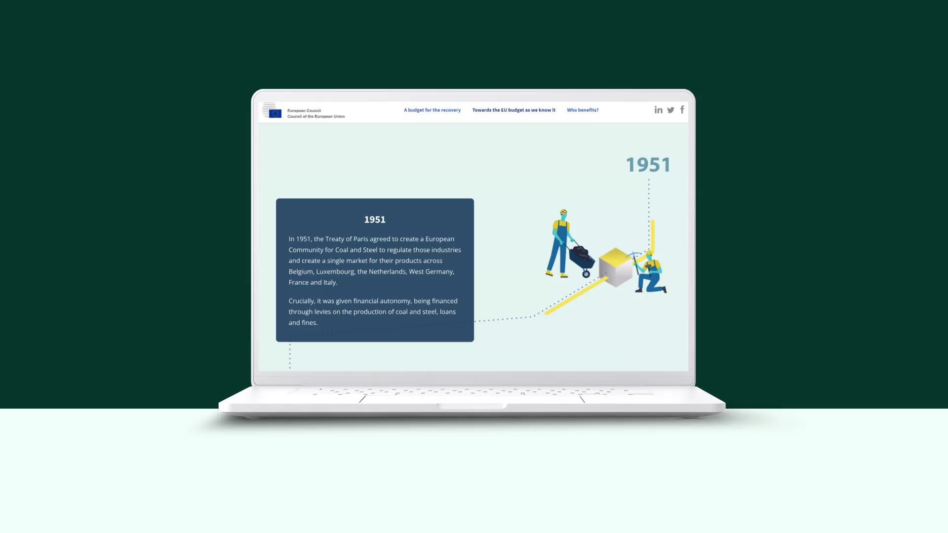
A blueprint for the future
What: an interactive timeline of the European Union’s budget, history, and impact
Who: European Council
Why we picked this example:
Produced by the European Council, this piece is a great example of overall design. The timeline is a major component of the story here — leading readers through to the upcoming budget plan timeline — and its design reflects that.
Breaking up each year (or range) and triggering the next time period by scrolling allows for the amount of written content required, without feeling overwhelming for the reader or aesthetically crowded.

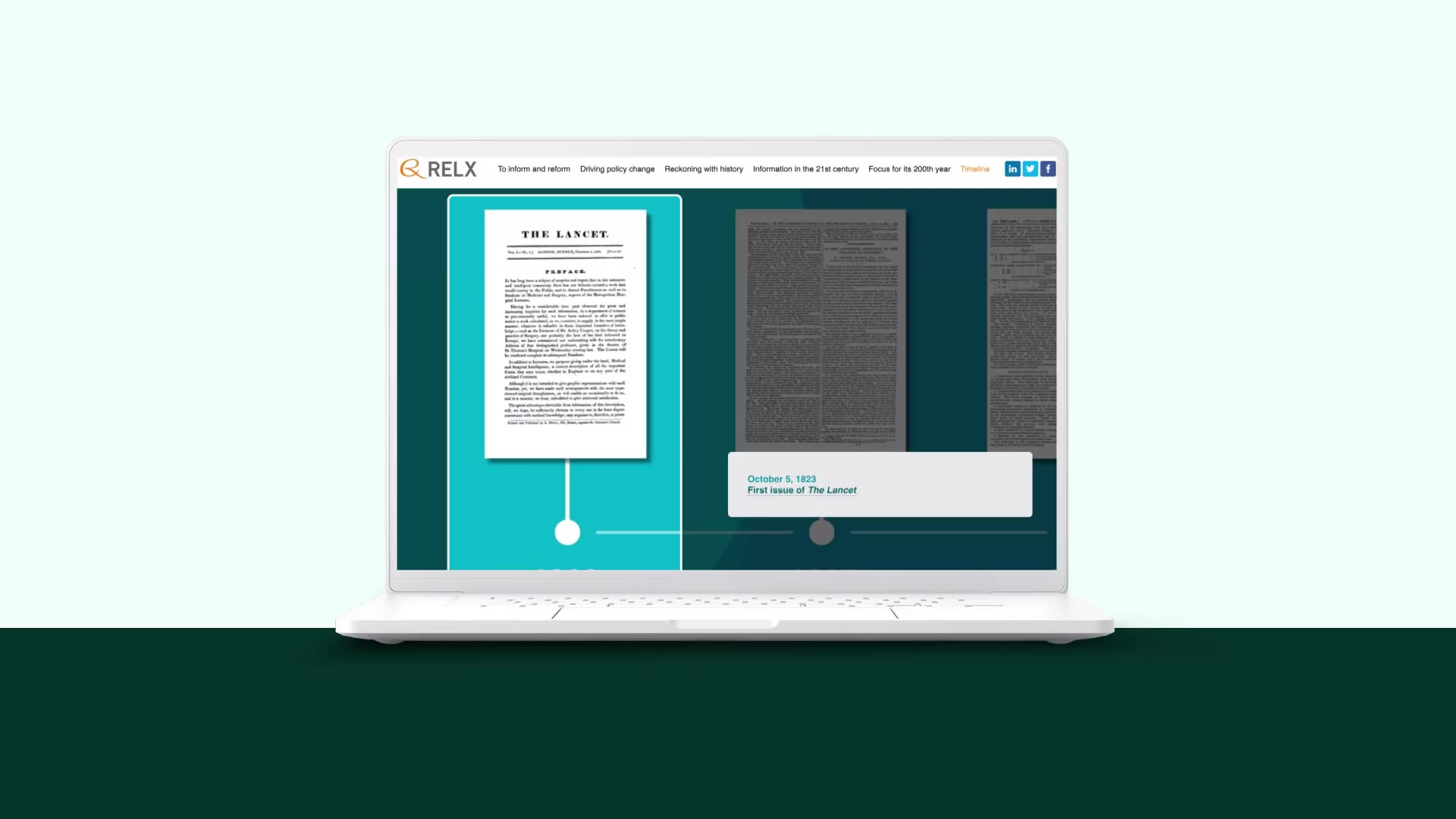
The Lancet at 200
What: an in-depth look at medical journal The Lancet and its 200-year history
Who: RELX
Why we picked this example:
RELX does a great job of bringing a variety of media and interactive features into this piece.
The history timeline, toward the end of the article, uses scrollmation to move readers through the years. It moves in a unique way that keeps the reader engaged as they scroll, showcasing the medical breakthroughs The Lancet has covered, as well as how the journal’s design has changed, before zooming out to give a bird’s eye view of the 200-year timeline.

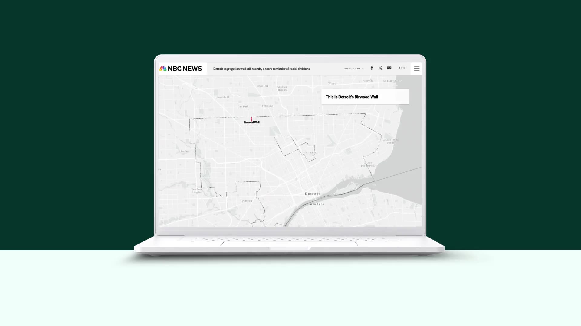
Built to keep Black from white
What: an editorial on the history and legacy of segregation in the US
Who: Detroit News and NBC News
Why we picked this example:
This editorial, which won a Webby Award for Best Individual Editorial Feature, is a masterclass in visual storytelling.
This creative timeline (toward the final half of the feature) is almost entirely visual, showcasing how segregation in Detroit has endured even as the population has grown, the city sprawled, and formal segregation ended. The visual timeline makes the data clear cut, and communicates the story's central point at a glance.

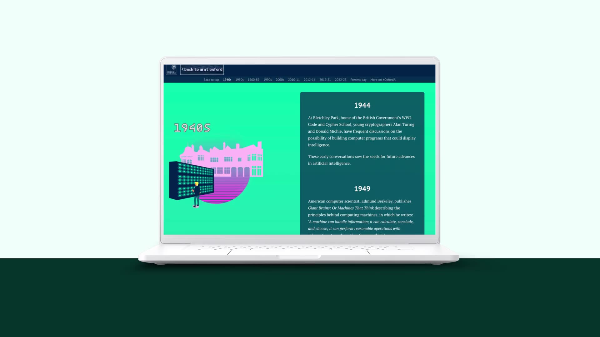
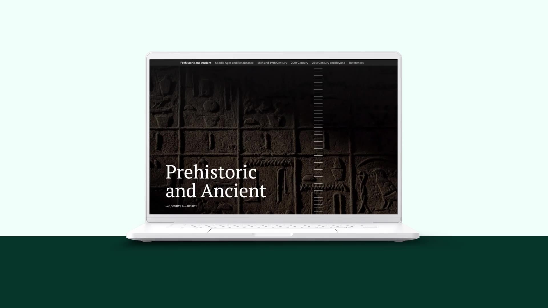
A history of AI
What: a timeline of how AI developed into what we know today
Who: University of Oxford
Why we picked this example:
For many of us, it feels like Artificial Intelligence (AI) burst onto the scene when OpenAI launched ChatGPT in late 2022. The University of Oxford wants you to know that isn’t the case.
This retrospective dive into AI’s half-century roadmap is one of the purest timeline-based examples on this list; the timeline is the story. It’s presented in a straightforward way, with scrollmation and plentiful visual elements to keep the reader engaged throughout.

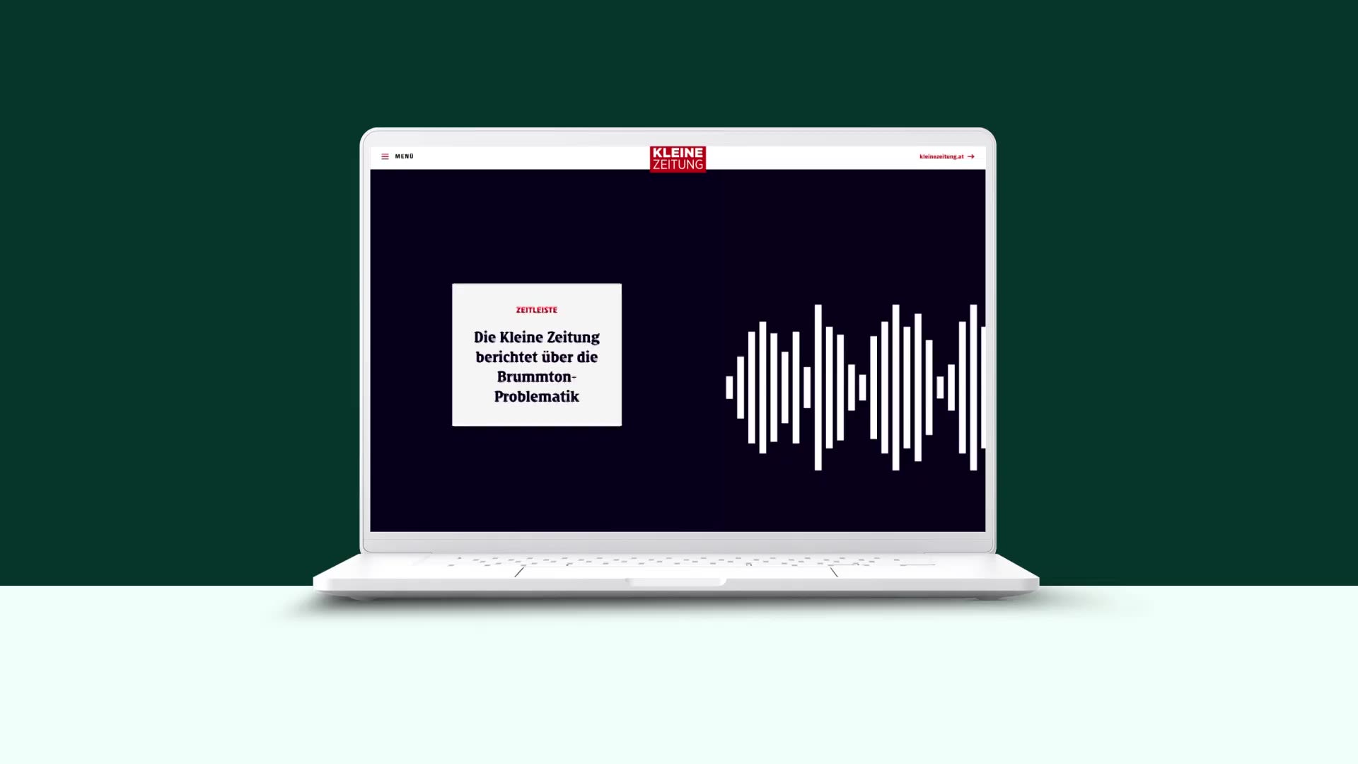
Immer mehr Betroffene klagen über Brummtöne – das steckt dahinter
What: a report on a peculiar humming phenomenon
Who: Kleine Zeitung
Why we picked this example:
This report from Kleine Zeitung explores the history and investigation of a peculiar and unexplained humming noise heard by many in Germany. The timeline portion summarises the reporting done on the phenomenon since it was first identified in mid-2022.
Each block is clear and concise, with a link to the original article published at that time. The horizontal scroll of the soundwave in the background signifies the humming sound, but it also gives readers the feeling of a more traditional horizontal timeline.

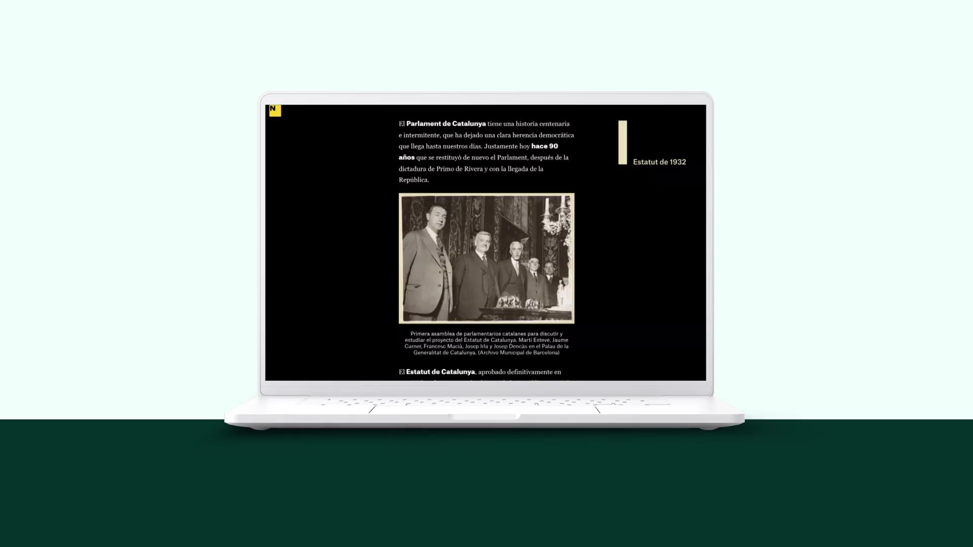
90 años del Parlament, la herencia democrática que ha llegado a nuestros días
What: a history of the Parliament of Catalonia and its legacy
Who: ElNacional.cat
Why we picked this example:
This retrospective details the history and legacy of the Parliament of Catalonia. The timeline uses concise blocks of text to explain important events and minimal design to keep the reader focused. Drawing on native Shorthand sections, the background showcases the timeline in full, adding each date as the reader scrolls and creating a persistent bird’s eye view of the full 90-year history.

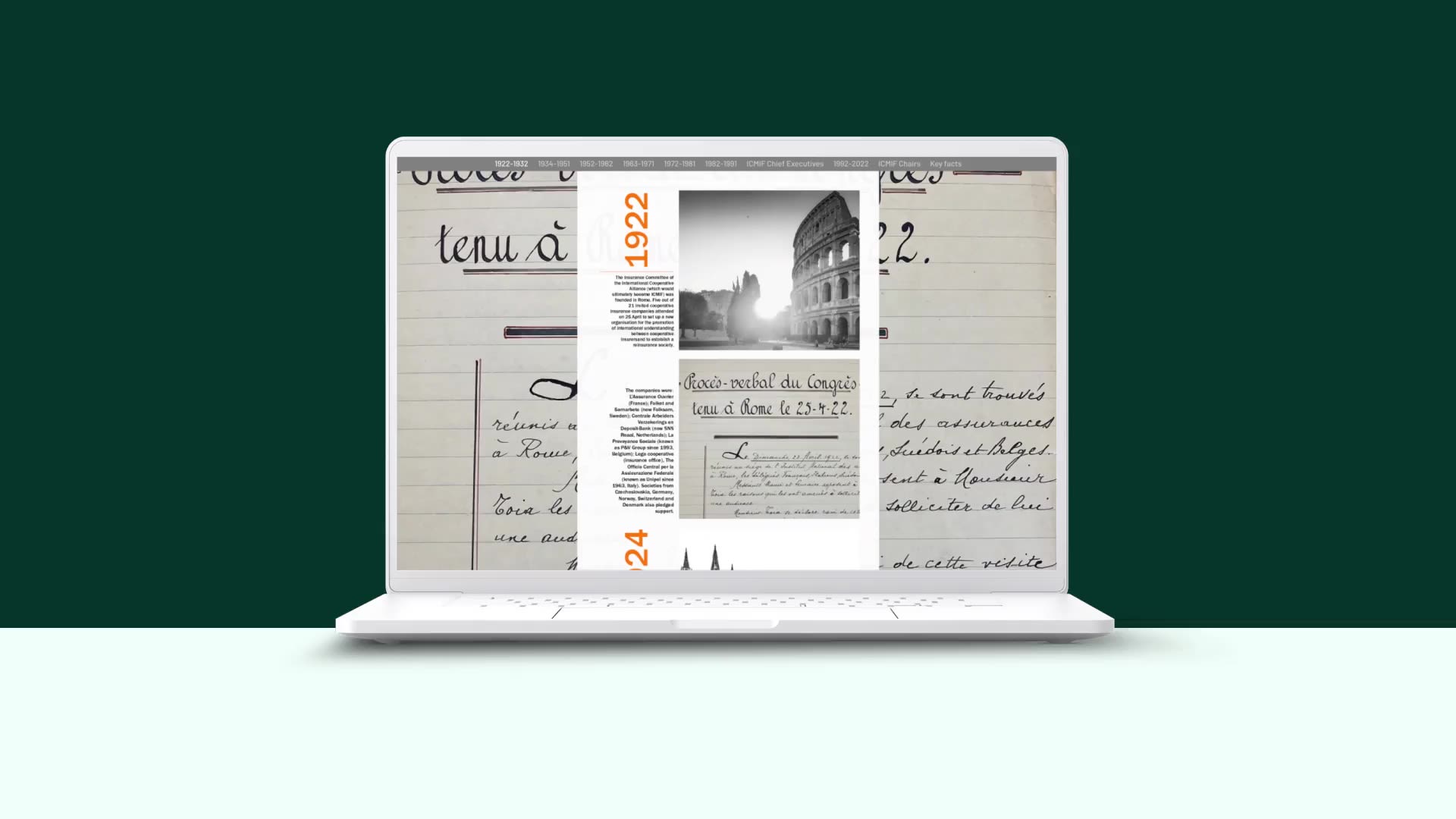
The History of the International Cooperative and Mutual Insurance Federation
What: a history of the ICMIF
Who: International Cooperative and Mutual Insurance Federation (ICMIF)
Why we picked this example:
Created in celebration of the ICMIF’s centenary, this piece is a great example of the timeline driving the article.
Unlike many of the timeline examples here, this one is more about visuals than text; it’s almost like a timeline infographic. The vertical timeline includes the year in bold, prominent text, alongside photographs from throughout the Federation’s 100-year history with minimal text serving more as a photo caption than anything else.

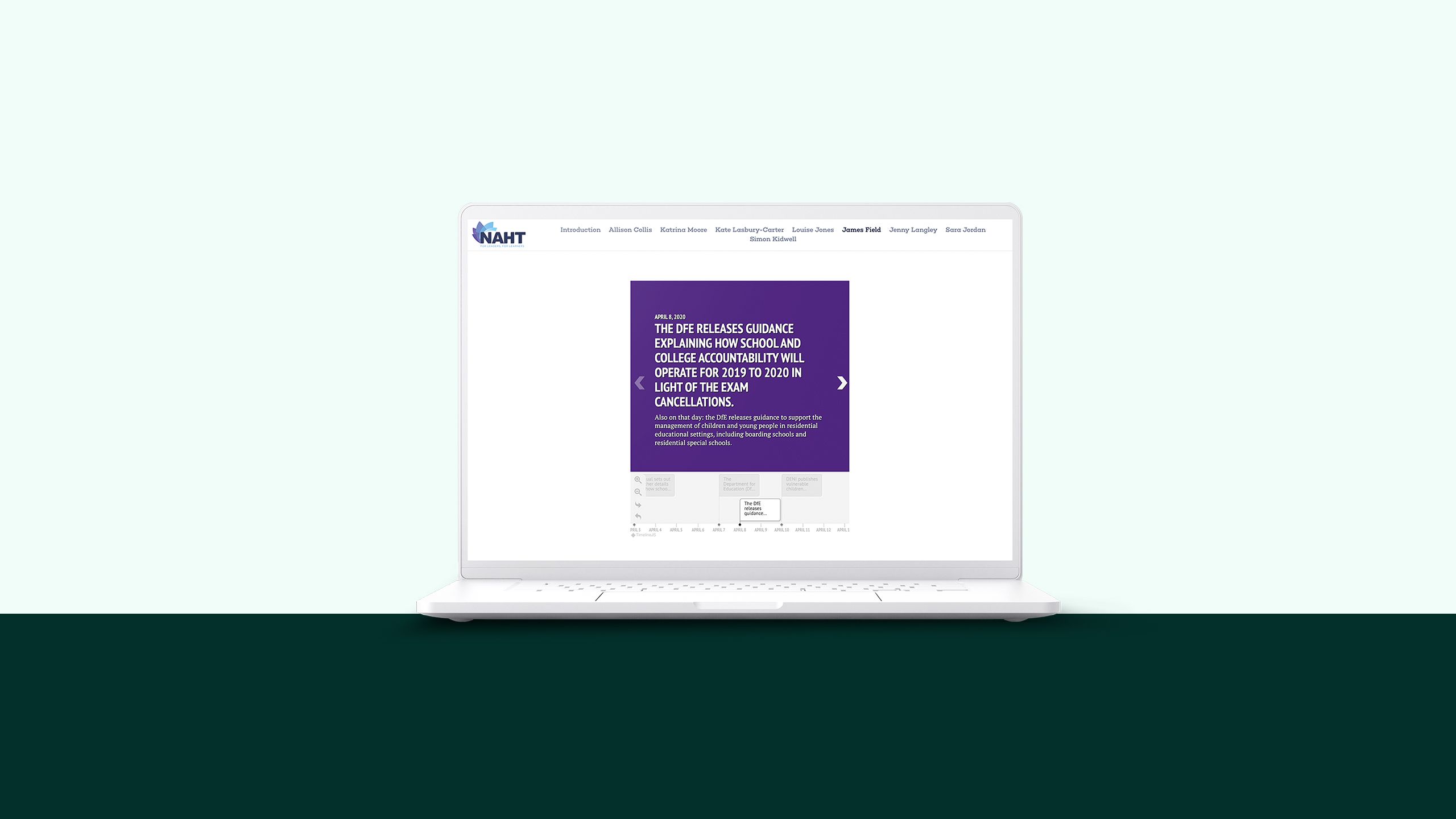
COVID-19: school leaders on the frontline
What: an exploration of the real-life experiences of frontline educators
Who: National Association of Head Teachers (NAHT)
Why we picked this example:
This article chronicles the actual experiences of frontline teachers, educators, and team members throughout the early days of the COVID-19 pandemic.
The timeline component is unique among the other examples on our list. Built using Knight Lab’s timeline maker functionality and TimelineJS library, it’s a different type of timeline: a fully interactive historical timeline that features a headline above, with the horizontally scrolling timeline below. Readers can click through at their own pace while enjoying a broader view of the highlights in chronological order.


Fantastic feats
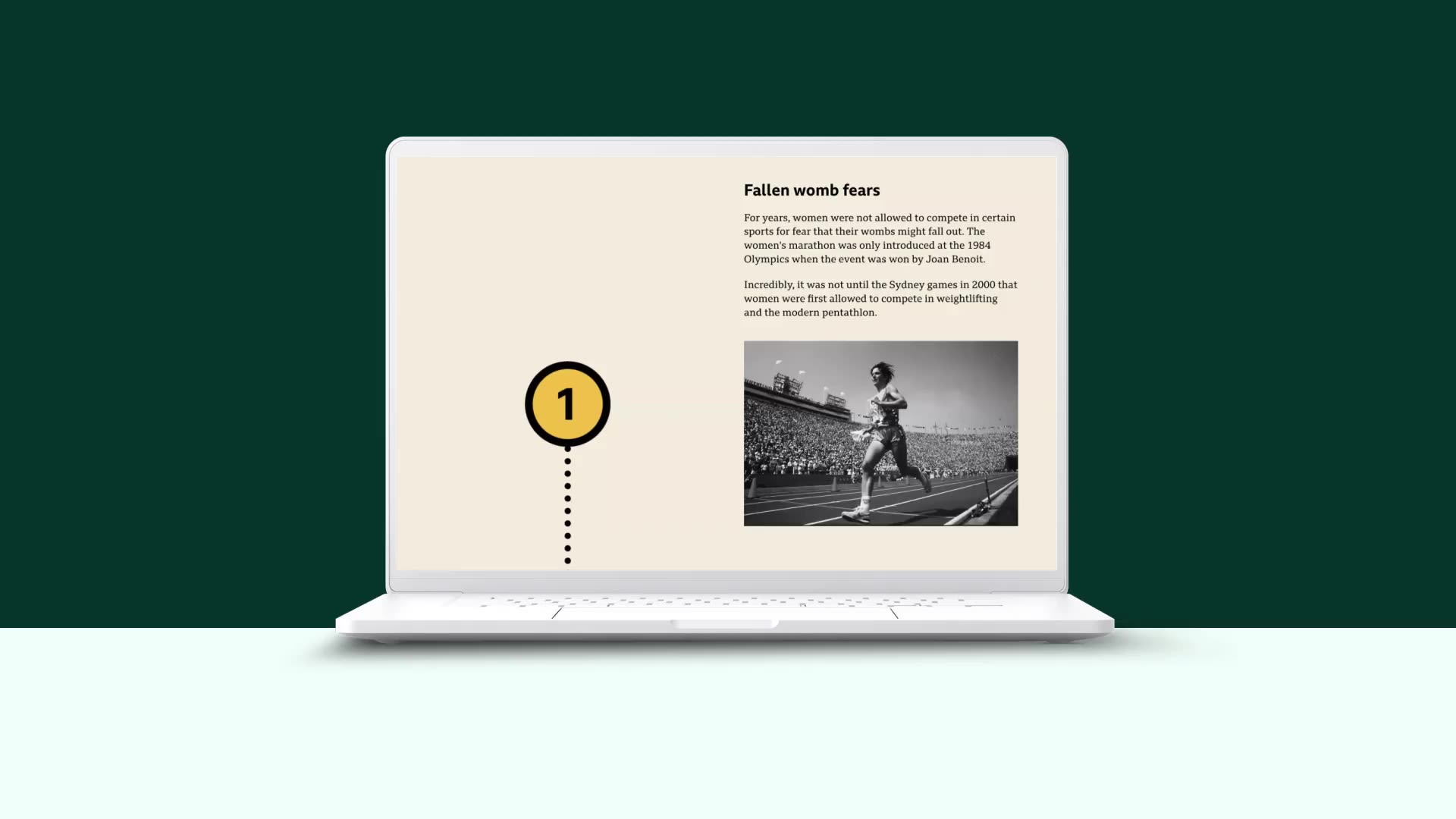
What: an article highlighting key events of the last 128 years of the Olympic Games
Who: BBC Sport
Why we picked this example:
This short and sweet article from the BBC spotlights a number of interesting titbits and historical events from the past 128 years of the modern Olympic Games.
While the timeline format isn’t as essential here — the year each event takes place is more of a fun fact than a crucial piece of information — it still works as a simple way to organise the information presented and symbolise the history of the Games.

The Craft's history of visual storytelling
What: a brief visual history of visual storytelling
Who: The Craft
Why we picked this example:
Shameless self-promotion, really. Though we do feel it’s a fantastic timeline, worthy of a look, which will get you inspired to think about your own visual narratives.

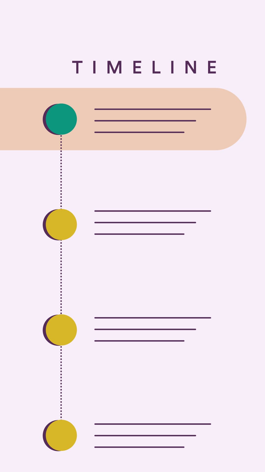
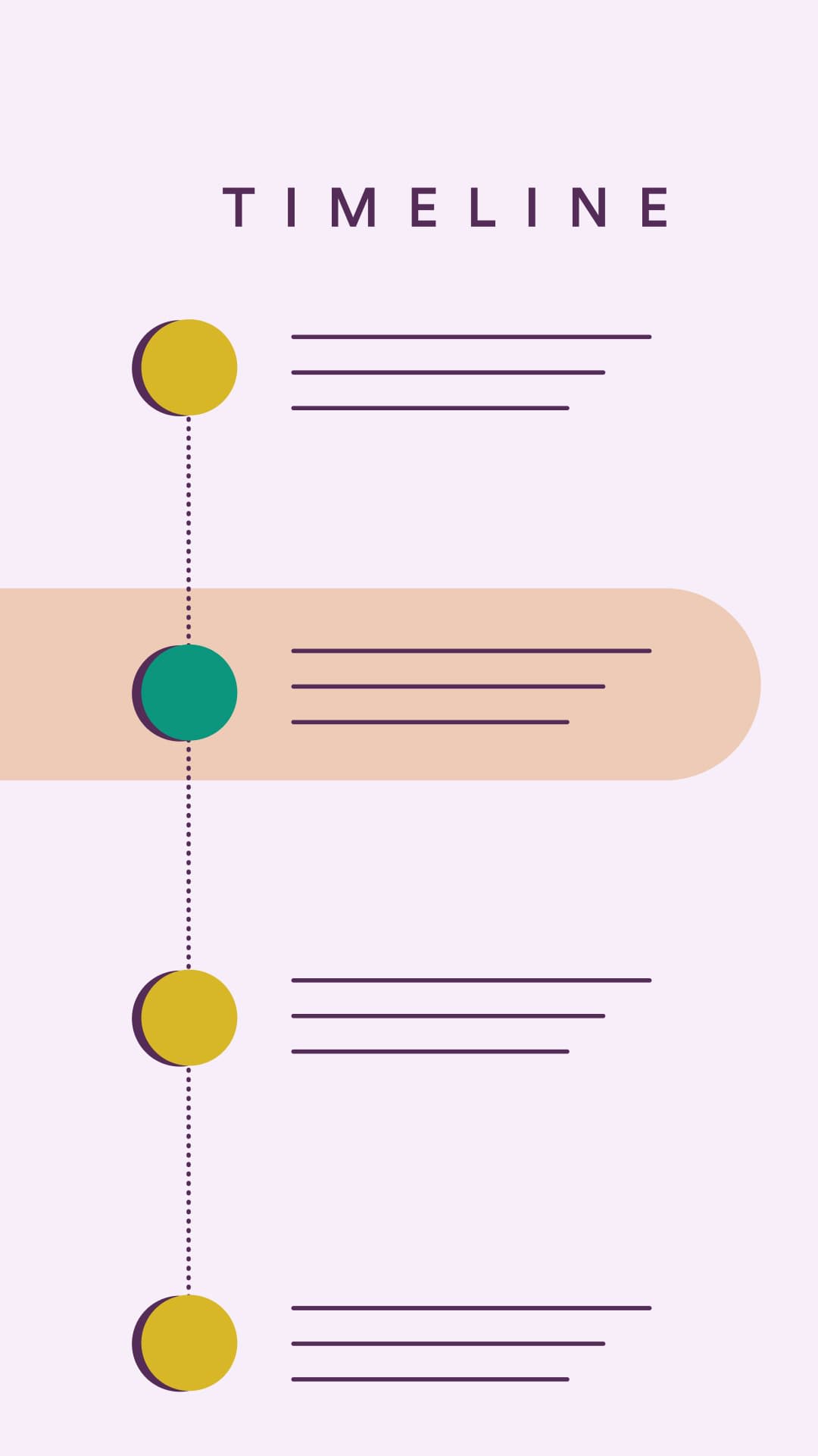
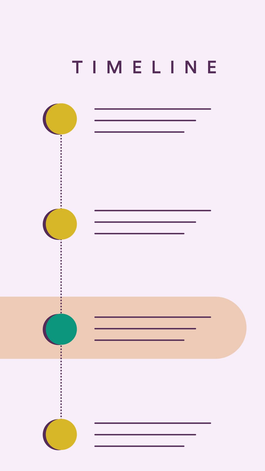
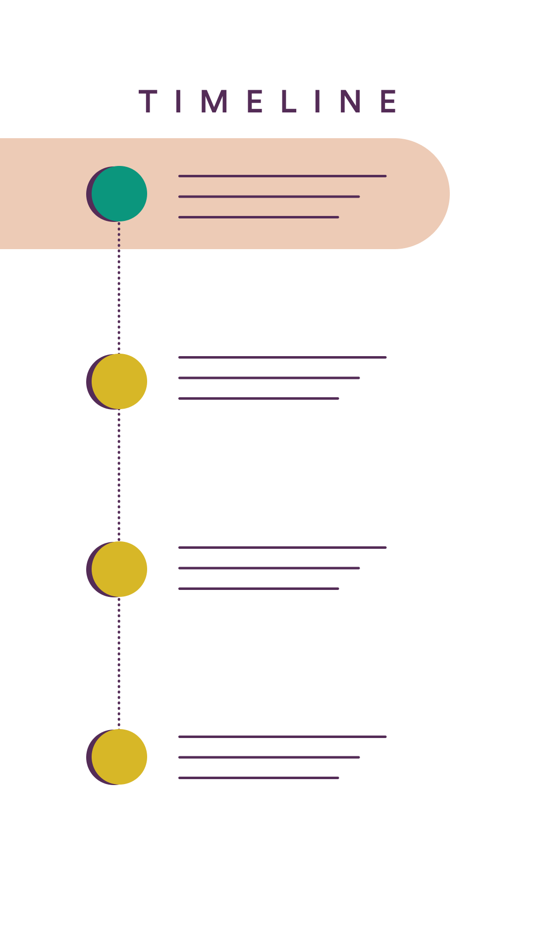
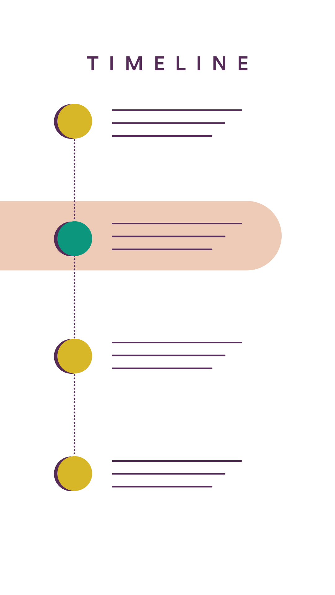
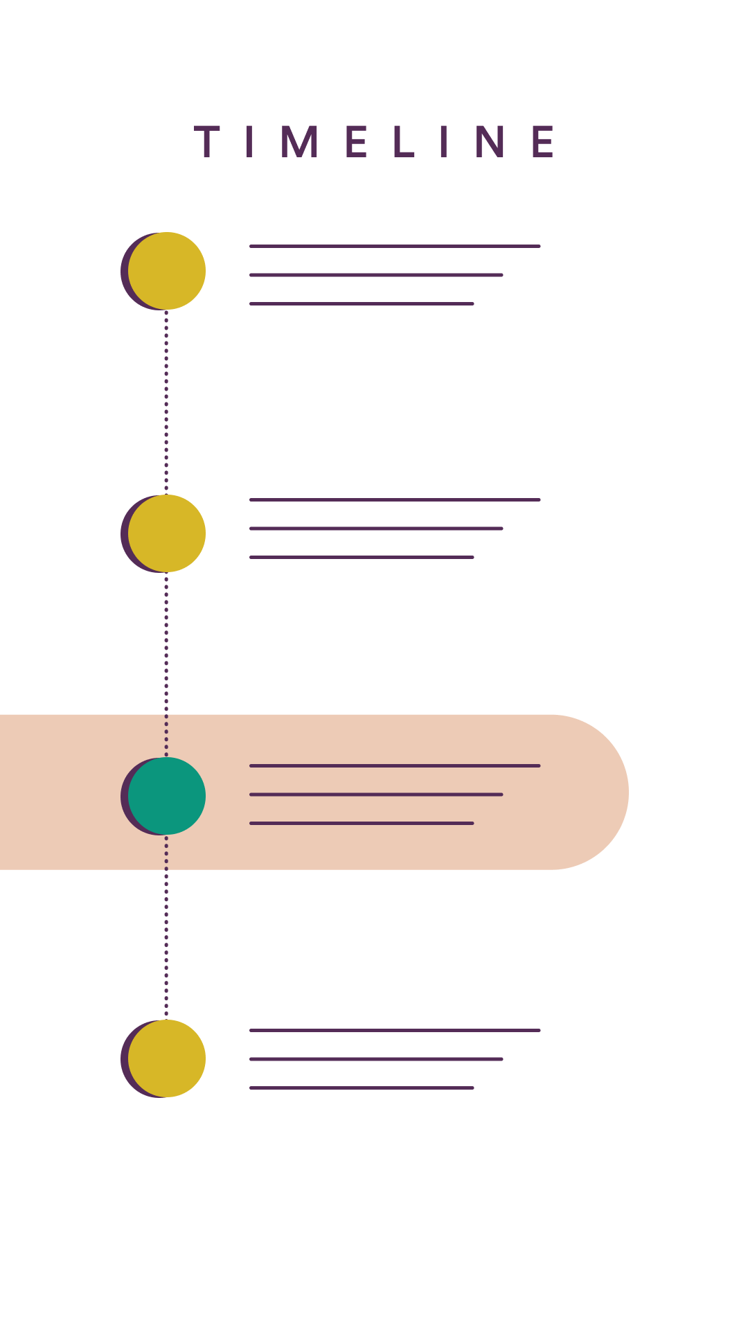
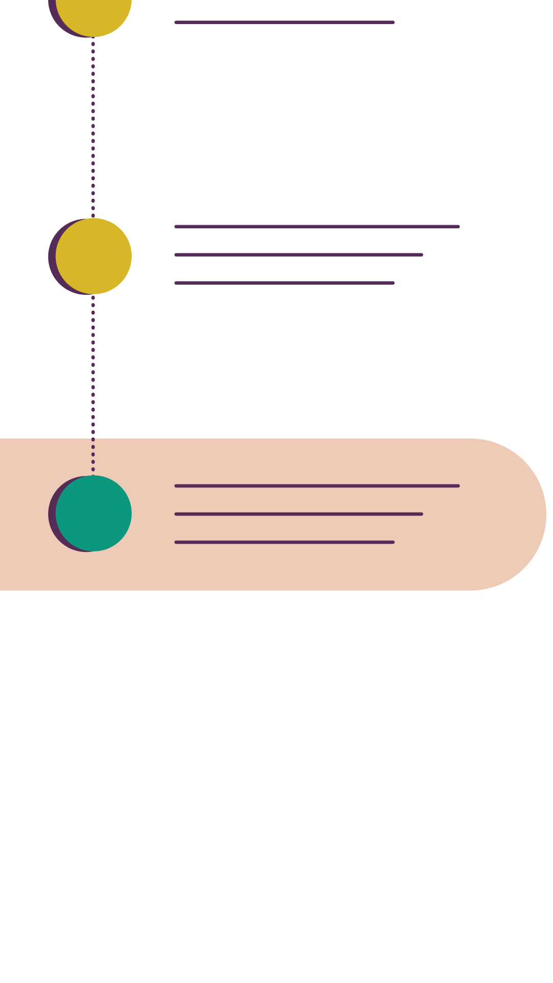
Free timeline template


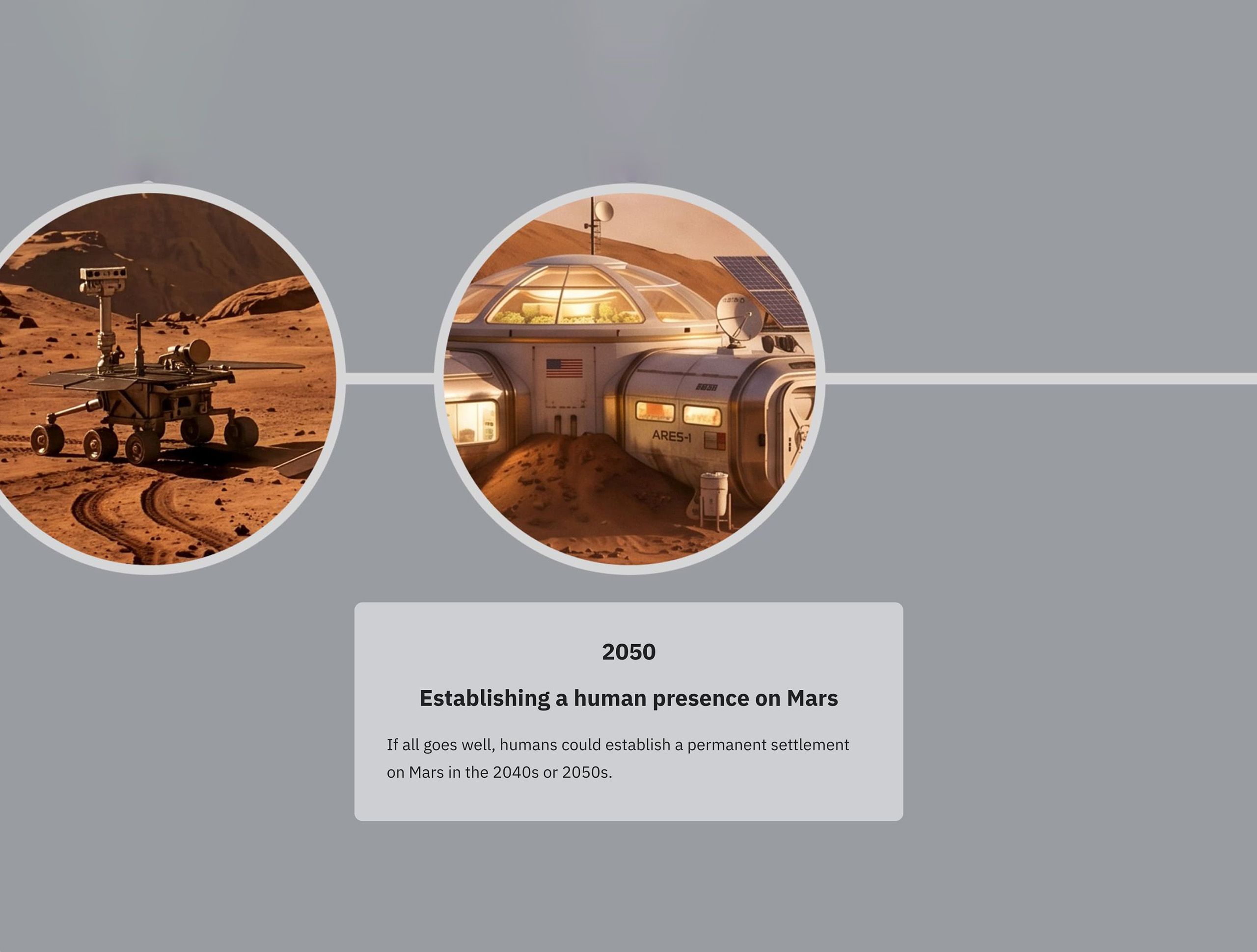
Walk your reader through time in Shorthand’s free timeline template
This timeline template includes two separate timelines built in different styles. Take a look, make your choice, and add in your own branding, media, and copy.
Visual timeline FAQs
What makes a visual timeline more engaging than a standard timeline?
A strong visual timeline does more than list events in order. It uses layout, imagery, pacing, hierarchy, and sometimes interactivity to guide the reader through a story.
The best examples in the article are interactive, not just chronological. As we know from our deep dive into engagement, high-performing digital stories use interactivity to capture readers’ attention.
When should I use a visual timeline instead of another storytelling format?
A visual timeline works best when time is central to the story, such as in a history, campaign evolution, project journey, product development, or major sequence of events.
If your content depends on showing progression, change, or cause and effect over time, a timeline is often the clearest format. Other formats may be more effective in some cases. Check out our listicle examples roundup, our introduction to brand storytelling, and our engaging feature storytelling examples.
Where can I view more visual timeline examples?
Shorthand’s featured visual timelines page contains a regularly updated selection.
How do I choose the right events for a visual timeline without making it feel cluttered?
The strongest visual timeline examples focus on the milestones that move the story forward, rather than trying to include every detail. Start with a clear narrative arc, then choose the events that show change, create momentum, or help the audience understand the bigger picture.
To keep the timeline polished, keep each milestone concise, use a consistent design and strong visual hierarchy, and only add media and effects where they genuinely improve comprehension and reader enjoyment.
Ready to join the leading publishers and brands creating engaging visual timelines with Shorthand?
For more inspiration, browse our full gallery of visual timeline examples.