
10 accessible website examples that work for
everyone
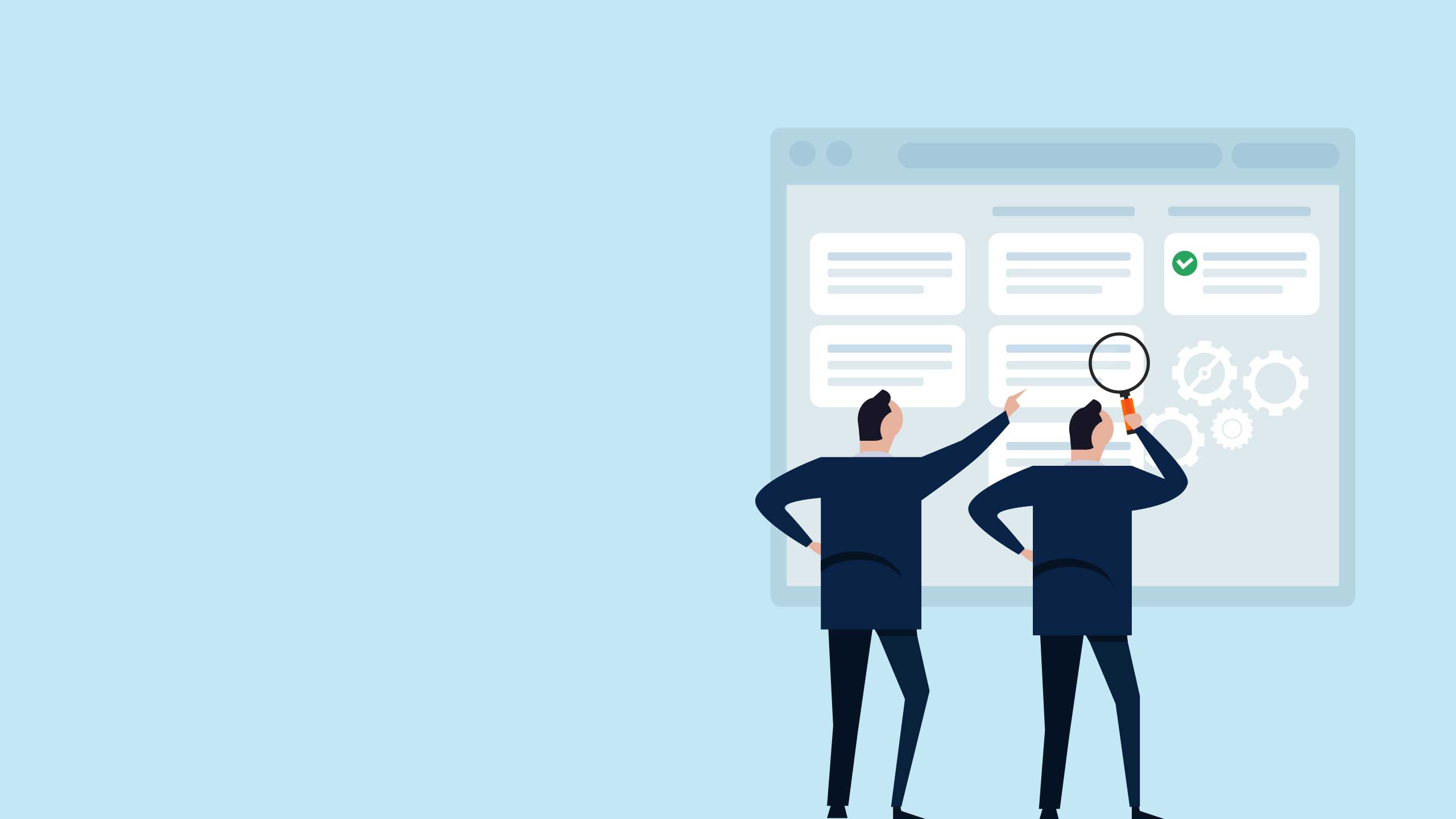

We talk a lot about how to create accessible content and which tools can help. But sometimes it's helpful to get beyond the theory and best practices, and see what's actually happening out there on the pages of the internet.


Here are 10 accessible website examples, collected from a wide range of accessibility awards, recommendations, and research, and tested with some of the accessibility tools that we recently evaluated. You'll find ideas and inspiration for every content team, from government comms to non-profit appeals, global brands, and research institutions.
We'll cover:
Start creating with Shorthand
It's the fastest way to publish beautifully engaging digital magazines, reports, internal comms, and more.

Why is accessibility so important?
Accessibility is not niche. It might get treated that way by some developers and content marketers — but they're missing a major trick.
The CDC estimates that up to one in four adults in the United States have a disability. Add in other factors such as access to computers and internet, and a startlingly high percentage of your audience will need some kind of accommodation to access your online content.
Unfortunately, web accessibility is lagging far behind what people really need. An annual survey of the top million websites by WebAIM produced some devastating results.
- The average site in 2023 had 50 accessibility errors.
- Home pages have become more complex, with 10% more elements than previously, but accessibility has only increased by 1.6% year on year.
- Almost 100% of pages still have at least one accessibility error.
What's most surprising about these statistics is how easily they could be improved. In the websites we reviewed for this articles, most of the errors we found were simple fixes — things like marking headers correctly, or remembering to add alt text to images.
Accessibility isn't difficult, too expensive, or out of reach. As content creators and publishers, we can do better.
Making accessible websites: the basics
Making accessible websites starts with the POUR framework. That means making your page Perceivable, Operable, Understandable, and Robust. Everybody should be able to see or hear the content; interact with it, however they choose to access the internet; understand the information you're giving them; and continue to have access in the future, as hardware, software, and publishing trends evolve.
There are countless checklists and tools out there which can help you create accessible websites, test them, and monitor them for continued compliance. However, a lot of accessibility comes down to simple principles.
Let's start with the absolute basics…
- Structure. Lay out information clearly and use HTML mark-up to label different headings and sections. If the webpage is complex or has a lot of dynamic elements or interactive features, use ARIA to support people who use assistive tech.
- Text. Use fonts and font sizes that can be read clearly. Always use live text rather than showing words as part of an image, so that screen readers can pick up on the text.
- Images. Always label images with alt text so that people with visual impairments can still access the information in them.
- Contrast. Choose images and colour palettes which work for everyone. Be aware of visual impairments, such as colour-blindness, and other conditions which can be triggered by specific contrasts and light patterns, such as epilepsy.
- Links. Label links with clear, descriptive text, so that people know what to expect if they click through.
- Multimedia content. You can absolutely create accessible multimedia pages. Just make sure that users can toggle content on and off, rather than being surprised by autoplay, and that every piece of information comes in at least two media. So, for example, if someone can't hear a podcast, they can still read the transcript.
These are all things that you can do to your content right now.
In fact, it's often easier to follow these guidelines than not! Why would you ever want to share a link without a clear label? Does anyone actually enjoy autoplay video?
In the next section, you'll see 10 examples of well-made, accessible websites from a wide range of sectors. Some of them use dazzling multimedia storytelling, while others focus on a clean, stripped-back design. But they all have one thing in common: they get the basics right.

10 accessible website examples

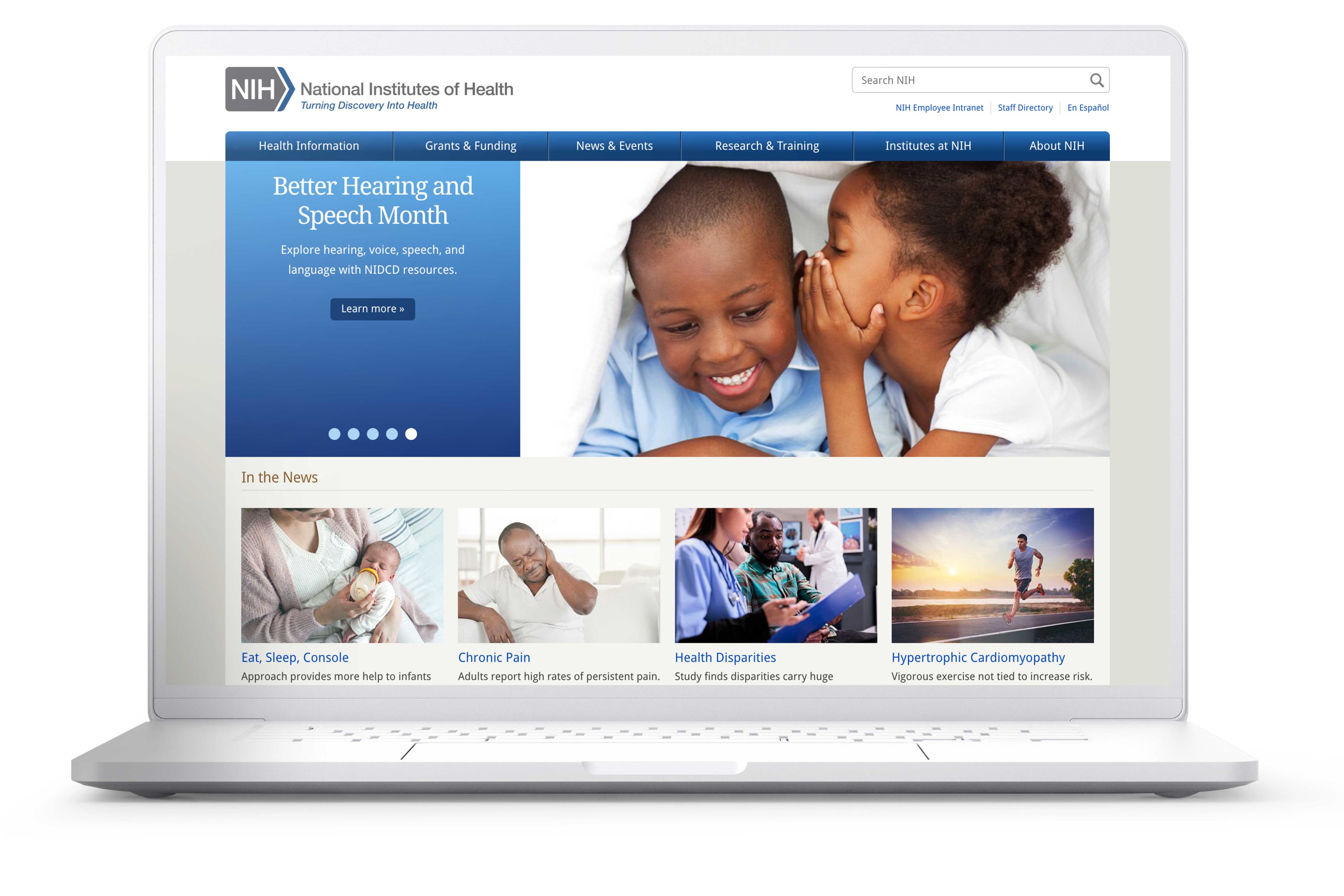
Healthcare: National Institutes of Health
The National Institutes of Health is the go-to health information resource for scientists, doctors, and patients in the United States. It publishes health information, vaccine advice, and news, as well as covering opportunities for funding and grants. That means it has to share a lot of complex information with a very wide range of people.
The website is impressively accessible. When we tested it with the WAVE accessibility evaluation tool, it registered zero errors. All the webpage elements are labelled correctly, and the design and images are sensitively chosen.
The web designers at NIH have created a website with a clear structure that's easy to navigate. In fact, it's so well-planned that only a few ARIA tags are needed to clarify the navigation.
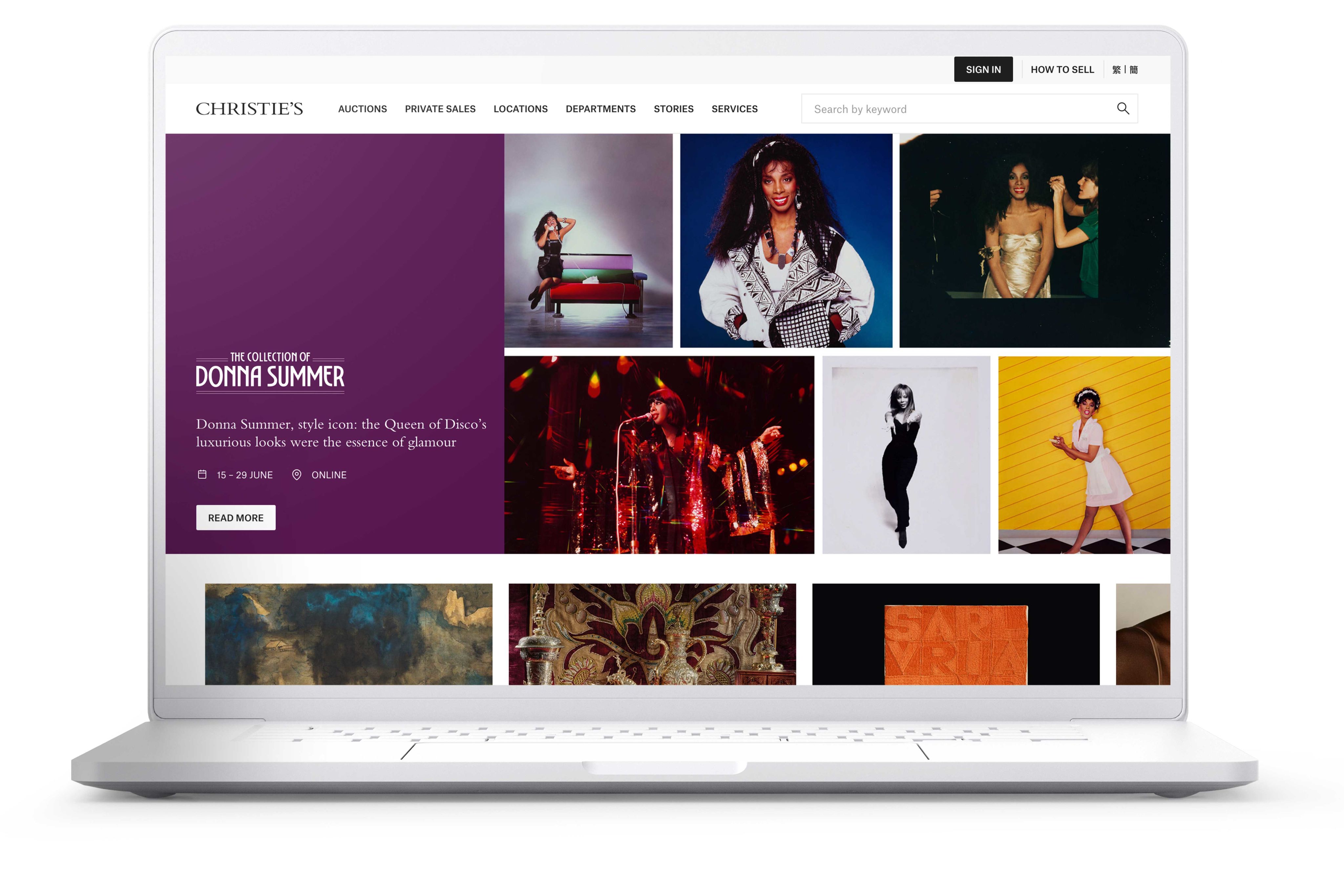
Arts: Christies
Christies is one of the most venerable and famous auction houses in the world. But, being an old institution doesn't mean that it's stuck in the past.
Christies still sells the most modern art… and keeps up with the latest recommendations in accessibility. They use their website to attract sellers, highlight special items up for auction, and share fascinating content about the art and artists they work with.
Art galleries, museums and institutions have to be thoughtful about accessibility because their content is often highly visual. Christies has created a glossy website that conveys a sense of their history and auction items, while still being almost fully accessible.
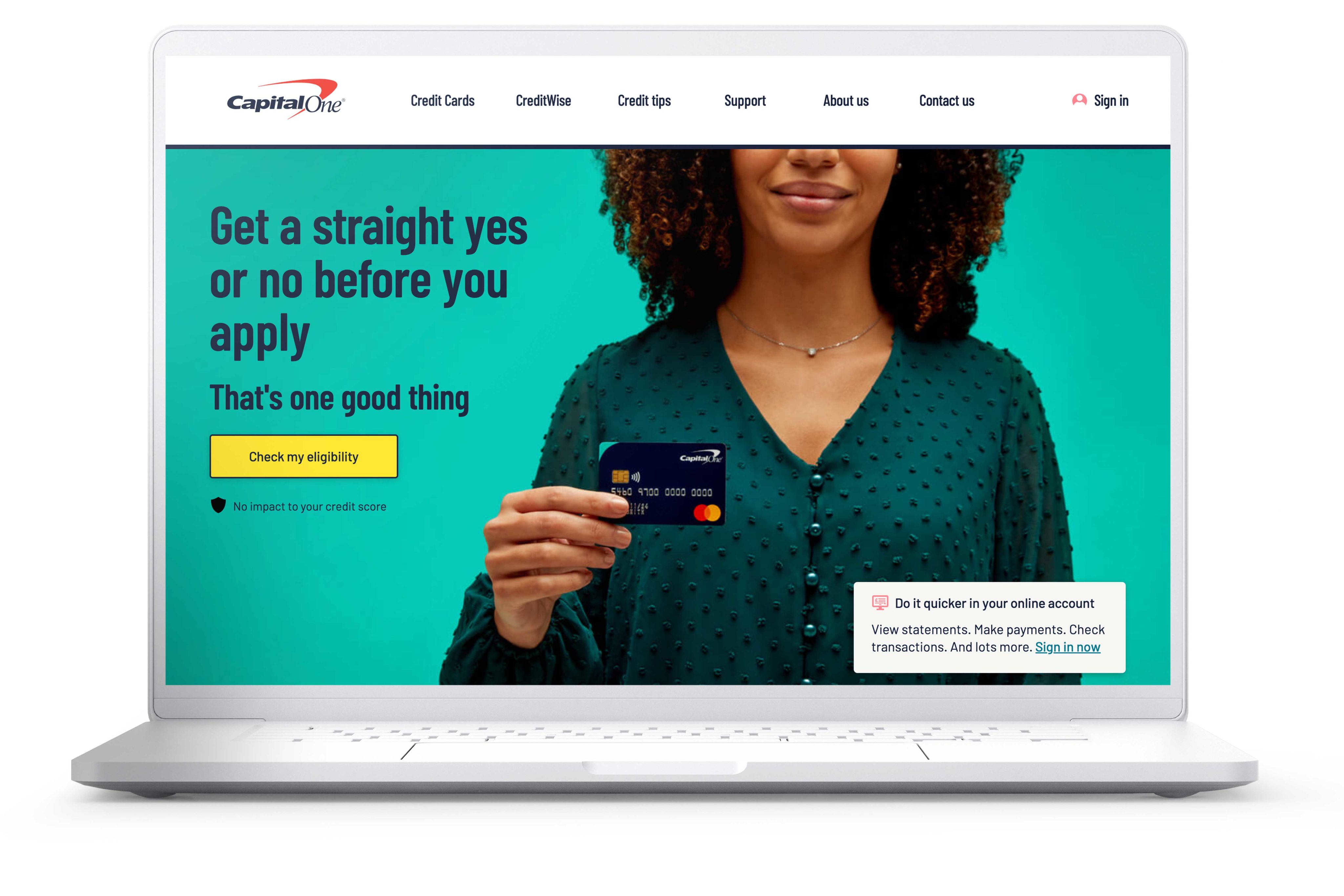
Consumer finance: CapitalOne
Pretty much everyone needs a bank — but high street banks are disappearing. So, online banking needs to be accessible to absolutely everyone. Their services need to be easy to use and understand. Even for their customers without accessibility needs, clarity and ease of use are an important part of building trust between the bank and its account holders.
CapitalOne is a notable example of a consumer finance company that gets this right. Its website is fully accessible, with no recorded errors in labelling or colour contrast. It also uses ARIA elements to help users navigate their account services.
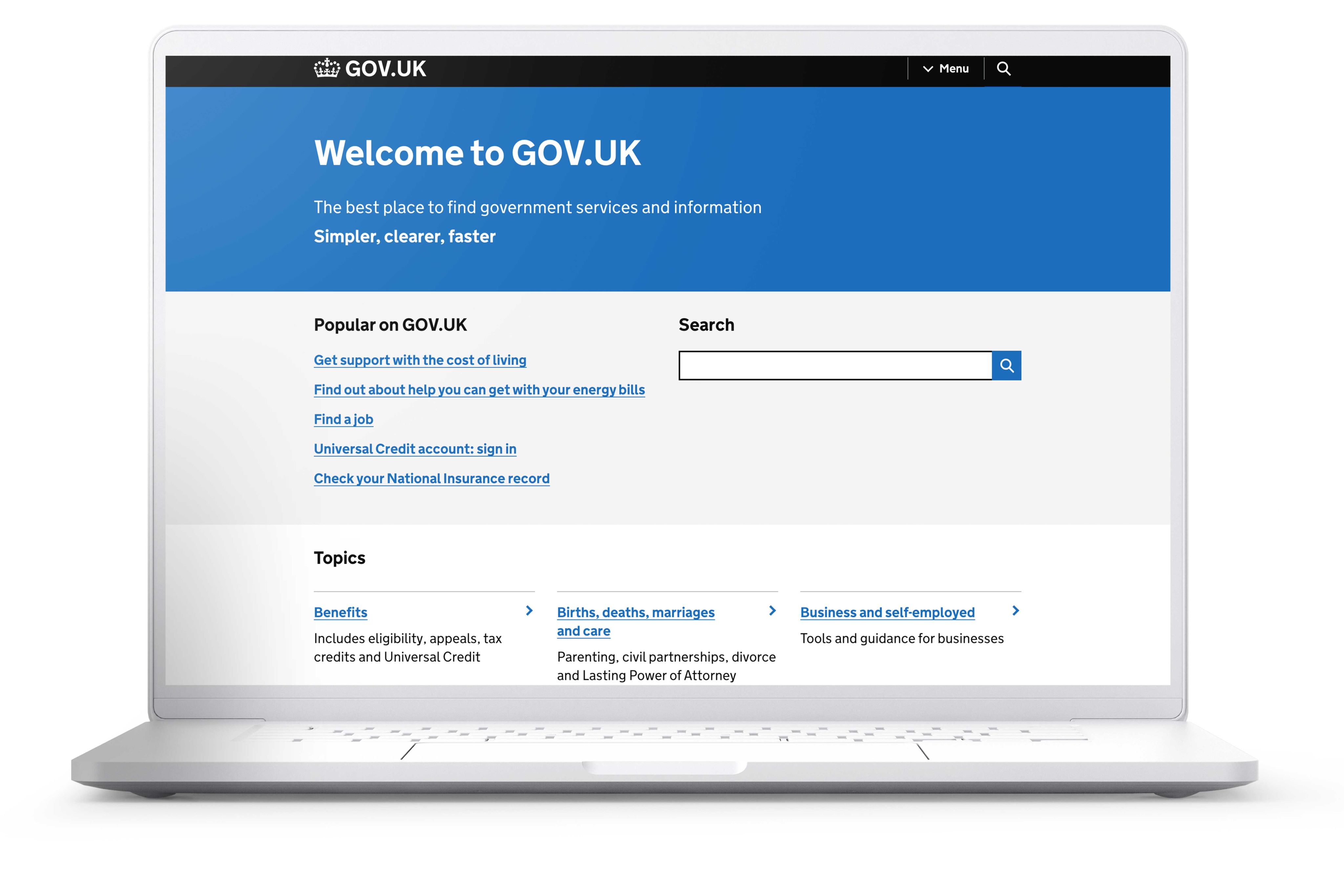
Government: GOV.UK
The United Kingdom's government portal is a pioneering example of content design that works for everyone.
The website has to be fully accessible, because it's used for almost anything you can think of: job hunting, pension management, registering marriages, claiming benefits, ordering passports, founding businesses, and more. It also includes services and resources especially for disabled people.
GOV.UK is designed to be as clear as possible — from its simple colour palette to navigation menus full of descriptive links. The most impressive thing about it is the eminently simple website structure. Every user can find what they need, fast.
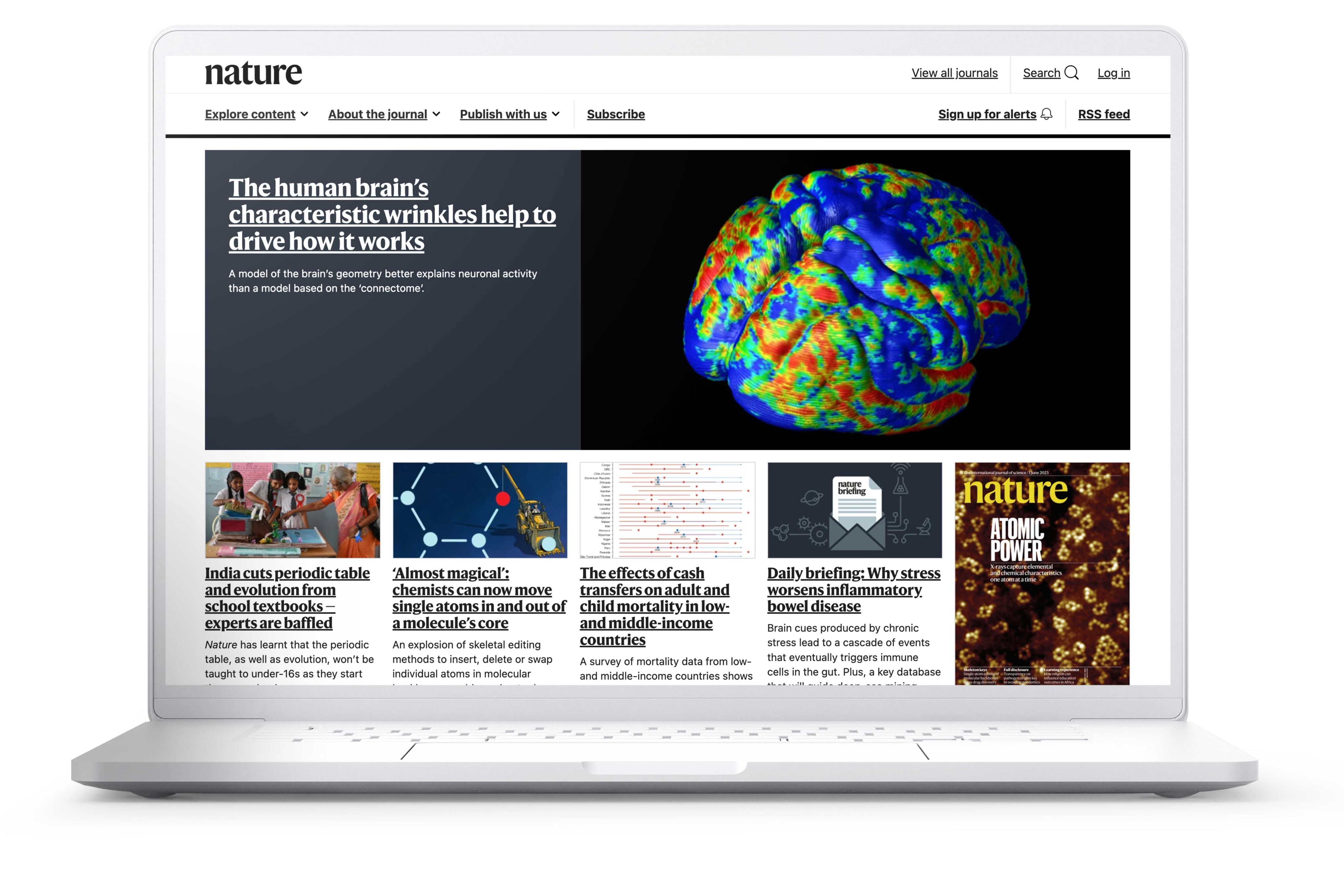
Science and research: Nature
Nature is a world-famous scientific journal that continually publishes new research. It has heaps of data, charts, analysis, and images to share — and an ethical responsibility to make sure all of that information is accurate, clearly presented, and accessible.
It's also known for sharing research that is timely and highly readable, such as this report on COVID and inequality, produced with Shorthand.
The journal's website scores impressively high on a quick accessibility check, with no errors and only a few alerts. It's clearly structured so that users can navigate through the different sections to find what they need.
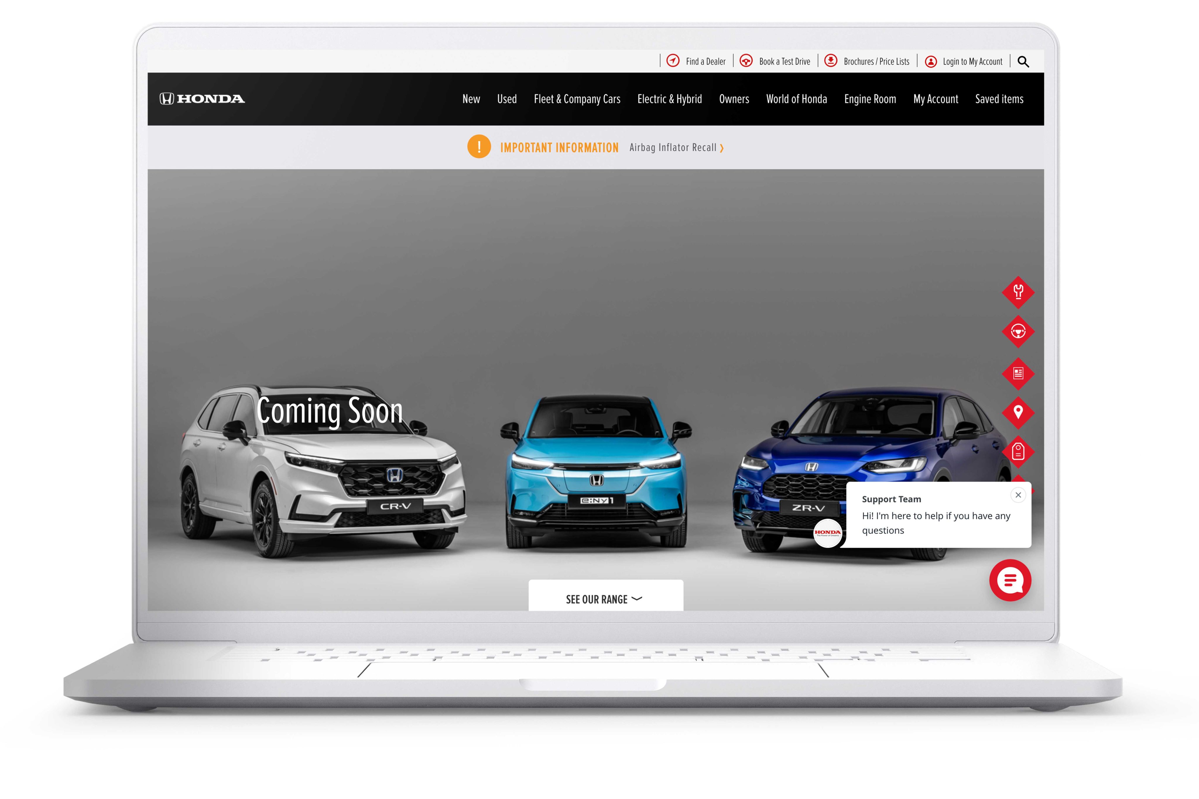
Global brand: Honda
The vehicle manufacturer Honda has built a strong community around their brand that reaches across the globe. The reason for their success? Not only quality products, but also valuable content, engagement with the community — and an accessible approach that welcomes everybody in.
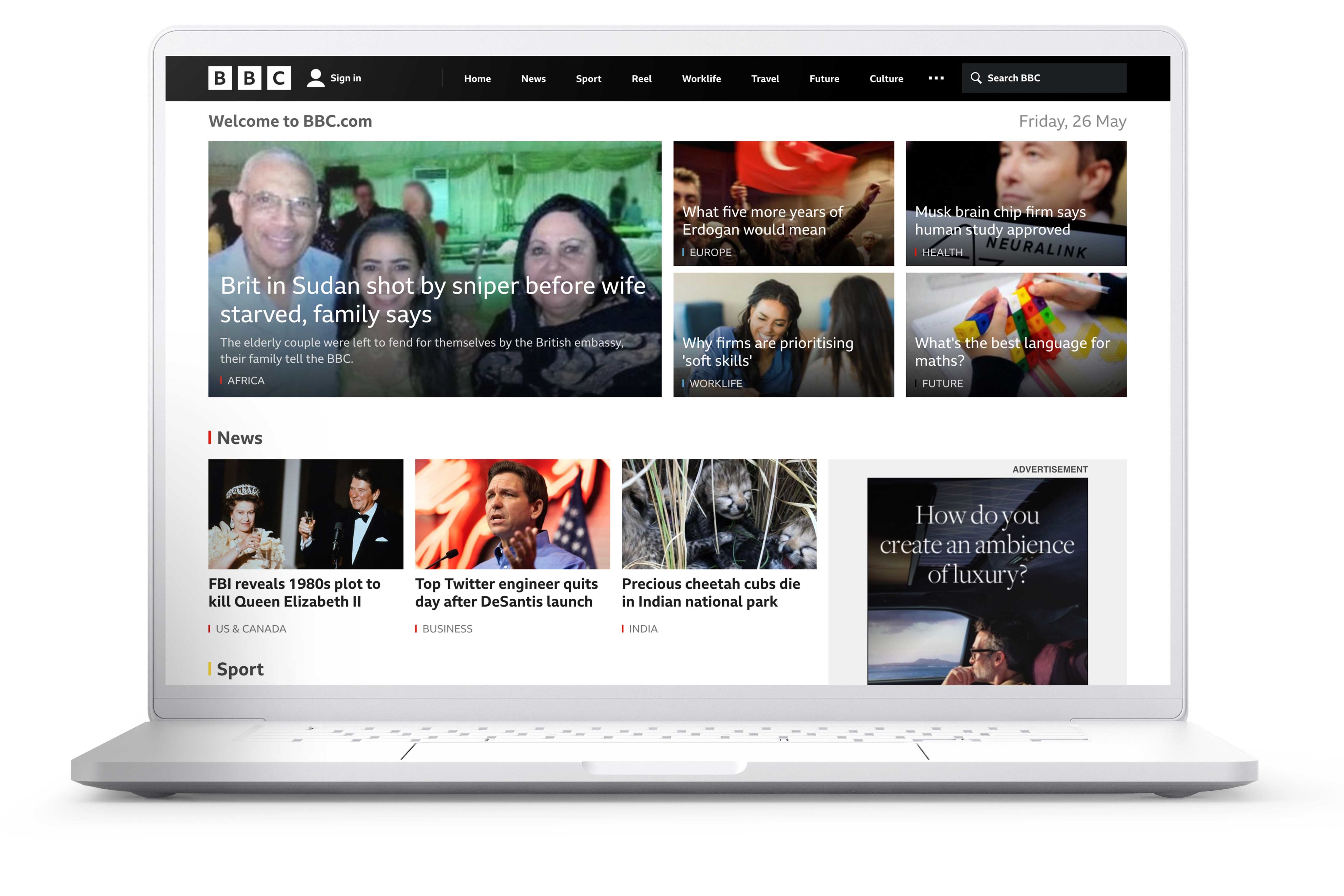
News: BBC
The BBC is a globally trusted and respected news source. It's free — and accessible — to everybody.
The BBC website scores highly for accessibility, with only a few contrast issues. It has to contain a lot of information which is constantly updated in the form of new articles, so it uses lots of ARIA labelling to keep track of different news sections. The stripped-back, mostly monochrome design is efficient and easy to read.
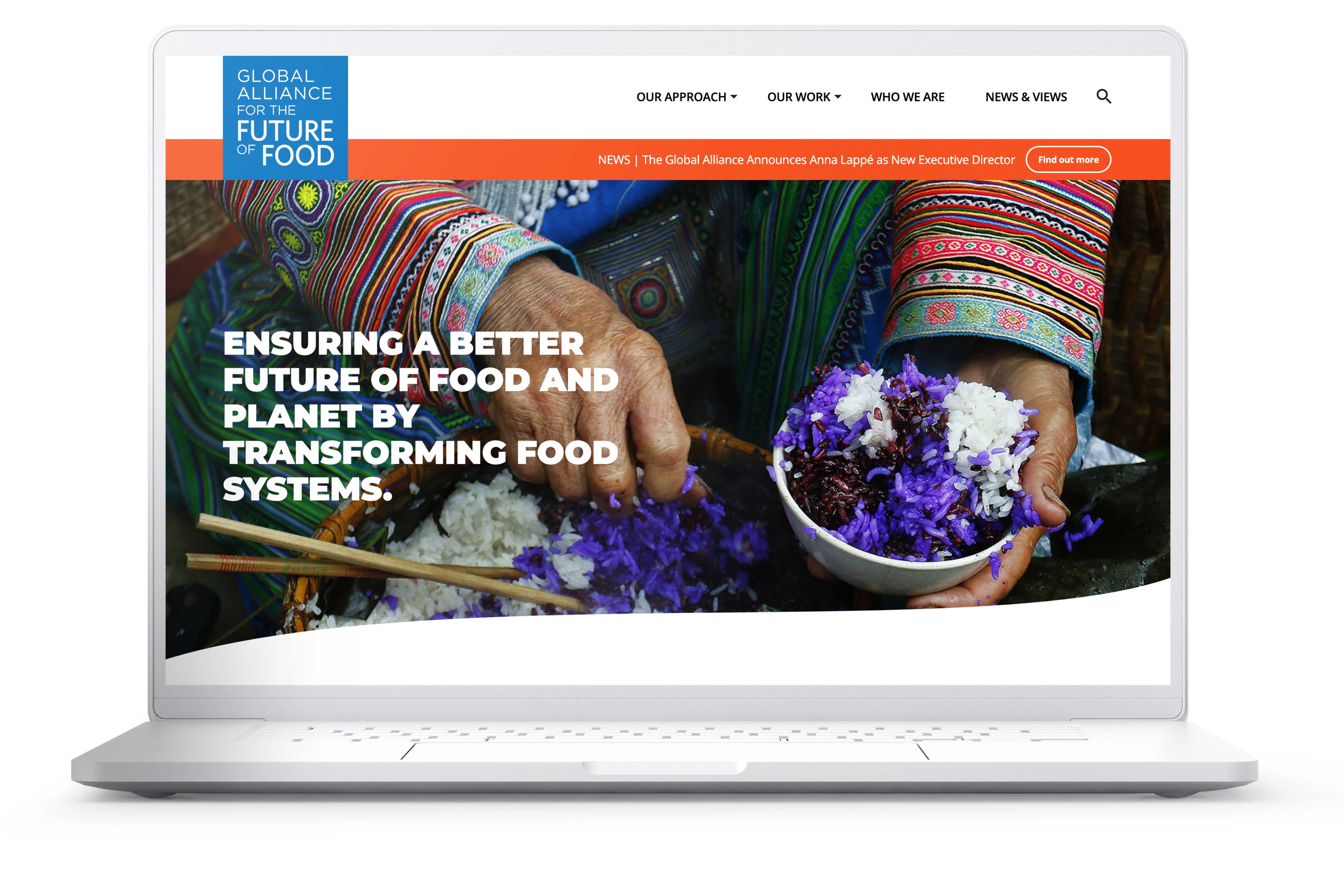
Non-profits and charities: Global Alliance for the Future of Food
The Global Alliance for the Future of Food brings together non-profits, NGOs, and a global stable of experts to solve the looming problem of food insecurity. It takes a systemic approach, including equity, diversity and renewability, to try and fix things in the long term.
The Future of Food website reflects that commitment to inclusion and diversity. It scores highly on most accessibility metrics, with only a few errors in labelling or contrast. What's more, the content it publishes combines vivid, multimedia design with diverse voices and views.
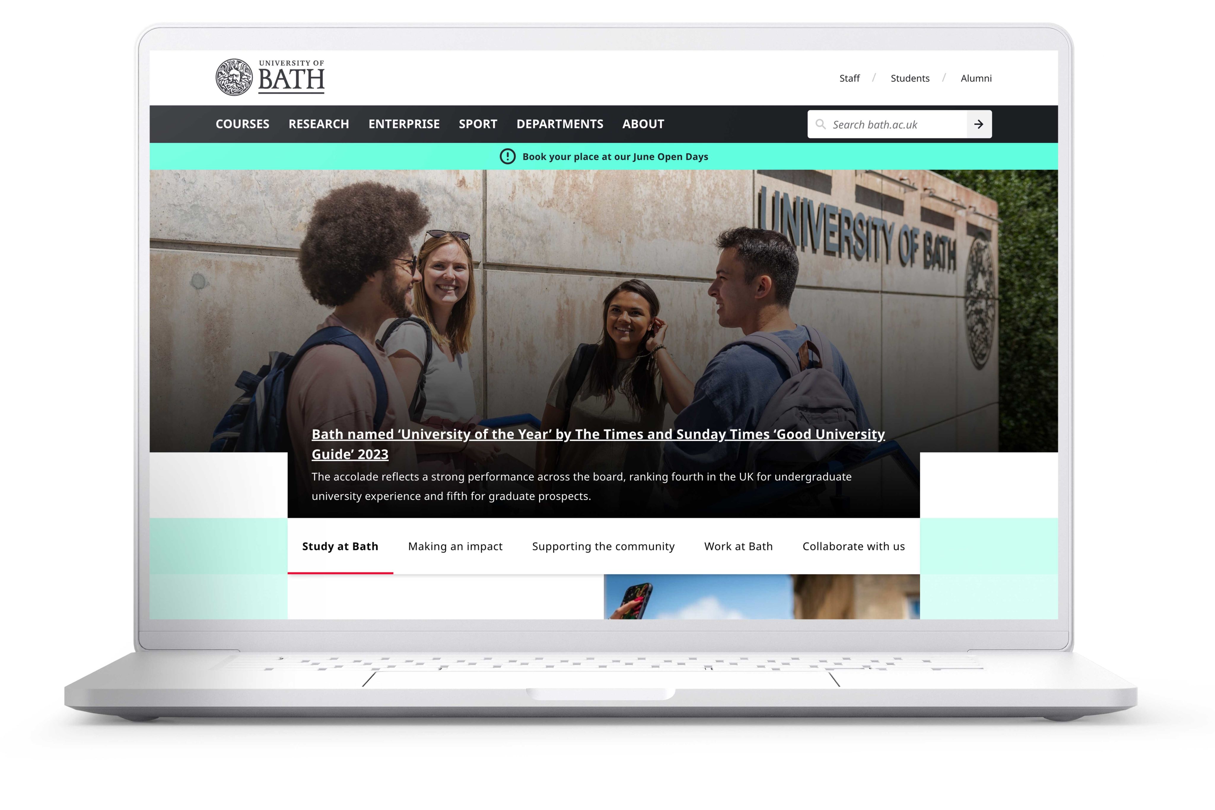
Higher education: University of Bath
University websites have to juggle a lot. They need to attract and inform potential students, provide services to current students, support academic researchers, and publish new research — to name just a few things on their to-do list.
It's especially important for educational institutions to have accessible websites, so that no student is locked out of education. University web pages aim to welcome a diverse range of applicants, including students with disabilities.
The University of Bath — which was recently crowned University of the Year, and first for student satisfaction in the UK — rises to the challenge. Its website is fully accessible and easy to navigate. It packs in glossy photos, interactive forms, information and links, without ever compromising on accessible design.
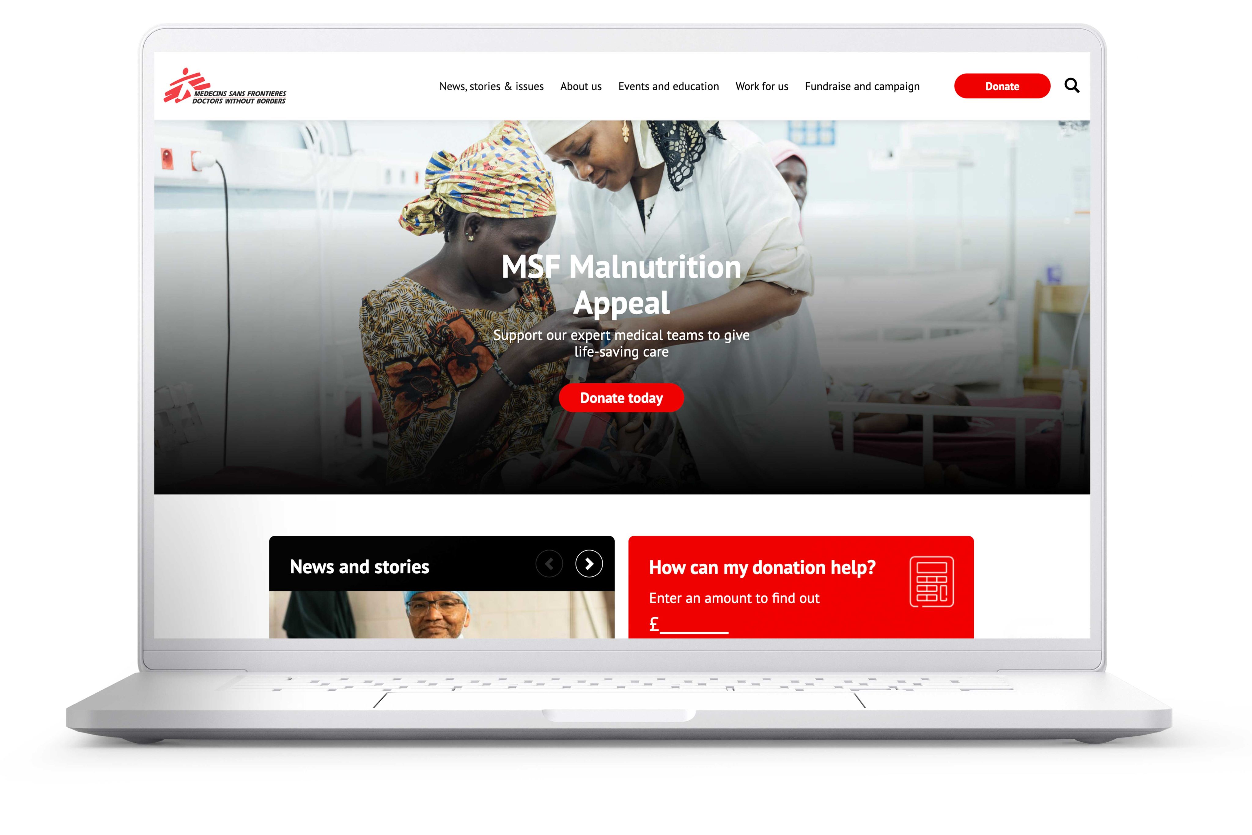
Non-profits and charities: MSF
Médecins Sans Frontières (MSF) is an international organisation that gives medical assistance to people in need, wherever they are. Their website has to work in different languages, in different locations and conditions, and for people with various accessibility needs.
It also has to fulfil multiple roles: sharing information with other organisations, recruiting healthcare workers, and making a persuasive case to donors through telling stories about their work.
The main MSF website scores highly for accessibility. It shares the latest news, reports, and updates from different regions in a way that's easy to scroll through and understand.
Image sources courtesy of bakhtiarzein via Adobe Stock.