
12 examples of stunning science communication

Unlikely as this might seem from social media platforms, we’re living in a golden age of science communication.
As newspapers and magazines struggle to fund specialist science reporters, it might seem like science communication is on the back foot.
But as we show in this piece, new digital tools are making it possible for science communicators to tell important, fascinating, and funny science stories to the general public.
In this guide, we look at:
Start creating with Shorthand
It's the fastest way to publish beautifully engaging digital magazines, reports, internal comms, and more.


What is science communication?
Science communication is the practice of informing and inspiring the general public about scientific knowledge. Science communication takes many forms, from longform journalism and podcasts to social media posts and seminars.
In recent years, science communication has become a greater priority in the scientific community, especially in response to increases in misinformation on everything from climate change and vaccines to telecommunications.
Some of the leaders in science communication include the American Association for the Advancement of Science (AAAS), the Public Library of Science (PLOS), and NASA.
Why is science communication important?
To address urgent issues
As we've seen in the pandemic and climate change, communicating science is critical to solving the world's most urgent issues. While it's not always a fair fight — too often, misinformation travels the world while the scientific truth is tying its shoe laces — it's a hugely necessary one, for public health and the planet.
To make science more transparent
As we discuss in our piece on storytelling and the impact of academic research, most basic science is funded by the public. At the same time, the public communication of this science — that is, the published articles and books — tend to be stuck in academia behind a hugely expensive paywall.
Whatever the merits of this system, the science community needs to communicate in order to continue to justify the investment of their main stakeholders: the public.
To educate non-scientists
The public understanding of science is a good thing in its own right, and plenty of science of communication is produced simply to educate the public about what we know — and don't know — about life, the universe, and everything.*
Science education initiatives can also aim to increase public engagement on the most critical issues of our time.
* With apologies to Douglas Adams.
To educate decision makers
It's good to educate the public; however, it's critical to educate those making decisions. While we sometimes like to imagine — or hope — that our leaders are informed about the most important issues we face, the truth is rather less inspiring. In most countries, leaders have varied points of view about science, and scientific literacy is not evenly distributed.
While it might be considered a 'stretch goal', one clear aim of science communication is to inspire better understanding of science by policy makers. Ideally, this can lead to evidence based public policy and decision-making by governments across the board.
To inspire the next generation of scientists
For the future of our economies, environments, and societies, it's critical that the next generation of talented people embrace a career in the sciences (including social sciences) — and develop great communication skills along the way. The best way to do this is inspire them with excellent scientific communication.
To inspire local communities
All science happens somewhere, and it's important for science communicators to engage with their local communities. While this is often difficult — there are only 24 hours in a day, after all — it's a key tactic improve science literacy among the public.
Great community outreach can even inspire contributions to science by amateurs in the local community, otherwise known as citizen science.
The University of Queensland


Science communication is often based on specific research outputs — usually technical journal articles. The most effective science communication, though, finds a way of placing technical research in a larger narrative context.
That is, they tell a story.

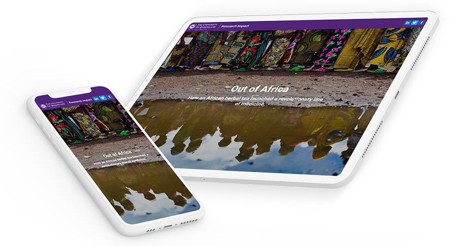
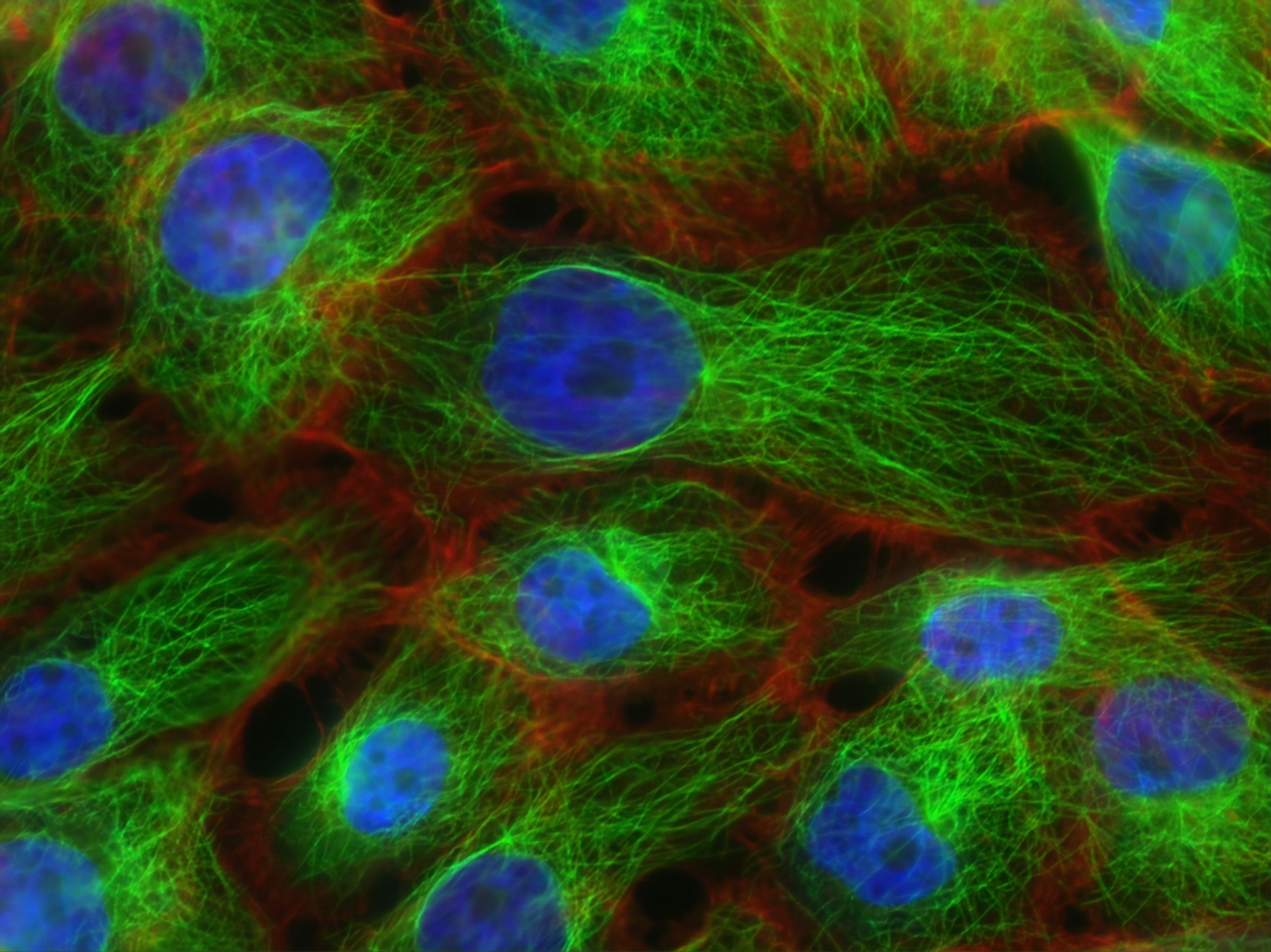
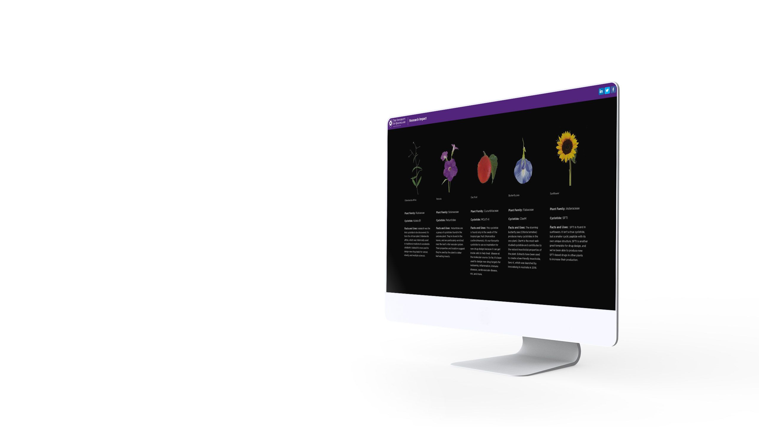
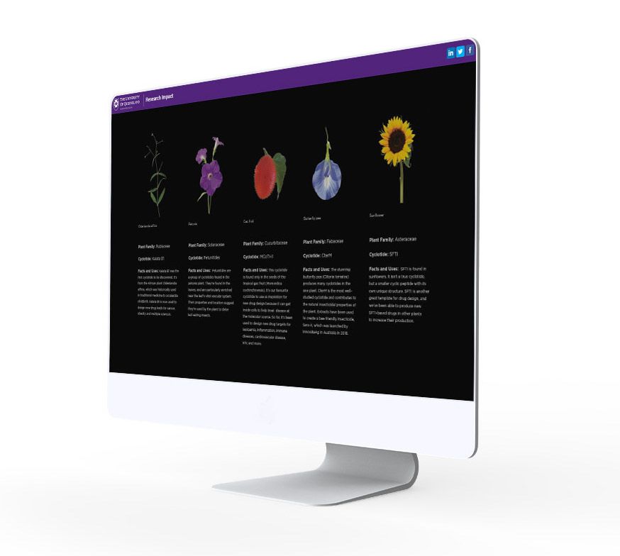
Out of Africa from The University of Queensland begins with a herbal tea widely consumed in West Africa in the 1960s, before introducing the more technical — and serendipitous — process of scientific discovery at the University of Oxford thirty years later.
The piece is a fascinating introduction to the science of plant-based peptides, and makes it clear why research into peptides and proteins from the natural world is so important today.


Science communication is often based on specific research outputs — usually technical journal articles. The most effective science communication, though, finds a way of placing technical research in a larger narrative context.
That is, they tell a story.
Out of Africa from the University of Queensland begins with a herbal tea widely consumed in West Africa in the 1960s, before introducing the more technical — and serendipitous — process of scientific discovery at the University of Oxford thirty years later.
The piece is a fascinating introduction to the science of plant-based peptides, and makes it clear why research into peptides and proteins from the natural world is so important today.
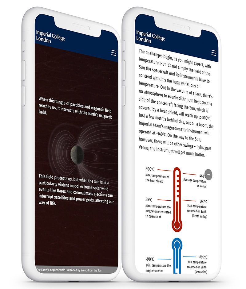
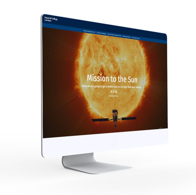
Imperial College London


The difference between a good science story and a great one often comes down to the quality of its visual assets.
Over the last few years, web publishing standards have risen dramatically. Once upon a time, you might have been able to get away with cheap stock photography or low-resolution photos.
But that was the old web, and times have changed. Now, the best science stories are truly immersive, with rich photography, videos, illustrations, and scroll-based visual effects.
Mission to the Sun from Imperial is a slightly unfair example — not every science communicator gets to tell the story of a literal journey to space. But it’s still a great example of a story that makes the most of its visual assets.
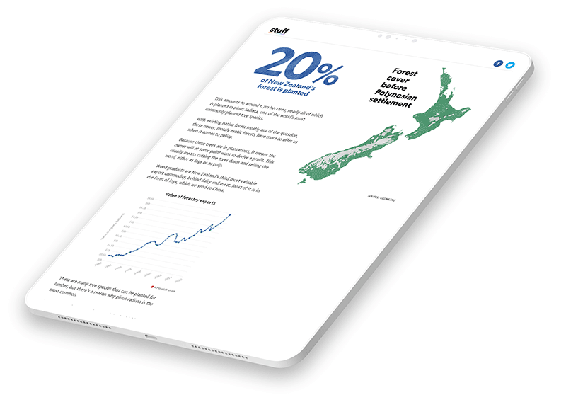
Stuff


The best science stories on the web benefit from excellent story design. This is true of many of New Zealand media company Stuff’s feature stories.
‘Story design’ is a broad term, but it generally refers to how a story’s producer arranges various story elements — including text, video, imagery, and visual techniques — to best engage the reader.
In Root & Branch, the Stuff team consider the thorny problem of land use, reforestation, and climate change in Aotearoa. They do an amazing job of explaining a complex science story, punctuating their text with graphs, infographics, video, illustrations, and stunning photography.
If you're looking for more examples like this one, check out our guide, 8 examples of powerful data stories, and our introduction to data storytelling.
Nature


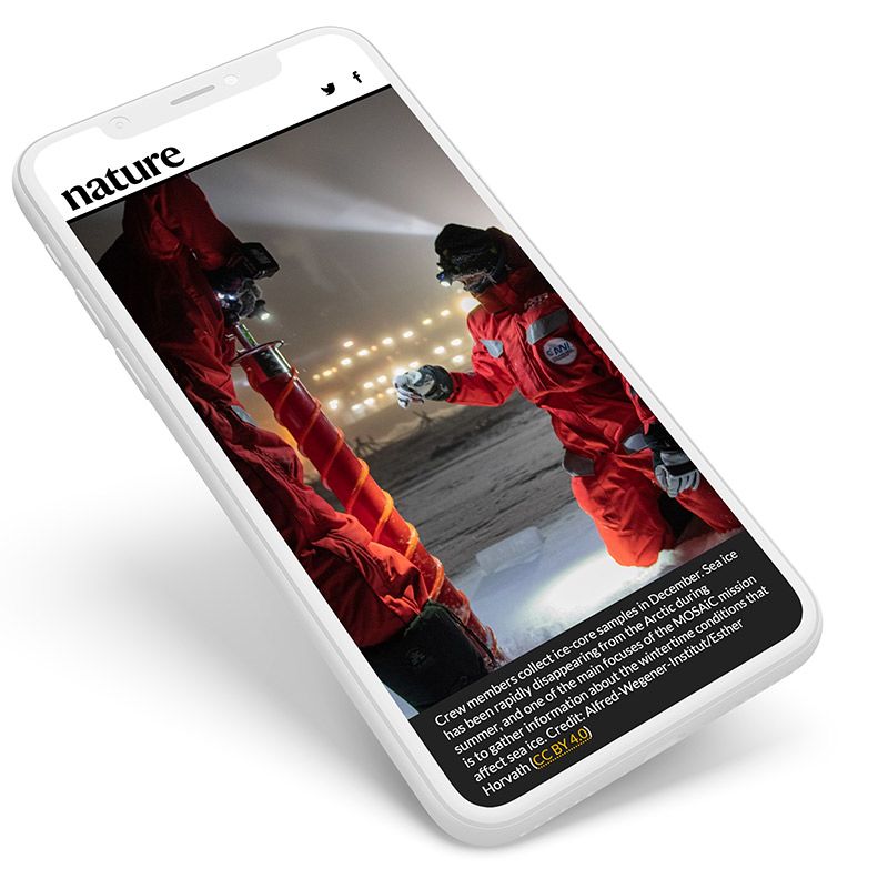
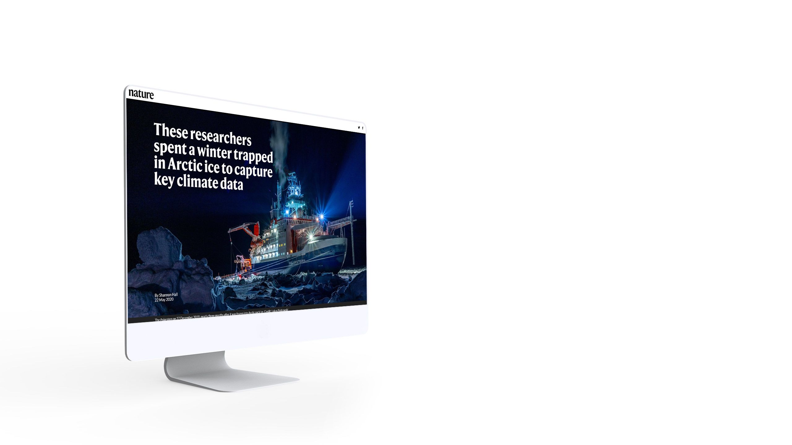
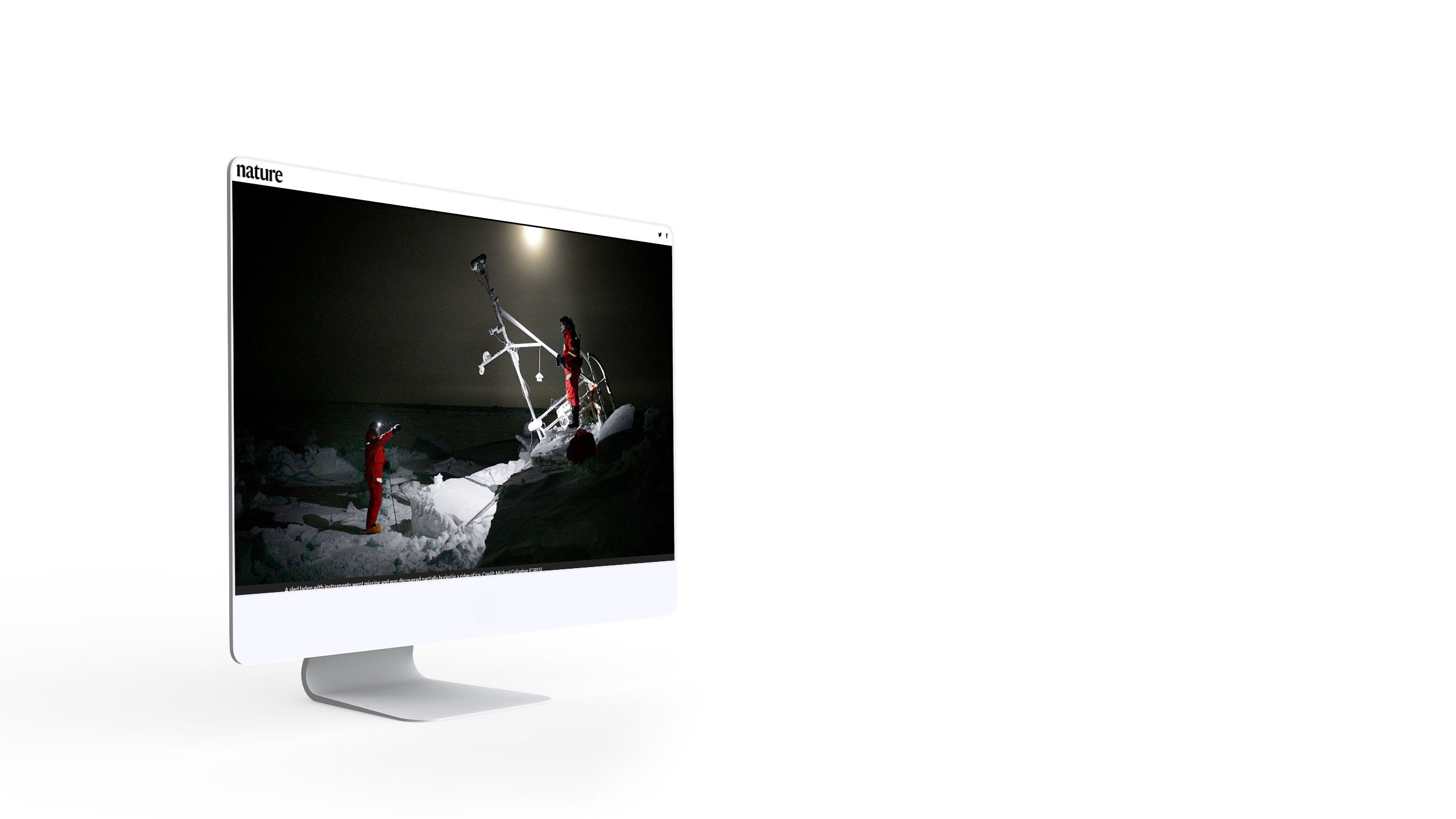
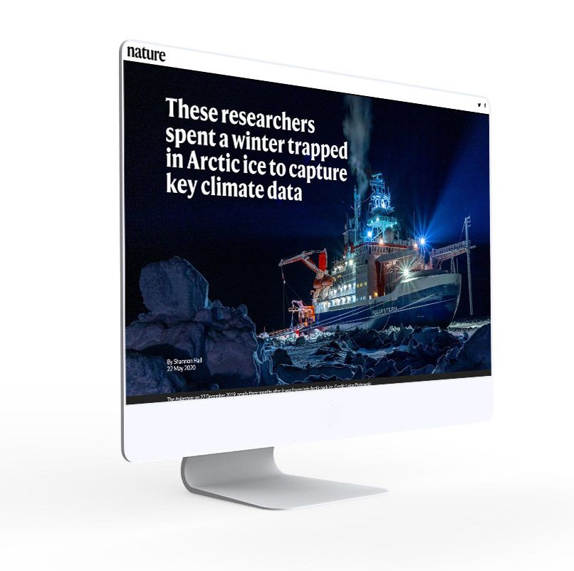
Sometimes, the most effective way to tell a science story is to focus on the process — especially when the process includes months-long expeditions to the Arctic.
Science journalist Shannon Hall of Nature tells just that story. Beautifully illustrated with photos of weather balloons, arctic skies, and — of course — polar bears, her story shows us the complexity and risk involved in collecting Arctic climate data.
Along the way, we learn about the current state of Arctic sea ice, and what that might mean for climate change in the future.
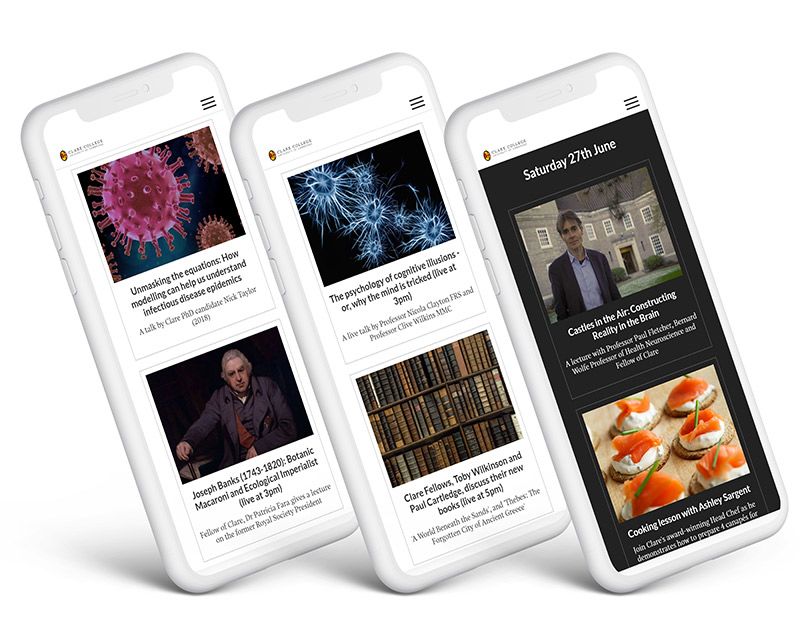
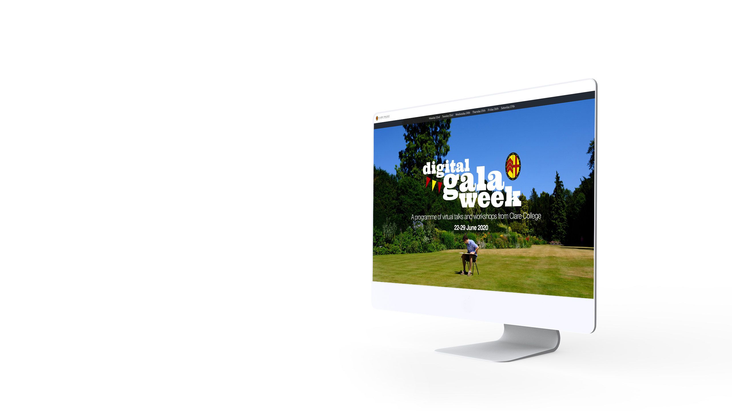
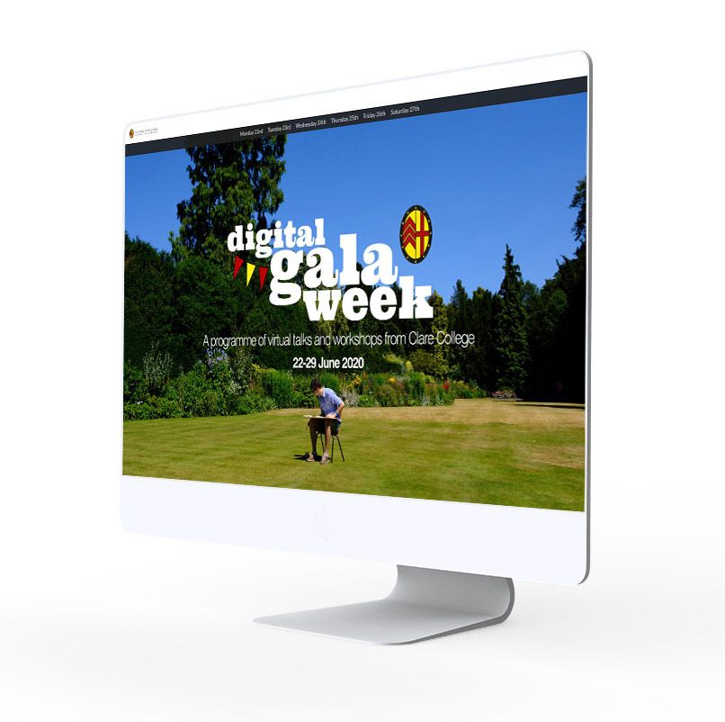
Clare College


Not all science communication happens on the page. Colleges and universities, for example, host an enormous number of guest lectures and panel discussions during the academic year — often aimed at non-expert audiences.
With COVID-19, many institutions are looking for ways to replicate that experience online. For their Gala Week, Clare College produced a virtual event using digital stories and embedded video, featuring talks from many of their scientists.
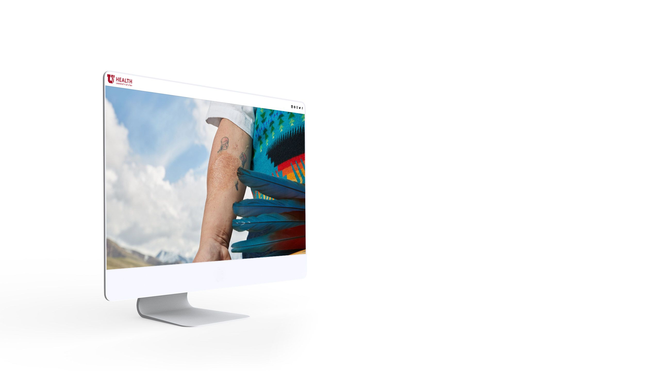
University of Utah


Members of the public are often most interested in the impact scientific research has on our world. This is the focus of the University of Utah team in They Emerge Transformed, which presents the science of burn treatment through the stories of burn survivors.
With striking photography and detailed portraits, the story leaves the reader in no doubt about the importance of research into burn treatments at the University of Utah’s Health Burn Center.
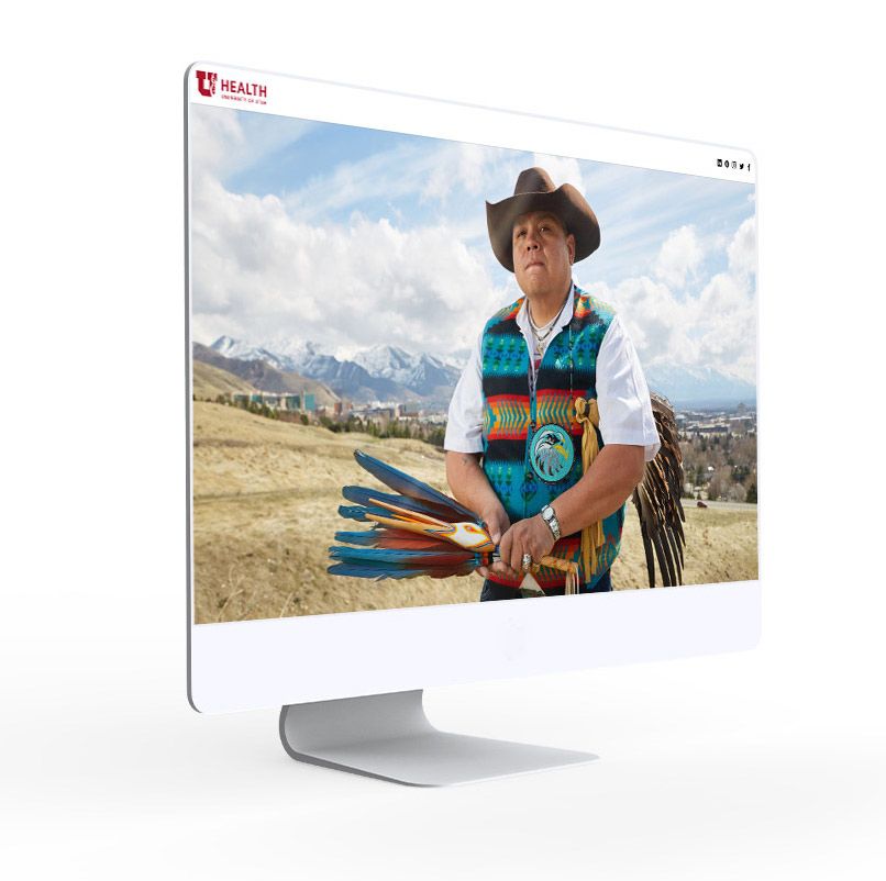
The University of Cambridge

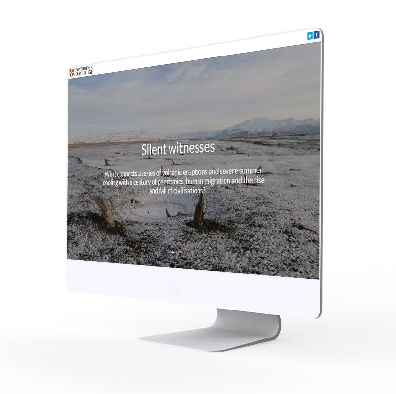
Not every scientist travels to the arctic or sends rockets into space. For stories with less inherent drama, digital storytelling techniques can be used to capture the reader’s attention.
This is the approach taken by Louise Walsh in Silent Witnesses. She uses starkly beautiful images to show how research into tree rings is contributing to solutions to our planet’s most urgent issues.
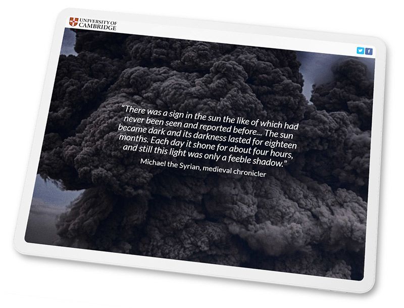
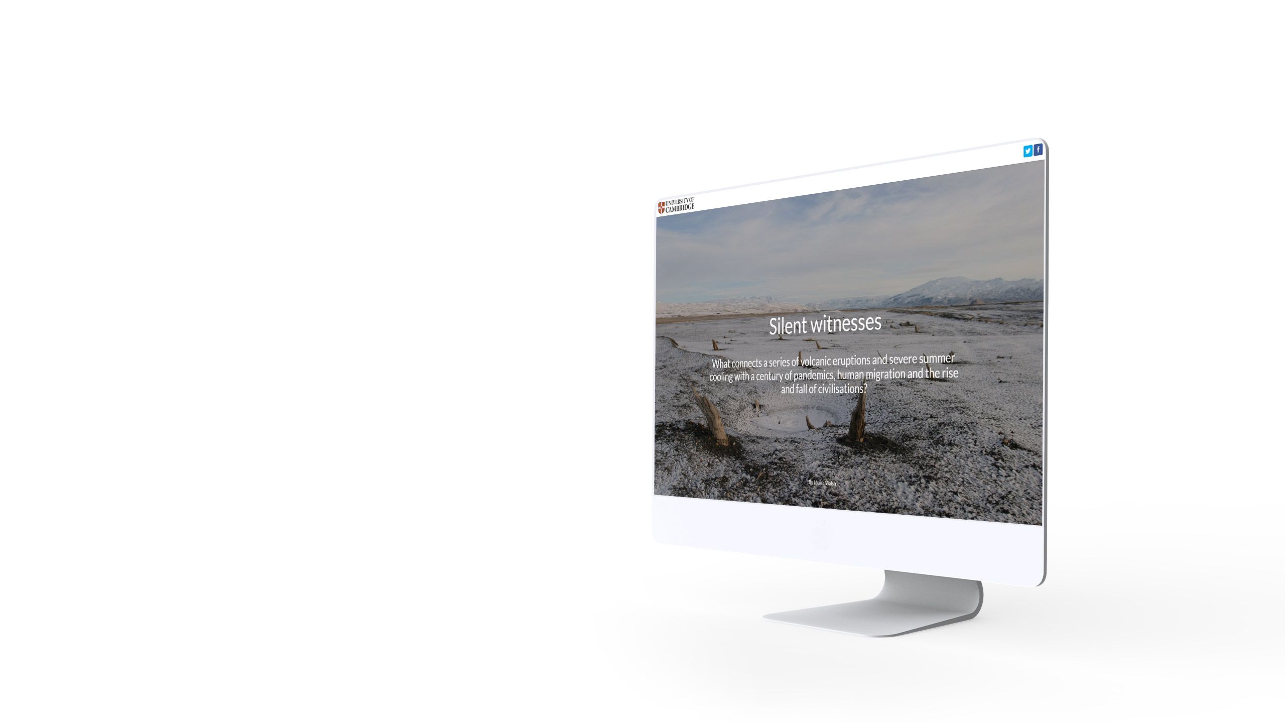
United Nations Development Programme

For better and worse, science communication is competing with every other form of entertainment on the web. Many readers following the links to science stories will also have tabs open to Facebook, Twitter, blogs, and media outlets.
To keep the attention of the reader, science communicators need to publish to the highest standards of the modern web. This includes the basics, such as being mobile-friendly and using high quality media assets.
It also means taking advantage of modern web-based visual techniques — such as scroll-based animation — which have been proven to increase audience engagement rates and dwell time.
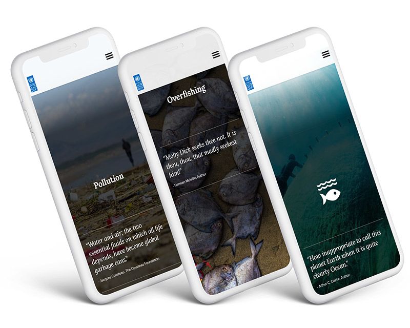
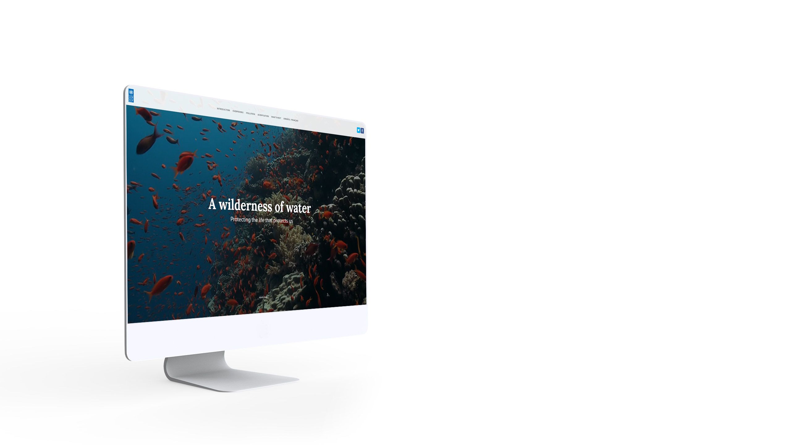
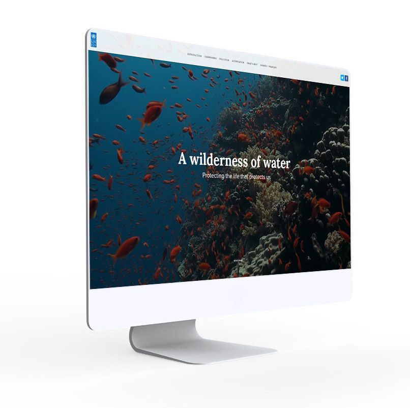
The UNDP uses these techniques in their exceptional story, A Wilderness of Water. With rich video and beautiful historical — if erroneous — maps, the UNDP introduces the science while forcefully communicating the urgency of protecting our oceans.
For better and worse, science communication is competing with every other form of entertainment on the web. Many readers following the links to science stories will also have tabs open to Facebook, Twitter, blogs, and media outlets.
To keep the attention of the reader, science communicators need to publish to the highest standards of the modern web. This includes the basics, such as being mobile-friendly and using high quality media assets.
It also means taking advantage of modern web-based visual techniques — such as scroll-based animation — which have been proven to increase audience engagement rates and dwell time.
The UNDP uses these techniques in their exceptional story, A Wilderness of Water. With rich video and beautiful historical — if erroneous — maps, the UNDP introduces the science while forcefully communicating the urgency of protecting our oceans.
CIFOR


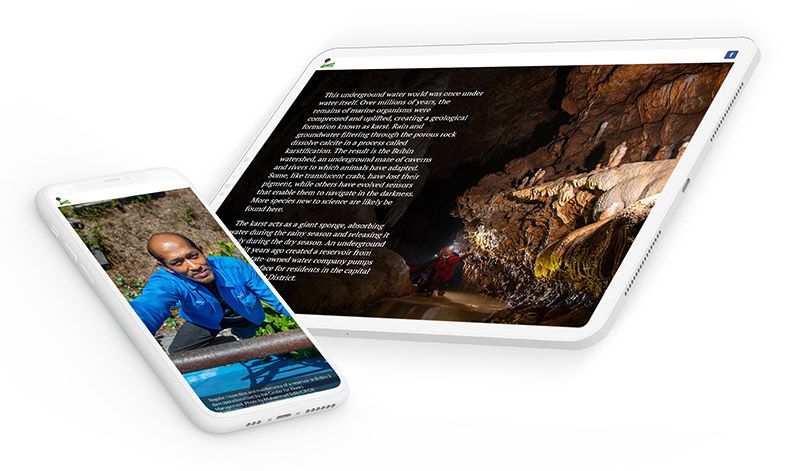
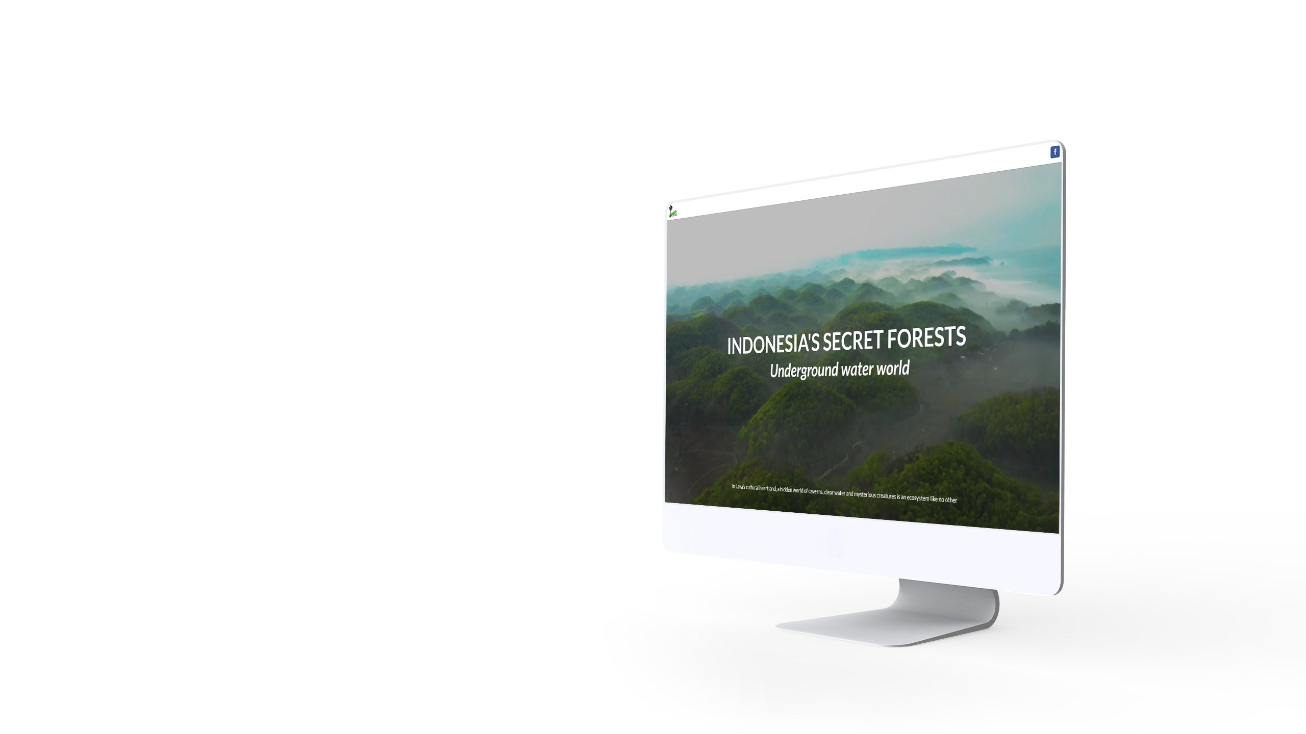
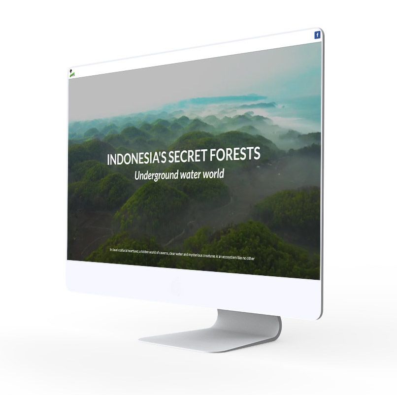
Some subjects just lend themselves to visual storytelling. Indonesia’s Secret Forests takes us into the underground network of caves and rivers — with mysterious creatures — in the heartland of Java.
The piece uses video and photography to showcase the inherent natural beauty of the environment. But the piece also teaches the reader about the wonders of the local ecosystem, and highlights its fragility in the face of tourism and agriculture.
Sky News


During the COVID-19 pandemic, data journalists around the world have provided a critical public service by documenting the spread of the virus. This has often involved interrogating data provided by government agencies, and sometimes required uncovering truths that public officials have tried to conceal.
We’ve gathered a collection of these stories built with Shorthand on our blog.
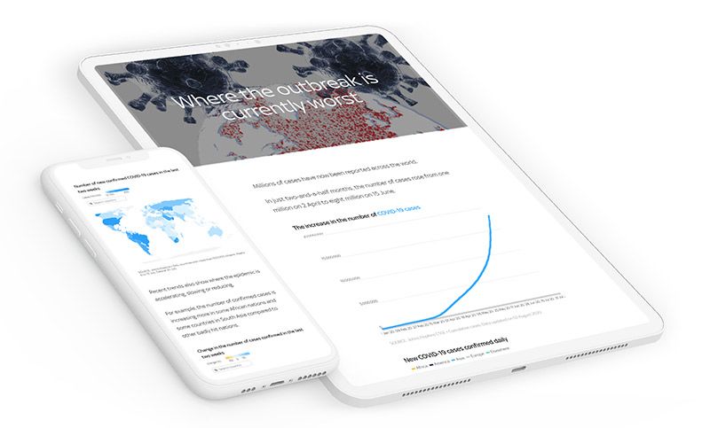
For this guide, we’ll focus on just one example. Over the course of the pandemic, Sky News have maintained a series of interactive charts and maps visualising its spread around the world. Presented with spare commentary and minimalist story design, the Sky News team allows space for the data to speak for itself.
The story is a powerful depiction of the spread of the virus.


During the COVID-19 pandemic, data journalists around the world have provided a critical public service by documenting the spread of the virus. This has often involved interrogating data provided by government agencies, and sometimes required uncovering truths that public officials have tried to conceal.
We’ve gathered a collection of these stories built with Shorthand on our blog.
For this guide, we’ll focus on just one example. Over the course of the pandemic, Sky News have maintained a series of interactive charts and maps visualising its spread around the world. Presented with spare commentary and minimalist story design, the Sky News team allows space for the data to speak for itself.
The story is a powerful depiction of the spread of the virus.
BBC

Journalists are always interested in telling longform stories — but these stories don’t always fare well on the web. With the rise of digital storytelling platforms, though, this is quickly changing. We’re currently seeing a boom in visual, longform science stories.
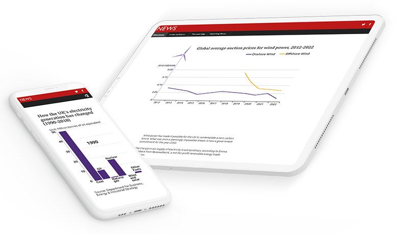
The BBC have published many such stories. One great example is The road to clean energy, which is a deep-dive into the data around clean energy in the UK.
The use of data visualisations, images, illustrations, and pull-quotes breaks up the text of the story, producing a compelling and immersive reading experience.


Journalists are always interested in telling longform stories — but these stories don’t always fare well on the web. With the rise of digital storytelling platforms, though, this is quickly changing. We’re currently seeing a boom in visual, longform science stories.
The BBC have published many such stories. One great example is The road to clean energy, which is a deep-dive into the data around clean energy in the UK.
The use of data visualisations, images, illustrations, and pull-quotes breaks up the text of the story, producing a compelling and immersive reading experience.
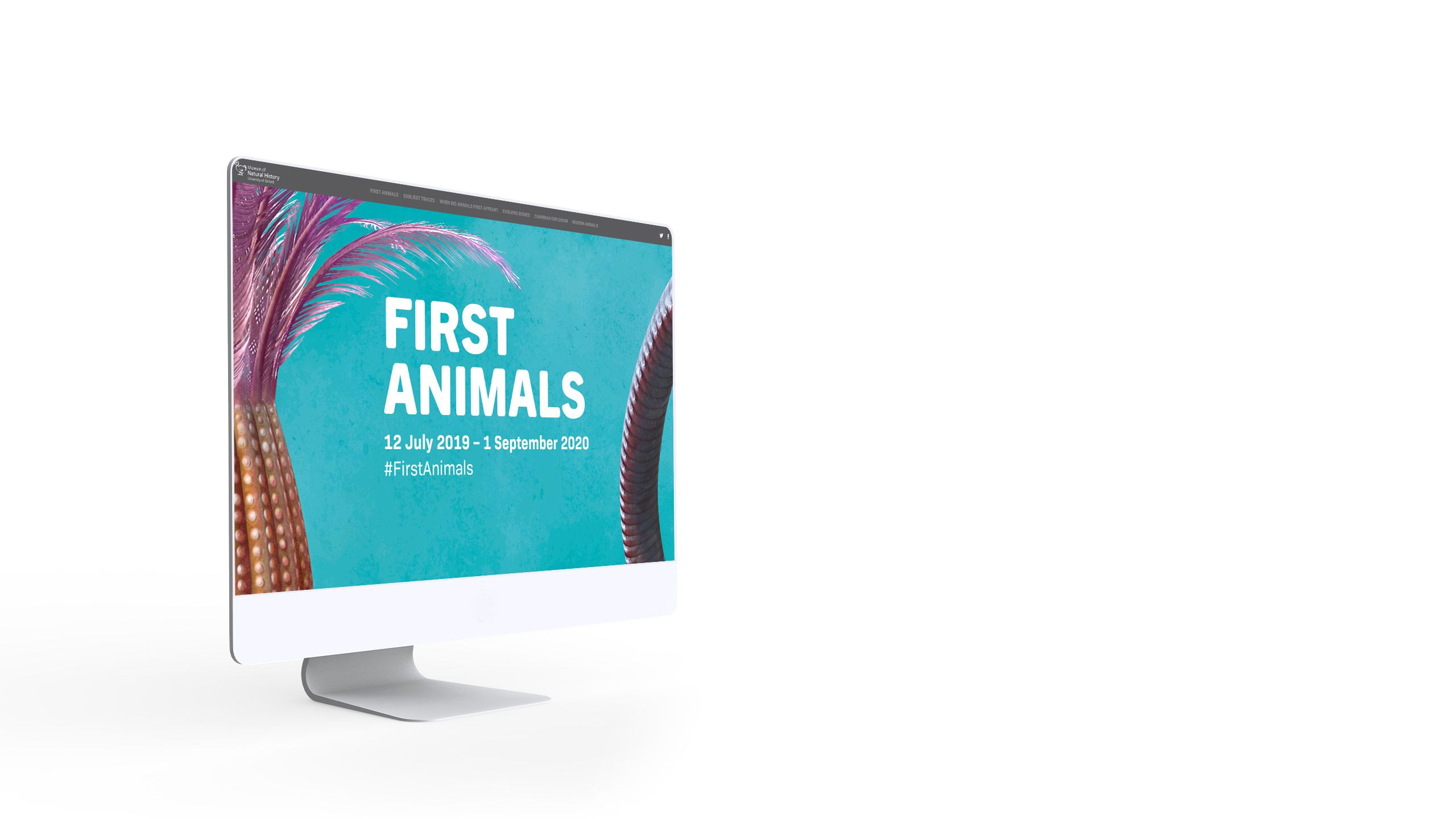
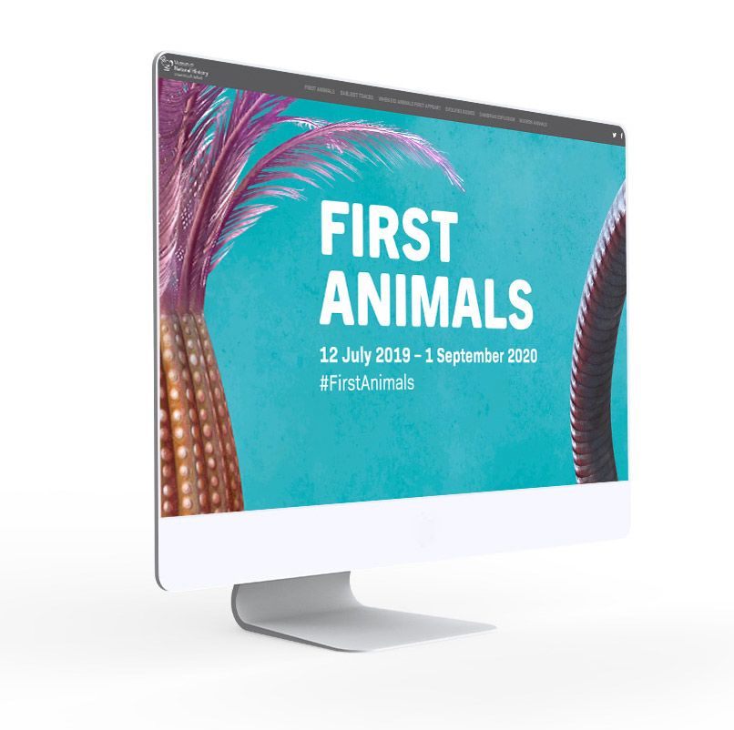
The University of Oxford


Some of the best science stories are published by museums.
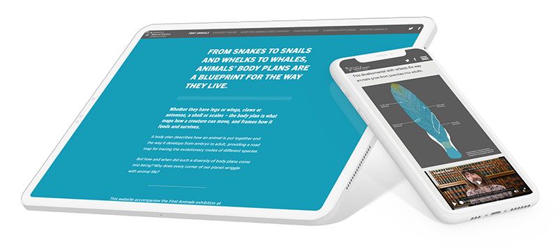
Making the most of their amazing collections and expert staff, the Museum of Natural History at the University of Oxford have built a detailed digital story to introduce their ‘First Animals’ exhibition.
With so much rich material at their fingertips, the museum uses maps, video, illustrations, and high resolution photos of their fascinating collection items to tell the story of Earth’s “mysterious early animals.” Learn about molecular clocks, Snowball Earth, and the Cambrian Explosion.

Some of the best science stories are published by museums.
Making the most of their amazing collections and expert staff, the Museum of Natural History at the University of Oxford have built a detailed digital story to introduce their ‘First Animals’ exhibition.
With so much rich material at their fingertips, the museum uses maps, video, illustrations, and high resolution photos of their fascinating collection items to tell the story of Earth’s “mysterious early animals.” Learn about molecular clocks, Snowball Earth, and the Cambrian Explosion.