
10 examples of intelligent and useful content design


Every good website, software, or piece of online content is good in a different way, but the great ones, the ones that stand out, have a keen understanding of why people are using them. Whether it’s finding information, booking tickets, filling out forms, paying bills, or buying a birthday present… the content is designed to help people fulfil their needs.


by Corinna Keefe
Content design is the discipline of understanding your particular users’ needs, and creating an online experience that accommodates them effortlessly. In this article, we’ve collected 10 content design examples that showcase the best of helpful, interactive online content — across web design and digital marketing. From government health advice to online banking, scientific research to food delivery, each example shows how to prioritise readability, usability, and seamless user experience.
We'll cover:
What do the BBC, Tripadvisor, and Penguin have in common?
They craft stunning, interactive web content with Shorthand. And so can you! Create your first story — no code or web design skills required.
Sign up now.
What is good content design?


Content design is important at every stage of the content creation and product design process. It runs through every aspect of your content like veins through marble.
The goal of content design is to help users do what they need to, as simply as possible, through whatever format suits them. Content designers dig into the details of what people want to do or find through qualitative and quantitative user research, such as journey mapping, interviews, usage metrics, and other data.
It’s not just about graphic design, but also user experience, web design, copywriting, readability, accessibility, information architecture, and deploying the most appropriate type of media. So whether you’re a designer, UX writer, editor, content strategist, or web developer, content design is probably part of your job, even if you don’t know it yet.
Content design can be applied to both interactive and static web content. Interactive content tools can help people to perform specific actions, navigate through complex information, or get a personalised experience online.
The best content design also gives people a consistent experience through the words, visual design, infographics, pop-ups, and other elements of user experience — a style guide is important! This can be invaluable in growing trust, ensuring your content is accessible, and helping people find what they need.
Depending on who your users are, and what your user research tells you they want to do, that content might take many different forms. In the examples below, we’ll see how the principles of content design can be applied to everything from calendars to pie charts, search bars to sign-up forms.
10 great examples of
content design


We’ve collected 10 examples of websites, apps, and research reports from a range of sectors — government departments, tech start-ups, content marketing, universities, non-profits, research institutes, and museums — that all use the principles of content design.
Each one of those organisations has a different audience and different goals. So you’ll see them using different formats to support their users. But one thing unites them all: they’re brilliant examples of online content that’s designed to put users first.
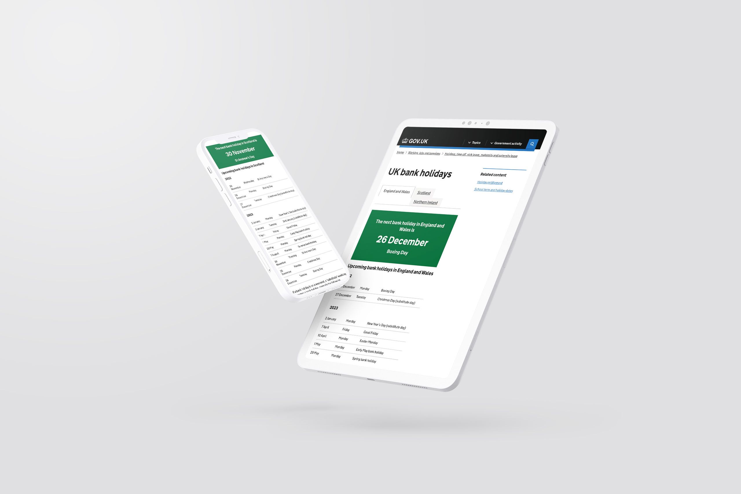
1. Gov.uk
Gov.uk is a one-stop-shop for citizens of the United Kingdom; it’s where people find information and services from their government.
Sarah Winters — who formulated the discipline of content design and now runs an independent content design agency in London — worked on gov.uk with her team, and she later went on to write Content Design, a practical book about the discipline.
Gov.uk is simple, carefully structured, follows a reassuringly consistent style across its pages, and is regularly updated and iterated.
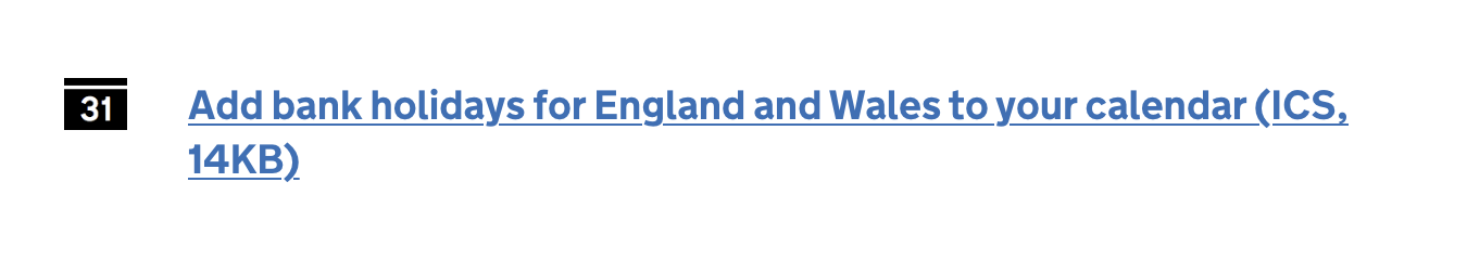
The specific example we’ve picked here is a landing page that lists when bank holidays are in the UK. This page is a classic in the world of content design, because instead of showing a confusingly dense spreadsheet of all the annual bank holidays, it simply opens with a big green box that holds the information everybody wants to know: when the next day off is! Through this research, the team at gov.uk discovered that this was the main reason people were searching for this page.

There are several interactive elements worth noting, too. The page has an instant link to add bank holidays to your online calendar, and it also offers clear links to other relevant information such as school holidays, entitlement to days off, and how bank holidays affect benefit payments. It’s been designed to anticipate and answer users’ questions, which have been thoroughly researched and prioritised by the gov.uk design team.

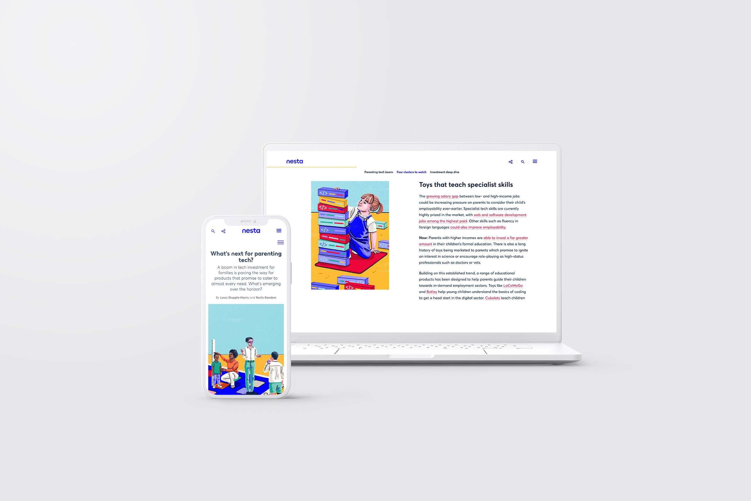
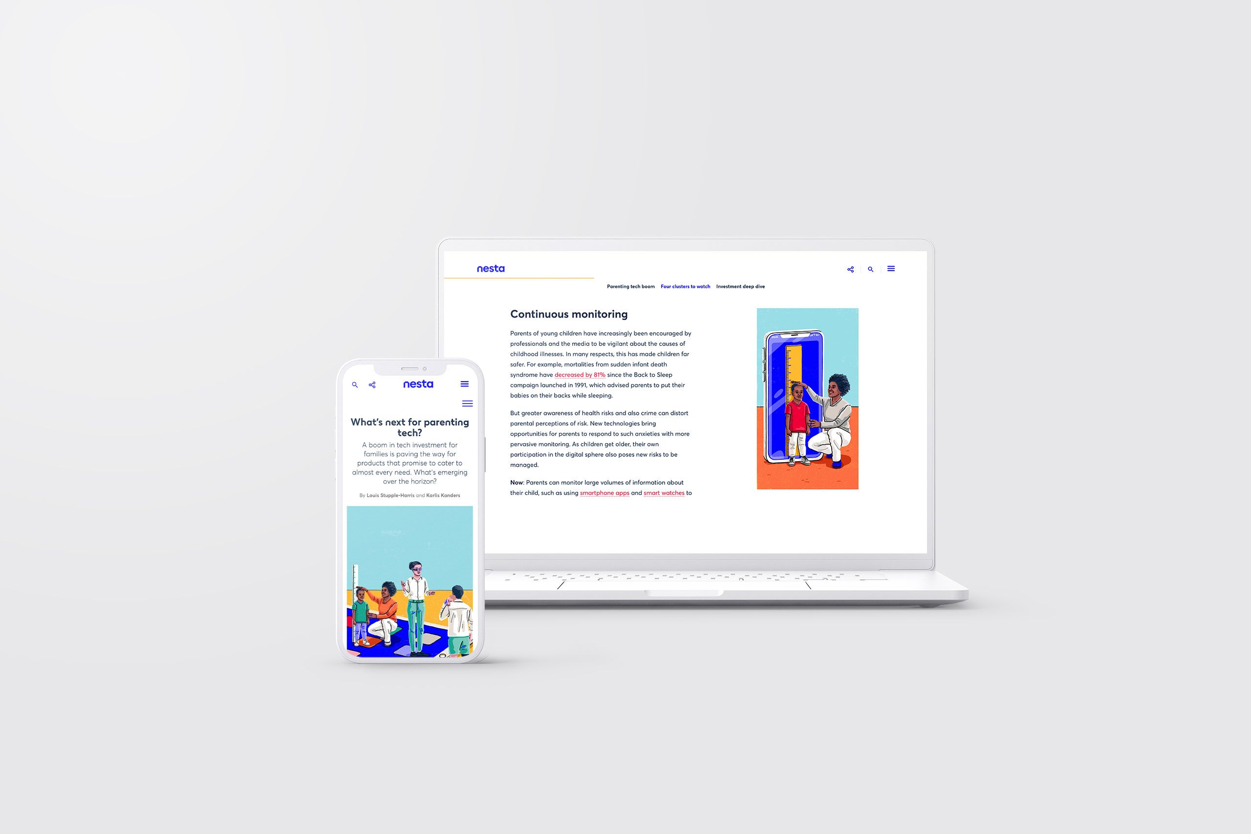
2. Nesta
Nesta is an agency in the UK that researches new technologies and analyses how they can help society overall. In this example we’ve chosen, they covered various new tech items and apps for parents.
The report covers a lot of detailed information, but it’s aimed at an audience that isn’t necessarily expert in tech, and parents are not generally a group of users who have a lot of time to spare on complex data.

Nesta use content design principles to make the report readable and attractive. The text of the report is broken up with frequent, informative headings. Links are shown in a bright colour so that they’re easily spotted if readers want to look up more information. Bright, colourful drawings break up the report even further — as well as hinting at the content of each individual section.


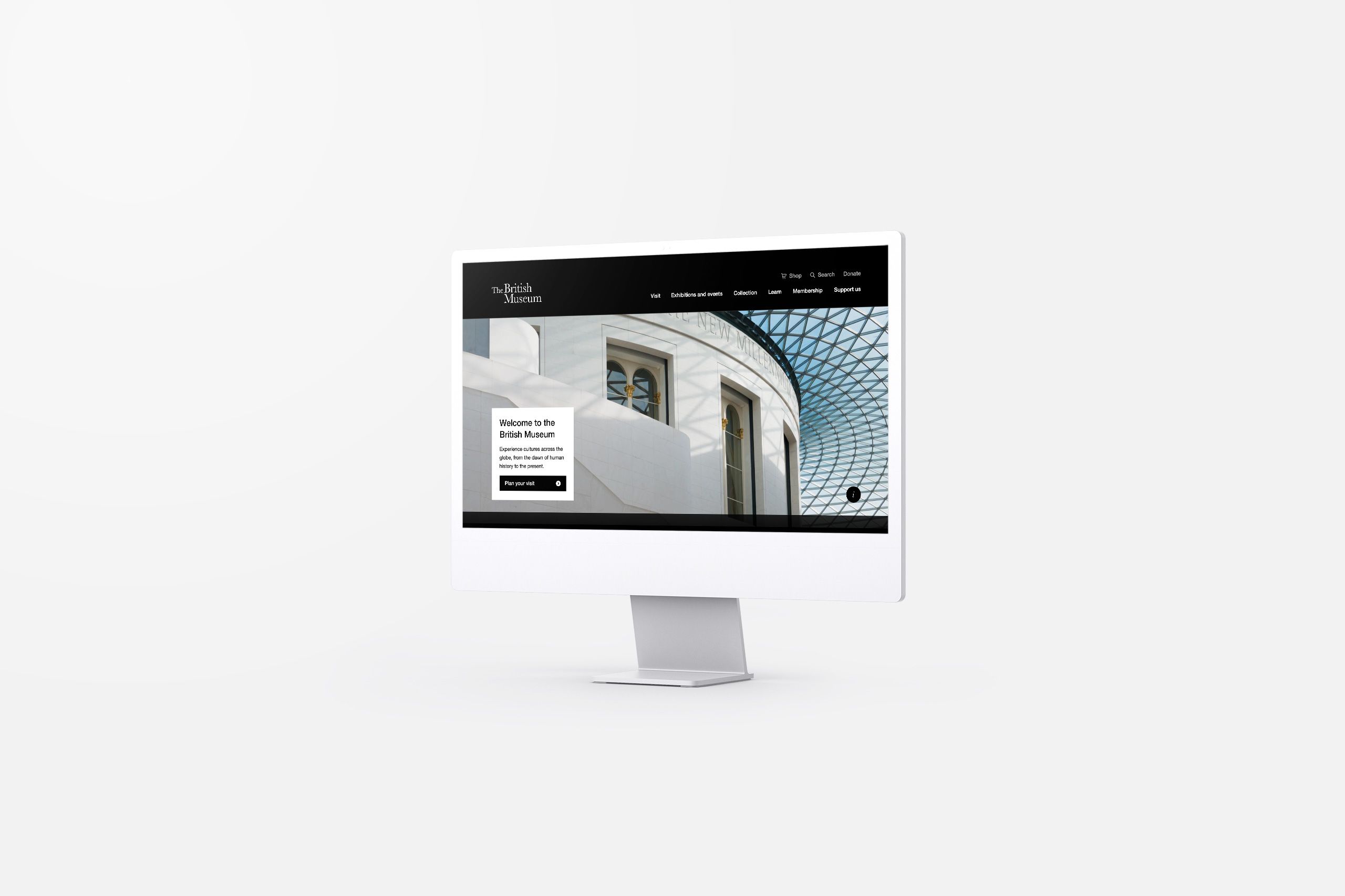
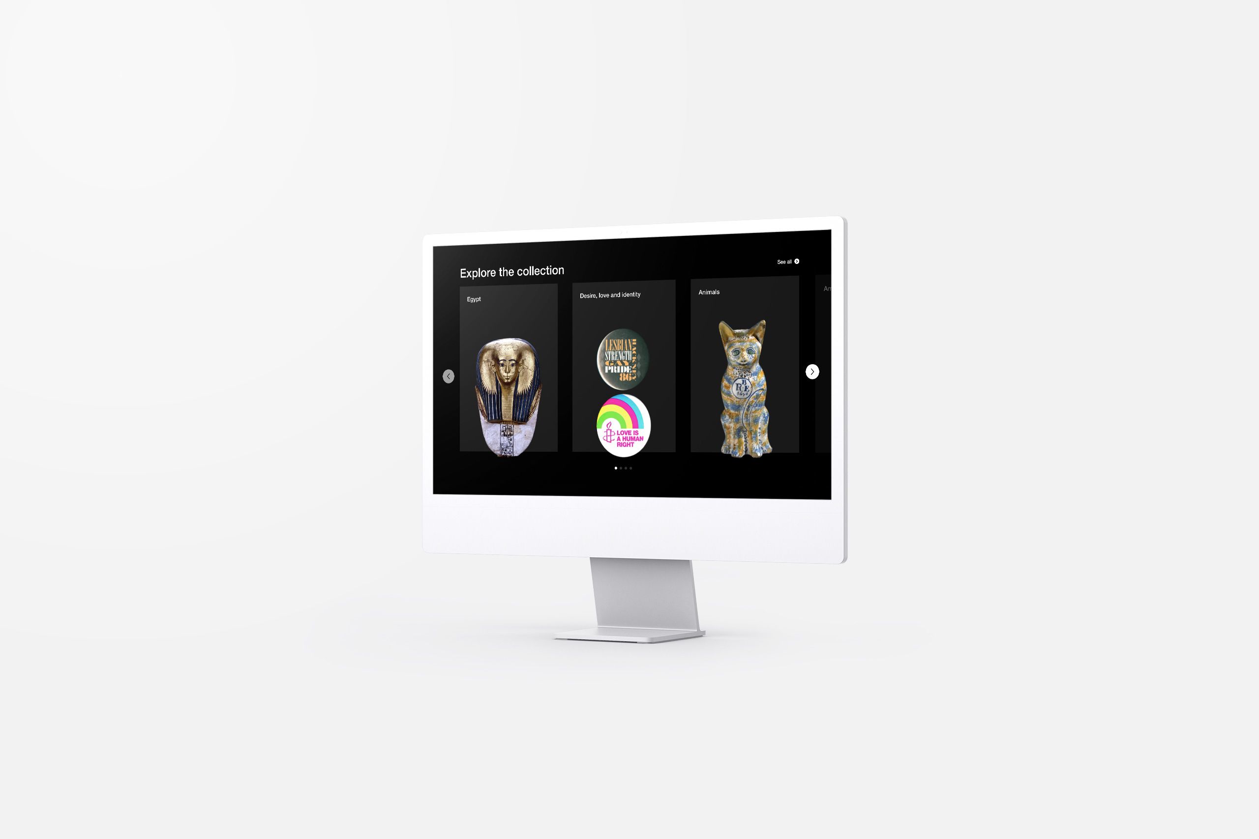
3. British Museum
The British Museum website has to work for a lot of different stakeholders. It has to share information for visitors and tourists. It has to point towards research and news for museum professionals and researchers. And it’s also an important source of membership sign-ups, online purchases, and donations to keep the museum running.
That’s where content design comes in. The information architecture is carefully planned so that everybody can find what they need — while the overall design remains appealing and consistent.
If you scroll through the homepage, you’ll notice that it’s illustrated with lots of big, glossy images. That serves several purposes: it supports the text on the page, showcases the best of the museum, and contributes to the museum’s image as a grand place to visit.

The main headline of the website — and the first interactive button — are focused on “planning your visit”. That’s because the first group of users, visitors, are the bulk of the website’s traffic. But other users can quickly scroll down to find membership information, read the latest reports, and explore the collections.


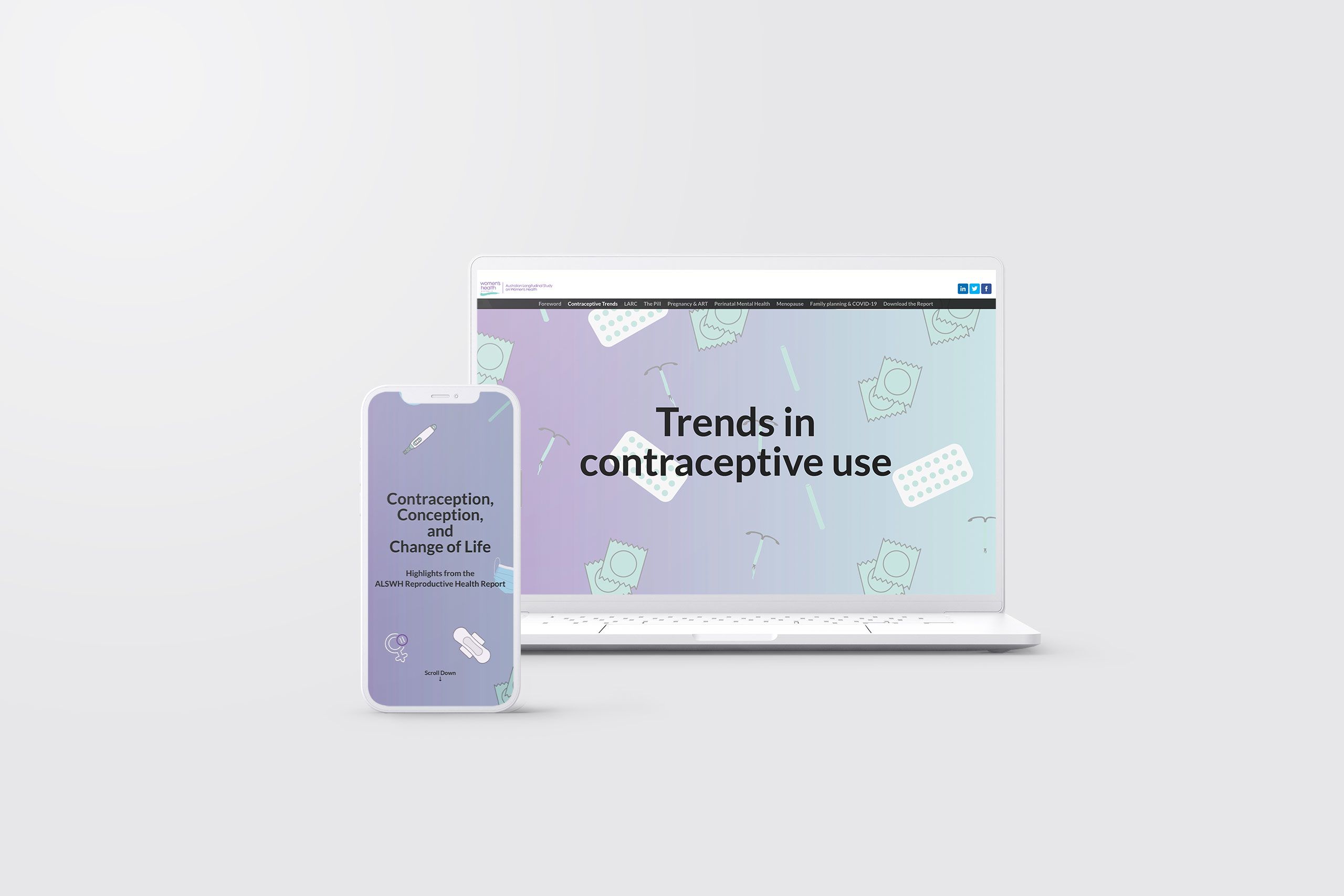
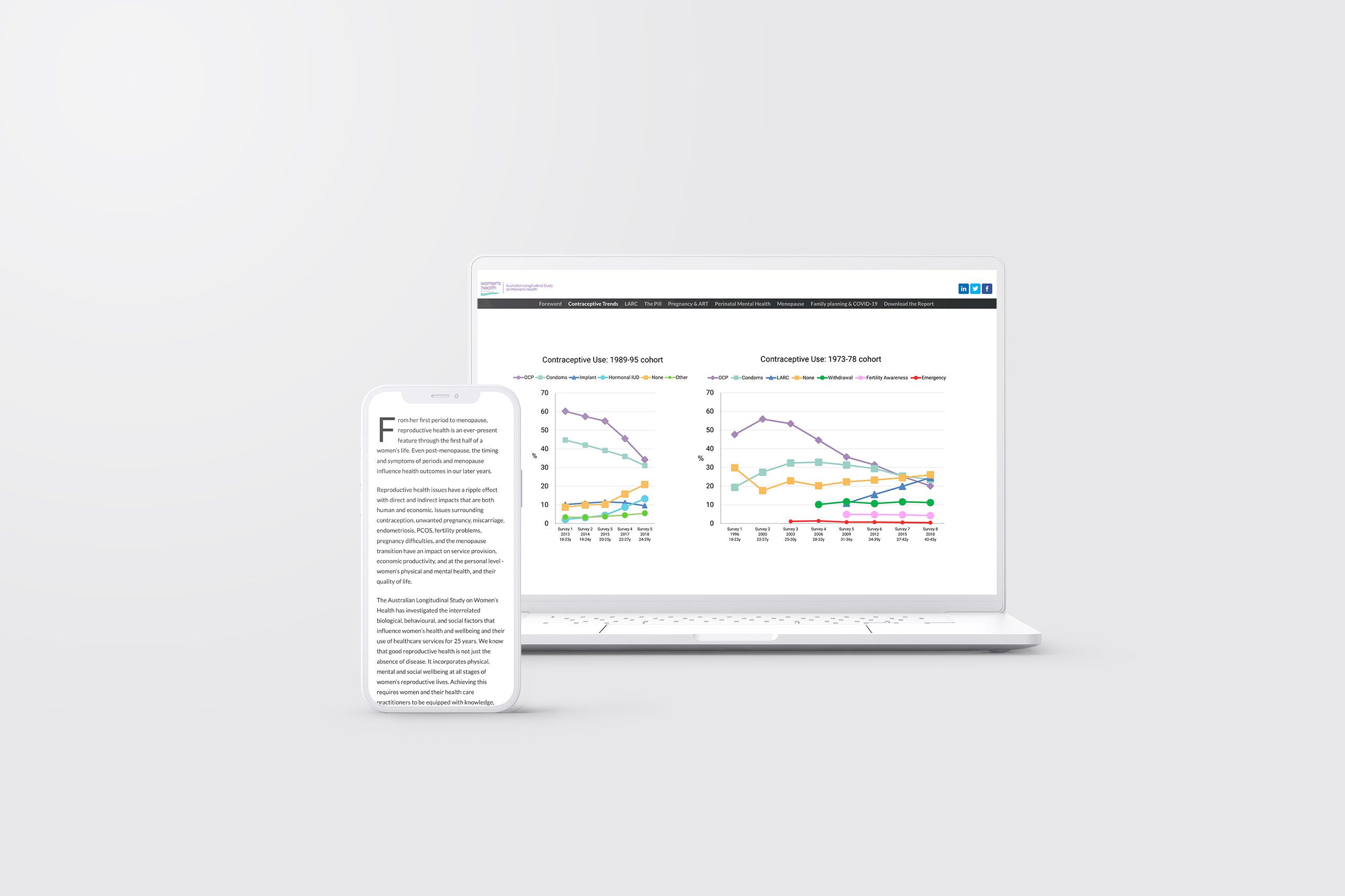
4. Women’s Health Australia
Our next example is a report on research from Women’s Health Australia (WHA): specifically, the Australian Longitudinal Study on Women’s Health.
It is a colossal piece of medical research over time, with a lot of complex data to share. But it’s also relevant to a large percentage of the population. So the content design has to make all of that complexity readable and useful for a wide audience of stakeholders.

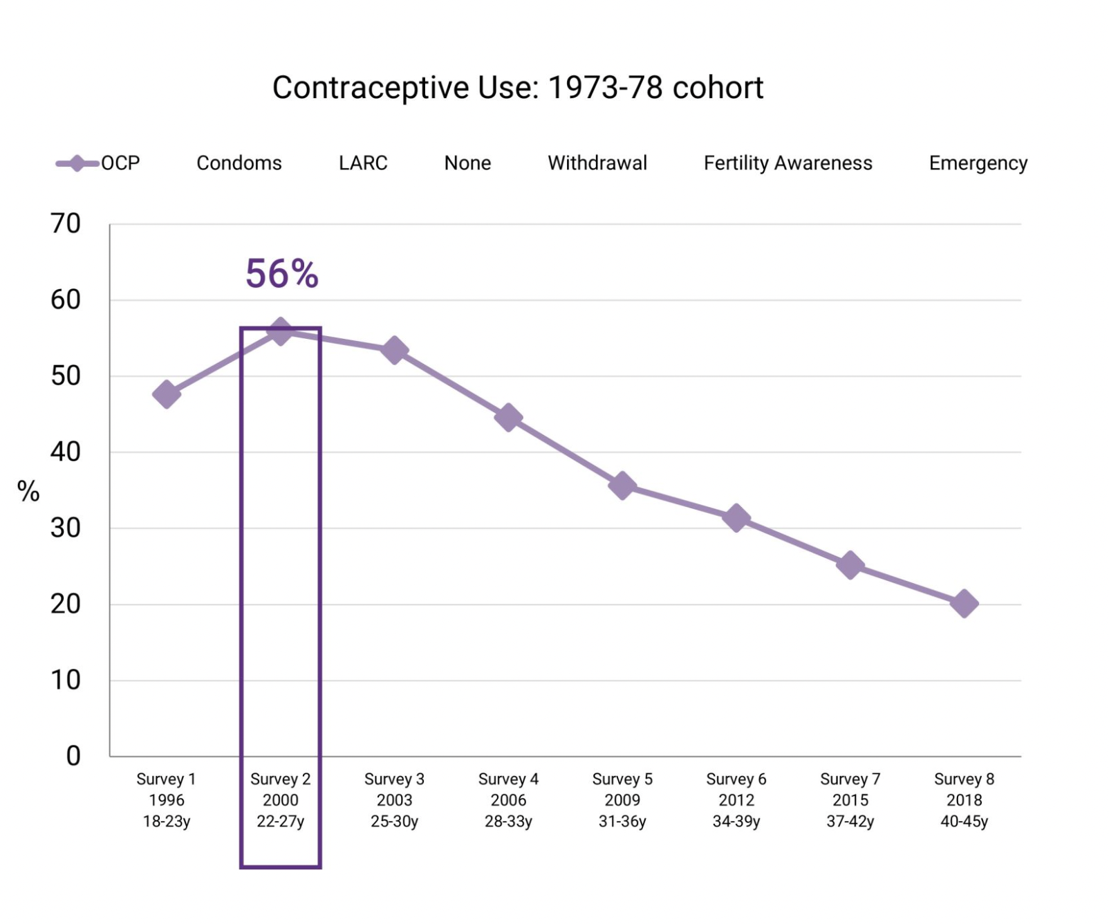
There are two ways that WHA have achieved this. First, the information architecture of the report is carefully planned. It begins with edited highlights, proceeds to more detail, and finally offers links to individual chapters of research for those who want to dig into the data. Charts are designed with scroll-based animations so that they can show a range of information without overwhelming the reader.
Second, the report actually includes tips on how to read it, presented as pull quotes in the introduction. The advice on how to navigate the report is also supported with clear headings, colourful graphics, and illustrations.


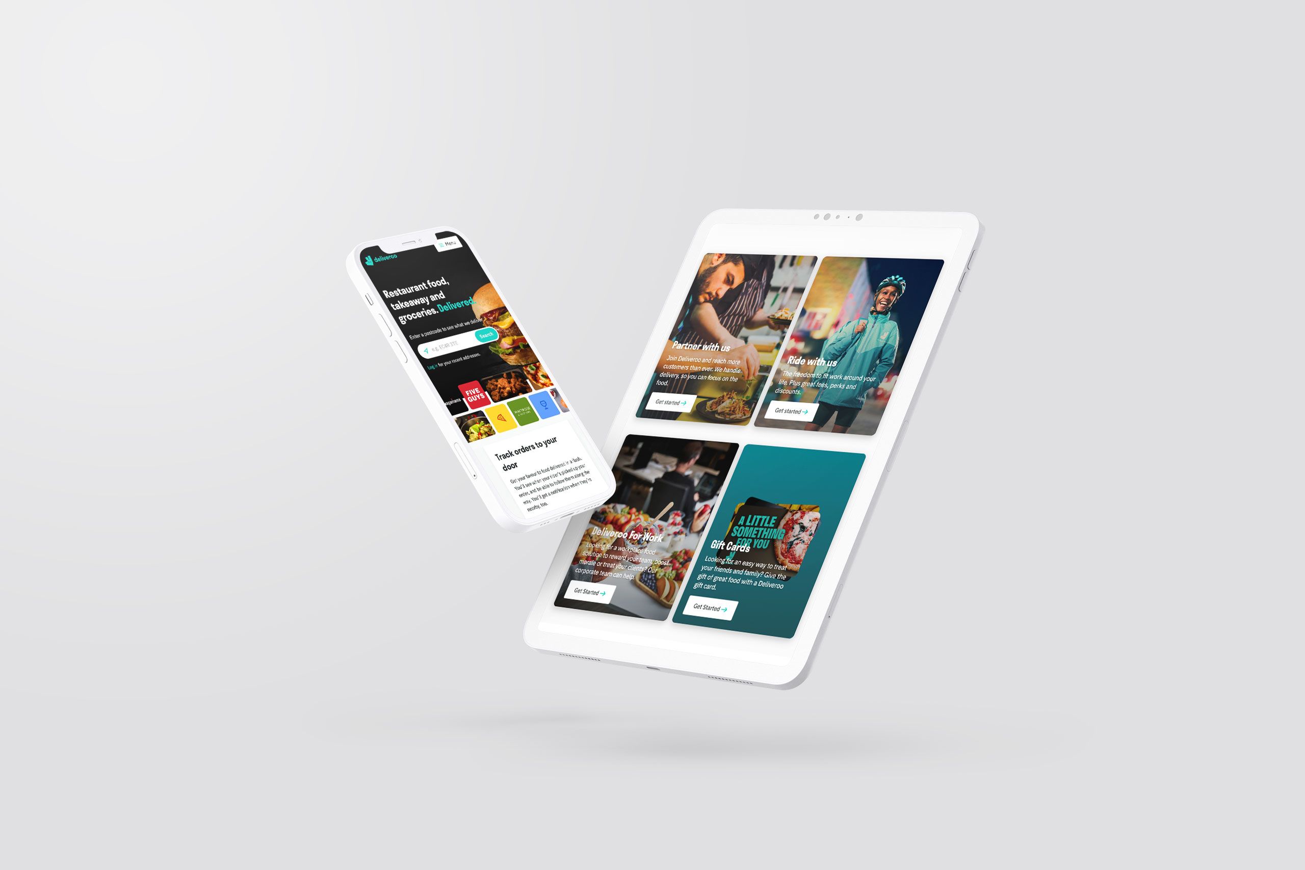
5. Deliveroo
The principles of content design, such as tracking a user journey, are invaluable when designing an online ecommerce experience.
Deliveroo is one of the biggest food delivery apps in the world, and one reason for their success is their focus on content design and user experience.
When you visit the Deliveroo website, the first thing you see is an interactive search bar where you can enter your postcode to see what’s cooking. It couldn’t be simpler for hungry and impatient users! Right below that interactive element, there’s a carousel of brand logos scrolling past to inspire your food choices.
However, like many websites, the Deliveroo page has to serve multiple audiences at once.

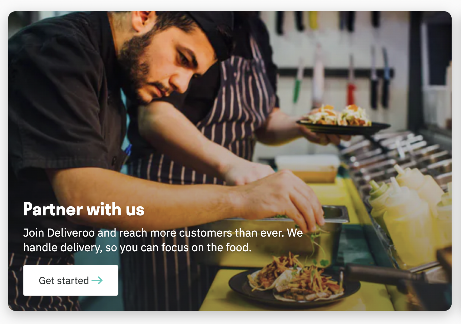
Scroll past that search bar and carousel, and you’ll find links for users who want to add their restaurant to Deliveroo, sign up to be a driver, cater an event, or buy gift cards. Each option is marked out with clear headings, illustrative photos, and a single interactive button to get started.

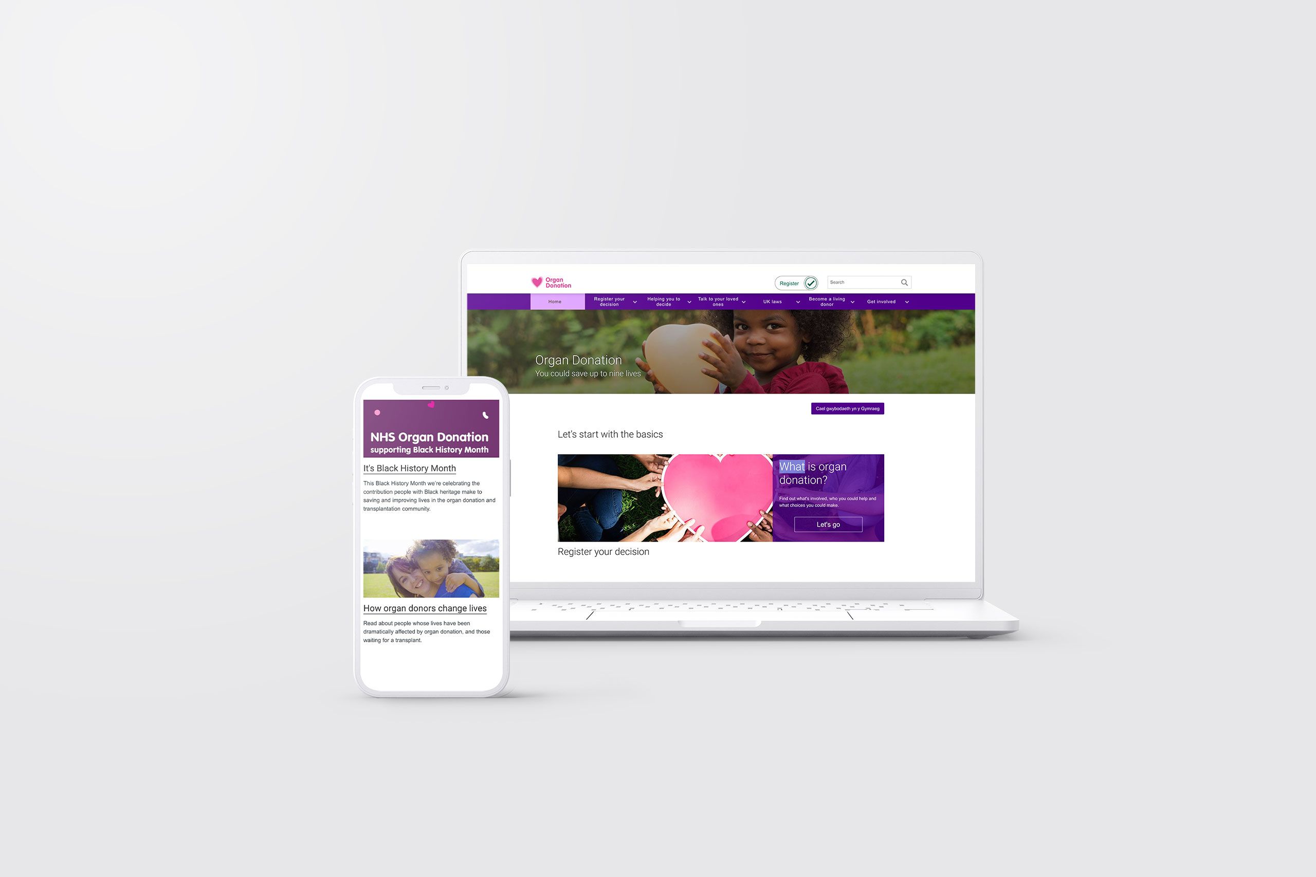
6. Organ Donation UK
In the UK, organ donation recently changed from being an opt-in service (where potential donors had to actively register their wishes) to being opt-out (where people have to register their preference not to donate). People still have a completely free choice, but the default option has changed.
So the NHS Organ Donation website has a unique content design: its absolute priority is to give users a choice.

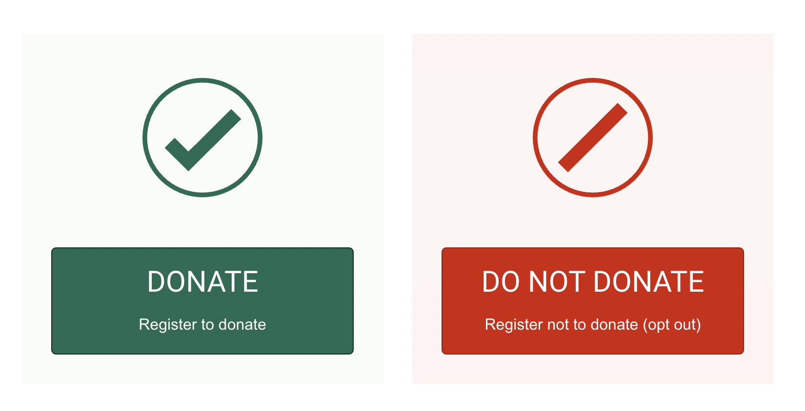
The first link on the page leads to more information about organ donation and how it works. But below that, you’ll see three very large, colourful buttons: “Get the facts”, “Donate”, and “Do not donate”. It’s very clear that the choice is in the user’s hands. This is a powerful example of how content design can reassure and empower users, even on complex or emotional issues.

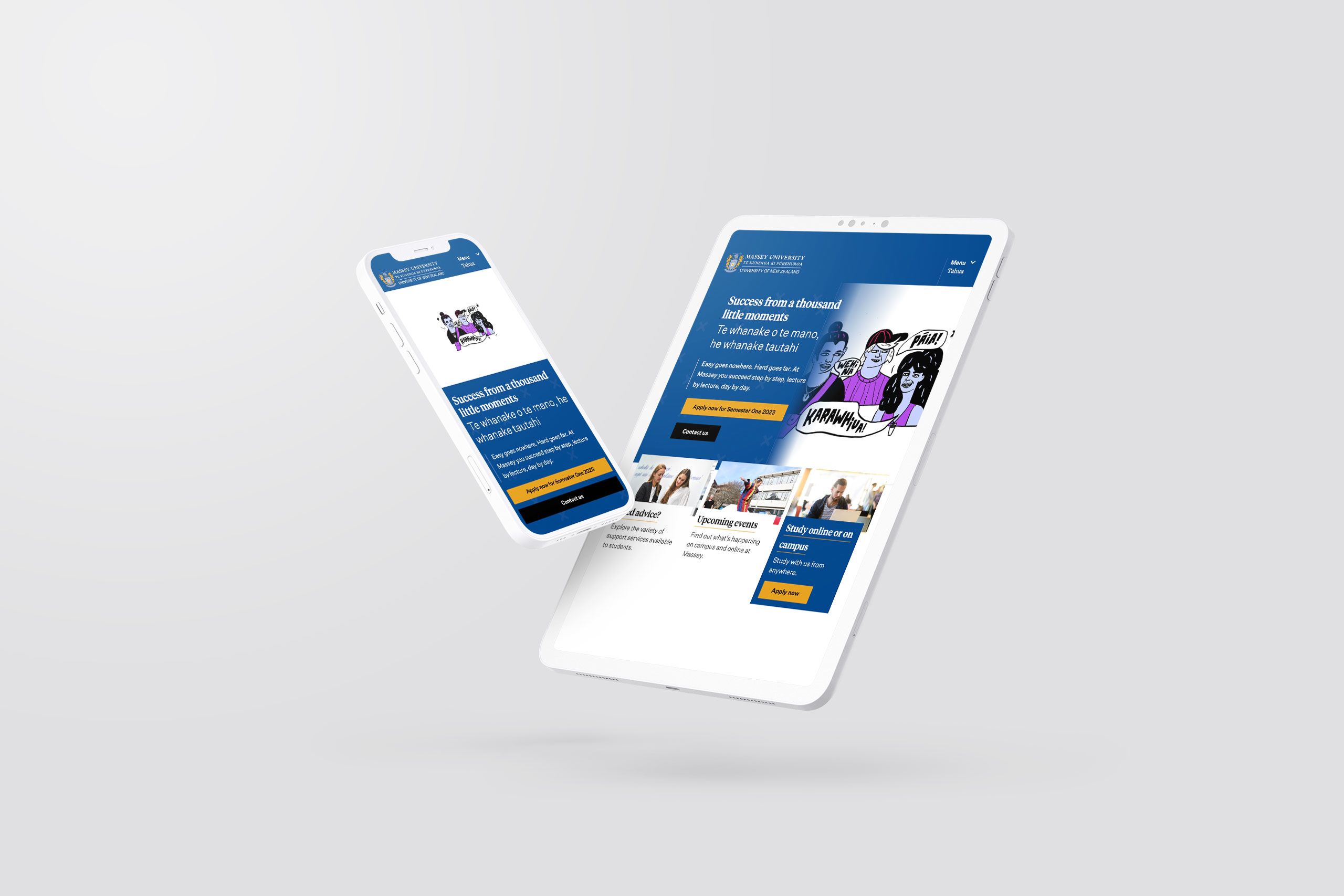
7. Massey University
Massey University is a New Zealand education provider with a commitment to operating in both Māori and English, and that’s reflected in the content design of their website.
University websites are already a challenge for content designers. There are multiple user groups: students, academics, parents, staff, and more. Each group has different needs and may need to fill out forms or make complex applications. That makes clear design and navigation essential.


This website is a great case study of how to present all of that information in a bilingual site. Instead of opting for a drop-down menu where users can switch between languages, the Massey University site simply presents both languages side by side. Massey’s design work also incorporates motifs from Māori art and visual culture, showing that the university’s inclusive approach goes beyond language.

8. Covid19.govt.nz
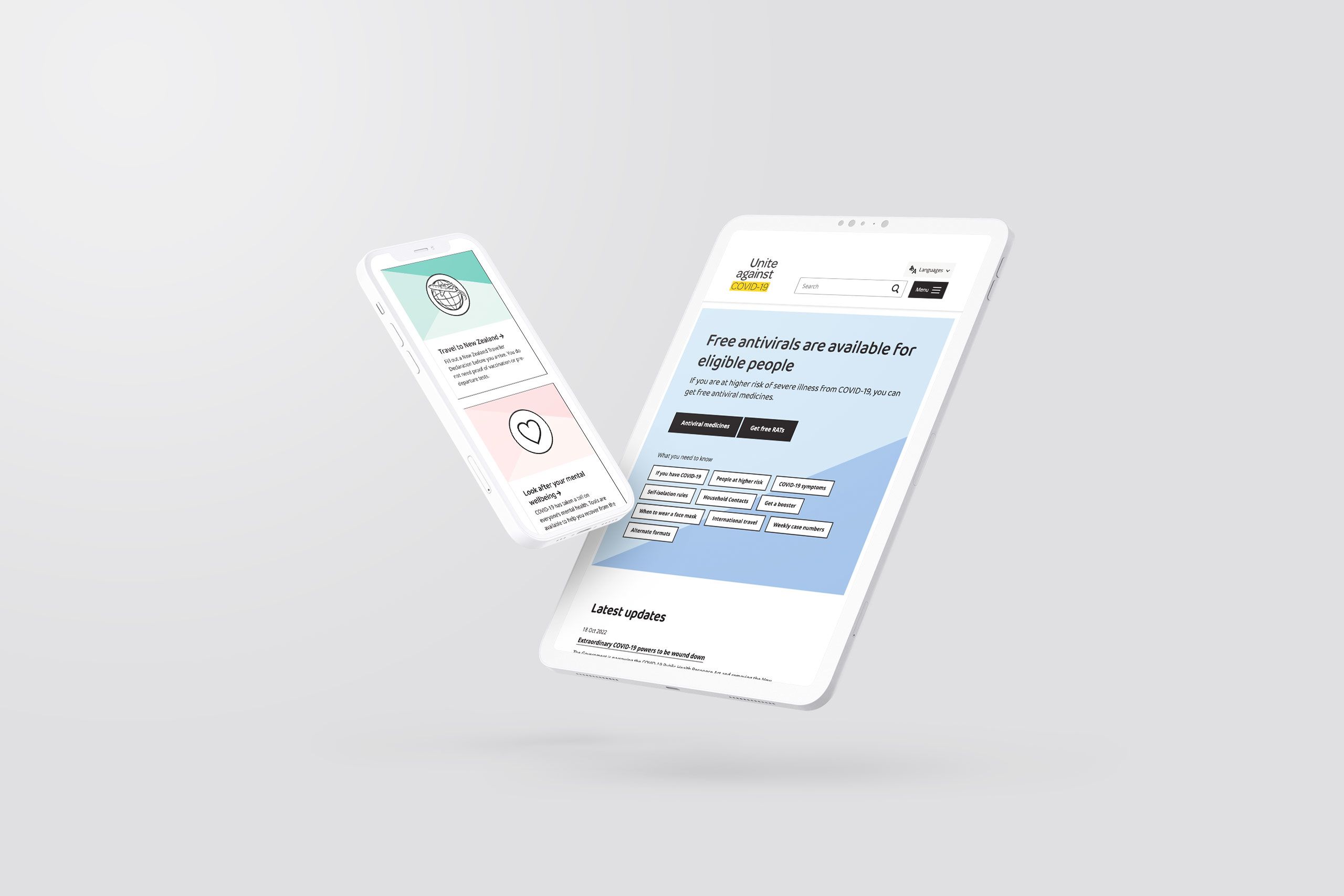
In the early months and years of the COVID-19 pandemic, content design became hugely important for governments and healthcare providers to keep people safe. This COVID-19 website from the New Zealand government is a great example of how to fulfil multiple complex and urgent user needs, and also how a web team can iterate rapidly as user needs change.
The first text you’ll notice on the page is “COVID-19 symptoms” and “How to get a test”. That’s because the most important information on the page is for people who currently have the disease.
These headers are instantly followed up by a list of interactive buttons for other needs: such as when to wear face masks, how to get a booster, and where to get vaccinated. The buttons mean that the website can contain a lot of information, and convey it to the right people, as simply as possible. The social media buttons are also high in the hierarchy of the homepage, so people can quickly find the latest updates.

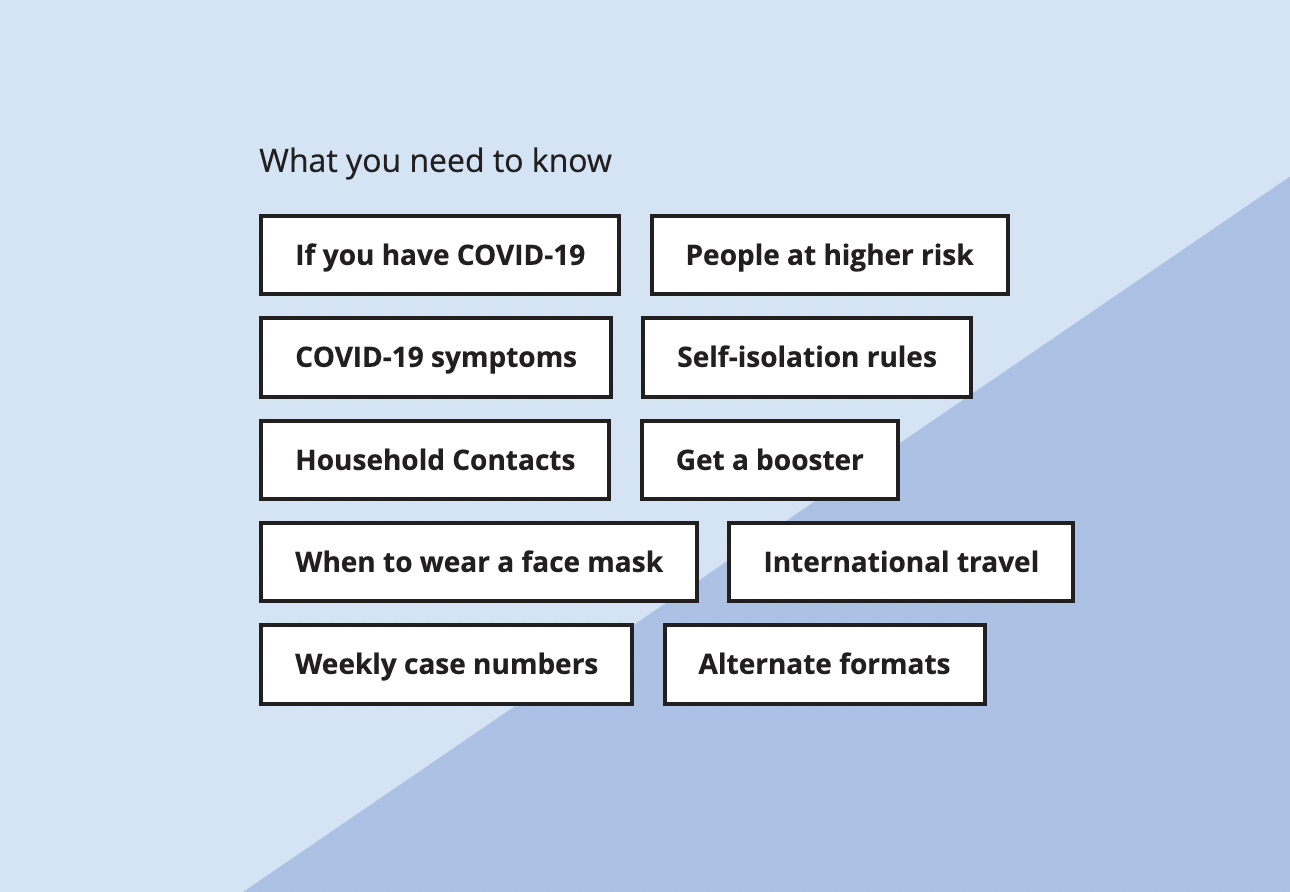
Covid19.govt.nz has a clear content strategy and architecture, and is regularly re-written and optimised for search engines, so that people can find the important information they need.

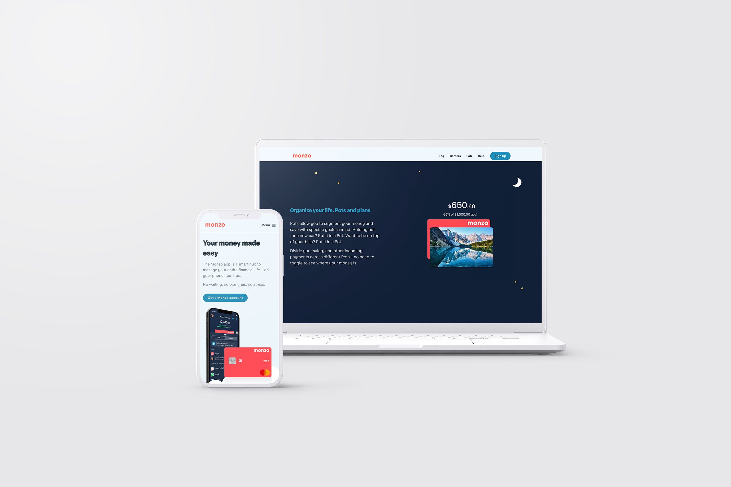
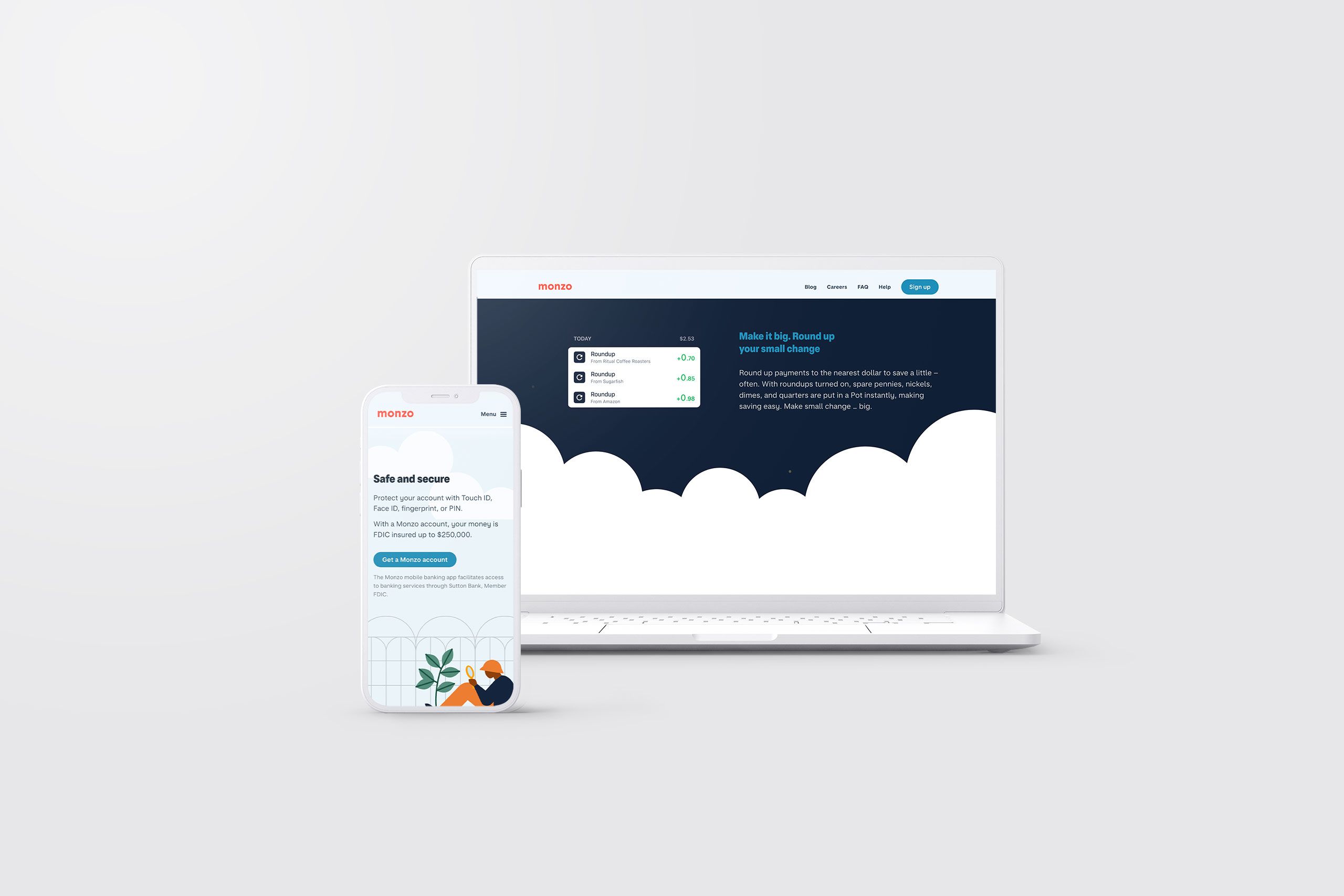
9. Monzo
Monzo is one of the new generation of online banking apps that pride themselves on user experience above all else. Their goal is to simplify and demystify banking.
So how does their website reflect that?
The first several links on their homepage guide users to download the app, showing that Monzo prioritises mobile banking, and the language used is also different from conventional banks: you can “get” an account or “sign up” for an account, instead of “applying” for an account. The copy has been carefully written to make sense for online users.

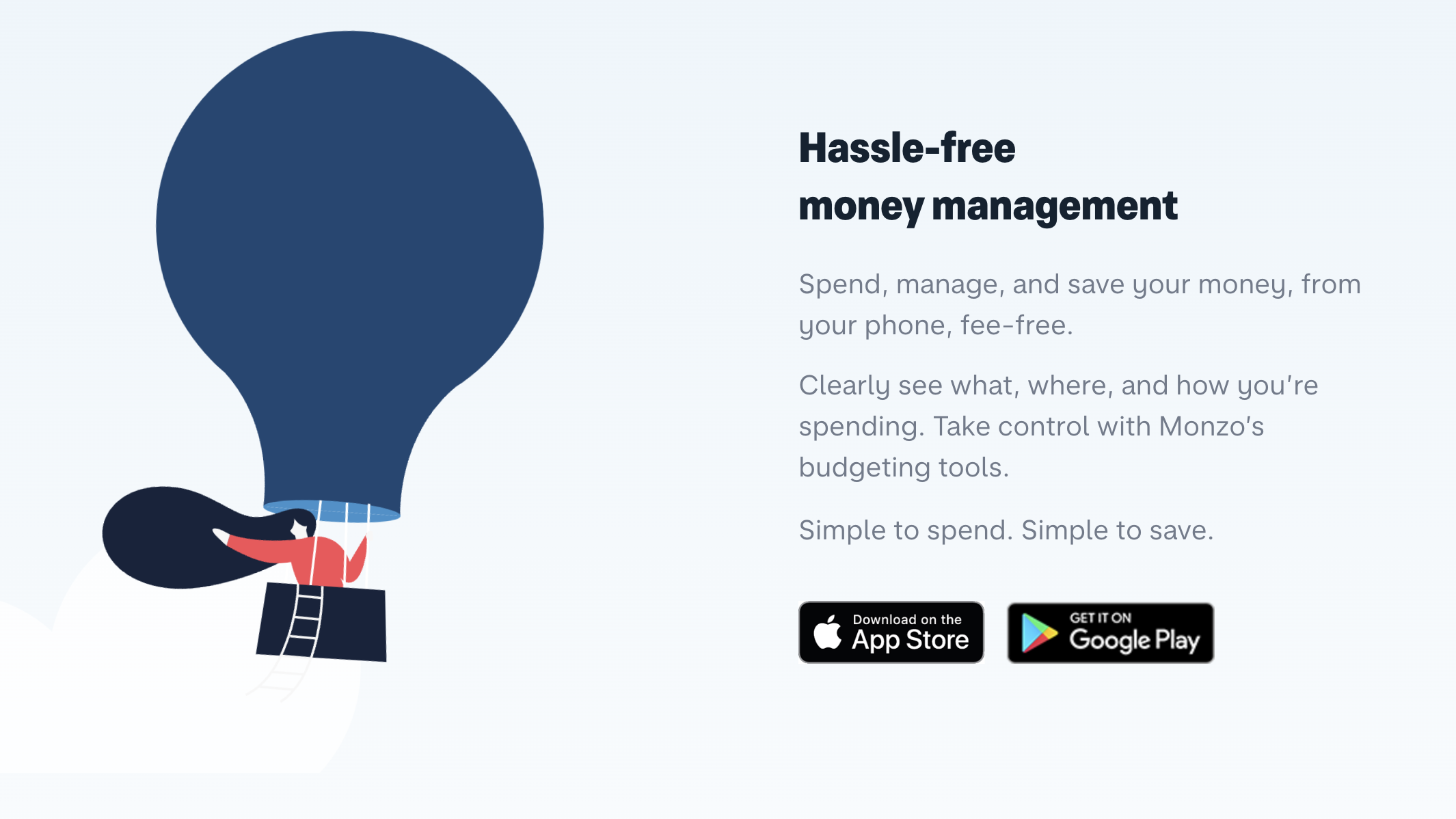
The graphic design supports Monzo’s goals, too. The website is full of white space and uses sans serif fonts. That’s not just about looking modern: it also makes the page clear and easy to navigate, a key part of good content design.


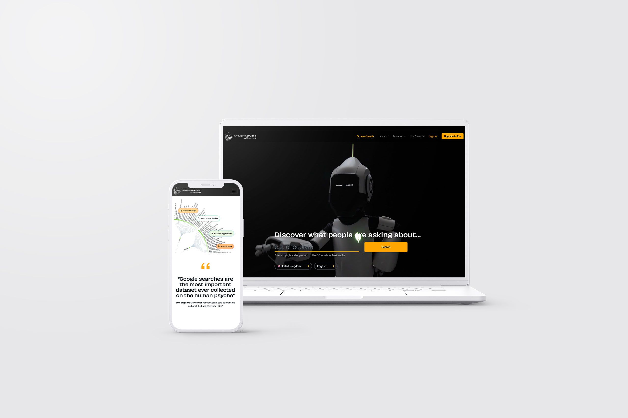
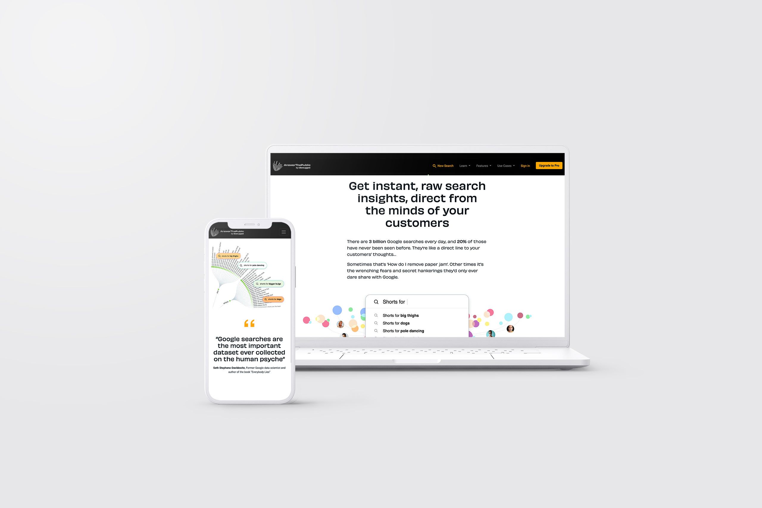
10. Answer the Public
Our last example is one that many marketers, strategists, and writers will recognise: Answer the Public.
Answer the Public is an online tool for SEO research. You can type in a few keywords and find out which questions people are asking with those terms online. It’s an invaluable source of topic ideas and inspiration.
And it also happens to have great content design.

The entire homepage is a single, looping image with a giant search bar. It couldn’t be easier to use. When you type in a search, the results are presented in a range of media: as flowcharts, in alphabetical lists, and in downloadable image and spreadsheet formats.


In these examples, you’ve seen how content design can be useful to many different industries and audiences, and that’s after just a few years of content design emerging as a distinct discipline in the worlds of digital publishing and product design.
In the future, content design could make content better for so many more users and organisations. How could it change your work?