Reveal masterclass
We recently ran a Reveal webinar, where we explained what the section is and how it can be used effectively.
Missed it? Catch up with this Craft post

As well as our regular full training webinar on Shorthand (where we give an overview of all the tool's features), we've got a number of special webinars planned over the coming months that take a particular feature or topic and go a bit deeper.
The last session we ran was a Reveal masterclass. Here's a recap of what we covered.
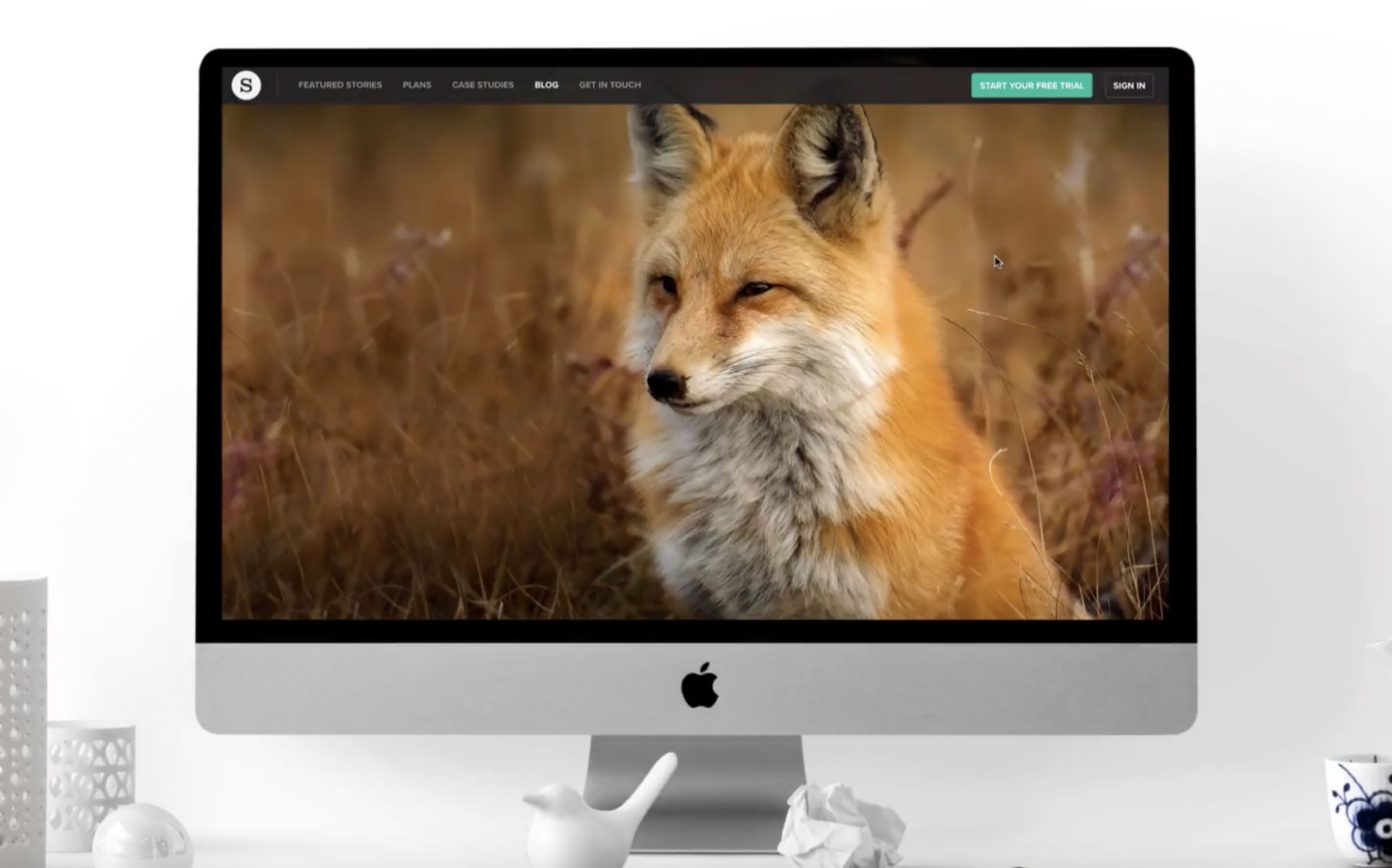
So, what is the Reveal section?
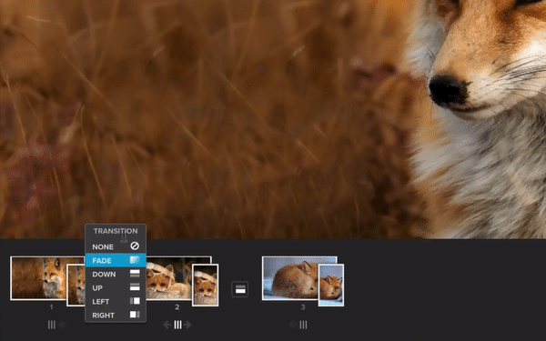
The Reveal section is one of the section types in Shorthand available on all of our plans. It allows you to feature full screen images and place a transition between them. The transition from one image to another is triggered as the reader scrolls.
There are six transitions to choose from:
1) None 2) Fade 3) Down 4) Up 5) Left 6) Right

It's a really powerful section, but don't just take our word for it! Let's look at some of the ways Reveal can be used.
10 ways to use Reveal
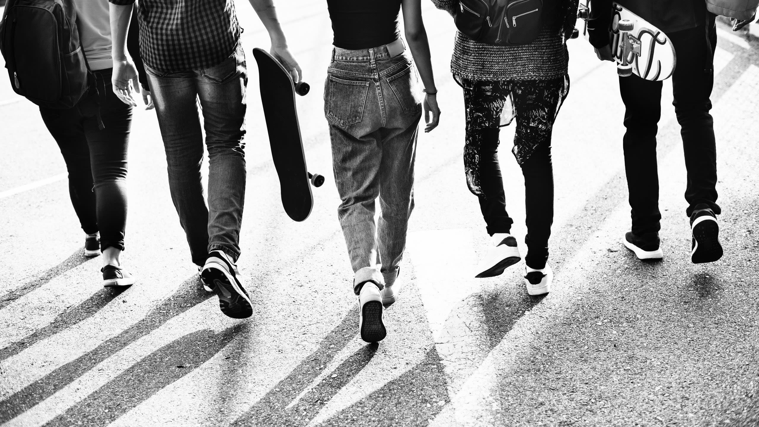
1. Galleries
Fade, swipe or quickly flip between images.

The Reveal section can be an excellent way of featuring full screen images, one after the other, to create a gallery.
Unlike galleries that use a carousel-type effect, it won't interrupt the scroll action for the reader. It also means the images can be full screen — resulting in a much more immersive experience.
See how Travel Weekly have employed this in their Rwanda Rising story.

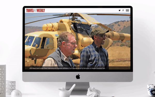
Click to open the full story
Click to open the full story
2. Deliver information
Display text in your images


Designing full screen images (see our size guidelines) and including written information means that you can upload them into the Reveal section, and then use the transitions to switch between them.
Complex used this technique in their Cannabis Crib Notes story.


Click to open the full story
Click to open the full story
The story is broken up into several chapters using Text Over Media sections. Then, in each chapter, a Reveal section enables you to swipe upwards to present a series of dos and don'ts.
3. Compare & contrast
Convey changes or the passing of time


The Reveal provides a great way to show the passing of time or comparative changes between images.
In Seven years of war by The National, the sombre Reveal section shows how areas of the country have been devastated by the conflict.

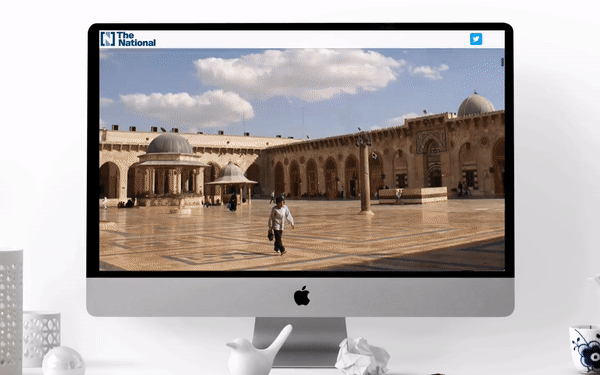
Click to open full story
Click to open full story
It shows three areas in total, all within the same Reveal section, with a fading transition between each image. It shows you what the area looked like before the war, and how it looks now. The difference is clear and shocking.
You could also use Reveal to contrast from day to night.
See our New York example.


Fancy creating this yourself? Click the folder to download the images.


4. Highlight information
Draw the readers' attention around the image

By starting with an raw image and then editing subsequent images to make certain elements stand out, you can guide the reader to those chosen points as they scroll.
UNDP's Beyond Bitcoin does just that in this story.
Click to open full story
Click to open full story
We start with an unedited image, then we fade in a second image with a dotted line around a person, then we fade in the third image with a mock identification card added. As you continue to scroll, the same happens further back in the image to another person.
5. Image layering
Build on or peel back


Building on layers, again by starting with an unedited image and adding elements to that same image, can be a great way of presenting visual cues in a measured way.
Honda's Stranger Things: Britain's Custom Bikes uses this method to layer on the aesthetics of a range of bikes.

Click to open full story
Click to open full story
You could also use this method in reverse, where you peel back layers rather than adding them.
See our lion example.

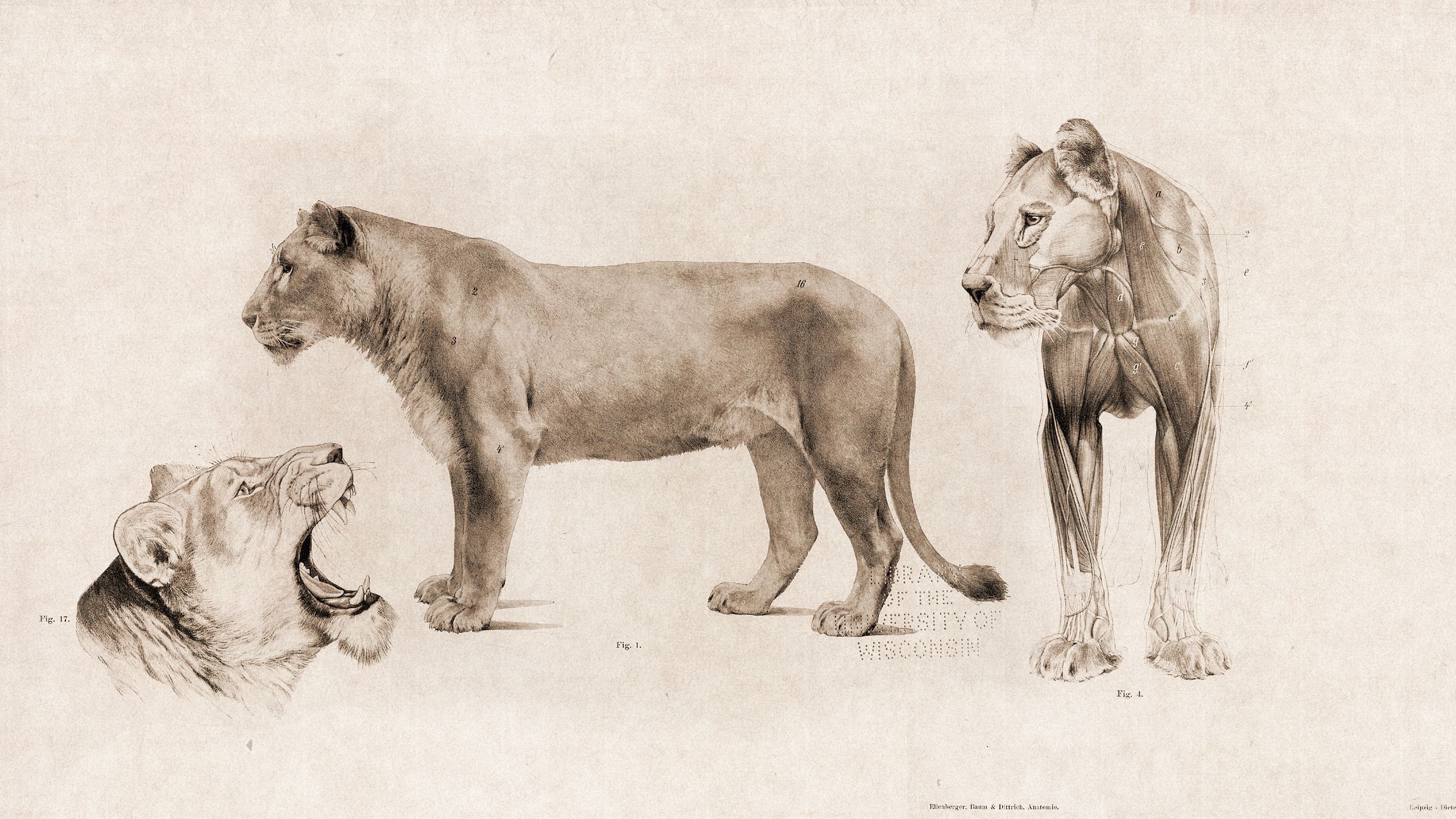

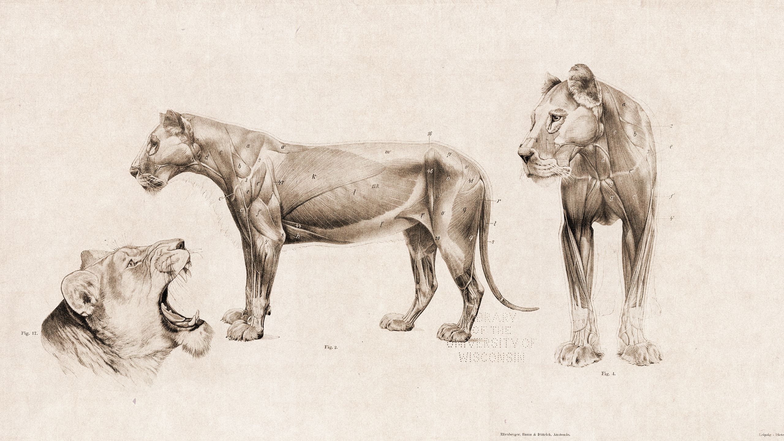

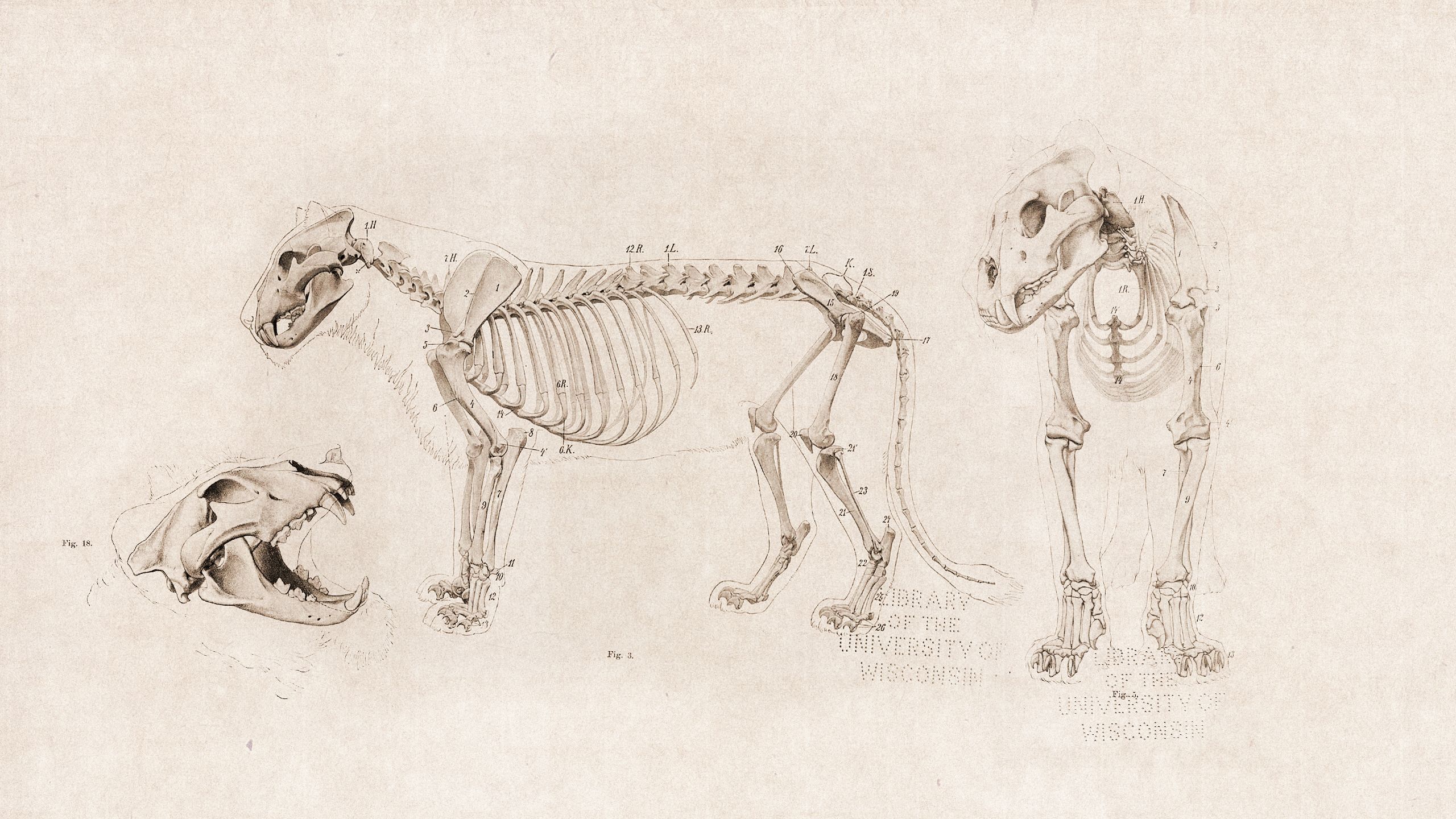
Fancy creating this yourself? Click the folder to download the images.

6. Plot a journey
Transport your readers


This is where the directional swipes could really create some storytelling magic. You can start with an unedited image, such as a blank map, and then bring in arrows or dotted lines to take the reader on a journey — whether that's heading north, south, east or west.
War Child used a downwards swipe in Keeping up with the Kassabs to retrace the journey of the Syrian refugee family.


Click to open full story
Click to open full story
Scrolling brings the country Jordan into view first, then we 'draw' (but really, we are just bringing the images into view from the top to bottom) on the dotted line in two parts to complete their journey to the Za'atari camp.
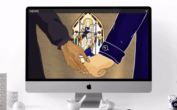
7. Animation
Make your artwork move

If you're using artwork or cartoons in your story, consider using the Reveal section to add movement.
BBC News used this in a very emotive way in the story I am a mother without a baby.
Click to open full story
Click to open full story
Watch how the hands embrace as you scroll. This is very simple, yet effective. They've used the 'none' transition option, so that the hands quickly come together in a flip book style.
8. Real life flipbook
Capture the action in stills and bring it back to life

This idea is very similar to the previous, but it's good to draw the distinction between using the flip book element on real life images and artwork for idea creation.
In Huck's For pro skater Karl Berglind, home is where the board is, they show readers his skating skills.

Click to open full story
Click to open full story
Using a number of still shots one after the other — with no transition in between — means that the reader can scroll and watch the action unfold in their own time.
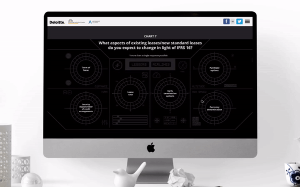
9. Data visualization
Make your graphs and charts more engaging

Data in a story — whether it's a juicy pie chart or a steep incline on a graph — can demonstrate hugely important facts in a story. By using Reveal you can make them even more visual, interactive and engaging.
Take Balancing the Books, by Euromoney Institutional Investor, Airfinance Journal and Deloitte, for example.
Click to open full story
Click to open full story
On a number of occasions the Reveal (and the Scrollmation sections) are used. The above example, starts with an image featuring blank charts, then they place a fade transition between the next two images with the data sets. Because the images are the same, excluding the added data, it feels like it's just the data that you fade in as you scroll.
The reader is also totally in control of how they interact with the data, e.g., how fast or how slow they make that transition, digesting the report at their own pace.
See our coffee example.


Fancy creating this yourself? Click the folder to download the images.

10. Chapter heads


Text Over Media or Text sections with limited text are often used as chapter heads. However, the Reveal can be used too.
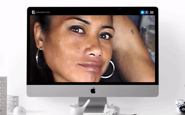
New Zealand Herald apply this approach in The Misery of Marie. A tragedy about domestic violence.
Click to open full story
Click to open full story
This chapter head is very poignant here. It divides the story into two halves, and it's here that the story reaches its lethal climax.
They use five images and fade between each one. The first is a colour image of Marie, followed by a black and white version, the third introduces a filter (created on a tool, such as Photoshop or PicMonkey), then the words are introduced, and the final image is the words on a black background.
Examples like this show how much emotion can be conveyed with images and transitions, while raising awareness about an important issue.