
NEW IN SHORTHAND
A media upgrade for Custom HTML sections, smoother Scrollmation, and more
NEW IN SHORTHAND
A media upgrade for Custom HTML sections, smoother Scrollmation, and more
In the first half of 2026, we shipped some hefty upgrades to our most-loved section types. Here are the improvements we made to Custom HTML, Scrollmation, Grid, and Media Gallery sections.
In case you missed it: we also gave Theme Builder a bigger font library, added new button styling controls, and made media load more smoothly.
In the first half of 2026, we shipped some hefty upgrades to our most-loved section types. Here are the improvements we made to Custom HTML, Scrollmation, Grid, and Media Gallery sections.
In case you missed it: we also gave Theme Builder a bigger font library, added new button styling controls, and made media load more smoothly.
Use your media library in Custom HTML sections
Custom HTML sections now have full access to your Shorthand media library. Upload images and videos straight to your library from inside the section, or pick from what's already there — no more hosting media externally just to use it in custom code.
Click the ADD MEDIA button inside a Custom HTML section to open the media panel. It works the same as in other section types: you can add captions and alt text, and apply image enhancements and filters. Shorthand automatically generates fully responsive versions that work on all devices.
Use your media library in Custom HTML sections
Custom HTML sections now have full access to your Shorthand media library. Upload images and videos straight to your library from inside the section, or pick from what's already there — no more hosting media externally just to use it in custom code.
Click the ADD MEDIA button inside a Custom HTML section to open the media panel. It works the same as in other section types: you can add captions and alt text, and apply image enhancements and filters. Shorthand automatically generates fully responsive versions that work on all devices.
Showcase your media your way
Media Gallery can now preserve the original aspect ratio of your images and videos or crop them to suit your design.
Choose the presentation that works best for your story.
Fade transitions for Scrollmation sections
Scrollmation and Background Scrollmation sections now support smooth background fade transitions, making it easier to move between images of different sizes or shapes without a jarring cut.
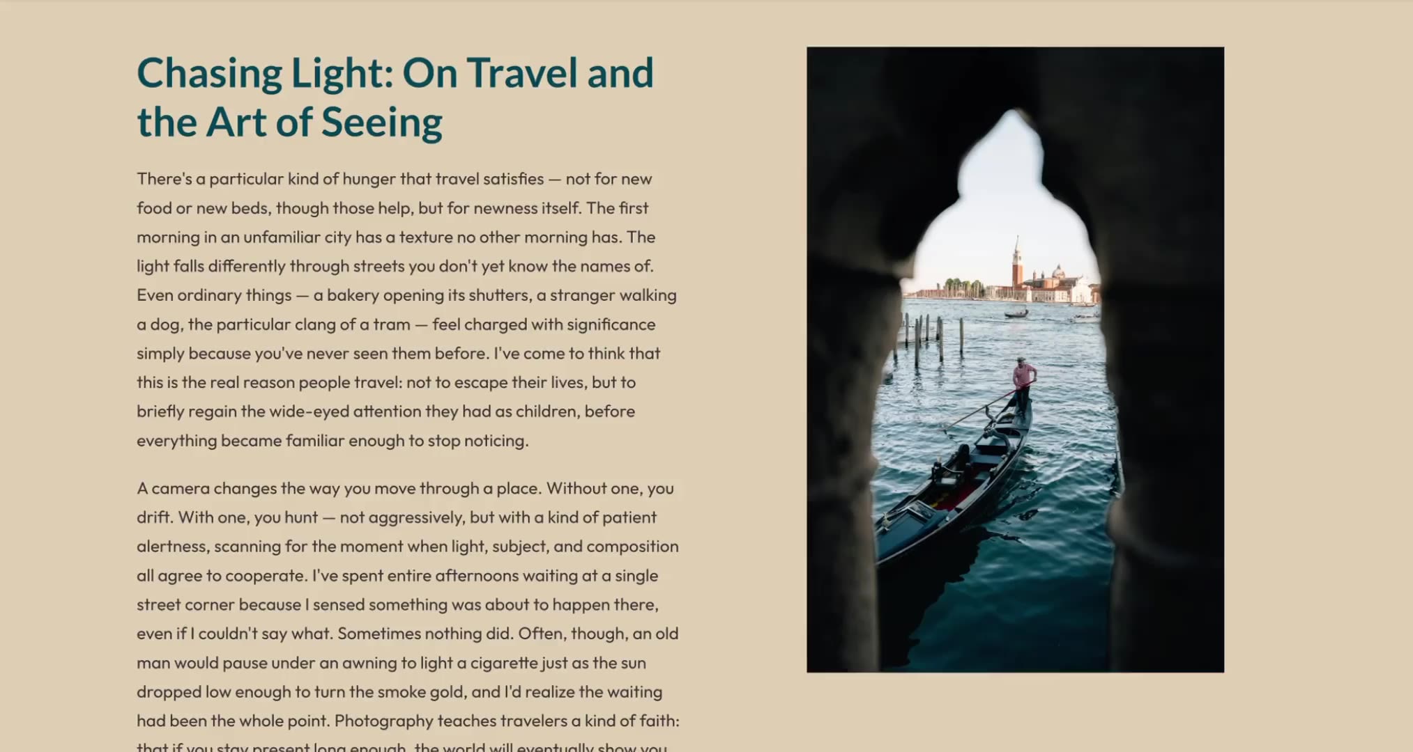
Fade transitions for Scrollmation sections
Scrollmation and Background Scrollmation sections now support smooth background fade transitions, making it easier to move between images of different sizes or shapes without a jarring cut.

Faster image loads for readers
We've simplified the way images load behind the scenes so media-heavy stories feel faster and smoother for your readers. Now, the main image handles its own loading state, and we preload images further down the page before readers scroll to them.
Grid updates you asked for
We made Grid sections easier to use thanks to dozens of tweaks. You’ll now see improved toolbar and menu behaviour on narrower cards, clearer control when inserting new elements, and better visual feedback when adding new cards.
You can also control how many cards appear across desktop, tablet, and mobile layouts.
Grid sections now also have footers, so you can add a spacer or extra content below your grid — a small but mighty feature many of you have asked for
Grid updates you asked for
We made Grid sections easier to use thanks to dozens of tweaks. You’ll now see improved toolbar and menu behaviour on narrower cards, clearer control when inserting new elements, and better visual feedback when adding new cards.
You can also control how many cards appear across desktop, tablet, and mobile layouts.
Grid sections now also have footers, so you can add a spacer or extra content below your grid — a small but mighty feature many of you have asked for.
Typography to match your brand
Theme Builder now pulls from a wider Google Fonts library, giving you more flexibility to align stories with your brand guidelines.
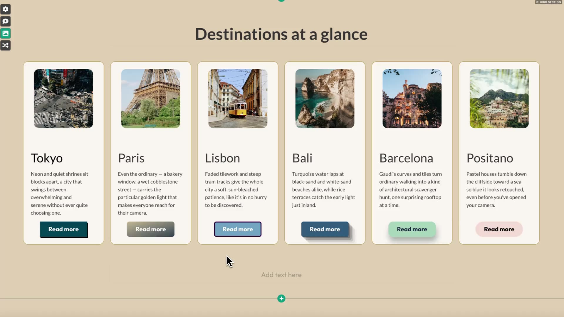
More control over buttons
Choose from a range of preset button styles to complement your theme colours, making it easier to create calls-to-action that feel consistent with your brand.
You can also customise button shape and other styling attributes beyond the background and text colour options previously available.
Typography to match your brand
Theme Builder now pulls from a wider Google Fonts library, giving you more flexibility to align stories with your brand guidelines.
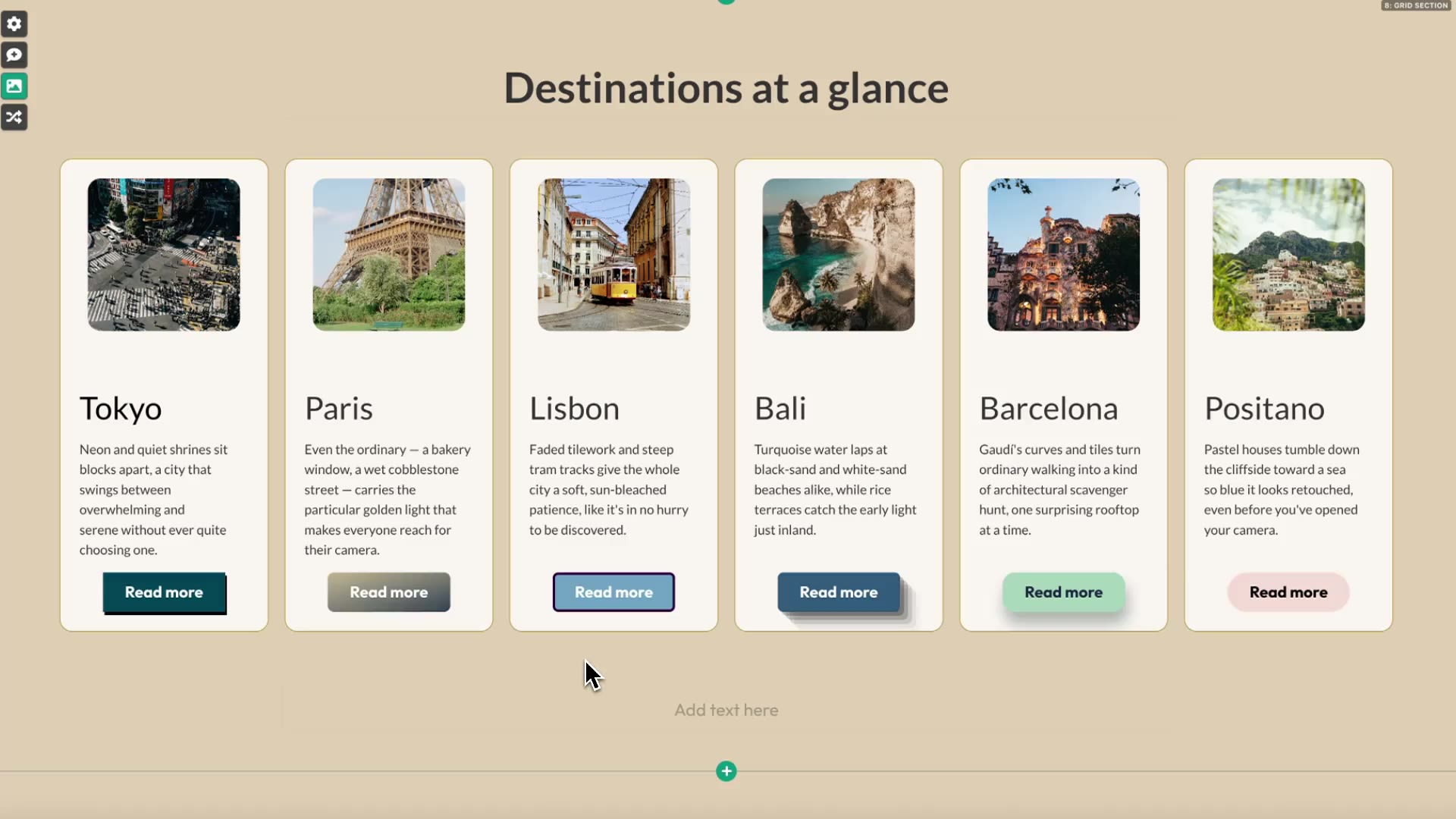
More control over buttons
Choose from a range of preset button styles to complement your theme colours, making it easier to create calls-to-action that feel consistent with your brand.
You can also customise button shape and other styling attributes beyond the background and text colour options previously available.
 Built with Shorthand