Text on Reveal
Upgrading a great storytelling feature

By Scott Moorhead
April 23, 2020
The Reveal section has always been a powerful Shorthand feature, and we've seen it used in some amazing ways.
Now it's even better.
A Shorthand Reveal section is typically used to showcase a series of full-screen images. Each image displays in sequence, with a transition effect between them that resolves as readers scroll. While the section has allowed for a short text accompaniment to each image, displayed in a small caption field at the bottom of the screen, the images themselves are always the heroes.
Heroes deserve powers, so we've given Reveal a new one: text blocks. Big, bold, and colourful, or discreet …lots of text, just a little, or none …it's up to you. Each image in the section can have its own text block that scrolls up the page before the transitions between images. This differs from Background Scrollmation sections, where a single column of text applies to the whole section rather than individual images, and scrolls up the page as the images behind it change.
Text on Reveal also delivers some other great practical storytelling benefits. Previously we have seen some Shorthand stories containing Reveal sections with text embedded as a graphical element within the images. Text rendered that way can present a few problems: it's harder to edit, isn't responsive on the page (it can't wrap or scale to fit different screen sizes), and isn't visible to search engines or screen readers used by people with visual impairment. Because the new text boxes in Reveal sections use actual text, they are SEO & screen-reader friendly, responsive, and easy to edit with Shorthand.
What can you use it for?
We think you'll surprise us with your ingenuity here, but we've found Text On Reveal sections to be especially useful when sections of narrative correspond directly with individual images.
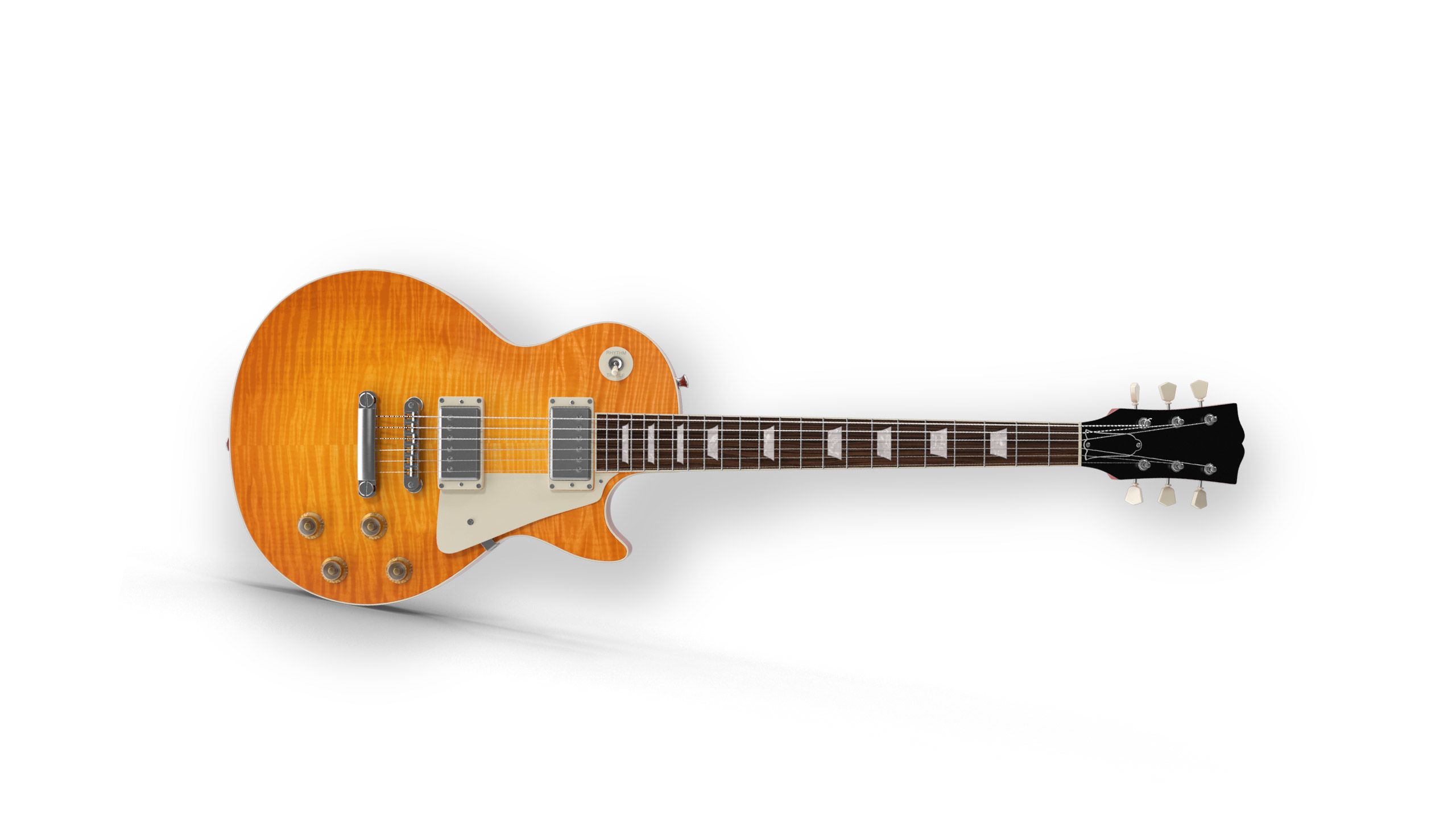
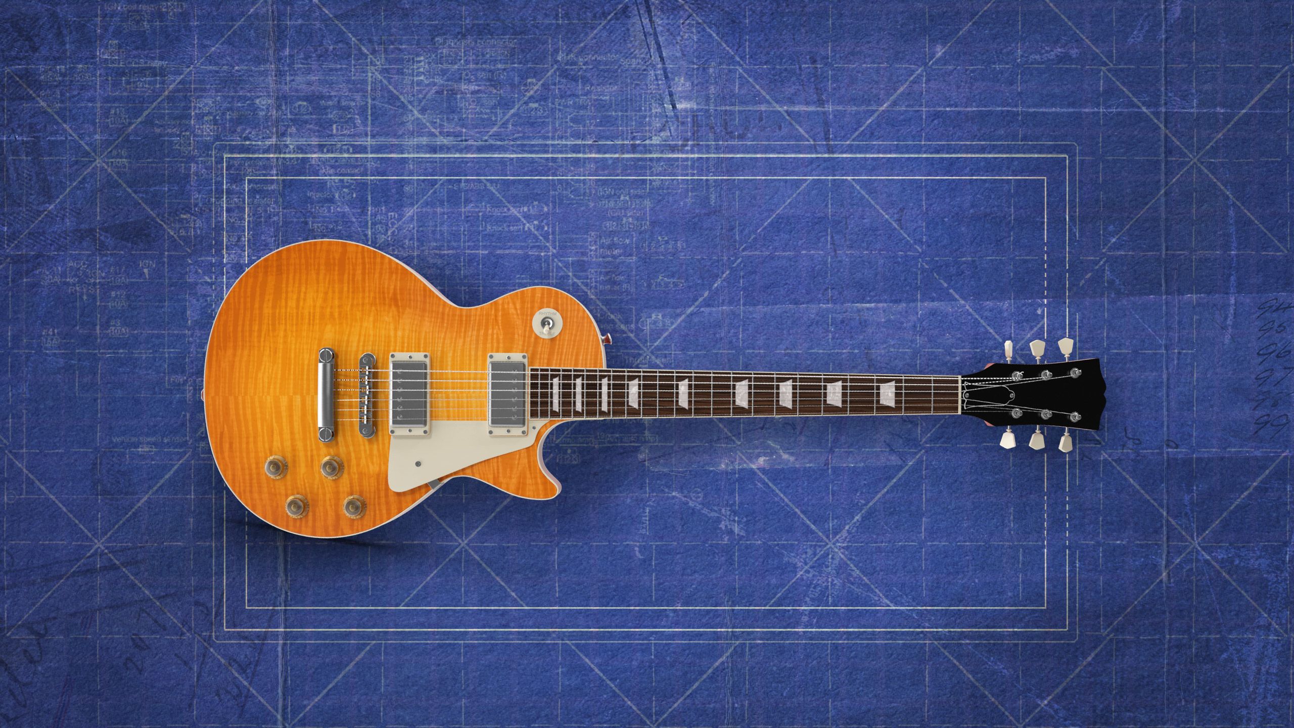
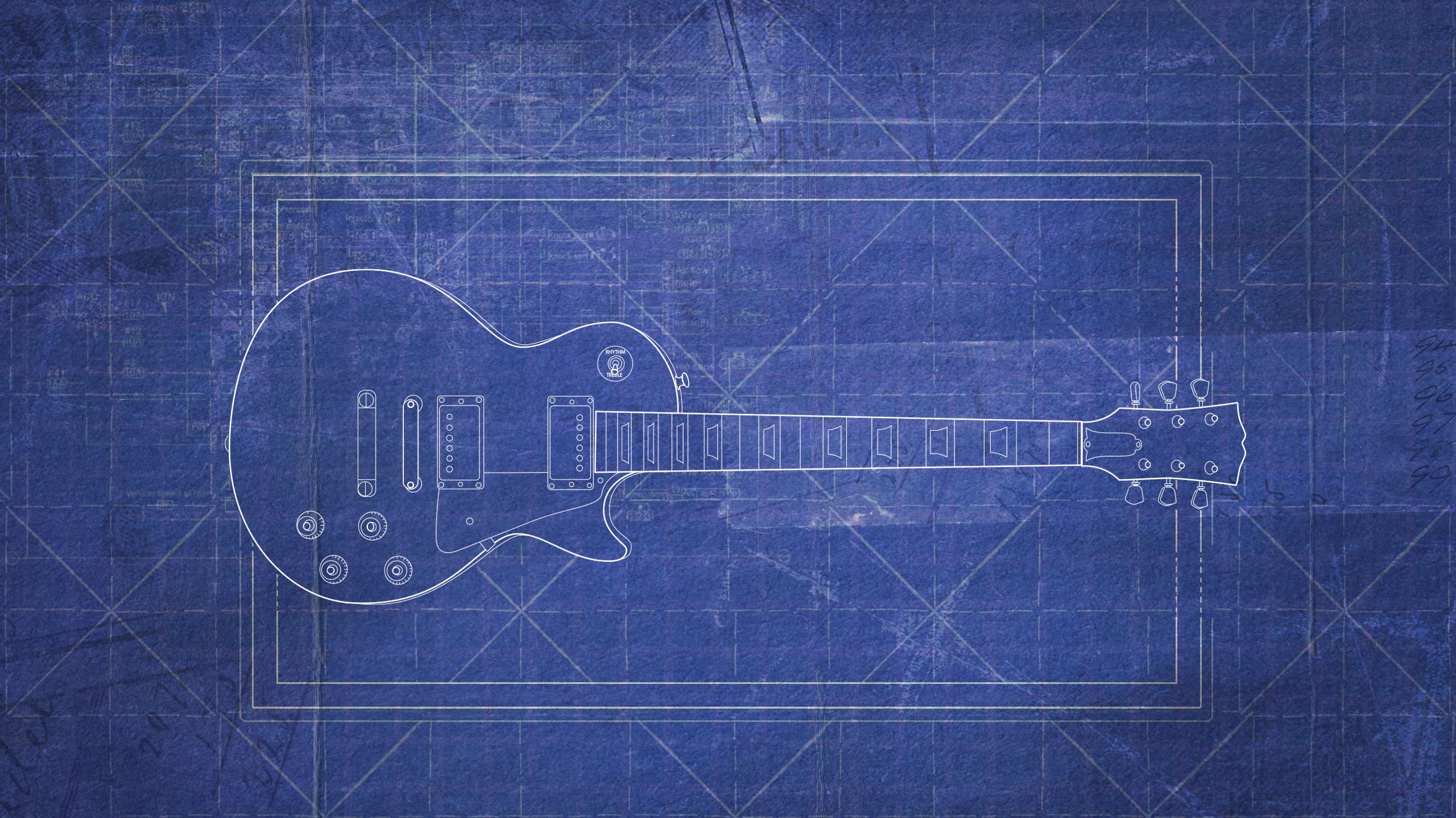
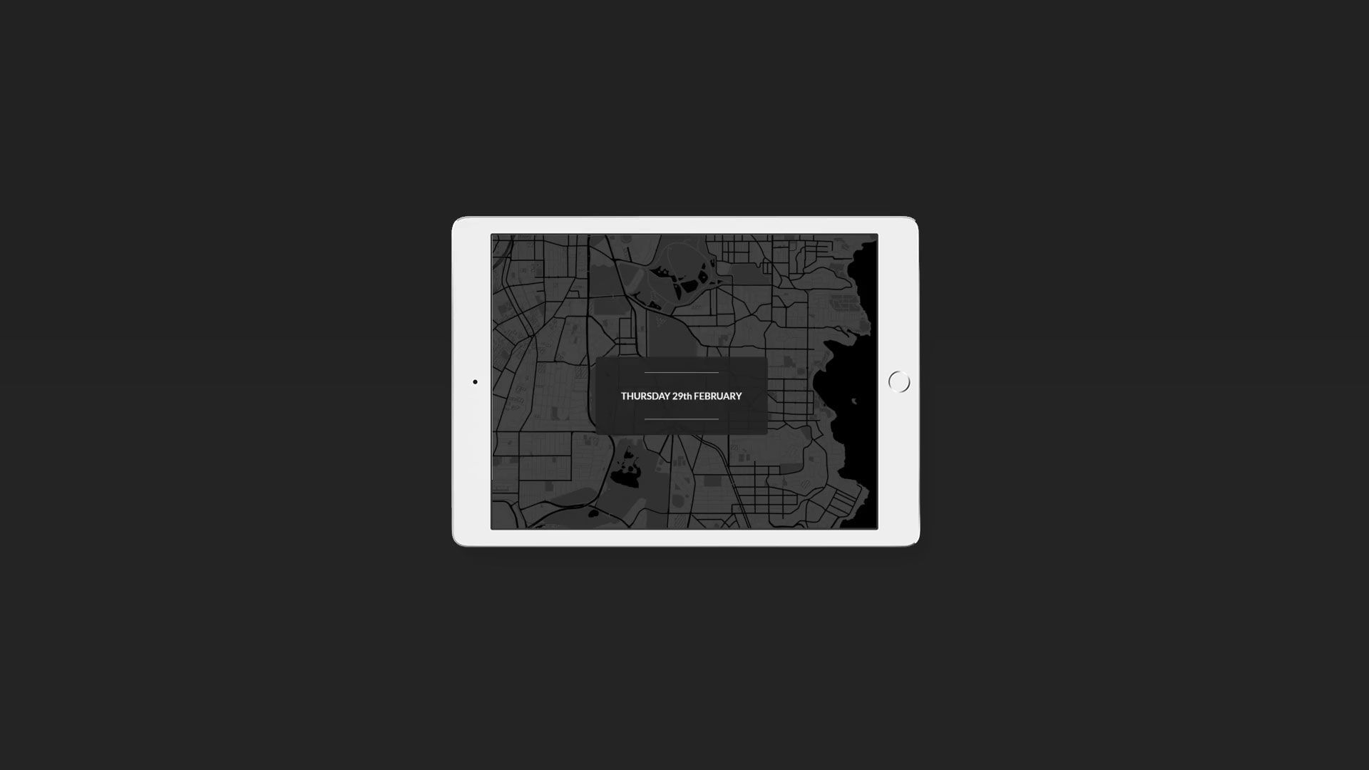
It's perfect for simultaneously describing and highlighting individual parts in a series of images of the same object (as in our guitar example in the header of this story) or perhaps to provide detail of events in an updating map:
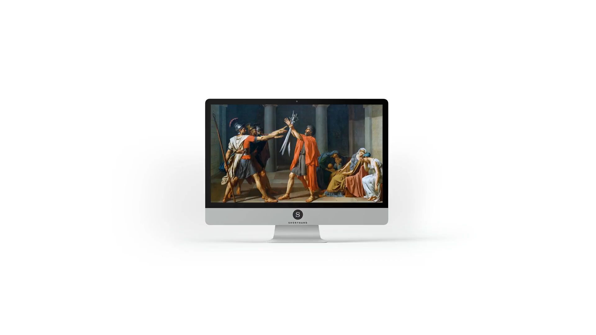
Educational material is also a great candidate for Reveal sections with text, as a single image and the text that describes it are displayed together without any other distractions on page, regardless of the length of text or number of images in the section. This keeps readers focused on individual, shorter, illustrated concepts.
In the following example, the figures in a classical painting are highlighted as they are described.
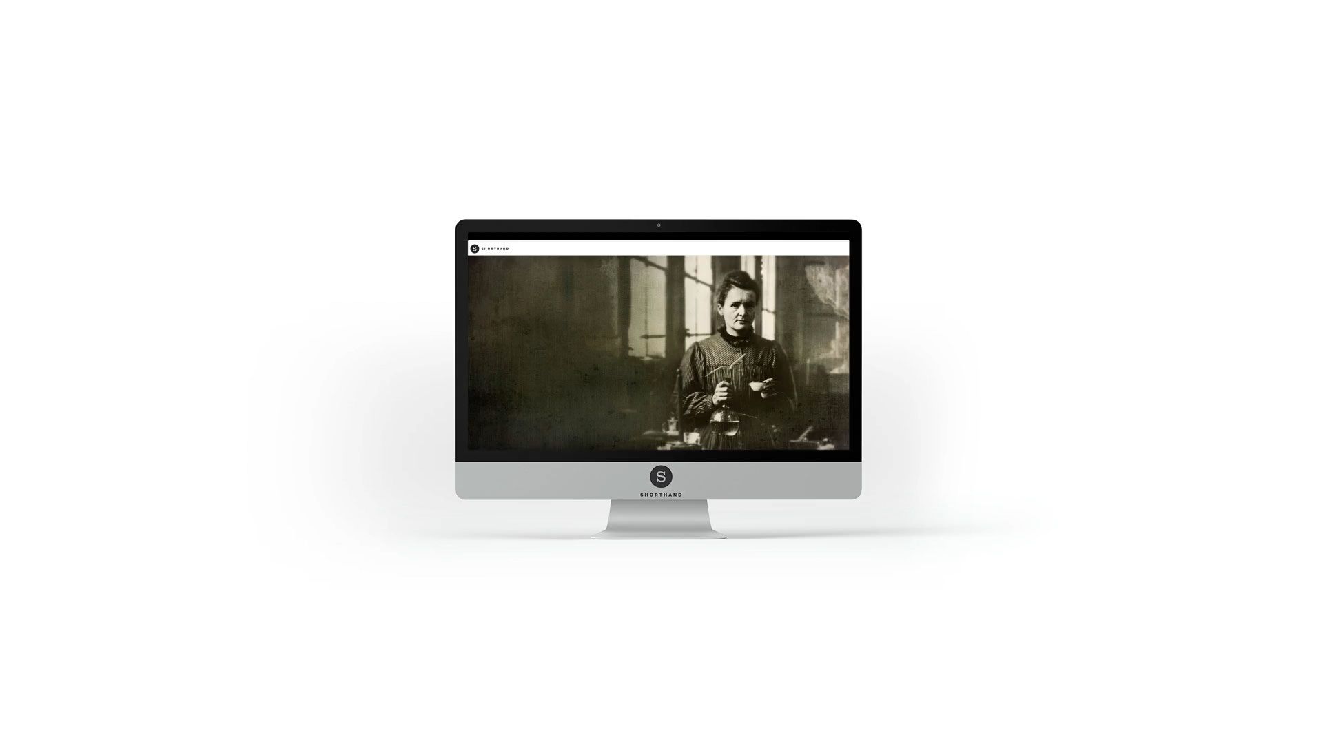
...and for images that require longer sections of text? Not a problem. The text box will expand to accommodate lengthier descriptions, while still ensuring that each section of text is displayed with its corresponding background image.
In the example below, the lengthy text that describes each of the scientists in the story is considerably longer than a single screen. The text column scrolls in its entirety before the transition effects occur between the images, regardless of the length of text or the resolution of the reader's screen.
How do I access this new power?
As you are working with Reveal sections in the Shorthand editor, you'll now see a faint message on each frame: "Add text here". Just click and type if you'd like text on that frame in the section.
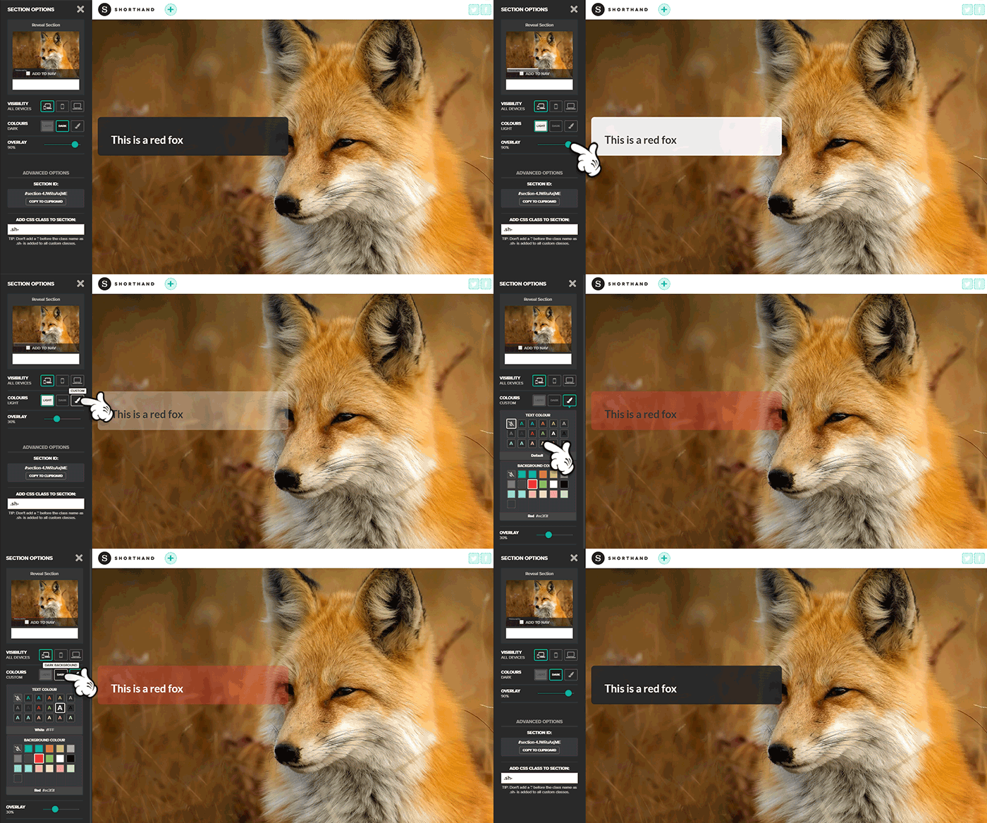
Styling the text box is managed through the Section Options panel, where you can set the box colour and opacity as well as text colour that will apply to each text box in the section. The text colour, size and style can also be independently set within each box.
Text blocks are now enabled for Reveal on all Shorthand plans.
We can't wait to see what you create.
