Introducing new layout options for Title & Text Over Media sections
Half screen layouts for desktop and mobile


We have introduced a half screen layout option on the Title and Text Over Media sections. This means you can now place your text to the left or right hand side of your media on landscape screens, and above or below on portrait screens.
This gives greater flexibility to tailor your stories, especially where you do not want to place your text on top of images or videos, where it could obscure key visual details.
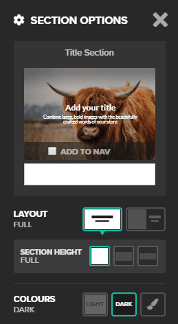
You will find this new feature under the Section Options.

Read on for three ideas on how to use this new feature.
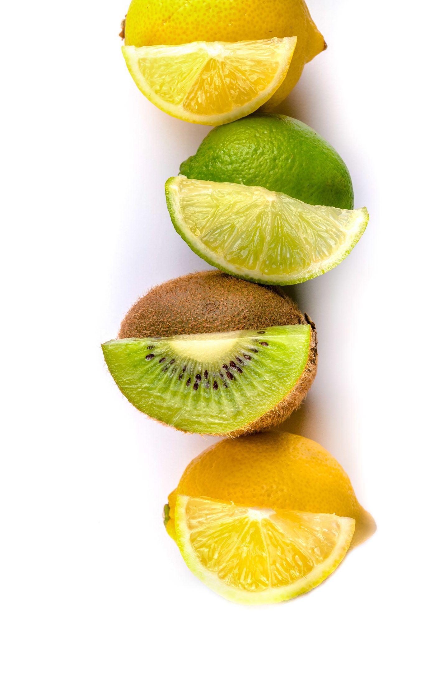
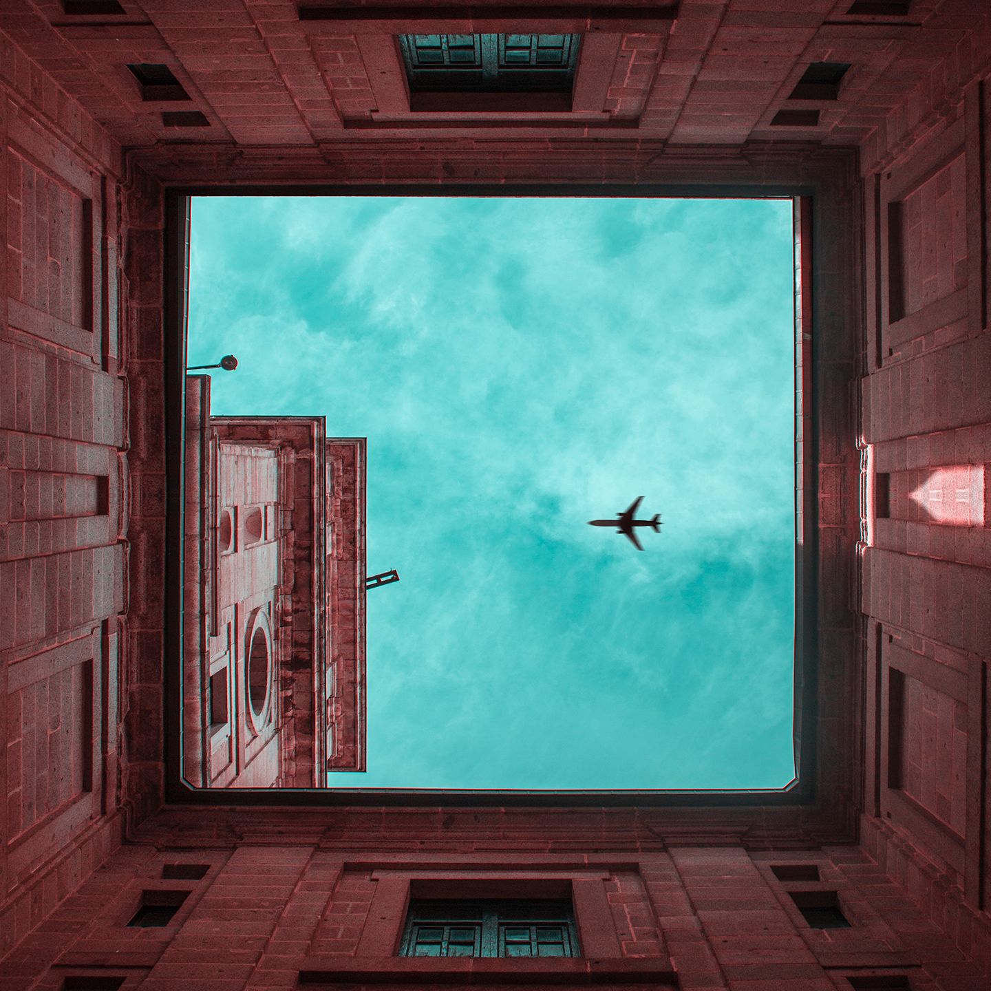
1) Use it for images that naturally fit better into a square space

Some things just don't suit rectangles.

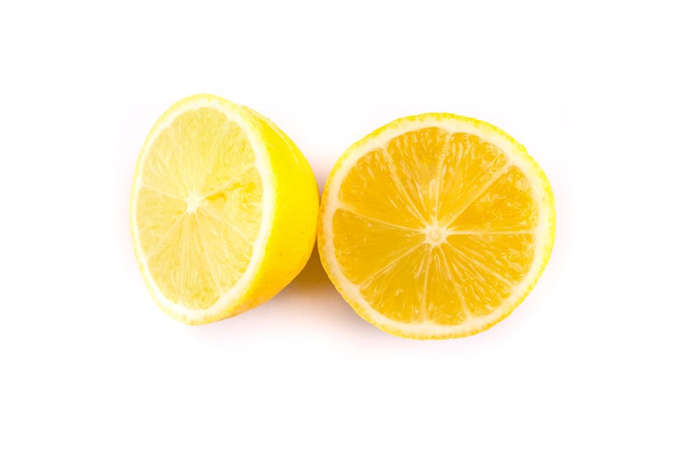
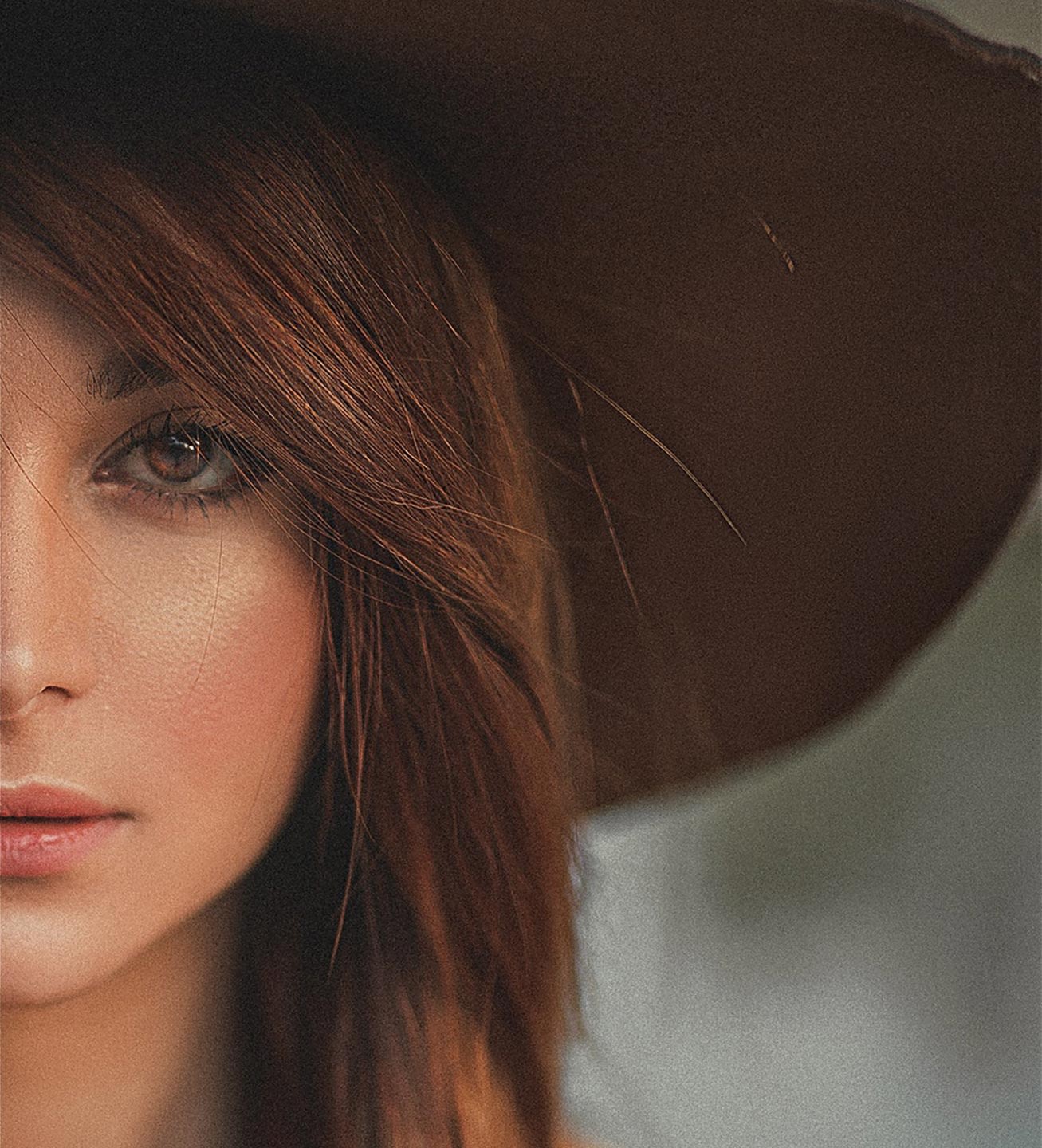
The first Text Over Media section is set to show the media on the right hand side on wide screens, while the media is set to show on the top on small screens. The second Text Over Media section has the opposite settings.
The background position is also different on the two sections. The first is set to fixed so the story scrolls over the static image, while the second section is set to scrolls, meaning the text and the image scroll out of view at the same time.
2) Show different aspects of a scene across multiple sections

Get creative.
The two halves don't have to match in every way.

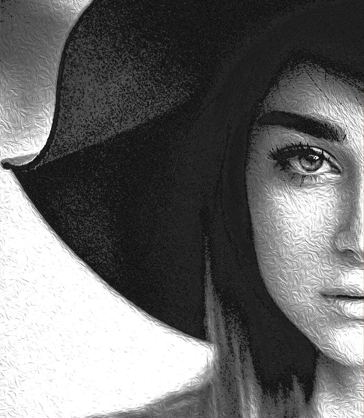
In both of the Text Over Media sections above we have used different images, with a varying crop and effect, in the wide screen and tall screen options to tailor the experience for different devices.

View this story on desktop and mobile to see the contrasting layouts!
3) Use the same full-screen image multiple times in a story


Use copies of the same Text Over Media section multiple times throughout your story, such as for chapter headings. It will help to maintain visual consistency and you can create some great visual effects.


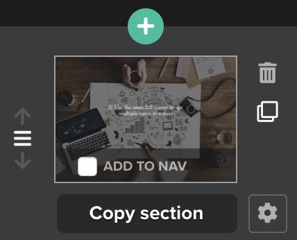
This one image of a planning session can be re-purposed multiple ways with a single upload by using the copy section feature.


For variety, add different layout options to the section copies and choose different focal points for the image.

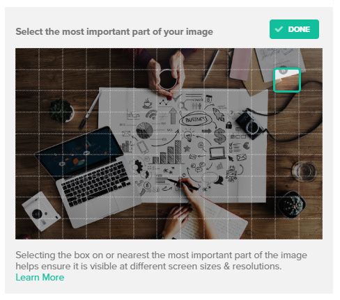
You can move your readers' eyes to different parts of the image as they scroll, or concentrate on the most relevant part of the image for the text featuring alongside at that moment.
Using copies of the same Text Over Media section in different ways and with different focal points will help to maintain visual consistency in your story...
… while also helping to keep the overall file size of your story low.
And that means faster load times for your readers, too.
Want to try it for yourself?
Download the files used in this story.

Final tips for getting the most out of the half screen layout:
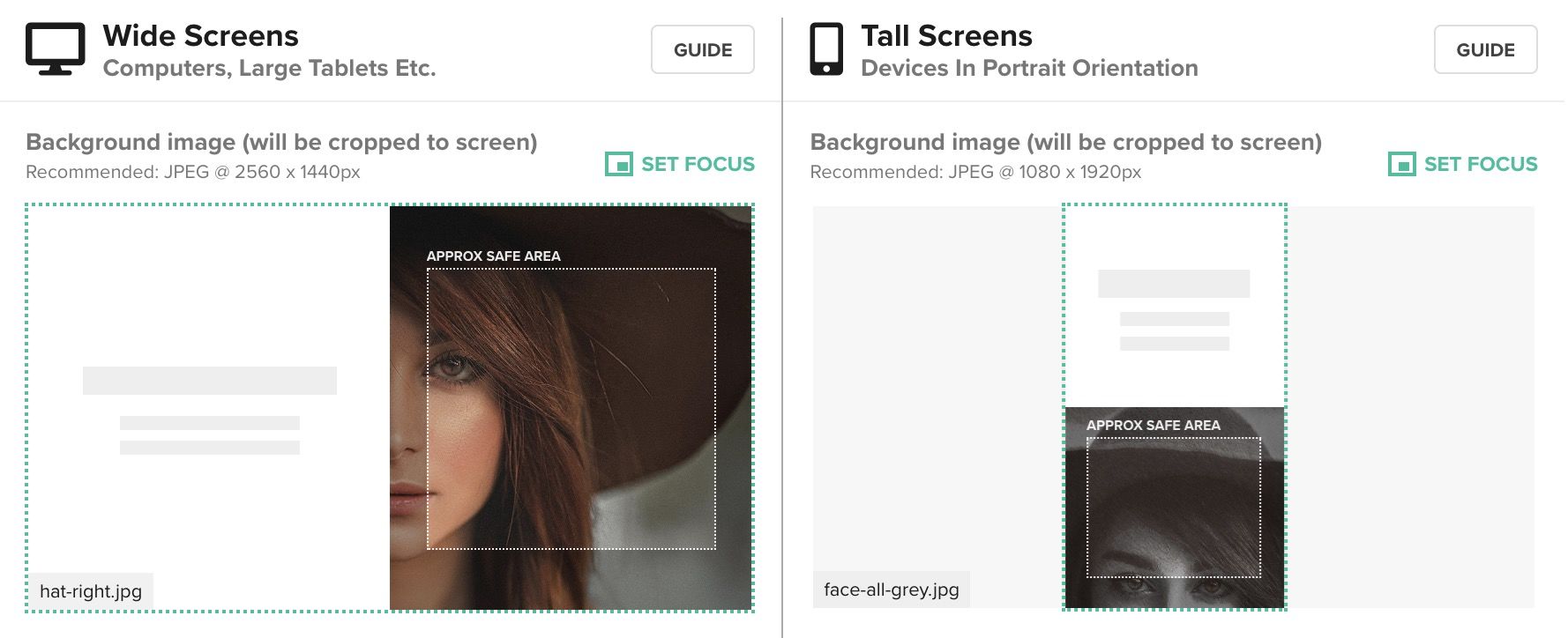
- For image sizes we recommend 2560px × 1440px for full-screen landscape images and 1080px × 1920px for full-screen portrait images, both JPEGs at 100% quality.
- When using the half screen layout feature, those full-screen images will appear to be cropped to show roughly a square equal to half of their original size. Use the set focus feature to ensure your images are framed correctly in the safe area guides.
- You can also experiment with uploading square images when using the half screen layout, like we have above. For this we would recommend 1440px × 1440px JPEGs. Download the files above to try them out for yourself.
- Think about how much text you will add to these sections. The Title and Text Over Media sections work best with a small amount of text. Check to make sure the text you have added works well on desktop and mobile. Experiment with the size of your text.
- Does the effect you've created work well for desktop, but not for mobile? Don't forget you can use the visibility feature to further tailor different sections and hide/show on wide or tall screen devices.
- If you're using the same image multiple times, don't forget to use the copy section feature, rather than uploading again. This will keep the overall file size of your story lower.
What do you think?
We're always eager to get your feedback on how new features are working for you, and to hear about other enhancements you'd like to see in the future.
Get in touch with us if you want to have a chat about the new half screen layout option, or anything else.
 Built with Shorthand