
Introducing
Grids


Today, we’re excited to announce our latest addition to Shorthand: Grids!
With Grids, you can easily create flexible web layouts for your content. This allows you to create a much wider range of content types — including web pages, proposals, and content hubs — all from within Shorthand.

How does this work? It’s as simple as clicking the ‘Grid’ section type and adding in your content.
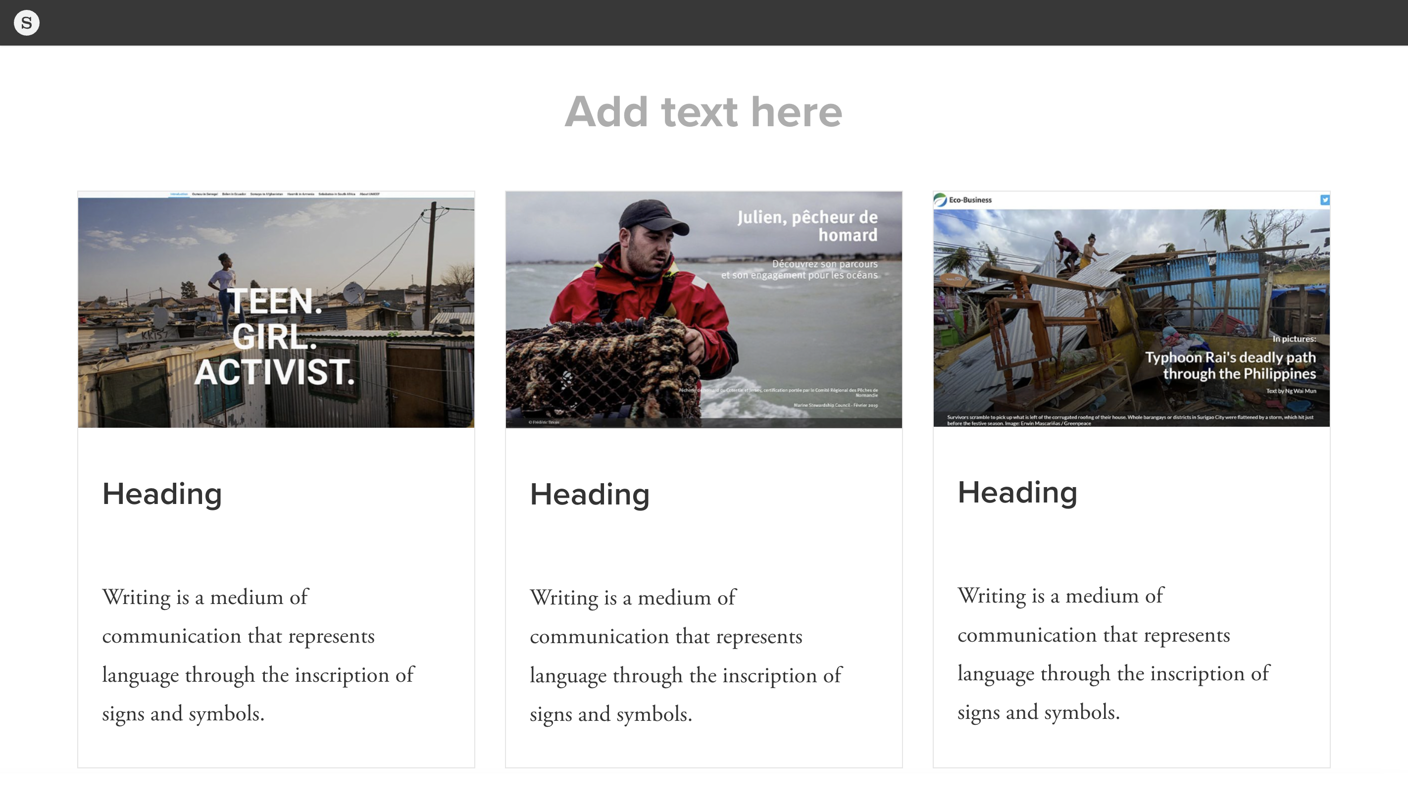
As always, we thought it was better to show than tell. Here's a quick walkthrough of how to create a Grid section in the Shorthand editor.


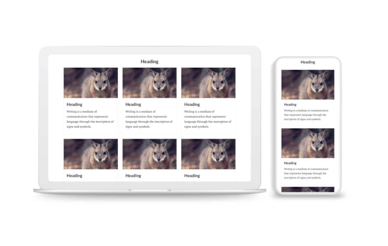
Here's an example of what a minimally-styled three row grid looks like.

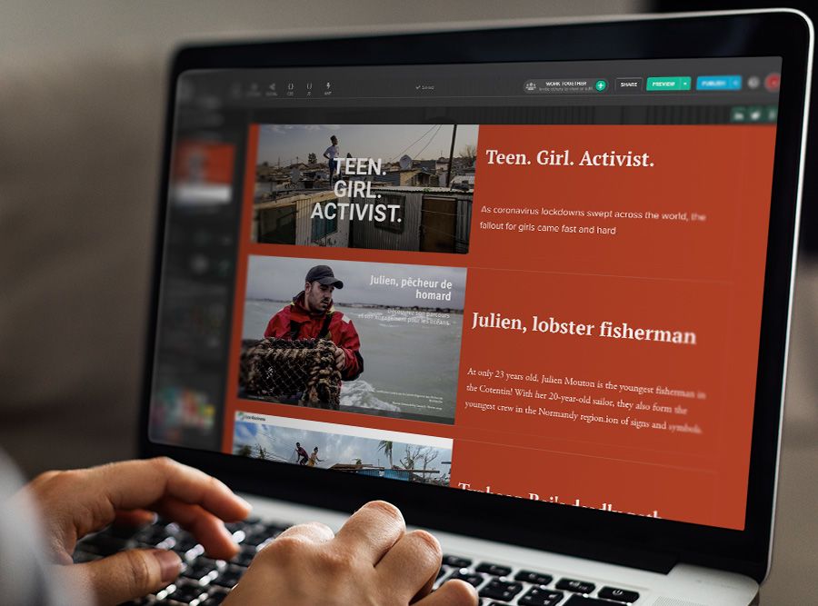
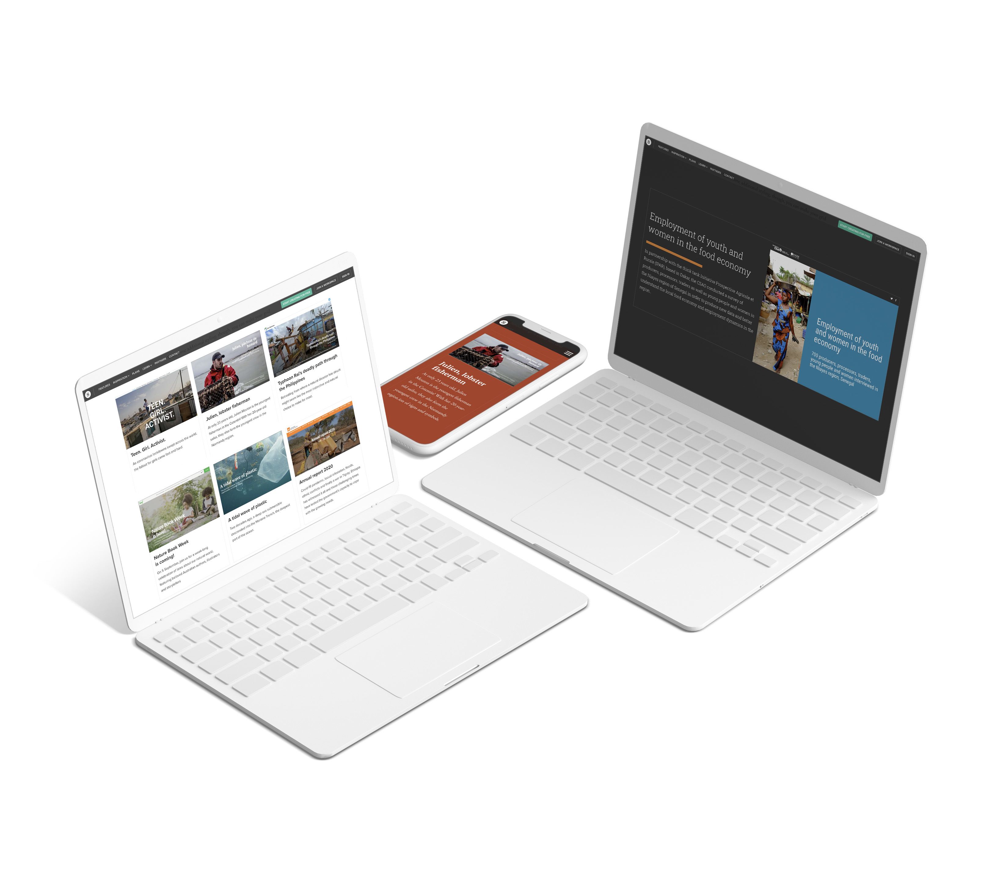
As with all Shorthand's features, Grids are truly flexible. you can add colours, fonts, and images to make something truly exciting.
You can also take grids a step further, and use them to create stunning web layouts — without needing the assistance of a web designer.


Existing customers might wonder how this is different to Shorthand’s existing Collections section.
Unlike Collections, Grids can be customised by anyone on your team directly in the Shorthand editor, with no skills in web design or code required. You can easily add new rows and cells, import images, change fonts, and apply colours — all with a click of a button.

You can read the full documentation for Grids at Shorthand Support.
Grids is now available to all Shorthand users. If you’re not a Shorthand customer, get started for free and try it for yourself. And don’t forget to let us know what you think!
We can’t wait to see the amazing content you create!
 Built with Shorthand