like the
revolution:
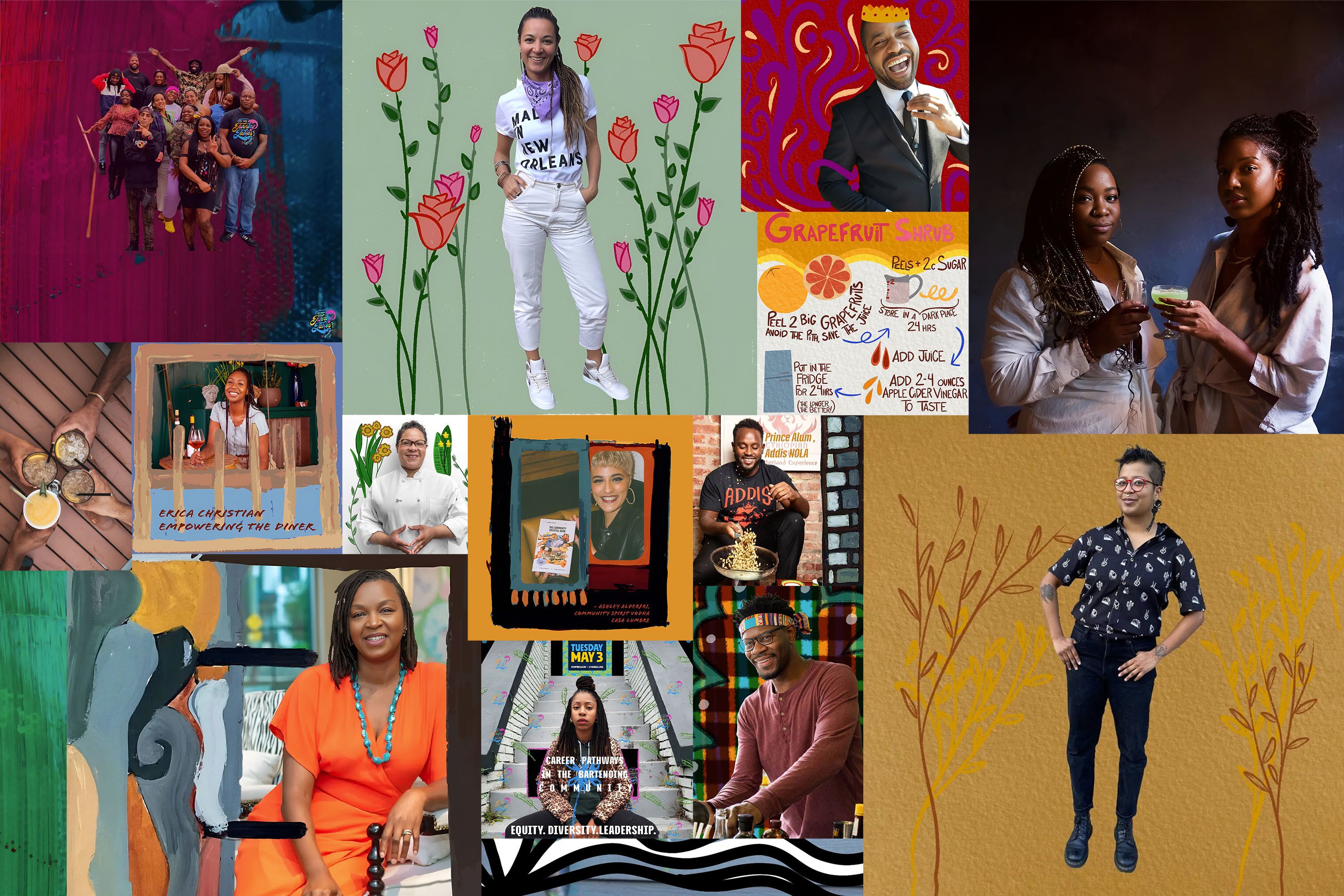
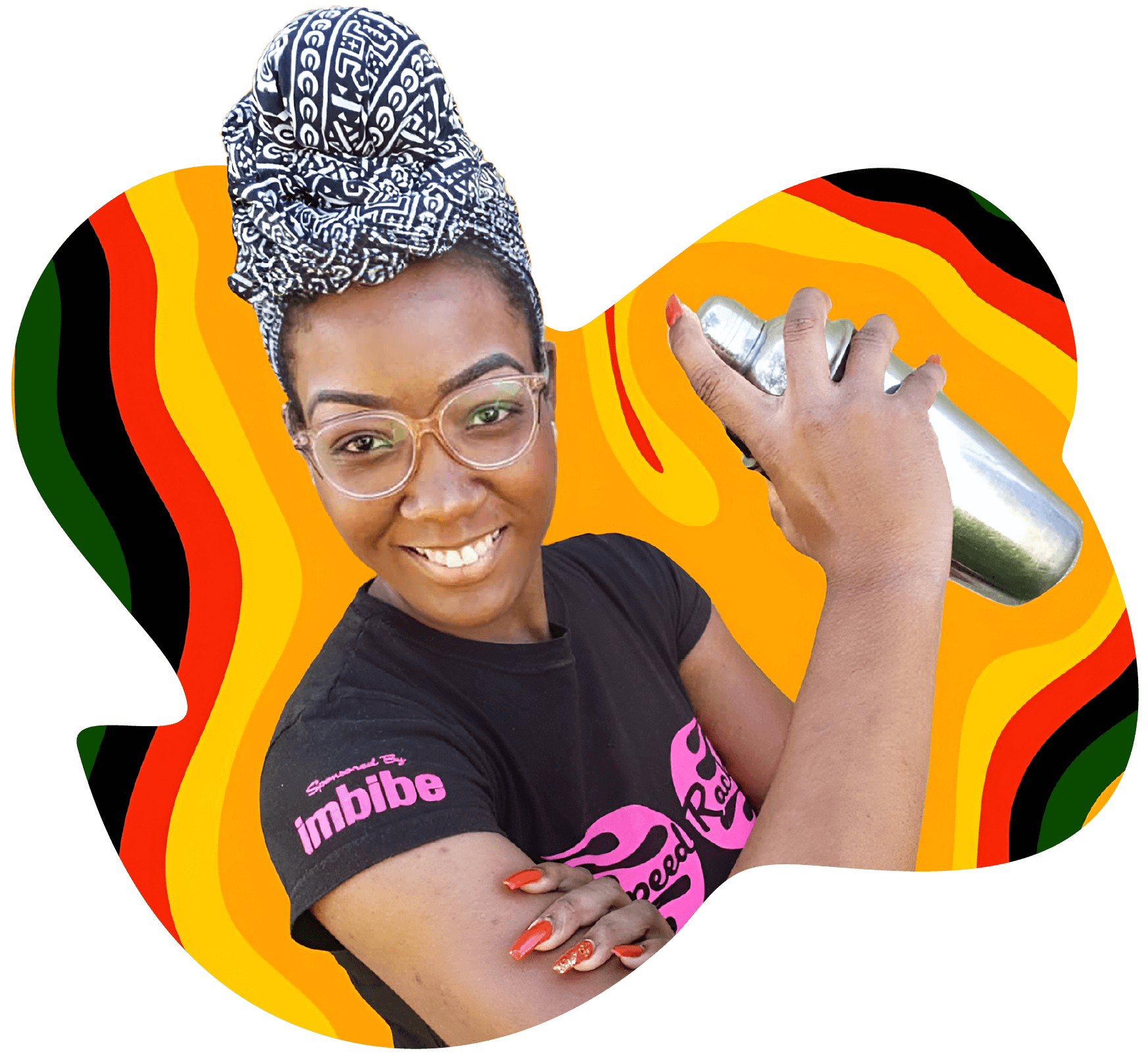
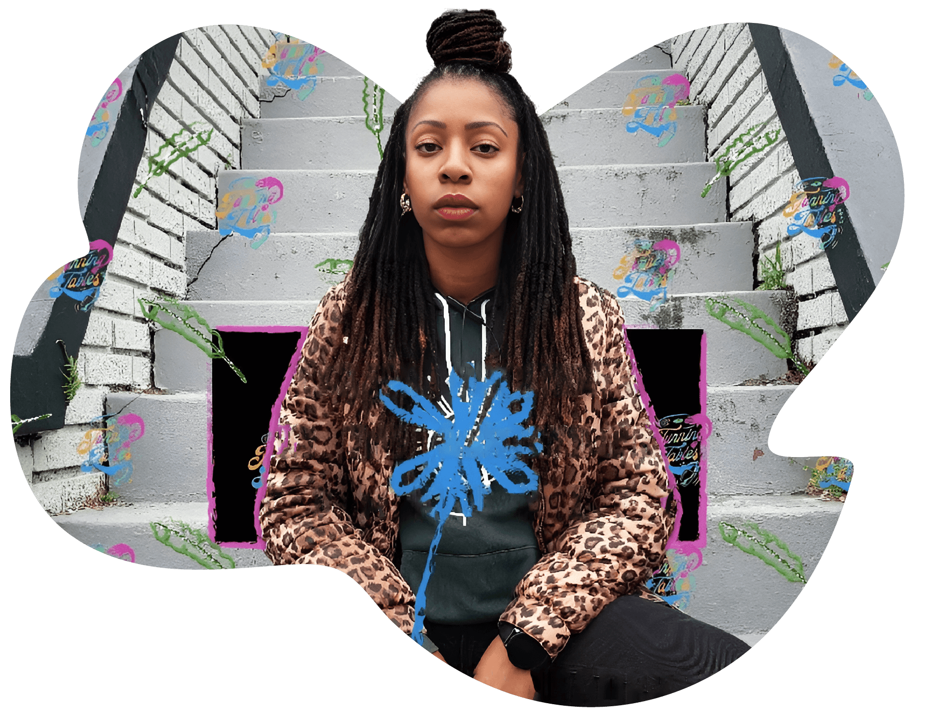
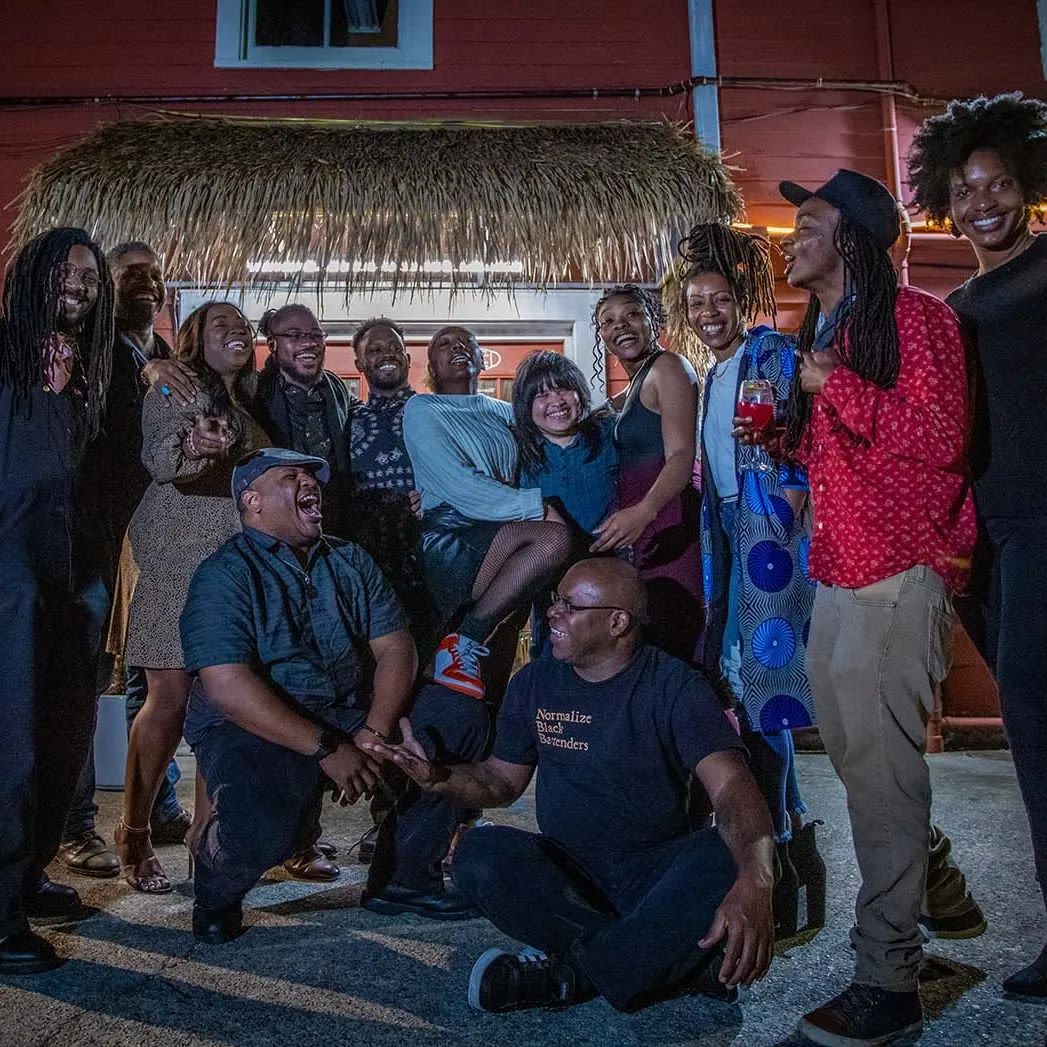
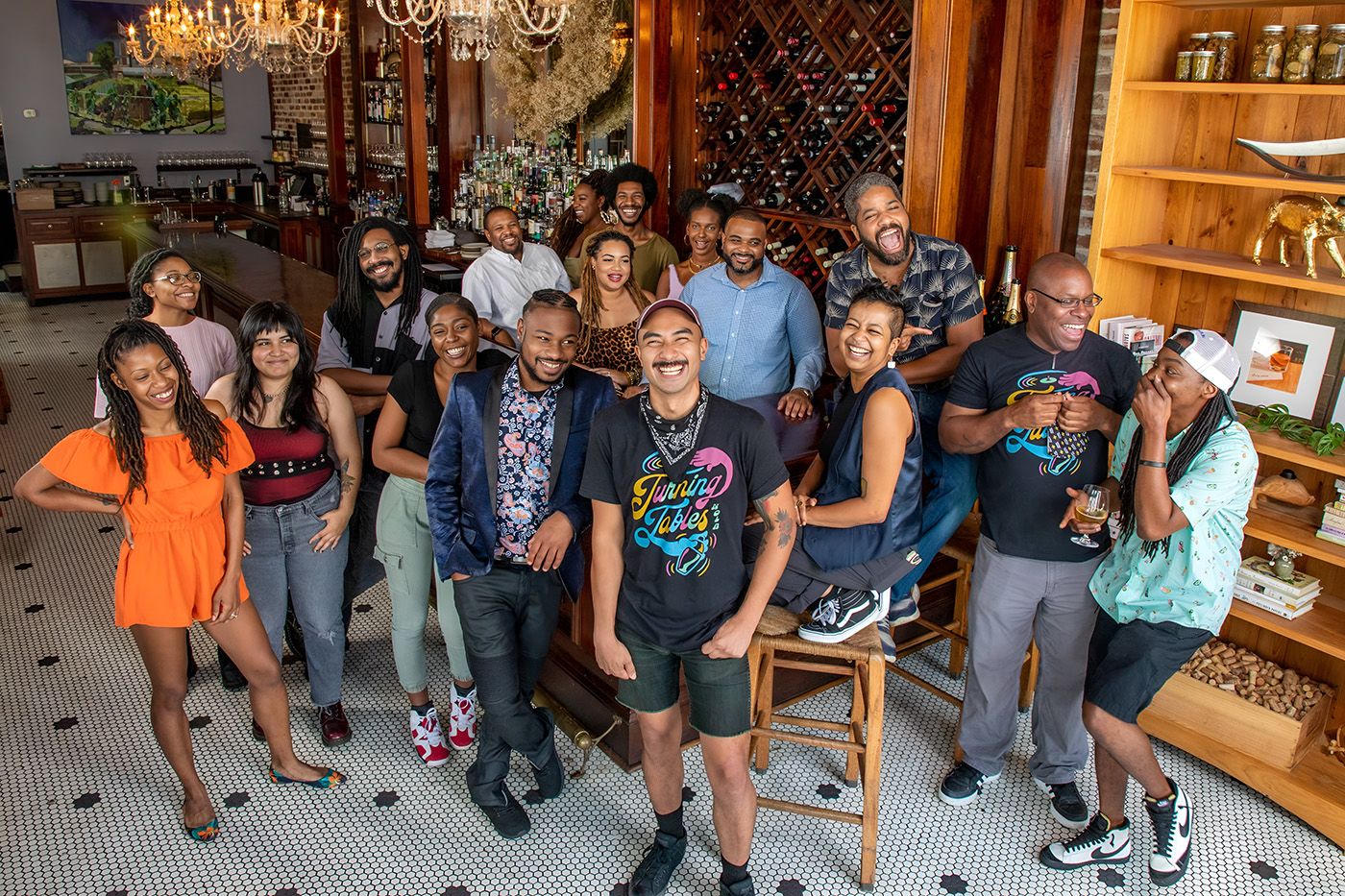
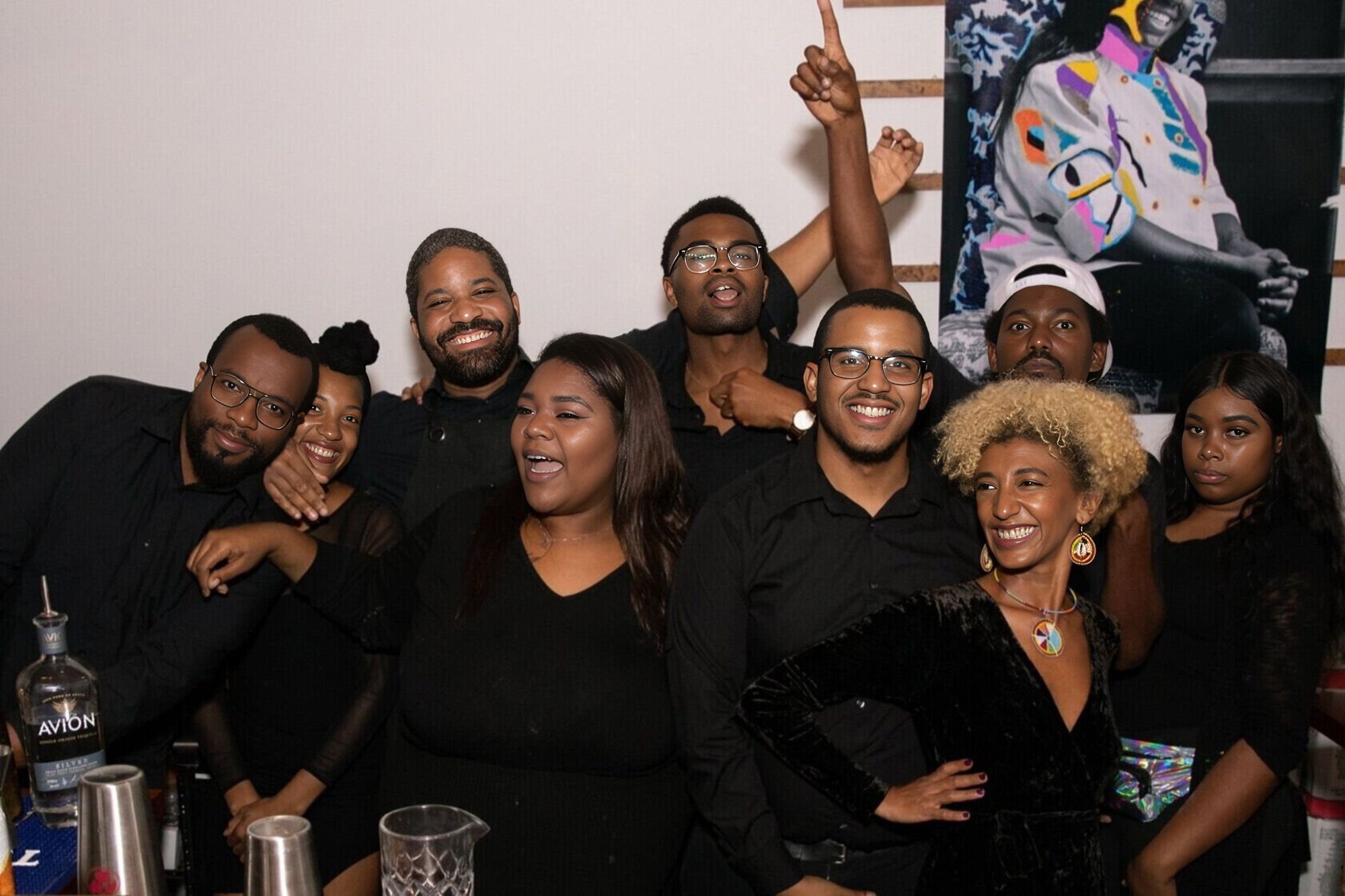
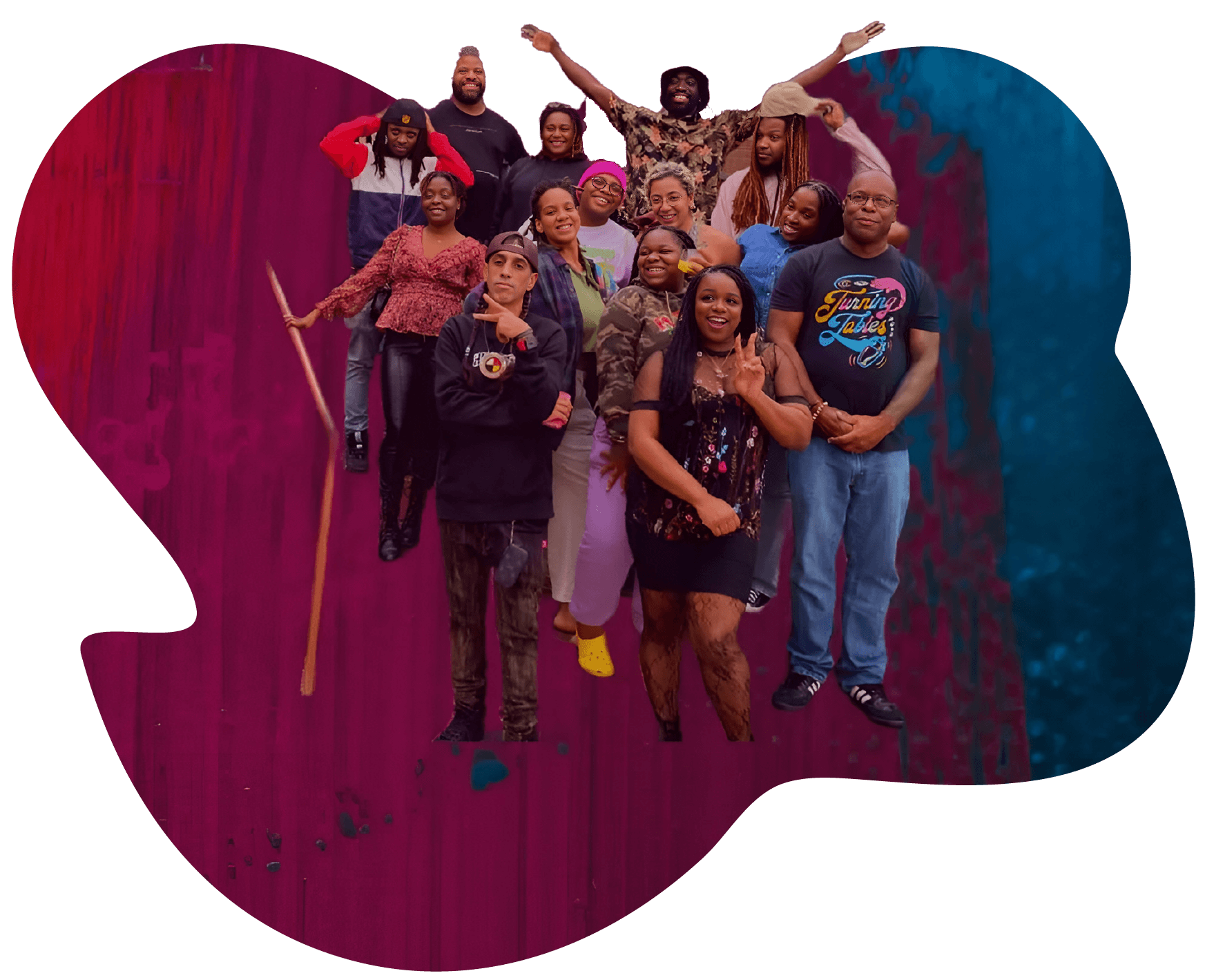
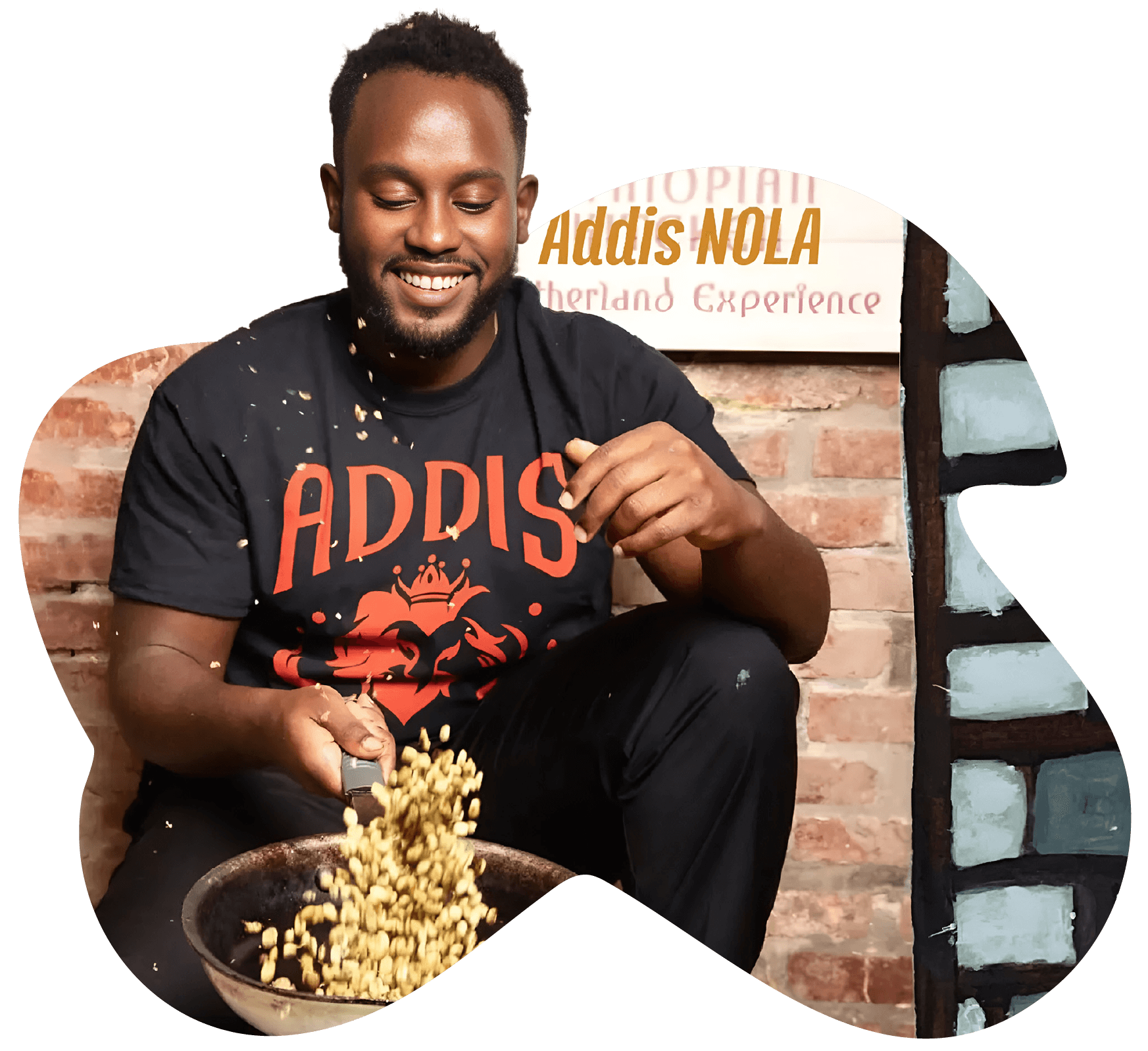
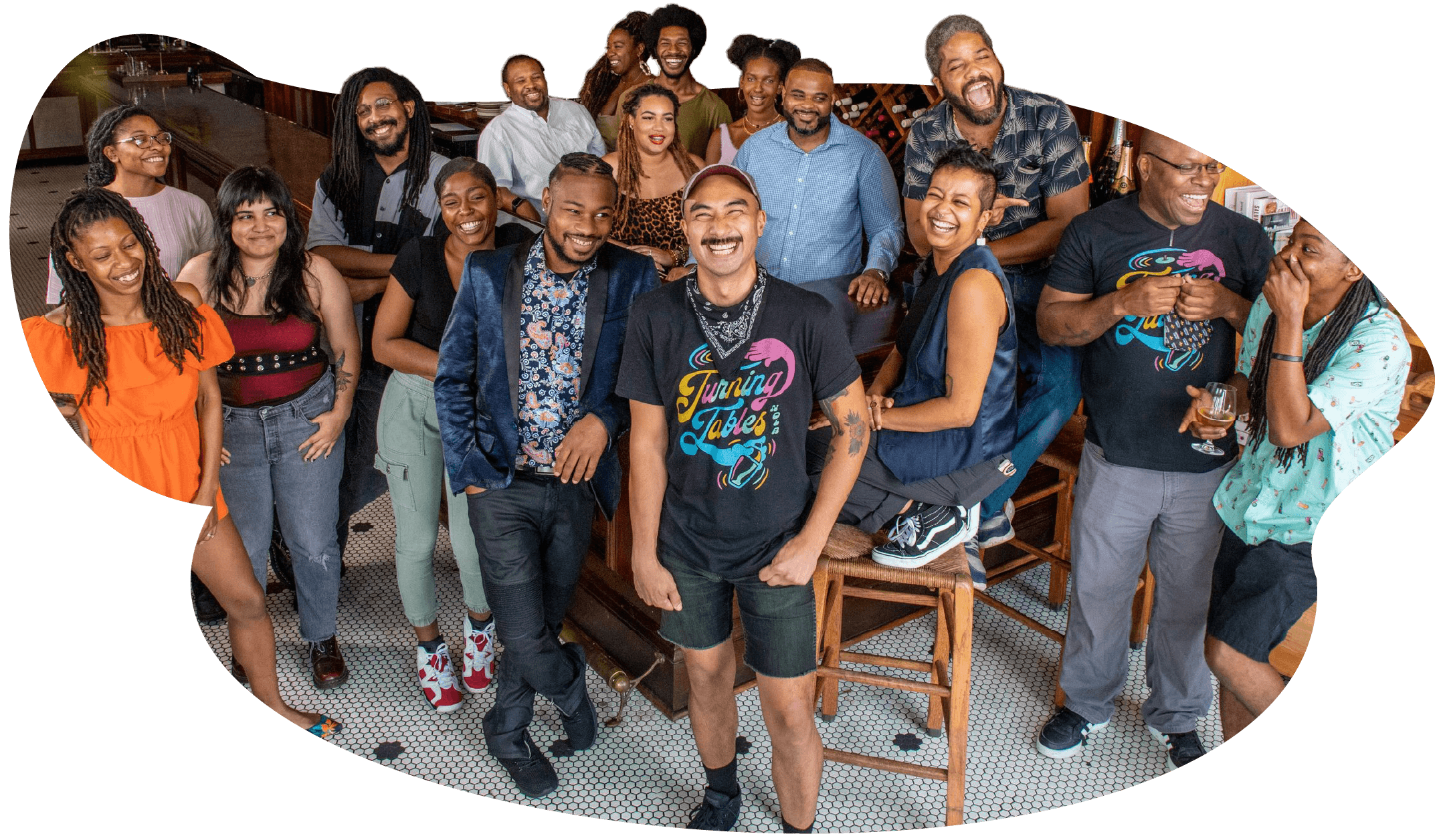
Touré Folkes is a softly spoken man, but when I ask him to tell me what he’s working on, the list is very long. Touré leads Turning Tables, an organisation that advocates for equity for Black and brown individuals in the hospitality community of New Orleans through a twelve-week training programme on beer, wine, and spirits.
But, more importantly, Touré says, “the programme gives everyone a sense of community, and the chance to connect with other people of colour, who can share their journey in the industry.”
Turning Tables has a vivid brand — across its social media, website, and newsletter — that draws inspiration from African American artists such as Emory Douglas, Kehinde Wiley, and Jacob Lawrence.
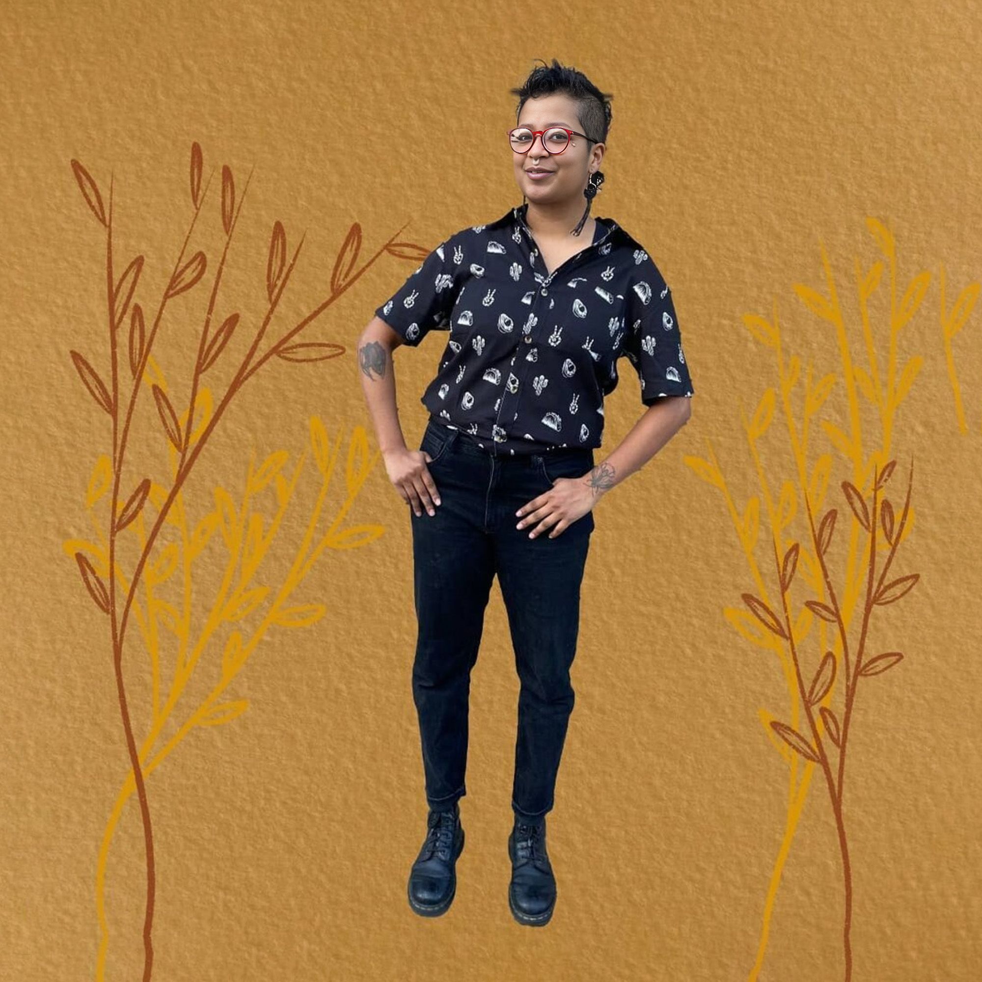
Here, designer Ray Fontaine and Touré talk with Shorthand’s Thomasin Sleigh about the ideas behind Turning Tables’ distinctive digital storytelling.
Turning Tables advocates for equity in hospitality for the Black and brown community of New Orleans.
TS: As well as your training programme, you also do consultancy work for restaurants, is that right?
TF: We consult for local bars and restaurants in two capacities. In the first instance, this is by bringing in DEI (diversity, equity, and inclusion) workers to help shape the way that people hire and fire, think about microaggressions, implicit bias, and how they train individuals towards upward mobility. And the second is by working with Black-owned businesses to level the playing field for access to distributors, training programmes that will keep their costs low, and also identify people within their staff to lead the bar programmes, while giving them access to our resources.
TS: How do you have those hard conversations with organisations?
TF: These conversations were happening with us before the racial awakening of George Floyd where suddenly communities felt a need to address equity; it was something that we were already in the process of doing as an organisation and with our work.
I've been in a position in bars and restaurants where not only was I overlooked for my talent, but also not given opportunities. Often, in previous jobs, I didn't speak up for myself. So, now I’m doing it for others.
There are people that may or may not have the right intentions but want to do it for all the wrong reasons. They want to bring in someone just to tokenise and check a box and claim to have an equitable space.
Meanwhile, they don’t realise that their practices aren't equitable. Has that person been asked to be in management? Are they heard when they told you that something happened and there was a microaggression, and do you know how to handle that?
Equity and access are not just for Black and brown people. Do you have a woman in leadership? Or, are there accommodations for people with disabilities?
TS: You have this really interesting word, “externs”. Is that specific to Turning Tables?
TF: I think that word is from Liberty’s Kitchen, an offshoot of a local programme called Reconcile. They're both workforce development organisations and when they send someone from their programming into a space, they call it an ‘externship’.
It's placing someone in real life experience to get hands-on training, so that they have the ability to learn within a system of support, and they’re not thrown to the wolves.
TS: How important is your social media, branding, and website to Turning Tables?
TF: A lot of people have had a hand at our design; it is a homage to African American artists.
In our first year, we were emulating Emory Douglas and the Black Panther newspapers that he brought to the community. The second year it was a dark time, so we wanted to bring a little brightness into the mix, and Kehinde Wiley shows people in the hood in a dignified way, shows all people in a dignified way.
In our first year, we were emulating Emory Douglas and the Black Panther newspapers that he brought to the community. The second year it was a dark time, so we wanted to bring a little brightness into the mix, and Kehinde Wiley shows people in the hood in a dignified way, shows all people in a dignified way.
Last year, Ray and I had conversations about Jacob Lawrence’s style and how we could bring his work into how we present Turning Tables.
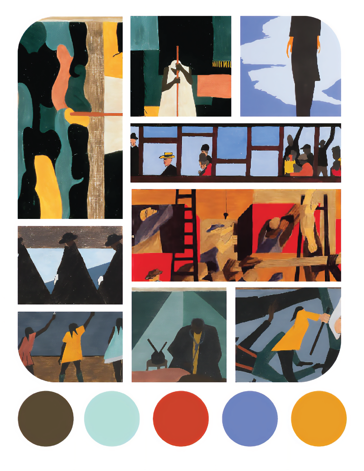
Jacob Lawrence moodboard
Jacob Lawrence moodboard
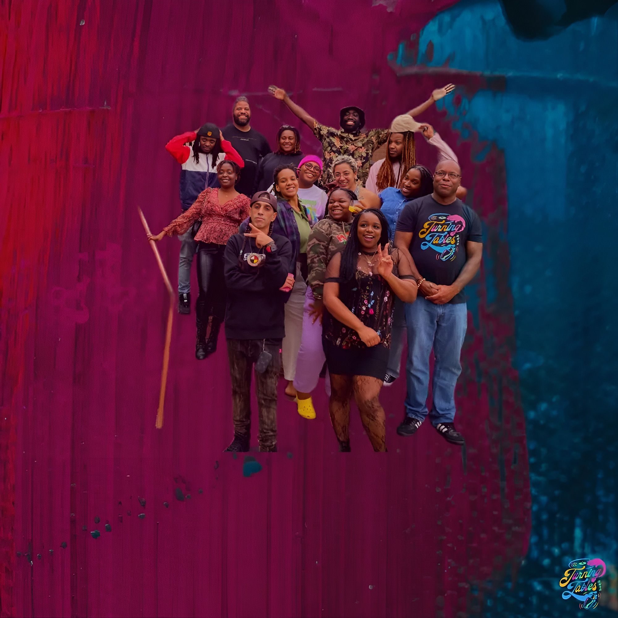
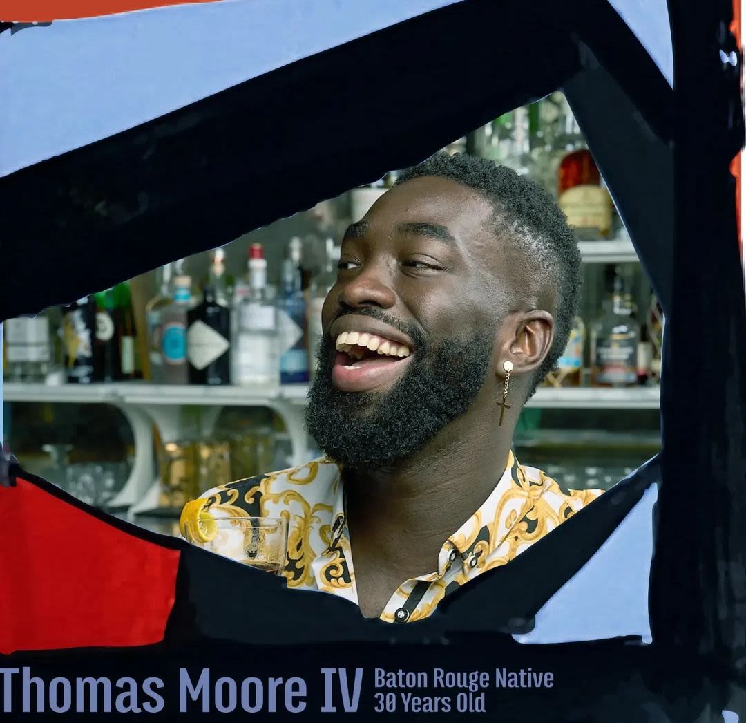
We want to highlight every student and to show their journey so that people are familiar with them. It’s nice when the students are recognised as a person from Turning Tables, it makes them feel a bit more seen, and our audience can go on the journey with them.
TS: Ray, did you have anything to add?
Ray Fontaine: One of the reasons why I created Bywater Branding is because there are non-profit organisations that are doing the hard work to pursue their vision, and I want to support their story being told and expressing their vision to the world.
As Touré mentioned, every year Turning Tables honours a different historic Black artist, and this year was Jacob Lawrence. So, we had a really good talk about the goals of this approach and what the assets we’re creating needed to achieve. More than just a graphic designer or a content creator, I’m really trying to capture the point of Turning Tables’ work.
We also wanted to be in a position where we’re not just doing a social media post, but we're building a library of content that we can then use in the future — a library of images and icons that shape a visual narrative for Turning Tables, and tell the stories that he's trying to share, about not only the students, but the people who contribute to Turning Tables.


I check in with my clients and have lots of checkpoints before I get too far into work. So I created this mood board and a colour palette that drew from a lot of Jacob Lawrence's work...
...Once we got that approved, I pulled out elements from that mood board and hand-illustrated and painted it and turned it into these digital components that now we use all the time for social media and for the newsletter.
I check in with my clients and have lots of checkpoints before I get too far into work. So I created this mood board and a colour palette that drew from a lot of Jacob Lawrence's work. Once we got that approved, I pulled out elements from that mood board and hand-illustrated and painted it and turned it into these digital components that now we use all the time for social media and for the newsletter.
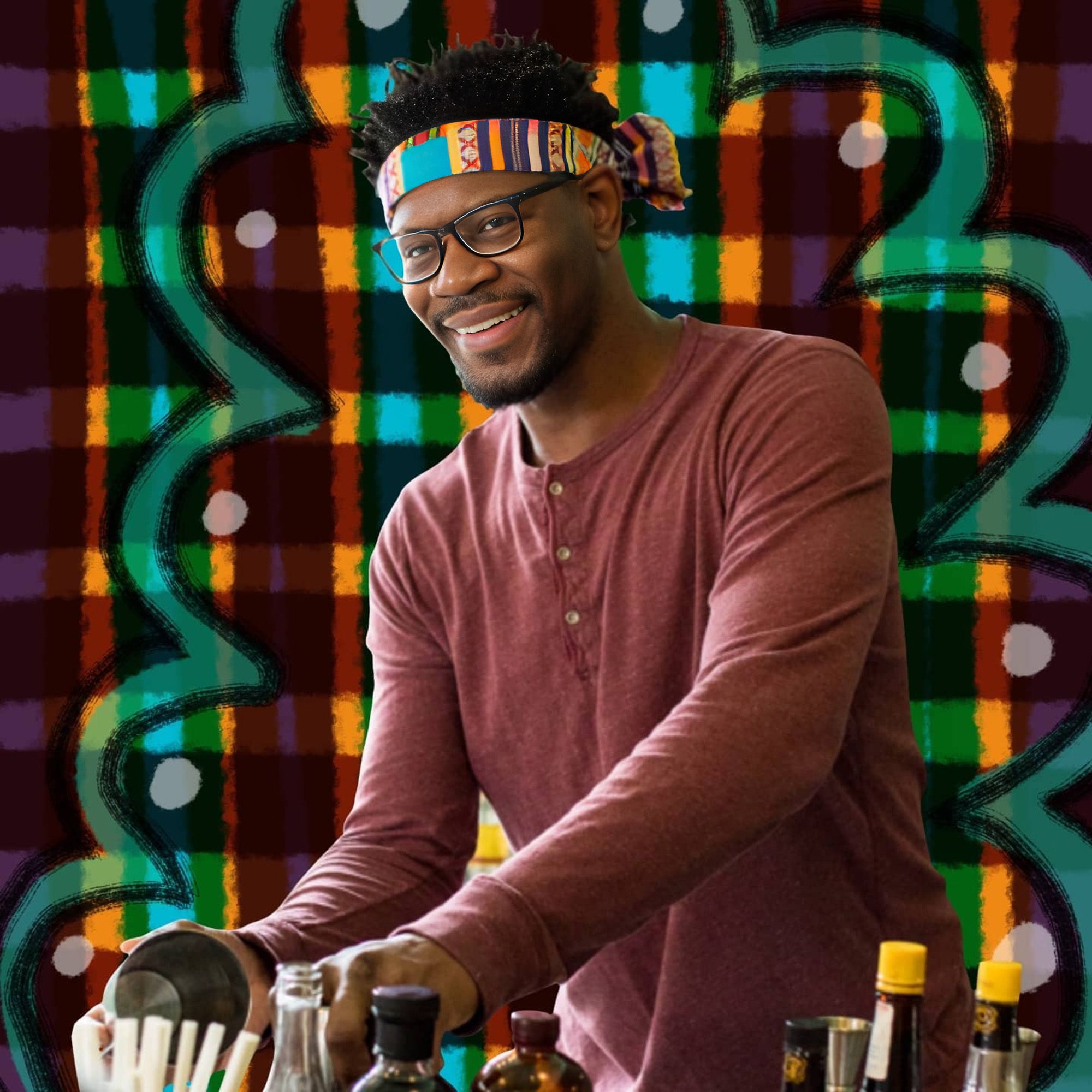
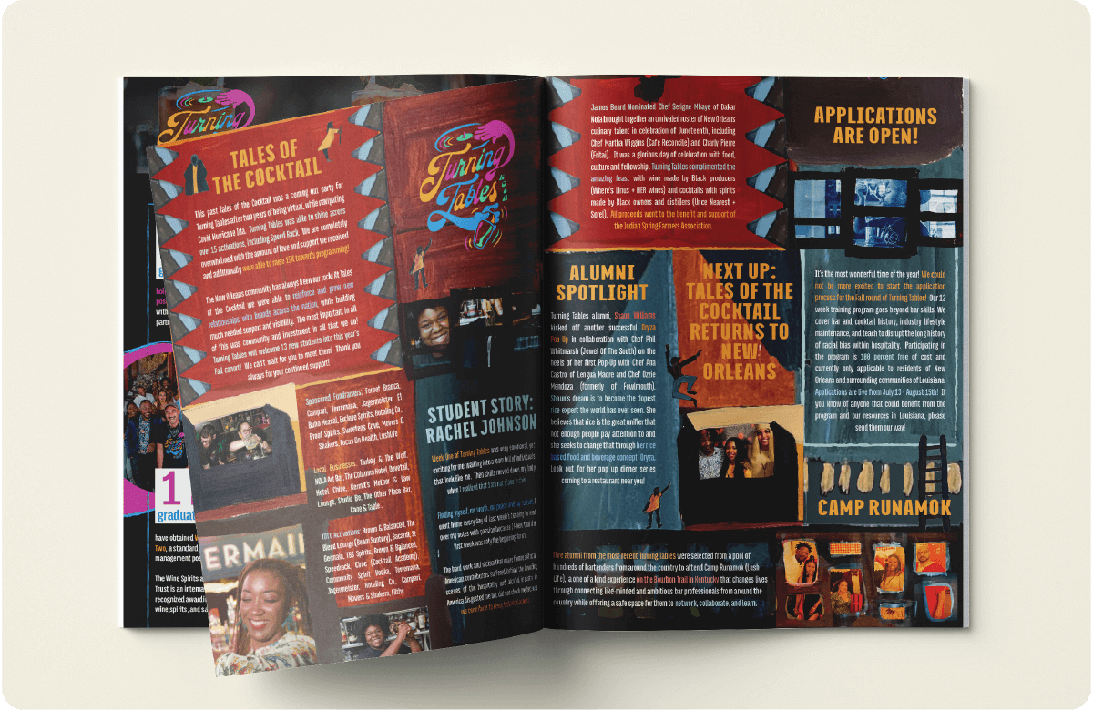
Turning Tables' newsletter
Turning Tables' newsletter
These selected components of Lawrence’s art can be featured over and over in different arrangements. Each time we post, we’re still drawing inspiration and honouring Jacob Lawrence’s work. It was a way that we could put a method behind the madness of content creation and stay true to what we're trying to achieve.
TS: Lawrence’s famous work The Migration Series (1940–41) was painted on hardwood boards, and I got that same sense from looking at Turning Tables’ Instagram — it has a tactile sense to it.
RF: Yes, I wanted to create the same texture, by hand painting.
TS: Ray, have you had any thoughts about how it is best to reference another artist’s work sensitively?
RF: There are two things: Ray Fontaine the artist, and then Ray Fontaine who is the branding specialist, who works with a brand to craft their visual identity and be the megaphone for their message. In the second role, I really try to take myself out of it, listen, and have lots of checkpoints.
I don't want to claim to be this masterful expert on all sensitivity issues, because I'm not; I don't know everything. What I do know is that I'm trying to create materials to support what Turning Tables is doing and Touré’s vision. I do this by having that mood board and checking in first by reading the artists’ history and stories.
I don't want to claim to be this masterful expert on all sensitivity issues, because I'm not; I don't know everything. What I do know is that I'm trying to create materials to support what Turning Tables is doing and Touré’s vision. I do this by having that mood board and checking in first by reading the artists’ history and stories. These guide me and I try to take inspiration and remain open throughout the entire process about how to honour someone other than myself.
One of the books we had at design school was "Steal like an Artist". It asked, what is the difference between plagiarism and inspiration? I want to do something where the audience can tell where the inspiration is drawn from, which means borrowing key components and capturing the spirit without just duplicating.
There’s a famous Jacob Lawrence painting with two women writing on a chalkboard. Instead of trying to duplicate this painting and then throw a picture inside of it, I created something similar that was inspired by that colour palette, but was my own creation; it is now a small element that gets put into larger designs.
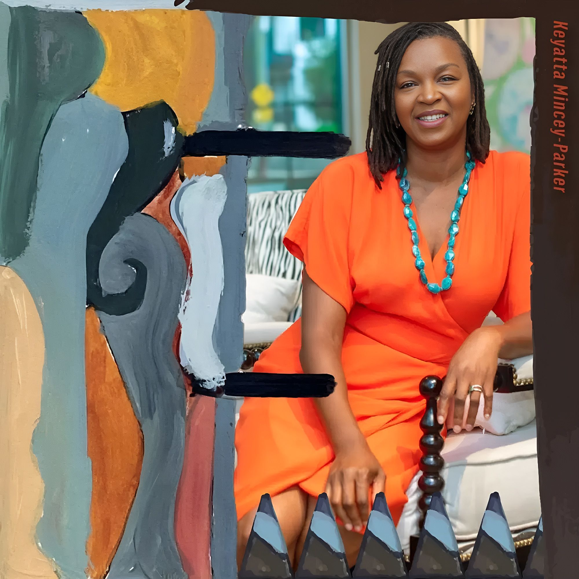
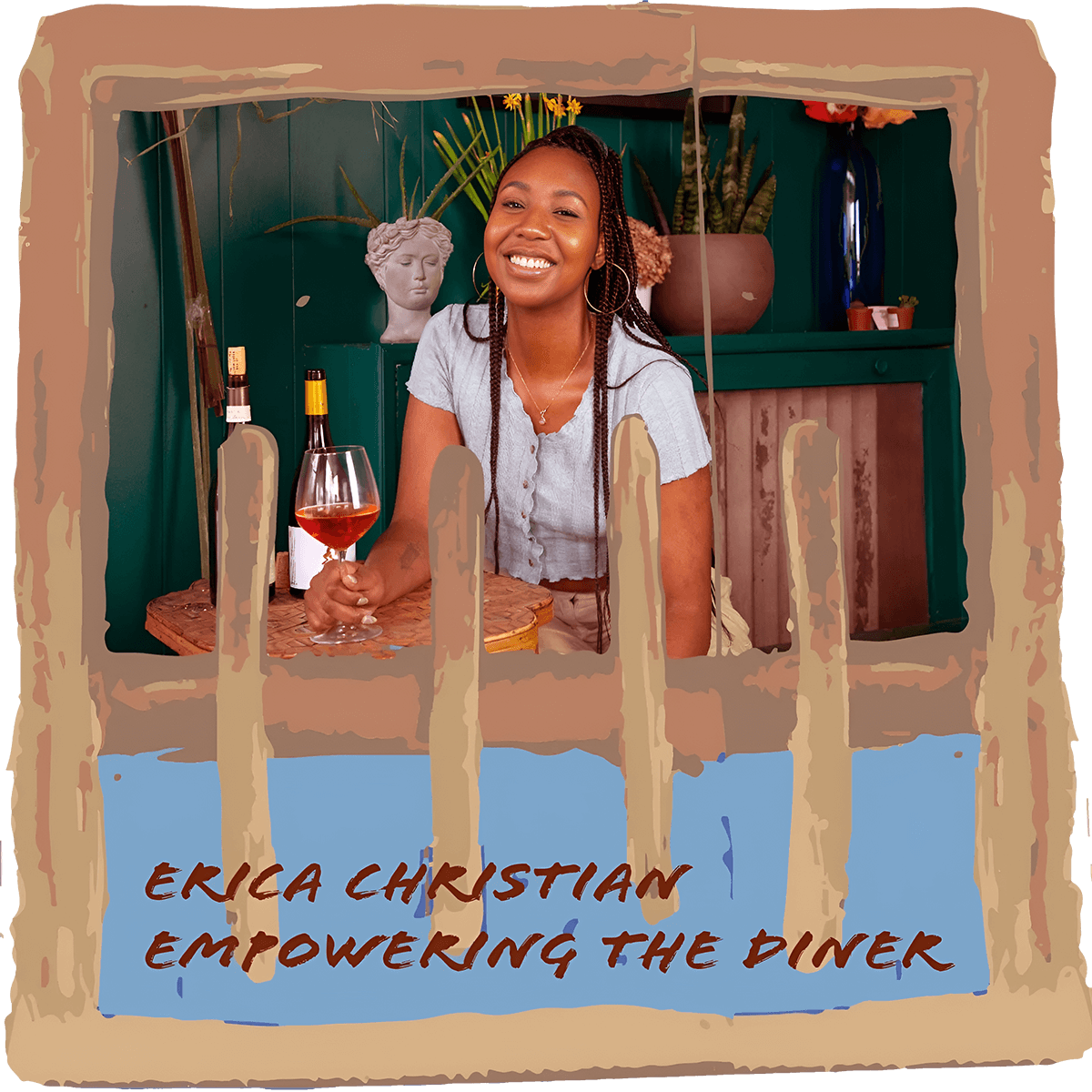
There's also a Lawrence painting with a series of windows and ladders and pieces of wood that are being carried and pulled out. I used the image of the windows and the colour palette and put photos of people behind the windows that existed in that painting, but not stealing the concept of that painting. Not trying to replicate it, but instead taking like the spirit of the craft and the motif.
Example of the ladder motif used in this image from this Instagram post from December 2022
Example of the ladder motif used in this image from this Instagram post from December 2022
TS: Do you have any thoughts on that, Touré?
TF: I think what Ray is doing is taking inspiration. I do think about what it means for a white woman to be drawing inspiration from Black art. I think we have a good process with Ray, and that she’s very aware that she’s not here to copy this other person's art, but to make it her own and to create a visual aesthetic for Turning Tables. We want people to open their browsers and always know that it’s a message from us.
TS: Would you say that the aesthetic you’re creating is something of a safe space for the externs? To be surrounded by their cultural heritage?
RF: I think my job in this situation is to create visual support for Turning Tables’ story. Touré, did you want to flesh that out?


I think that how Turning Tables communicates will evolve...
...In five years it’ll be interesting to see how the students visualise themselves, how they want to be seen, and what the social media will look like; it might be mostly video; it might be something completely different...
...but I have prepared for the time, two or three years from now, someone might say, “This doesn’t fit us, let’s do something different.”
TF: I think that how Turning Tables communicates will evolve. In five years it’ll be interesting to see how the students visualise themselves, how they want to be seen, and what the social media will look like; it might be mostly video; it might be something completely different, but I have prepared for the time, two or three years from now, someone might say, “This doesn’t fit us, let’s do something different.” Because they are from New Orleans, and they might be inspired more by New Orleans artists.
There are always so many new tools! I wish that I could divide myself into many people and just keep learning constantly because there's so much to know. And I'm an interdisciplinary artist and designer and so I'm passionate about mixing media, which I think is evident in my sketching and painting and then bringing it into digital.
TS: Ray, are there new platforms that you’re hoping to work in, in 2023?
RF: There are always so many new tools! I wish that I could divide myself into many people and just keep learning constantly because there's so much to know. And I'm an interdisciplinary artist and designer and so I'm passionate about mixing media, which I think is evident in my sketching and painting and then bringing it into digital.
I'm sure you know of Procreate, it's a big deal. And I was originally interested in its integration with all of these different brushes; it works with the tablet and you can really capture physical texture. But you can still hit command z! Which is cool! I’m wildly curious about this tool.
I'm also an animator both in After Effects, as well as in stop motion animation. So Procreate having this animation aspect as well, is awesome.
I have fears and excitement and confusion around the use of Canva. I love the accessibility that it gives people, allowing them to be creative in a world where digital marketing is such an important way of connecting with people.
At one point with Bywater Branding, we were trying to help small business owners and non-profit directors have the tools to create content on their own and get strategic guidance and training. But, as it turned out, it wasn't just about them not being able to physically do the work, they also just don’t have the time.


But now, if you have an idea, there's just this world of templates that are on trend and ready to go...
...I think Canva challenges me as a designer to commit to true artistry and individuality and create custom work that cannot just be built in Canva, but instead is so unique that you can only achieve that by working with someone who's creating something custom.
But now, if you have an idea, there's just this world of templates that are on trend and ready to go. I think Canva challenges me as a designer to commit to true individuality and create custom work that cannot just be built in Canva.
TS: Touré, do you feel like your personal style is present in Turning Tables’ branding?
TF: I think the logo our designer came up with couldn't have nailed it any better; it’s completely like us.
Growing up in New York, the music, and the bright colours of graffiti are definitely my culture — hip hop is my culture.
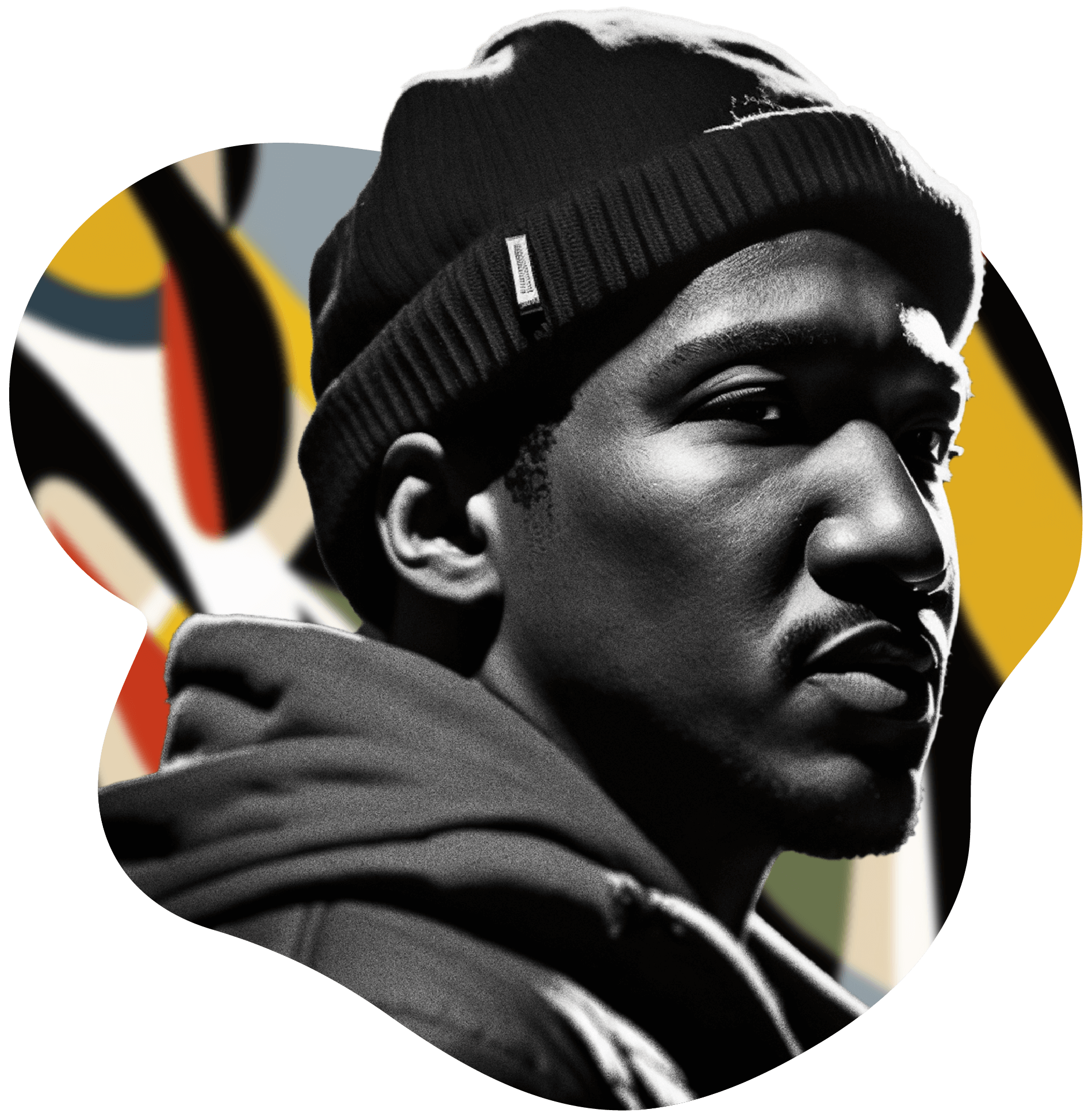
We were talking before about homage versus imitation. There’s a line that Q-Tip said once that, hip hop artists came from communities where they were not educated properly, they weren’t given anything. It was the crack era, it's the AIDS era. There was so much poverty in Black neighbourhoods that a lot of people in those communities didn't have anything. But what they did have was music that they could reinvent. To take music, sample it, remix it, and make it something that was new and fresh and make it there was something that was theirs.
We were talking before about homage versus imitation. There’s a line that Q-Tip said once that, hip hop artists came from communities where they weren't educated properly, they weren’t given anything. It was the crack era, it was the AIDS era. There was so much poverty in Black neighbourhoods that a lot of people in those communities didn't have anything. But what they did have was music that they could reinvent. To take music, sample it, remix it, and make it something that was new and fresh and make it there was something that was theirs.
So that energy is a part of my DNA. And, to take it even a step further, I don't think there are any other non-profits that exist like us. So I think we're remixing a little bit how it’s possible for people to be in a community and make social change.
I think we're remixing a little bit how it’s possible for people to be in a community and make social change.
If I have one more person call me a charity! It is a a lot more empowering to feel that you are in community with others.
What we’re doing is in community with people. There are charitable elements, but we’re not helpless and we do all that we can to collaborate and work with our community. If I don't get a grant tomorrow, it'll suck. But we’ll do events, we have relationships with people. We'll get the money that we need to exist. We'll do the things that we want to do because we're just gonna do it, whether it's part of the normal non-profit wheel or not.
RF: One of the things that I love about my job is getting to work with organisations like Turning Tables that are doing things differently.
I think that even beyond the concepts of charities and non-profits, this organisation works to create a network of benefit and positive impact. Turning Tables enriches a community of young aspiring professionals, BIPOC businesses, and cocktail culture itself.

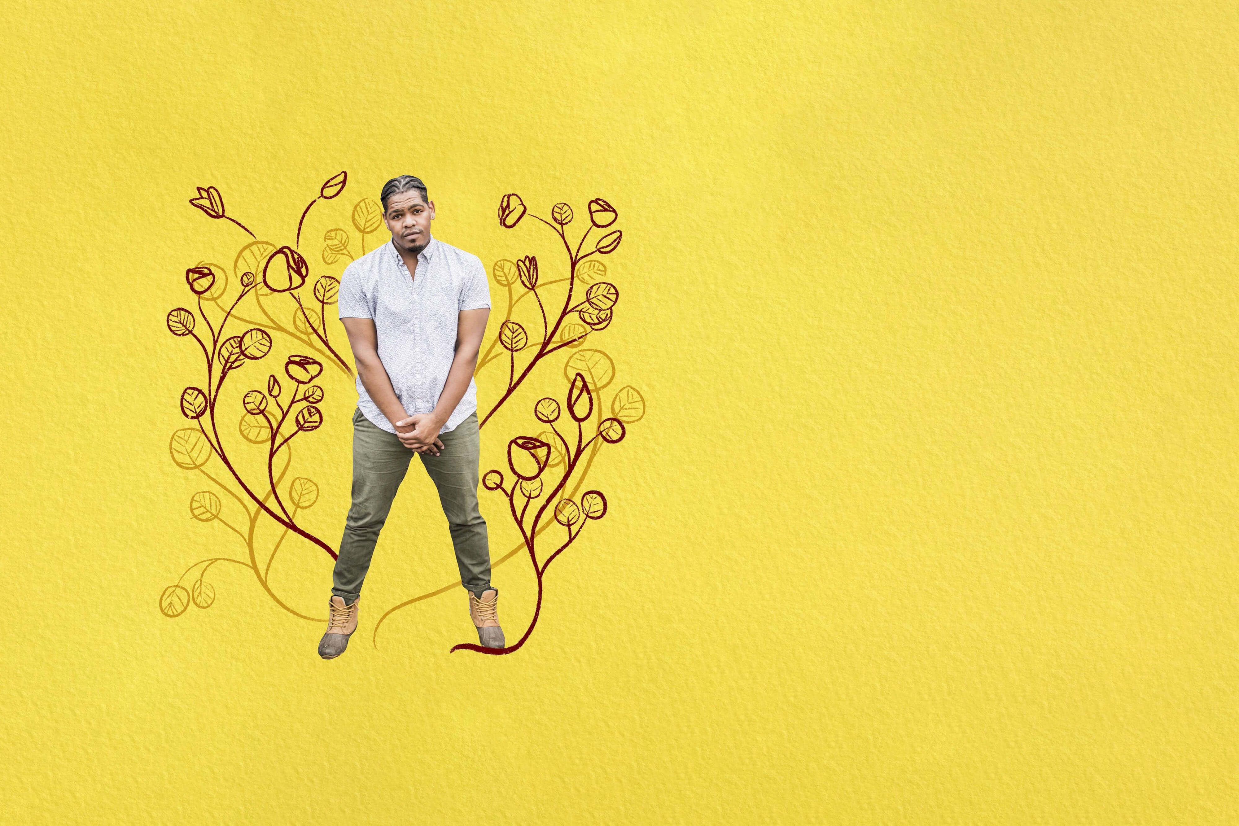
You're not just showing your students how to carry plates! You're helping them figure out their identity and their future...
...and to dream and giving them the connections that empower them to actually go after it and make it real.
TF: One of my students, who is from New Orleans, said to me, “Touré, man you need to stop calling us a bartending programme. It does so much more than that!”
TS: Do you plan to expand Turning Tables outside of New Orleans?
TF: This was the first year that I was able to travel and as a result I've formed relationships or like a mentorship capacity with people in Utah, Portland, Maine, DC, and even Oaxaca. It’s really interesting to be in community with individuals looking to work in parallel universes.
I'm a person that likes to be in different spaces, but if I could bring this home, that would be amazing to me. I would love to bring this gift back to the place that I came from, so that people in New York who look like me can have these opportunities as well.
I'm a person that likes to be in different spaces, but if I could bring this home, that would be amazing to me. I would love to bring this gift back to the place that I came from, so that people in New York who look like me can have these opportunities as well.
All images courtesy of Turning Tables, except the images of Q-Tip and the people drinking cocktails, which were generated by Midjourney.


