inside
books:
Vasanti Unka's award-winning illustrations are full of visual tricks, play, and humour — kids run and jump across swatches of watercolour, words leap from mouths and take the shape of buildings.
In this interview, she chats to Thomasin Sleigh about growing up as an Indian kid in Tāmaki Makaurau Auckland, learning to love detail, and avoiding her computer.
Thomasin Sleigh: Vasanti, how did you come to work in illustration?
Vasanti Unka: It was an accident, really. It was a long time ago, when I'd just had my first child, and I stopped working to look after him. Before that, I was a graphic designer, and I’d never actually illustrated before but, for some reason, people think it's the same thing.
A friend of my sister’s approached me. She came to my house with a CD of kids singing preschool songs and she wanted to make a book out of it. So, I illustrated it and she managed to sell it to a children's book publisher, and then they asked for another one. I did lots of books with her, and that started me on my illustrating path.
TS: Were you a big reader as a kid when you were growing up? Were there particular illustrators that you can remember from your childhood?
VU: I’m really quite old! I grew up in a family that was quite poor. We grew up in Pukekohe, south of Tāmaki Makaurau Auckland, in a market garden and there were six of us kids and there wasn't a lot of money. Nobody bought us books.
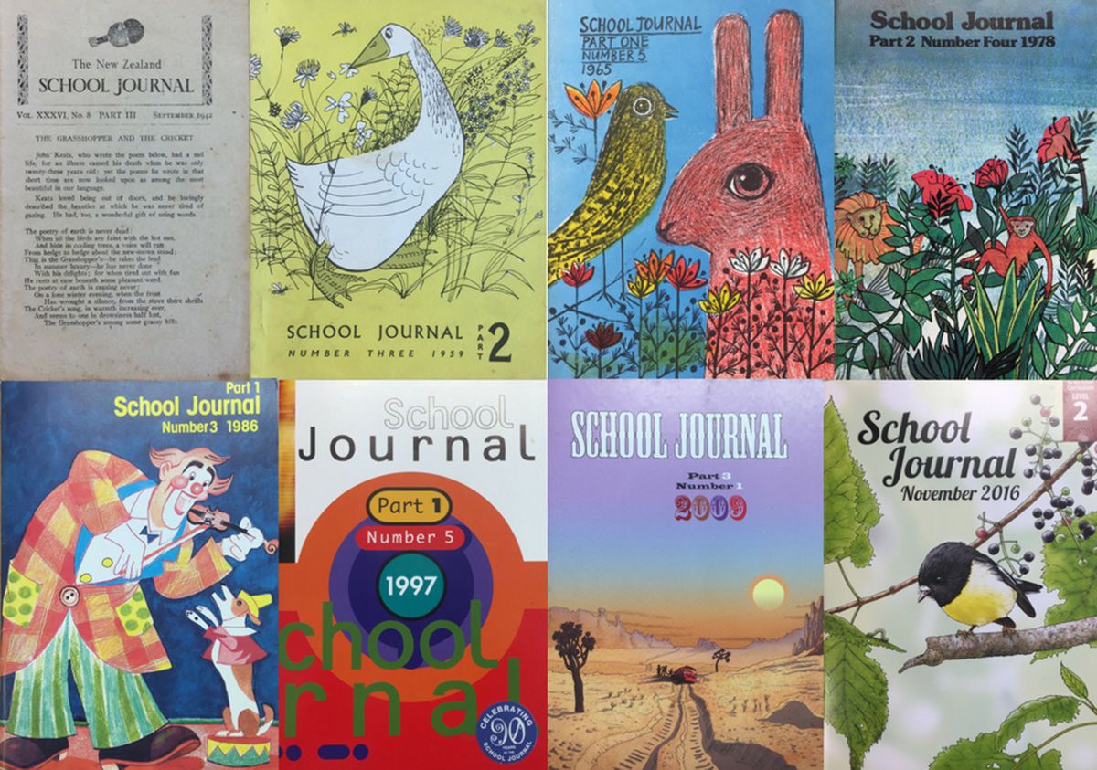
The books that we had at home were school journals that somebody, one of my older sisters, had forgotten to take back to school. Honestly, the artwork in those journals had a big impact on me.
The New Zealand School Journals 1942–2016
The New Zealand School Journals 1942–2016
The books that we had at home were school journals that somebody, one of my older sisters, had forgotten to take back to school. Honestly, the artwork in those journals had a big impact on me. Jill McDonald was the main illustrator that I loved in those journals. I can still feel the atmosphere of them.
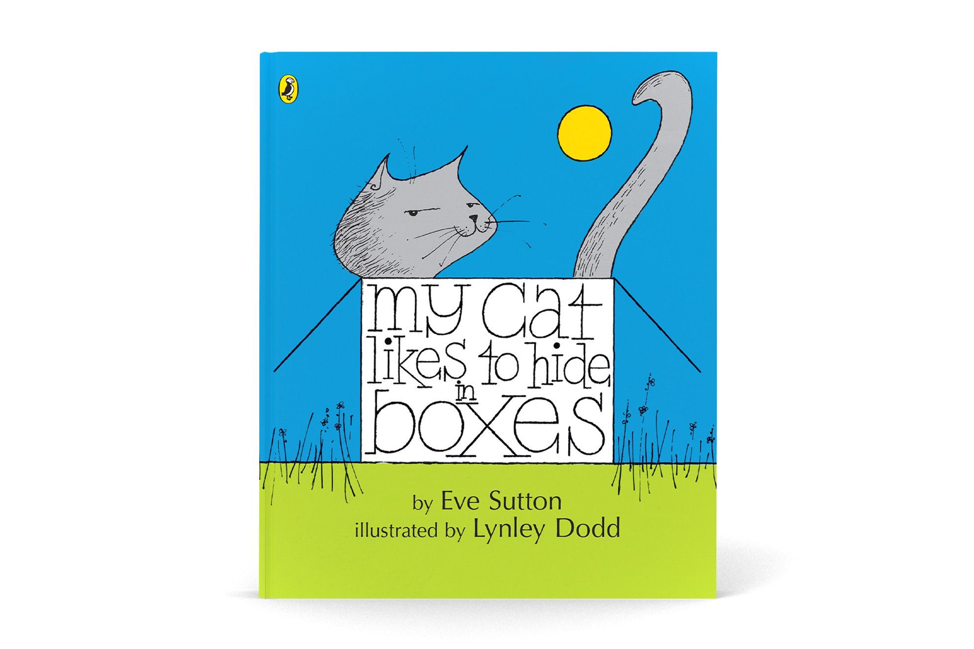
When I was older, I loved the illustrations of Lynley Dodd, when she first started. We’re so used to her artwork now, but when we first saw her art, it was just so innovative and new and fresh.
TS: Her work is so much a part of the national psyche of Aotearoa New Zealand. It's interesting to hear how innovative she was when she was first starting out.
VU: Yeah, like My Cat Likes to Hide in Boxes and The Nickle Nackle Tree — that was quite out there and modernist, at the time.
My Cat Likes to Hide In Boxes — by Eve Sutton and illustrated by Lynley Dodd
My Cat Likes to Hide In Boxes — by Eve Sutton and illustrated by Lynley Dodd
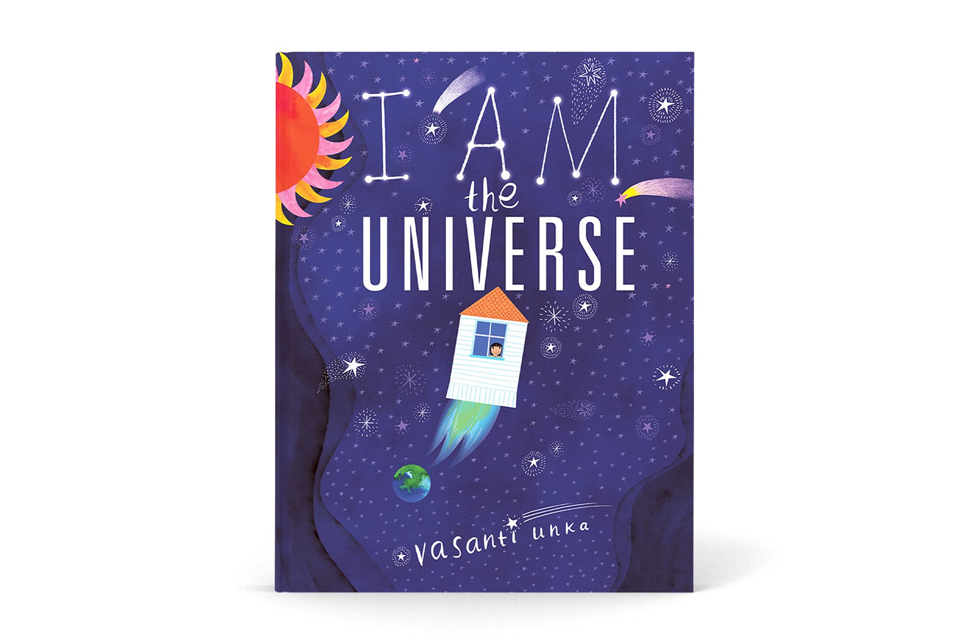
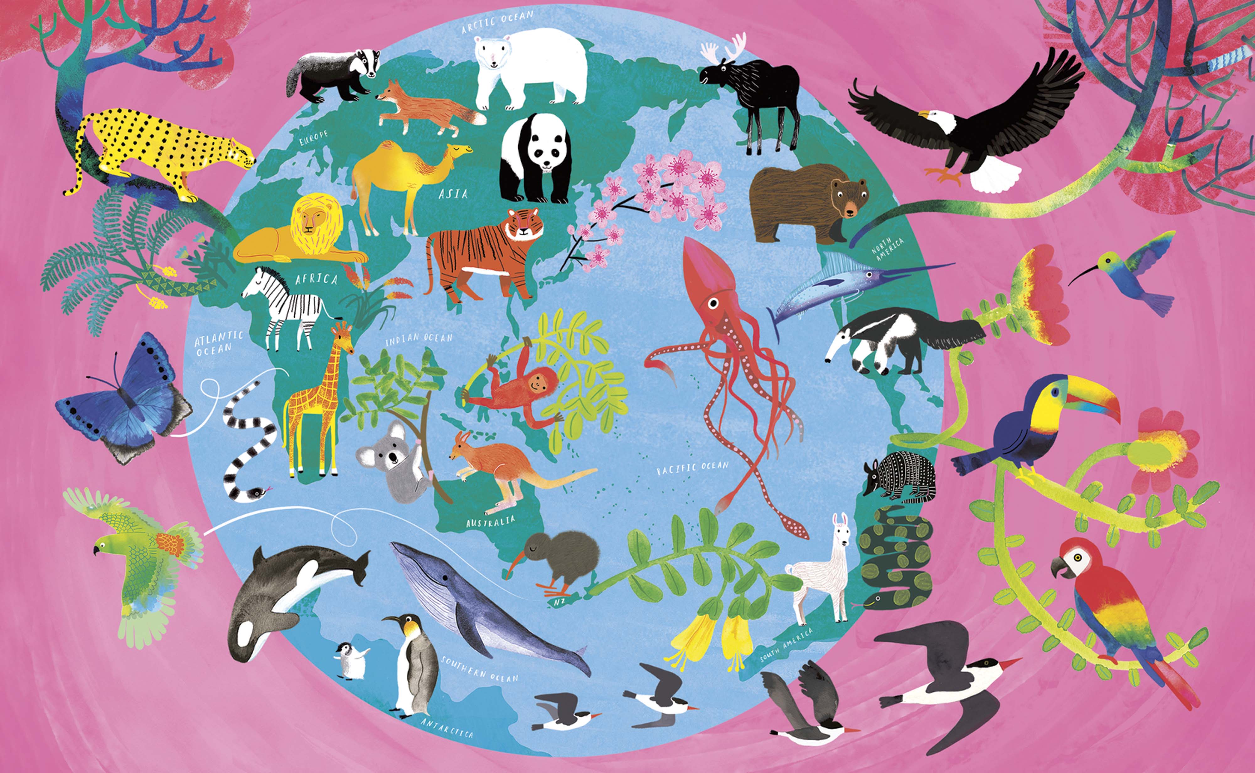
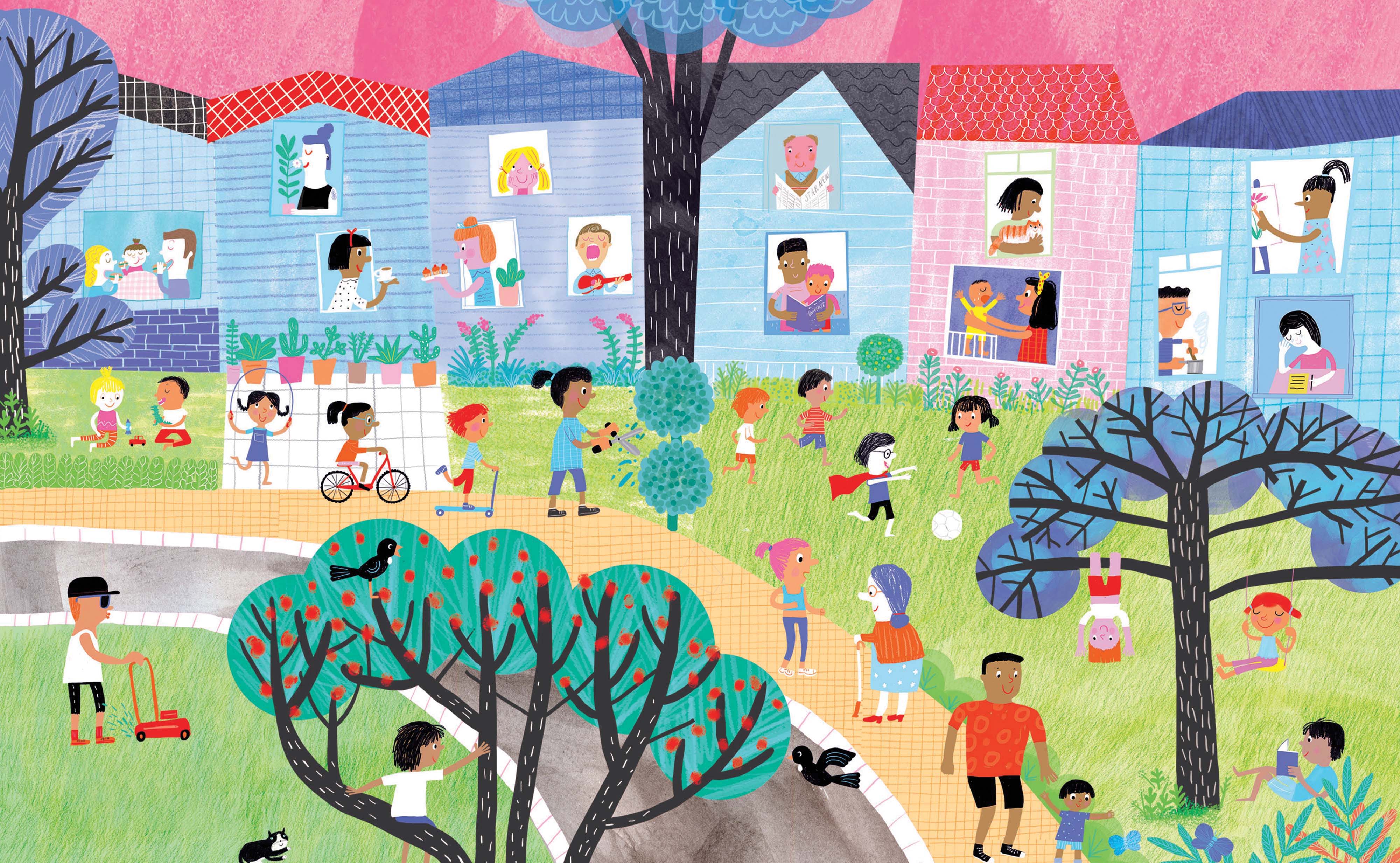
TS: At my house, with my kids, we love your book I Am the Universe. I love how this book moves from micro to macro. When you begin a project, do you have it all in your head when you start, in its entirety?
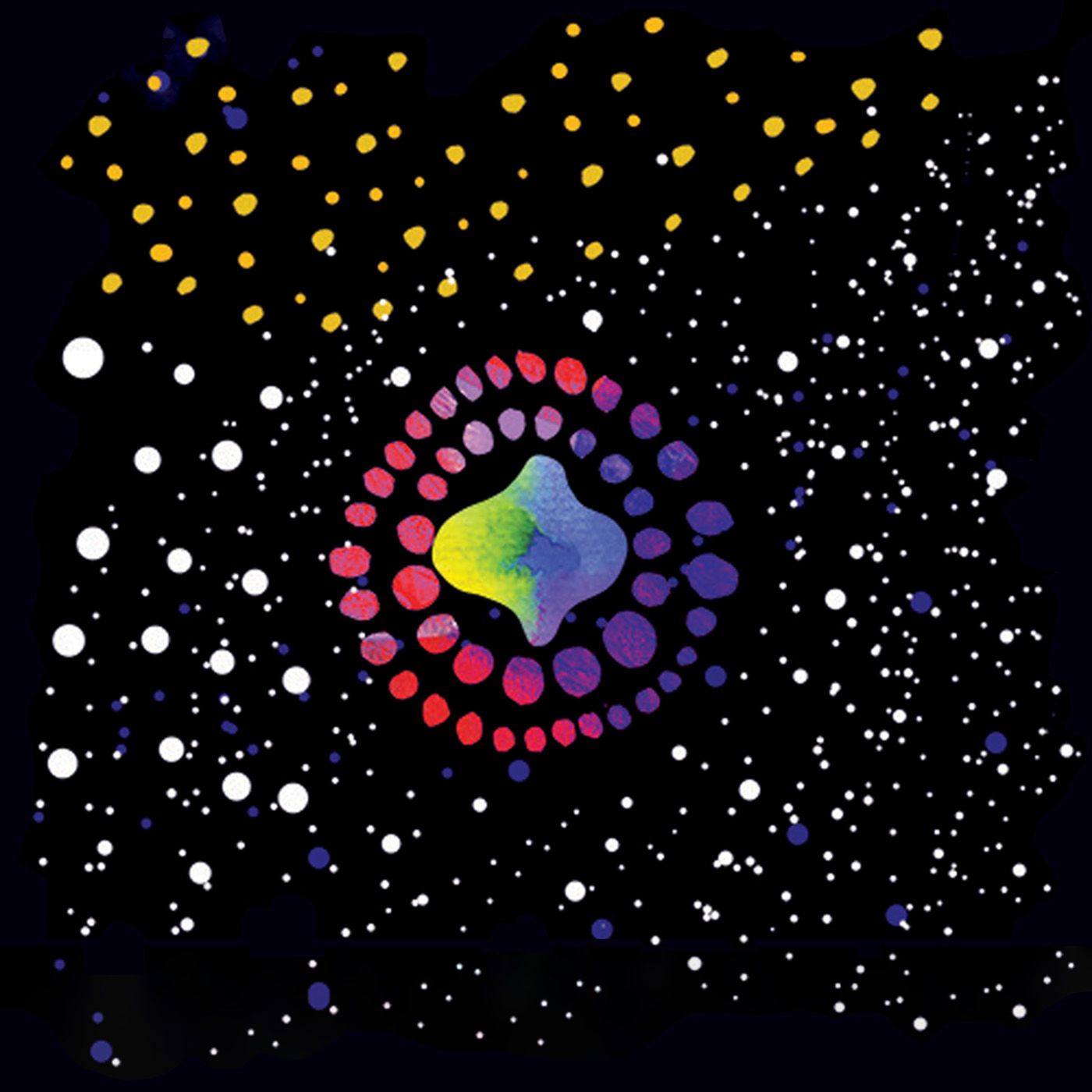
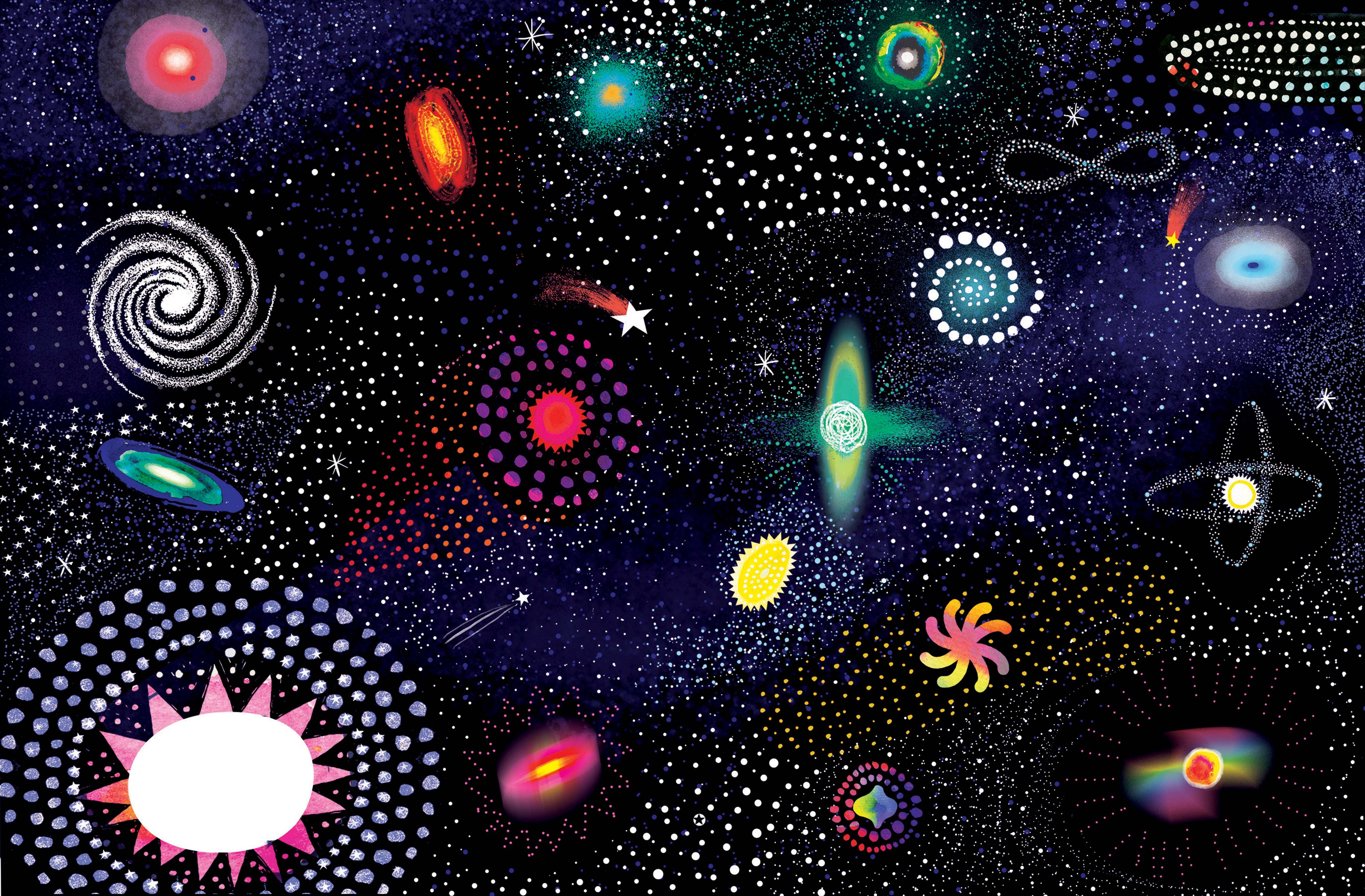
I am the Universe — Vasanti Unka
I am the Universe — Vasanti Unka
A book starts as a rough blob in my head — like a flash of an idea — and it takes a long time to mold and refine it, every single page takes a long time to refine further.
VU: Yes, I do. A book starts as a rough blob in my head — like a flash of an idea — and it takes a long time to mold and refine it, every single page takes a long time to refine further. But the whole does usually come at once from beginning to end.
TS: One moment that I love in I am the Universe is when there's the cover of I am the Universe actually in the book, there’s a doubling of the book, in the book. Do these visual tricks come to you in the middle of a project?
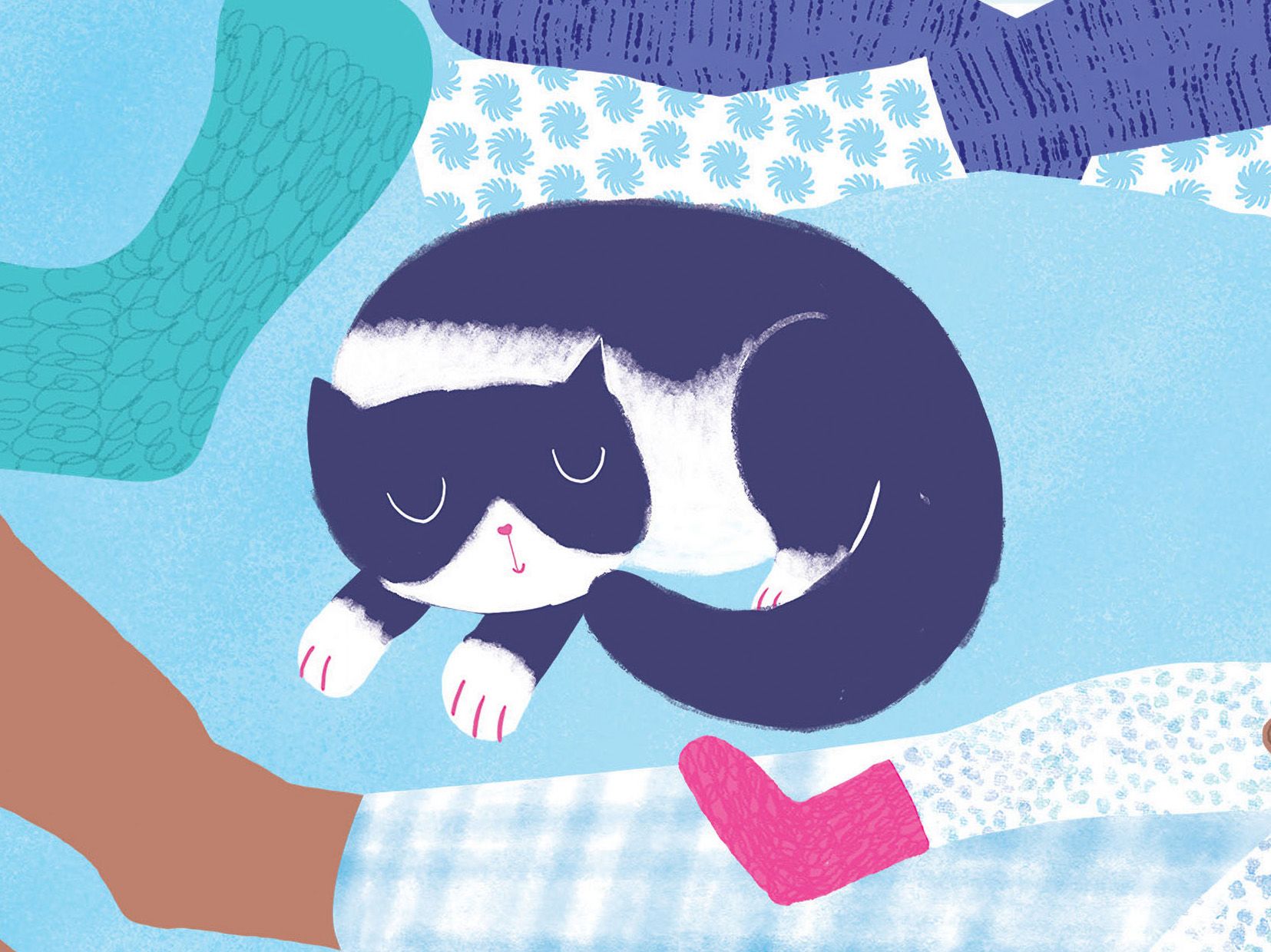
VU: All the time! I wish I could do more of this. I like playful and silly things. My cat is in that book, too. When I go to do a school visit, I always take photos of my cat that I show the class, so they’re on the lookout for my cat in the book.
Vasanti's cat in I am the Universe
Vasanti's cat in I am the Universe
TS: Your style has a cutout effect. In I am the Universe all the planes and objects sit on top of the background, so that they’re almost touchable. I've noticed that my son reaches out and touches the pages. How do you do that slightly cut out 3D effect in illustrations?
VU: That's so awesome that your son does that, because that's honestly the effect I'm trying to create. I love texture, and I aim for people to enjoying touching my books.
I work in many different formats. I will hand paint things, plus I will do some stuff on the computer in different programmes, and then I combine it all, so there is quite a lot of cutting out and placing onto backgrounds.
TS: What is the relationship between your analog and digital work? What’s the workflow between your hand-drawn work and the online tools you use?
I've become more and more digital just because it's easier and less for me to clean up! But I do really prefer the hand-done look. So if I can do the digital to make it look as if it’s done by hand, that's what I'm aiming for.
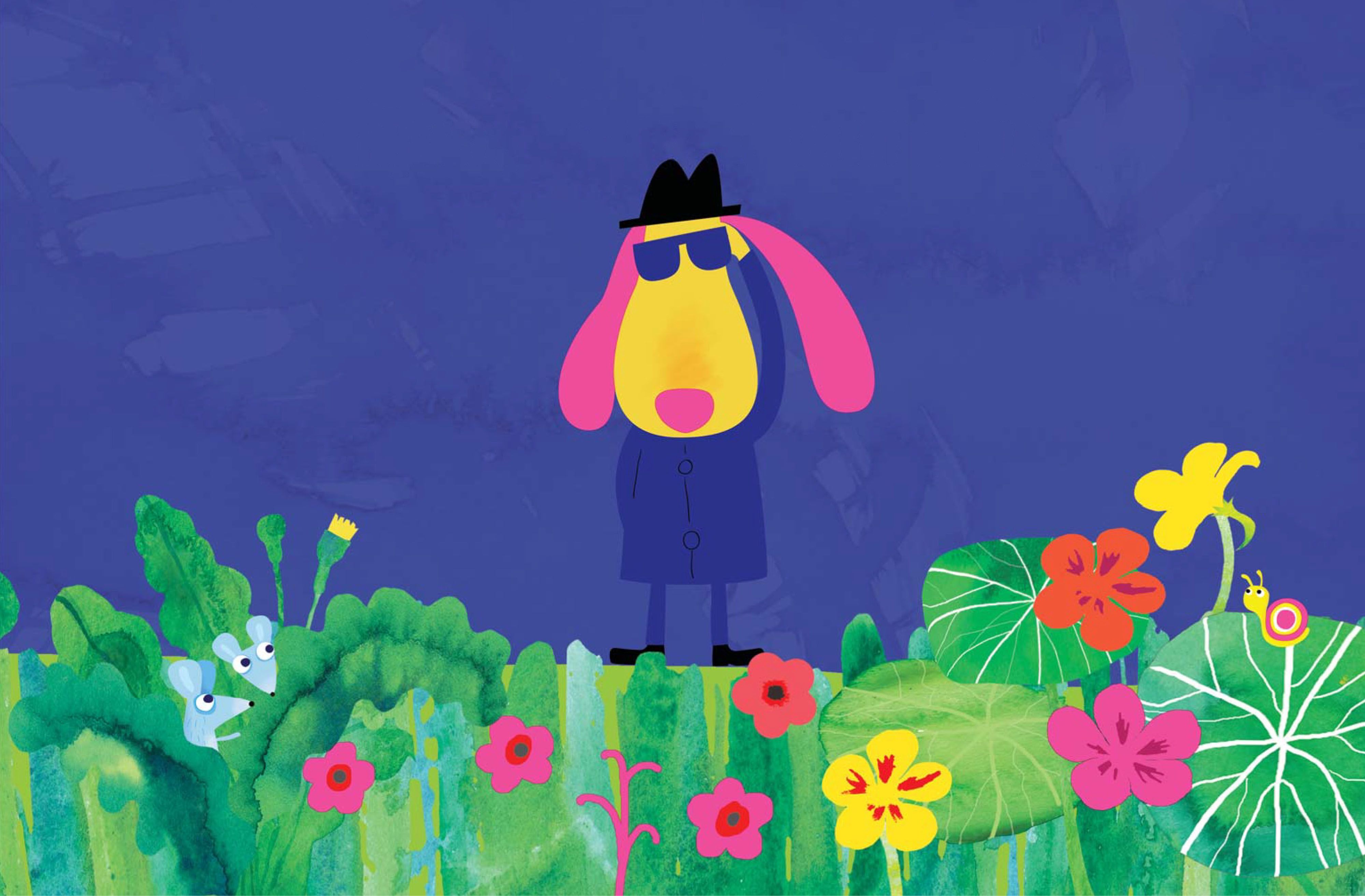
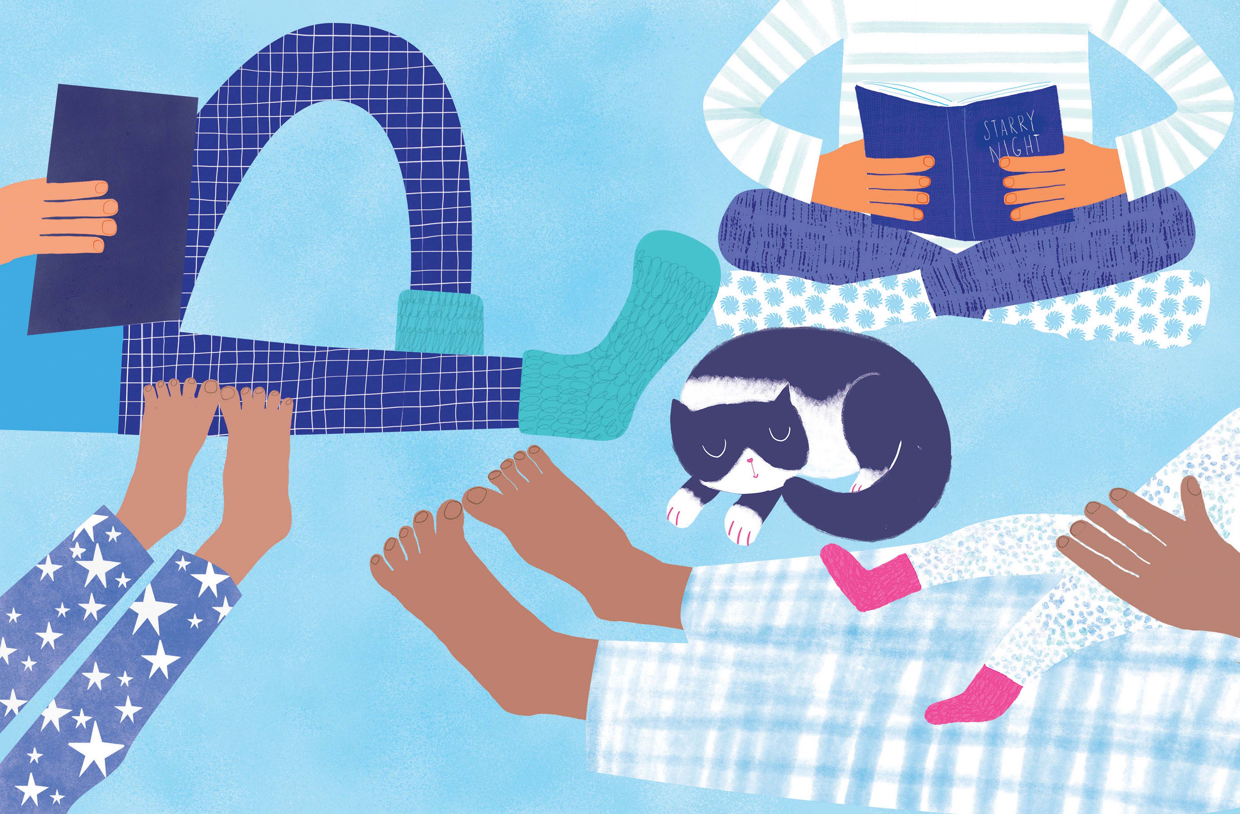
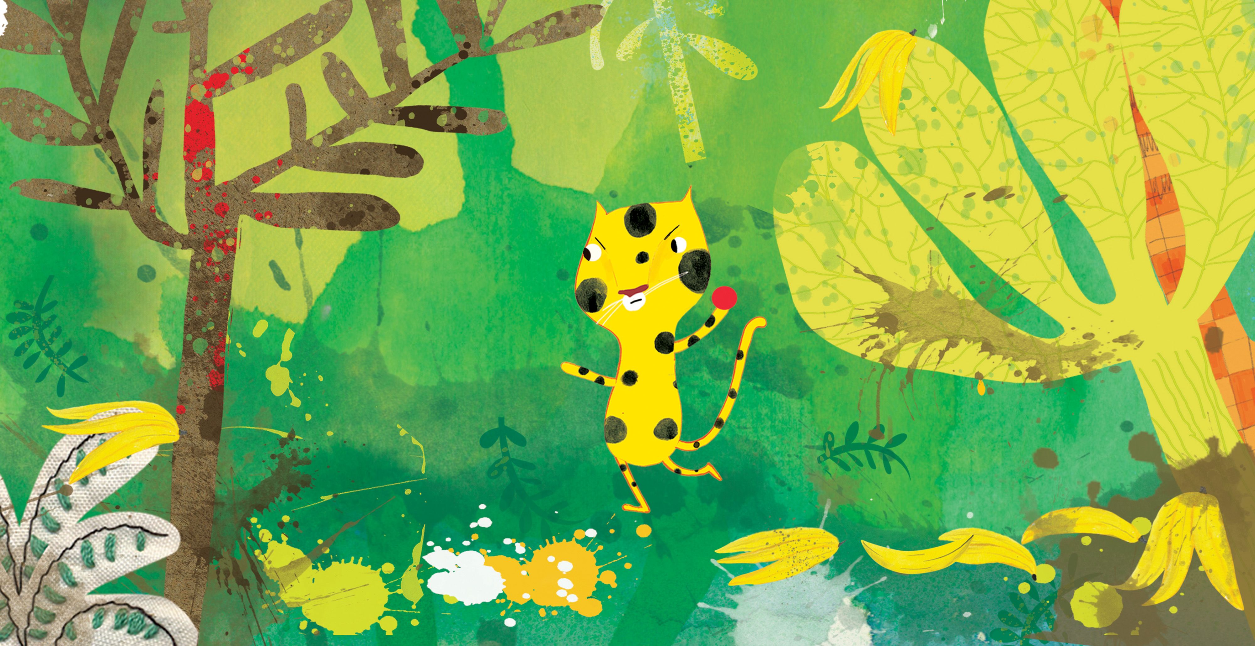
VU: I've become more and more digital just because it's easier and less for me to clean up!
But I do really prefer the hand-done look. So, if I can do the digital to make it look as if it’s done by hand, that's what I'm aiming for. I like to combine both digital and analogue because when you're doing stuff with your hands, like watercolors for instance, looking for lovely textures, they often happen by accident, and I like all the accidents that happen in the process. I spend too much time experimenting, but to me that's the interesting part.
I like to combine both digital and analogue because when you're doing stuff with your hands, like watercolors for instance, looking for lovely textures, they often happen by accident, and I like all the accidents that happen in the process. I spend too much time experimenting, but to me that's the interesting part.
TS: Do you think you can make a digital accident?
VU: You definitely can. I don’t like the very super airbrushed things that look really skilled and, I mean, they are really skilled. Whereas my work looks like it requires no skill. But I do spend a lot of time with them. Probably as much as an airbrush artist would.
I do like some airbrushed work, it’s so sleek and wonderful that they don’t seem human, almost.
TS: That’s interesting in relation to the contemporary discussion around AI technologies of creating images and where the human-ness lives in those images.
VU: I think there is very human intelligence involved in those images, in the humour. I've looked at some of those images and they're really funny.
TS: You're right, and that doesn’t just come from nowhere.
VU: It’s in the prompts, and I think that’s the art form.
TS: What’s your research process for a book?
VU: I have an idea of an illustration style that I’d like to pursue in my head. I don't like my work looking the same as previous projects; I try to always venture out and learn new things while I'm doing it.
Before I am the Universe, I was quite afraid of doing detailed artwork because it takes such a long time and I was afraid of doing so many tiny things in one picture. But I learned to love it and to really appreciate doing it. And I love pattern, and I saw that book as an extended way of doing pattern.
I am the Universe started with the first illustration, and often if I can make the first illustration work the way I want it to, the rest will follow suit. The first illustration doesn’t need to be the first in the book; it just needs to be one that I think I can carry that style through the whole book and enjoy doing it.
The first illustration doesn’t need to be the first in the book; it just needs to be one that I think I can carry that style through the whole book and enjoy doing it.
TS: In The Boring Book, there's all this amazing typographic play with font and type and the words having this life of their own. Which one came first? The words or the graphic elements?
VU: That was my first launch into doing my own kids' books. I had the idea because I was designing a book for a company that was really a boring book. And I was thinking, “Who on earth is going to read this book?”
I was in the shower one morning thinking, “Oh no, I’ve got to work on this book today.” It was taking longer to do the book because it was so boring. I started imagining a children’s book about words, stuck in a boring book going off and having a party and doing their own things.
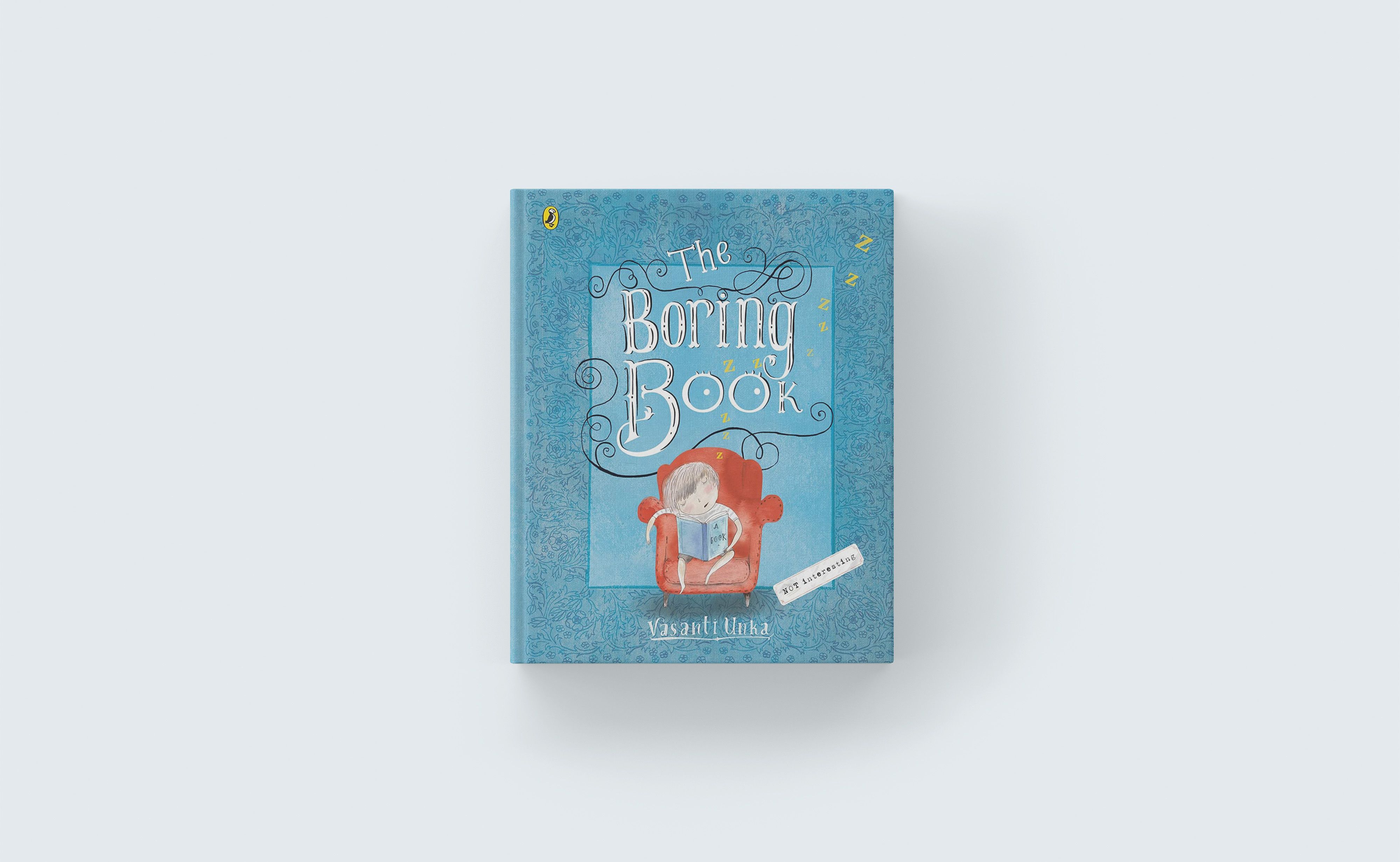
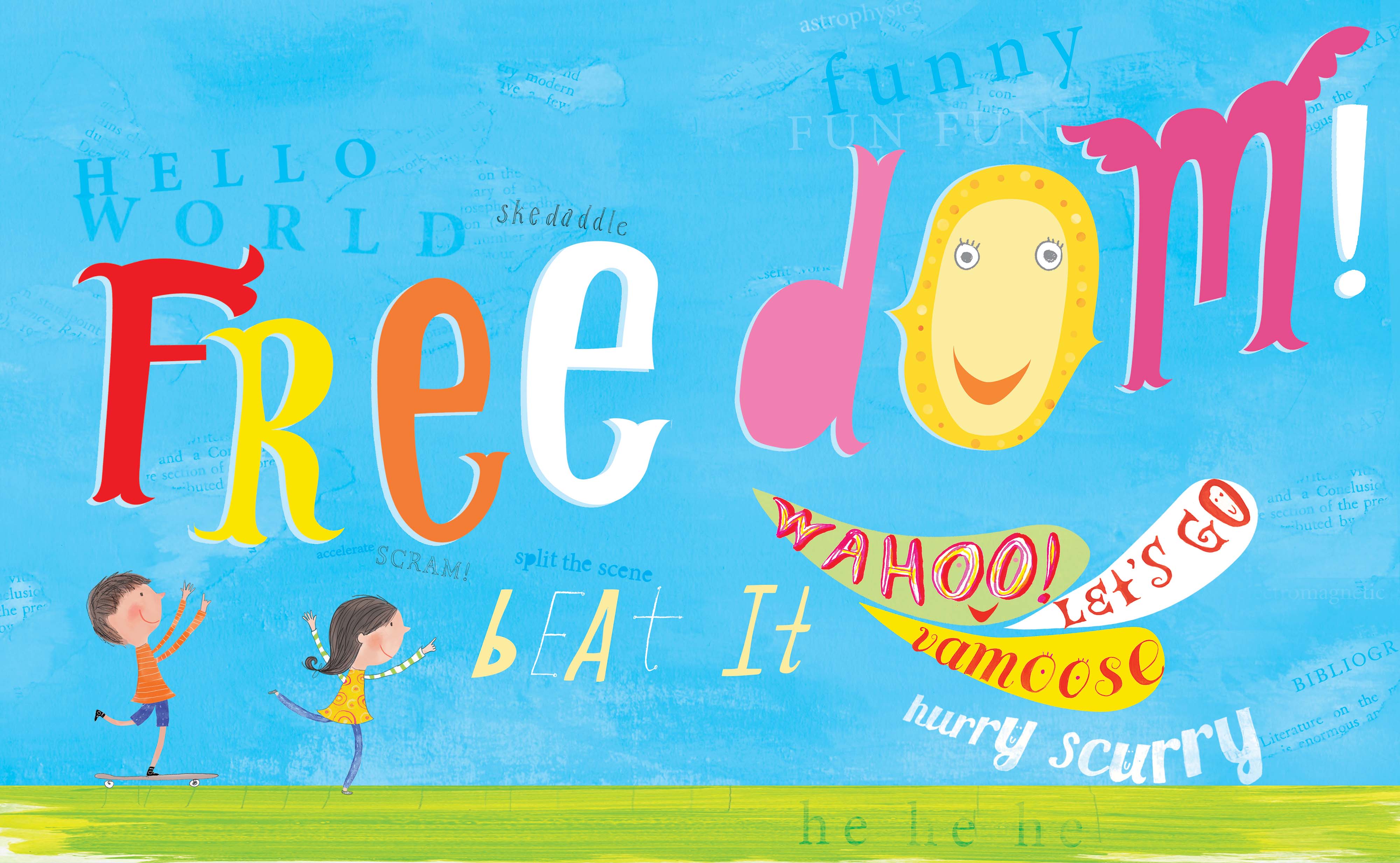
I was in the shower one morning thinking, “Oh no, I’ve got to work on this book today.” It was taking longer to do the book because it was so boring. I started imagining a children’s book about words, stuck in a boring book going off and having a party and doing their own things. Then I talked to the Commissioning Editor at Penguin, and she told me it was a good idea and to go away and write it. It was like an order, a challenge.
But I did nothing about it for a long time, but every time I bumped into her, she’d ask me about it, and she’d say, “Have you written your book, yet?”
One day, we were at the Auckland Writers Festival, going to see Oliver Jeffers speak. I remember that he said he didn’t feel like a writer at all, but he makes these books because they’re inside of him. And, I thought, “I feel exactly like that.”
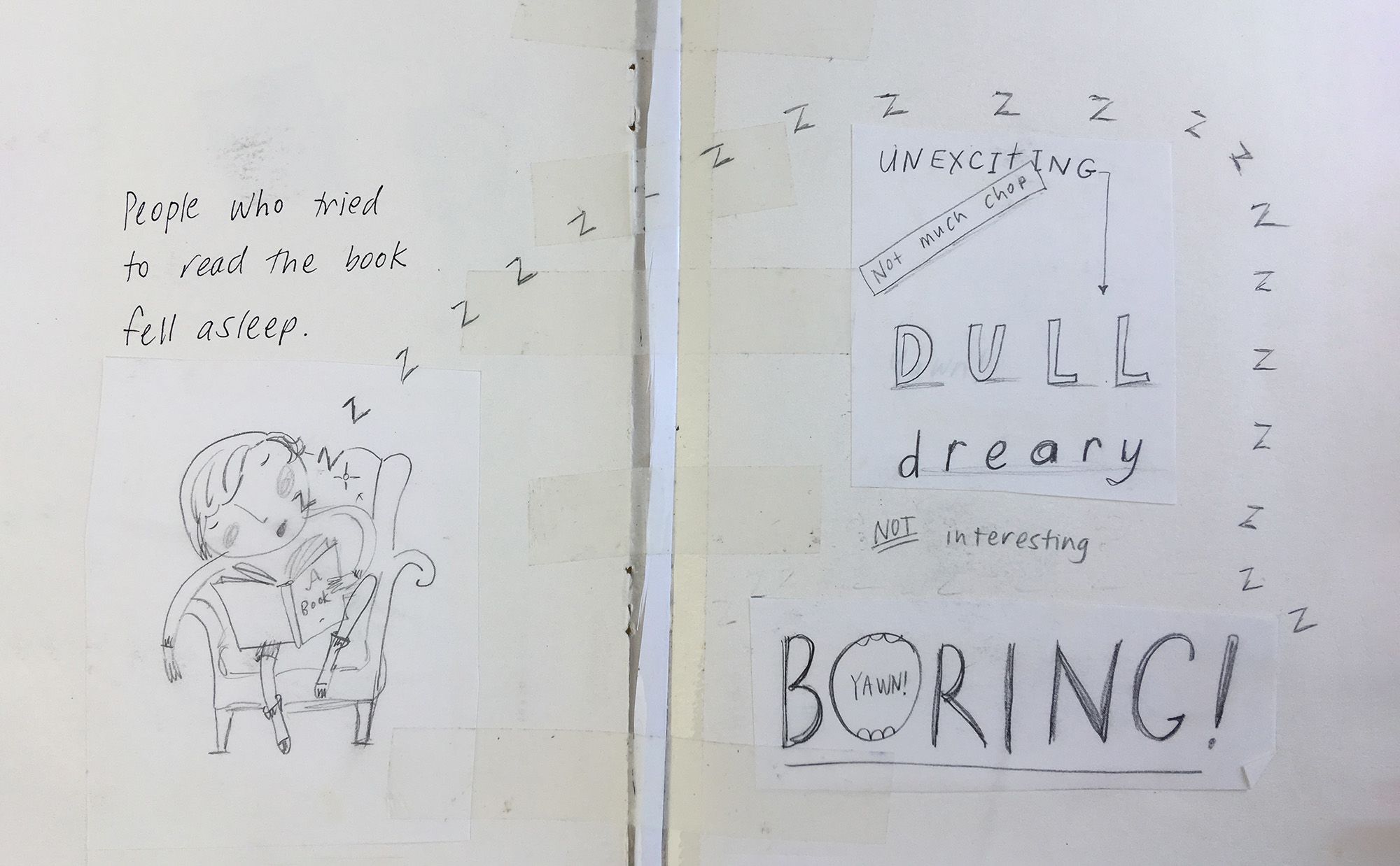
When I went to get my book signed by Jeffers, the editor from Penguin came up behind me in the queue and she asked me again, “Have you written your book?” So, that week, I started. But I couldn’t sit down at the computer, so I started making quite a few little books out of cut out and glued paper. My book got bigger and bigger, made out of these smaller books.
Draft design and layout for The Boring Book
Draft design and layout for The Boring Book
I finally took the book to the editor and she was happy to keep it. I drove home that day feeling happy that she just wanted to keep my book!
Then a couple of weeks later she rang and said, “Oh, we're gonna publish it.” And honestly that was the happiest day of my life. Even more than when I've had my kids. Don't tell them! No, it's probably not as happy as that, but it was so happy.
TS: I see you go out and do quite a lot of work in schools with your books. What is it like to see your books out in the wild with kids?
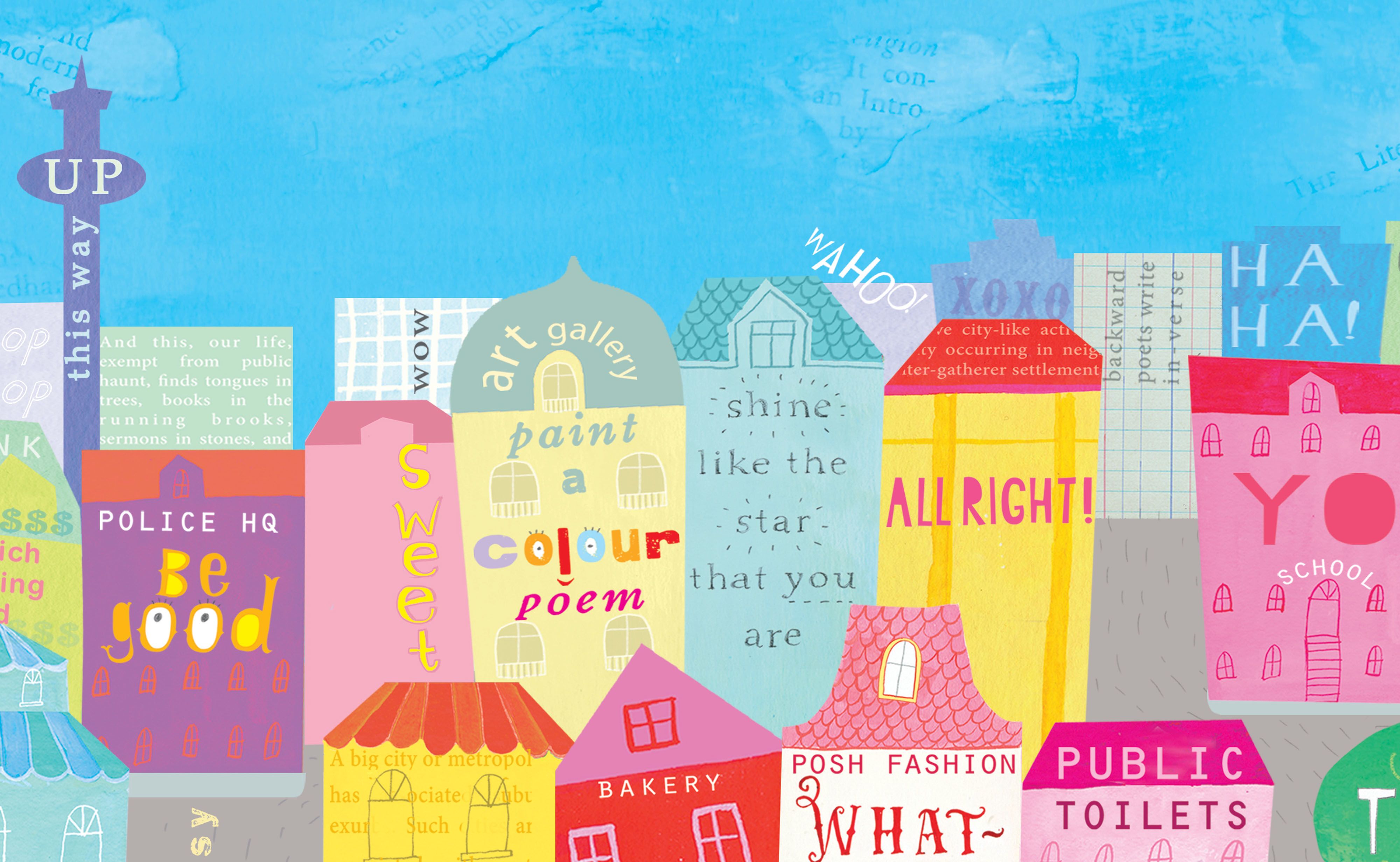
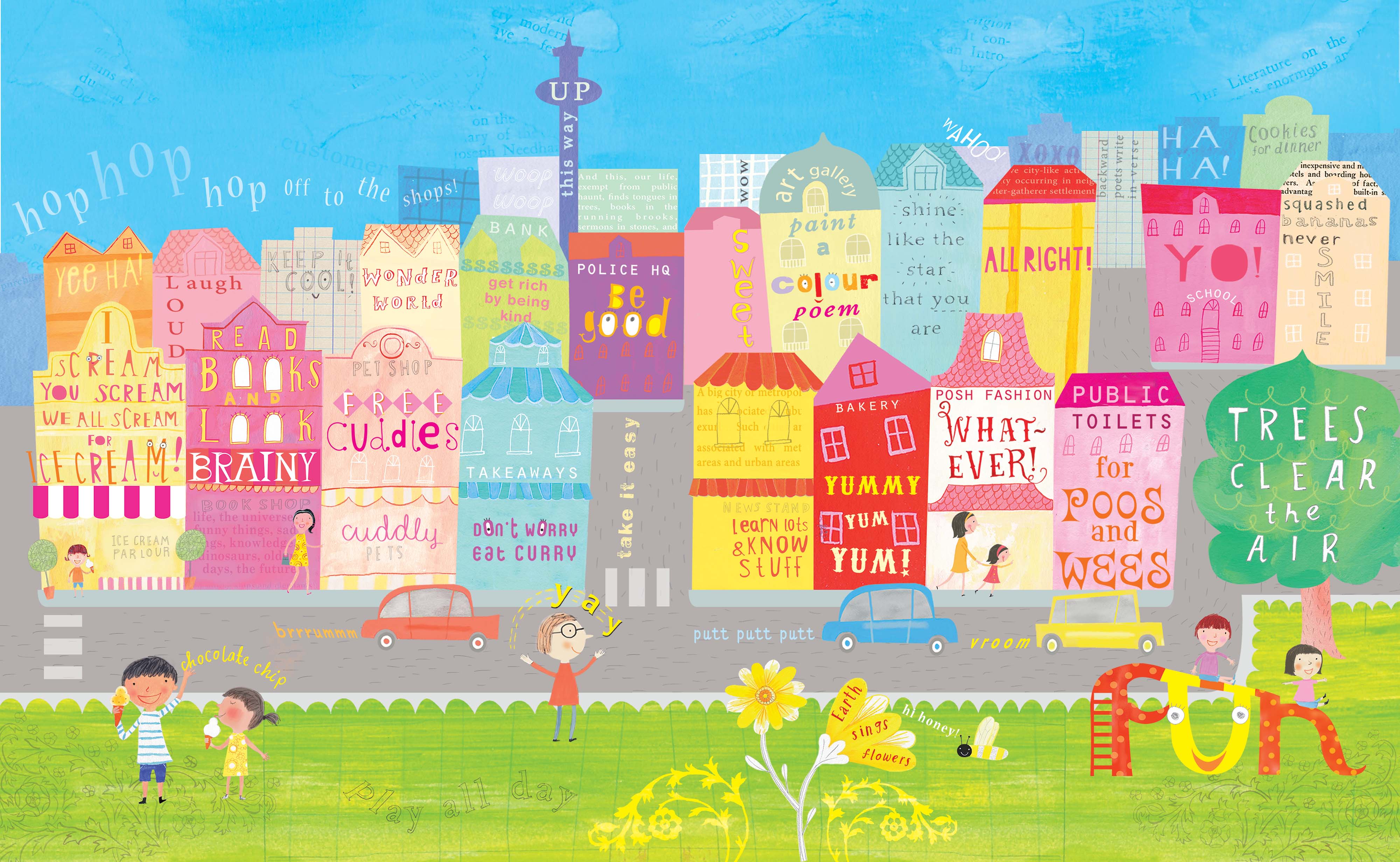
VU: I've just had such a good time with I am the Universe, especially when I show it on these huge TV screens that they have in classrooms. They get so excited! I have to give them a few minutes to talk over each illustration; the city one and the neighbourhood one, they get super excited and point out things to each other.
TS: Do any of your books exist as e-publications or have you done illustration for online stories? Do you have a different approach for illustration for online materials?
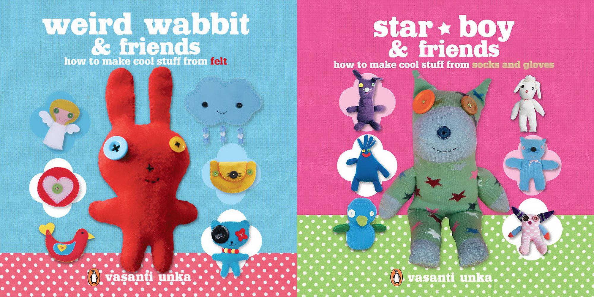
VU: Years ago, I did instructional craft books for kids called, Weird Wabbit and Friends: How to Make Cool Stuff from Felt, and Star Boy and Friends: How to Make Cool Stuff from Socks and Gloves. The Weird Wabbit book is available online.
Weird Wabbit and Friends: How to Make Cool Stuff from Felt, and Star Boy and Friends: How to Make Cool Stuff from Socks and Gloves.
Weird Wabbit and Friends: How to Make Cool Stuff from Felt, and Star Boy and Friends: How to Make Cool Stuff from Socks and Gloves.
I haven’t done a huge amount of online work, but I’d like to try because I love the brighter colours. In print publishing it’s really expensive to use a fluro colour, and I’d also like to play around with animated GIFs more.
TS: Do you have a favourite paint or paper or tool that you go back to for your illustration?
VU: I really just love pencils. I like pencils and Zeta paper to tell the truth. Most illustrators would think, “Yuck! Zeta paper!” But I like its smoothness.
TS: What does a typical work day look like for you at the moment?
VU: I usually do something meditative after breakfast, like walking or yoga. There are quite a few spare rooms in my house that I can use as offices. I’m working in the front room at the moment, which looks out to the front garden; it's lovely and spacious and has my desk in there. So I go in there for the whole day and come out at lunchtime and come out at the end of the day to cook dinner.
But, in that time, while I work, I could be dreaming, I could be wandering around the garden. I could be hanging out the washing, I could be chatting away to somebody, or listening. I listen to books a lot. If I'm illustrating or if I'm designing, I'll listen to podcasts. With illustrating, I just love that I can listen to a whole book.
TS: In your experience producing books for kids, do you have any thoughts on the best ways to entice kids to read?
VU: My son, he's an adult now, but he's dyslexic. When he was younger, we tried a million ways to get him to read and spent a lot of time learning about how to get kids to read.
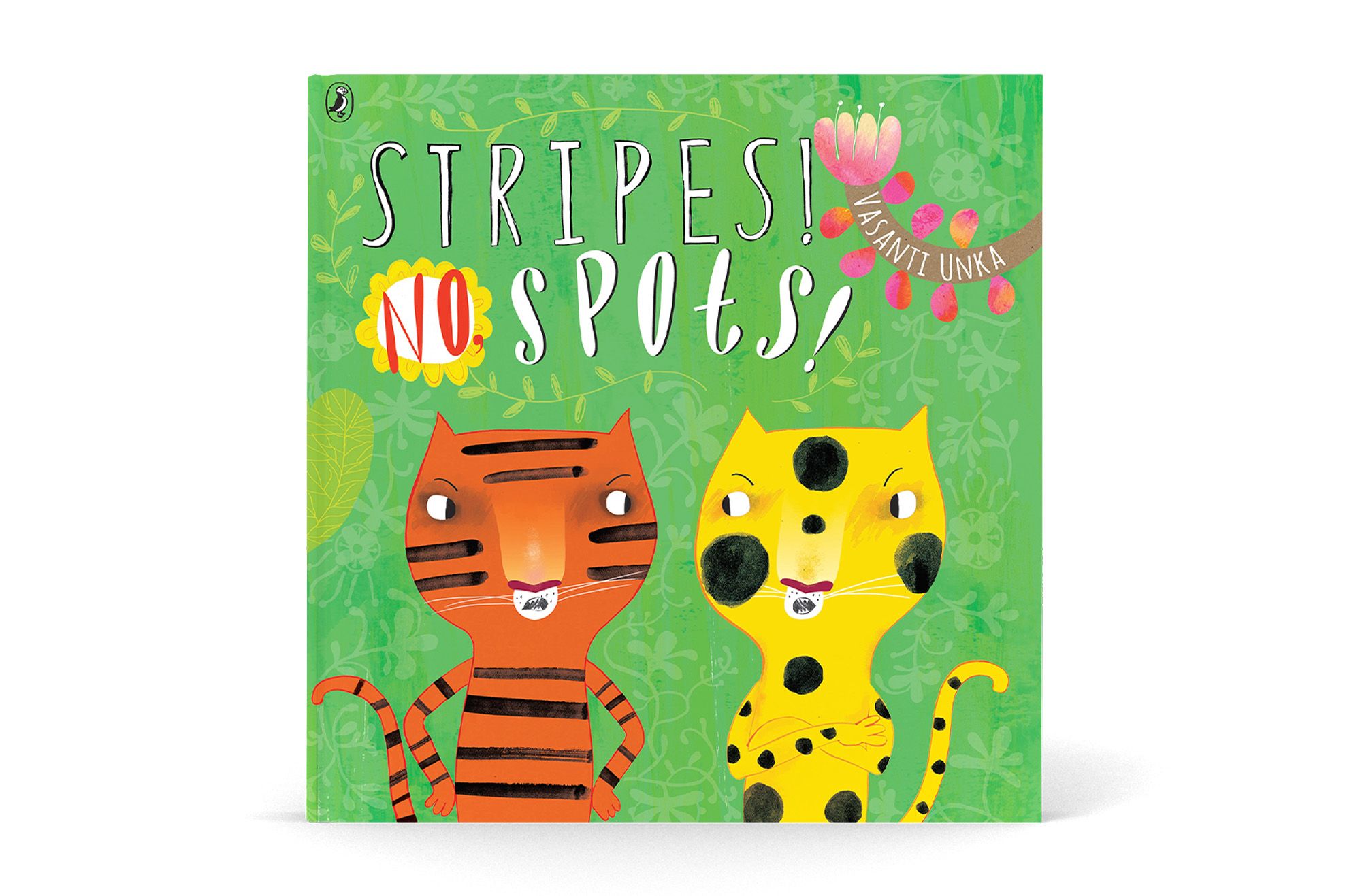
When I was first designing The Boring Book, I showed it to quite a few different groups of kids, and I found a child who was dyslexic, and he loved it. And he gave me suggestions for my next book, Stripes! No, Spots!
Stripes! No, Spots! - Vasanti Unka
Stripes! No, Spots! - Vasanti Unka
I’ve found that dyslexic kids really get the humour in my books, and they have a lot of empathy. I’ve found that a lot of adults think, “Oh, this book’s too sophisticated for kids”, but they really get it.
I’ve found that dyslexic kids really get the humour in my books, and they have a lot of empathy. A lot of adults think, “Oh, this book’s too sophisticated for kids”, but they really get it.
That’s also why I show so many different kinds of people in my books. I want all kids to want to pick my books up and see themselves. And that's why, when I go out to schools, my talk is often about reading, because it was such a big help to me, as a kid, being a different-looking kid in a Pākehā environment.
TS: What were the dyslexic kid’s suggestions, out of interest?
VU: He wanted a bomber plane, a submarine, more explosions. He also wanted a party at the end!
TS: Are there illustrators at the moment that you really love and that you follow?
VU: I really love the work of Joohee Yoon, and also the French illustrators, Isabelle Arsenault and Clotilde Perrin.
TS: What’s on the cards for you for next year?
VU: I've got a few illustration projects on the go. Last year, I did a Masters in Creative Writing, so one of my goals next year is to follow up on the writing I did in this course. I want to write a book about growing up as an Indian in Aotearoa.
Images courtesy of Vasanti Unka.

