Crisis reporting: Providing clarity in crisis through visual and immersive storytelling

In the moment of a crisis, the focus is, quite rightly, on the facts. Who, what, and where. But all stories have so much more to them than that.
Stories about crisis, in particular, lack impact if they come across as merely a dry presentation of facts. They need to cut through the noise — to attract attention, hold interest, and elicit a proportionate and informed response.
At Shorthand, we are passionate about making it easier for storytellers to tell compelling stories that offer readers greater meaning, context, and colour through engaging visuals and interactivity.
Shorthand is a particularly powerful tool when reporting on a crisis — where there are intricate details to communicate, data to explain, and personal impacts to share.
Here are a few tips on effective crisis reporting through longform visual storytelling, with examples from publishers and charities using Shorthand to capture attention and, in many cases, drive action.

1. Go in-depth with human stories

During and after a crisis, the stories of the people affected are at risk of becoming lost in the statistics. Visual storytelling brings the reader face-to-face with those individuals; people become centre-stage in the narrative.
2. Give context

Understanding a crisis often requires knowledge of the locations, economics, and population that it affects. Making sense of the data can be difficult. Visual storytelling techniques can be an effective way to make the context easier to understand.
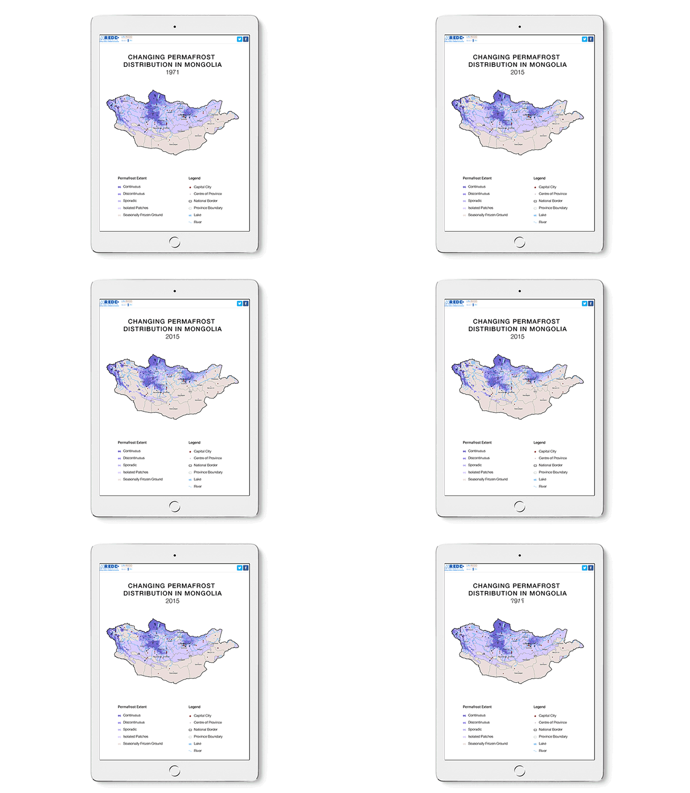
In The Changing World of Mongolia's Boreal Forests, for example, a number of sections use Shorthand's Scrollmation and Reveal features to compare data as the reader scrolls. In one section, a map of Mongolia shows how much of the country was covered in permafrost in 1971, and then in 2015. The reader can easily compare the coverage simply by scrolling through the story. The picture evolves at the reader's own pace, making it easier to digest the information, or go back a step if helpful.
This historical context can be an important key to understanding how a crisis has reached a certain point, or to reflect back on past events. The addition of interactivity puts the comparison in the reader's hands.
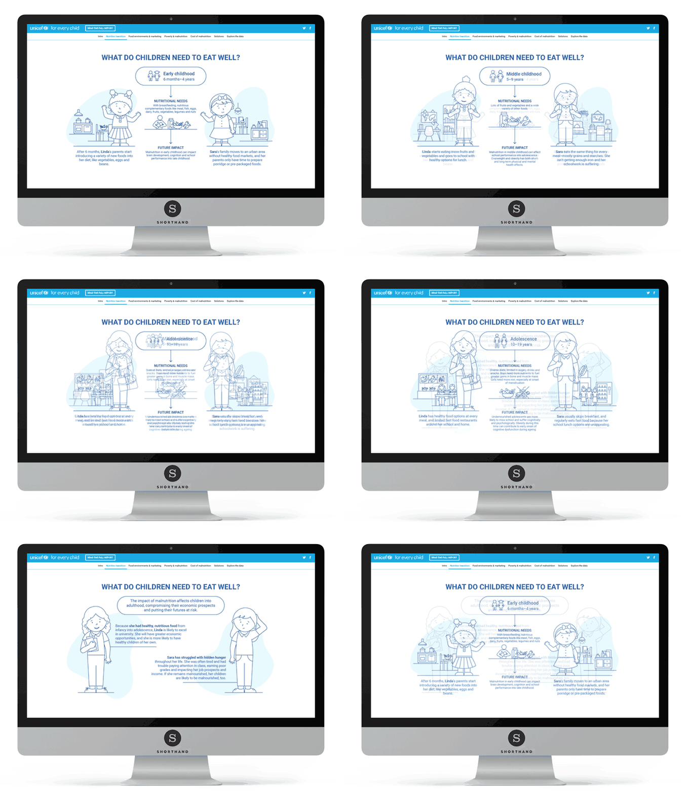
UNICEF use the Reveal effect for data comparison in their story: The Changing Face of Malnutrition. Across multiple sections, illustrations contrast the outcome of good versus poor diets on the lives of children.
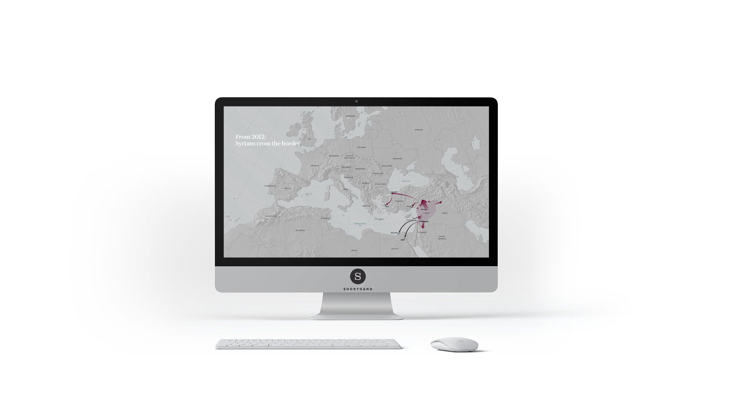
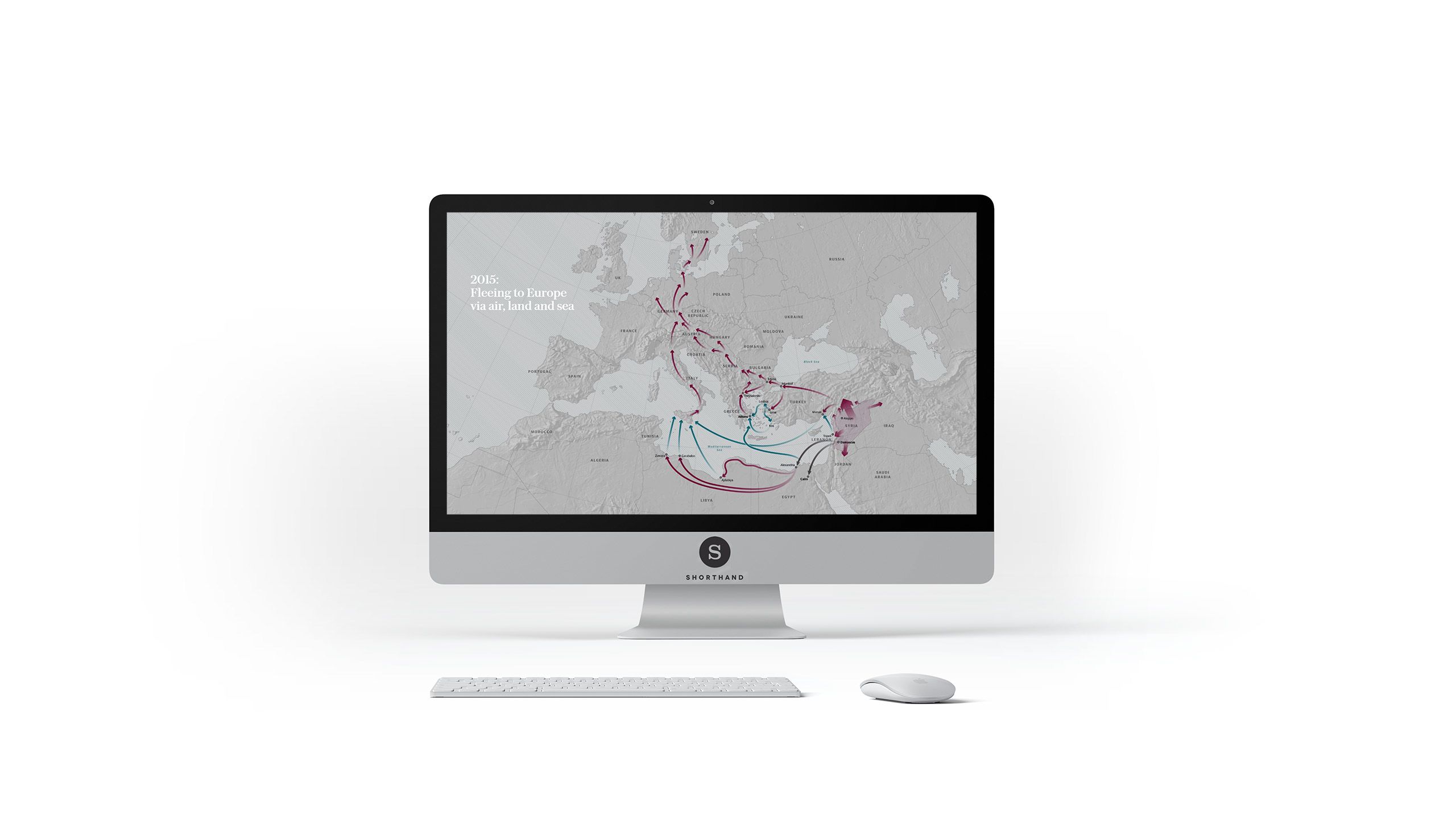
In Fleeing Syria, the Telegraph helps readers understand the difference between migration patterns in 2012 and 2015, through map transitions triggered via scrolling:

3. Convey atmosphere

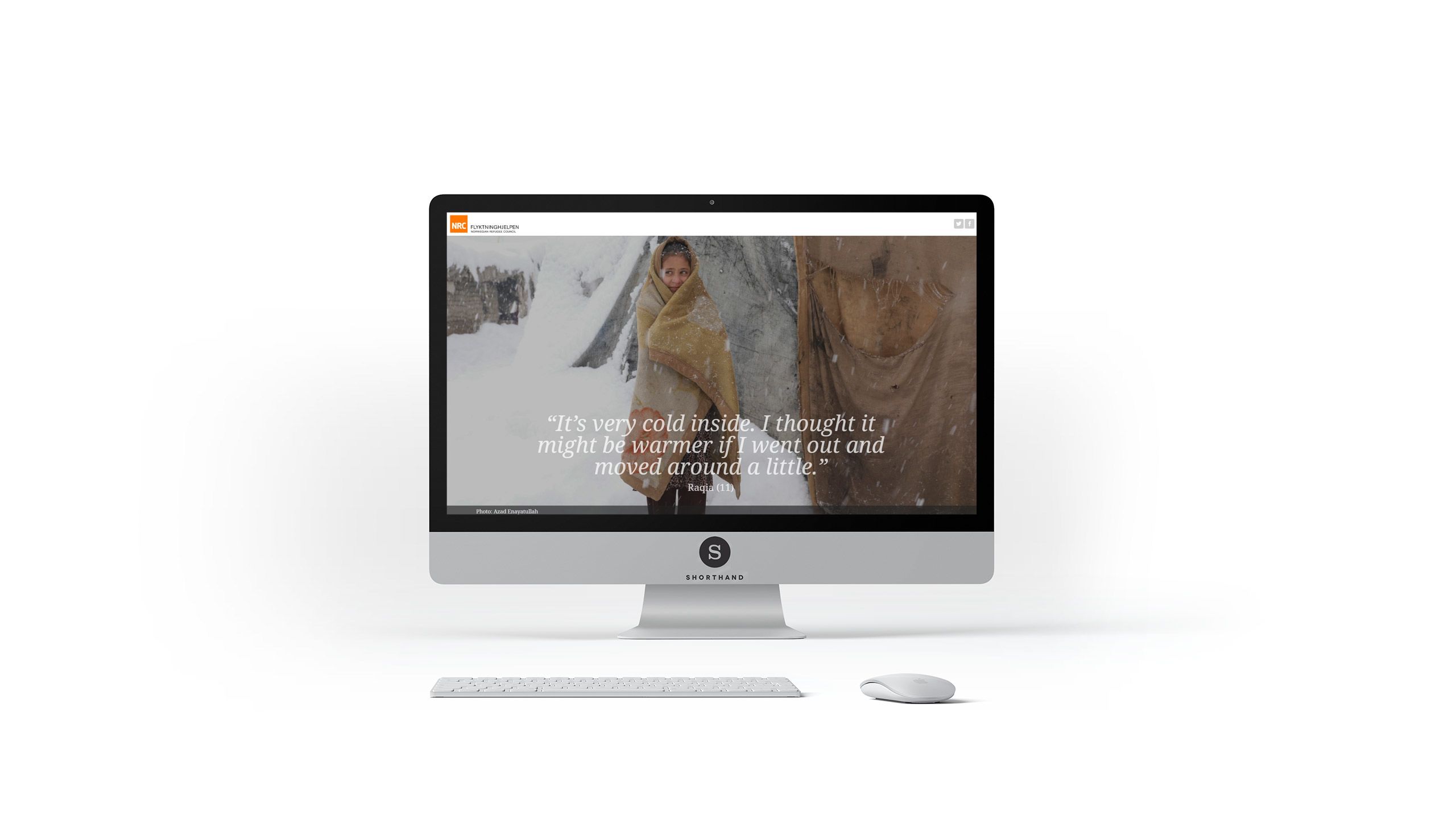
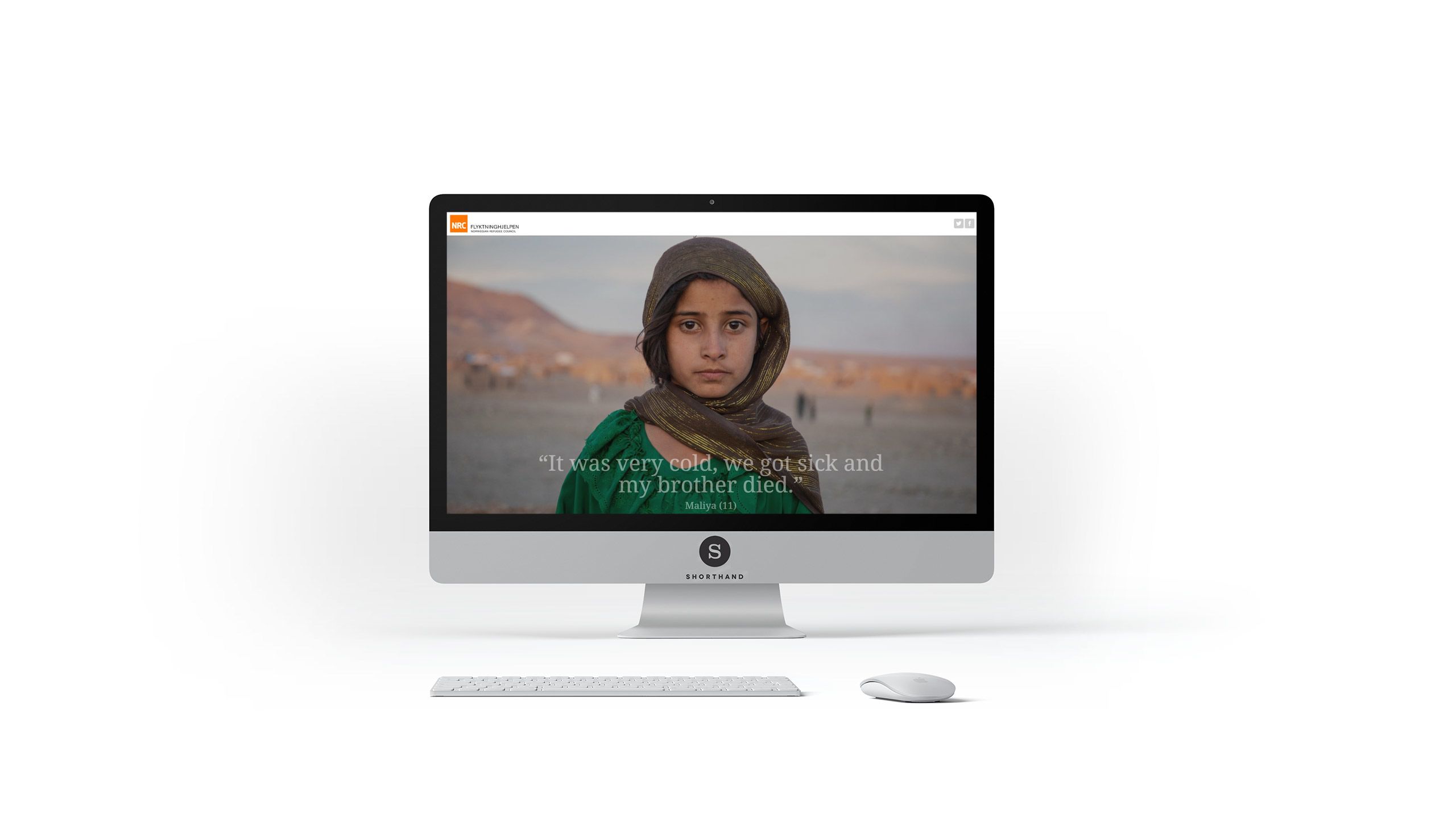
Visuals alone are one of the most powerful tools for conveying emotion and atmosphere. When presented full-screen, within an engaging narrative and other media, there is the potential for even greater impact.
Take, for example, the Norwegian Refugee Council story: Afghanistan, Where destitution and cold kills. Coupled with personal quotes, the images of children drive a deep emotional response.

4. Paint a richer picture

If a storyteller has the creative freedom to tell stories in new ways, there is the chance to let images do the majority of the talking.
Visual storytelling enables the image to lead the narrative, and to offer the reader a view of the bigger picture — quite literally.
In crisis reporting, this can help to give the reader a greater sense of what it is like to be on the ground where an event is taking place, because they can be shown the situation 'from all angles'.
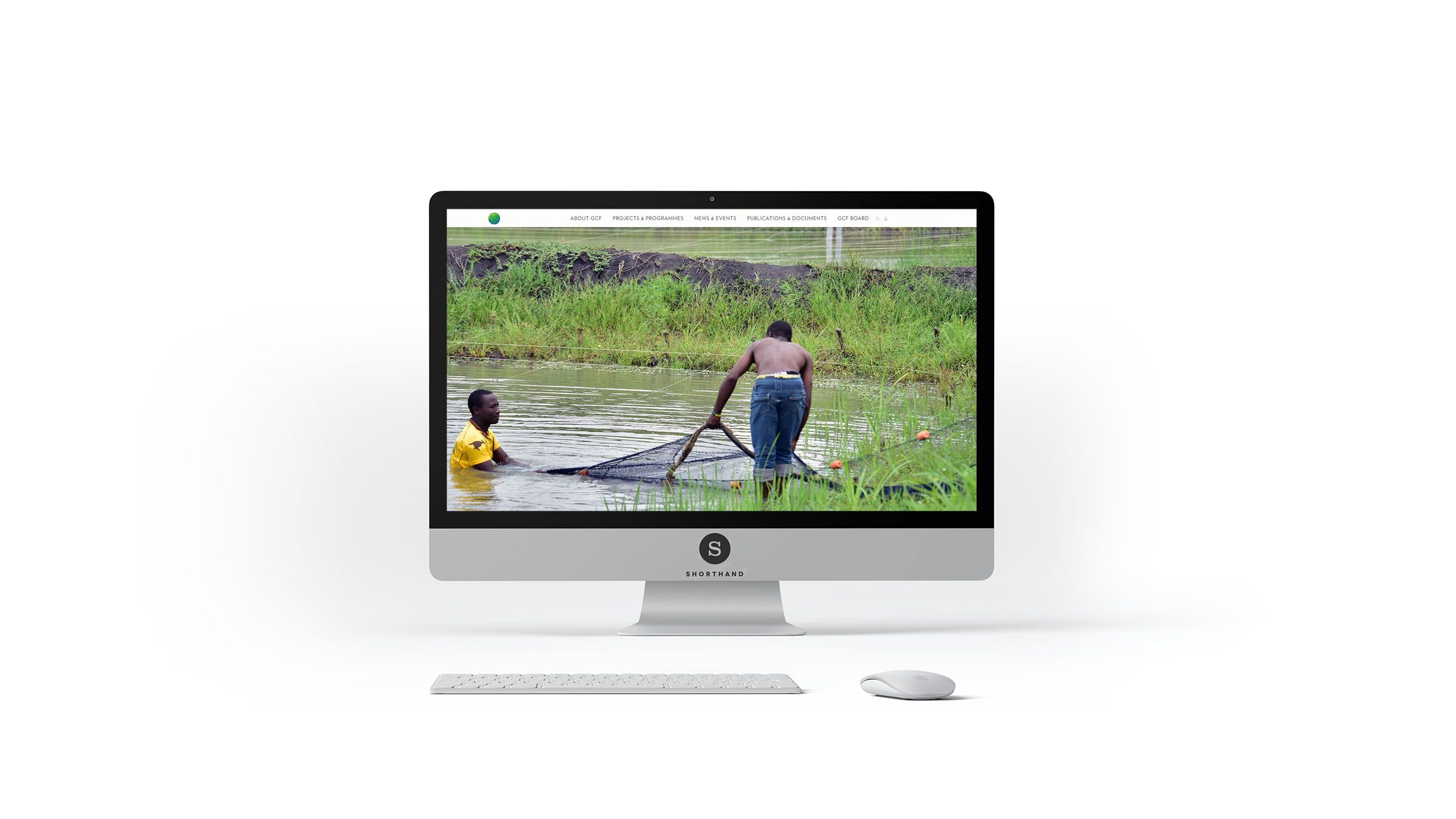
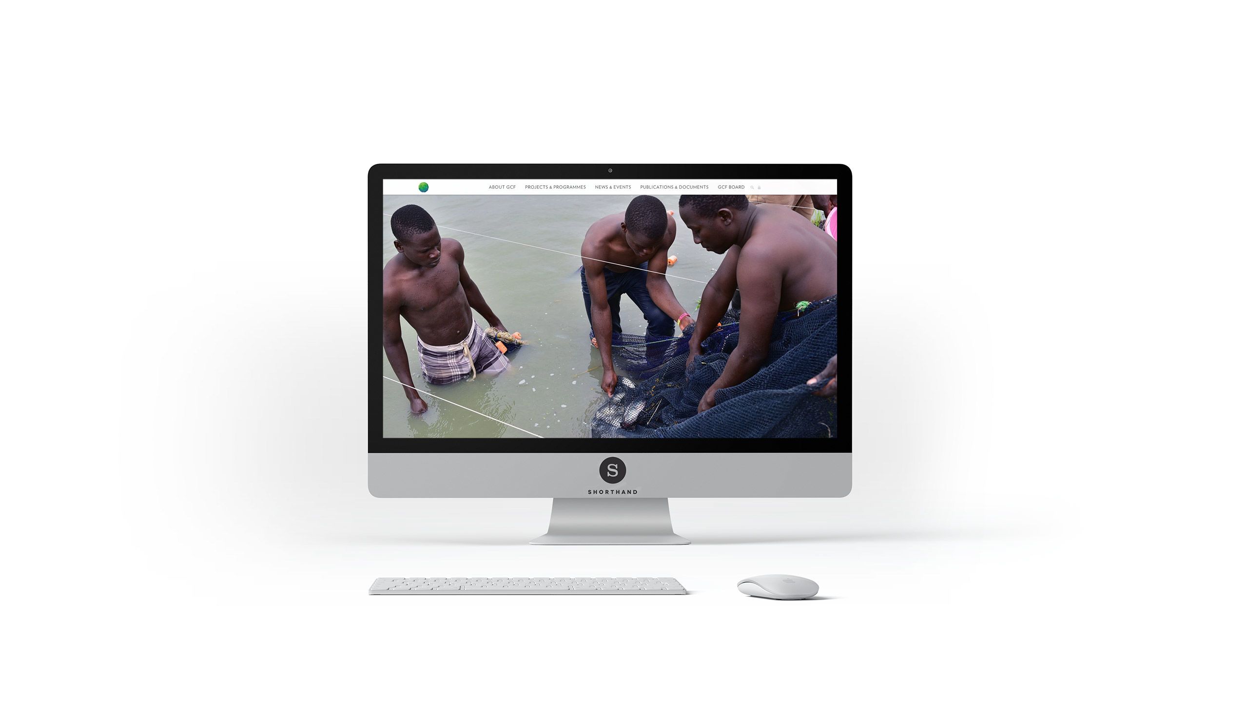
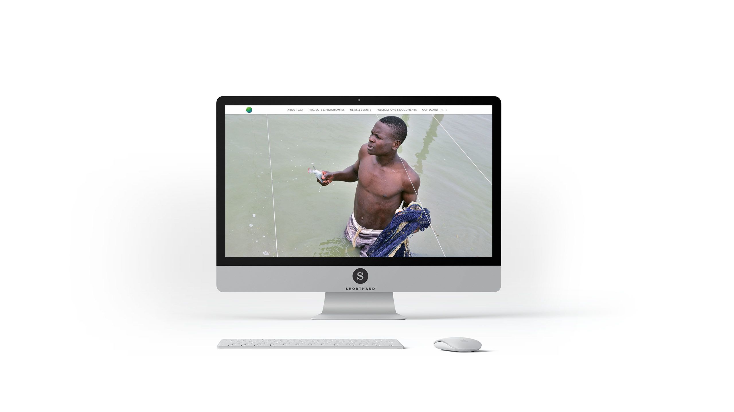
In Using ecosystems to counter climate crisis, by the Green Climate Fund, a series of images shows how communities are tackling the changes to their local environments. Coupled with graphed data and video interviews, the story provides multiple ways in which to engage with the narrative and dive deeper into sections of particular interest.

5. Break down complex processes

Breaking a narrative down into clear chapters is a helpful way to communicate the complexity of a crisis, and to make an in-depth story digestible.
It can also help make a timeline of events, which can span hours, days, or years, much easier to follow and comprehend.
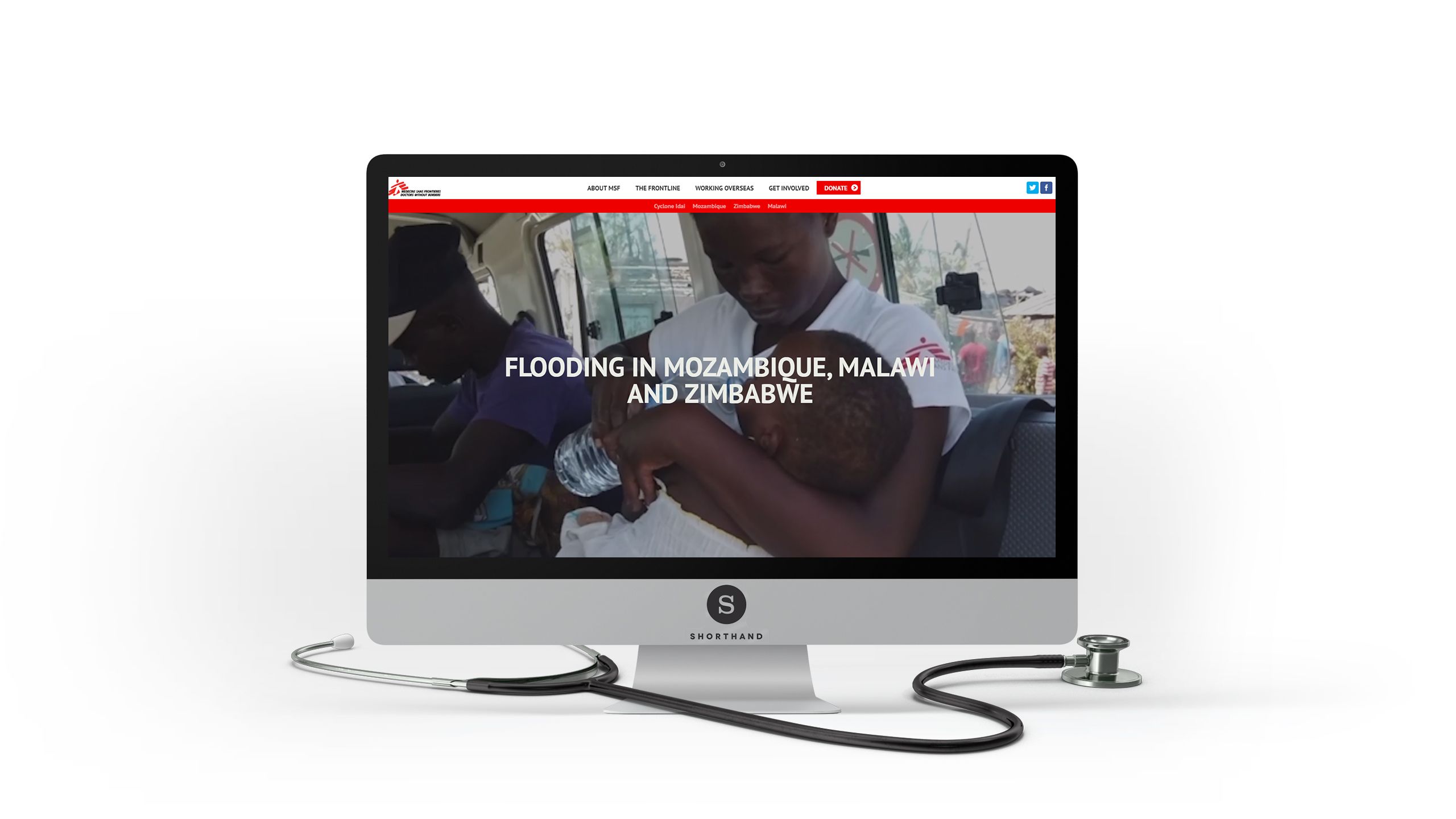
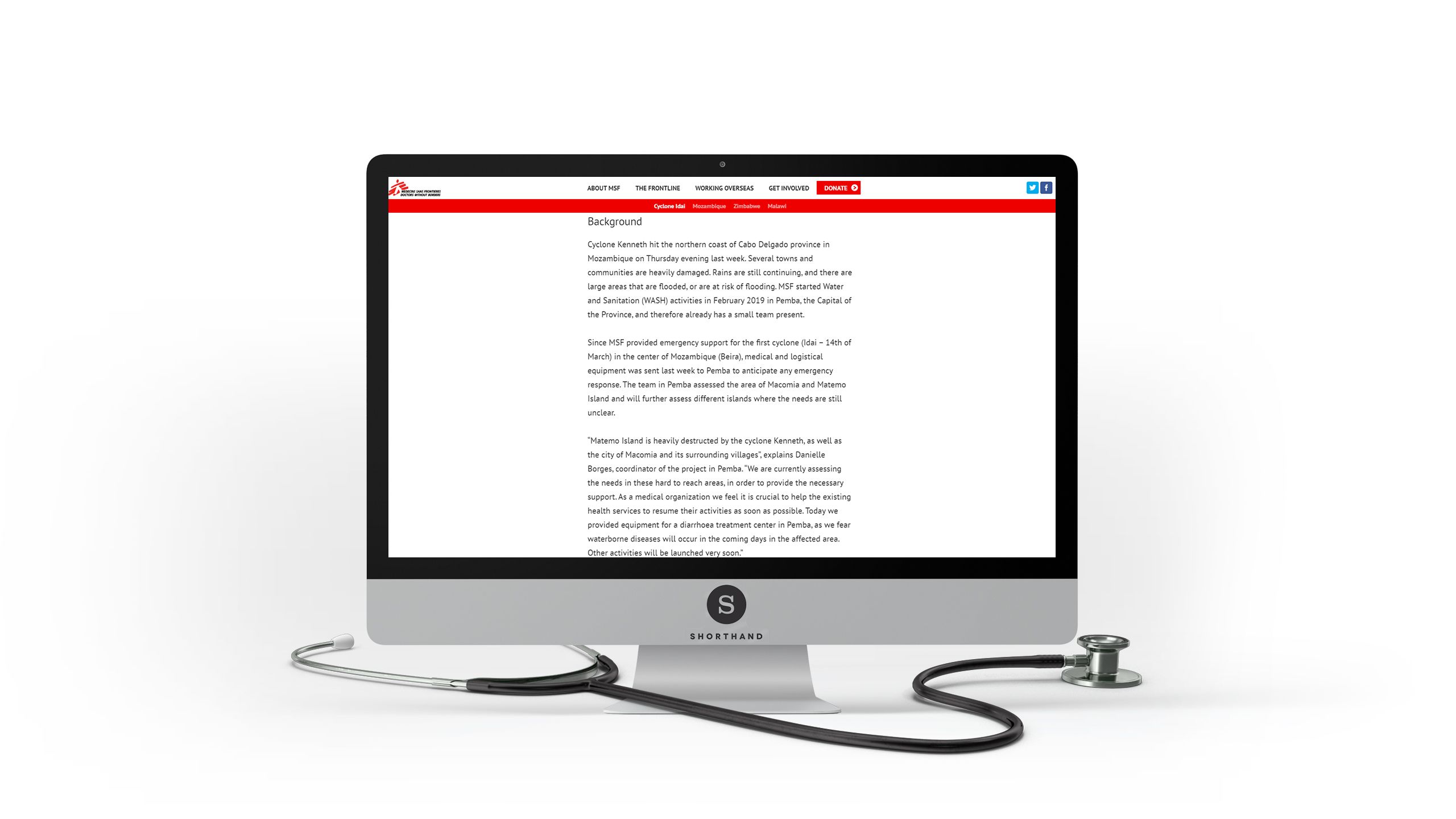
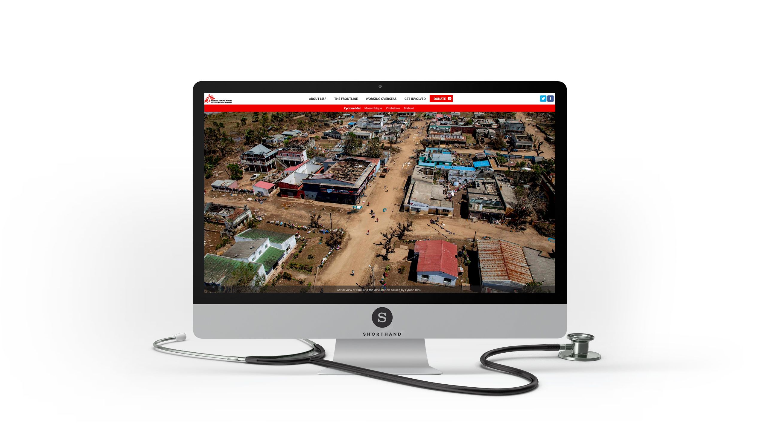
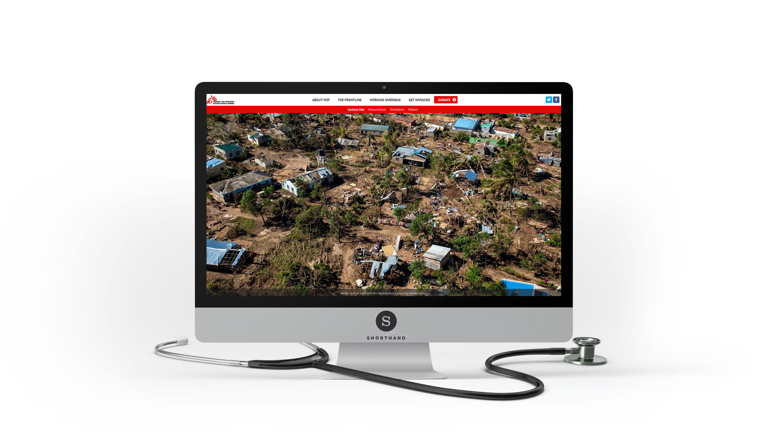
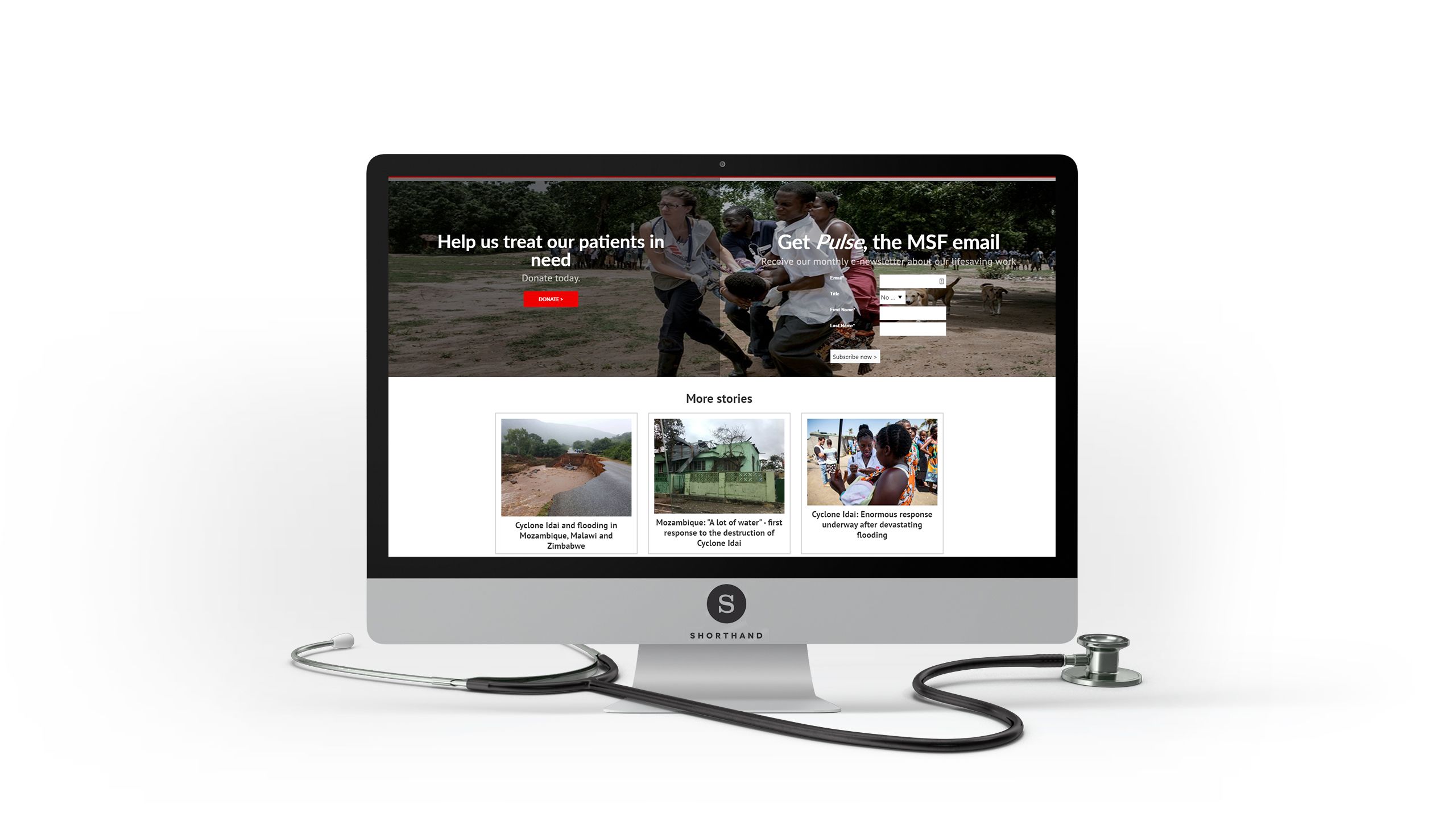
For example, in Flooding in Mozambique, Malawi and Zimbabwe, Médecins Sans Frontières uses visually engaging chapter headings, and prominent story navigation, to offer a clear flow to the narrative as it leads the reader through the crisis, and on to actions they can take to help.

6. Bring it all together
Journalists have a plethora of tools at their disposal when covering a story, from in-the-moment live-streaming video and social media posts, to follow-up interviews, reports, and infographics.
What can be difficult is bringing that together in one place, in a way that tells a coherent and engaging story.
The media-rich, vertical-scrolling story format can bring order and structure to your coverage of chaotic and evolving situations — and provide your reader with a single place to be informed and engaged.
