The world’s leading media companies are investing in longform features. But how do they earn — and keep — their readers’ attention?
In 2001, researchers at the Metropolitan Museum of Art conducted a study on how people experience art galleries. To the dismay of professional artists — but to the surprise of virtually no one else — the study concluded that the median time a visitor spent looking at an artwork was just 17 seconds.
This isn’t very long to take in the glories of Monet; it’s also not very surprising. These days, most people find it hard to pay attention. Visitors of art galleries are hungry, thirsty, or tired. Their backs or heads or feet are sore. They have chores and obligations nibbling away at the back of their mind.
They also have miniature casinos in their pocket, pinging and vibrating every other minute.
Unfortunately, this same dismal dynamic applies to journalism published on the modern web. The unending feeds of social media — coupled with email, Slack, and the dozen other tabs open in the browser — make it hard for anyone to concentrate for more than a few seconds (literally) at a time.


For most publications, longform feature stories are the most important stories they publish. They are expensive to produce; they are supported by original reporting; and they usually cover topics of real significance to our lives.
As you can see in the stories featured below, these topics include the corruption of our institutions, the fate of the vulnerable, and the transformation of our planet.
Over the last decade, some publications have responded to dwindling levels of attention by cutting publication of longform stories, usually coupled with a radical increase in low-quality clickbait. This has led to a deluge of stories published purely to satisfy the algorithms of Google and Facebook.
This isn’t good for readers. And it isn’t good for our societies, our politics, or our planet.
Is there another way?

The one major alternative to clickbait is the subscription model, in which media outlets ask (or require) readers to pay for the stories they read. The New York Times is the most successful publication to embrace this strategy, but many others around the world are doing the same.
People won’t pay for clickbait. But they are theoretically much more likely to pay for immersive, high quality feature stories — especially feature stories that are built to hold attention and free from the annoying distractions of the modern web.
The New York Times tested this theory in 2012, assigning a team of journalists, developers, and designers to produce Snow Fall. This hugely impressive and immersive digital story went on to win the Pulitzer Prize. As you might expect, journalists around the world looked to immersive stories like ‘Snow Fall’ as the future of longform journalism on the web.
But there was one major catch: few media companies could afford to assign a team to build a feature story — especially a team that included developers and web designers. Even if they could pull it off once or twice, they couldn’t afford to do it at scale.


What to do? Seeing a gap in the market, various companies developed digital storytelling platforms to allow anyone to build ‘Snowfall’-like stories.
Some of these platforms were built to streamline developer workflows. Others were effectively ‘lite’ web design tools. A third category of platform was built to ensure that journalists could create beautiful and immersive stories on their own — without the involvement of developers or web designers whatsoever.
This last point proved critical to the rise of immersive feature stories. Why? It took into account the real-life workflows of journalists — who rarely have developers on hand — and finally allowed them to publish at will, and at scale. Media companies like the BBC were soon routinely publishing beautiful, immersive, distraction-free stories.
People were paying attention. In 2017, Chartbeat created a list of the UK’s most engaging stories. These were stories that people were actually reading. 5 of the top 10 for that year were immersive feature stories built with Shorthand.
A new era of immersive feature stories was born.
Since then, the publication of immersive feature stories has continued apace. At Shorthand, we’ve seen literally thousands of amazing stories, some of which we showcase in our regular newsletter. Here are five of the best.
NBC News

Maps are a critical tool for investigative journalism.
But too often, static maps aren’t able to represent the complexity of a subject in an easily digestible way.
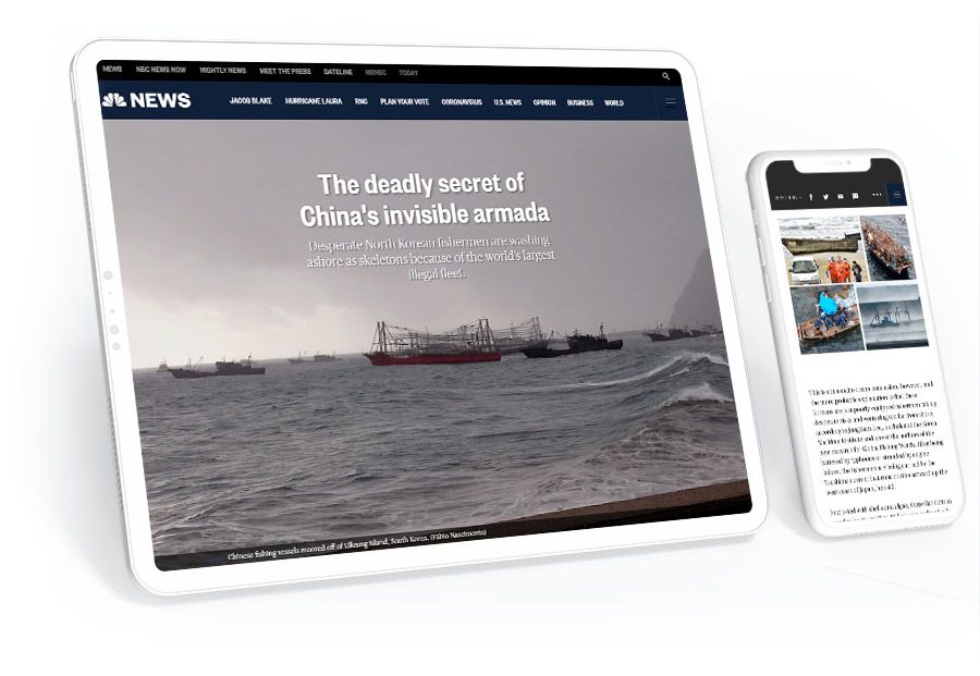
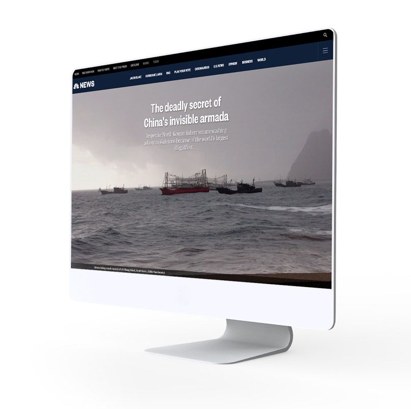
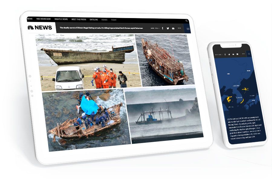
Enter The deadly secret of China's invisible armada. In this story, Ian Urbina and the team at NBC News use scroll-based animation effects — with GPS signals and satellite imagery — to chart the course of an armada of Chinese fishing vessels into North Korean waters.
Coupled with the testimony of numerous NGOS, Urbina is able to show how the illegal movements of Chinese fishing vessels may have contributed to ‘widows villages’ and the collapse of squid stocks in North Korean waters.
BBC

Stories about the technology industry are hard to do well.
Many writers focus on the softer sides of technology, such as the personalities of tech founders or the slosh of venture capital. Others focus on the more complex subject of what technology products and platforms actually do — but these stories are harder to write, and don’t always keep the reader’s attention.
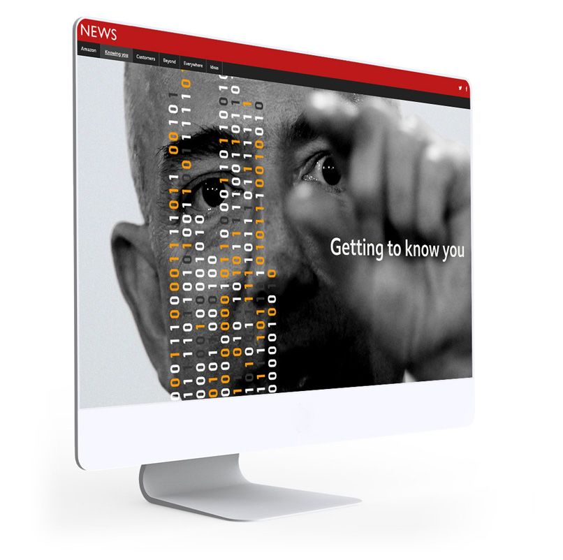
In Why Amazon knows so much about you, Leo Kelion takes an unflinching look at the data collection — and business — practices of Amazon. The story makes a powerful case for the significance of Amazon’s practices for our economy and society. As Kelion concludes, “it’s now practically impossible to go about the day without enriching Amazon in some way.”
To maintain the reader’s attention through a long and complicated story, the BBC team use a range of animated illustrations, triggered by the scroll of the reader. The story also includes some classic photos of Jeff Bezos, from the days when Amazon was little more than an online bookstore.
Sky News
Great feature writing shows the real world complexity of a subject — without making the reader sweat.
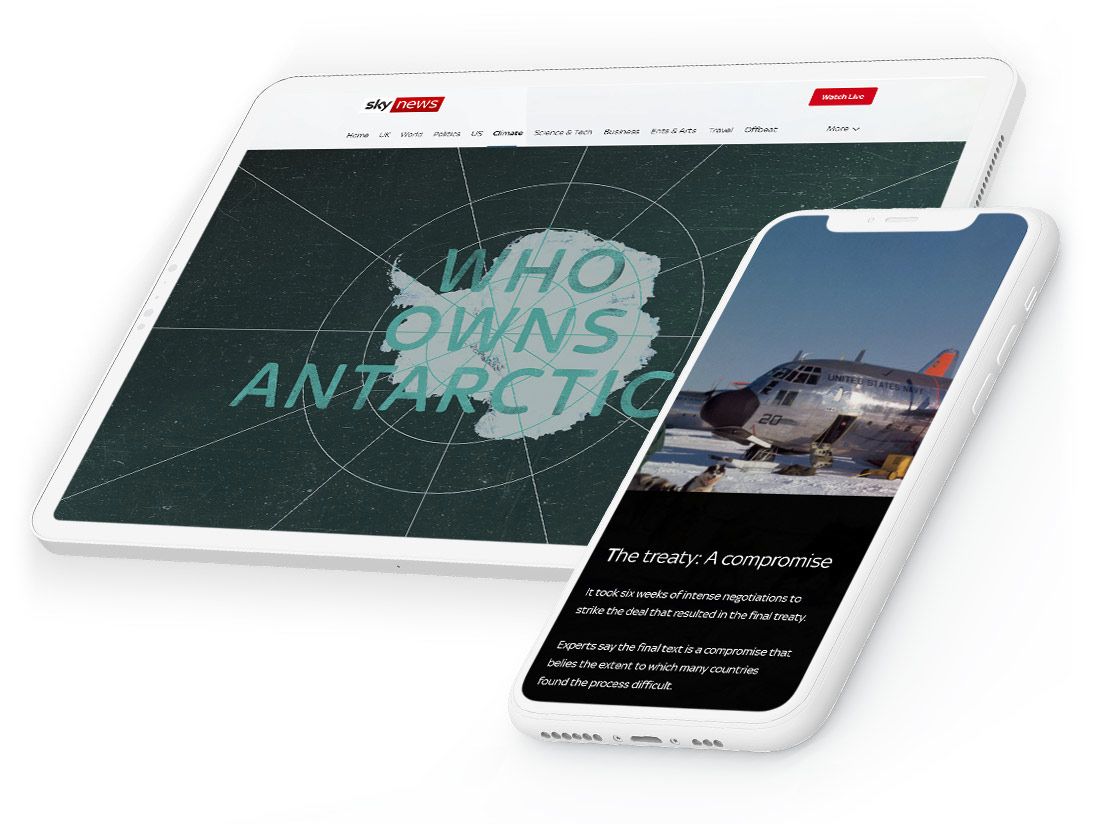
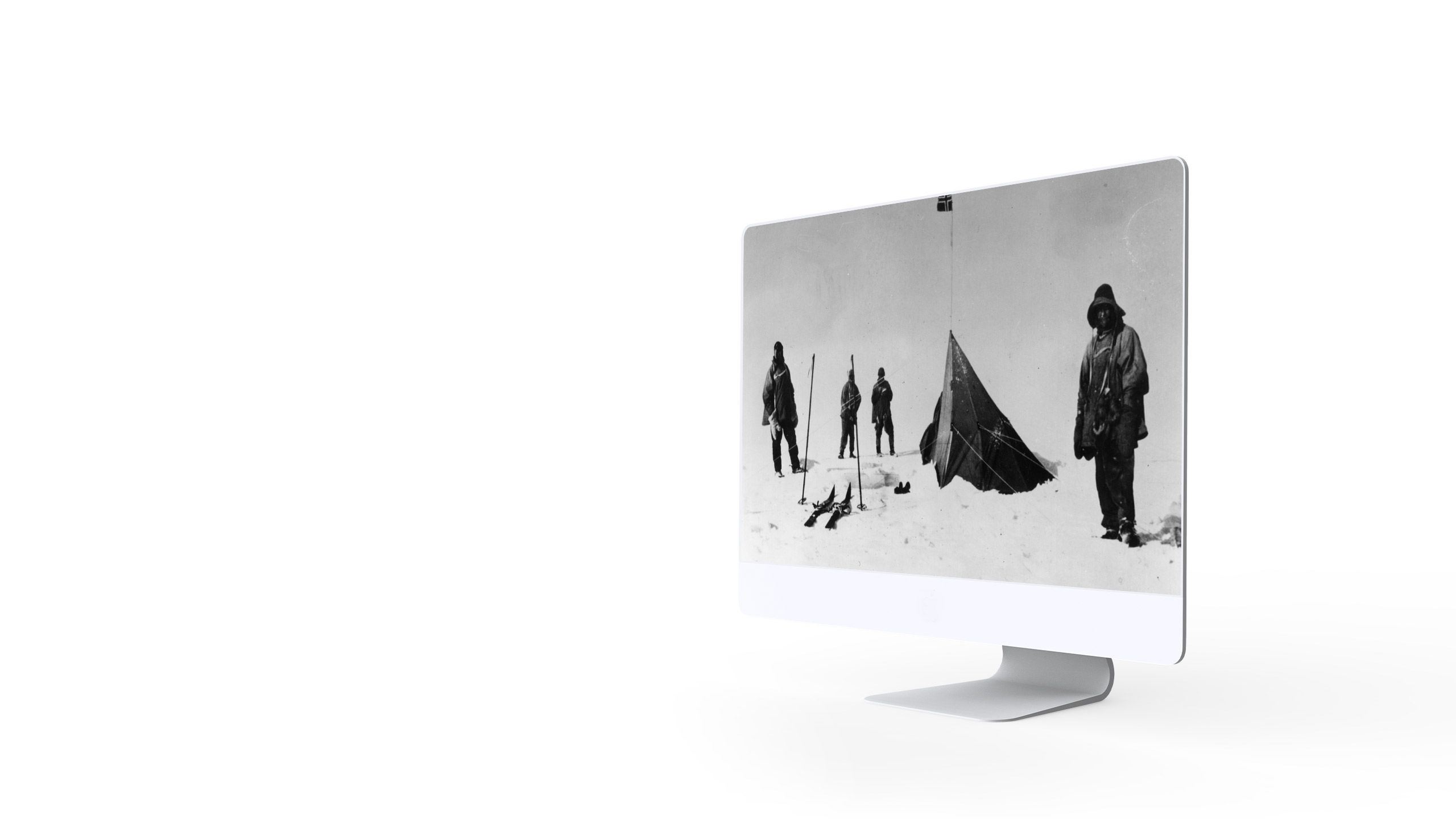
A great example of this is Who owns Antarctica? from the team at Sky News. They tackle the extremely complicated history of territorial claims to the continent of Antarctica.
Using animated maps and illustrations, the team outline the Cold War treaty that has enabled more than 60 years of peace on the frozen continent — even when its signatories were fighting proxy wars elsewhere — but also point to pressures that might test the existing compromise.
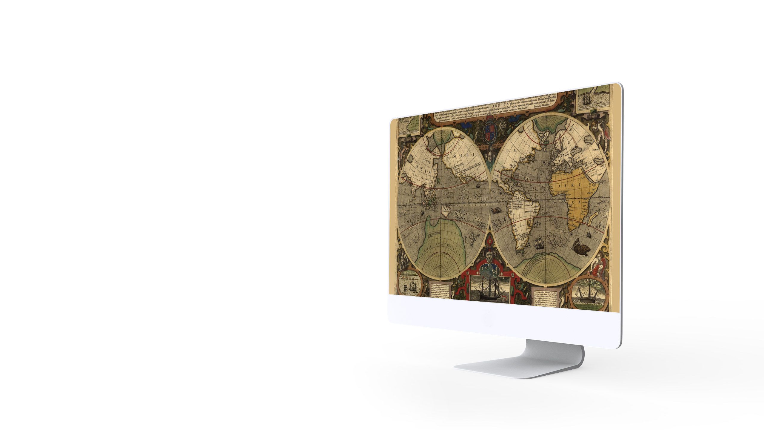
Great feature writing shows the real world complexity of a subject — without making the reader sweat.
A great example of this is Who own Antarctica? from the team at Sky News. They tackle the extremely complicated history of territorial claims to the continent of Antarctica.
Using animated maps and illustrations, the team outline the Cold War treaty that has enabled more than 60 years of peace on the frozen continent — even when its signatories were fighting proxy wars elsewhere — but also point to pressures that might test the existing compromise.
Stuff

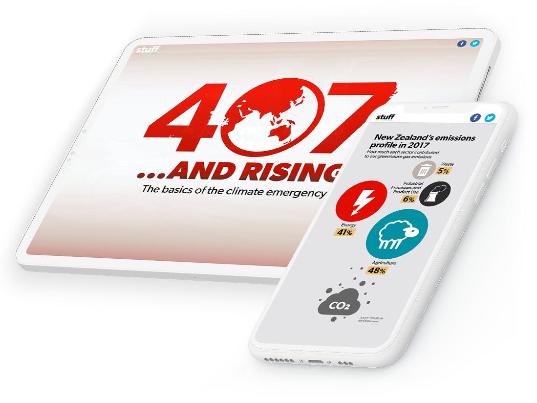
In 2019, New Zealand media company Stuff — the most popular media website in the country — started including the country’s carbon level readings in its daily weather report.
This was soon expanded to a Climate Change section on its homepage, with a live ticker providing up-to-date readings of atmospheric CO2.
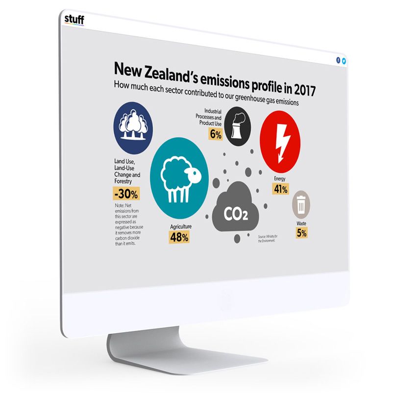
But what do those numbers mean? In 407... and rising, Joel MacManus and Kathryn George use simple and compelling illustrations — again, triggered by the scroll of the mouse — to show the real world impact of climate change on sea levels, land use, and biodiversity.
THINK

As new digital storytelling technologies evolve, the best media companies are experimenting with form.
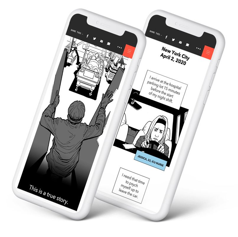
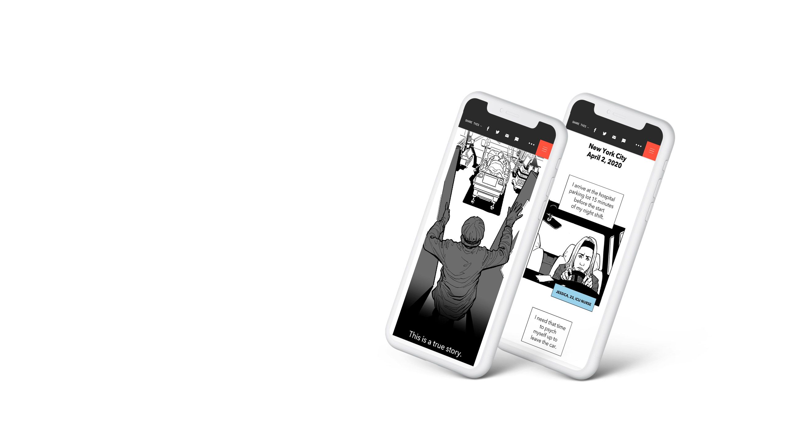
One example comes from THINK from NBC. In the midst of the pandemic, the team published The Covid Chronicles, a series of moving and inspiring comics on the impact of COVID-19.
Highlights from the series include the story of a nurse in ICU, behind the scenes of the lockdown in Wuhan, and an opera singer who performs for the neighbourhood from his balcony.
Feature stories have always had to fight for our attention — especially stories about serious and complex subjects. With the rise of the hugely distracting and addictive modern web, this had once seemed like a problem that was only going to get worse.
But as these examples show, the world’s most successful media companies are building a new genre of immersive, visual storytelling. Free of many of the distractions of modern web design, immersive stories use modern scroll-based narrative techniques to capture and keep the reader’s attention.
Crucially, these stories are being built without an enormous investment in developers and web designers. This makes it possible for media companies to scale their immersive storytelling, with the BBC and Stuff publishing literally hundreds of longform features over the years.
Inspired? Start building your own immersive digital story today.

