5 ways to use Section Options

Sometimes the simplest changes or feature introductions can have an outsized impact when it comes to storytelling. That was certainly the case with our Section Options feature.
by Dawn Murden
In 2018, we unveiled the settings cog on the left hand side of sections and gave storytellers the ability to alter height, scroll positioning, overlay, as well as light and dark theme options. Here, we take a look at how these have made storytelling extra special.
From listicles to amazing x-ray vision, Shorthanders embraced the enhancements afforded by Section Options to pack a punch in their stories. There's nothing better than seeing a feature come to life in the wild and to serve as inspiration to others on how to use them. So, we thought it's time we highlighted some of those great examples...
1. Title tricks

Section Options mean that you can change the height of Title and Text Over Media sections from the default full viewport height, to half (like the above!) or third height. On top of this you can, when using images, set the scroll position so it moves or so it's fixed.
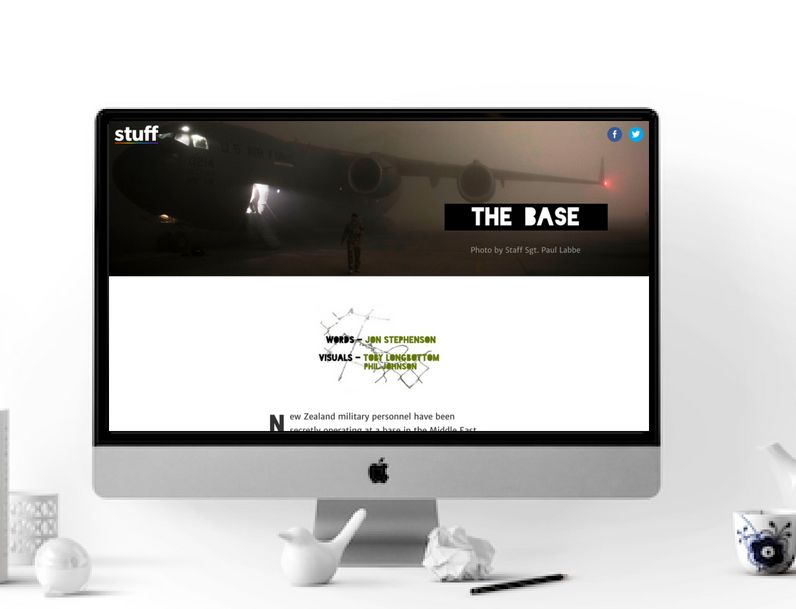
The Base, by Stuff NZ used a half-height Title section. Using this reduced height section with the header meant that Stuff was able to use a banner image, take advantage of white space and feature its stylised credits.
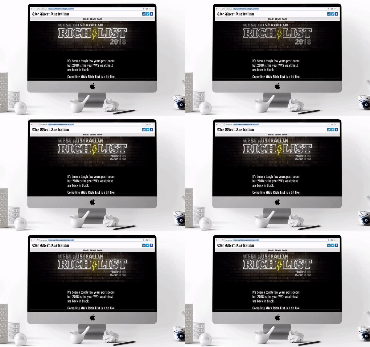
The West Australian's Rich List did the same, but with video.
For more Title Tricks, don't forget to check out our story template called 'Example Titles', which has ideas on how to put together Title and Text Over Media sections. Simply click on the plus button to create a new story and select that template.
2. Awesome X-ray vision
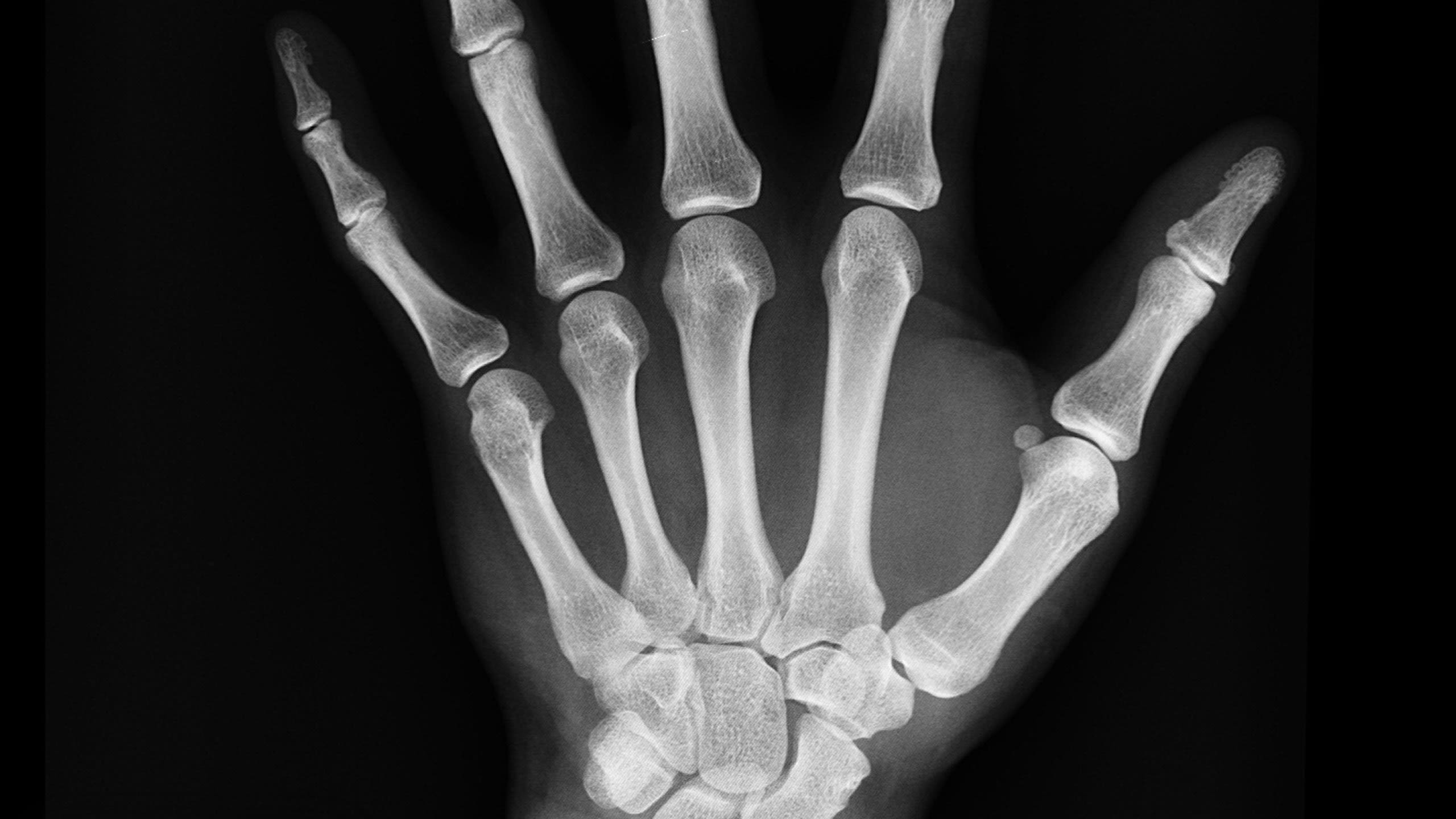
We've always known that image layering is a winning way of telling stories, whether it's breaking down complex data with a visualisation or comparative before and afters.
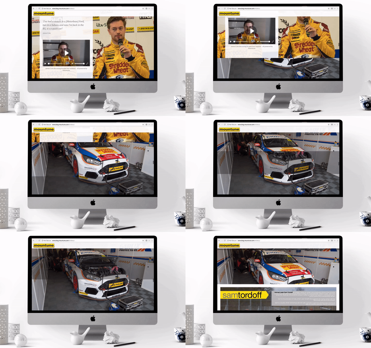
With Section Options there's a new way to layer images. With three Text Over Media sections, the first and last with a full height section, and a half- or third-height section in between, it's super easy to create X-ray vision style sections.
Take the below example by Mountune, BTCC IS GO. It was a launch story for the 2018 racing season, and it used the Section Options to allow its audience to peek inside the bonnet of a car.
3. Pull quotes and key information

Text Over Media has always been an effective section to use when pulling out key information, such as stats and pull quotes. With Section Options, it means storytellers can adapt the size of this section to the text.
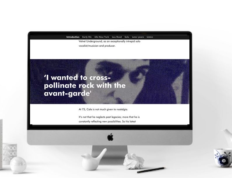
The Barbican did just that with John Cale: A Futurespective, featuring pull quotes in half-height Text Over Media sections in a fixed position.
John Cale: A Futurespective, the Barbican
John Cale: A Futurespective, the Barbican
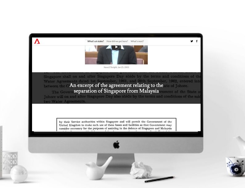
Channel NewsAsia used a comparative technique with Singapore and Malaysia: The Water Issue report, featuring excerpts in a third height section with a fixed position.
4. Listicles

Listicles — top tips on, 10 of the best, or 5 ways to (ahem) — are often very popular with audiences, breaking down an issue or highlighting key points in an easily digestible way.
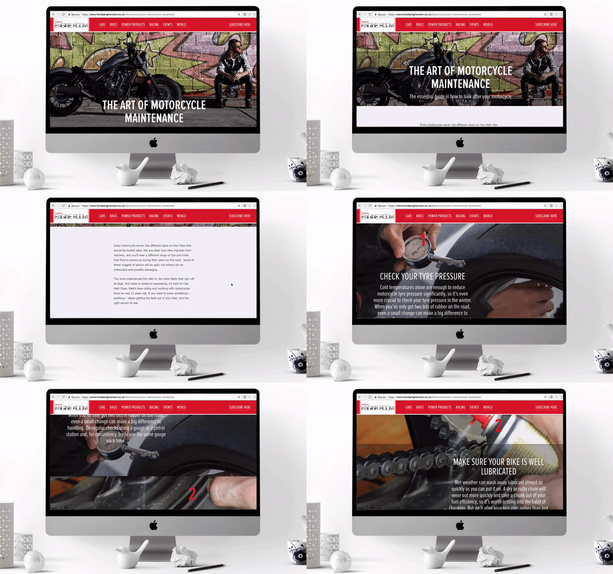
Honda relaunched its entire Engine Room site with Shorthand and hit upon an effective listicle format using third height Text Over Media sections, followed by full height Text Over Media sections with an overlay.
You can see it below from, in The Art of Motorcycle Maintenance.
5. Wow moments

Our mission is to provide an intuitive tool that makes it easy and enjoyable for teams to create beautiful and engaging stories. We're not into gimmicks or style over substance, but we do love design genius and stories that simply make you go WOW!
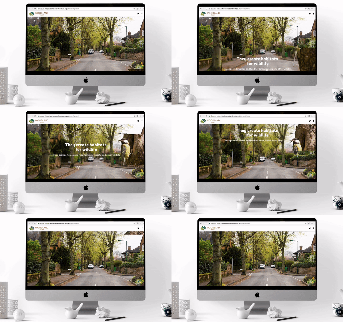
And by using Section Options Woodland Trust's second Shorthand story, 'Street Fighters', was one of those.
It has been great seeing how the Section Options have been used.
Within the Title and Text Over Media sections you'll see an additional option to add a text fade in or out. You'll also find you can add a text fade into the Background Scrollmation section.
Plus, on the Background Scrollmation you can now add a fast or slow fading transition between the images by selecting the tortoise or the hare. This can be a great way to make the change between contrasting images much smoother. Find out more here.
We'd love to hear from you if you have any questions or feedback about Section Options, or indeed if you've used them in an innovative way you want to share.
Happy storytelling!
