Multimedia storytelling & data
Statistics and beautiful storytelling go together - here are some tips for when you combine the two

Statistics are at the heart of many a story. And when you’re planning a longform, multimedia story you have the added challenge of how to make the numbers beautiful, compelling and easy to understand.
So we’ve compiled a number of tips based on some of the great examples we have seen by publishers, charities and brands in their online storytelling.
They are not intended to be golden rules for all stories, but they should be helpful considerations as you look to bring data to the surface.

No one wants to feel overrun with data, so apply good storytelling practice in how you break down the numbers.
If it’s a scrolling story, consider how you could add layers, or let data develop, as the reader moves through the narrative. Consider whether the interactivity should be built into the scrolling, or if the reader should be encouraged to dig deeper into a graphic.
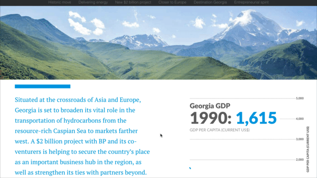
See how BP’s story on Georgia breaks down a line chart in order to pull out key stats at each point, so the reader can clearly see the headline stats step-by-step.
More generally, consider how a clear chapter structure to your story could help break data up into digestible subsets. For example, see how the Office of National Statistics assessed marriage data by date and subject, using clear visual chapter headers to guide their reader from one area of focus to the next.


Where possible, show, don’t tell. This is the mantra of visual storytelling, and when it comes to information, if there’s a way to show it visually, studies have shown the majority of people will take more in.
Comparative visuals can also help the reader understand the difference between two figures e.g. over time, geography etc. So again, finding opportunities to let them see it, rather than trying to explain in text, is clearer, richer and more engaging.
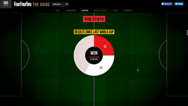
See how FourFourTwo compared games won, drawn and lost in the World Cup, for example, by creating comparative pie charts for the reader to scroll through.
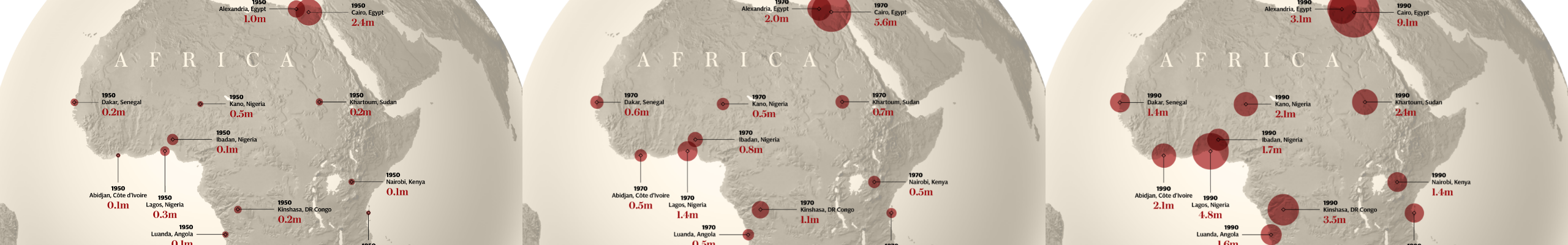
Similarly, see how the Telegraph showed increased in African populations in 'What Africa will look like in 100 years' by creating a series of graphics, with differently sized circles representing the number for each year.

Simplicity is often a good place to start with visual storytelling, and if you’re throwing numbers into the mix too then giving data space on the page can help your reader engage.
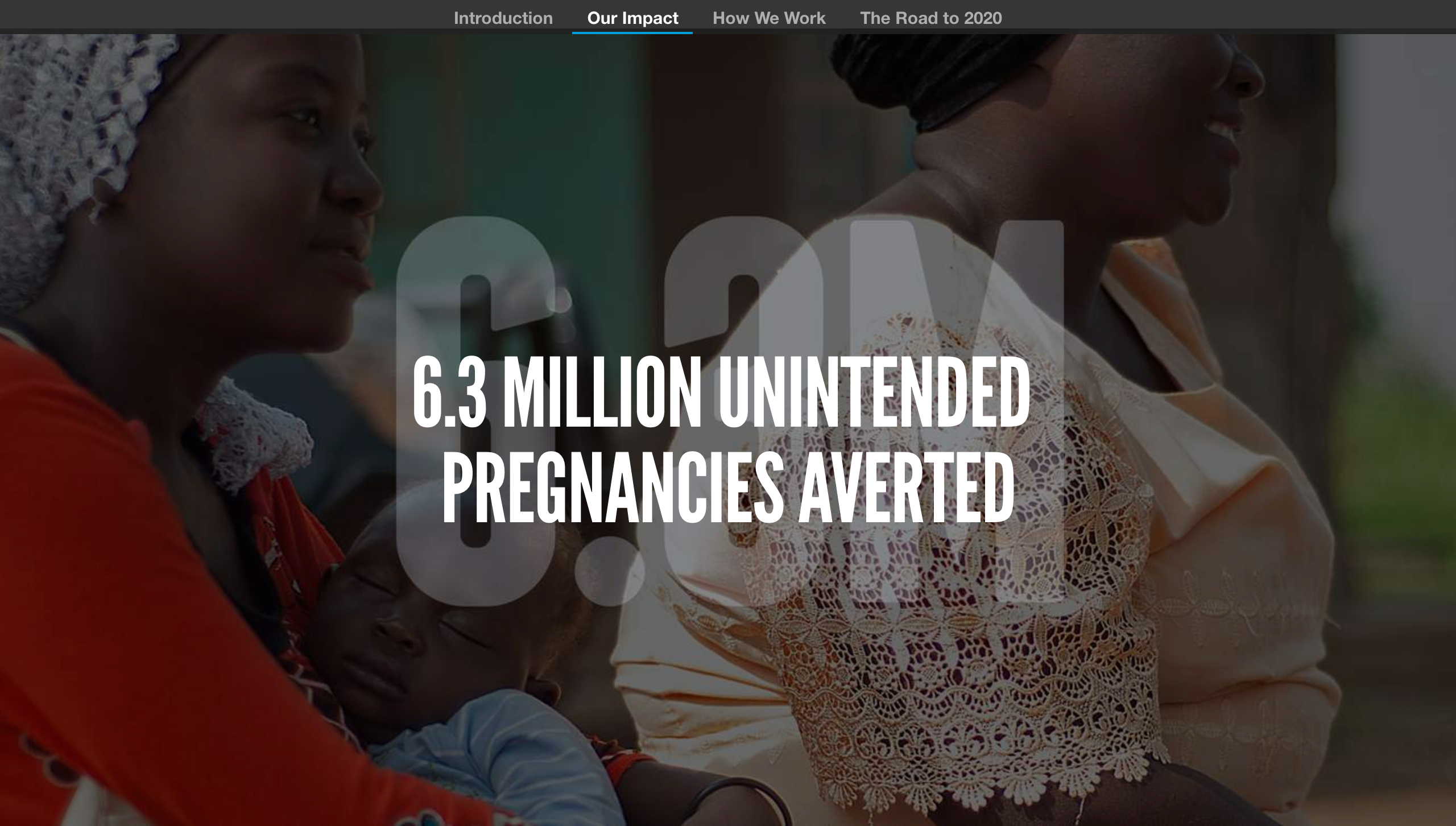
See how Marie Stopes International reinforced key figures from the past year in their Global Impact Report by presenting the stats as a large background graphic, reinforced by a fuller explanation over the top.
Don’t try and throw too much into the mix at once. Take it one point / headline at a time, and give the reader a chance to reflect on the finding before moving onto the next. This comes back to finding an opportunity to break down the detail and make data more digestible.

We’re talking about delivering data and statistics as part of a wider multimedia story – so visuals are an obvious point in this list. But the key is how they’re used in combination with data.
Firstly, visuals, be it an image or video, can obviously add key context to the raw numbers. Talking about population numbers with a map graphic to give the geographical context is perhaps a no-brainer – but consider a clean map, without too many extra layers so your reader can focus on the main 2 variables: the number and the location.
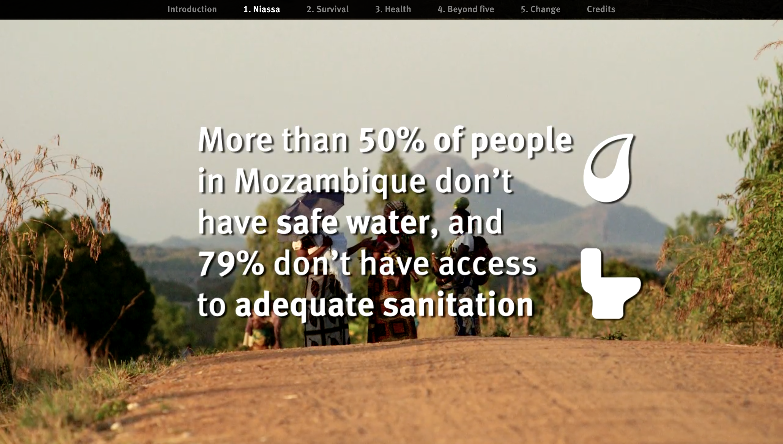
And visuals can play a more subtle, but powerful role. For example, consider how the autoplay video backgrounds in Child of Mine by Wateraid, set in the background of overlaid statistics, offers another layer to the numbers, introducing us to the people and places where these statistics are a reality.
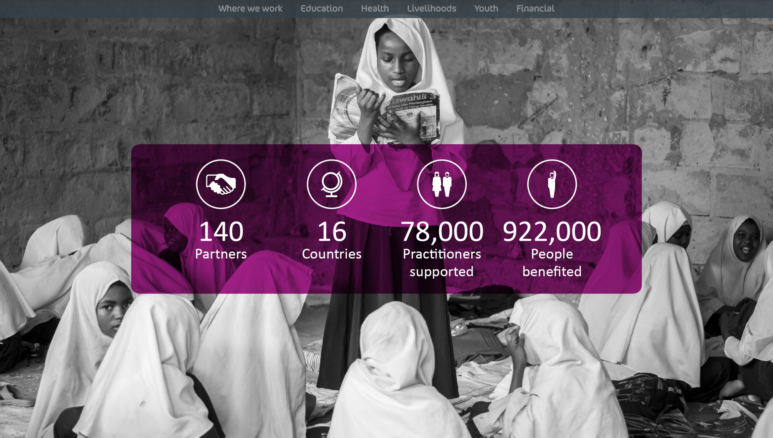
It's the power of putting a face to a number. If the data you’re referring to relates to real people, real lives, then presenting it alongside imagery of those people helps reinforce the wider story. See how VSO delivers data snippets as overlays on related photography in their Annual Review 2016 in a way that really humanises the numbers.
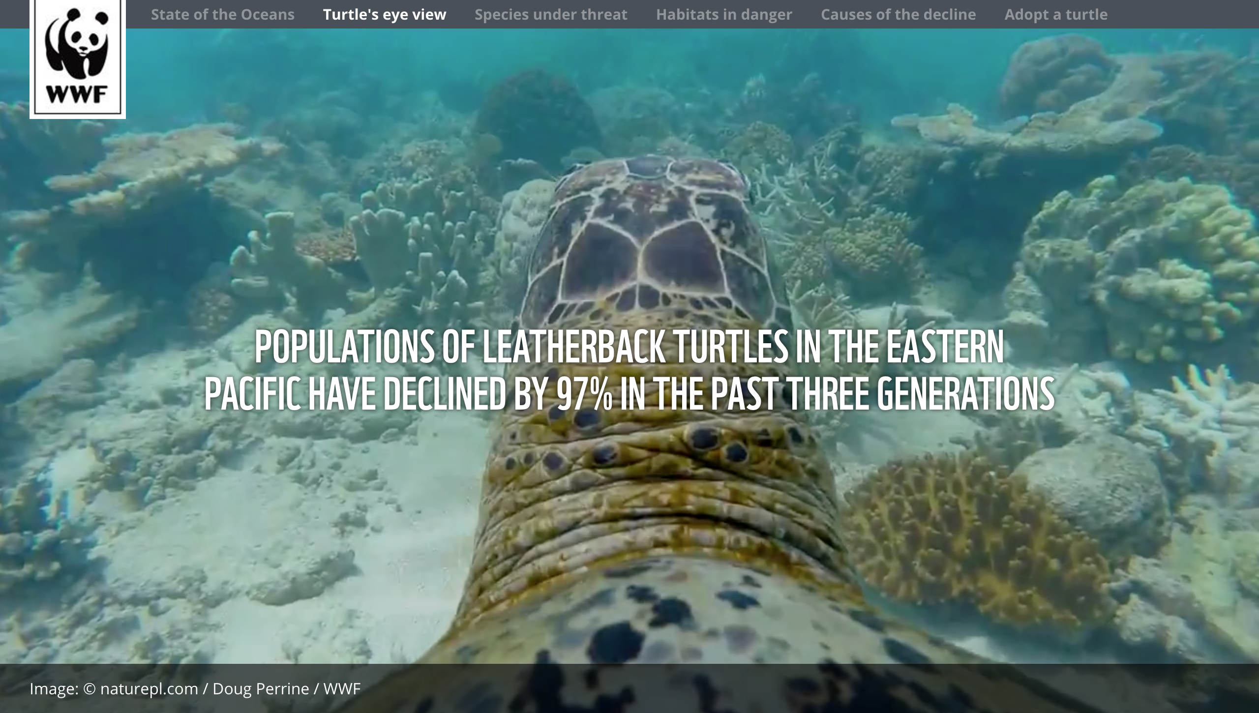
Or see how WWF takes you for a ride on the back of a turtle in its Living Blue Planet report, while highlighting the decline of the population. You truly feel closer to underwater life, and this helps hit home the potential loss being raised by the statistics.
In some cases, the numbers might be the headline of the piece, and as such should take centerstage. In others, they may be part of the wider narrative.
But the most important thing is that the story at the heart remains the focus, and the delivery of data serves to really strengthen its impact, and add rich and valuable context.